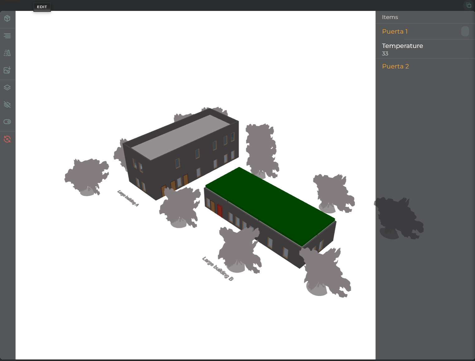
The BIM/IFC widget allows you to configure a 3D model under the BIM/IFC standard and add sensors to the desired elements of the model.
How it Works
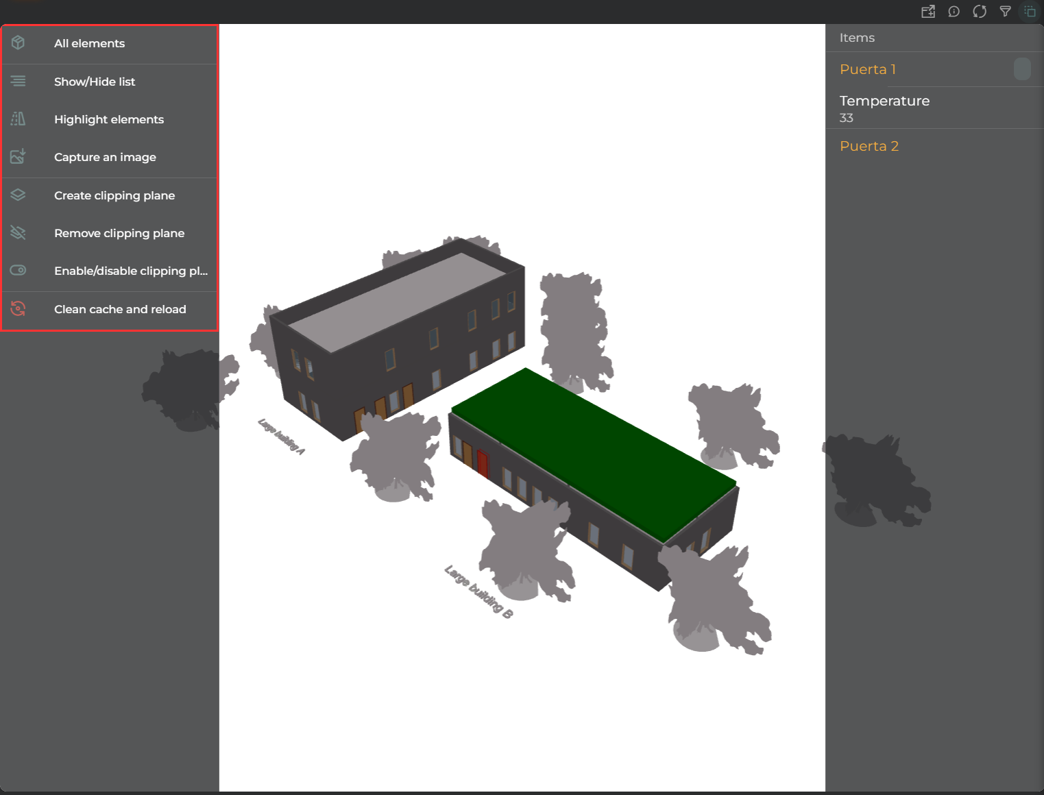
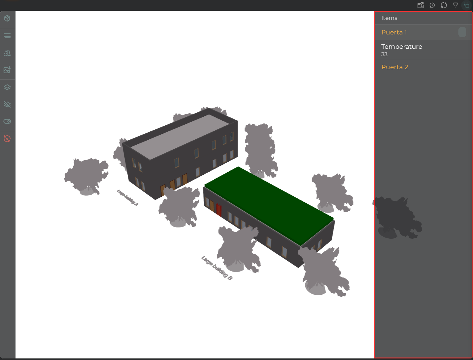
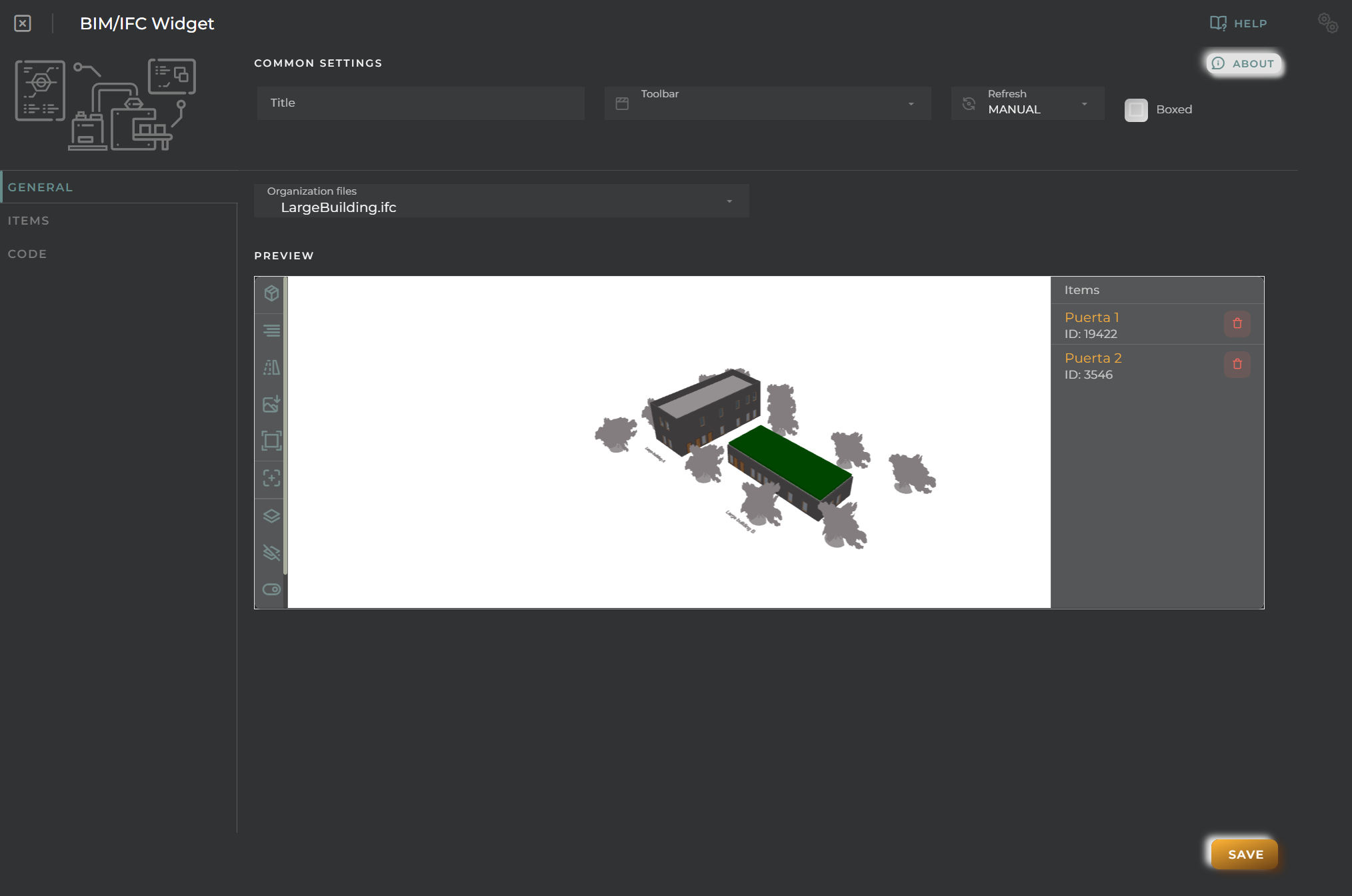
The widget displays the selected model, covering the widget area. To the left of the widget is a panel with available actions, and to the right are listed the selected and monitored elements.
Actions Panel
With the Actions Panel, you can:
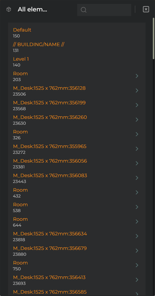
All elements displays a list of all elements in the model, allowing you to search and select an element quickly
Show/Hide list allows you to show/hide the right panel of elements
Highlight elements will select all preconfigured elements from the right panel in the model
Capture an image downloads a snapshot of only the model in its current state
Create clipping plane enables the option to select an element in the model to create a cutting layer that allows you to cut the model and see elements inside
Remove clipping plane removes the selected cutting layer
Enable/disable clipping planes activates/deactivates the cutting layers without needing to remove and add
Clear cache and reload clears the cache and reloads the image to return it to its initial state
Elements Panel
With the Elements Panel, you can select an element to highlight it in the model for more precise location.
States are also represented here as established by the configured code.
Configuration
General
Boxed: widget will be displayed with background in dahsboard.
About: widget description in Markdown format.
Title: widget title. It can be configured to remain fixed in the widget or only be displayed when it receives focus.
Toolbar: configures the behavior of the widget bar on the dashboard, allowing you to hide it, hide it when not in use, or leave it always visible.
Refresh Frequency: allows configuring the data refresh frequency displayed in the list.
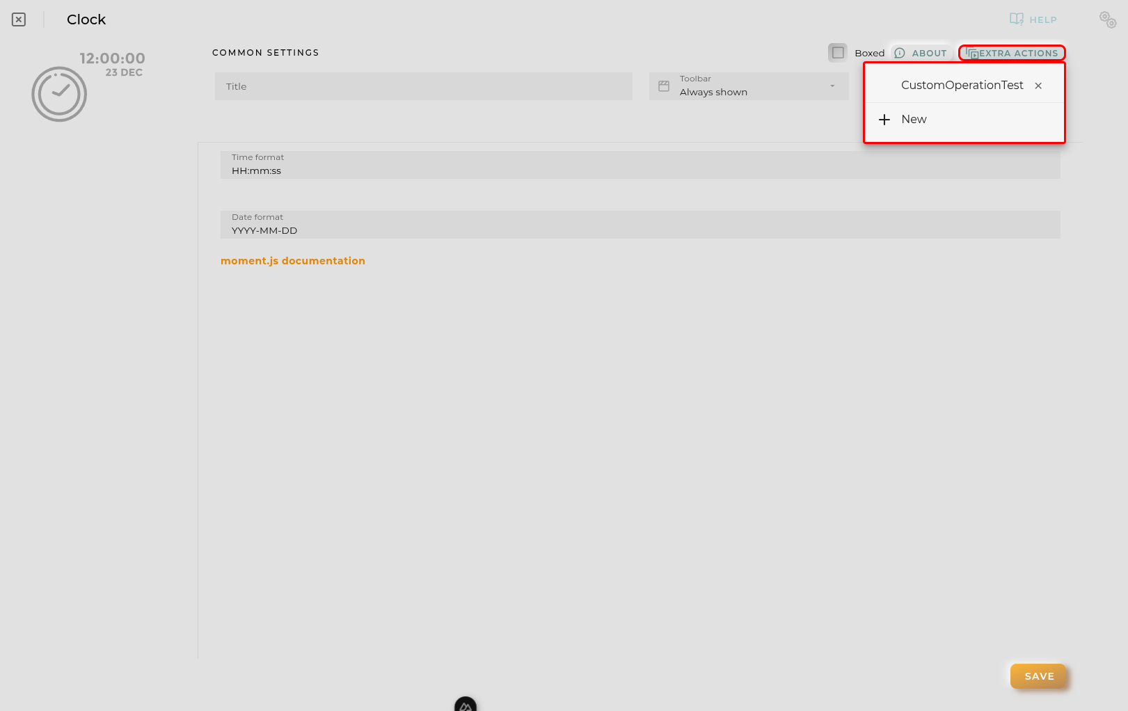
Extra actions: allows user to add new specific actions to the widget with your own code.
You can add a new one by pressing the New button.
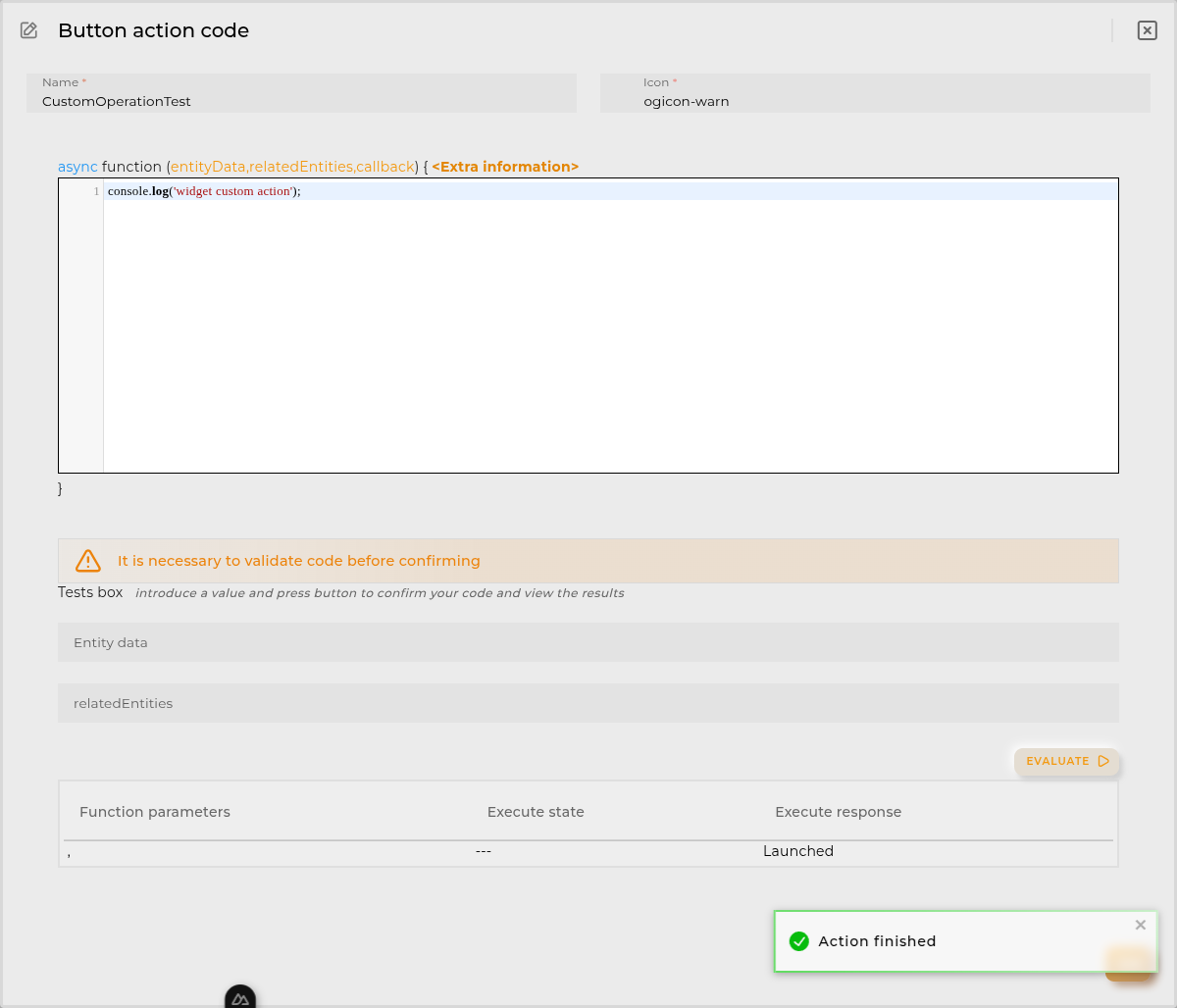
Once you added a custom action it can be modified later by pressing the name in the list.
In order to remove the custom action click the delete icon button on the right.
In extra actions you can write your own code were you can open other dashboards, entities dashboards or execute wizards.
You can find all available functions and methods in Extra Information
Organization files allows you to select a file to add to our widget
Preview here, you can see the loaded model and preselect those elements you want to highlight/monitor
In the preview panel, the following actions are found:
[…The actions are similar to the Actions Panel section…]
Items Tab
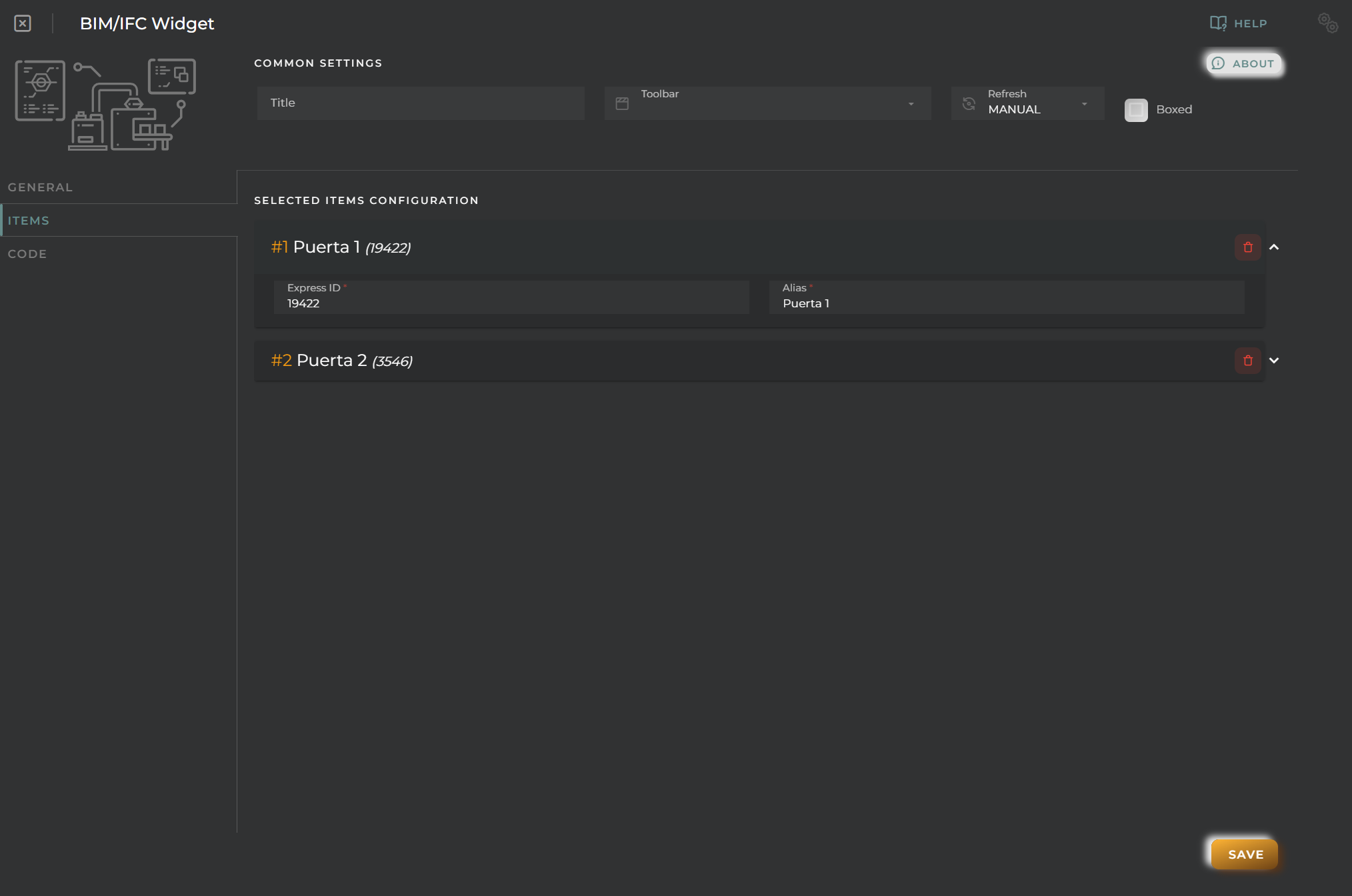
From here, you can alter the values of the elements selected in the model preview:
Express ID allows you to modify the ID of the selected element if it has changed in the model
Alias you can assign an alternative display name
Code Tab
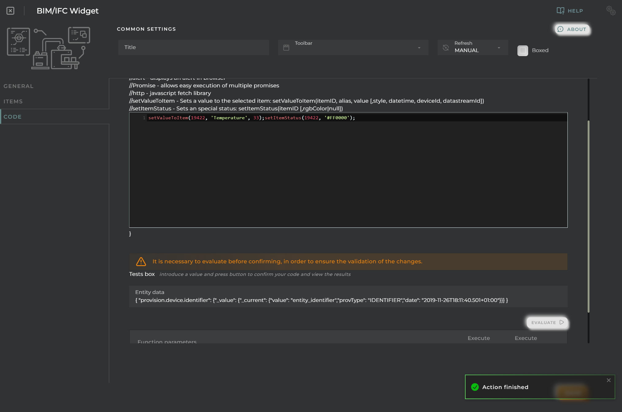
Here, you configure the logic needed for the identification of different values and to display them on the elements of the model.
IMPORTANT NOTE: Whenever code is modified, it must be evaluated to save the changes
Function
Depending of the configuration receives the following parameters:
entityData contains the data of the opened entity
NOTE: only available when the user opens an entity dashboard template
Promise -> allows easy execution of multiple promises
http -> javascript encapsulation of a useFetch (Nuxt 4) instance doc. Returns { data, error, status, refresh, clear } where data and error are reactive Refs.
alert -> alert navigator method
setValueToItem -> Sets a value to the selected item
setValueToItem(itemID, alias, value [,style, datetime, deviceId, datastreamId])
/**
* Logic:
* 1. Queries a sample of maximum 50 entities.
* 2. Calculates the average of the `device.powersupply.battery.charge` values.
* 3. Update "VentanaPrincipal" value with the average.
* 4. If the floor of average is even, changes "VentanaPrincipal" status to Red (#FF0000).
* 5. If the floor of average is odd, changes "VentanaPrincipal" status to Green (#00FF00).
*/// 1. Create the builder to search for entities, limiting to 50
varbuilder=$api.entitiesSearchBuilder()
.limit(50)
.flattened();
// 2. Execute the query
varresponse=awaitbuilder.build().execute();
vartotalCharge=0;
varcount=0;
// 3. Iterate through the results and sum the battery charge
if (response&&response.data&&response.data.entities) {
response.data.entities.forEach(function(entity) {
// Access the battery charge field
// Field: device.powersupply.battery.charge
varbatteryField=entity['device.powersupply.battery.charge'];
if (batteryField&&batteryField._value&&batteryField._value._current&&batteryField._value._current.value) {
varval= parseFloat(batteryField._value._current.value);
if (!isNaN(val)) {
totalCharge+=val;
count++;
}
}
});
}
// 4. Calculate Average
varaverage=count>0?totalCharge/count:0;
// 5. Determine color based on parity of the floor of the average
// Even -> Red "#FF0000"
// Odd -> Green "#00FF00"
varfloorAvg= Math.floor(average);
varisEven=floorAvg%2===0;
varcolor=isEven?"#FF0000":"#00FF00";
// 6. Set the item status and value
// setItemStatus(itemID, [rgbColor(string format)|null])
setItemStatus("VentanaPrincipal", color);
// setValueToItem(itemID, alias, value)
setValueToItem("VentanaPrincipal", "Battery Avg", average.toFixed(2));
// Use return as the function is async
return;
All Entities Average Battery
Code
/**
* Logic:
* 1. Iterates through ALL entities in the platform using `executeWithAsyncPaging` (efficient pagination).
* 2. Calculates the average of the `device.powersupply.battery.charge` values across all entities.
* 3. Update "VentanaPrincipal" value with the global average.
* 4. If the floor of average is even, changes "VentanaPrincipal" status to Red (#FF0000).
* 5. If the floor of average is odd, changes "VentanaPrincipal" status to Green (#00FF00).
*/vartotalCharge=0;
varcount=0;
// 1. Create the builder
varbuilder=$api.entitiesSearchBuilder()
.limit(2000) // Max limit per page
.flattened();
// 2. Execute with async paging
// executeWithAsyncPaging(resourceName) returns a Promise
returnbuilder.build().executeWithAsyncPaging('entities').then(
// Success Callback (called when all pages are processed)
function() {
// 4. Calculate Average
varaverage=count>0?totalCharge/count:0;
// 5. Determine color based on parity of the floor of the average
varfloorAvg= Math.floor(average);
varisEven=floorAvg%2===0;
varcolor=isEven?"#FF0000":"#00FF00";
// 6. Set the item status and value
setItemStatus("VentanaPrincipal", color);
setValueToItem("VentanaPrincipal", "Battery Avg", average.toFixed(2));
},
// Error Callback
function(err) {
console.error("Error in paging:", err);
},
// Notify Callback (called for each page of results)
function(pageData) {
if (pageData&&pageData.length>0) {
pageData.forEach(function(entity) {
// Access the battery charge field
varbatteryField=entity['device.powersupply.battery.charge'];
if (batteryField&&batteryField._value&&batteryField._value._current&&batteryField._value._current.value) {
varval= parseFloat(batteryField._value._current.value);
if (!isNaN(val)) {
totalCharge+=val;
count++;
}
}
});
}
}
);
Custom Action
Custom action widgets allow you to code an action to be performed, which will be triggered by a button or a form.
How it Works
This widget will display a form or button that will execute the user-coded action.
In the case of using a form, the action will receive the form values and any desired logic can be applied to them.
Additionally, this widget can be configured so that the action executes within a dialog box as an independent form.
Once the execution is initiated, a progress box will appear displaying the result of the action.
The execution will be successful as long as no exception is thrown in the source code.
Configuration
General
Boxed: widget will be displayed with background in dahsboard.
About: widget description in Markdown format.
Title: widget title. It can be configured to remain fixed in the widget or only be displayed when it receives focus.
Toolbar: configures the behavior of the widget bar on the dashboard, allowing you to hide it, hide it when not in use, or leave it always visible.
Refresh Frequency: allows configuring the data refresh frequency displayed in the list.
Extra actions: allows user to add new specific actions to the widget with your own code.
You can add a new one by pressing the New button.
Once you added a custom action it can be modified later by pressing the name in the list.
In order to remove the custom action click the delete icon button on the right.
In extra actions you can write your own code were you can open other dashboards, entities dashboards or execute wizards.
You can find all available functions and methods in Extra Information
Description here you will write what action will be executed when the corresponding button is pressed
Icon determines the type of desired visualization: a button with an icon, an image, or a custom form. In the case of a form, it can also be specified if you want to display it as a dialog box.
If it’s a form, you must enter a JSON schema that determines what will be drawn.
Expert
Here you can configure source code that will run before the widget is loaded, allowing for the dynamic construction of the JSON schema of the form to be displayed, thereby facilitating the construction of dynamic forms based on platform data.
Available utils
$api -> use it to create http petitions to OpenGate Api Rest doc
Promise -> allows easy execution of multiple promises
http -> javascript encapsulation of a useFetch (Nuxt 4) instance doc. Returns { data, error, status, refresh, clear } where data and error are reactive Refs.
Function
Depending of the configuration receives the following parameters:
entityData contains the data of the opened entity
NOTE: only available when the user opens an entity dashboard template
// Check if a value is provided
if (!value) {
console.warn("No value provided for search.");
return;
}
// Define the API endpoint (JSONPlaceholder)
// We'll filter todos by userId based on the input value
varapiUrl="https://jsonplaceholder.typicode.com/todos?userId="+value;
console.log("Fetching data from: "+apiUrl);
try {
// Perform the request using the platform's http utility (encapsulation of Nuxt 4 useFetch)
// useFetch typically parses JSON automatically.
// We await the result.
// Note: useFetch in Nuxt returns { data, error, ... }
const { data, error } =awaithttp(apiUrl);
if (error&&error.value) {
thrownew Error("Generic Error: "+error.value);
}
// Access the data (Ref value if it's a ref, or direct if the utility un-refs it)
// Assuming standard Nuxt composition API behavior where top level properties are Refs
constresults=data.value||data;
console.log("--- Search Results (User ID: "+value+") ---");
// Check if we got any results
if (results&&results.length>0) {
console.table(results); // Display as a table for better readability
console.log("Total records found: "+results.length);
} else {
console.log("No records found for User ID: "+value);
}
} catch (err) {
console.error("Fetch error:", err);
}
Custom Action Entity Search Example
Code
// Check if model is provided
if (!model) {
console.warn("No form data (model) provided.");
return;
}
const { name, specificType } =model;
console.log("Searching entities with Name:", name, "and Specific Type:", specificType);
// Create the builder
varbuilder=$api.entitiesSearchBuilder().flattened();
// Define filters based on model values
varfilter= {
and: [
{
eq: {
'resourceType':'entity.device' }
}
]
};
if (name) {
filter.and.push({
like: {
'provision.administration.identifier':name// Assuming 'name' maps to identifier for this example, or use 'provision.device.name' if appropriate
}
});
}
if (specificType) {
filter.and.push({
eq: {
'provision.device.specificType':specificType }
});
}
// Apply filter if any conditions were added
if (filter.and.length>0) {
builder.filter(filter);
}
try {
// Execute the search
// await is supported in this context
constresponse=awaitbuilder.build().execute();
if (response.statusCode===200) {
console.log("--- Entity Search Results ---");
constentities=response.data.entities;
if (entities&&entities.length>0) {
console.table(entities.map(e => ({
id:e['provision.administration.identifier']._value._current.value,
specificType:e['provision.device.specificType'] ?e['provision.device.specificType']._value._current.value:'N/A' })));
console.log("Total entities found:", entities.length);
} else {
console.log("No entities match the criteria.");
}
} else {
console.error("Search failed with status:", response.statusCode);
}
} catch (err) {
console.error("Error executing entity search:", err);
}
Custom Chart
Custom charts allow for the display of data in graphical format based on user-defined logic.
How it Works
Once the logic for data retrieval is entered, the data will be displayed on the widget.
What sets the custom chart apart from others is that the data source can be external, internal, both, or even fabricated. Moreover, multiple charts can be combined within the same widget.
This widget is compatible with eCharts library version 5. Multiple examples can be accessed via the following link: eCharts
Configuration
General
Boxed: widget will be displayed with background in dahsboard.
About: widget description in Markdown format.
Title: widget title. It can be configured to remain fixed in the widget or only be displayed when it receives focus.
Toolbar: configures the behavior of the widget bar on the dashboard, allowing you to hide it, hide it when not in use, or leave it always visible.
Refresh Frequency: allows configuring the data refresh frequency displayed in the list.
Extra actions: allows user to add new specific actions to the widget with your own code.
You can add a new one by pressing the New button.
Once you added a custom action it can be modified later by pressing the name in the list.
In order to remove the custom action click the delete icon button on the right.
In extra actions you can write your own code were you can open other dashboards, entities dashboards or execute wizards.
You can find all available functions and methods in Extra Information
Show widget filters instructs the widget to display its filters. These filters will be passed as an additional parameter to the data retrieval function.
Here, you input the necessary code to obtain the information to be displayed.
Depending on the selected options, the parameters received by the function will be displayed.
The function must always return a JSON object that is compatible with eCharts’ chart configuration.
Every time the code is updated, it must be evaluated where a preview of the result can be seen.
Function
Depending of the configuration receives the following parameters:
entityData contains the data of the opened entity
NOTE: only available when the user opens an entity dashboard template
filters introduced by the user. These filters are:
generic widget generic filter
period widget date period filter
inherit json object with inherited filter if ‘shared filter’ is enabled. This filter is composed by ‘and’ filter that contains standar filter, private/template filter and headers filters from the source widget.
Promise -> allows easy execution of multiple promises
http -> javascript encapsulation of a useFetch (Nuxt 4) instance doc. Returns { data, error, status, refresh, clear } where data and error are reactive Refs.
Custom tables allow you to display data in a list format based on logic encoded by the user.
How it Works
Once the logic for data retrieval is entered, the data will be displayed in the table.
What sets the custom table apart is that the data source can be external, internal, both, or even fabricated. Moreover, custom charts can be mixed in, and additional information can be included in the expandable panel.
Configuration
General
Boxed: widget will be displayed with background in dahsboard.
About: widget description in Markdown format.
Title: widget title. It can be configured to remain fixed in the widget or only be displayed when it receives focus.
Toolbar: configures the behavior of the widget bar on the dashboard, allowing you to hide it, hide it when not in use, or leave it always visible.
Refresh Frequency: allows configuring the data refresh frequency displayed in the list.
Extra actions: allows user to add new specific actions to the widget with your own code.
You can add a new one by pressing the New button.
Once you added a custom action it can be modified later by pressing the name in the list.
In order to remove the custom action click the delete icon button on the right.
In extra actions you can write your own code were you can open other dashboards, entities dashboards or execute wizards.
You can find all available functions and methods in Extra Information
Pagination type allows you to specify the kind of pagination you want. There may be no pagination, pagination handled by the table component (local), or server-side pagination.
If server-side pagination is chosen, the script will receive parameters like the number of elements and the page, allowing the user to decide.
Page elements specifies the number of elements to show per page.
Allow data grouping enables the table to group items by elements in a column.
Show widget filters instructs the widget to display its filters. These filters will be passed as an additional parameter to the data retrieval function.
Compact the size of the table rows will make the table rows more compact to save vertical space.
Expandable rows enables an information button for expanded data on each row. The code must fill this information, or an empty space will be displayed.
Column Configuration
The data that will be displayed in table. In order to finish the configuration for this you must add one column at least and select a primary key.
For every column you can define the next data:
Name to show in headers
JSON field is the field to read in data returned by the function. Primary key use that field
Sortable permits sorting for this column
Groupable allow group by this field in table
Filterable allow filter by this field in table
Data type of the filter (only when filterable)
Divisor draws a separator between this column and the next
Show entity actions enables context menu for the column allowing to perform some actions depending of the item value.
Columns supports drag&drop in order to determine the position in the table.
Code Tab
This is where you input the necessary code to retrieve the data to be displayed.
Depending on the options selected in the general tab, the parameters received by the function will be displayed.
The function must always return an array of JSON objects compatible with the specified configuration for the component to be able to render them.
Each time the code is updated, it must be evaluated where a preview of the result can be seen.
Finally you MUST return an array with a json that matches the columns configuration.
Function
Depending of the configuration receives the following parameters:
entityData contains the data of the opened entity
NOTE: only available when the user opens an entity dashboard template
filters introduced by the user. These filters are:
generic widget generic filter
period widget date period filter
column json object with each column filter
sort an array containing every sorted column with its direction sorted by user preferences
inherit json object with inherited filter if ‘shared filter’ is enabled. This filter is composed by ‘and’ filter that contains standar filter, private/template filter and headers filters from the source widget.
An example:
{
"filters": {
"generic": "filter introduced by the user",
"period": {"from":"2023-03-27T10:59:27+02:00","to":null},
"column": {
[columnvaluefield]:{operator:"eq",
value:"filter introduced by the user in colum" },
[columnvaluefield]:{operator:"gt",
value:"filter introduced by the user in colum" }
},"sort": [
{
column:"column value field",
direction:"asc"or"desc" },
{
column:"column value field",
direction:"asc"or"desc" }
],"inherit": {
"and": [
{ "eq": {"field.identifier._current.value": "value"}},
{ "eq": {"field2.identifier._current.value": "value2"}}
]
}
}}
pageElements and page that determines the current page to display. Only enabled when server pagination enabled in table parameters. Disabling server pagination quits this parameters and function must be evaluated again.
callback function used to send table data only when the api/http petitions are promised
Promise -> allows easy execution of multiple promises
http -> javascript encapsulation of a useFetch (Nuxt 4) instance doc. Returns { data, error, status, refresh, clear } where data and error are reactive Refs.
openDashboard -> (workspaceId, dashboardId, newPage) -> Opens the selected dashboard in selected workspace
openEntityDashboard -> (entityIdentifier[, organization[user if empty], resourceType[’entity.device’ if empty] , newPage]) -> Opens the entity’s temporary dashboard
Data format
Returned data must have one of the following formats (per item):
simple json data
{
    "jsonfield": "value to display. It can be HTML."
}
‘complex’ json data
{
    "jsonfield": {
        "value": "value to display. It can be HTML",
        "_style": "cell custom style",
        "_chart": "displays an echarts chart. Overrides others in this item",
        "_extension": "jsonfield like (value, _style, _chart)  plus _table. Only enabled when expandable rows enabled"
    }
}
NOTE _extension field can combine _chart and _table elements in the same item
Element _chart
Must have an echarts config json.
Element _table
Displays a table inside the column and overrides others in this item.
This example demonstrates how to fetch data from the USGS Earthquake Hazards Program API.
This service supports server-side date filtering, which aligns perfectly with the widget’s Period Filter.
Function Explanation
Date Filtering: The code checks the filters.period object.
If from and to are present, they are formatted to ISO 8601 strings (YYYY-MM-DD) and sent as starttime and endtime parameters.
If no period is selected, it defaults to the last 24 hours.
Name/Text Filtering: The filters.generic (search text) is used to filter the results client-side (searching within the place field), as the API does not support a direct “text search” parameter for this endpoint.
Code
// Main function executed by the Custom Table widget
// parameters: entityData, filters, page, pageElements, callback
// Base URL for USGS Earthquake API (GeoJSON format)
leturl='https://earthquake.usgs.gov/fdsnws/event/1/query?format=geojson&limit=200';
// 1. Handle Date Filters (Server-Side)
if (filters&&filters.period&&filters.period.from&&filters.period.to) {
// Helper to format date as YYYY-MM-DD
constformatDate= (dateStr) => new Date(dateStr).toISOString().split('T')[0];
conststart=formatDate(filters.period.from);
constend=formatDate(filters.period.to);
url+=`&starttime=${start}&endtime=${end}`;
} else {
// Default to 'now' if no filter (API defaults to last 30 days usually, let's limit to recent)
// Actually, let's explicitely ask for last 2 days to keep data manageable if no filter
// But for simplicity, we rely on the API defaults or a 'limit' param already added above.
}
try {
// 2. Fetch Data
constresponse=awaithttp(url);
letfeatures= [];
if (response&&response.features) {
features=response.features;
} elseif (response&&response.json) {
constjson=awaitresponse.json();
features=json.features|| [];
}
// 3. Handle Name/Text Filter (Client-Side)
// filtering by 'place' property
if (filters&&filters.generic&&filters.generic.length>0) {
constsearch=filters.generic.toLowerCase();
features=features.filter(f =>
f.properties.place&&f.properties.place.toLowerCase().includes(search)
);
}
// 4. Map to Table Columns
// Configured Columns hint: 'place', 'magnitude', 'time', 'status'
consttableData=features.map(f => {
constprops=f.properties;
constdateObj=new Date(props.time);
// Determine color based on magnitude
letmagColor='green';
if (props.mag>=5) magColor='red';
elseif (props.mag>=3) magColor='orange';
return {
place:props.place,
magnitude: {
value:props.mag?props.mag.toFixed(1) :'0.0',
_style:`font-weight:bold; color: ${magColor};` },
time:dateObj.toLocaleString(),
status:`<a href="${props.url}" target="_blank">Ver Detalles</a>` };
});
callback(tableData);
} catch (error) {
console.error("Error fetching earthquake data:", error);
callback([]);
}
Filtered Entity Retrieval
Description
This example shows how to retrieve entities filtering by a parameter and sorting by name.
Code
/**
* Main function to retrieve and display entities
* @param {Object} entityData - Context entity data
* @param {Object} filters - Filters passed from the widget
*/varbuilder=$api.entitiesSearchBuilder().limit(100).flattened();
// 1. Filter by parameter (assuming it comes in filters.generic or a specific field)
// Here we assume filters.generic contains a string to filter by name
if (filters&&filters.generic) {
builder.filter({
like: {
'provision.asset.name':filters.generic// Adjust field as needed (e.g., provision.device.name)
}
});
}
// 2. Sort by name
builder.sort([
{
column:'provision.asset.name',
direction:'asc' }
]);
// 3. Execute query
varresponse=awaitbuilder.build().execute();
// 4. Transform results
varresults= [];
if (response&&response.data&&response.data.entities) {
response.data.entities.forEach(function(entity) {
// Extract identifier (using bracket notation for flattened keys)
varid=entity['provision.administration.identifier'] ?entity['provision.administration.identifier']._value._current.value:"Unknown";
// Extract name (handle if it doesn't exist)
varname="N/A";
if (entity['provision.asset.name']) {
name=entity['provision.asset.name']._value._current.value;
}
results.push({
identifier:id,
name:name });
});
}
returnresults;
Server Pagination Example (Reqres)
Static content
This example demonstrates how to implement server-side pagination using an external API (reqres.in).
When “Server Pagination” is enabled in the widget configuration, the script receives page and pageElements parameters.
Function Explanation
Page Parameters: The page and pageElements arguments act as the current page number and the page size (limit), respectively.
API Request: The code constructs a request to reqres.in passing page and per_page query parameters.
Callback: The function processes the response and sends the array of users to the widget via the callback.
Code
// Main function executed by the Custom Table widget
// parameters: entityData, filters, page, pageElements, callback
// 1. Prepare Pagination Parameters
// Ensure we have defaults if arguments are missing (safeguard)
constcurrentPage=page||1;
constperPage=pageElements||5;
// 2. Construct URL with pagination params
// reqres.in uses 'page' (1-based) and 'per_page'
consturl=`https://reqres.in/api/users?page=${currentPage}&per_page=${perPage}`;
try {
// 3. Fetch Data
constresponse=awaithttp(url);
// 4. Extract Data
// reqres.in returns: { page: 1, per_page: 6, total: 12, total_pages: 2, data: [...] }
letusers= [];
// Check various response wrappers as 'http' might auto-parse JSON
if (response&&response.data&& Array.isArray(response.data)) {
users=response.data;
} elseif (response&&response.json) {
constjson=awaitresponse.json();
users=json.data|| [];
} elseif (response&& Array.isArray(response)) {
users=response;
}
// 5. Format for Table
// Configured Columns hint: 'id', 'avatar', 'first_name', 'last_name'
consttableData=users.map(user => {
return {
id:user.id,
avatar:`<img src="${user.avatar}" style="width: 30px; border-radius: 50%;">`,
first_name:user.first_name,
last_name:user.last_name,
email:user.email };
});
// 6. Return Data
// We return the array of items for the current page.
callback(tableData);
} catch (error) {
console.error("Error fetching paged data:", error);
callback([]);
}
Battery Level Pie Chart
Description
This example shows how to retrieve entities and display their battery level as a Pie Chart within the table row.
Code
varbuilder=$api.entitiesSearchBuilder().limit(100).flattened();
// Handle generic filter if present
if (filters&&filters.generic) {
builder.filter({
like: {
'provision.administration.identifier':filters.generic }
});
}
varresponse=awaitbuilder.build().execute();
varresults= [];
if (response&&response.data&&response.data.entities) {
response.data.entities.forEach(function(entity) {
// Get identifier
varid=entity['provision.administration.identifier'] ?entity['provision.administration.identifier']._value._current.value:"Unknown";
// Get battery charge (default to 0 if not present)
varcharge=0;
if (entity['device.powersupply.battery.charge']) {
charge=entity['device.powersupply.battery.charge']._value._current.value;
}
// Create the chart configuration
varpieOption= {
color: ['#91c7ae', '#c23531'],
series: [
{
type:'pie',
radius: ['50%', '70%'],
avoidLabelOverlap:false,
label: {
show:false,
position:'center' },
emphasis: {
label: {
show:true,
fontSize:'10',
fontWeight:'bold' }
},
labelLine: {
show:false },
data: [
{ value:charge, name:'Charge' },
{ value:100-charge, name:'Empty' }
]
}
]
};
results.push({
identifier:id,
battery: {
"_chart":pieOption,
"_style":"height: 50px; width: 50px;"// Optional styling for the cell
}
});
});
}
returnresults;
Custom Widget
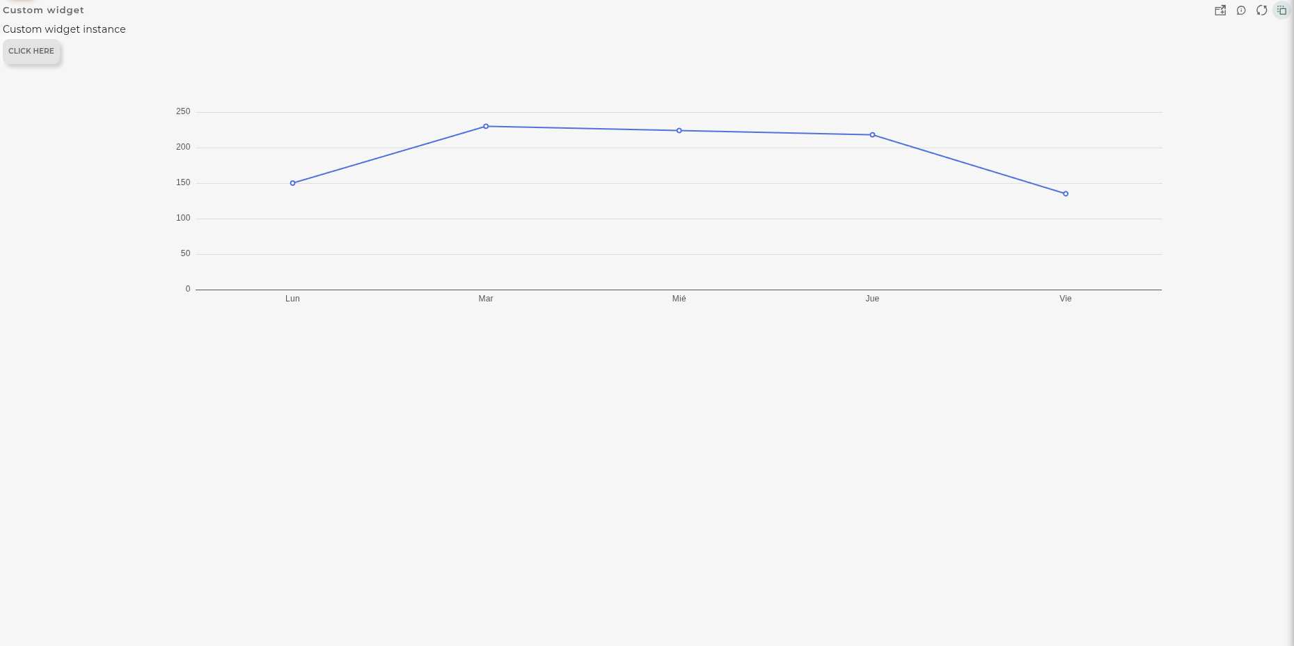
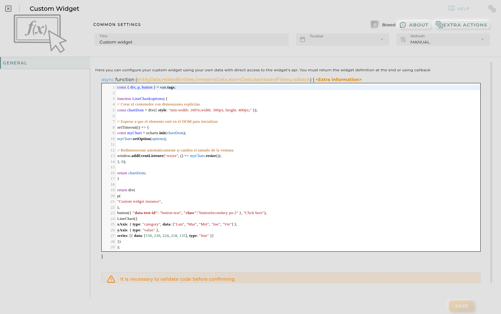
This widget allows to create a full widget by using the van js templating system and echarts
How it Works
Once the code is entered, the coded form will be displayed on the widget.
This widget is compatible with eCharts library version 6. Multiple examples can be accessed via the following link: eCharts
Configuration
General
Boxed: widget will be displayed with background in dahsboard.
About: widget description in Markdown format.
Title: widget title. It can be configured to remain fixed in the widget or only be displayed when it receives focus.
Toolbar: configures the behavior of the widget bar on the dashboard, allowing you to hide it, hide it when not in use, or leave it always visible.
Refresh Frequency: allows configuring the data refresh frequency displayed in the list.
Extra actions: allows user to add new specific actions to the widget with your own code.
You can add a new one by pressing the New button.
Once you added a custom action it can be modified later by pressing the name in the list.
In order to remove the custom action click the delete icon button on the right.
In extra actions you can write your own code were you can open other dashboards, entities dashboards or execute wizards.
You can find all available functions and methods in Extra Information
Here, you input the necessary code to obtain the information to be displayed.
The function must always return a van ui object.
Every time the code is updated, it must be evaluated where a preview of the result can be seen.
Function
Depending of the configuration receives the following parameters:
entityData contains the data of the opened entity
NOTE: only available when the user opens an entity dashboard template
Promise -> allows easy execution of multiple promises
http -> javascript encapsulation of a useFetch (Nuxt 4) instance doc. Returns { data, error, status, refresh, clear } where data and error are reactive Refs.
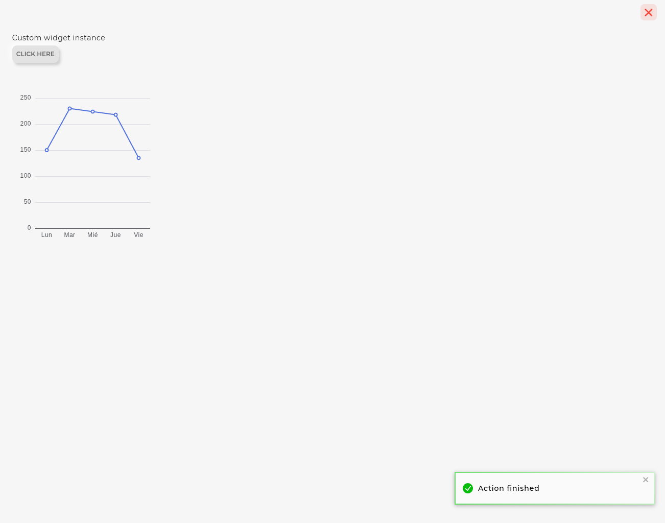
openWidget -> (widgetId[, entityKey, title, extraConf]) -> Opens the selected widget in a modal panel
openDashboard -> (workspaceId, dashboardId, newPage) -> Opens the selected dashboard in selected workspace
openEntityDashboard -> (entityIdentifier[, organization[user if empty], resourceType[’entity.device’ if empty] , newPage]) -> Opens the entity’s temporary dashboard
openWizard -> (wizardId[, wizardData, isEdit]) -> Opens the selected wizard in a modal panel. A list of available wizards will be available to use directly.
Final code structure build by the application
asyncfunctionmain(entityData,relatedEntities,timeserieData,alarmData,dashboardFilters,callback) {
// YOUR CODE HERE WITH RETURN OR CALLBACK (function is declared automatically)
}
// 1. Importar tags de VanJS
const { div, input, button, ul, li, span, p } =van.tags;
// 2. Extraer el ID por defecto si entityData está presente en el contexto
constdefaultDeviceId=entityData?.['provision.administration.identifier']?._value?._current?.value||"";
// 3. Estados reactivos de VanJS
conststatusText=van.state(defaultDeviceId?"Cargando datos...":"Introduce un ID de dispositivo y pulsa Consultar");
constfieldsList=van.state([]);
constloadedEntity=van.state(null); // Guardará la entidad en modo flattened
constcurrentDeviceId=van.state(defaultDeviceId);
// 4. Estilos en línea
conststyles= {
container:"padding: 14px; font-family: system-ui, -apple-system, sans-serif; color: #1e293b; height: 100%; box-sizing: border-box; overflow-y: auto;",
searchBox:"display: flex; gap: 8px; margin-bottom: 12px;",
input:"flex: 1; padding: 8px 12px; border: 1px solid #cbd5e1; border-radius: 6px; font-size: 0.875rem; outline: none;",
primaryBtn:"padding: 8px 16px; background-color: #2563eb; color: white; border: none; border-radius: 6px; font-size: 0.875rem; font-weight: 500; cursor: pointer;",
actionsBox:"display: flex; gap: 8px; margin-bottom: 14px; flex-wrap: wrap;",
actionBtn:"padding: 6px 12px; background-color: #0f766e; color: white; border: none; border-radius: 6px; font-size: 0.8125rem; font-weight: 500; cursor: pointer; display: flex; align-items: center; gap: 6px;",
secondaryActionBtn:"padding: 6px 12px; background-color: #475569; color: white; border: none; border-radius: 6px; font-size: 0.8125rem; font-weight: 500; cursor: pointer; display: flex; align-items: center; gap: 6px;",
list:"list-style: none; padding: 0; margin: 0; display: flex; flex-direction: column; gap: 8px;",
item:"display: flex; justify-content: space-between; align-items: center; padding: 8px 12px; background: #f8fafc; border-radius: 6px; border: 1px solid #e2e8f0; font-size: 0.875rem;",
key:"color: #64748b; font-weight: 500;",
value:"font-weight: 600; color: #0f172a; word-break: break-all;",
status:"color: #64748b; font-size: 0.875rem; text-align: center; padding: 16px 0; margin: 0;"};
// 5. Función asíncrona para consultar el dispositivo usando $api
asyncfunctionsearchDevice(id) {
consttargetId= (id||"").trim();
if (!targetId) {
statusText.val="⚠️ Por favor, introduce un identificador de dispositivo válido.";
fieldsList.val= [];
loadedEntity.val=null;
return;
}
statusText.val=`Buscando dispositivo "${targetId}"...`;
fieldsList.val= [];
loadedEntity.val=null;
currentDeviceId.val=targetId;
try {
// Consulta en modo .flattened()
constresponse=await$api.entitiesSearchBuilder()
.filter({
eq: {
'provision.administration.identifier':targetId }
})
.flattened()
.limit(1)
.build()
.execute();
constentity=response?.data?.entities?.[0];
if (!entity) {
statusText.val=`❌ No se encontró ningún dispositivo con ID: "${targetId}"`;
return;
}
// Guardar la entidad en modo flattened en el estado
loadedEntity.val=entity;
statusText.val="";
// Mapeo de campos simples a mostrar
fieldsList.val= [
{ label:"Identificador", value:entity['provision.administration.identifier']?._value?._current?.value||targetId },
{ label:"Organización", value:entity['provision.administration.organization']?._value?._current?.value||"N/A" },
{ label:"Canal", value:entity['provision.administration.channel']?._value?._current?.value||"N/A" },
{ label:"Grupo de Servicio", value:entity['provision.administration.serviceGroup']?._value?._current?.value||"N/A" },
{ label:"Tipo Específico", value:entity['provision.device.specificType']?._value?._current?.value||"N/A" },
{ label:"Número de Serie", value:entity['provision.device.serialNumber']?._value?._current?.value||"N/A" },
{ label:"Estado Operacional", value:entity['device.operationalStatus']?._value?._current?.value||"N/A" }
];
} catch (error) {
console.error("Error al consultar el dispositivo:", error);
statusText.val=`❌ Error en la consulta: ${error.message||error}`;
}
}
// 6. Funciones para ejecutar las acciones sobre el dispositivo cargado
functionhandleOpenDeviceDetails() {
if (!currentDeviceId.val) {
return;
}
// Abrir widget deviceInfoDetails con el identificador del dispositivo
openWidget('deviceInfoDetails', currentDeviceId.val, `Detalles: ${currentDeviceId.val}`);
}
functionhandleOpenEntitiesWizard() {
if (!loadedEntity.val) {
return;
}
// Abrir wizard entities pasando el objeto de la entidad en modo flattened
openWizard('entities', loadedEntity.val, true);
}
// 7. Input de texto pre-rellenado
consttextInput=input({
type:"text",
placeholder:"Identificador del dispositivo...",
value:defaultDeviceId,
style:styles.input,
onkeydown: (e) => {
if (e.key==="Enter") {
searchDevice(textInput.value);
}
}
});
// 8. Búsqueda automática inicial si entityData contenía un ID
if (defaultDeviceId) {
searchDevice(defaultDeviceId);
}
// 9. Retorno del componente reactivo VanJS
returndiv({ style:styles.container },
// Barra de búsqueda
div({ style:styles.searchBox },
textInput,
button({
style:styles.primaryBtn,
onclick: () => {
searchDevice(textInput.value);
}
}, "Consultar")
),
// Contenido reactivo: Estado o Botones de Acción + Listado
() => {
if (statusText.val) {
returnp({ style:styles.status }, statusText.val);
}
returndiv(
// Barra de acciones disponibles para el dispositivo cargado
div({ style:styles.actionsBox },
button({
style:styles.actionBtn,
onclick: () => {
handleOpenDeviceDetails();
}
}, "📱 Abrir 'deviceInfoDetails'"),
button({
style:styles.secondaryActionBtn,
onclick: () => {
handleOpenEntitiesWizard();
}
}, "🧙 Abrir Wizard 'entities'")
),
// Listado de datos simples
ul({ style:styles.list },
fieldsList.val.map((field) => {
returnli({ style:styles.item },
span({ style:styles.key }, field.label),
span({ style:styles.value }, String(field.value))
);
})
)
);
}
);
Open HMI/Custom Image
Programmable HMIs allow for the construction and modification of the interface.
How it Works
Once the logic for data retrieval and SVG painting/modification has been entered, it will be displayed on the widget.
What distinguishes this widget from the original HMI is that data sources can be external, and the widget’s content is built/modified through coding.
Configuration
General
Boxed: widget will be displayed with background in dahsboard.
About: widget description in Markdown format.
Title: widget title. It can be configured to remain fixed in the widget or only be displayed when it receives focus.
Toolbar: configures the behavior of the widget bar on the dashboard, allowing you to hide it, hide it when not in use, or leave it always visible.
Refresh Frequency: allows configuring the data refresh frequency displayed in the list.
Extra actions: allows user to add new specific actions to the widget with your own code.
You can add a new one by pressing the New button.
Once you added a custom action it can be modified later by pressing the name in the list.
In order to remove the custom action click the delete icon button on the right.
In extra actions you can write your own code were you can open other dashboards, entities dashboards or execute wizards.
You can find all available functions and methods in Extra Information
SVG Content allows you to input the source code of an SVG as a starting point. The SVG content can be manipulated with the svgDom object of the editor. Content can either be entered directly or by selecting a file.
CSS Content allows you to apply styles to the SVG. Content can be entered directly or by selecting a file.
Preview shows a live preview resulting from the combination of the previously entered values, without running any code.
Code Tab
This is where you enter the code required for SVG manipulation. It is not necessary to enter code, but you must at least return the svgDom object for it to be able to render.
For SVG manipulation, standard HTML manipulation libraries will be used. Interactions can also be added to the SVG itself to integrate it with the platform’s data, linking it to device data and providing access to it.
Every time the code is updated, it must be evaluated, where a preview of the result will be shown. For this preview, the entered code is indeed evaluated, so the outcome will vary based on its execution.
Available utils
$api -> use it to create http petitions to OpenGate Api Rest doc
Promise -> allows easy execution of multiple promises
http -> javascript encapsulation of a useFetch (Nuxt 4) instance doc. Returns { data, error, status, refresh, clear } where data and error are reactive Refs.
alert -> javascript alert function
document -> javascript document object
domParser -> javascript DOMParser object
showPopup -> shows options for the selected entity: showPopup(entityId[,datastreamId])
Function
Depending of the configuration receives the following parameters:
entityData contains the data of the opened entity
NOTE: only available when the user opens an entity dashboard template