Custom Table
Custom tables allow you to display data in a list format based on logic encoded by the user.
How it Works

Once the logic for data retrieval is entered, the data will be displayed in the table.
What sets the custom table apart is that the data source can be external, internal, both, or even fabricated. Moreover, custom charts can be mixed in, and additional information can be included in the expandable panel.

Configuration
General
- Boxed: widget will be displayed with background in dahsboard.
- About: widget description in Markdown format.
- Title: widget title. It can be configured to remain fixed in the widget or only be displayed when it receives focus.
- Toolbar: configures the behavior of the widget bar on the dashboard, allowing you to hide it, hide it when not in use, or leave it always visible.
- Refresh Frequency: allows configuring the data refresh frequency displayed in the list.
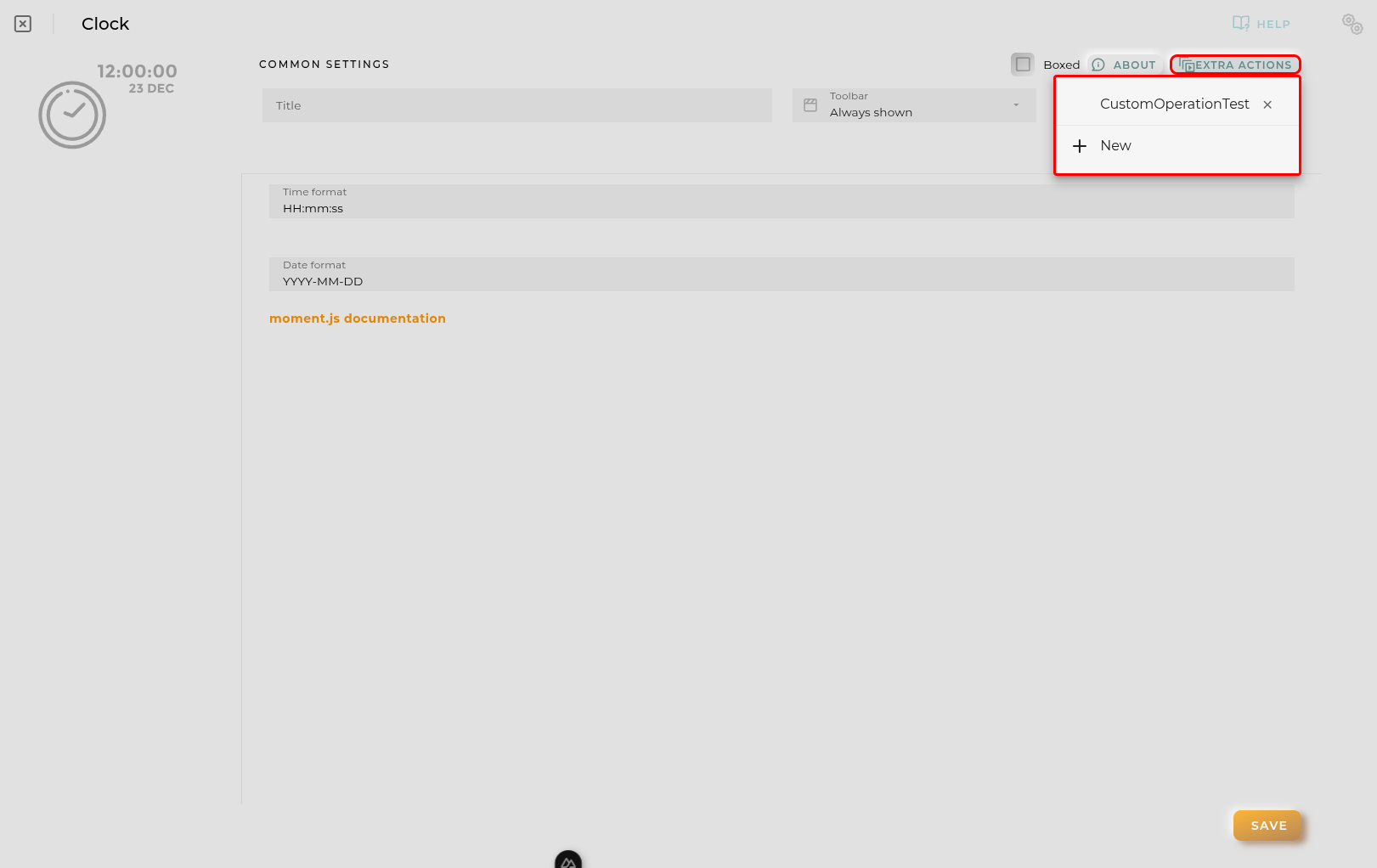
- Extra actions: allows user to add new specific actions to the widget with your own code.
You can add a new one by pressing the New button.
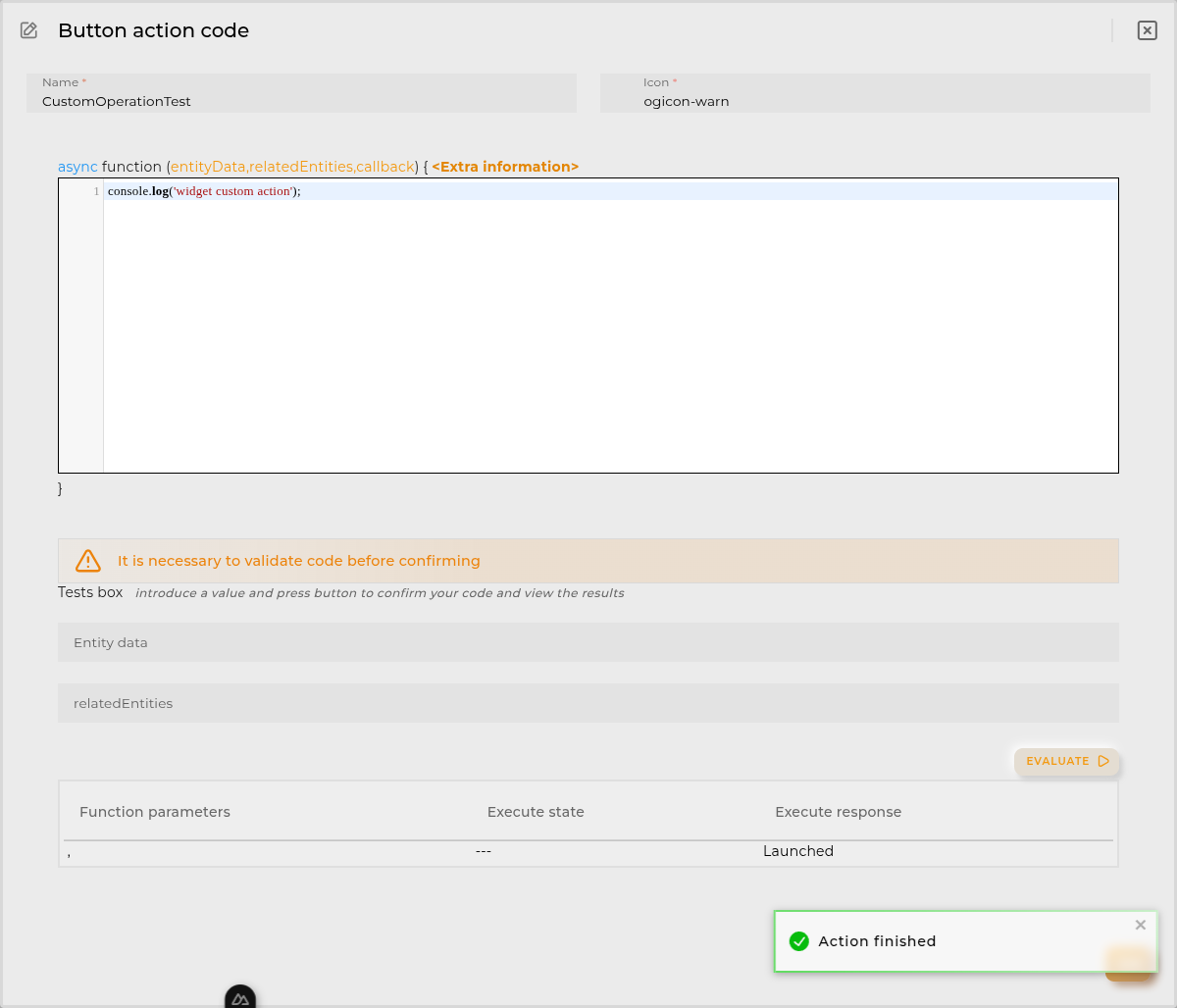
Once you added a custom action it can be modified later by pressing the name in the list.
In order to remove the custom action click the delete icon button on the right.
In extra actions you can write your own code were you can open other dashboards, entities dashboards or execute wizards.
You can find all available functions and methods in Extra parameters
- Pagination type allows you to specify the kind of pagination you want. There may be no pagination, pagination handled by the table component (local), or server-side pagination.
If server-side pagination is chosen, the script will receive parameters like the number of elements and the page, allowing the user to decide.
- Page elements specifies the number of elements to show per page.
- Allow data grouping enables the table to group items by elements in a column.
- Show widget filters instructs the widget to display its filters. These filters will be passed as an additional parameter to the data retrieval function.
- Compact the size of the table rows will make the table rows more compact to save vertical space.
- Expandable rows enables an information button for expanded data on each row. The code must fill this information, or an empty space will be displayed.

Column Configuration

The data that will be displayed in table. In order to finish the configuration for this you must add one column at least and select a primary key. For every column you can define the next data:
- Name to show in headers
- JSON field is the field to read in data returned by the function. Primary key use that field
- Sortable permits sorting for this column
- Groupable allow group by this field in table
- Filterable allow filter by this field in table
- Data type of the filter (only when filterable)
- Divisor draws a separator between this column and the next
- Show entity actions enables context menu for the column allowing to perform some actions depending of the item value.
Columns supports drag&drop in order to determine the position in the table.
Code Tab
This is where you input the necessary code to retrieve the data to be displayed.

Depending on the options selected in the general tab, the parameters received by the function will be displayed.
The function must always return an array of JSON objects compatible with the specified configuration for the component to be able to render them.
Each time the code is updated, it must be evaluated where a preview of the result can be seen. Finally you MUST return an array with a json that matches the columns configuration.

Function
Depending of the configuration receives the following parameters:
- entityData contains the data of the opened entity NOTE: only available when the user opens an entity dashboard template
Example:
{
  "provision.administration.identifier": {
    "_value": {
      "_current": {
        "value": "device_1"
      }
    }
  },
  "provision.administration.organization": {
    "_value": {
      "_current": {
        "value": "organization_name"
      }
    }
  },
  "provision.administration.channel": {
    "_value": {
      "_current": {
        "value": "channel_name"
      }
    }
  },
  "provision.administration.serviceGroup": {
    "_value": {
      "_current": {
        "value": "service_group_name"
      }
    }
  }
}- relatedEntities contains an array of entities related to the entity selected. NOTE: only available when the user opens an entity dashboard template
Example:
[{
  "provision.administration.identifier": {
    "_value": {
      "_current": {
        "value": "related_1"
      }
    }
  },
  "provision.administration.organization": {
    "_value": {
      "_current": {
        "value": "organization_name"
      }
    }
  },
  "provision.administration.channel": {
    "_value": {
      "_current": {
        "value": "channel_name"
      }
    }
  },
  "provision.administration.serviceGroup": {
    "_value": {
      "_current": {
        "value": "service_group_name"
      }
    }
  }
}]- timeserieData contains info about the timeserie opened by the user
- config timeserie configuration
- data timeserie row selected
NOTE: only available when the user opens an entity dashboard template from timeserie table widget
An example:
{
  "config": {
    "identifier": "69281dc43545e97df66c42a1",
    "name": "Battery charge history",
    "timeBucket": 3600,
    "bucketColumn": "bucketEnd",
    "bucketInitColumn": "bucketInit",
    "identifierColumn": "EntityID",
    "retention": 2592000,
    "origin": "2025-11-26T23:00:00Z",
    "context": [
      {
        "path": "provision.device.administrativeState",
        "name": "Administrative state",
        "sort": "true",
        "filter": "YES",
        "type": "string"
      }
    ],
    "columns": [
      {
        "path": "device.powersupply.battery.charge._current.value",
        "name": "Powersupply battery charge Current Value",
        "filter": "NO",
        "type": "number",
        "sort": false,
        "aggregationFunction": "FIRST"
      }
    ]
  },
  "data": {
    "bucketEnd": "2025-12-11T13:00:00+01:00",
    "bucketInit": "2025-12-11T12:00:00+01:00",
    "EntityID": "entity_1",
    "Powersupply battery charge Current Value": 34
  }
}- alarmData contains the data of the alarm opened in template
{
  "identifier": "270dd9f9-1396-4660-bb5f-8d8b471e1dcd",
  "name": "activityForbidden",
  "rule": "activityForbidden",
  "description": "Activity detected for an entity with administrative state disabled",
  "severity": "INFORMATIVE",
  "priority": "LOW",
  "organization": "organization_name",
  "channel": "default_channel",
  "entityIdentifier": "A_WORKER_1",
  "subEntityIdentifier": "A_WORKER_1",
  "resourceType": "ENTITY_ASSET",
  "status": "CLOSED",
  "openingDate": "2019-06-27T08:57:36+02:00",
  "closureDate": "2019-06-27T08:57:51+02:00"
}- filters introduced by the user. These filters are:
- generic widget generic filter
- period widget date period filter
- column json object with each column filter
- sort an array containing every sorted column with its direction sorted by user preferences
An example:
{
    "filters": {
        "generic": "filter introduced by the user",
        "period": {"from":"2023-03-27T10:59:27+02:00","to":null},
        "column": {
            [column value field]: {
                operator: "eq",
                value: "filter introduced by the user in colum"
            },
            [column value field]: {
                operator: "gt",
                value: "filter introduced by the user in colum"
            }
        },
        "sort": [
            {
                column: "column value field",
                direction: "asc" or "desc"
            },
            {
                column: "column value field",
                direction: "asc" or "desc"
            }
        ]
    }
}-
pageElements and page that determines the current page to display. Only enabled when server pagination enabled in table parameters. Disabling server pagination quits this parameters and function must be evaluated again.
-
callback function used to send table data only when the api/http petitions are promised
callback(data);or
callback([{
  "field1": "value1",
  "field2": "value2"
}]);
Available utils
$api -> use it to create http petitions to OpenGate Api Rest doc
$user -> Logged user
Example:
{
    "email": "email@amplia.es",
    "workgroup": "workgroup",
    "domain": "domain",
    "profile": "profile",
    "countryCode": "ES",
    "langCode": "en",
    "timezone": "Europe/Madrid"
}
$moment -> use it to format date doc
console -> display messages in navigator console
Promise -> allows easy execution of multiple promises
http -> javascript encapsulation of useFetch (Nuxt 4) library doc
openDashboard -> (workspaceId, dashboardId, newPage) -> Opens the selected dashboard in selected workspace
openEntityDashboard -> (entityIdentifier[, organization[user if empty], resourceType[’entity.device’ if empty] , newPage]) -> Opens the entity’s temporary dashboard
Data format
Returned data must have one of the following formats (per item):
- simple json data
{
    "jsonfield": "value to display. It can be HTML."
}- ‘complex’ json data
{
    "jsonfield": {
        "value": "value to display. It can be HTML",
        "_style": "cell custom style",
        "_chart": "displays an echarts chart. Overrides others in this item",
        "_extension": "jsonfield like (value, _style, _chart)  plus _table. Only enabled when expandable rows enabled"
    }
}
NOTE _extension field can combine _chart and _table elements in the same item
-
Element _chart Must have an echarts config json.
-
Element _table Displays a table inside the column and overrides others in this item.
{
    columns: ['each', 'item', 'is', 'a', 'column],
    data: [
        ['data 1', 'in', 'columns', 'order', { jsonfield (without _extension is supported) }],
        ['data 2', 'in', 'columns', 'order', { jsonfield (without _extension is supported) }]
    ]

}
Examples
- Custom Table Example
- External API (USGS Earthquakes)
- Filtered Entity Retrieval
- Server Pagination Example (Reqres)
- Battery Level Pie Chart

