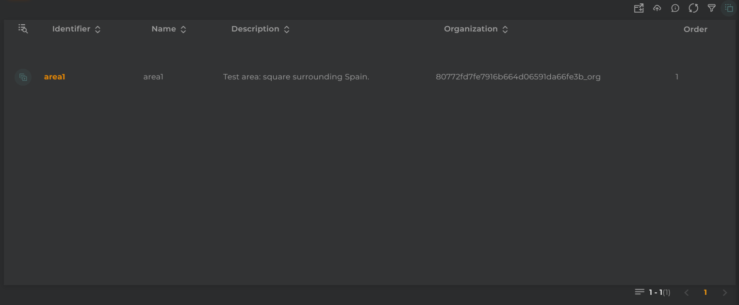
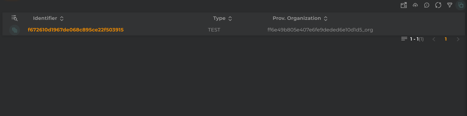
The website features listings, widgets that will display information in a table format.
Columns to display and the format of the data can be configured. One can filter by content, dates, and perform various actions such as executing operations on the displayed entities.
The listing of areas allows you to view/manage the areas within the organization.
How it works
Below are the actions that can be performed both within the widget and on the displayed data.
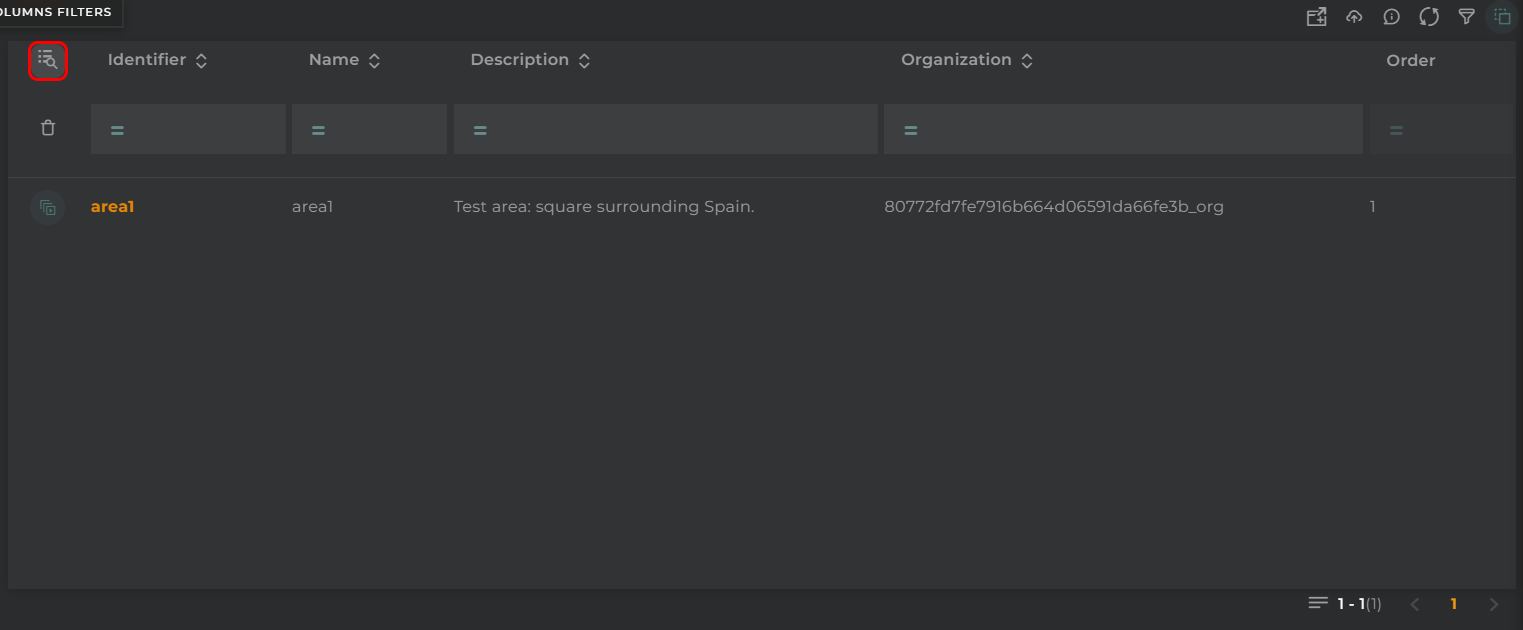
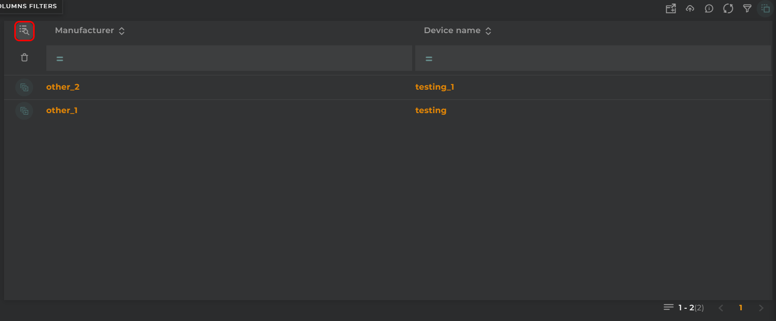
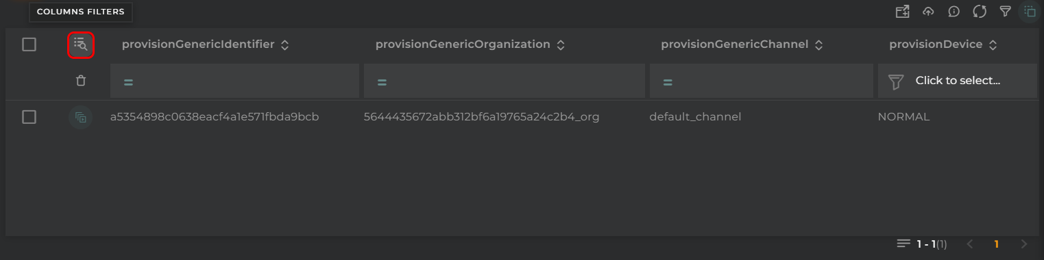
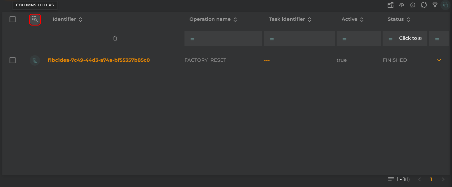
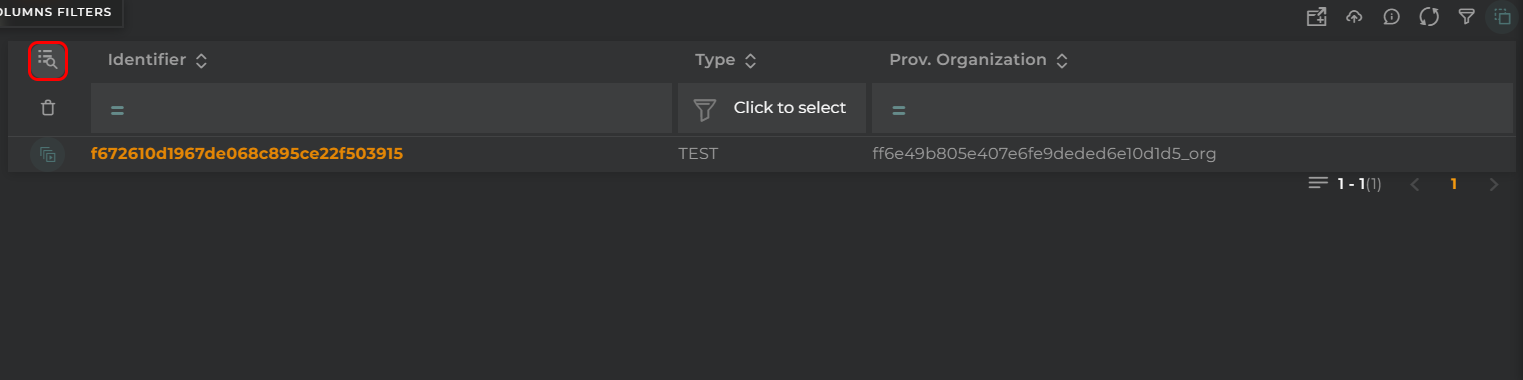
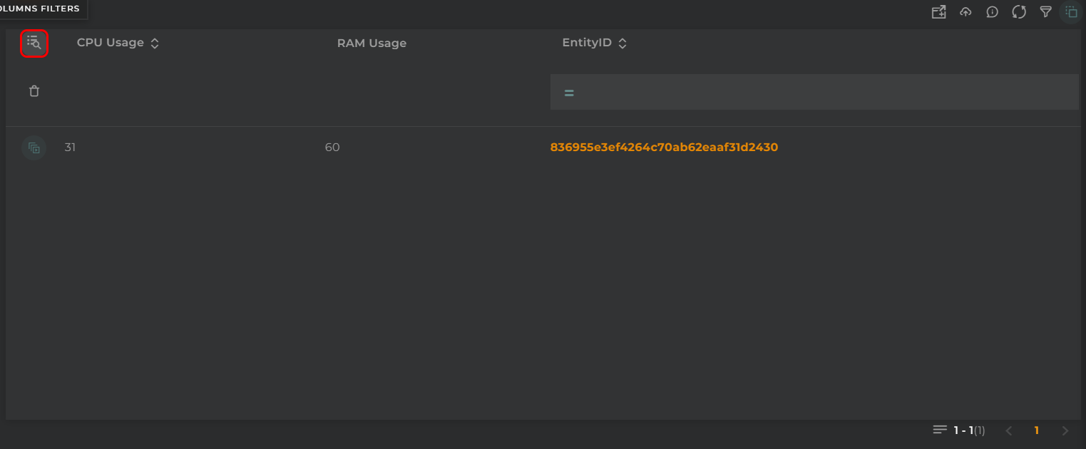
Filter by Columns
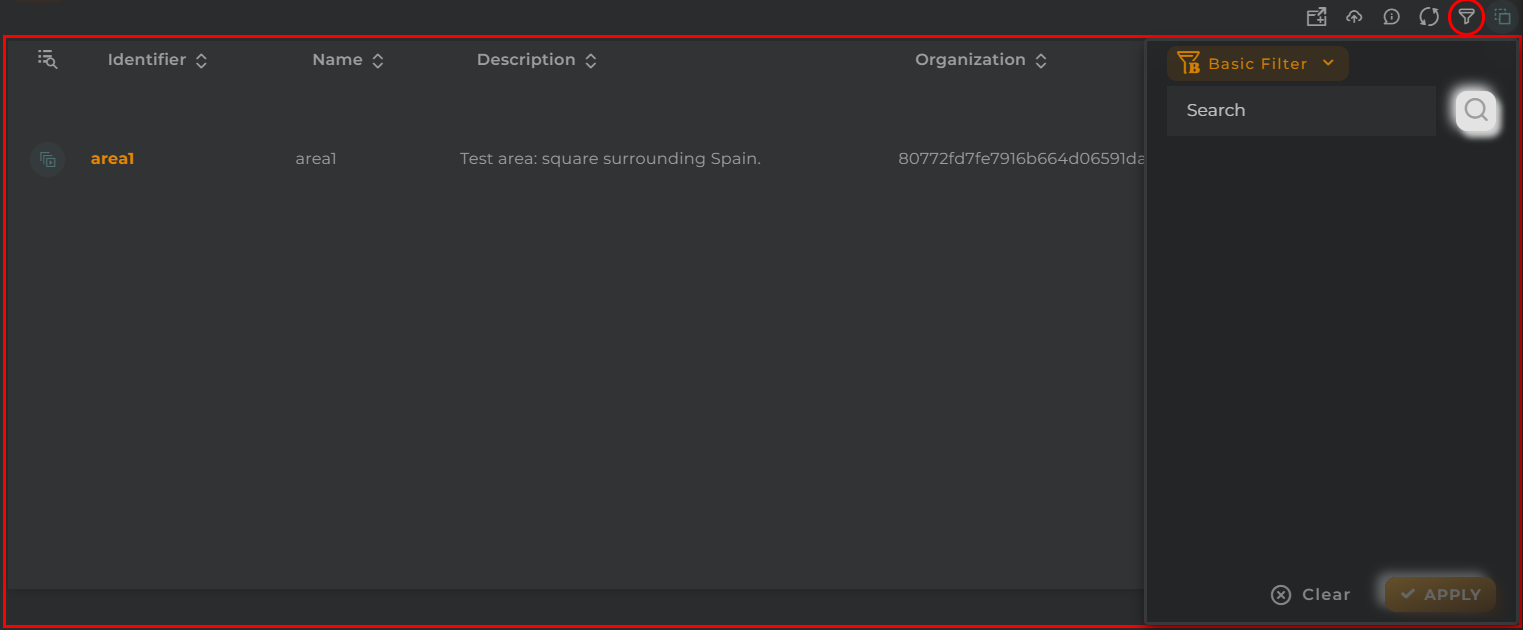
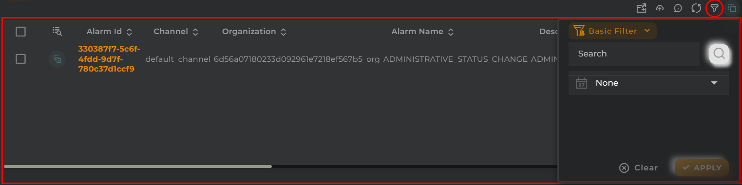
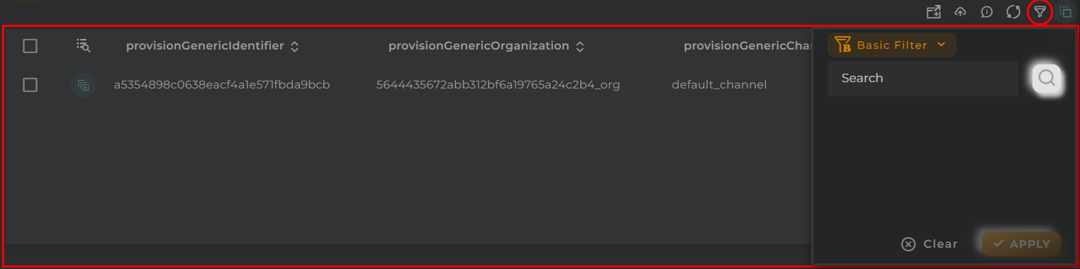
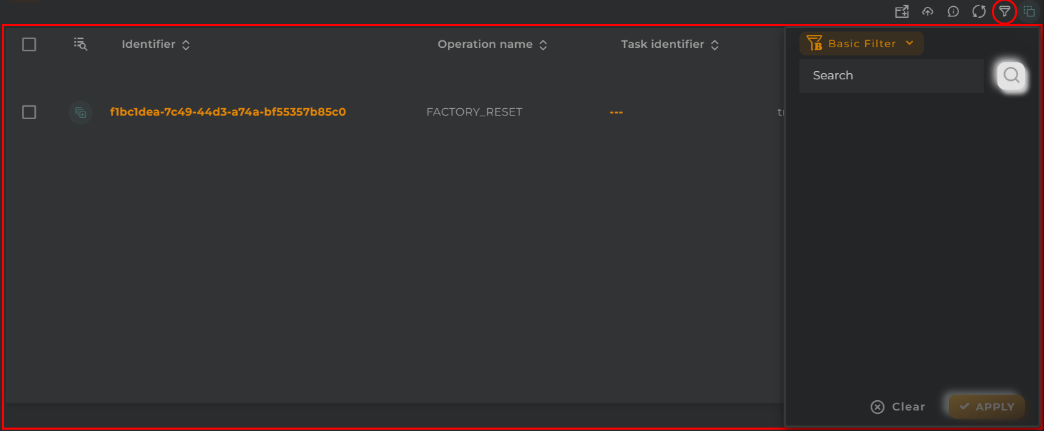
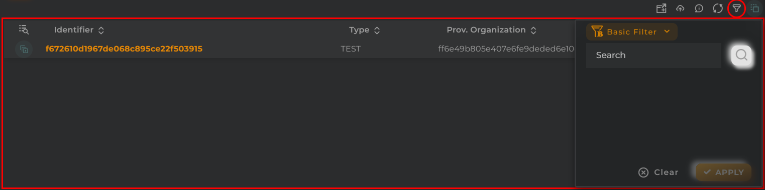
Basic Filter
Perform a basic search by entering text that will filter by predefined fields.
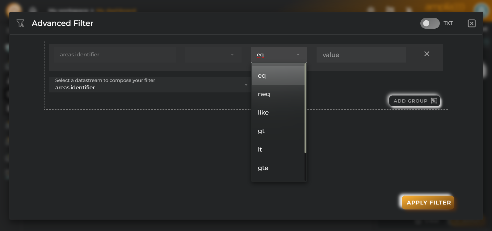
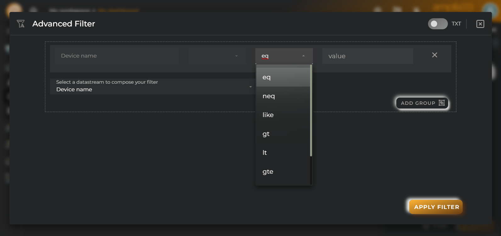
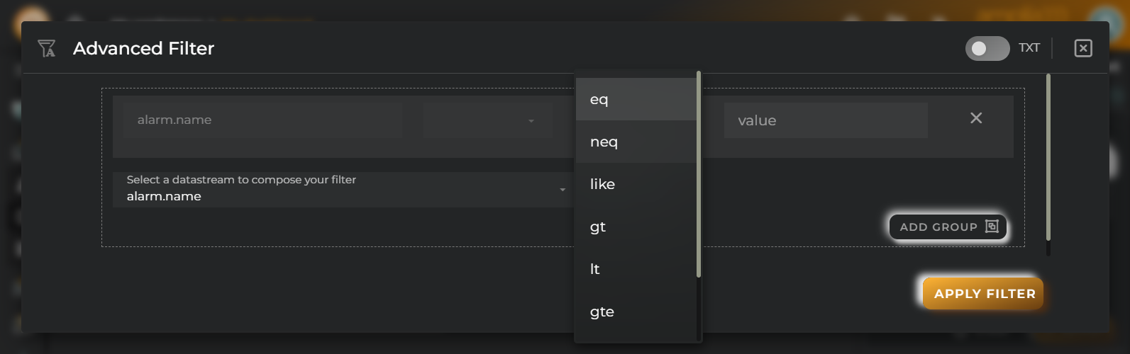
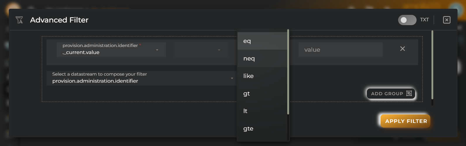
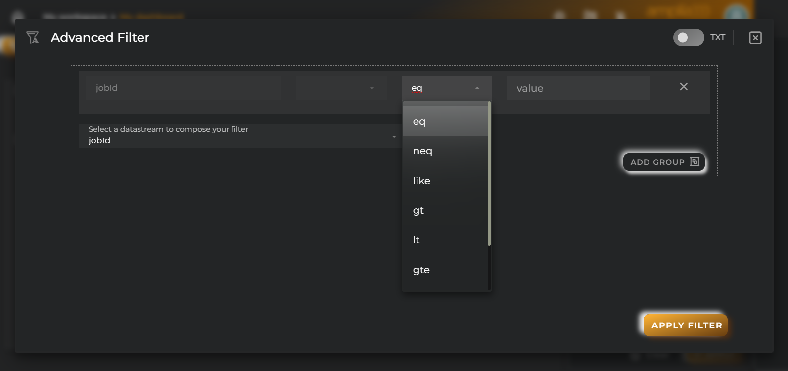
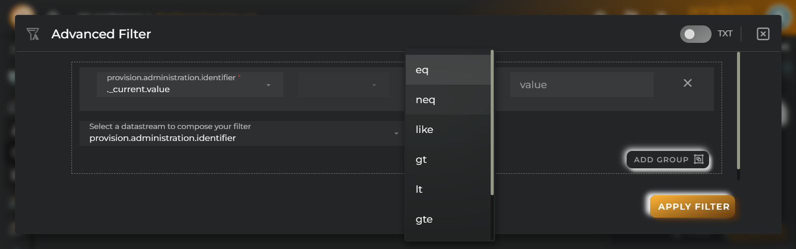
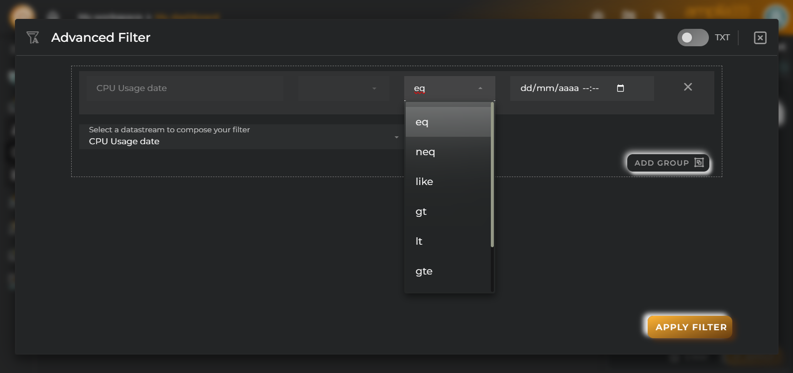
Advanced Filter
Perform a search by selecting the fields to filter by and how to filter by them.
Save and Restore Filters
Basic and Advanced filters can be saved in order to preconfigure a list of filters and restore them at any time. This feature is only available in own dashboards but can be shared with other users.
You can save a filter by fullfilling the filter name in the field at the bottom of the filter panel and clicking on the save button. When a filter is saved, it is stored in the widget’s filter list and can be restored at any time by selecting it from the saved filters list located at the top of the filter panel.
Filters can be saved only when a new filter is created.
This can be useful when you want to save a list of filters that you use frequently and restore them at any time.
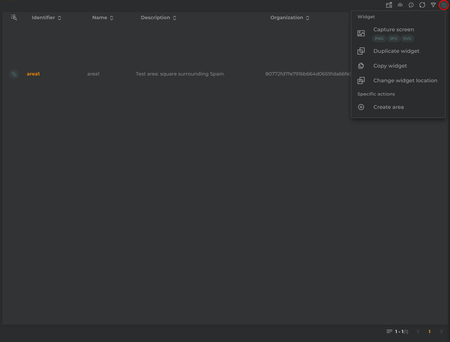
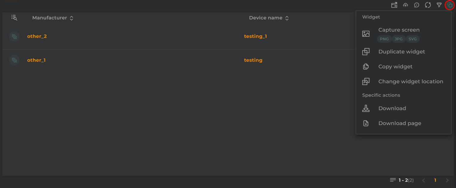
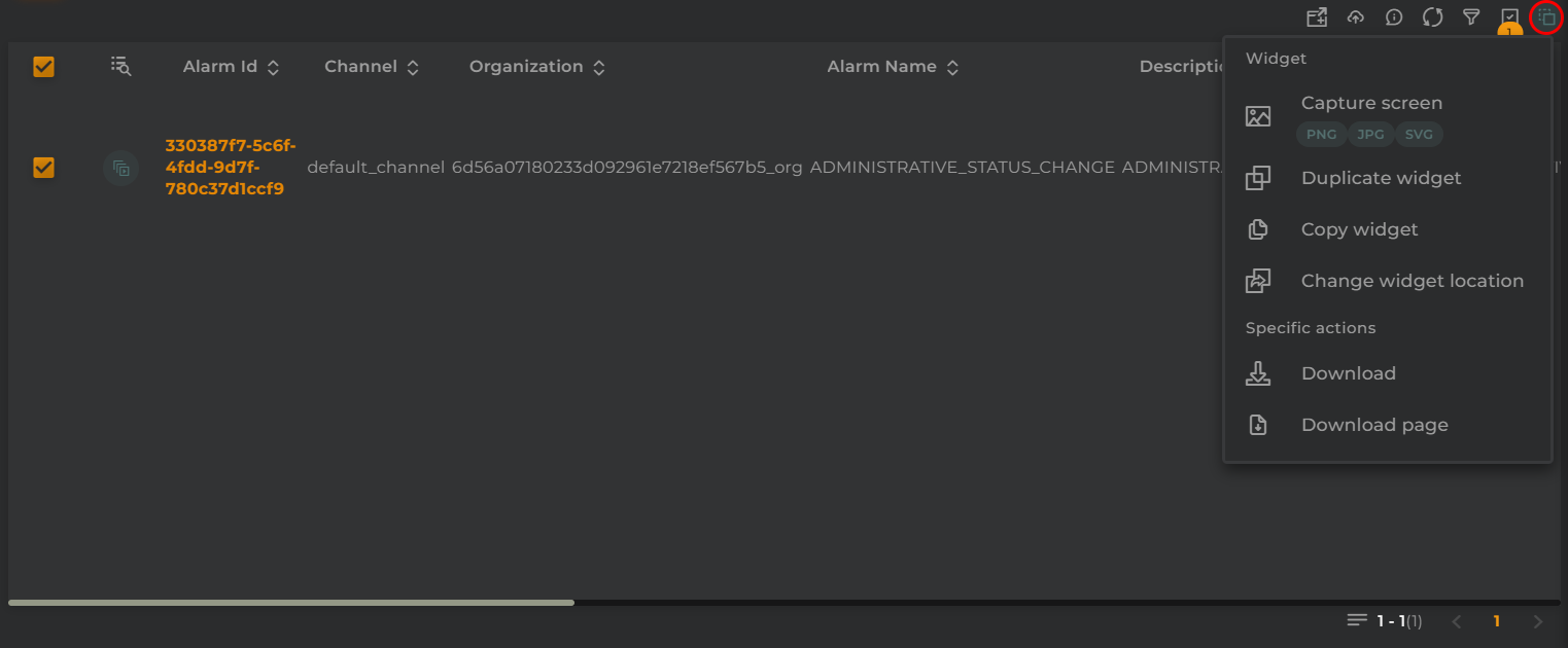
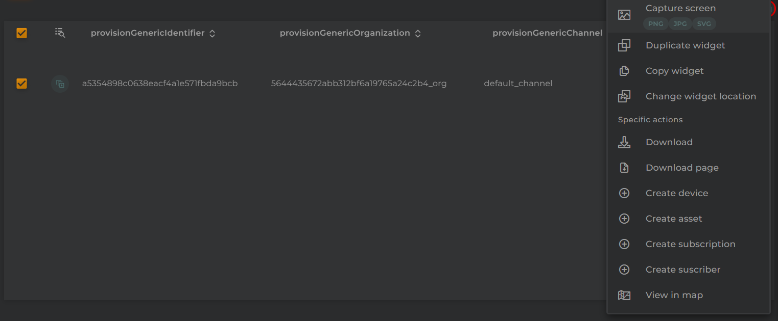
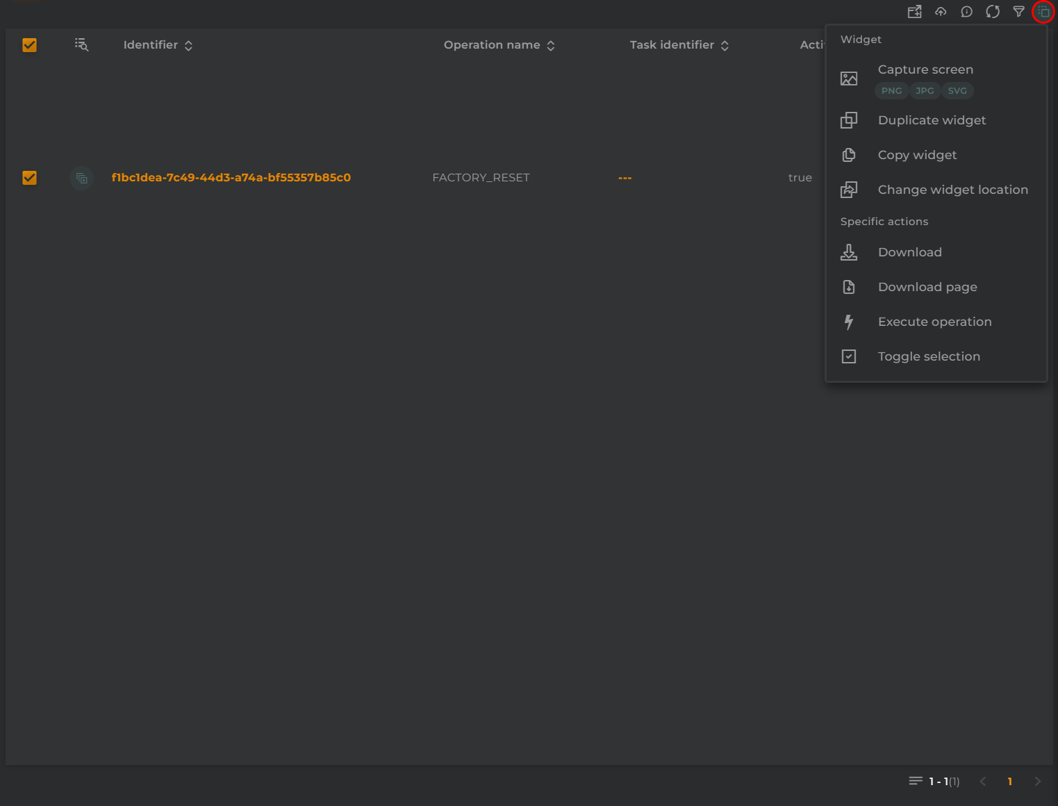
Widget Menu
The following actions can be performed:
New area: Opens the area creation wizard
Capture screen: Takes a screenshot of the widget.
Duplicate widget: Creates a duplicate of the widget on the dashboard.
Copy widget: Copies the widget to another dashboard.
Change widget location: Moves the widget to another dashboard.
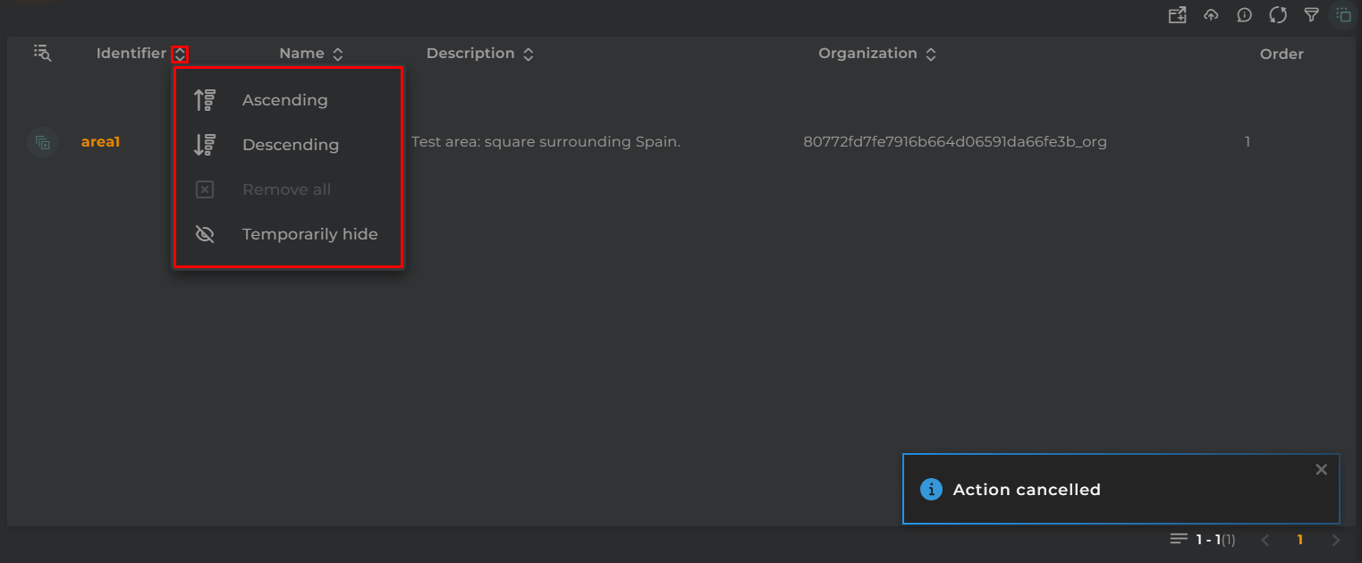
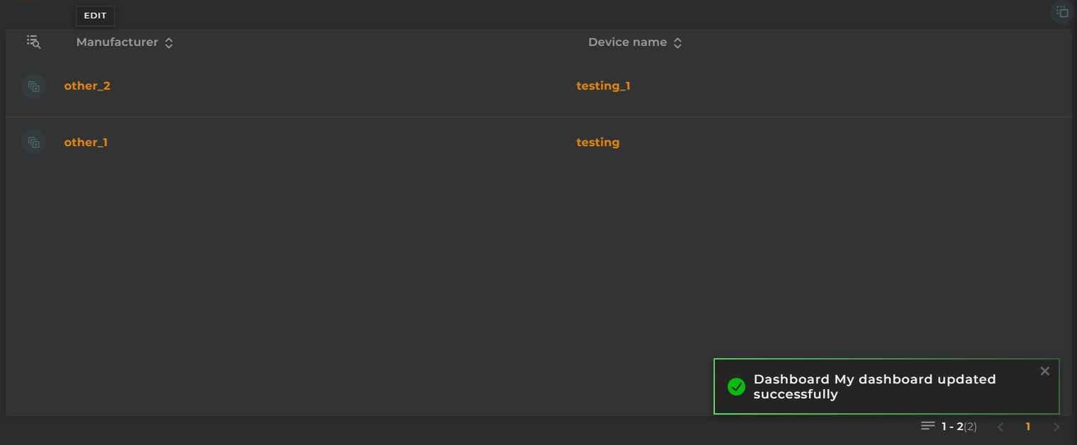
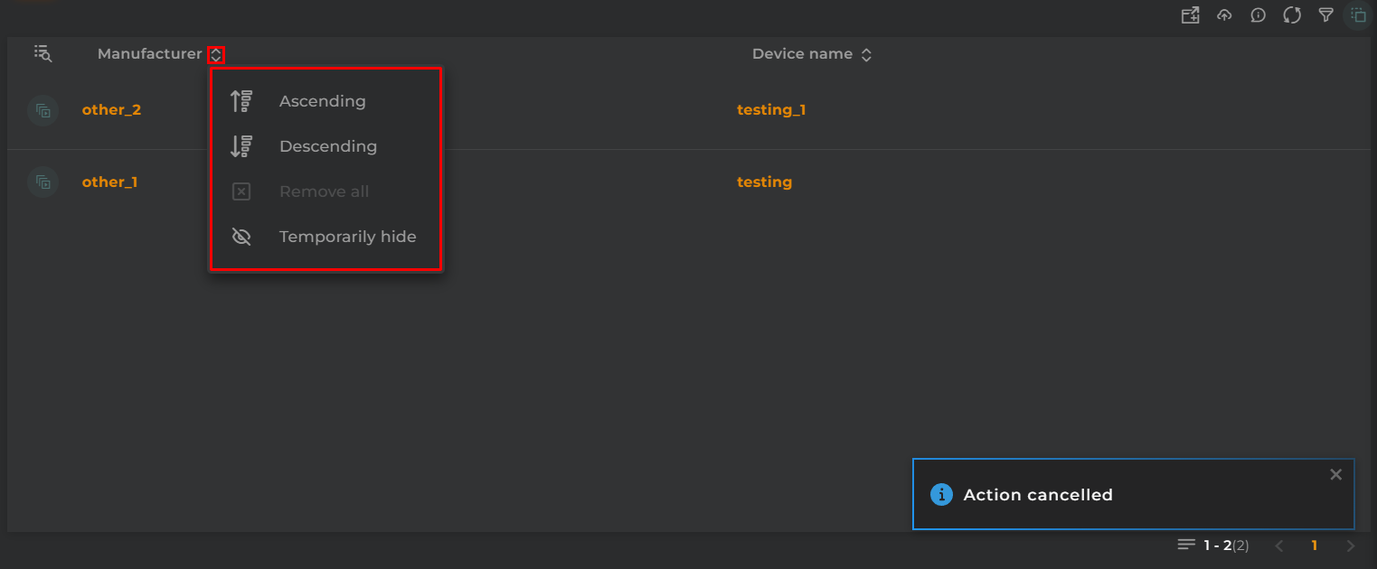
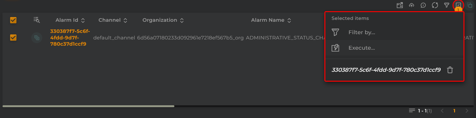
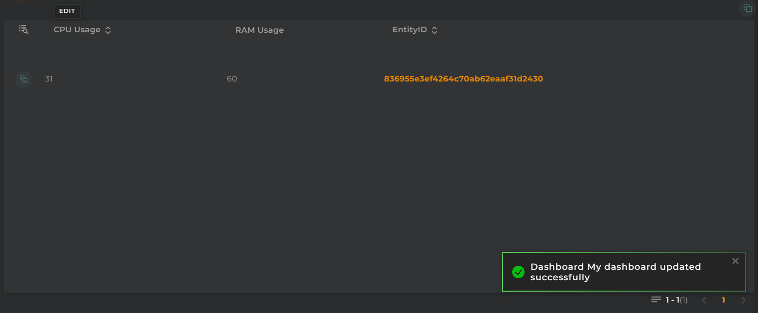
Temporarily Sort and Hide Column
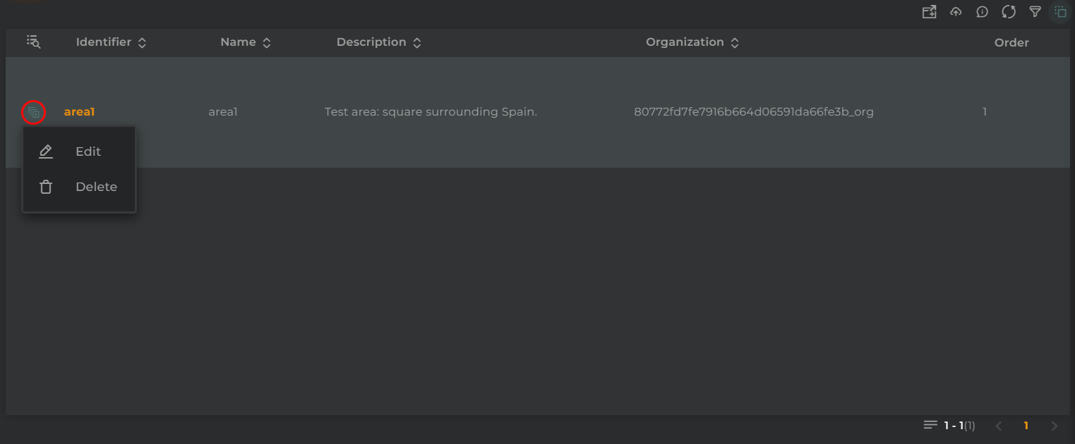
Actions Per Entity
The following actions can be performed:
Edit: Opens the area editing wizard
Delete: Deletes the user
Configuration
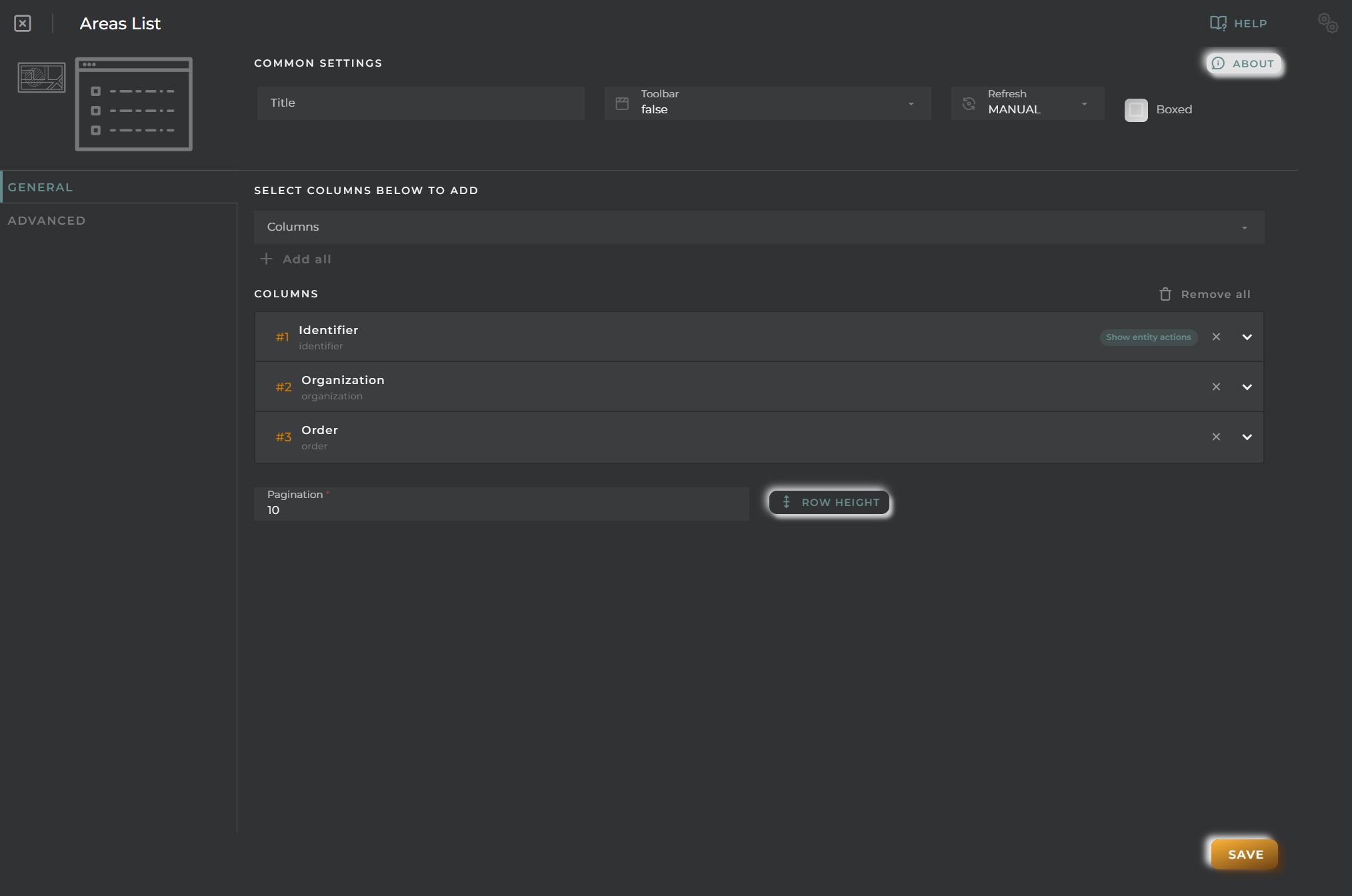
General
Boxed: widget will be displayed with background in dahsboard.
About: widget description in Markdown format.
Title: widget title. It can be configured to remain fixed in the widget or only be displayed when it receives focus.
Toolbar: configures the behavior of the widget bar on the dashboard, allowing you to hide it, hide it when not in use, or leave it always visible.
Refresh Frequency: allows configuring the data refresh frequency displayed in the list.
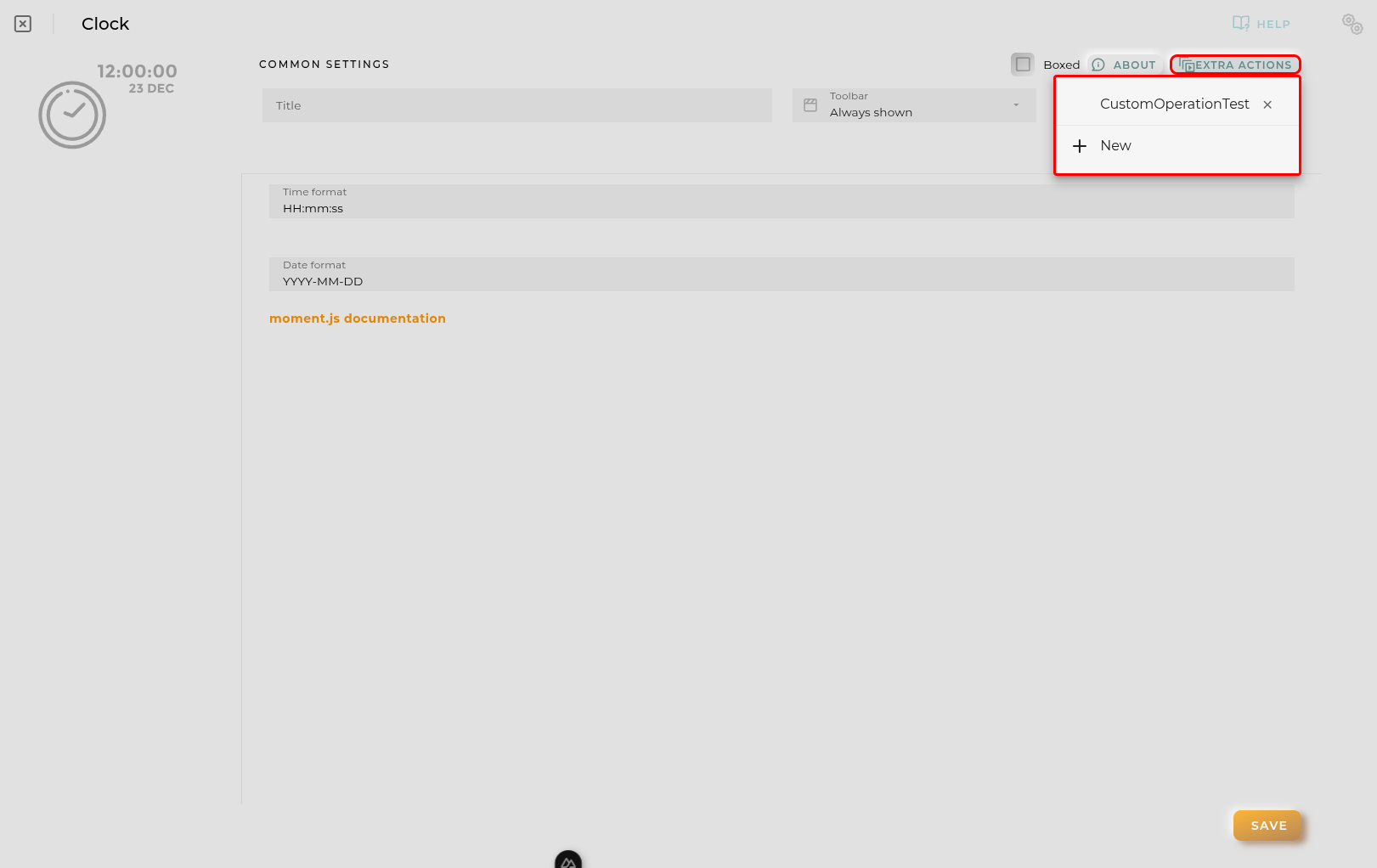
Extra actions: allows user to add new specific actions to the widget with your own code.
You can add a new one by pressing the New button.
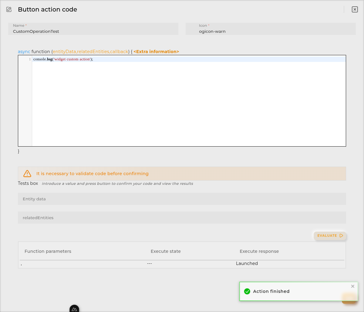
Once you added a custom action it can be modified later by pressing the name in the list.
In order to remove the custom action click the delete icon button on the right.
In extra actions you can write your own code were you can open other dashboards, entities dashboards or execute wizards.
You can find all available functions and methods in Extra Information
Cell Configuration
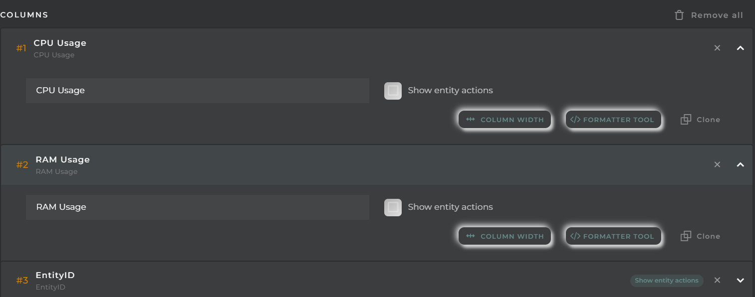
Alias: Modify the column name. If nothing is added, it will use the default configured name.
Show entity actions: Allow displaying the actions menu when selecting its value in the cell. If the column is an identifier, this field will be enabled.
Hidden column: Enabling this option will hide the column from the user. This is useful when you need the data for formatting purposes, as only the data required in the list will be available.
Options:
Modify the cell’s width and horizontal alignment of its content.
Format the cell’s value.
Pagination: Configure the number of rows to display per page.
Virtual columns
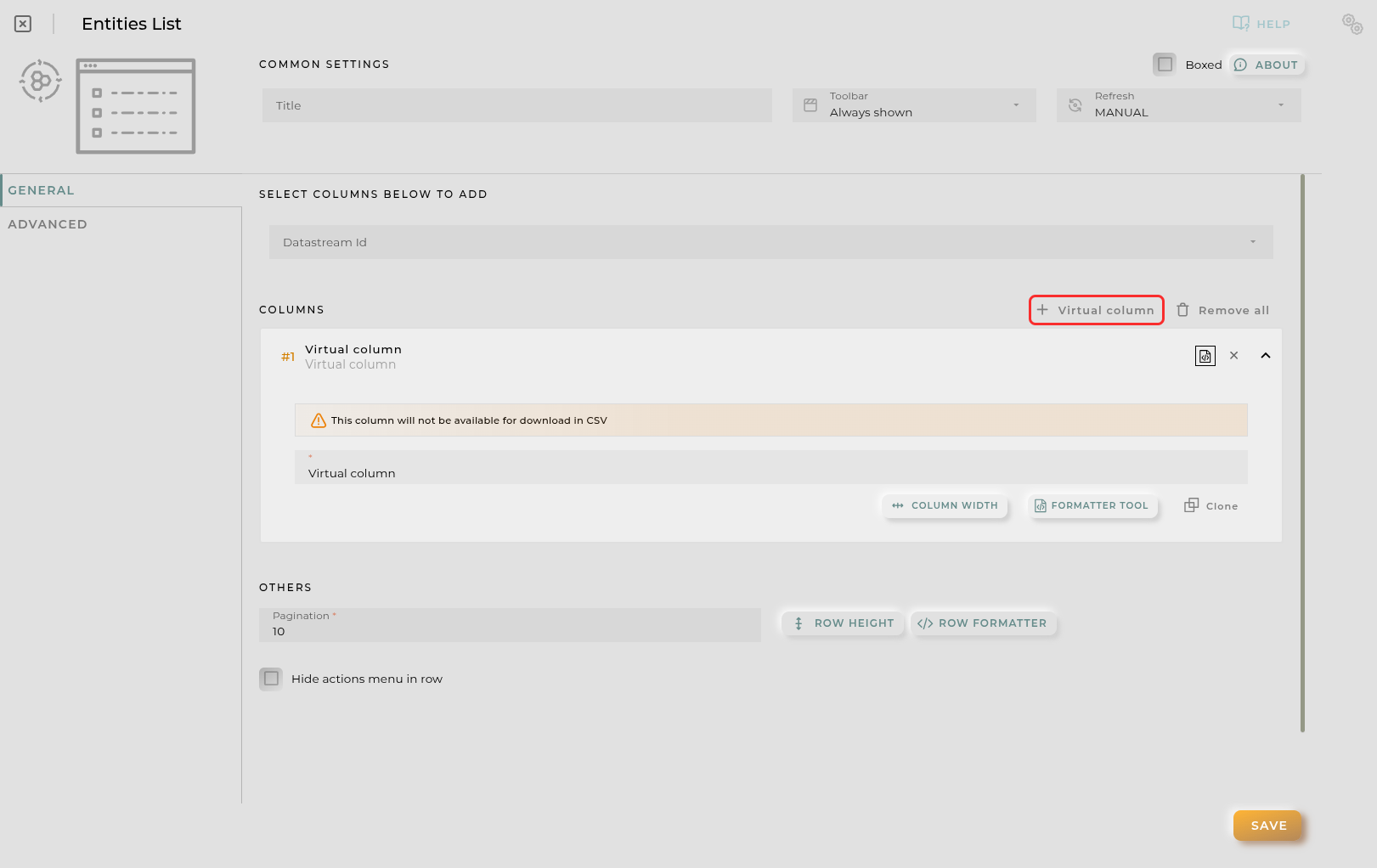
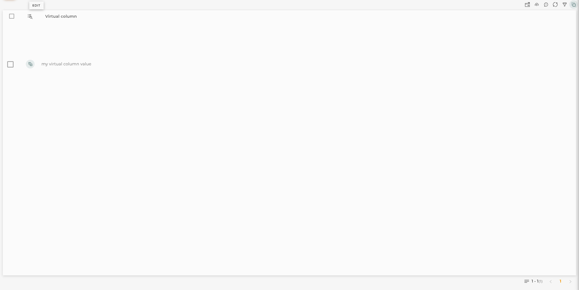
Also you can add virtual columns to lists.
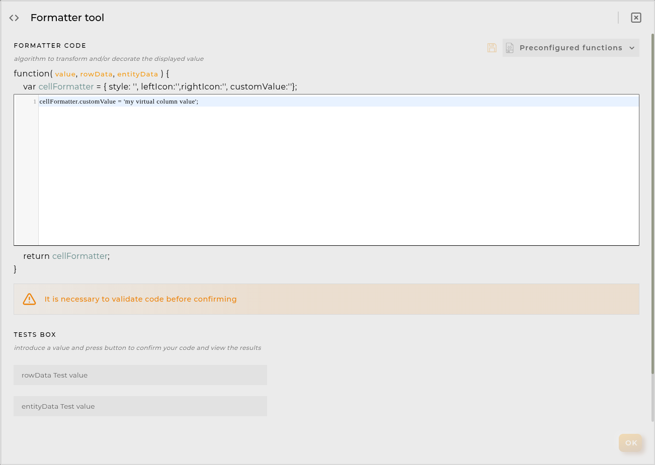
These columns do not have their own values and must be configured in the column formatter once added.
Please note that the contents of this column will never be output to CSV, as it is calculated on the fly and does not rely on any native platform resources.
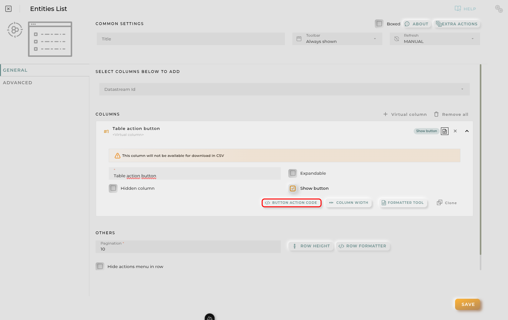
Button columns
Also you can add button columns to lists in order to execute some custom action related with the row data.
Button label can be setted in normal or virtual columns. Label will be the value.
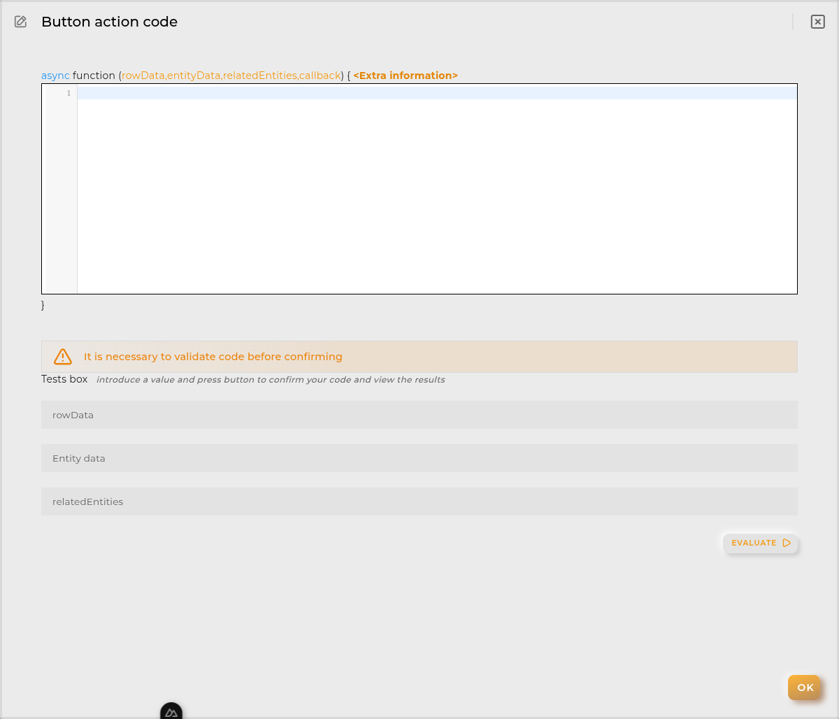
Button action code receives the complete rowData and you can open other dashboards, entities dashboards or execute wizards.
You can find all available functions and methods in Extra Information
Advanced
In this section, you will configure various filters that will be applied to queries regardless of the user’s specific filtering preferences.
Widget Filters Configuration
Here you can define how widget filters should behave when sharing the dashboard with other users/organizations. This means that when sharing, a user opens these dashboards and won’t see the filters applied to the original dashboard in the specified widgets, preventing the information displayed from changing after a dashboard refresh.
The three possible options are:
Don’t share the widget’s general filter
Don’t share header filters in lists
Don’t share sorting in lists
Bulk List
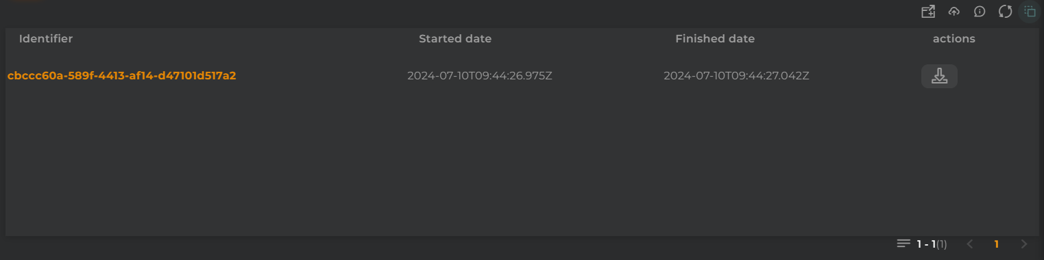
The listing of bulks allows you to view the executed bulks within the organization and their outcomes.
How it works
Below are the actions that can be performed both within the widget and on the displayed data.
Widget Menu
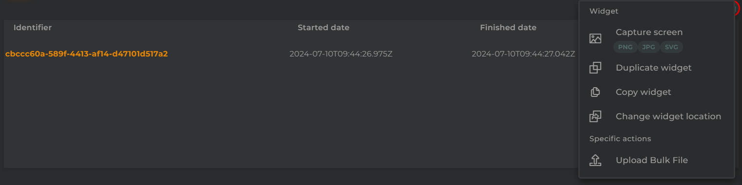
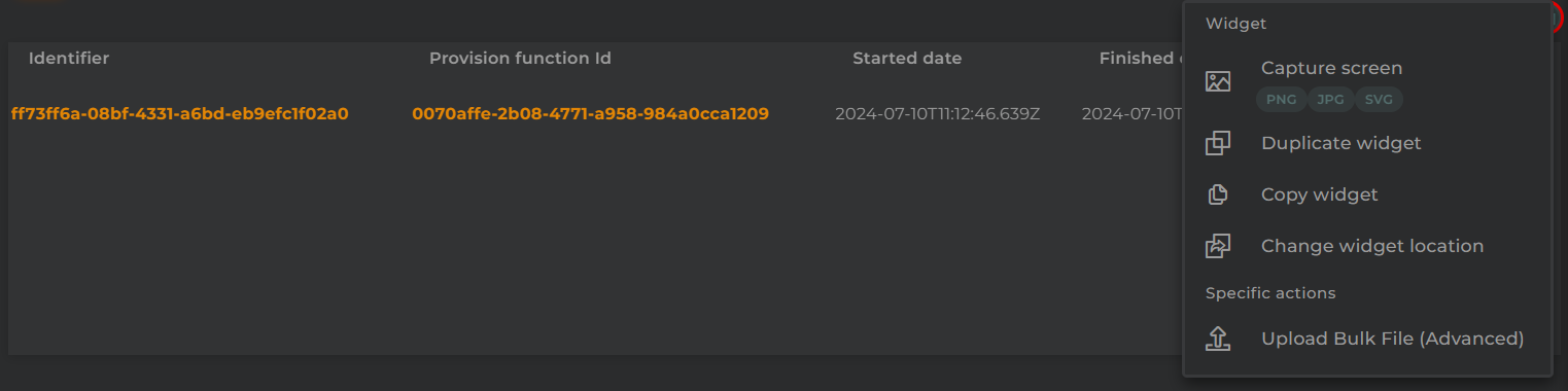
The following actions can be undertaken:
Upload Bulk File: Opens the bulk upload wizard
Capture screen: Takes a screenshot of the widget.
Duplicate widget: Creates a duplicate of the widget on the dashboard.
Copy widget: Copies the widget to another dashboard.
Change widget location: Moves the widget to another dashboard.
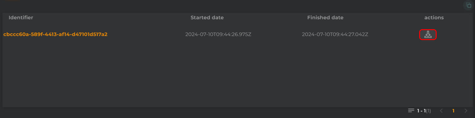
Download Result
From here, you can download the result of the bulk operation.
Configuration
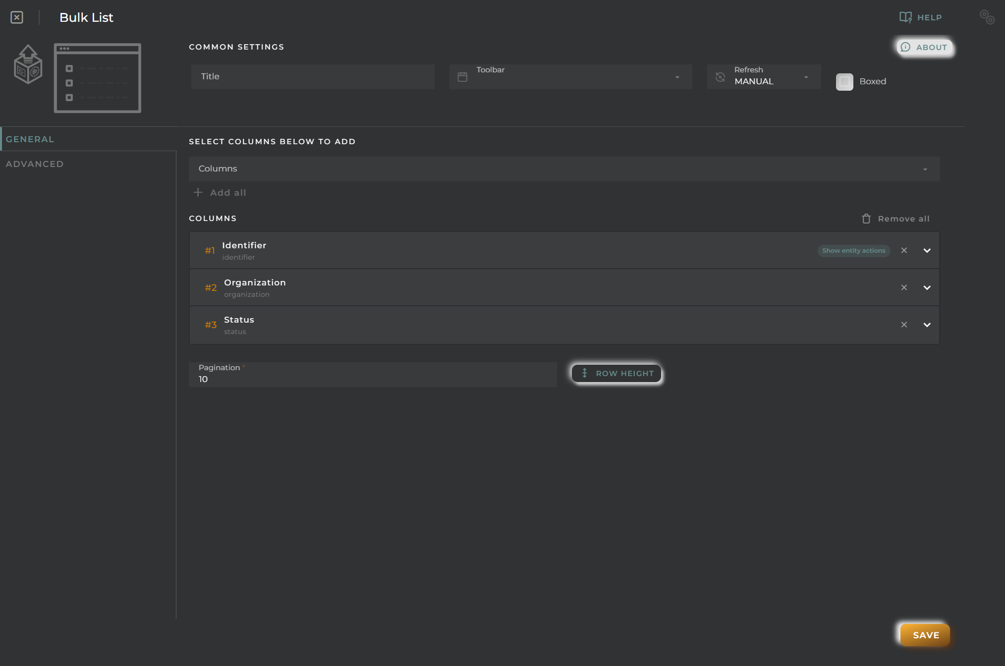
General
Boxed: widget will be displayed with background in dahsboard.
About: widget description in Markdown format.
Title: widget title. It can be configured to remain fixed in the widget or only be displayed when it receives focus.
Toolbar: configures the behavior of the widget bar on the dashboard, allowing you to hide it, hide it when not in use, or leave it always visible.
Refresh Frequency: allows configuring the data refresh frequency displayed in the list.
Extra actions: allows user to add new specific actions to the widget with your own code.
You can add a new one by pressing the New button.
Once you added a custom action it can be modified later by pressing the name in the list.
In order to remove the custom action click the delete icon button on the right.
In extra actions you can write your own code were you can open other dashboards, entities dashboards or execute wizards.
You can find all available functions and methods in Extra Information
Cell Configuration
Alias: Modify the column name. If nothing is added, it will use the default configured name.
Show entity actions: Allow displaying the actions menu when selecting its value in the cell. If the column is an identifier, this field will be enabled.
Hidden column: Enabling this option will hide the column from the user. This is useful when you need the data for formatting purposes, as only the data required in the list will be available.
Options:
Modify the cell’s width and horizontal alignment of its content.
Format the cell’s value.
Pagination: Configure the number of rows to display per page.
Virtual columns
Also you can add virtual columns to lists.
These columns do not have their own values and must be configured in the column formatter once added.
Please note that the contents of this column will never be output to CSV, as it is calculated on the fly and does not rely on any native platform resources.
Button columns
Also you can add button columns to lists in order to execute some custom action related with the row data.
Button label can be setted in normal or virtual columns. Label will be the value.
Button action code receives the complete rowData and you can open other dashboards, entities dashboards or execute wizards.
You can find all available functions and methods in Extra Information
Advanced
In this section, you will configure various filters that will be applied to queries regardless of the user’s specific filtering preferences.
Widget Filters Configuration
Here you can define how widget filters should behave when sharing the dashboard with other users/organizations. This means that when sharing, a user opens these dashboards and won’t see the filters applied to the original dashboard in the specified widgets, preventing the information displayed from changing after a dashboard refresh.
The three possible options are:
Don’t share the widget’s general filter
Don’t share header filters in lists
Don’t share sorting in lists
Bulk List (Advanced)
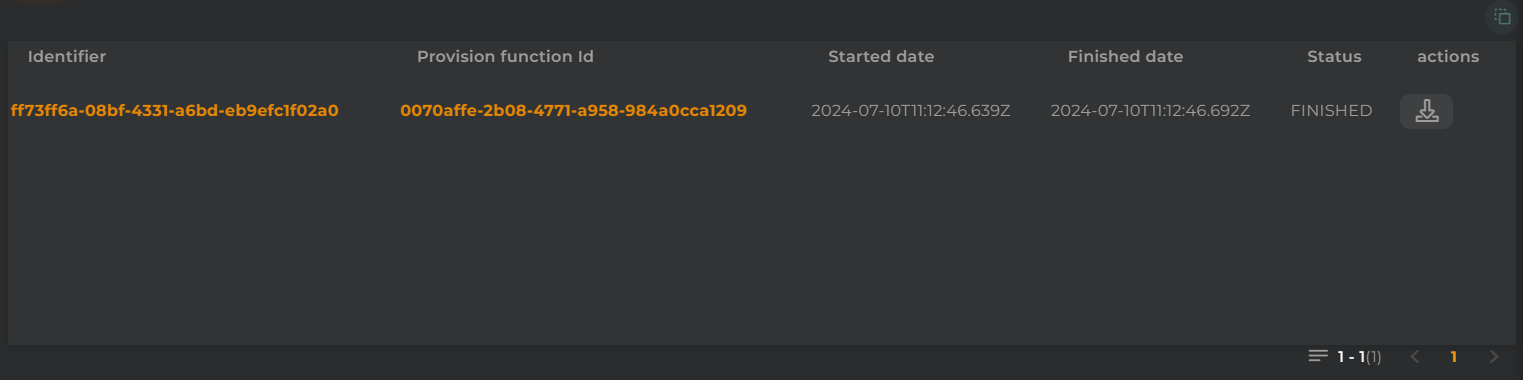
The listing of advanced bulks allows you to view executed bulks, using provisioning features, within the organization and their outcomes.
How it works
Below are the actions that can be performed both within the widget and on the displayed data.
Duplicate widget: Creates a duplicate of the widget on the dashboard.
Copy widget: Copies the widget to another dashboard.
Change widget location: Moves the widget to another dashboard.
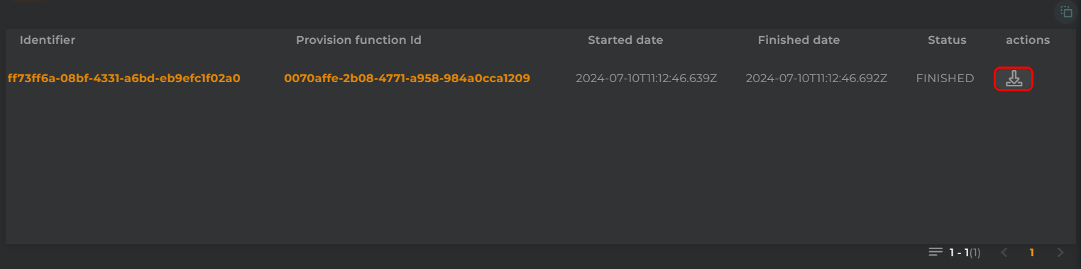
Download Result
From here, you can download the result of the bulk operation.
Configuration
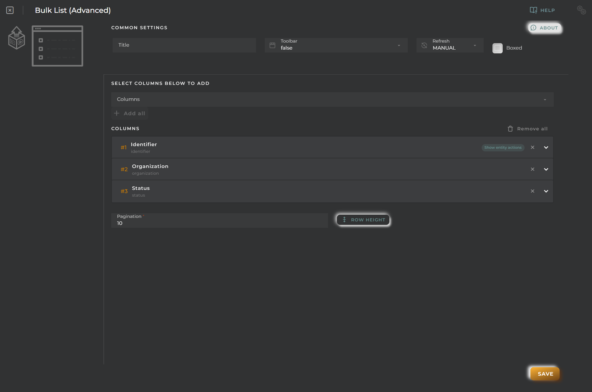
General
Boxed: widget will be displayed with background in dahsboard.
About: widget description in Markdown format.
Title: widget title. It can be configured to remain fixed in the widget or only be displayed when it receives focus.
Toolbar: configures the behavior of the widget bar on the dashboard, allowing you to hide it, hide it when not in use, or leave it always visible.
Refresh Frequency: allows configuring the data refresh frequency displayed in the list.
Extra actions: allows user to add new specific actions to the widget with your own code.
You can add a new one by pressing the New button.
Once you added a custom action it can be modified later by pressing the name in the list.
In order to remove the custom action click the delete icon button on the right.
In extra actions you can write your own code were you can open other dashboards, entities dashboards or execute wizards.
You can find all available functions and methods in Extra Information
Cell Configuration
Alias: Modify the column name. If nothing is added, it will use the default configured name.
Show entity actions: Allow displaying the actions menu when selecting its value in the cell. If the column is an identifier, this field will be enabled.
Hidden column: Enabling this option will hide the column from the user. This is useful when you need the data for formatting purposes, as only the data required in the list will be available.
Options:
Modify the cell’s width and horizontal alignment of its content.
Format the cell’s value.
Pagination: Configure the number of rows to display per page.
Virtual columns
Also you can add virtual columns to lists.
These columns do not have their own values and must be configured in the column formatter once added.
Please note that the contents of this column will never be output to CSV, as it is calculated on the fly and does not rely on any native platform resources.
Button columns
Also you can add button columns to lists in order to execute some custom action related with the row data.
Button label can be setted in normal or virtual columns. Label will be the value.
Button action code receives the complete rowData and you can open other dashboards, entities dashboards or execute wizards.
You can find all available functions and methods in Extra Information
Advanced
In this section, you will configure various filters that will be applied to queries regardless of the user’s specific filtering preferences.
Widget Filters Configuration
Here you can define how widget filters should behave when sharing the dashboard with other users/organizations. This means that when sharing, a user opens these dashboards and won’t see the filters applied to the original dashboard in the specified widgets, preventing the information displayed from changing after a dashboard refresh.
The three possible options are:
Don’t share the widget’s general filter
Don’t share header filters in lists
Don’t share sorting in lists
Bundles List
The listing of bundles allows you to view/manage the bundles within an organization.
How it works
Below are the actions that can be performed both within the widget and on the displayed data.
Filter by Columns
Basic Filter
Perform a basic search by entering text that will filter by predefined fields.
Advanced Filter
Perform a search by selecting the fields to filter by and how to filter by them.
Save and Restore Filters
Basic and Advanced filters can be saved in order to preconfigure a list of filters and restore them at any time. This feature is only available in own dashboards but can be shared with other users.
You can save a filter by fullfilling the filter name in the field at the bottom of the filter panel and clicking on the save button. When a filter is saved, it is stored in the widget’s filter list and can be restored at any time by selecting it from the saved filters list located at the top of the filter panel.
Filters can be saved only when a new filter is created.
This can be useful when you want to save a list of filters that you use frequently and restore them at any time.
Widget Menu
The following actions can be performed:
New bundle: Opens the bundle creation wizard.
Capture screen: Takes a screenshot of the widget.
Duplicate widget: Creates a duplicate of the widget on the dashboard.
Copy widget: Copies the widget to another dashboard.
Change widget location: Moves the widget to another dashboard.
Sort and Temporarily Hide Columns
Entity Actions
The following actions can be performed:
Edit: Opens the bundle editing wizard. Only if the bundle is deactivated.
Activate/Deactivate: Activates or deactivates the bundle.
Delete: Deletes the bundle.
Configuration
General
Boxed: widget will be displayed with background in dahsboard.
About: widget description in Markdown format.
Title: widget title. It can be configured to remain fixed in the widget or only be displayed when it receives focus.
Toolbar: configures the behavior of the widget bar on the dashboard, allowing you to hide it, hide it when not in use, or leave it always visible.
Refresh Frequency: allows configuring the data refresh frequency displayed in the list.
Extra actions: allows user to add new specific actions to the widget with your own code.
You can add a new one by pressing the New button.
Once you added a custom action it can be modified later by pressing the name in the list.
In order to remove the custom action click the delete icon button on the right.
In extra actions you can write your own code were you can open other dashboards, entities dashboards or execute wizards.
You can find all available functions and methods in Extra Information
Cell Configuration
Alias: Modify the column name. If nothing is added, it will use the default configured name.
Show entity actions: Allow displaying the actions menu when selecting its value in the cell. If the column is an identifier, this field will be enabled.
Hidden column: Enabling this option will hide the column from the user. This is useful when you need the data for formatting purposes, as only the data required in the list will be available.
Options:
Modify the cell’s width and horizontal alignment of its content.
Format the cell’s value.
Pagination: Configure the number of rows to display per page.
Virtual columns
Also you can add virtual columns to lists.
These columns do not have their own values and must be configured in the column formatter once added.
Please note that the contents of this column will never be output to CSV, as it is calculated on the fly and does not rely on any native platform resources.
Button columns
Also you can add button columns to lists in order to execute some custom action related with the row data.
Button label can be setted in normal or virtual columns. Label will be the value.
Button action code receives the complete rowData and you can open other dashboards, entities dashboards or execute wizards.
You can find all available functions and methods in Extra Information
Advanced
In this section, you will configure various filters that will be applied to queries regardless of the user’s specific filtering preferences.
Widget Filters Configuration
Here you can define how widget filters should behave when sharing the dashboard with other users/organizations. This means that when sharing, a user opens these dashboards and won’t see the filters applied to the original dashboard in the specified widgets, preventing the information displayed from changing after a dashboard refresh.
The three possible options are:
Don’t share the widget’s general filter
Don’t share header filters in lists
Don’t share sorting in lists
Data Points List
The listing of data points allows you to view the data of various entities within an organization.
How it works
Below are the actions that can be performed both within the widget and on the displayed data.
Filter by Columns
Basic Filter
Perform a basic search by entering text that will filter by predefined fields.
Advanced Filter
Perform a search by selecting the fields to filter by and how to filter by them.
Save and Restore Filters
Basic and Advanced filters can be saved in order to preconfigure a list of filters and restore them at any time. This feature is only available in own dashboards but can be shared with other users.
You can save a filter by fullfilling the filter name in the field at the bottom of the filter panel and clicking on the save button. When a filter is saved, it is stored in the widget’s filter list and can be restored at any time by selecting it from the saved filters list located at the top of the filter panel.
Filters can be saved only when a new filter is created.
This can be useful when you want to save a list of filters that you use frequently and restore them at any time.
Widget Menu
The following actions can be performed:
Download: Download data in CSV format.
Capture screen: Takes a screenshot of the widget.
Duplicate widget: Creates a duplicate of the widget on the dashboard.
Copy widget: Copies the widget to another dashboard.
Change widget location: Moves the widget to another dashboard.
Sort and Temporarily Hide Columns
Configuration
General
Boxed: widget will be displayed with background in dahsboard.
About: widget description in Markdown format.
Title: widget title. It can be configured to remain fixed in the widget or only be displayed when it receives focus.
Toolbar: configures the behavior of the widget bar on the dashboard, allowing you to hide it, hide it when not in use, or leave it always visible.
Refresh Frequency: allows configuring the data refresh frequency displayed in the list.
Extra actions: allows user to add new specific actions to the widget with your own code.
You can add a new one by pressing the New button.
Once you added a custom action it can be modified later by pressing the name in the list.
In order to remove the custom action click the delete icon button on the right.
In extra actions you can write your own code were you can open other dashboards, entities dashboards or execute wizards.
You can find all available functions and methods in Extra Information
Cell Configuration
Alias: Modify the column name. If nothing is added, it will use the default configured name.
Show entity actions: Allow displaying the actions menu when selecting its value in the cell. If the column is an identifier, this field will be enabled.
Hidden column: Enabling this option will hide the column from the user. This is useful when you need the data for formatting purposes, as only the data required in the list will be available.
Options:
Modify the cell’s width and horizontal alignment of its content.
Format the cell’s value.
Pagination: Configure the number of rows to display per page.
Virtual columns
Also you can add virtual columns to lists.
These columns do not have their own values and must be configured in the column formatter once added.
Please note that the contents of this column will never be output to CSV, as it is calculated on the fly and does not rely on any native platform resources.
Button columns
Also you can add button columns to lists in order to execute some custom action related with the row data.
Button label can be setted in normal or virtual columns. Label will be the value.
Button action code receives the complete rowData and you can open other dashboards, entities dashboards or execute wizards.
You can find all available functions and methods in Extra Information
Advanced
In this section, you will configure various filters that will be applied to queries regardless of the user’s specific filtering preferences.
Widget Filters Configuration
Here you can define how widget filters should behave when sharing the dashboard with other users/organizations. This means that when sharing, a user opens these dashboards and won’t see the filters applied to the original dashboard in the specified widgets, preventing the information displayed from changing after a dashboard refresh.
The three possible options are:
Don’t share the widget’s general filter
Don’t share header filters in lists
Don’t share sorting in lists
Data Set data List
The listing allows us to view the values provided by a data set and manage the entities related to it.
How it works
Below are the actions that can be performed both within the widget and on the displayed data.
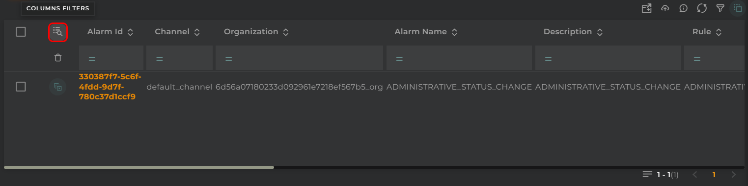
Filter by Columns
Advanced Filter
Perform a search by selecting the fields to filter by and how to filter by them.
Save and Restore Filters
Basic and Advanced filters can be saved in order to preconfigure a list of filters and restore them at any time. This feature is only available in own dashboards but can be shared with other users.
You can save a filter by fullfilling the filter name in the field at the bottom of the filter panel and clicking on the save button. When a filter is saved, it is stored in the widget’s filter list and can be restored at any time by selecting it from the saved filters list located at the top of the filter panel.
Filters can be saved only when a new filter is created.
This can be useful when you want to save a list of filters that you use frequently and restore them at any time.
Widget Menu
The following actions can be performed:
Download: Download data in CSV format
Capture screen: Takes a screenshot of the widget.
Duplicate widget: Creates a duplicate of the widget on the dashboard.
Copy widget: Copies the widget to another dashboard.
Change widget location: Moves the widget to another dashboard.
Sort
If data set has sorting columns configured, the sort menu will display the configured sorting columns.
You can apply the sorting configuration by clicking on the sorting configuration desired and remove with the clean button.
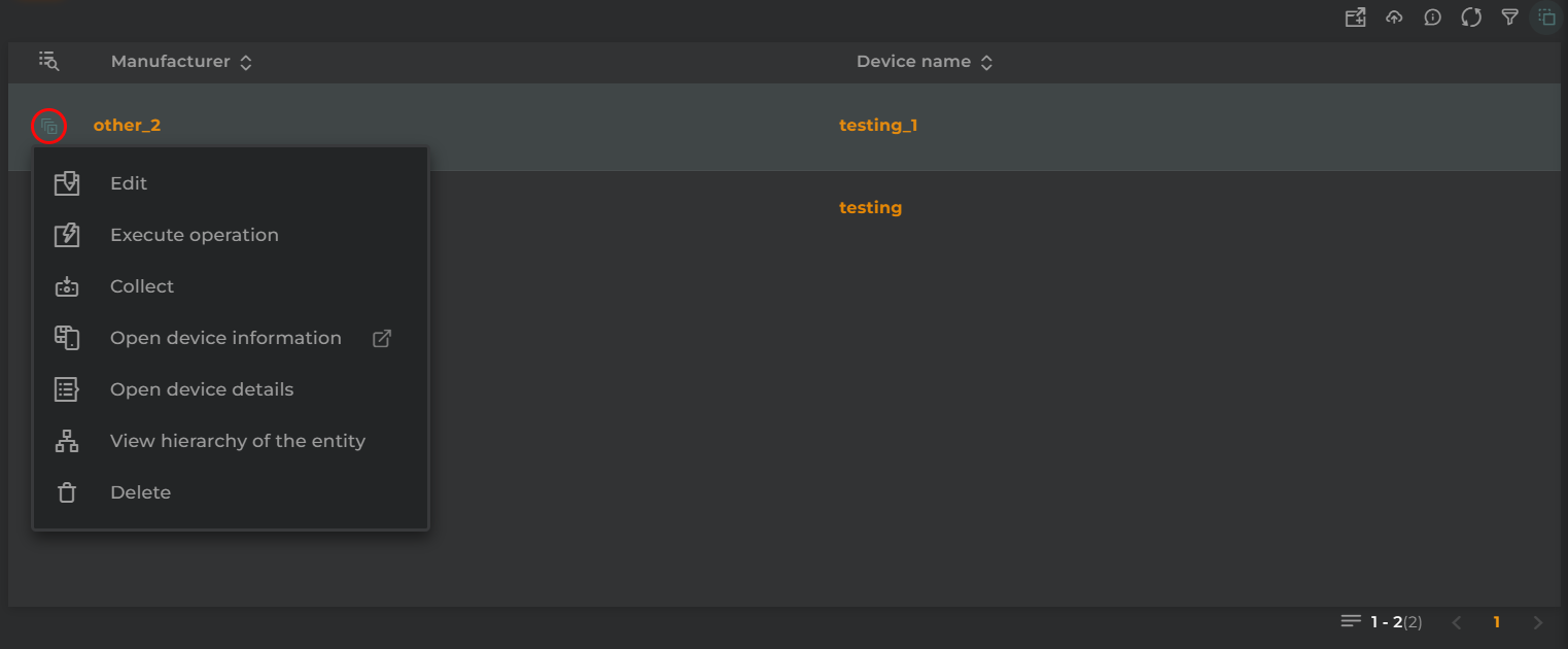
Entity Actions
The actions to be performed will depend on the type of entity configured as the identifying column:
Edit: Edit the entity by opening the corresponding wizard for that entity type
Execute operation: Perform an operation on the displayed entity
Collect: Simulate data collection on an entity (if the entity type supports this action)
Open device/asset/subscriber/subscription information: Opens a temporary dashboard that will display information related to the entity
Open device/asset/subscriber/subscription details: Opens the information widget of an entity with the data of the entity
View hierarchy of the entity: Opens the hierarchy widget to display the hierarchy of the entity (if the entity type supports this action)
Delete: Delete the entity
Configuration
General
Boxed: widget will be displayed with background in dahsboard.
About: widget description in Markdown format.
Title: widget title. It can be configured to remain fixed in the widget or only be displayed when it receives focus.
Toolbar: configures the behavior of the widget bar on the dashboard, allowing you to hide it, hide it when not in use, or leave it always visible.
Refresh Frequency: allows configuring the data refresh frequency displayed in the list.
Extra actions: allows user to add new specific actions to the widget with your own code.
You can add a new one by pressing the New button.
Once you added a custom action it can be modified later by pressing the name in the list.
In order to remove the custom action click the delete icon button on the right.
In extra actions you can write your own code were you can open other dashboards, entities dashboards or execute wizards.
You can find all available functions and methods in Extra Information
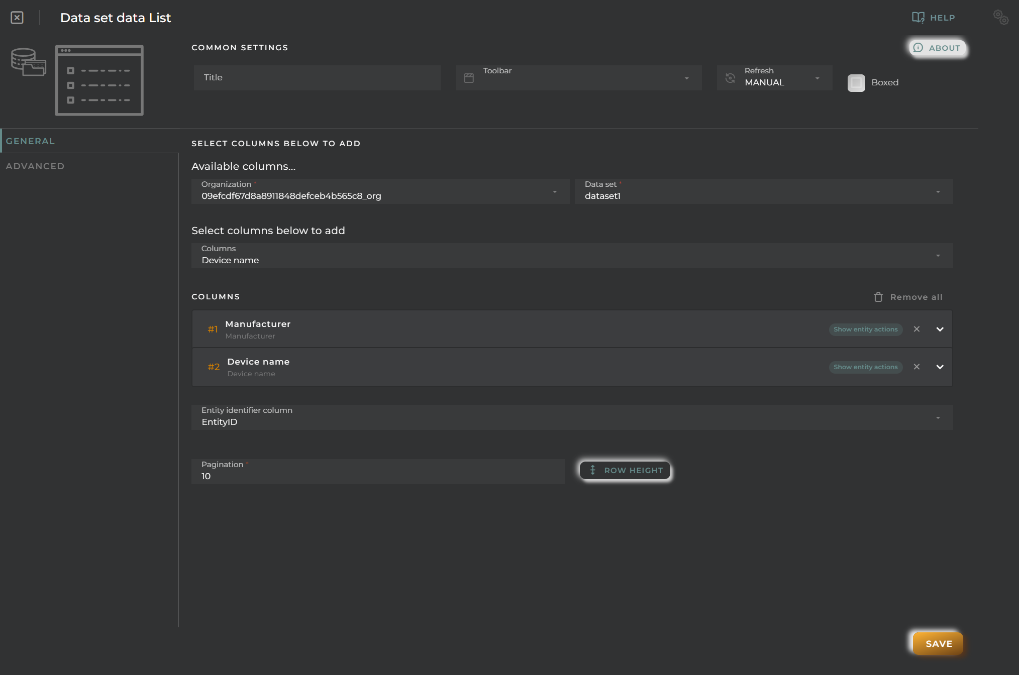
Data Set and Column Selection
Organization: Select the organization to which the data set belongs
Data set: Select the data set
Columns: Select columns configured in the data set
Column Identifier Selection
Selection of the identifying column.
Based on the value of this column, the table will display different actions to perform on each of its rows.
Cell Configuration
Alias: Modify the column name. If nothing is added, it will use the default configured name.
Show entity actions: Allow displaying the actions menu when selecting its value in the cell. If the column is an identifier, this field will be enabled.
Hidden column: Enabling this option will hide the column from the user. This is useful when you need the data for formatting purposes, as only the data required in the list will be available.
Options:
Modify the cell’s width and horizontal alignment of its content.
Format the cell’s value.
Pagination: Configure the number of rows to display per page.
Virtual columns
Also you can add virtual columns to lists.
These columns do not have their own values and must be configured in the column formatter once added.
Please note that the contents of this column will never be output to CSV, as it is calculated on the fly and does not rely on any native platform resources.
Button columns
Also you can add button columns to lists in order to execute some custom action related with the row data.
Button label can be setted in normal or virtual columns. Label will be the value.
Button action code receives the complete rowData and you can open other dashboards, entities dashboards or execute wizards.
You can find all available functions and methods in Extra Information
Advanced
In this section, you will configure various filters that will be applied to queries regardless of the user’s specific filtering preferences.
Widget Filters Configuration
Here you can define how widget filters should behave when sharing the dashboard with other users/organizations. This means that when sharing, a user opens these dashboards and won’t see the filters applied to the original dashboard in the specified widgets, preventing the information displayed from changing after a dashboard refresh.
The three possible options are:
Don’t share the widget’s general filter
Don’t share header filters in lists
Don’t share sorting in lists
Entities Alarms List
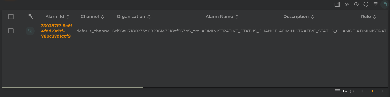
The alarm list allows you to view/manage alarms generated by the system in your organization.
How it works
Below are the actions that can be performed both within the widget and on the displayed data.
Filter by Columns
Basic Filter
Perform a basic search by entering text that will filter by predefined fields.
Advanced Filter
Perform a search by selecting the fields to filter by and how to filter by them.
Save and Restore Filters
Basic and Advanced filters can be saved in order to preconfigure a list of filters and restore them at any time. This feature is only available in own dashboards but can be shared with other users.
You can save a filter by fullfilling the filter name in the field at the bottom of the filter panel and clicking on the save button. When a filter is saved, it is stored in the widget’s filter list and can be restored at any time by selecting it from the saved filters list located at the top of the filter panel.
Filters can be saved only when a new filter is created.
This can be useful when you want to save a list of filters that you use frequently and restore them at any time.
Widget Menu
The following actions can be performed:
Download: Data download in CSV format
Capture screen: Takes a screenshot of the widget.
Duplicate widget: Creates a duplicate of the widget on the dashboard.
Copy widget: Copies the widget to another dashboard.
Change widget location: Moves the widget to another dashboard.
Selection and Operations on Entities
The following actions can be performed on the selected alarm entities:
Filter: Data will be displayed after filtering on the selected alarm entities
Execute Operations: Perform an operation on the selected alarm entities
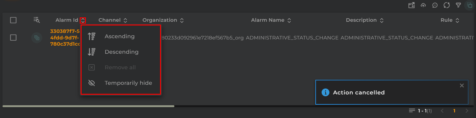
Temporarily Sort and Hide Column
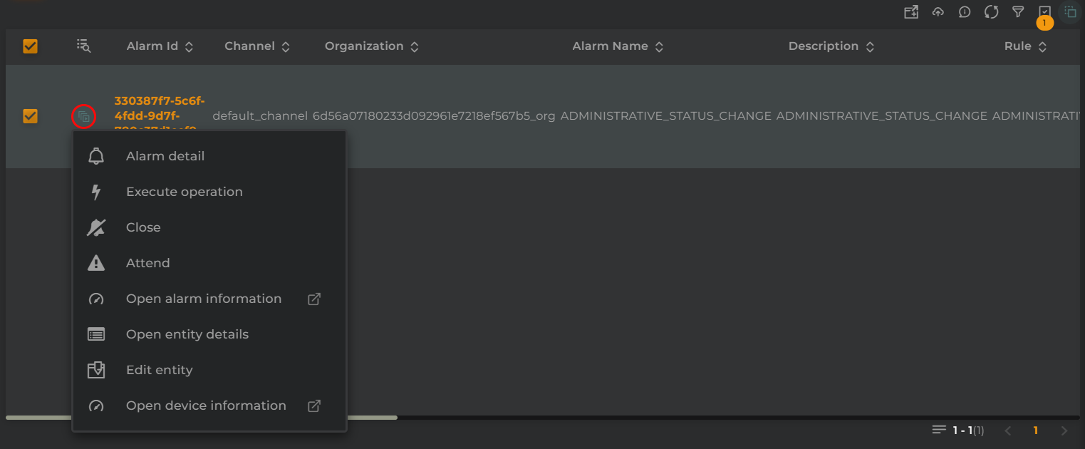
Actions Per Entity
The following actions can be performed:
Alarm detail: Opens the information widget for an alarm
Execute operation: Perform an operation on the selected alarm entity
Close: Opens the alarm wizard to close the selected alarm
Attend: Opens the alarm wizard to address the selected alarm
Open alarm information: Opens a temporary dashboard that will display information related to the alarm
Open device details: Opens the information widget for an entity with the entity’s data
Edit entity: Edits the entity by opening the corresponding wizard for the type of alarm entity selected
Open device information: Opens a temporary dashboard that will display information related to the alarm entity
Configuration
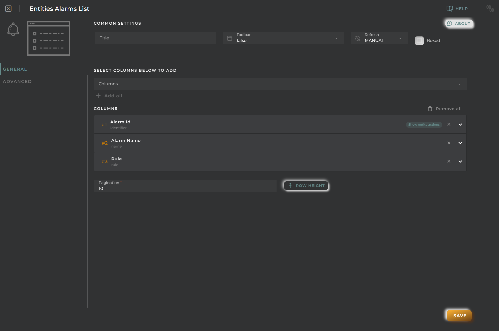
General
Boxed: widget will be displayed with background in dahsboard.
About: widget description in Markdown format.
Title: widget title. It can be configured to remain fixed in the widget or only be displayed when it receives focus.
Toolbar: configures the behavior of the widget bar on the dashboard, allowing you to hide it, hide it when not in use, or leave it always visible.
Refresh Frequency: allows configuring the data refresh frequency displayed in the list.
Extra actions: allows user to add new specific actions to the widget with your own code.
You can add a new one by pressing the New button.
Once you added a custom action it can be modified later by pressing the name in the list.
In order to remove the custom action click the delete icon button on the right.
In extra actions you can write your own code were you can open other dashboards, entities dashboards or execute wizards.
You can find all available functions and methods in Extra Information
Cell Configuration
Alias: Modify the column name. If nothing is added, it will use the default configured name.
Show entity actions: Allow displaying the actions menu when selecting its value in the cell. If the column is an identifier, this field will be enabled.
Hidden column: Enabling this option will hide the column from the user. This is useful when you need the data for formatting purposes, as only the data required in the list will be available.
Options:
Modify the cell’s width and horizontal alignment of its content.
Format the cell’s value.
Pagination: Configure the number of rows to display per page.
Virtual columns
Also you can add virtual columns to lists.
These columns do not have their own values and must be configured in the column formatter once added.
Please note that the contents of this column will never be output to CSV, as it is calculated on the fly and does not rely on any native platform resources.
Button columns
Also you can add button columns to lists in order to execute some custom action related with the row data.
Button label can be setted in normal or virtual columns. Label will be the value.
Button action code receives the complete rowData and you can open other dashboards, entities dashboards or execute wizards.
You can find all available functions and methods in Extra Information
Advanced
In this section, you will configure various filters that will be applied to queries regardless of the user’s specific filtering preferences.
Widget Filters Configuration
Here you can define how widget filters should behave when sharing the dashboard with other users/organizations. This means that when sharing, a user opens these dashboards and won’t see the filters applied to the original dashboard in the specified widgets, preventing the information displayed from changing after a dashboard refresh.
The three possible options are:
Don’t share the widget’s general filter
Don’t share header filters in lists
Don’t share sorting in lists
Entities List
The list of entities allows you to view and manage various types of entities: asset, device, subscriber, subscription; created within your organization.
How it works
Below are the actions that can be performed both within the widget and on the displayed data.
Filter by Columns
Basic Filter
Perform a basic search by entering text that will filter by predefined fields.
Advanced Filter
Perform a search by selecting the fields to filter by and how to filter by them.
Save and Restore Filters
Basic and Advanced filters can be saved in order to preconfigure a list of filters and restore them at any time. This feature is only available in own dashboards but can be shared with other users.
You can save a filter by fullfilling the filter name in the field at the bottom of the filter panel and clicking on the save button. When a filter is saved, it is stored in the widget’s filter list and can be restored at any time by selecting it from the saved filters list located at the top of the filter panel.
Filters can be saved only when a new filter is created.
This can be useful when you want to save a list of filters that you use frequently and restore them at any time.
Widget Menu
The following actions can be performed:
Download: Download data in CSV format
Create Device: Opens the device creation wizard
Create Asset: Opens the asset creation wizard
Create Subscription: Opens the subscription creation wizard
Create Subscriber: Opens the subscriber creation wizard
View in map: Opens the Maps widget, displaying the location of the entities shown in the table
Capture screen: Takes a screenshot of the widget.
Duplicate widget: Creates a duplicate of the widget on the dashboard.
Copy widget: Copies the widget to another dashboard.
Change widget location: Moves the widget to another dashboard.
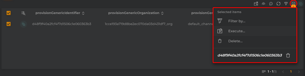
Selection and Operations on Entities
The following actions can be performed on the selected entities:
Filter: Will display data filtered based on the selected entities
Execute operations: Execute an operation on the selected entities
Delete: Delete all selected entities and entities related to them
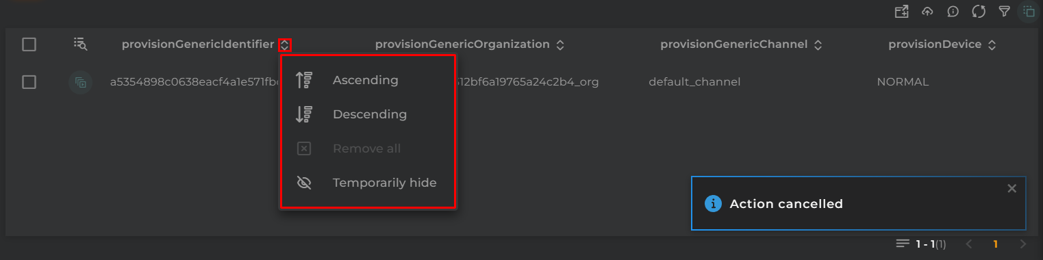
Sort and Temporarily Hide Columns
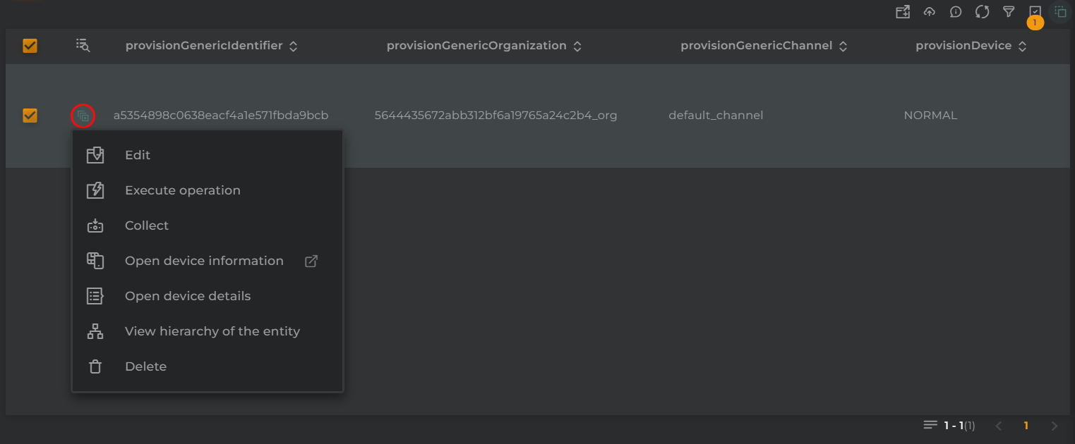
Actions per Entity
The following actions can be performed:
Edit: Edit the entity by opening the corresponding wizard for the type of entity
Execute operation: Execute an operation on the displayed entity
Collect: Simulate data collection on an entity
Open device information: Opens a temporary dashboard displaying information related to the entity
Open device details: Opens the information widget of an entity with the entity’s data
View hierarchy of the entity: Opens the hierarchy widget to display the hierarchy of the entity
Delete: Deletes the entity
Configuration
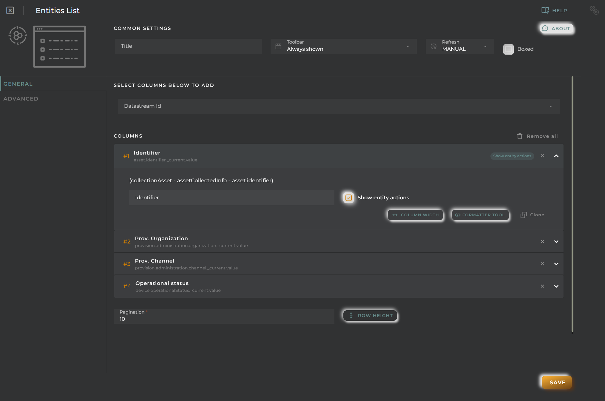
General
Boxed: widget will be displayed with background in dahsboard.
About: widget description in Markdown format.
Title: widget title. It can be configured to remain fixed in the widget or only be displayed when it receives focus.
Toolbar: configures the behavior of the widget bar on the dashboard, allowing you to hide it, hide it when not in use, or leave it always visible.
Refresh Frequency: allows configuring the data refresh frequency displayed in the list.
Extra actions: allows user to add new specific actions to the widget with your own code.
You can add a new one by pressing the New button.
Once you added a custom action it can be modified later by pressing the name in the list.
In order to remove the custom action click the delete icon button on the right.
In extra actions you can write your own code were you can open other dashboards, entities dashboards or execute wizards.
You can find all available functions and methods in Extra Information
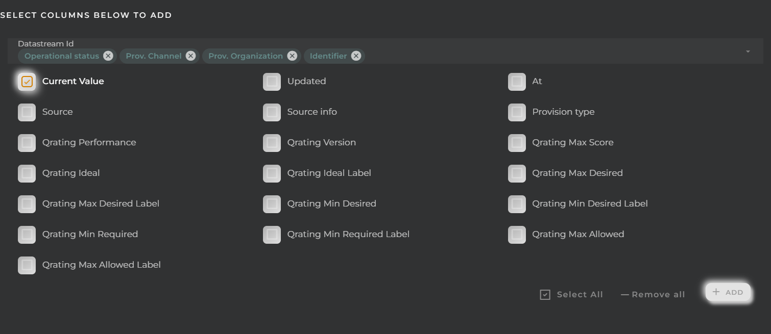
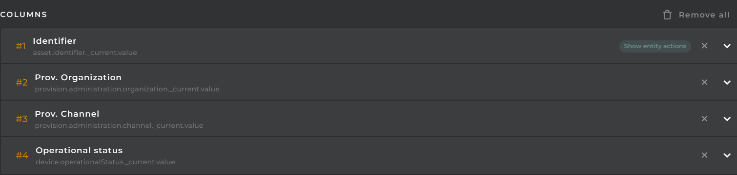
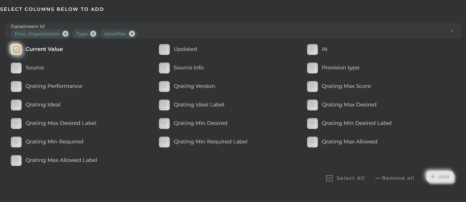
Column Selection
Steps to select and configure the value of a datastream in a column:
Select one or more data streams.
Choose which values from these data streams to display; these will become different columns.
Once selected, click the + button.
Cell Configuration
Alias: Modify the column name. If nothing is added, it will use the default configured name.
Show entity actions: Allow displaying the actions menu when selecting its value in the cell. If the column is an identifier, this field will be enabled.
Hidden column: Enabling this option will hide the column from the user. This is useful when you need the data for formatting purposes, as only the data required in the list will be available.
Options:
Modify the cell’s width and horizontal alignment of its content.
Format the cell’s value.
Pagination: Configure the number of rows to display per page.
Virtual columns
Also you can add virtual columns to lists.
These columns do not have their own values and must be configured in the column formatter once added.
Please note that the contents of this column will never be output to CSV, as it is calculated on the fly and does not rely on any native platform resources.
Button columns
Also you can add button columns to lists in order to execute some custom action related with the row data.
Button label can be setted in normal or virtual columns. Label will be the value.
Button action code receives the complete rowData and you can open other dashboards, entities dashboards or execute wizards.
You can find all available functions and methods in Extra Information
Advanced
In this section, you will configure various filters that will be applied to queries regardless of the user’s specific filtering preferences.
Widget Filters Configuration
Here you can define how widget filters should behave when sharing the dashboard with other users/organizations. This means that when sharing, a user opens these dashboards and won’t see the filters applied to the original dashboard in the specified widgets, preventing the information displayed from changing after a dashboard refresh.
The three possible options are:
Don’t share the widget’s general filter
Don’t share header filters in lists
Don’t share sorting in lists
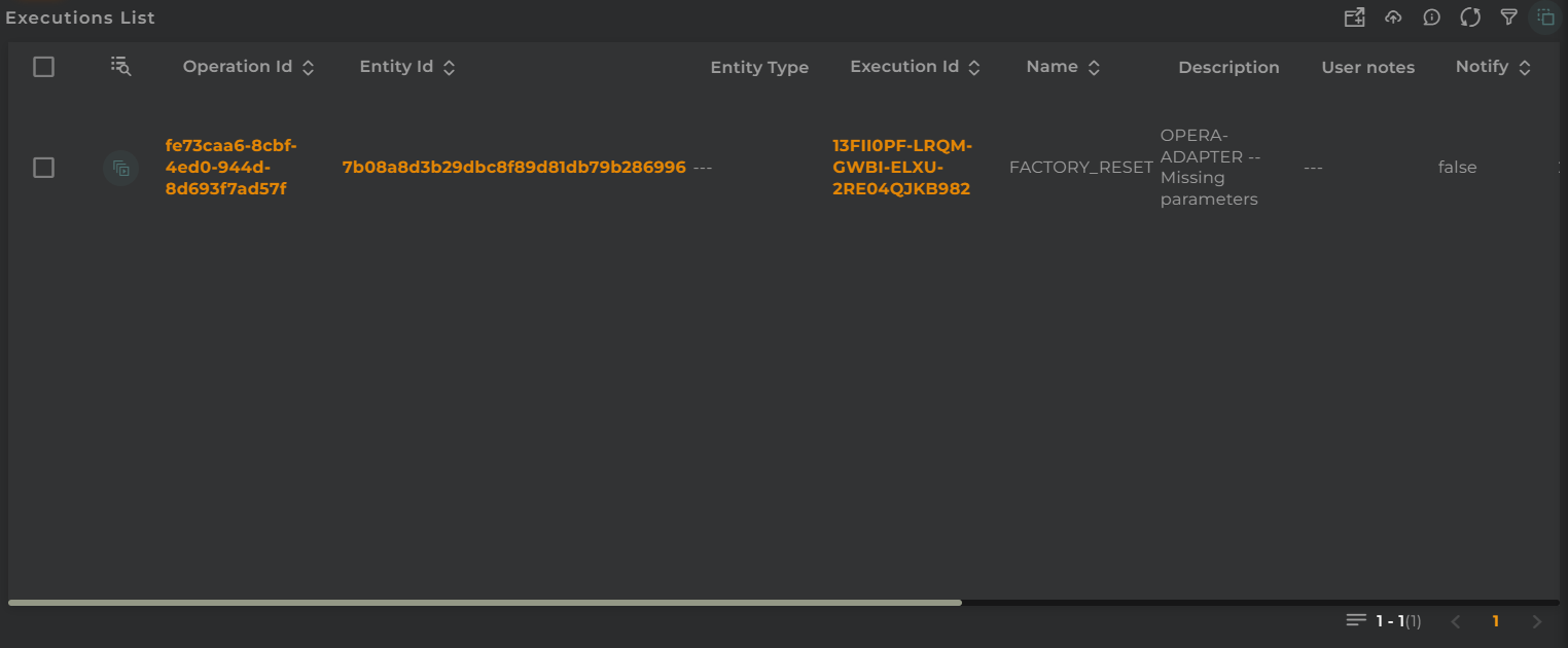
Executions List
The list of operation executions allows you to view and manage the operation executions performed on various types of OpenGate entities: devices, subscribers, and subscriptions.
How it works
Below are the actions that can be performed both within the widget and on the displayed data.
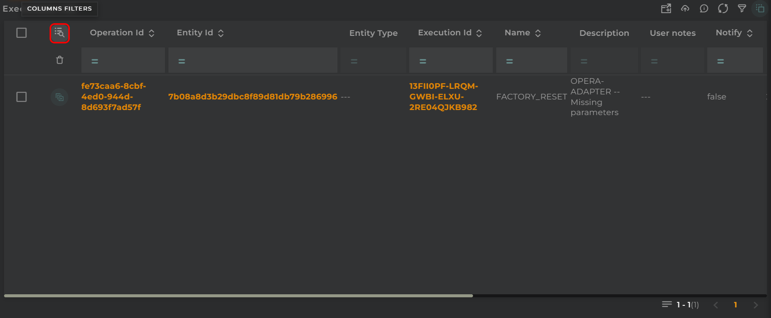
Filter by Columns
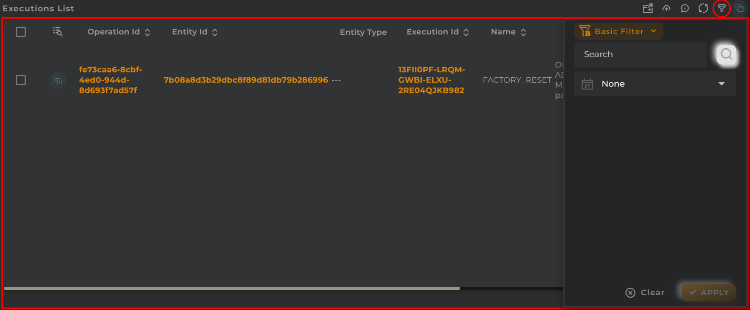
Basic Filter
Perform a basic search by entering text that will filter by predefined fields.
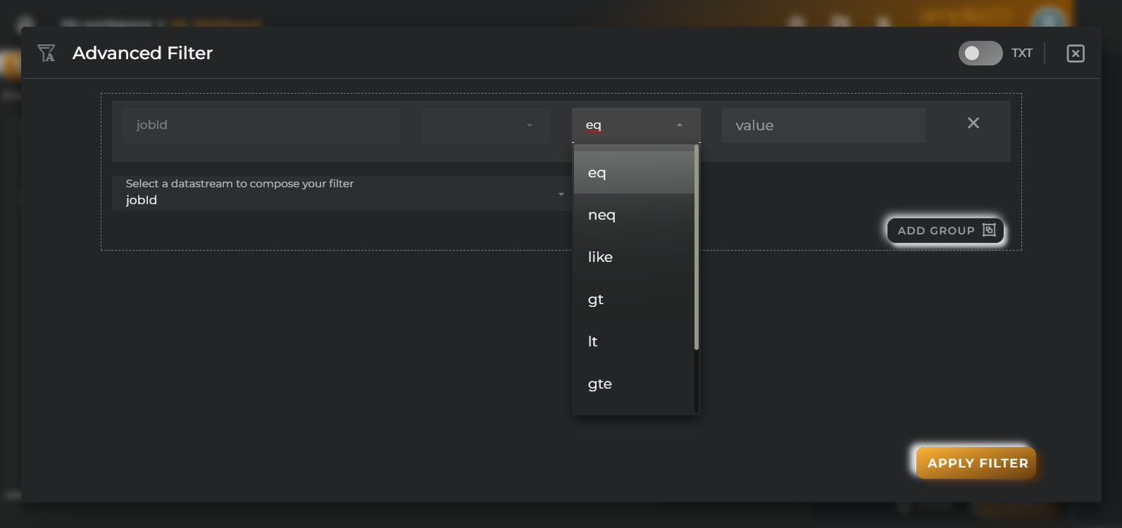
Advanced Filter
Perform a search by selecting the fields to filter by and how to filter by them.
Save and Restore Filters
Basic and Advanced filters can be saved in order to preconfigure a list of filters and restore them at any time. This feature is only available in own dashboards but can be shared with other users.
You can save a filter by fullfilling the filter name in the field at the bottom of the filter panel and clicking on the save button. When a filter is saved, it is stored in the widget’s filter list and can be restored at any time by selecting it from the saved filters list located at the top of the filter panel.
Filters can be saved only when a new filter is created.
This can be useful when you want to save a list of filters that you use frequently and restore them at any time.
Widget Menu
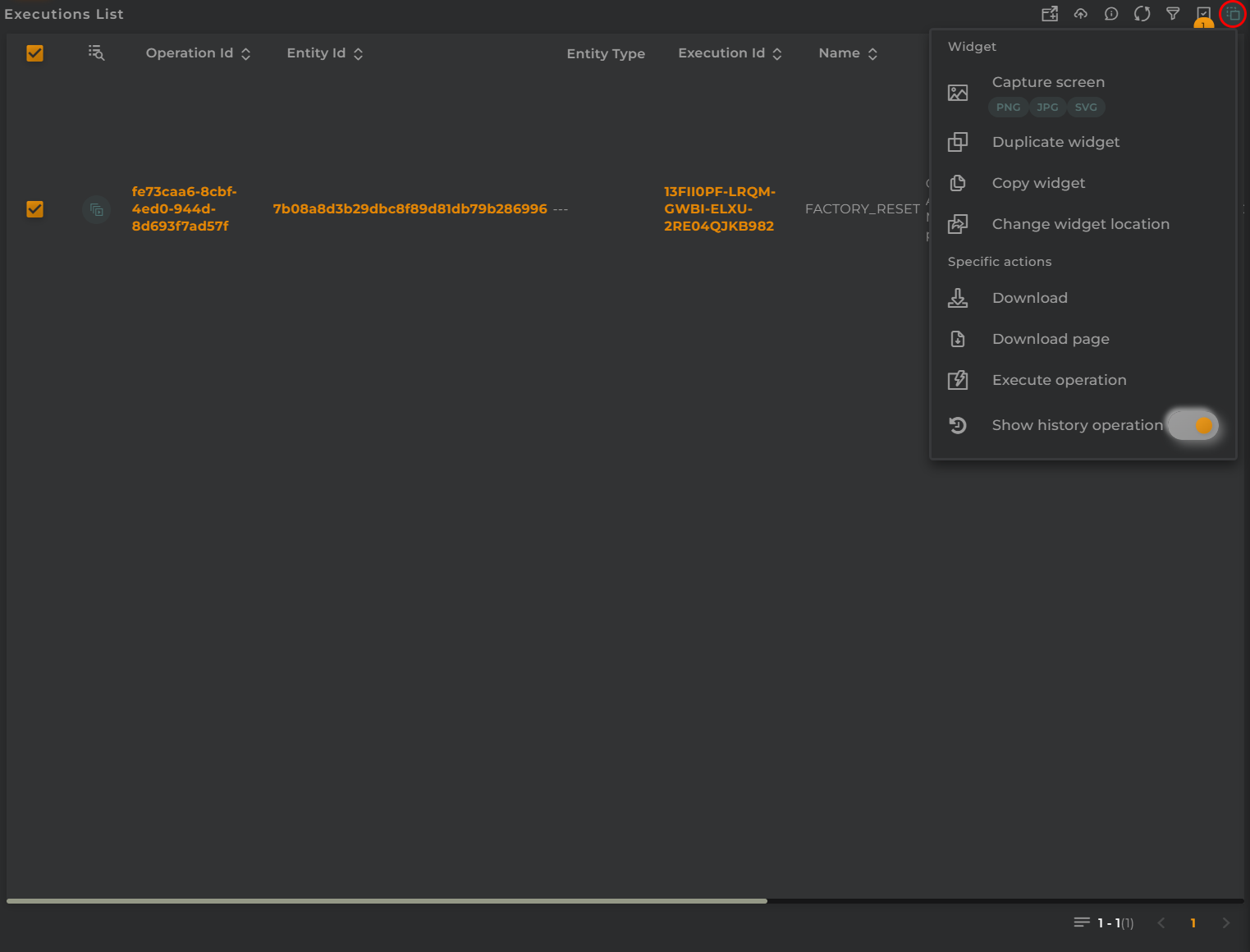
The following actions can be performed:
Download: Download data in CSV format
Execute operation: Opens the operation execution wizard
Show history operation: A switch that allows viewing either in-progress or completed executions.
Capture screen: Takes a screenshot of the widget.
Duplicate widget: Creates a duplicate of the widget on the dashboard.
Copy widget: Copies the widget to another dashboard.
Change widget location: Moves the widget to another dashboard.
Selection and Operations on Entities
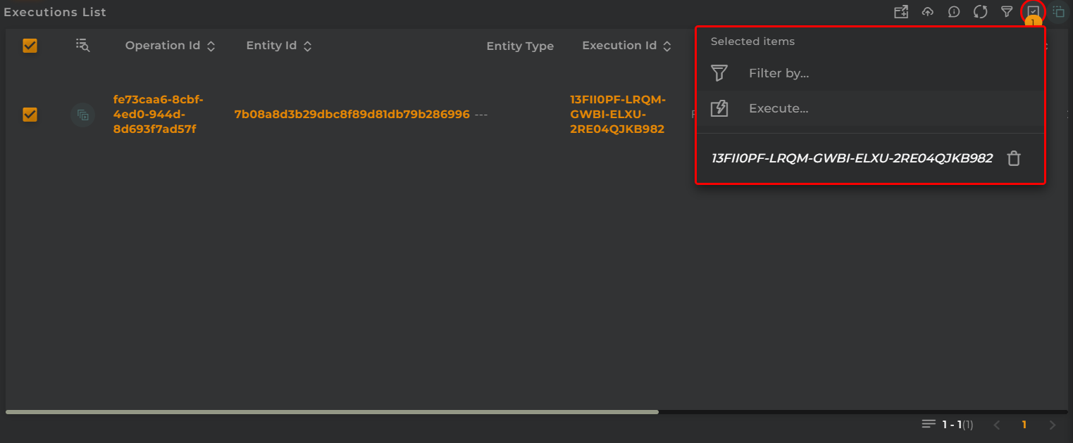
The following actions can be performed on the selected entities of the executions:
Filter: Data will be displayed filtered based on the selected entities
Execute operations: Execute an operation on the entities
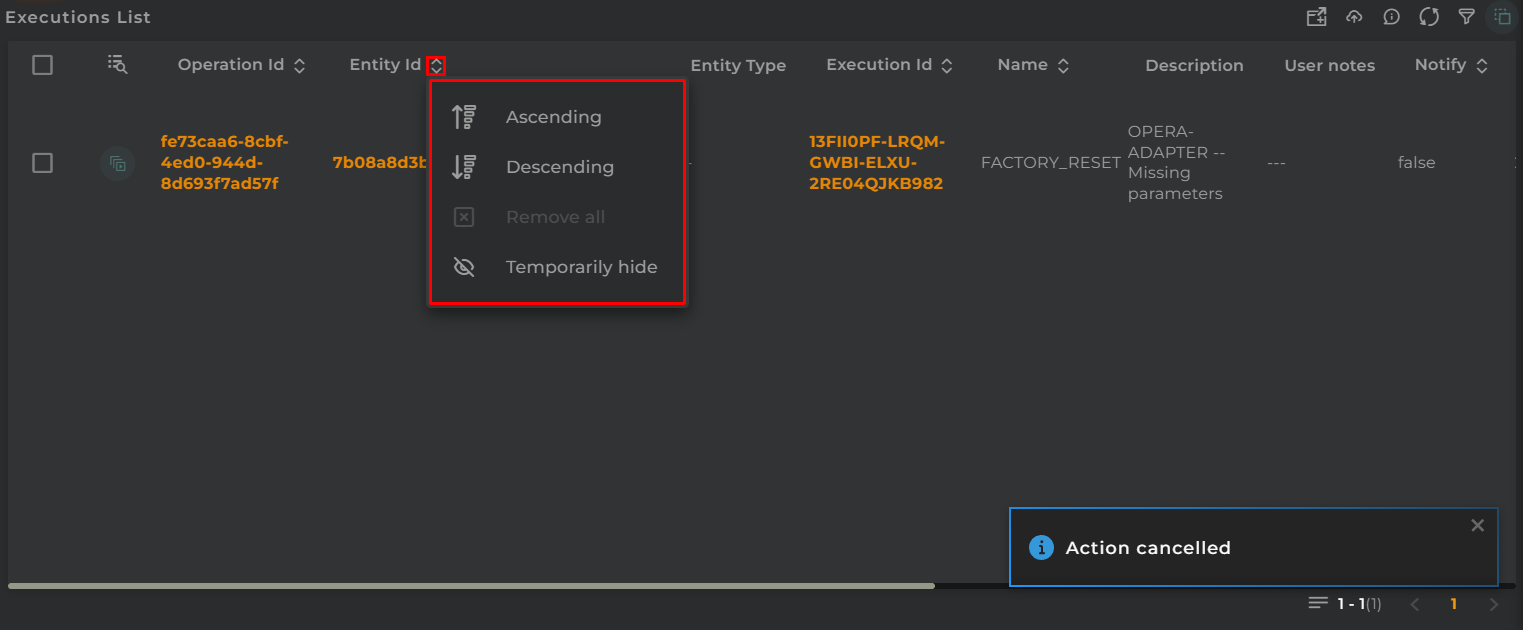
Sort and Temporarily Hide Columns
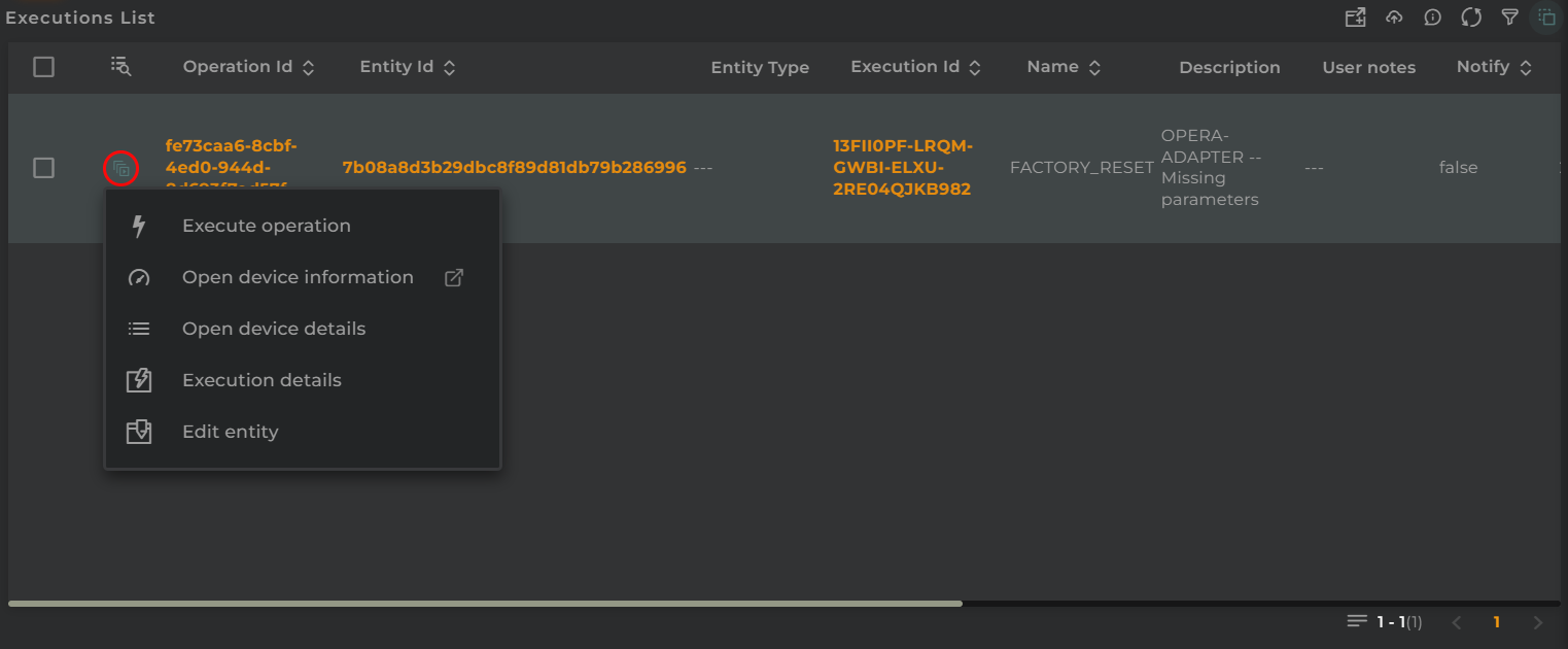
Actions per Entity
The following actions can be performed:
Execute operation: Execute an operation on the execution’s entity
Open device information: Opens a temporary dashboard displaying information related to the execution’s entity
Open device details: Opens the information widget of an entity with the execution entity’s data
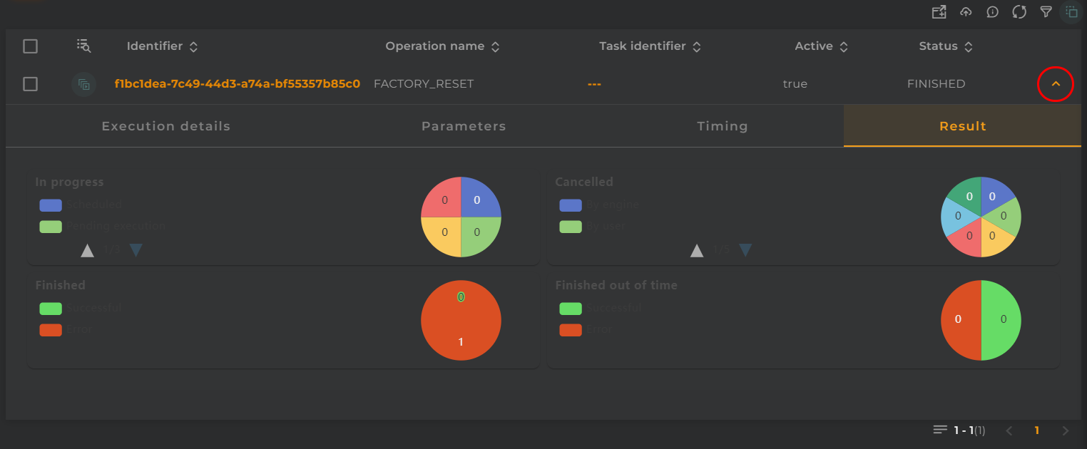
Execution details: Opens the execution information widget
Edit entity: Edit the entity by opening the corresponding wizard for the type of the execution’s entity
Configuration
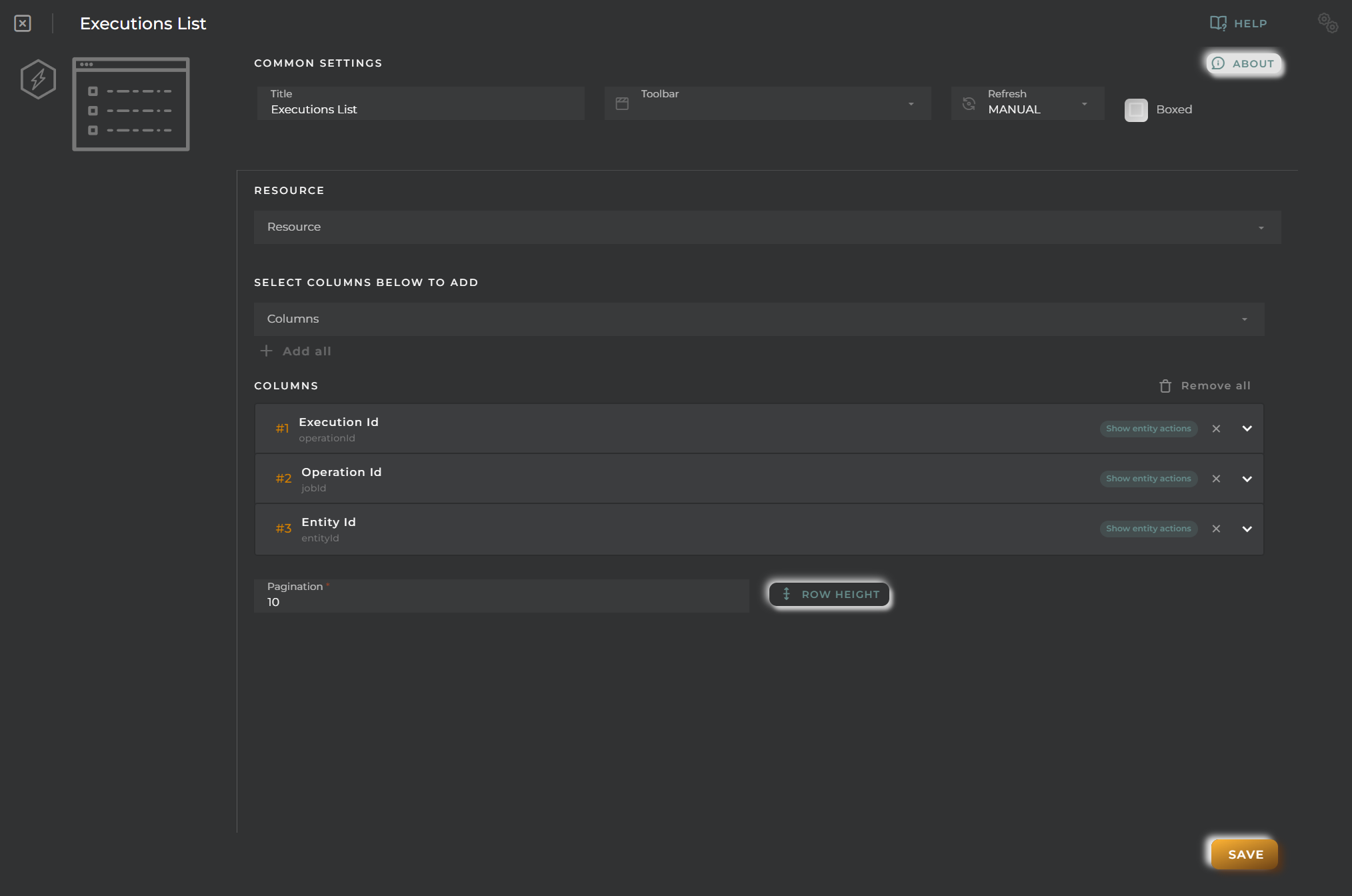
General
Boxed: widget will be displayed with background in dahsboard.
About: widget description in Markdown format.
Title: widget title. It can be configured to remain fixed in the widget or only be displayed when it receives focus.
Toolbar: configures the behavior of the widget bar on the dashboard, allowing you to hide it, hide it when not in use, or leave it always visible.
Refresh Frequency: allows configuring the data refresh frequency displayed in the list.
Extra actions: allows user to add new specific actions to the widget with your own code.
You can add a new one by pressing the New button.
Once you added a custom action it can be modified later by pressing the name in the list.
In order to remove the custom action click the delete icon button on the right.
In extra actions you can write your own code were you can open other dashboards, entities dashboards or execute wizards.
You can find all available functions and methods in Extra Information
Cell Configuration
Alias: Modify the column name. If nothing is added, it will use the default configured name.
Show entity actions: Allow displaying the actions menu when selecting its value in the cell. If the column is an identifier, this field will be enabled.
Hidden column: Enabling this option will hide the column from the user. This is useful when you need the data for formatting purposes, as only the data required in the list will be available.
Options:
Modify the cell’s width and horizontal alignment of its content.
Format the cell’s value.
Pagination: Configure the number of rows to display per page.
Virtual columns
Also you can add virtual columns to lists.
These columns do not have their own values and must be configured in the column formatter once added.
Please note that the contents of this column will never be output to CSV, as it is calculated on the fly and does not rely on any native platform resources.
Button columns
Also you can add button columns to lists in order to execute some custom action related with the row data.
Button label can be setted in normal or virtual columns. Label will be the value.
Button action code receives the complete rowData and you can open other dashboards, entities dashboards or execute wizards.
You can find all available functions and methods in Extra Information
Resource Configuration
Execution listings will be displayed for only one type of entity.
By default, entities of the type Device will be displayed.
Advanced
In this section, you will configure various filters that will be applied to queries regardless of the user’s specific filtering preferences.
Widget Filters Configuration
Here you can define how widget filters should behave when sharing the dashboard with other users/organizations. This means that when sharing, a user opens these dashboards and won’t see the filters applied to the original dashboard in the specified widgets, preventing the information displayed from changing after a dashboard refresh.
The three possible options are:
Don’t share the widget’s general filter
Don’t share header filters in lists
Don’t share sorting in lists
Operations List
The list of operations allows you to view/manage operations performed on various types of entities: device, subscriber, and subscription.
How it works
Below are the actions that can be performed both within the widget and on the displayed data.
Filter by Columns
Basic Filter
Perform a basic search by entering text that will filter by predefined fields.
Advanced Filter
Perform a search by selecting the fields to filter by and how to filter by them.
Save and Restore Filters
Basic and Advanced filters can be saved in order to preconfigure a list of filters and restore them at any time. This feature is only available in own dashboards but can be shared with other users.
You can save a filter by fullfilling the filter name in the field at the bottom of the filter panel and clicking on the save button. When a filter is saved, it is stored in the widget’s filter list and can be restored at any time by selecting it from the saved filters list located at the top of the filter panel.
Filters can be saved only when a new filter is created.
This can be useful when you want to save a list of filters that you use frequently and restore them at any time.
Widget Menu
The following actions can be performed:
Download: Download data in CSV format
Execute operation: Opens the operation execution wizard
Toggle selection: Allows toggling the selection of operations via check. This enables viewing in other compatible widgets the content filtered by this information.
Capture screen: Takes a screenshot of the widget.
Duplicate widget: Creates a duplicate of the widget on the dashboard.
Copy widget: Copies the widget to another dashboard.
Change widget location: Moves the widget to another dashboard.
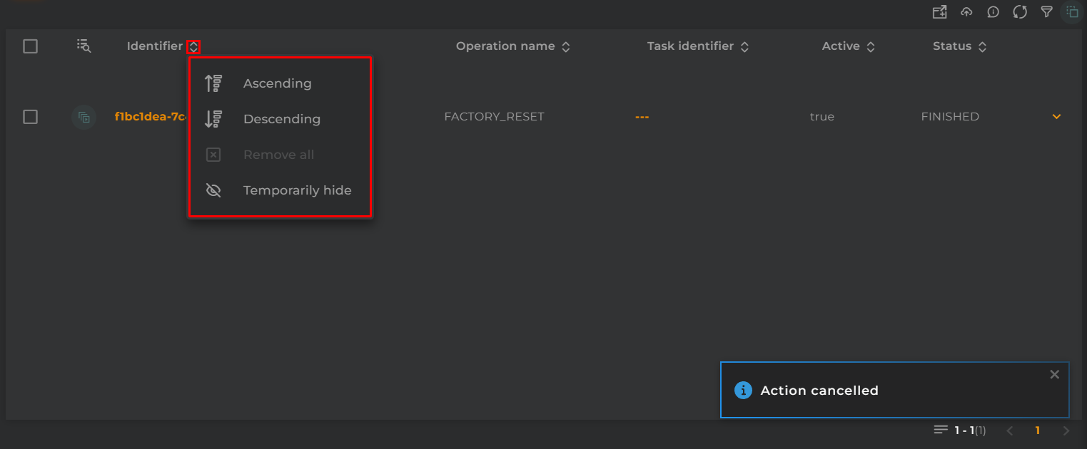
Sort and Temporarily Hide Columns
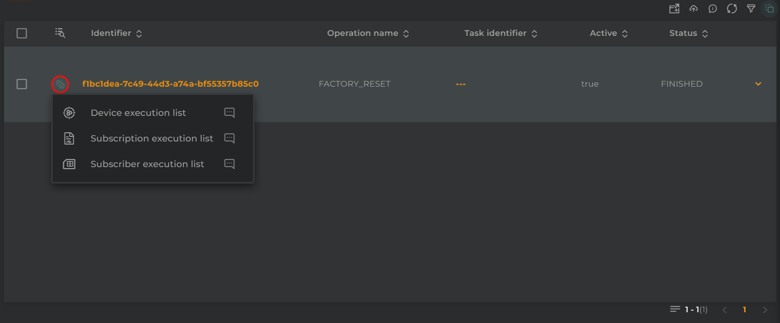
Actions per Entity
The following actions can be performed:
Device execution list: Opens the execution listing widget, filtering by the operation and selecting the entity type ‘device’
Subscription execution list: Opens the execution listing widget, filtering by the operation and selecting the entity type ‘subscription’
Subscriber execution list: Opens the execution listing widget, filtering by the operation and selecting the entity type ‘subscriber’
Configuration
General
Boxed: widget will be displayed with background in dahsboard.
About: widget description in Markdown format.
Title: widget title. It can be configured to remain fixed in the widget or only be displayed when it receives focus.
Toolbar: configures the behavior of the widget bar on the dashboard, allowing you to hide it, hide it when not in use, or leave it always visible.
Refresh Frequency: allows configuring the data refresh frequency displayed in the list.
Extra actions: allows user to add new specific actions to the widget with your own code.
You can add a new one by pressing the New button.
Once you added a custom action it can be modified later by pressing the name in the list.
In order to remove the custom action click the delete icon button on the right.
In extra actions you can write your own code were you can open other dashboards, entities dashboards or execute wizards.
You can find all available functions and methods in Extra Information
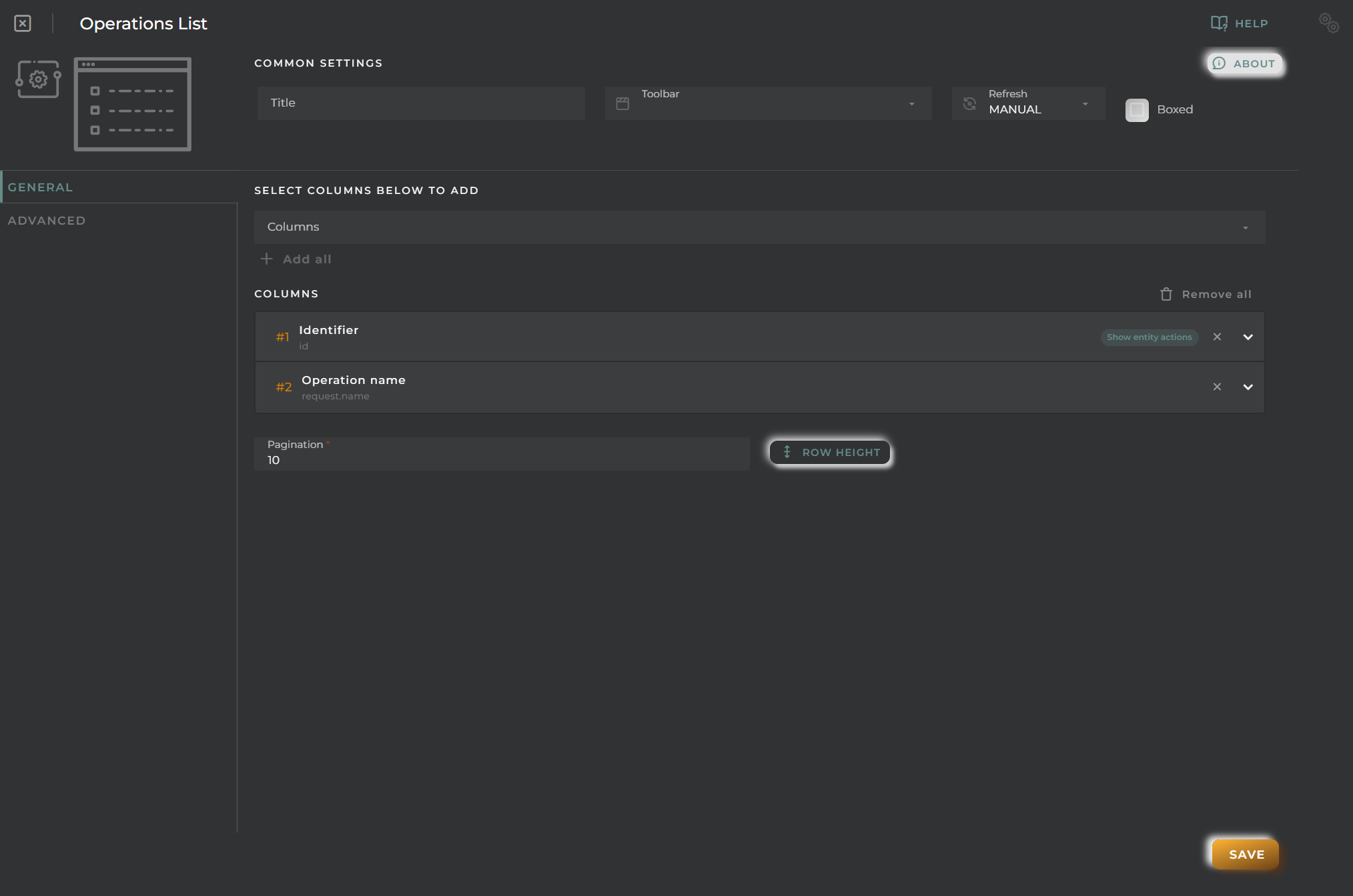
Cell Configuration
Alias: Modify the column name. If nothing is added, it will use the default configured name.
Show entity actions: Allow displaying the actions menu when selecting its value in the cell. If the column is an identifier, this field will be enabled.
Hidden column: Enabling this option will hide the column from the user. This is useful when you need the data for formatting purposes, as only the data required in the list will be available.
Options:
Modify the cell’s width and horizontal alignment of its content.
Format the cell’s value.
Pagination: Configure the number of rows to display per page.
Virtual columns
Also you can add virtual columns to lists.
These columns do not have their own values and must be configured in the column formatter once added.
Please note that the contents of this column will never be output to CSV, as it is calculated on the fly and does not rely on any native platform resources.
Button columns
Also you can add button columns to lists in order to execute some custom action related with the row data.
Button label can be setted in normal or virtual columns. Label will be the value.
Button action code receives the complete rowData and you can open other dashboards, entities dashboards or execute wizards.
You can find all available functions and methods in Extra Information
Advanced
In this section, you will configure various filters that will be applied to queries regardless of the user’s specific filtering preferences.
Widget Filters Configuration
Here you can define how widget filters should behave when sharing the dashboard with other users/organizations. This means that when sharing, a user opens these dashboards and won’t see the filters applied to the original dashboard in the specified widgets, preventing the information displayed from changing after a dashboard refresh.
The three possible options are:
Don’t share the widget’s general filter
Don’t share header filters in lists
Don’t share sorting in lists
Organization Files List
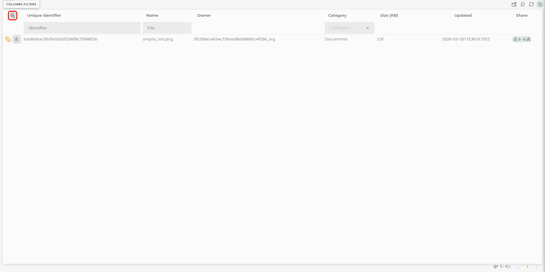
From here, you can manage the files uploaded to the private storage of the organization.
These are the same files managed in Organization Files, in the administration section of the organization.
How it Works
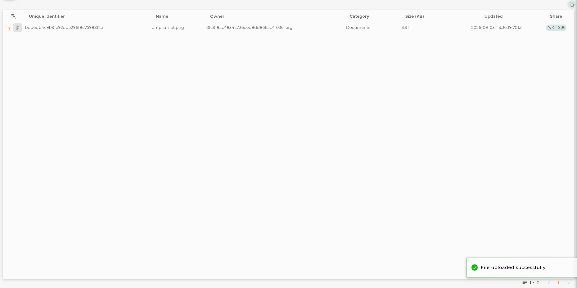
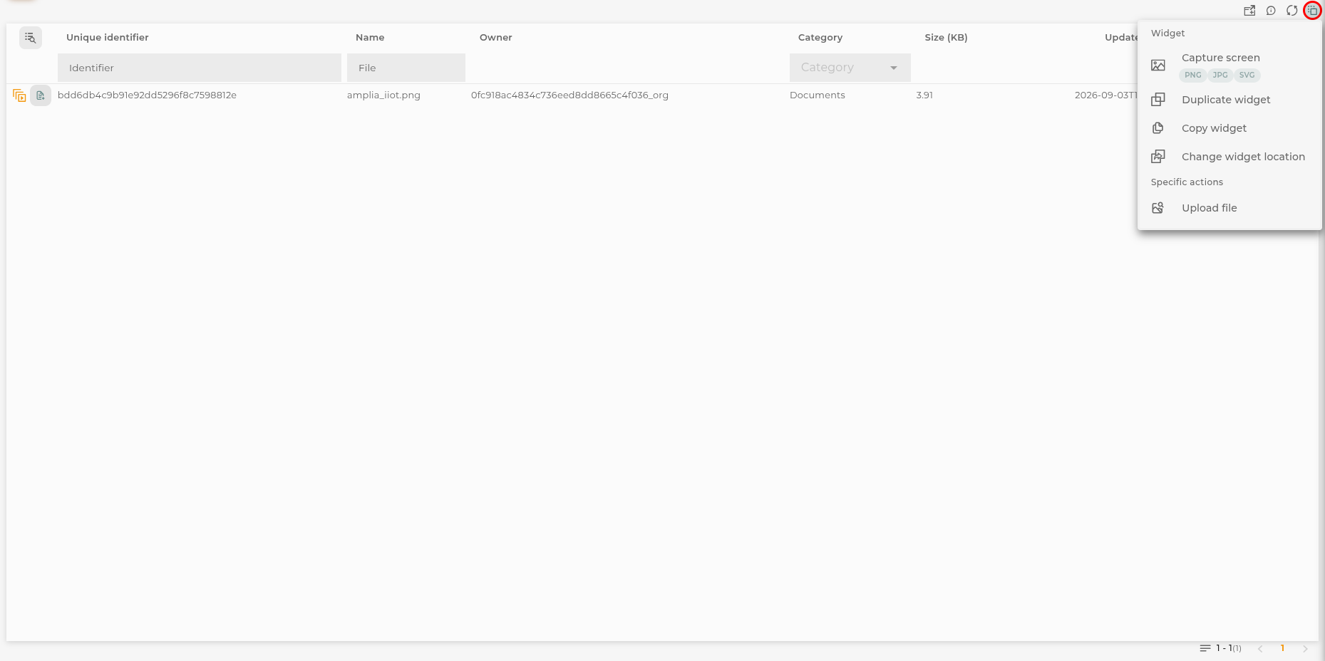
The file listing displays information for each of the stored files.
Files are grouped into 6 categories, which help the user identify the type of files and where they can be used. These categories are as follows:
BIM/IFC files in this category contain 3D models compatible with the BIM/IFC standard and are ready to be used in the corresponding widget (will be converted into fragments files when uploaded).
FRAG fragments files for the Advanced BIM widget to create an own BIM model with no need of external sources.
SVG vector files that can be used in image widgets or any configuration that allows image import.
Image image files that can be used in image widgets or in any configuration that allows image import.
Documents any type of documentation files can be placed here, especially to be used in iframe widgets and to be displayed.
JSON plain JSON files. These files are not processed by the platform in any way.
The following information is shown in the listing:
Unique Identifier the unique identifier of the file.
Name the name of the file.
Owner the organization where this file is located.
Category indicates the category where the file is placed.
Size (KB) the size of the file in kilobytes.
Updated date and time of the last file update.
Shared displays the number of users and organizations the file is shared with.
Uploading a file
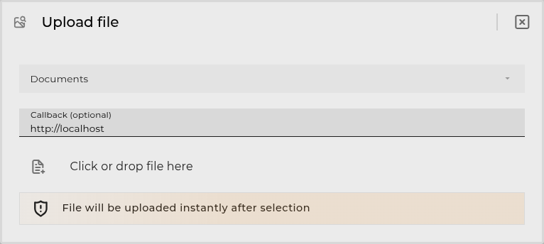
First, it is necessary to click on the “Upload File” button in the navigation bar. This will open the file selection dialog.
Here you must select the category for the file to upload. Once selected, you can enter a callback URL to be invoked once the file is uploaded. Finally, you must click on the “Click or drop file here” button to select the file to upload.
The callback URL is invoked with a POST request carrying the following body:
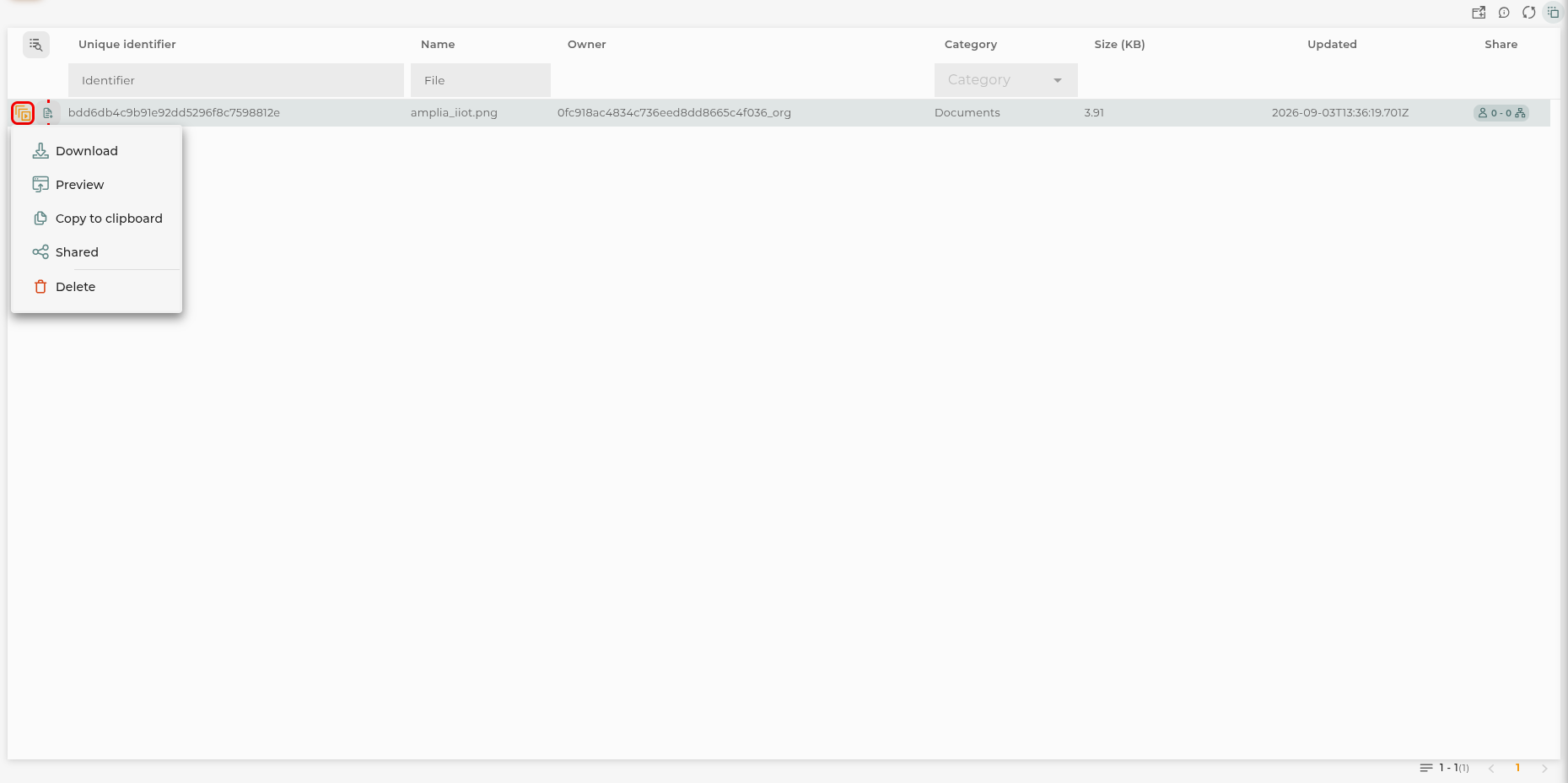
For each item in the listing, the following actions can be performed:
Download opens the file for downloading.
Copy to Clipboard copies the unique URL of the file for use on the platform.
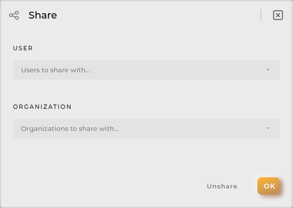
Share allows viewing and sharing the script for other users to use.
Choose File to Upload allows updating the uploaded file with another. This does not affect the generated link, so the change will be reflected wherever it was being used.
Delete removes the selected file.
Filters
Filters allow applying a filter on the listing.
You can use these filters:
Name filters by file name (like search).
Identifier filters by file identifier (like search).
Category filters by file category (list of predefined options).
List can be sorted by clicking on the column headers. This configuration will be saved if dashboard settings are saved. Default sort is by last updated date, descending.
Configuration
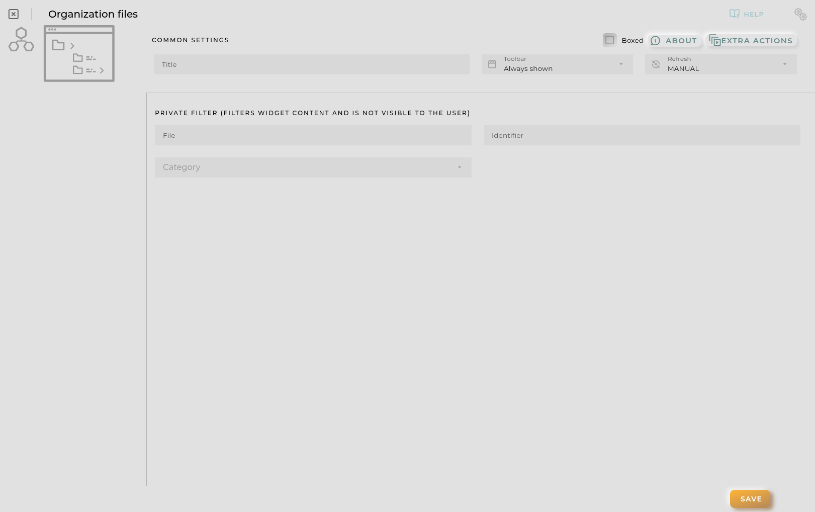
The widget can be configured with a predefined filter. In that case the inline filters are replaced by the configuration options, so the user browses the prefiltered listing without being able to change it.
Schedulers History List
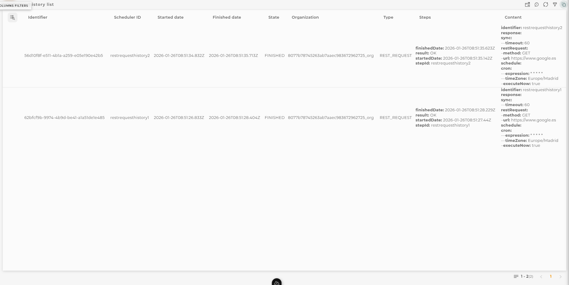
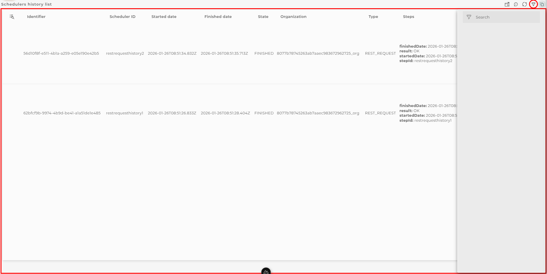
The schedulers history list allows you to view the execution history of the schedulers configured in your organization.
How it works
Below are the actions that can be performed both within the widget and on the displayed data.
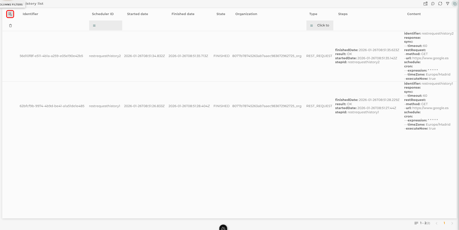
Filter by Columns
Basic Filter
Perform a basic search by entering text that will filter by predefined fields.
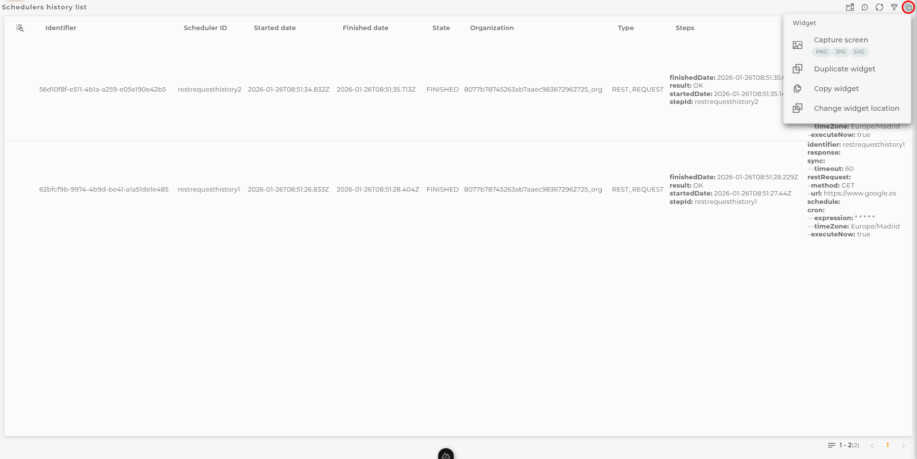
Widget Menu
The following actions can be performed:
Capture screen: Takes a screenshot of the widget.
Duplicate widget: Creates a duplicate of the widget on the dashboard.
Copy widget: Copies the widget to another dashboard.
Change widget location: Moves the widget to another dashboard.
Configuration
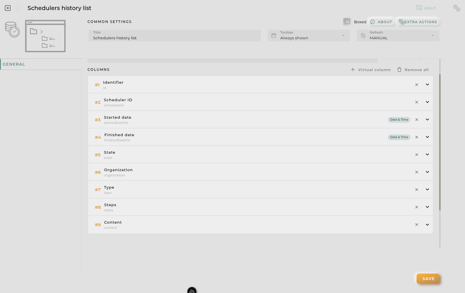
General
Boxed: widget will be displayed with background in dahsboard.
About: widget description in Markdown format.
Title: widget title. It can be configured to remain fixed in the widget or only be displayed when it receives focus.
Toolbar: configures the behavior of the widget bar on the dashboard, allowing you to hide it, hide it when not in use, or leave it always visible.
Refresh Frequency: allows configuring the data refresh frequency displayed in the list.
Extra actions: allows user to add new specific actions to the widget with your own code.
You can add a new one by pressing the New button.
Once you added a custom action it can be modified later by pressing the name in the list.
In order to remove the custom action click the delete icon button on the right.
In extra actions you can write your own code were you can open other dashboards, entities dashboards or execute wizards.
You can find all available functions and methods in Extra Information
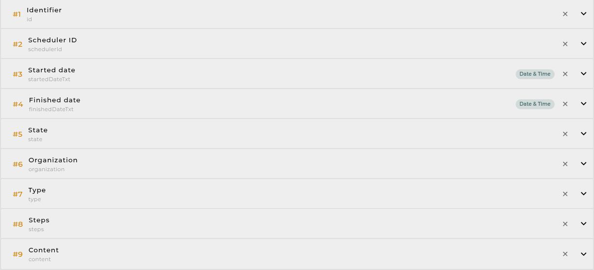
Cell Configuration
Alias: Modify the column name. If nothing is added, it will use the default configured name.
Show entity actions: Allow displaying the actions menu when selecting its value in the cell. If the column is an identifier, this field will be enabled.
Hidden column: Enabling this option will hide the column from the user. This is useful when you need the data for formatting purposes, as only the data required in the list will be available.
Options:
Modify the cell’s width and horizontal alignment of its content.
Format the cell’s value.
Pagination: Configure the number of rows to display per page.
Virtual columns
Also you can add virtual columns to lists.
These columns do not have their own values and must be configured in the column formatter once added.
Please note that the contents of this column will never be output to CSV, as it is calculated on the fly and does not rely on any native platform resources.
Button columns
Also you can add button columns to lists in order to execute some custom action related with the row data.
Button label can be setted in normal or virtual columns. Label will be the value.
Button action code receives the complete rowData and you can open other dashboards, entities dashboards or execute wizards.
You can find all available functions and methods in Extra Information
Advanced
In this section, you will configure various filters that will be applied to queries regardless of the user’s specific filtering preferences.
Widget Filters Configuration
Here you can define how widget filters should behave when sharing the dashboard with other users/organizations. This means that when sharing, a user opens these dashboards and won’t see the filters applied to the original dashboard in the specified widgets, preventing the information displayed from changing after a dashboard refresh.
The three possible options are:
Don’t share the widget’s general filter
Don’t share header filters in lists
Don’t share sorting in lists
Tickets List
The list of tickets allows you to view/manage the tickets created within your organization.
How it works
Below are the actions that can be performed both within the widget and on the displayed data.
Filter by Columns
Basic Filter
Perform a basic search by entering text that will filter by predefined fields.
Advanced Filter
Perform a search by selecting the fields to filter by and how to filter by them.
Save and Restore Filters
Basic and Advanced filters can be saved in order to preconfigure a list of filters and restore them at any time. This feature is only available in own dashboards but can be shared with other users.
You can save a filter by fullfilling the filter name in the field at the bottom of the filter panel and clicking on the save button. When a filter is saved, it is stored in the widget’s filter list and can be restored at any time by selecting it from the saved filters list located at the top of the filter panel.
Filters can be saved only when a new filter is created.
This can be useful when you want to save a list of filters that you use frequently and restore them at any time.
Widget Menu
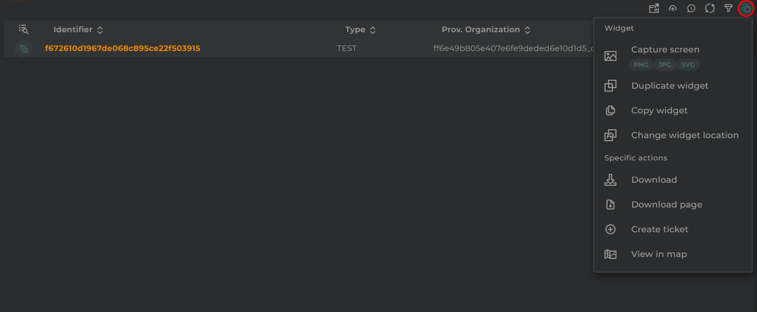
The following actions can be performed:
Download: Download data in CSV format
Create Ticket: Opens the ticket creation wizard
View in map: Opens the Maps widget, displaying the locations of the entities shown in the table
Capture screen: Takes a screenshot of the widget.
Duplicate widget: Creates a duplicate of the widget on the dashboard.
Copy widget: Copies the widget to another dashboard.
Change widget location: Moves the widget to another dashboard.
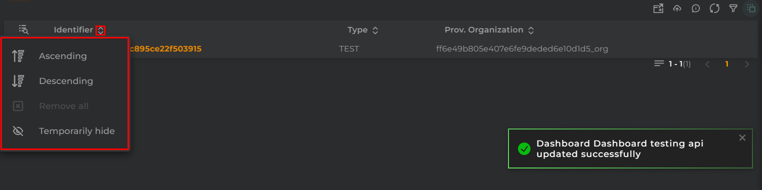
Sort and Temporarily Hide Columns
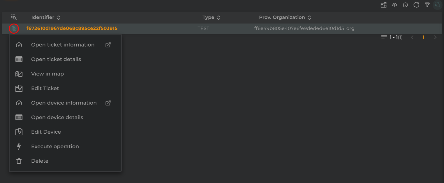
Actions per Entity
The following actions can be performed:
Open ticket information: Opens a temporary dashboard displaying information related to the ticket
Open ticket details: Opens the widget with ticket information and details
Edit ticket: Opens the ticket wizard to edit the ticket
Open device information: Opens a temporary dashboard displaying information related to the device associated with the ticket
Open device details: Opens the widget with information about the entity and details of the device associated with the ticket
Edit device: Opens the device wizard to edit the device associated with the entity
Execute operation: Executes an operation on the device associated with the ticket
Delete: Deletes the ticket
Configuration
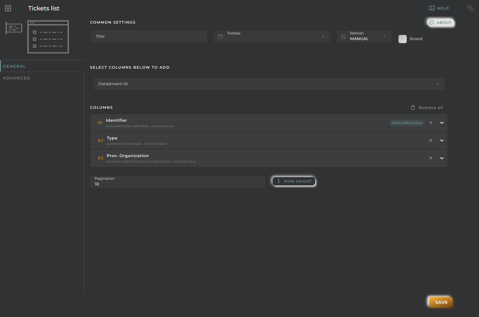
General
Boxed: widget will be displayed with background in dahsboard.
About: widget description in Markdown format.
Title: widget title. It can be configured to remain fixed in the widget or only be displayed when it receives focus.
Toolbar: configures the behavior of the widget bar on the dashboard, allowing you to hide it, hide it when not in use, or leave it always visible.
Refresh Frequency: allows configuring the data refresh frequency displayed in the list.
Extra actions: allows user to add new specific actions to the widget with your own code.
You can add a new one by pressing the New button.
Once you added a custom action it can be modified later by pressing the name in the list.
In order to remove the custom action click the delete icon button on the right.
In extra actions you can write your own code were you can open other dashboards, entities dashboards or execute wizards.
You can find all available functions and methods in Extra Information
Column Selection
Steps to select and configure the value of a datastream in a column:
Select one or more data streams.
Choose which values from these data streams to display; these will become different columns.
Once selected, click the + button.
Cell Configuration
Alias: Modify the column name. If nothing is added, it will use the default configured name.
Show entity actions: Allow displaying the actions menu when selecting its value in the cell. If the column is an identifier, this field will be enabled.
Hidden column: Enabling this option will hide the column from the user. This is useful when you need the data for formatting purposes, as only the data required in the list will be available.
Options:
Modify the cell’s width and horizontal alignment of its content.
Format the cell’s value.
Pagination: Configure the number of rows to display per page.
Virtual columns
Also you can add virtual columns to lists.
These columns do not have their own values and must be configured in the column formatter once added.
Please note that the contents of this column will never be output to CSV, as it is calculated on the fly and does not rely on any native platform resources.
Button columns
Also you can add button columns to lists in order to execute some custom action related with the row data.
Button label can be setted in normal or virtual columns. Label will be the value.
Button action code receives the complete rowData and you can open other dashboards, entities dashboards or execute wizards.
You can find all available functions and methods in Extra Information
Advanced
In this section, you will configure various filters that will be applied to queries regardless of the user’s specific filtering preferences.
Widget Filters Configuration
Here you can define how widget filters should behave when sharing the dashboard with other users/organizations. This means that when sharing, a user opens these dashboards and won’t see the filters applied to the original dashboard in the specified widgets, preventing the information displayed from changing after a dashboard refresh.
The three possible options are:
Don’t share the widget’s general filter
Don’t share header filters in lists
Don’t share sorting in lists
Time Series data List
The listing allows us to see the values provided by a time series and manage the entities related to it.
How it works
Below are the actions that can be performed both within the widget and on the displayed data.
Filter by Columns
Advanced Filter
Perform a search by selecting the fields to filter by and how to filter by them.
Save and Restore Filters
Basic and Advanced filters can be saved in order to preconfigure a list of filters and restore them at any time. This feature is only available in own dashboards but can be shared with other users.
You can save a filter by fullfilling the filter name in the field at the bottom of the filter panel and clicking on the save button. When a filter is saved, it is stored in the widget’s filter list and can be restored at any time by selecting it from the saved filters list located at the top of the filter panel.
Filters can be saved only when a new filter is created.
This can be useful when you want to save a list of filters that you use frequently and restore them at any time.
Widget Menu
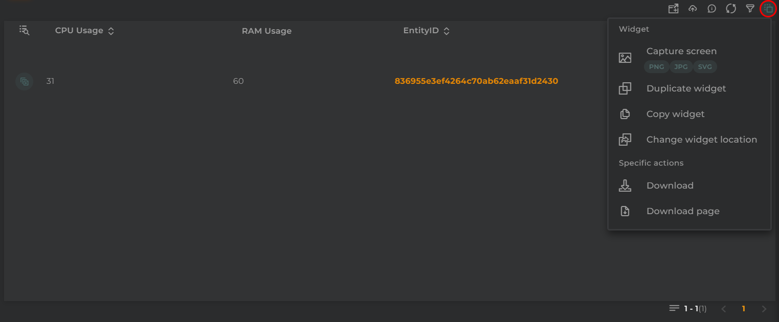
The following actions can be performed:
Download: Data download in CSV format
Capture screen: Takes a screenshot of the widget.
Duplicate widget: Creates a duplicate of the widget on the dashboard.
Copy widget: Copies the widget to another dashboard.
Change widget location: Moves the widget to another dashboard.
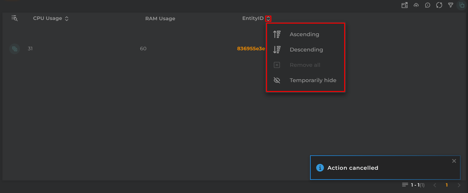
Sorting
If time series has sorting columns configured, the sort menu will display the configured sorting columns.
You can apply the sorting configuration by clicking on the sorting configuration desired and remove with the clean button.
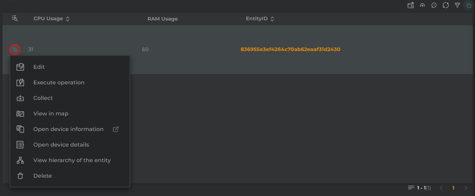
Actions by Entity
The actions to be performed will depend on the type of entity that is set as the identifying column:
Edit: Edit the entity by opening the corresponding wizard for that entity type
Execute operation: Perform an operation on the displayed entity
Collect: Simulate data collection on an entity (if the entity type supports this action)
Open device/asset/subscriber/subscription information: Open a temporary dashboard that will display information related to the entity
Open device/asset/subscriber/subscription details: Open the information widget for an entity with the entity’s details
View hierarchy of the entity: Open the hierarchy widget to display the hierarchy of the entity (if the entity type supports this action)
Delete: Delete the entity
Configuration
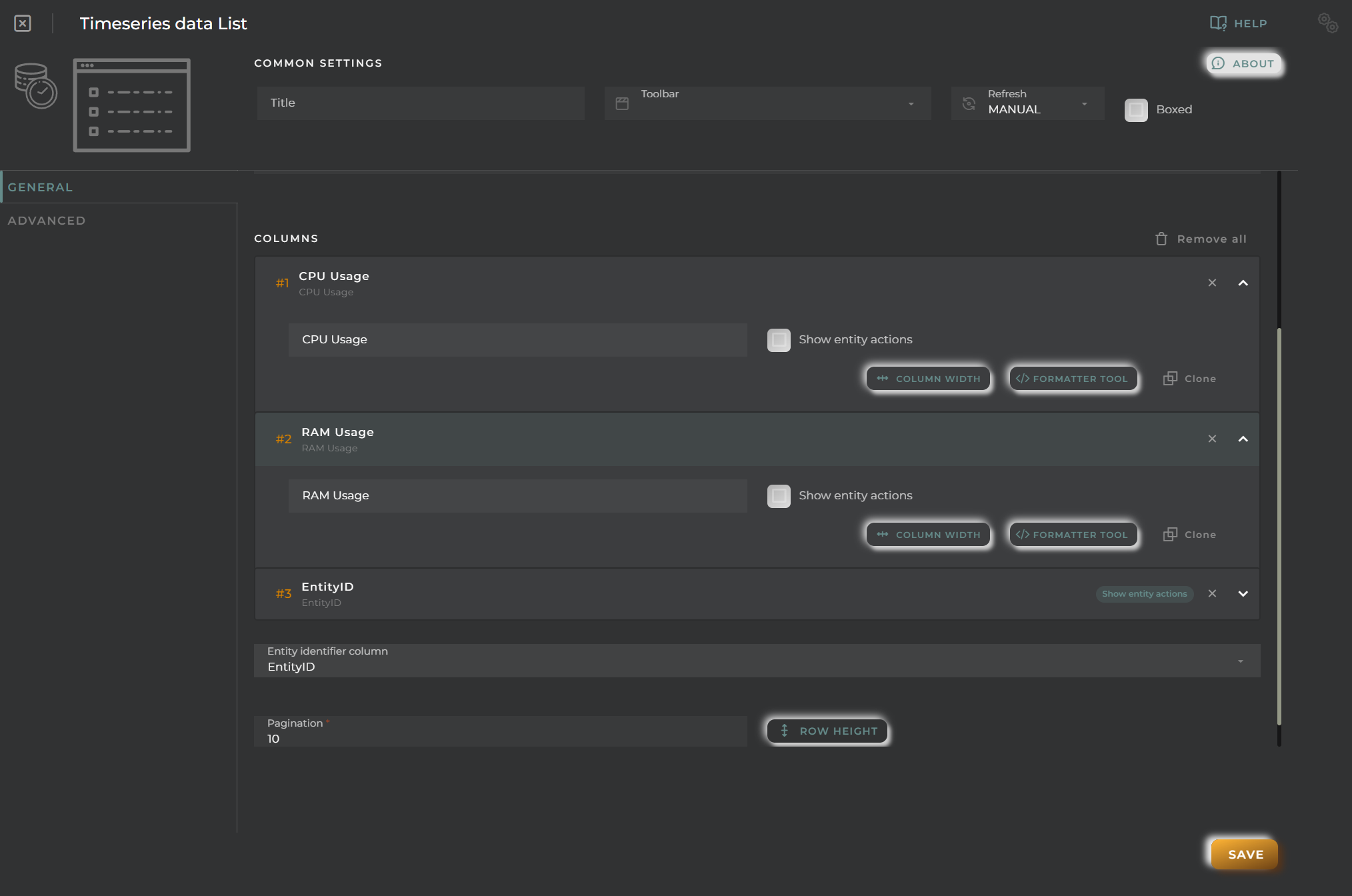
General
Boxed: widget will be displayed with background in dahsboard.
About: widget description in Markdown format.
Title: widget title. It can be configured to remain fixed in the widget or only be displayed when it receives focus.
Toolbar: configures the behavior of the widget bar on the dashboard, allowing you to hide it, hide it when not in use, or leave it always visible.
Refresh Frequency: allows configuring the data refresh frequency displayed in the list.
Extra actions: allows user to add new specific actions to the widget with your own code.
You can add a new one by pressing the New button.
Once you added a custom action it can be modified later by pressing the name in the list.
In order to remove the custom action click the delete icon button on the right.
In extra actions you can write your own code were you can open other dashboards, entities dashboards or execute wizards.
You can find all available functions and methods in Extra Information
Dataset and Column Selection
Organization: Select the organization to which the dataset belongs
Data set: Select the dataset
Columns: Select the configured columns in the dataset
Column Identifier Selection
Select the identifying column.
Based on the value of this column, the table will display different actions to be performed on each of its rows.
Cell Configuration
Alias: Modify the column name. If nothing is added, it will use the default configured name.
Show entity actions: Allow displaying the actions menu when selecting its value in the cell. If the column is an identifier, this field will be enabled.
Hidden column: Enabling this option will hide the column from the user. This is useful when you need the data for formatting purposes, as only the data required in the list will be available.
Options:
Modify the cell’s width and horizontal alignment of its content.
Format the cell’s value.
Pagination: Configure the number of rows to display per page.
Virtual columns
Also you can add virtual columns to lists.
These columns do not have their own values and must be configured in the column formatter once added.
Please note that the contents of this column will never be output to CSV, as it is calculated on the fly and does not rely on any native platform resources.
Button columns
Also you can add button columns to lists in order to execute some custom action related with the row data.
Button label can be setted in normal or virtual columns. Label will be the value.
Button action code receives the complete rowData and you can open other dashboards, entities dashboards or execute wizards.
You can find all available functions and methods in Extra Information
Advanced
In this section, you will configure various filters that will be applied to queries regardless of the user’s specific filtering preferences.
Widget Filters Configuration
Here you can define how widget filters should behave when sharing the dashboard with other users/organizations. This means that when sharing, a user opens these dashboards and won’t see the filters applied to the original dashboard in the specified widgets, preventing the information displayed from changing after a dashboard refresh.
The three possible options are:
Don’t share the widget’s general filter
Don’t share header filters in lists
Don’t share sorting in lists
Users List
The user listing allows for viewing/managing the users of the organization.
How it works
Below are the actions that can be performed both within the widget and on the displayed data.
Filter by Columns
Basic Filter
Perform a basic search by entering text that will filter by predefined fields.
Advanced Filter
Perform a search by selecting the fields to filter by and how to filter by them.
Save and Restore Filters
Basic and Advanced filters can be saved in order to preconfigure a list of filters and restore them at any time. This feature is only available in own dashboards but can be shared with other users.
You can save a filter by fullfilling the filter name in the field at the bottom of the filter panel and clicking on the save button. When a filter is saved, it is stored in the widget’s filter list and can be restored at any time by selecting it from the saved filters list located at the top of the filter panel.
Filters can be saved only when a new filter is created.
This can be useful when you want to save a list of filters that you use frequently and restore them at any time.
Widget Menu
The following actions can be performed:
New user: Opens the user creation wizard
Capture screen: Takes a screenshot of the widget.
Duplicate widget: Creates a duplicate of the widget on the dashboard.
Copy widget: Copies the widget to another dashboard.
Change widget location: Moves the widget to another dashboard.
Sort and Temporarily Hide Columns
Actions by Entity
The following actions can be performed:
Edit: Opens the user editing wizard
Delete: Deletes the user
Configuration
General
Boxed: widget will be displayed with background in dahsboard.
About: widget description in Markdown format.
Title: widget title. It can be configured to remain fixed in the widget or only be displayed when it receives focus.
Toolbar: configures the behavior of the widget bar on the dashboard, allowing you to hide it, hide it when not in use, or leave it always visible.
Refresh Frequency: allows configuring the data refresh frequency displayed in the list.
Extra actions: allows user to add new specific actions to the widget with your own code.
You can add a new one by pressing the New button.
Once you added a custom action it can be modified later by pressing the name in the list.
In order to remove the custom action click the delete icon button on the right.
In extra actions you can write your own code were you can open other dashboards, entities dashboards or execute wizards.
You can find all available functions and methods in Extra Information
Cell Configuration
Alias: Modify the column name. If nothing is added, it will use the default configured name.
Show entity actions: Allow displaying the actions menu when selecting its value in the cell. If the column is an identifier, this field will be enabled.
Hidden column: Enabling this option will hide the column from the user. This is useful when you need the data for formatting purposes, as only the data required in the list will be available.
Options:
Modify the cell’s width and horizontal alignment of its content.
Format the cell’s value.
Pagination: Configure the number of rows to display per page.
Virtual columns
Also you can add virtual columns to lists.
These columns do not have their own values and must be configured in the column formatter once added.
Please note that the contents of this column will never be output to CSV, as it is calculated on the fly and does not rely on any native platform resources.
Button columns
Also you can add button columns to lists in order to execute some custom action related with the row data.
Button label can be setted in normal or virtual columns. Label will be the value.
Button action code receives the complete rowData and you can open other dashboards, entities dashboards or execute wizards.
You can find all available functions and methods in Extra Information
Advanced
In this section, you will configure various filters that will be applied to queries regardless of the user’s specific filtering preferences.
Widget Filters Configuration
Here you can define how widget filters should behave when sharing the dashboard with other users/organizations. This means that when sharing, a user opens these dashboards and won’t see the filters applied to the original dashboard in the specified widgets, preventing the information displayed from changing after a dashboard refresh.