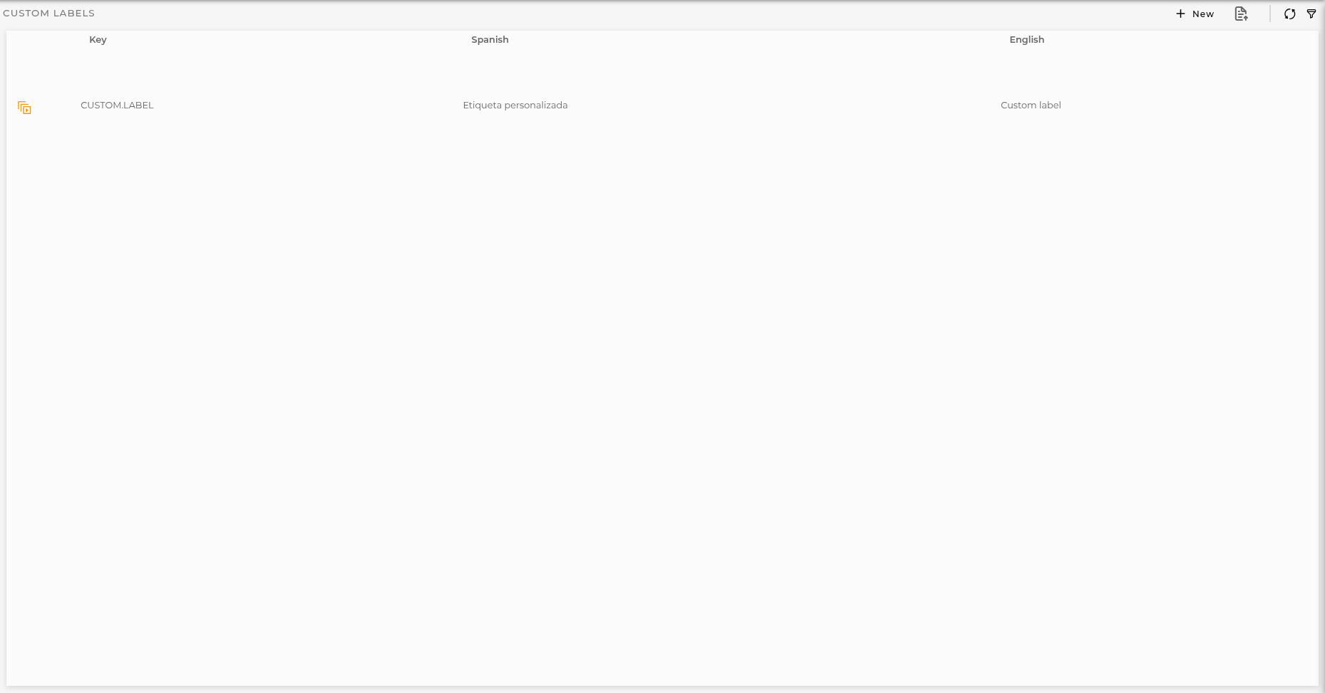
In this section you can customize labels for your organization. This labels can be used for table headers, datastreams, custom sections and as title for widgets, dashboards and workspaces.
Section
Below you can see the list of the configured labels.
Configuration
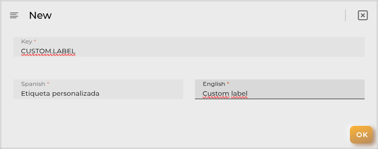
You can add a new custom label by clicking in the + New button:
Custom labels have 3 fields and all of them are required:
Key is the unique identifier for your label
Spanish is the desired translation for this language
English is the desired translation for this language
If you type an existing internal label during the creation Spanish and English fields will be fulfilled with the internal translations. This changes only applies to your organization until you remove the custom label.
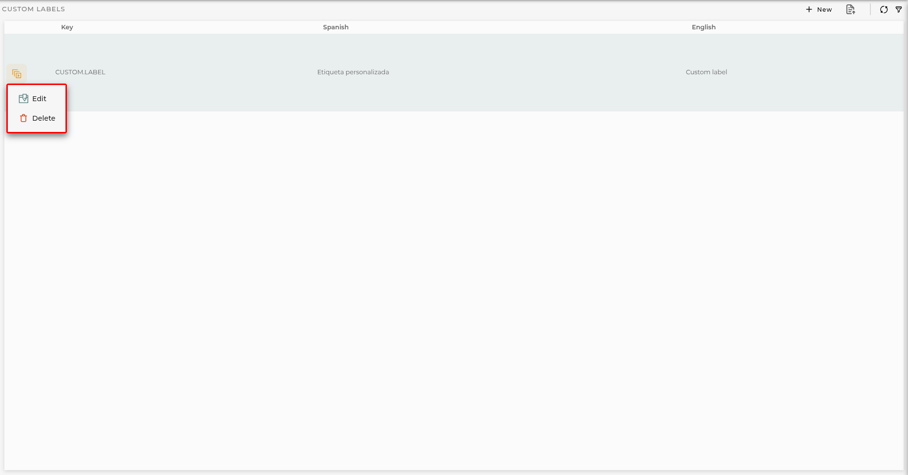
Labels actions
Edit You can update translation for your custom labels and changes will be applied immediately
Delete Also you can remove your custom labels but a browser restart is required. A warning is shown in order to remind you to restart.
Operations Launcher Wizards
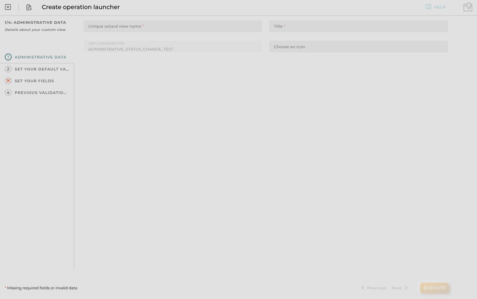
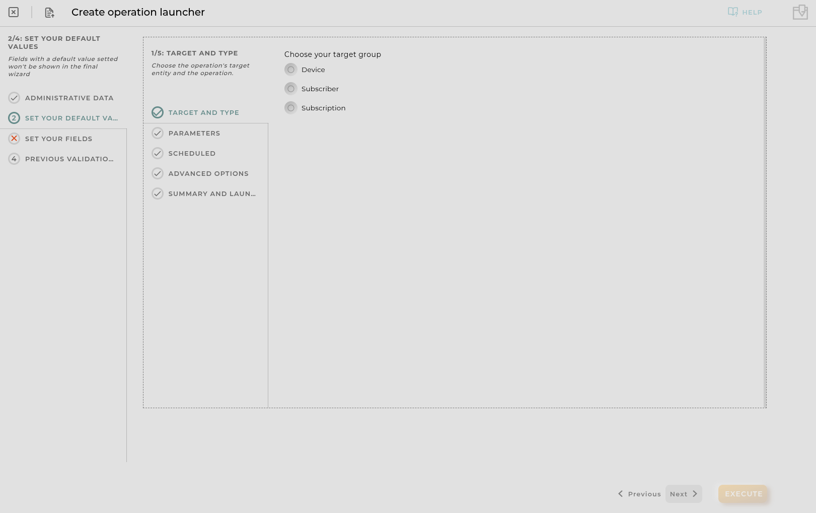
This wizard allows us to manage custom operation launchers for the existing operation types.
Steps
Administrative Data
Principal and administrative data for the Custom Operation View. Title and icon will be the visible parts in menus.
Set Your Default Values
Here you can configure default values for the operation that will be executed within this custom view.
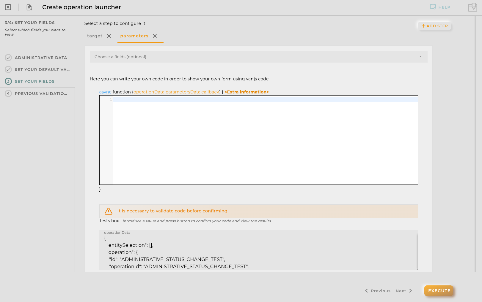
Set Your Fields
Here you can configure visible steps and fields for the operation execution wizard.
Configuring parameters Step
If your operation has parameters you can personalize Parameters Step using your own javascript sniplet with vanjs. Here you can define how the parameters step is displayed and how the data is introduced.
The code is encapsulated in a function that receives as parameters: operationData,parametersData,callback
operationData contains the data of the operation that is being executed in json format.
parametersData is an object that contains the parameters of the operation.
callback is a function that must be called in order to paint the vanjs form created.
Example:
asyncfunction (operationData,parametersData,callback) {
// YOUR CODE HERE
}
Available utils
$api -> use it to create http petitions to OpenGate Api Rest doc
Promise -> allows easy execution of multiple promises
http -> javascript encapsulation of a useFetch (Nuxt 4) instance doc. Returns { data, error, status, refresh, clear } where data and error are reactive Refs.
isFormValid(boolean, parametersValues): use it to (in)validate the form and send the final parameters object
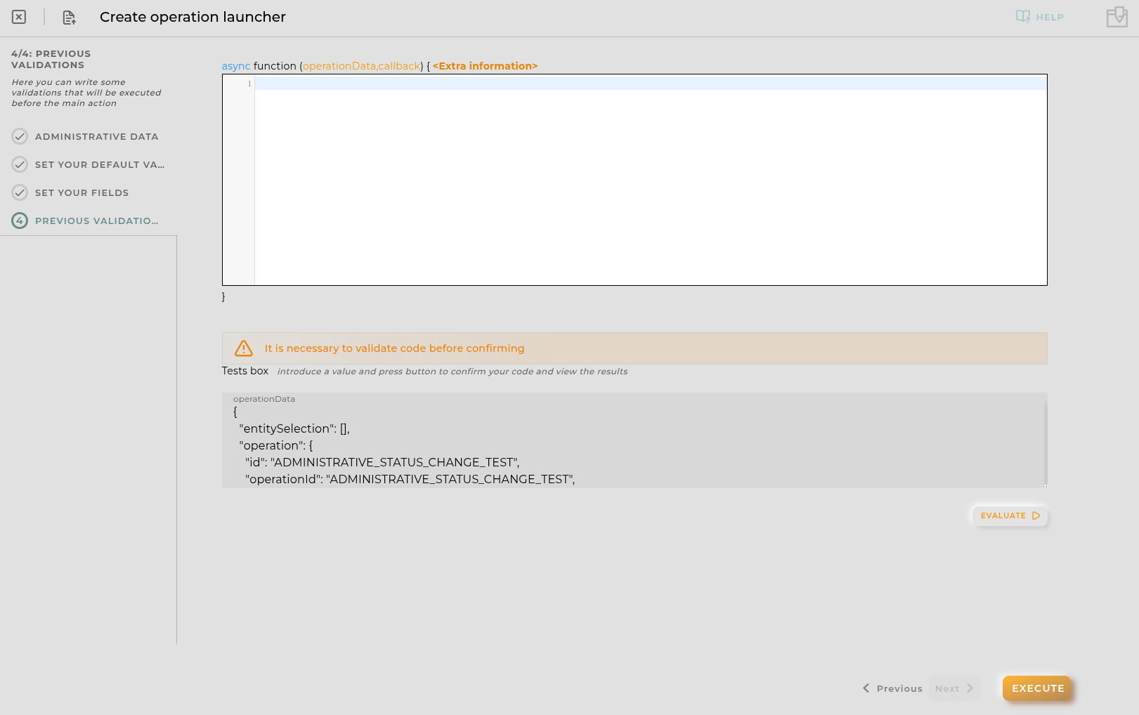
Create validations that will be executed before the execution of the operation.
Callback must be called in order to validate the introduced data:
callback(boolean result, array messages)
result must be true or false in order to determine if continue the execution
messages contains strings to be shown to the execution log
Widgets Defaults
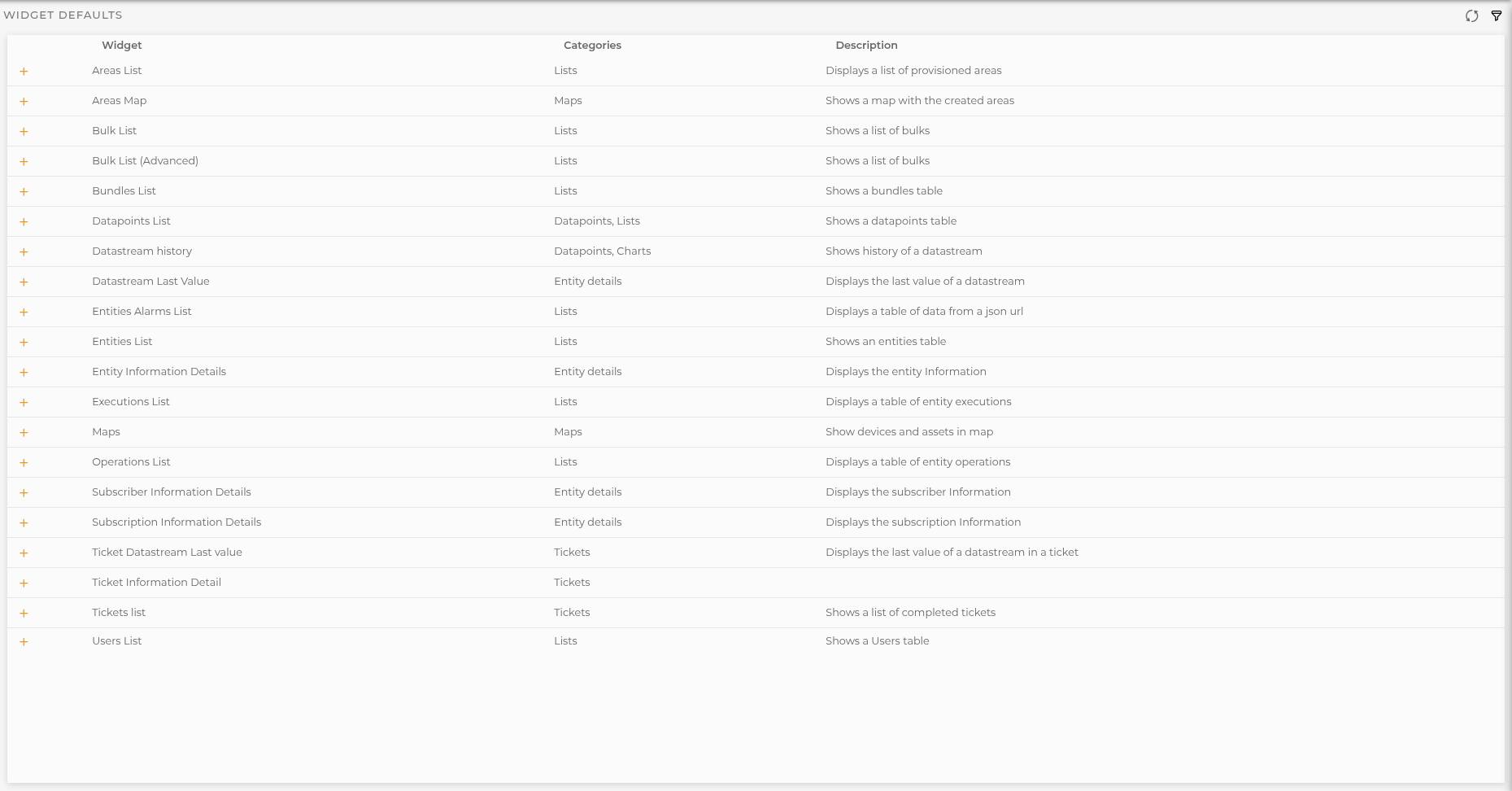
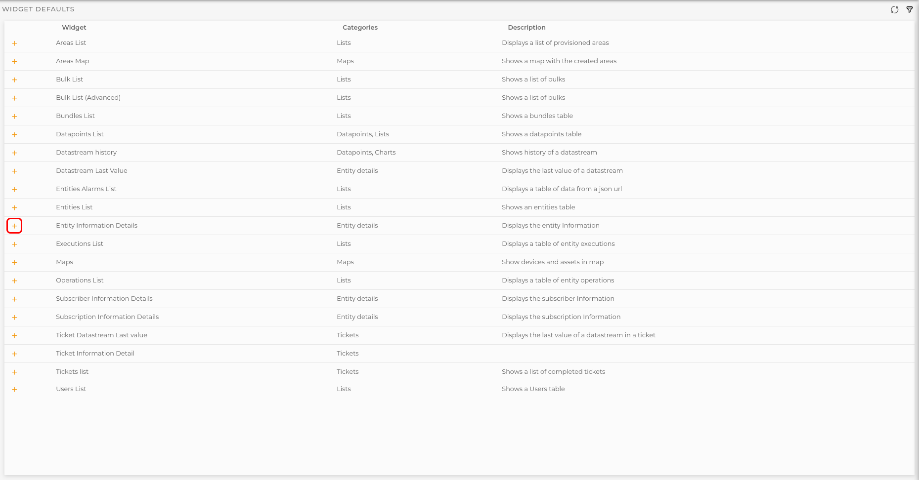
In this configuration section you can configure widgets behaviour when opened from others.
Section
Below you can see the list of the available configurable widgets. List can be filtered by category and/or widget name
You can add, edit and remove the configuration for every available widget in this list.
These configurations will be available for the user organization.
Widget defaults actions
Every listed widget has actions shown below:
New action is shown while no previous configuration saved and allows to configure new defaults for the selected widget
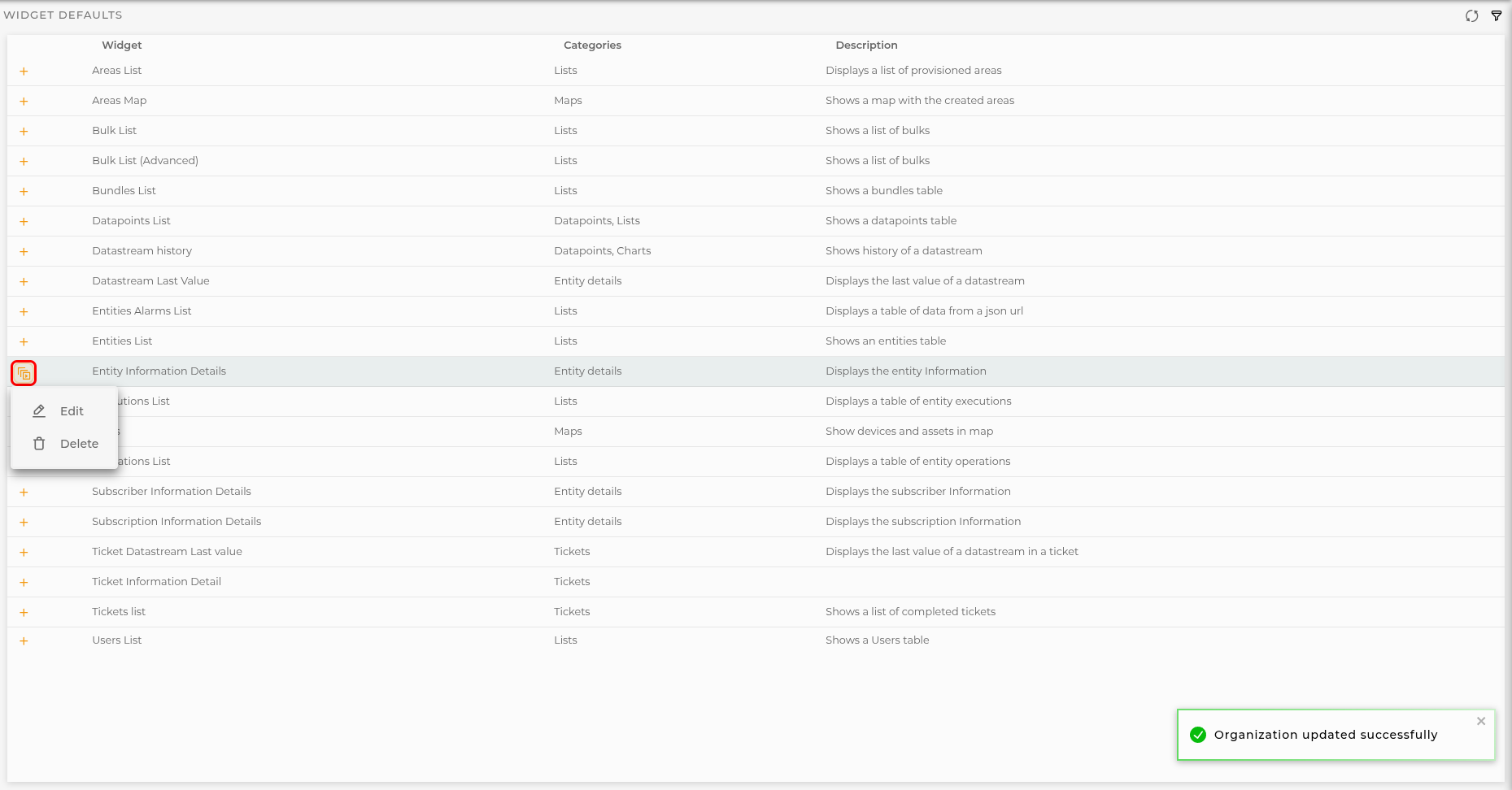
When widget is configured an actions menu will be available with these options:
Edit that allows change previously configured defaults
Delete quits the current configurations once you confirm the operation
Preview and configuration
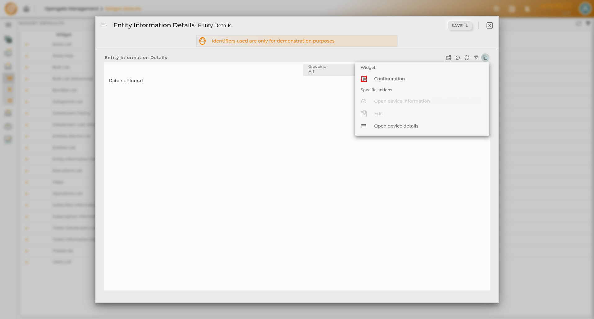
A preview window will be opened were you can see how is opened the selected widget.
From this you can configure as you consider using own widget configuration panel.
Workspaces templates
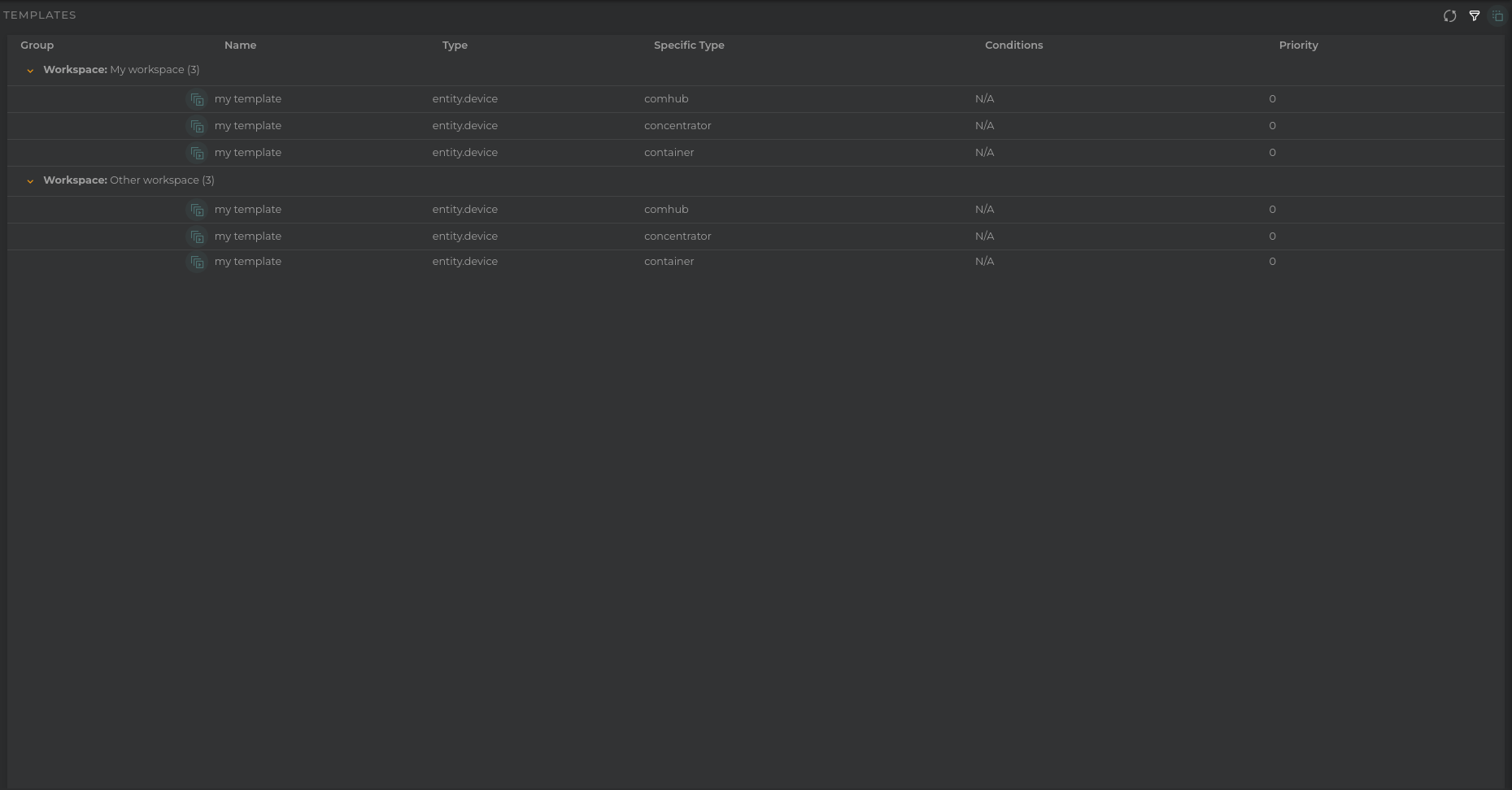
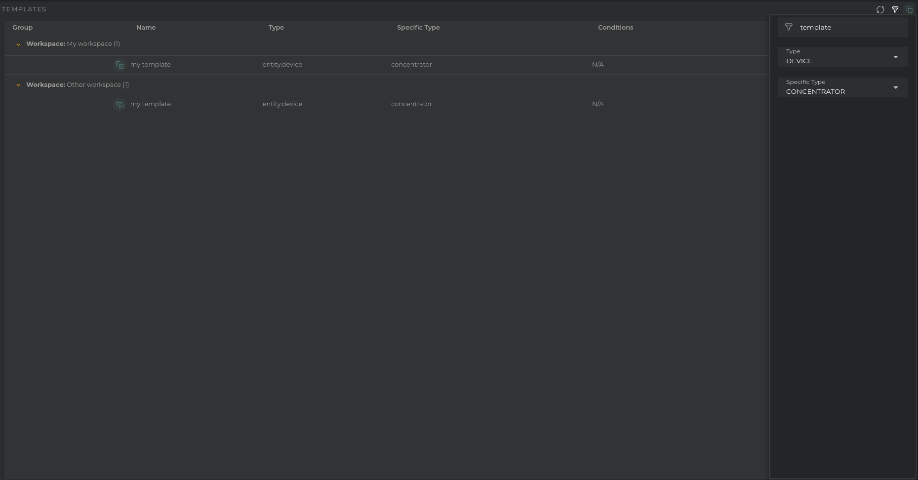
Templates are preconfigured dashboards designed to display relevant information about an entity: device, asset, subscriber, subscription, and tickets.
Here you can find all the preconfigured templates for your account in every workspaces.
Creating a Template
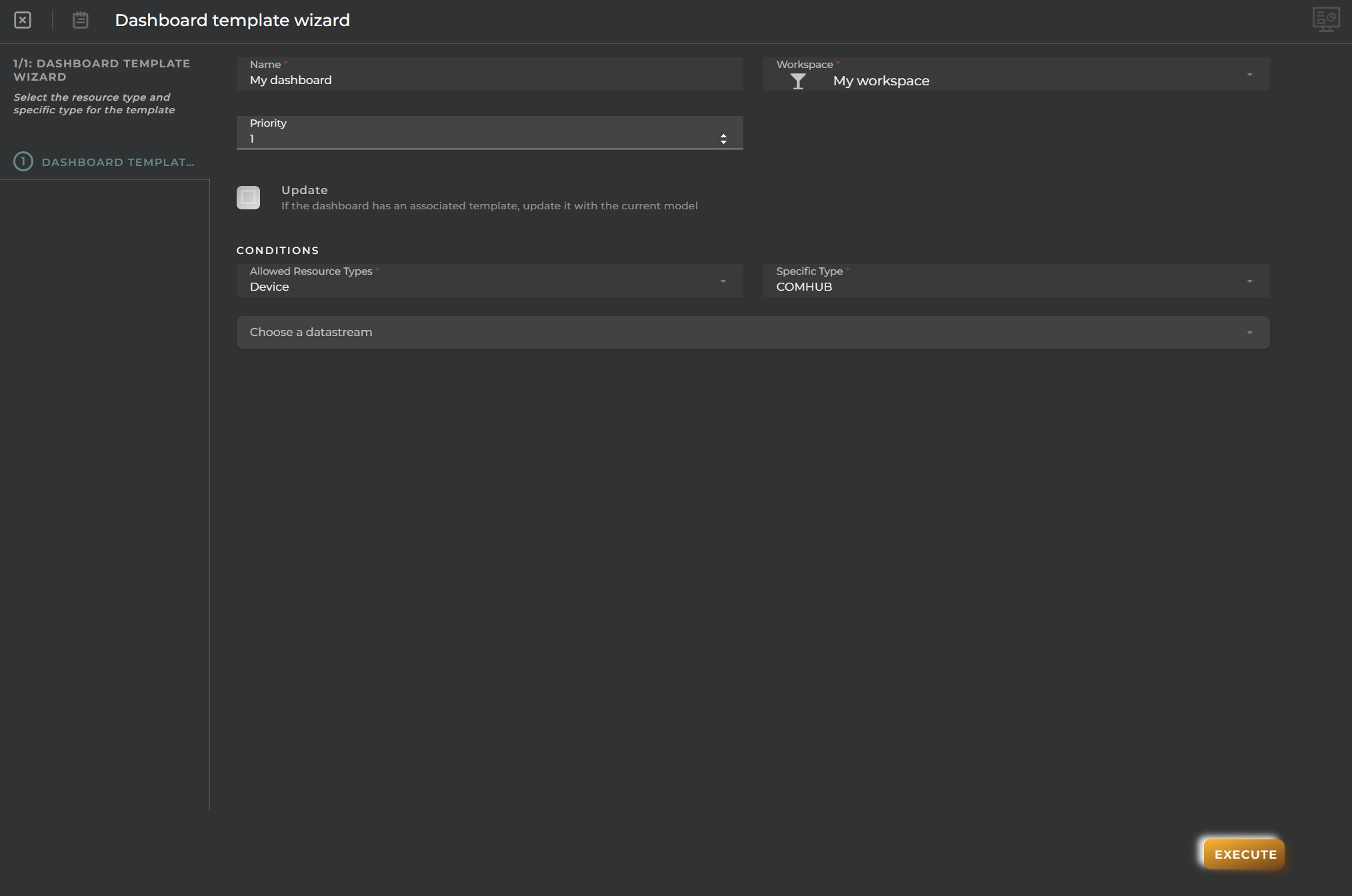
By clicking in the Actions Menu -> Create new template template wizard will be opened to configure your template:
Dashboard: Choose the dashboard for the template.
Workspace: Choose the workspace or workspaces where the template will be saved.
Name: Choose the name for the template.
Priority: Choose the priority for displaying different templates if you configure more than one for the same conditions.
Conditions
Allowed resource type: Choose the type of resource it will open.
Specific type: Choose the specific type or specific types of resource.
You can filter, delete and modify the templates configured for a workspace.
Custom Wizards
Here you can configure custom wizards for creating and provisioning new resources. The list of custom wizards allows you to have an overview of what has been created.
How it works
The custom wizard listing displays the created wizards along with the following information:
Wizard type: The type of the wizard and grouper in the wizard list.
Icon: Icon used to represent the wizard in the wizard list.
Identifier: The identifier of the wizard. Useful for APIs to reference the wizard.
Title: The title of the wizard.
Specific Type: The specific type of the wizard.
Actions on the wizard
For each item in the listing, you can perform the following actions:
Edit opens the wizard’s configuration for modification.
Delete removes the selected wizard.
Execute allows you to execute the wizard and see the results (real execution, not a test).
Wizard types
Currently there are 3 types of wizards:
Provision wizard: Wizard for creating and provisioning new resources as Devices, Assets, Tickets and so on.
Advanced wizard: With this wizard you can create a full customized wizard using VanJS code and you have full control over the wizard interface and logic. This kind of wizard is an option in the Provision Wizard by selecting “Advanced” in “Type” field.
Collection wizard: Here you can create collection wizards for devices using their specific type.
Here you can edit/configure collection wizards for your organization’s website.
Collection Wizard
When editing an item from the listing, you will see the collection wizard with its previously entered data.
Provision Wizard
Here you can view/configure provision wizards for your organization’s website.
Provision Wizard
When editing an item from the listing, you will see the wizard with its previously entered data.
Administrative data step
Here you must define administrative data for the provision wizard. This data will be used to identify the wizard in the system and the kind of resource that will be provisioned with this wizard.
Identifier: Identifies the wizard in the system. Useful when you need to invoke the wizard programmatically.
Title: Title of the wizard. This will be the visible part of the wizard in the system.
Icon: Icon of the wizard. This will be the visible part of the wizard in the system.
Wizard Type: Type of the wizard. This will be the visible part of the wizard in the system.
Specific Type: Specific type of the wizard. This will be the visible part of the wizard in the system.
Fields (tabs) step
Here you can define tabs and fields for the provision wizard. Each tab will be a tab in the wizard and each field will be a field in the tab.
You will find the following type of tabs/steps:
Default tabs: Tabs with predefined fields for the selected resource type (Only when not an Advanced Wizard)
Custom tabs: Tabs with custom fields/form for the selected resource type.
Custom tabs have their own fields:
Name: Name of the tab
Description: Description of the tab
Below you have to select how to configure the layout of the fields within this tab. You have 3 options:
Fields selection: a combo field will be displayed in final wizard with a list of all fields of this specific type. Select the fields you want to display.
Preselected fields: You can preselect some fields with default values. These fields will be displayed in final wizard with the preselected values.
Custom form: A fully customized form using vanjs will be displayed in final wizard. See Custom Form Tab for more information.
Default values step
Here you can define default values for the operation that will be executed within this custom view (Only when not an Advanced Wizard)
Previous validations step
In this step you can write a script to validate the data introduced in the previous steps before the final action is executed.
Note that in Advanced Wizards you have to perform the final action here because there is no default provision action as in other provision wizards.
The code is encapsulated in a function that receives as parameters: entityData, callback
entityData contains the data of the entity in json format. This can contain a fully flattened entity object or a simple key-value object depending on the type of wizard (provisioning or advanced).
callback is a function that must be called in order to validate the introduced data.
Callback must be called in order to validate the introduced data and has these params:
result: (boolean) determines if the execution can continue. If false, the execution will stop and the messages will be shown to the user.
messages: (array) messages to be shown in the execution log.
Example:
asyncfunction (entityData,callback) {
// YOUR CODE HERE WITHOUT FUNCTION DECLARATION
// Example of validation:
letvalidationResult=true;
letmessages= [];
if (entityData["name"] ==="") {
validationResult=false;
messages.push("Name is required");
}
callback(validationResult, messages);
}
Available utils
$api -> use it to create http petitions to OpenGate Api Rest doc
Promise -> allows easy execution of multiple promises
http -> javascript encapsulation of a useFetch (Nuxt 4) instance doc. Returns { data, error, status, refresh, clear } where data and error are reactive Refs.
Post execution step
In this step you can write a script to perform the final action of the wizard after the completion of the previous actions. If previous validations returned false this step would have never been executed.
The code is encapsulated in a function that receives as parameters: entityData, callback
entityData contains the data of the entity in json format.
callback is a function that must be called to indicate the end of the execution.
Callback must be called in order to validate the introduced data and has these params:
result: (boolean) indicates the result of the execution. If false, the execution will be marked as failed and the messages will be shown to the user.
messages: (array) messages to be shown in the execution log.
Example:
asyncfunction (entityData,callback) {
// YOUR CODE HERE WITHOUT FUNCTION DECLARATION
// Example:
letexecutionResult=true;
letmessages= [];
if (entityData["name"] ==="") {
executionResult=false;
messages.push("Name is required");
}
callback(executionResult, messages);
}
Available utils
$api -> use it to create http petitions to OpenGate Api Rest doc
Promise -> allows easy execution of multiple promises
http -> javascript encapsulation of a useFetch (Nuxt 4) instance doc. Returns { data, error, status, refresh, clear } where data and error are reactive Refs.
The code is encapsulated in a function that receives as parameters: entityData, callback
entityData contains the data of the entity in json format.
This can contain a fully flattened entity object or a simple key-value object depending on the type of wizard (provisioning or advanced).
callback is a function that must be called in order to paint the vanjs form created (useful when using promises or async code).
Function must return a vanjs element or a function that returns a vanjs element if no callback is provided.
Example:
asyncfunction (entityData, callback) {
// YOUR CODE HERE WITHOUT FUNCTION DECLARATION
const { div } =van.tags;
returndiv("Hello Form");
}
Available utils
$api -> use it to create http petitions to OpenGate Api Rest doc
Promise -> allows easy execution of multiple promises
http -> javascript encapsulation of a useFetch (Nuxt 4) instance doc. Returns { data, error, status, refresh, clear } where data and error are reactive Refs.
Functions and Variables
onDataUpdate(callback): callback to be called when data is updated from other steps. Callback receives all the data introduced in other steps as parameter.
onStepEnter(callback): callback to be called when entering the step. Use it to control when the step is entered.
setModelData(boolean[, data]): Use it to (in)validate the form and send the data to other tabs.
openWidget -> (widgetId[, entityKey, title, extraConf]) -> Opens the selected widget in a modal panel
openDashboard -> (workspaceId, dashboardId, newPage) -> Opens the selected dashboard in selected workspace
openEntityDashboard -> (entityIdentifier[, organization[user if empty], resourceType[’entity.device’ if empty] , newPage]) -> Opens the entity’s temporary dashboard
openWizard -> (wizardId[, wizardData, isEdit]) -> Opens the selected wizard in a modal panel. A list of available wizards will be available to use directly.
This example demonstrates the basics of a Custom Form Tab with VanJS:
Renders a single required field, a Sampling period selector.
Validates the selection on every change and shows an inline error message while the value is not valid.
Reports the step validity and its data to the wizard with setModelData(isValid, data), so the wizard only lets the user continue once the field is filled in.
Code
// 1. Import only the VanJS tags used below
const { div, span, strong, label, select, option, p } =van.tags;
// 2. Form state
constsamplingPeriod=van.state(0);
consterrorMessage=van.state("The sampling period cannot be 0.");
// 3. Validate the current value and report validity and data to the wizard
functionupdateValidity() {
constvalue= Number(samplingPeriod.val);
if (value===0) {
errorMessage.val="The sampling period cannot be 0.";
setModelData(false);
return;
}
errorMessage.val="";
setModelData(true, { samplingPeriod:value });
}
// 4. Invalidate the step until a valid value is selected
updateValidity();
// 5. Render the component
returndiv({ class:"pa-4 subtitle-2" },
div({ style:"margin-bottom: 2em" },
"Select how often the device must report its measurements. ",
div({ style:"margin-top: 0.5em" },
"Fields marked with ", span({ style:"color: red" }, "*"), " are mandatory." )
),
van.tags.form({ },
div({ style:"margin-bottom: 1em;" },
label({ for:"samplingPeriod", style:"display: block; font-weight: bold; margin-bottom: 0.5em;" },
"Sampling period (minutes) ", span({ style:"color: red" }, "*")
),
select({
id:"samplingPeriod",
value:samplingPeriod,
onchange: (e) => {
samplingPeriod.val=e.target.value;
updateValidity();
},
style:"padding: 0.5em; width: 100%; max-width: 200px; display: block;" },
option({ value:0 }, "0 (not set)"),
option({ value:5 }, "5"),
option({ value:15 }, "15"),
option({ value:60 }, "60")
),
p({ style:"font-size: 0.9em; margin-top: 0.5em; color: #555;" },
strong("NOTE"), ": the shorter the period, the faster the device drains its battery." )
),
() => errorMessage.val?p({ style:"color: red; font-weight: bold;" }, errorMessage.val) :null )
);
Example 2
Description
This example demonstrates how to build a Custom Form Tab with VanJS that:
Fetch data from an external API (randomuser.me) using the platform’s http utility (Nuxt 4 useFetch instance).
Automatically refresh users whenever the tab is entered or refreshed by utilizing the onStepEnter hook, without requiring a manual reload button.
Correctly build and populate the <select> dropdown elements using VanJS (...userOptions), avoiding invalid array returns from reactive binding functions.
Paint the VanJS form exclusively when refreshing/loading users by calling callback(formElement) within the refresh routine and never before.
Pass the selected user’s full name to subsequent wizard tabs using setModelData(true, { userName: ... }).
Invalidate the step (setModelData(false)) until a user is explicitly selected.
Code
// 1. Import only the VanJS tags used below
const { div, span, label, select, option, img, p } =van.tags;
// 2. Reusable inline styles
conststyles= {
container:"padding: 1rem; font-family: system-ui, -apple-system, sans-serif; color: #1e293b; max-width: 580px;",
header:"margin-bottom: 1.25rem;",
title:"font-size: 1.1rem; font-weight: 600; margin: 0 0 0.25rem 0; color: #0f172a;",
subtitle:"color: #64748b; font-size: 0.85rem; margin: 0;",
select:"width: 100%; padding: 0.5rem 0.75rem; border: 1px solid #cbd5e1; border-radius: 6px; font-size: 0.875rem; background-color: white; color: #1e293b; box-sizing: border-box;",
userCard:"margin-top: 1rem; padding: 1rem; border: 1px solid #e2e8f0; border-radius: 8px; background-color: #f8fafc; display: flex; gap: 1rem; align-items: center;",
avatar:"width: 56px; height: 56px; border-radius: 50%; border: 2px solid #3b82f6; object-fit: cover;",
userInfo:"flex: 1; min-width: 0;",
userName:"font-weight: 600; font-size: 0.95rem; color: #0f172a; margin: 0 0 0.2rem 0;",
userDetail:"font-size: 0.8rem; color: #64748b; margin: 0;",
successBadge:"display: inline-block; margin-top: 0.35rem; padding: 0.2rem 0.5rem; background-color: #dcfce7; color: #166534; font-size: 0.75rem; font-weight: 600; border-radius: 4px;",
errorText:"color: #dc2626; font-size: 0.85rem; margin-top: 0.5rem;"};
// 3. VanJS reactive state
constusersList=van.state([]);
constselectedUserId=van.state("");
constselectedUser=van.state(null);
letisFetching=false;
// 4. Invalidate the step until a user is selected
setModelData(false);
// 5. User selection handler
functiononUserSelected(uuid) {
selectedUserId.val=uuid;
constuser=usersList.val.find((u) => {
returnu.login.uuid===uuid;
});
if (user) {
selectedUser.val=user;
constfullName=`${user.name.first}${user.name.last}`;
// Store the selected name and data for the other tabs
setModelData(true, {
userName:fullName,
userEmail:user.email,
userCity:user.location?.city,
userAvatar:user.picture?.medium });
} else {
selectedUser.val=null;
setModelData(false);
}
}
// 6. Build the VanJS component with the select options already resolved
functionbuildForm() {
constuserOptions=usersList.val.map((u) => {
returnoption(
{ value:u.login.uuid },
`${u.name.first}${u.name.last} (${u.email})` );
});
returndiv({ style:styles.container },
// Header
div({ style:styles.header },
p({ style:styles.title }, "Responsible User Selection"),
p({ style:styles.subtitle },
"Fetches users from an external service to pass the selected name as a parameter to the following steps." )
),
// User selector
div(
label({ style:"display: block; font-weight: 600; font-size: 0.85rem; margin-bottom: 0.35rem; color: #334155;" },
"User ",
span({ style:"color: #dc2626;" }, "*")
),
select({
style:styles.select,
value:selectedUserId,
onchange: (e) => {
onUserSelected(e.target.value);
}
},
option({ value:"" }, "-- Select a user --"),
...userOptions )
),
// Preview card for the selected user
() => {
if (!selectedUser.val) {
returnnull;
}
constu=selectedUser.val;
constfullName=`${u.name.first}${u.name.last}`;
returndiv({ style:styles.userCard },
img({
src:u.picture?.medium||u.picture?.thumbnail,
alt:fullName,
style:styles.avatar }),
div({ style:styles.userInfo },
p({ style:styles.userName }, fullName),
p({ style:styles.userDetail }, `✉ ${u.email}`),
p({ style:styles.userDetail }, `📍 ${u.location?.city}, ${u.location?.country}`),
span({ style:styles.successBadge }, "✓ Parameter 'userName' stored for the other tabs")
)
);
}
);
}
// 7. Fetch the users and paint the component through the callback
asyncfunctionrefreshUsers() {
if (isFetching) {
return;
}
isFetching=true;
selectedUserId.val="";
selectedUser.val=null;
setModelData(false);
try {
// Request through the 'http' utility (a Nuxt 4 useFetch instance)
const { data, error } =awaithttp("https://randomuser.me/api/?results=8");
if (error&&error.value) {
thrownew Error(error.value.message||"Could not fetch the users");
}
constpayload=data&&data.value?data.value:data;
if (payload&& Array.isArray(payload.results)) {
usersList.val=payload.results;
} else {
usersList.val= [];
}
// Call the callback only once the user refresh has completed
callback(buildForm());
} catch (err) {
console.error("Error refreshing the users:", err);
consterrorView=div({ style:styles.container },
p({ style:styles.errorText }, `The users could not be loaded: ${err.message||err}`)
);
callback(errorView);
} finally {
isFetching=false;
}
}
// 8. Refresh the users automatically when the wizard tab is entered or refreshed
onStepEnter(() => {
refreshUsers();
});
Example 4
Description
This example demonstrates how to:
Fetch data from an external API (randomuser.me) using the platform’s http utility (Nuxt 4 useFetch instance).
Render an interactive data <table> with VanJS displaying user details (photo, name, email, location) with clickable, highlightable rows.
Automatically refresh users whenever the tab is entered or refreshed using the onStepEnter hook.
Paint the VanJS form exclusively when refreshing/loading users by calling callback(formElement) within the refresh routine and never before.
Pass the selected user’s full name to subsequent wizard tabs using setModelData(true, { userName: ... }).
Invalidate the step (setModelData(false)) until a user is explicitly selected.
Code
// 1. Import only the VanJS tags used below
const { div, span, table, thead, tbody, tr, th, td, img, p } =van.tags;
// 2. Reusable inline styles
conststyles= {
container:"padding: 1rem; font-family: system-ui, -apple-system, sans-serif; color: #1e293b; max-width: 680px;",
header:"margin-bottom: 1rem;",
title:"font-size: 1.1rem; font-weight: 600; margin: 0 0 0.25rem 0; color: #0f172a;",
subtitle:"color: #64748b; font-size: 0.85rem; margin: 0;",
table:"width: 100%; border-collapse: collapse; font-size: 0.85rem; margin-top: 0.75rem; border: 1px solid #e2e8f0; border-radius: 6px; overflow: hidden;",
th:"background-color: #f1f5f9; color: #475569; font-weight: 600; text-align: left; padding: 0.6rem 0.75rem; border-bottom: 1px solid #cbd5e1;",
row:"cursor: pointer; transition: background-color 0.15s ease; border-bottom: 1px solid #f1f5f9; background-color: white;",
selectedRow:"cursor: pointer; transition: background-color 0.15s ease; border-bottom: 1px solid #93c5fd; background-color: #eff6ff;",
td:"padding: 0.5rem 0.75rem; vertical-align: middle;",
tableAvatar:"width: 32px; height: 32px; border-radius: 50%; object-fit: cover; display: block;",
userCard:"margin-top: 1.25rem; padding: 1rem; border: 1px solid #bfdbfe; border-radius: 8px; background-color: #f0f9ff; display: flex; gap: 1rem; align-items: center;",
cardAvatar:"width: 52px; height: 52px; border-radius: 50%; border: 2px solid #3b82f6; object-fit: cover;",
userInfo:"flex: 1; min-width: 0;",
userName:"font-weight: 600; font-size: 0.95rem; color: #0f172a; margin: 0 0 0.2rem 0;",
userDetail:"font-size: 0.8rem; color: #64748b; margin: 0;",
successBadge:"display: inline-block; margin-top: 0.35rem; padding: 0.2rem 0.5rem; background-color: #dcfce7; color: #166534; font-size: 0.75rem; font-weight: 600; border-radius: 4px;",
errorText:"color: #dc2626; font-size: 0.85rem; margin-top: 0.5rem;"};
// 3. VanJS reactive state
constusersList=van.state([]);
constselectedUserId=van.state("");
constselectedUser=van.state(null);
letisFetching=false;
// 4. Invalidate the step until a user is selected
setModelData(false);
// 5. User selection handler, triggered by clicking a row
functiononUserSelected(uuid) {
selectedUserId.val=uuid;
constuser=usersList.val.find((u) => {
returnu.login.uuid===uuid;
});
if (user) {
selectedUser.val=user;
constfullName=`${user.name.first}${user.name.last}`;
// Store the selected name and data for the other tabs
setModelData(true, {
userName:fullName,
userEmail:user.email,
userCity:user.location?.city,
userAvatar:user.picture?.medium });
} else {
selectedUser.val=null;
setModelData(false);
}
}
// 6. Build the component with an interactive table
functionbuildForm() {
constrows=usersList.val.map((u) => {
constfullName=`${u.name.first}${u.name.last}`;
returntr({
style: () => {
if (selectedUserId.val===u.login.uuid) {
returnstyles.selectedRow;
}
returnstyles.row;
},
onclick: () => {
onUserSelected(u.login.uuid);
}
},
td({ style:styles.td },
img({
src:u.picture?.thumbnail,
alt:fullName,
style:styles.tableAvatar })
),
td({ style:styles.td }, fullName),
td({ style:styles.td }, u.email),
td({ style:styles.td }, `${u.location?.city}, ${u.location?.country}`)
);
});
returndiv({ style:styles.container },
// Header
div({ style:styles.header },
p({ style:styles.title }, "Responsible User Selection"),
p({ style:styles.subtitle },
"Click a table row to select the responsible user. Fields marked with ",
span({ style:"color: #dc2626;" }, "*"),
" are mandatory." )
),
// Users table
table({ style:styles.table },
thead(
tr(
th({ style:styles.th }, "Photo"),
th({ style:styles.th }, "Name"),
th({ style:styles.th }, "Email"),
th({ style:styles.th }, "Location")
)
),
tbody(...rows)
),
// Confirmation card for the selected user
() => {
if (!selectedUser.val) {
returnnull;
}
constu=selectedUser.val;
constfullName=`${u.name.first}${u.name.last}`;
returndiv({ style:styles.userCard },
img({
src:u.picture?.medium||u.picture?.thumbnail,
alt:fullName,
style:styles.cardAvatar }),
div({ style:styles.userInfo },
p({ style:styles.userName }, fullName),
p({ style:styles.userDetail }, `✉ ${u.email}`),
p({ style:styles.userDetail }, `📍 ${u.location?.city}, ${u.location?.country}`),
span({ style:styles.successBadge }, "✓ Parameter 'userName' stored for the other tabs")
)
);
}
);
}
// 7. Fetch the users and paint the component through the callback
asyncfunctionrefreshUsers() {
if (isFetching) {
return;
}
isFetching=true;
selectedUserId.val="";
selectedUser.val=null;
setModelData(false);
try {
// Request through the 'http' utility (a Nuxt 4 useFetch instance)
const { data, error } =awaithttp("https://randomuser.me/api/?results=8");
if (error&&error.value) {
thrownew Error(error.value.message||"Could not fetch the users");
}
constpayload=data&&data.value?data.value:data;
if (payload&& Array.isArray(payload.results)) {
usersList.val=payload.results;
} else {
usersList.val= [];
}
// Call the callback only once the user refresh has completed
callback(buildForm());
} catch (err) {
console.error("Error refreshing the users:", err);
consterrorView=div({ style:styles.container },
p({ style:styles.errorText }, `The users could not be loaded: ${err.message||err}`)
);
callback(errorView);
} finally {
isFetching=false;
}
}
// 8. Refresh the users automatically when the wizard tab is entered or refreshed
onStepEnter(() => {
refreshUsers();
});
Example 5
Description
This example demonstrates how to build a summary or review step that:
Tracks data updates across the wizard using onDataUpdate.
Avoids granular reactivity issues by repainting the entire form on demand when selecting/entering the tab via onStepEnter and callback(buildForm(currentData)).
Recursively parses objects, arrays, and primitive values into a collapsible VanJS tree structure using native <details> and <summary> elements.
Highlights different data types (strings, numbers, booleans, objects, arrays, and null/undefined) with distinct typography and colors.
Keeps the step valid using setModelData(true).
Code
// 1. Import only the VanJS tags used below
const { div, span, strong, p, details, summary, ul, li } =van.tags;
// 2. Reusable inline styles
conststyles= {
container:"padding: 1rem; font-family: system-ui, -apple-system, sans-serif; color: #1e293b; max-width: 720px;",
header:"margin-bottom: 1.25rem;",
title:"font-size: 1.1rem; font-weight: 600; margin: 0 0 0.25rem 0; color: #0f172a;",
subtitle:"color: #64748b; font-size: 0.85rem; margin: 0;",
treeBox:"background-color: #f8fafc; border: 1px solid #e2e8f0; border-radius: 8px; padding: 1rem; font-family: ui-monospace, SFMono-Regular, Menlo, Monaco, Consolas, monospace; font-size: 0.85rem; overflow-x: auto;",
details:"margin-left: 0.5rem; margin-top: 0.25rem;",
summary:"cursor: pointer; user-select: none; font-weight: 600; color: #2563eb; padding: 0.15rem 0;",
badge:"font-size: 0.75rem; color: #64748b; font-weight: normal; margin-left: 0.35rem;",
list:"list-style: none; margin: 0.2rem 0 0.2rem 0.5rem; padding-left: 0.75rem; border-left: 1px dashed #cbd5e1;",
item:"margin: 0.25rem 0;",
key:"color: #0f172a; font-weight: 600;",
strVal:"color: #166534;",
numVal:"color: #2563eb;",
boolVal:"color: #7c3aed;",
nullVal:"color: #94a3b8; font-style: italic;",
emptyText:"color: #94a3b8; font-style: italic; margin: 0;"};
// 3. Latest data accumulated by the wizard
letcurrentData=entityData|| {};
// 4. Mark the step as valid, since this is a read-only summary view
setModelData(true);
// 5. Listen for and store the updates coming from the other wizard steps
onDataUpdate((updatedData) => {
currentData=updatedData|| {};
});
// 6. Helpers to format primitive values
functionrenderPrimitive(val) {
if (val===null) {
returnspan({ style:styles.nullVal }, "null");
}
if (val===undefined) {
returnspan({ style:styles.nullVal }, "undefined");
}
if (typeofval==="string") {
returnspan({ style:styles.strVal }, `"${val}"`);
}
if (typeofval==="number") {
returnspan({ style:styles.numVal }, String(val));
}
if (typeofval==="boolean") {
returnspan({ style:styles.boolVal }, String(val));
}
returnspan(String(val));
}
// 7. Static recursive rendering as a tree
functionrenderTree(data) {
if (!data||typeofdata!=="object"|| Object.keys(data).length===0) {
returnp({ style:styles.emptyText }, "No data has been entered yet.");
}
constkeys= Object.keys(data);
constchildItems=keys.map((k) => {
constitemVal=data[k];
if (itemVal!==null&&typeofitemVal==="object") {
constisArray= Array.isArray(itemVal);
constcount= Object.keys(itemVal).length;
constbadgeLabel=isArray?`[${count} items]`:`{${count} fields}`;
returnli({ style:styles.item },
details({ style:styles.details, open:true },
summary({ style:styles.summary },
span({ style:styles.key }, k),
span({ style:styles.badge }, badgeLabel)
),
renderTree(itemVal)
)
);
}
returnli({ style:styles.item },
span({ style:styles.key }, `${k}: `),
renderPrimitive(itemVal)
);
});
returnul({ style:styles.list }, ...childItems);
}
// 8. Build the component with the current data
functionbuildForm(data) {
returndiv({ style:styles.container },
div({ style:styles.header },
p({ style:styles.title },
strong("Wizard Data Tree")
),
p({ style:styles.subtitle },
"Hierarchical structure of every parameter entered in the wizard so far." )
),
div({ style:styles.treeBox },
renderTree(data)
)
);
}
// 9. Repaint the form only when the tab is entered or selected
onStepEnter(() => {
setModelData(true);
callback(buildForm(currentData));
});
// 10. Initial paint
callback(buildForm(currentData));
Organization Files
From here, you can manage the files uploaded to the private storage of the organization.
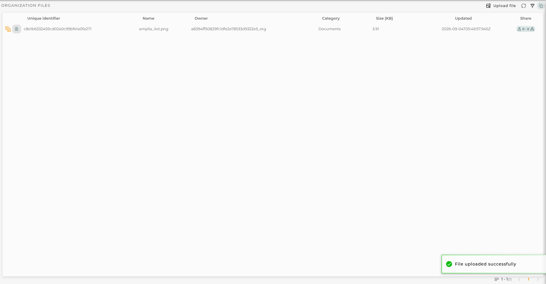
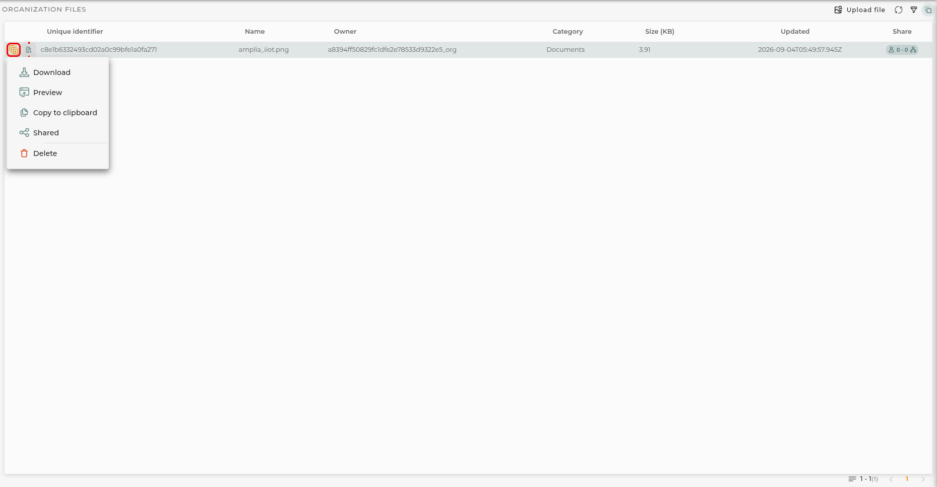
The file listing displays information for each of the stored files.
Files are grouped into 6 categories, which help the user identify the type of files and where they can be used. These categories are as follows:
BIM/IFC files in this category contain 3D models compatible with the BIM/IFC standard and are ready to be used in the corresponding widget (will be converted into fragments files when uploaded).
FRAG fragments files for the Advanced BIM widget to create an own BIM model with no need of external sources.
SVG vector files that can be used in image widgets or any configuration that allows image import.
Image image files that can be used in image widgets or in any configuration that allows image import.
Documents any type of documentation files can be placed here, especially to be used in iframe widgets and to be displayed.
JSON plain JSON files. These files are not processed by the platform in any way.
The following information is shown in the listing:
Unique Identifier the unique identifier of the file.
Name the name of the file.
Owner the organization where this file is located.
Category indicates the category where the file is placed.
Size (KB) the size of the file in kilobytes.
Updated date and time of the last file update.
Shared displays the number of users and organizations the file is shared with.
Uploading a file
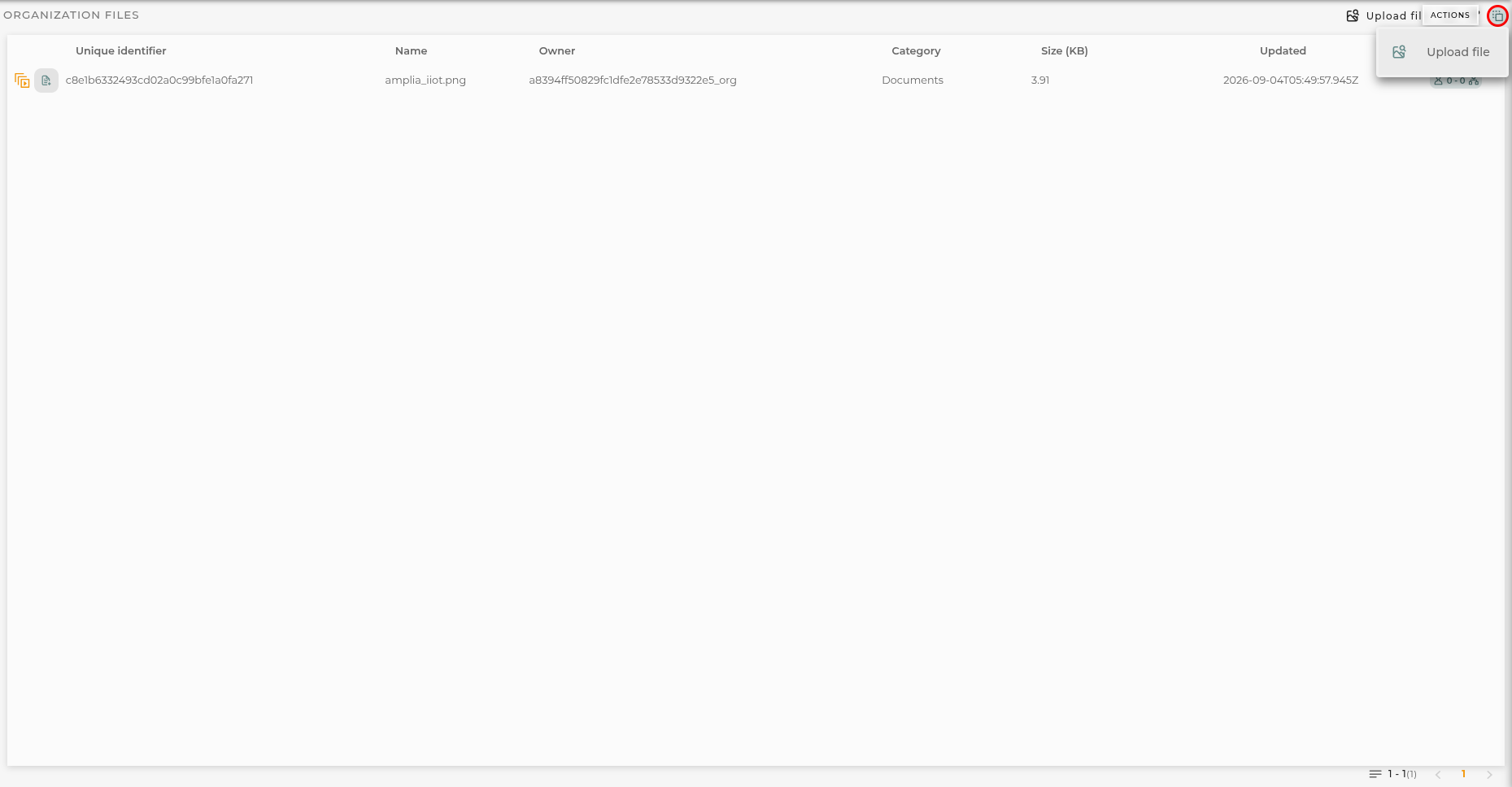
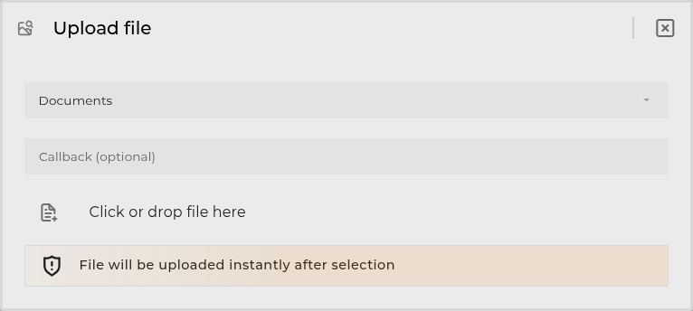
First, it is necessary to click on the “Upload File” button in the navigation bar. This will open the file selection dialog.
Here you must select the category for the file to upload. Once selected, you can enter a callback URL to be invoked once the file is uploaded. Finally, you must click on the “Click or drop file here” button to select the file to upload.
The callback URL is invoked with a POST request carrying the following body:
For each item in the listing, the following actions can be performed:
Download opens the file for downloading.
Copy to Clipboard copies the unique URL of the file for use on the platform.
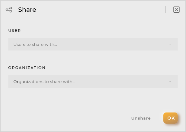
Share allows viewing and sharing the script for other users to use.
Choose File to Upload allows updating the uploaded file with another. This does not affect the generated link, so the change will be reflected wherever it was being used.
Delete removes the selected file.
Navigation Bar and Filters
In the navigation bar, the following actions can be performed:
Upload File opens the file selection dialog.
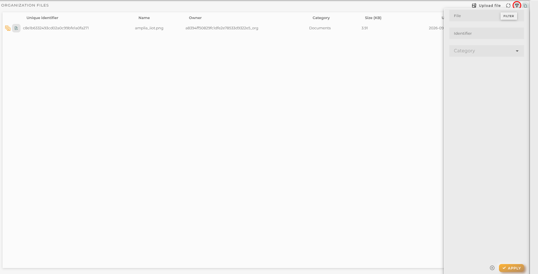
Filters allows applying a filter on the listing.
You can use these filters:
Name filters by file name (like search).
Identifier filters by file identifier (like search).
Category filters by file category (list of predefined options).
List can be sorted by clicking on the column headers. Default sort is by last updated date, descending.
Scripts Formatters
From here, you can manage the formatting scripts saved by the widgets.
How it Works
The list of scripts displays the necessary information to locate where it is used and for what purpose. The following information is detailed:
Name identifier of the script
Version a number identifying the versioning
Description descriptive text of what the script does
Widget type of widget compatible with this script
Expanding the row reveals in which dashboards, and by which users, the said script is being used.
Actions on Scripts
For each item on the list, the following actions can be performed:
Share allows viewing and sharing the script for use by other users on their dashboards
Edit opens the script’s editing form for modification
Delete removes the selected script
Navigation Bar
In the navigation bar, the following actions can be performed:
Search allows applying a filter to the list
Refresh refreshes the content of the list
Web Areas & Sections
From here, you can add new areas and sections to your left panel sections menu for the organization.
How it Works
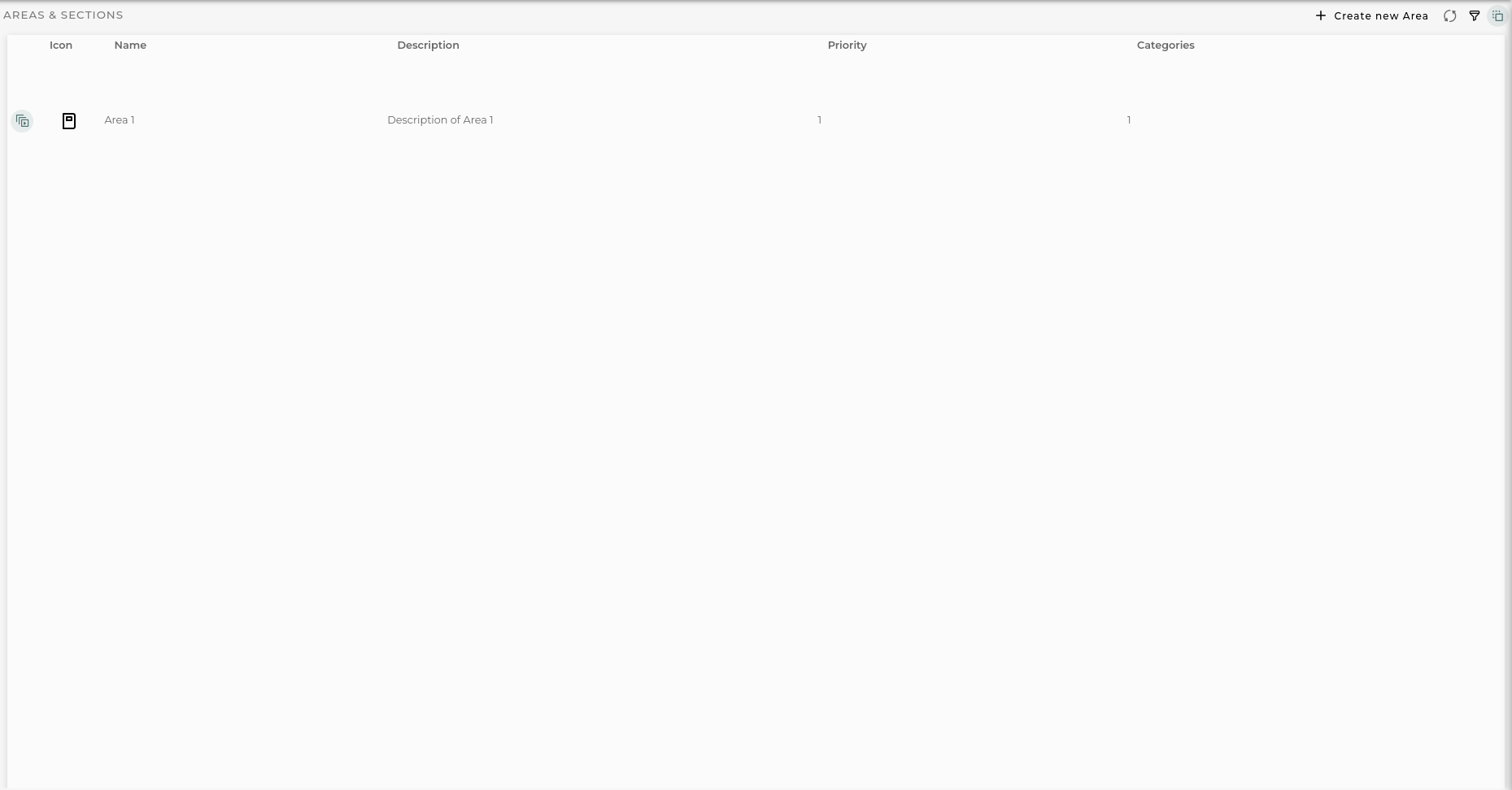
Web Sections list displays information of custom configured areas in domain.
The following information is shown in the list:
Icon representative icon for the area in menu.
Name the name displayed in menu.
Description the description for the area.
Priority the display priority for the area when displayed in menu.
Categories show total categories availables area.
Web Section Actions
For each item in the list, the following actions can be performed:
Edit opens the Areas & Sections wizard in order to manage selected option.
Delete removes the selected area and all its contents.
Navigation Bar
In the navigation bar, the following actions can be performed:
Filter allows filtering of areas by name.
Create new area opens Areas & Sections wizard in order to create a new one.
Configuring a section
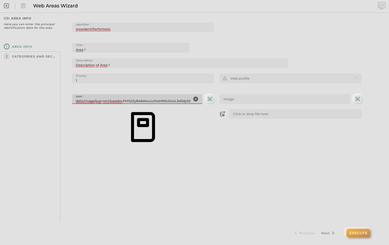
When you opened the section wizard you can see the area information step.
Area Information Step
Here you can configure the next information about the area:
Identifier unique identifier for the area (autogenerated but modifiable).
Title the name displayed in menu.
Description the description for the area.
Priority the display priority for the area when displayed in menu.
Web profile manages who can view this area in menu. If no one is seleted everyone can see it.
Icon representative icon for the area in menu.
Image background image for the area in the its home page.
Categories and Sections Step
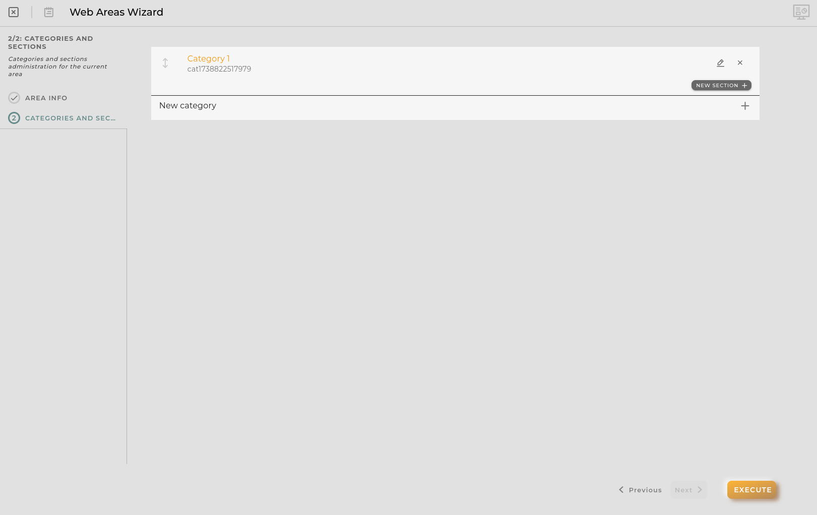
Once you complete the required fields in previous step you can continue to this step.
Here you can see current provisioned categories and sections for the area and manage categories order.
Also you can add new categories by pressing New Category or new sections for each category by pressing the conventient New section button.
Categories can be created, edited or deleted. Also you can manage sections from this panel.
Category modal
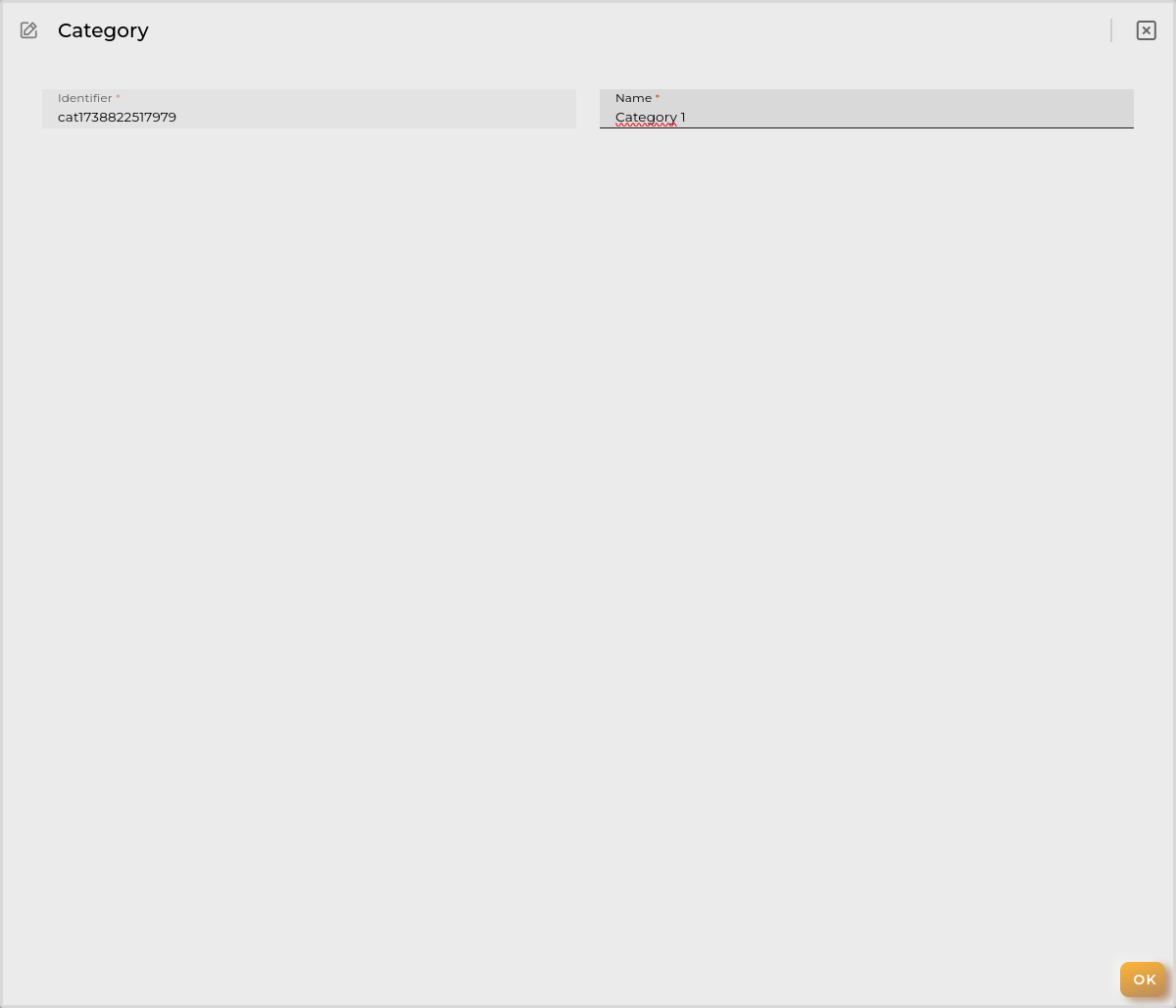
A category is the sections grouper in left menu once you opened Area menu. Every category has their own sections.
You can configure the next in a category:
Identifier unique identifier for the category (autogenerated but modifiable).
Name the name displayed in menu.
If sections available in category you can manage the display order by dragging then.
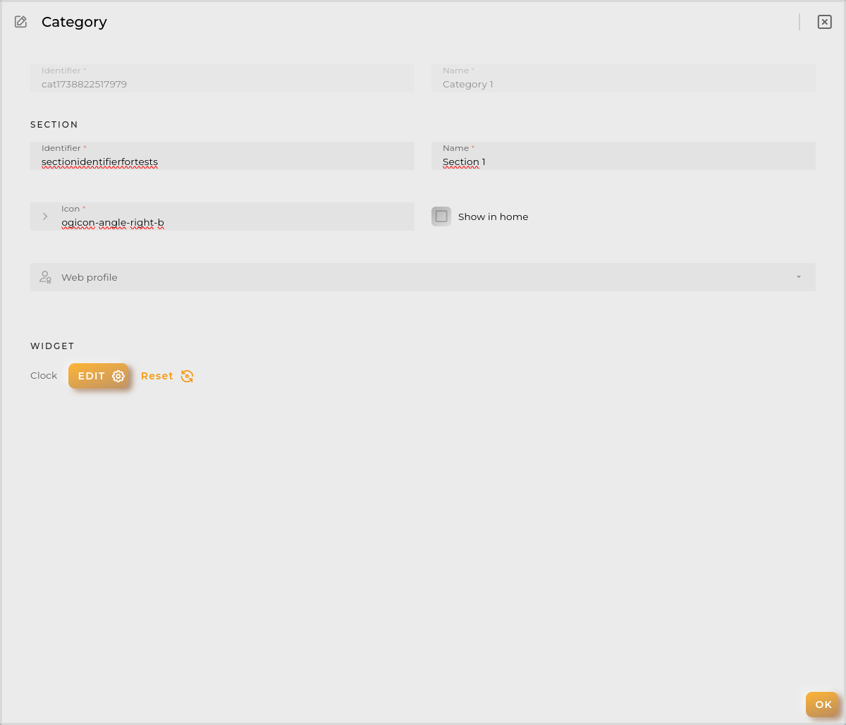
Section modal
Section represents the final menu leaf and the opened window.
You can configure the next in a section:
Identifier unique identifier for the section (autogenerated but modifiable).
Name the name displayed in menu.
Icon the icon that identify the section.
Show in home makes the sections appear at area’s home.
Web profile manages who can view this section in menu. If no one is seleted everyone can see it.
Widget is the preconfigured widget to be shown in section.
Web Permissions
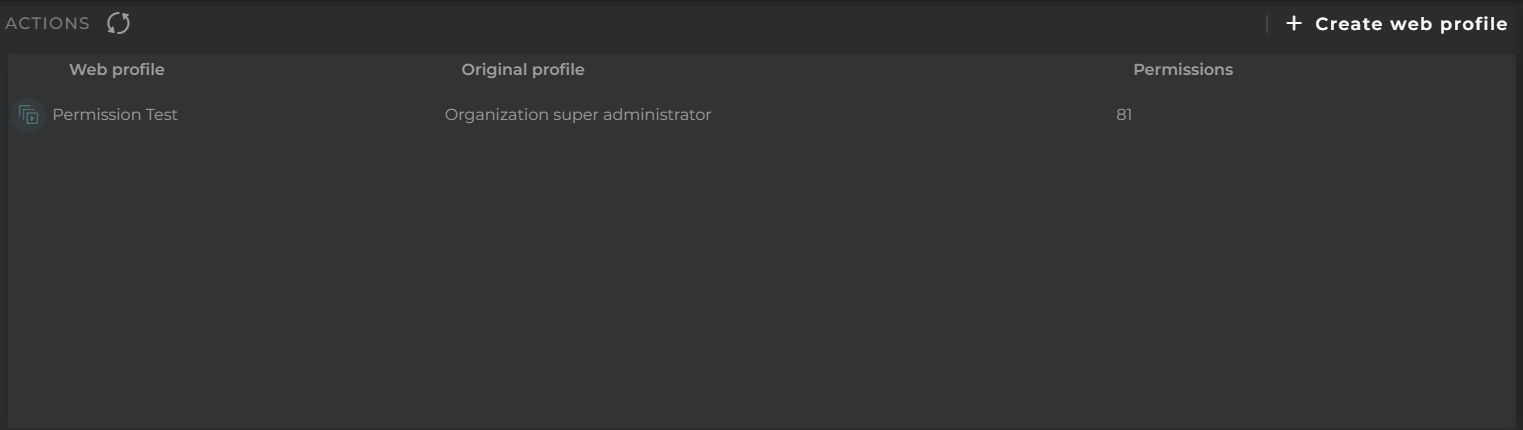
Here you can view/configure new roles for your organization’s web based on OpenGate’s original profiles.
How it Works
The list of roles shows the name of the role and the OpenGate profile on which it is based.
This means that a user will have the OpenGate profile as a base, but some functionalities will be limited on the web.
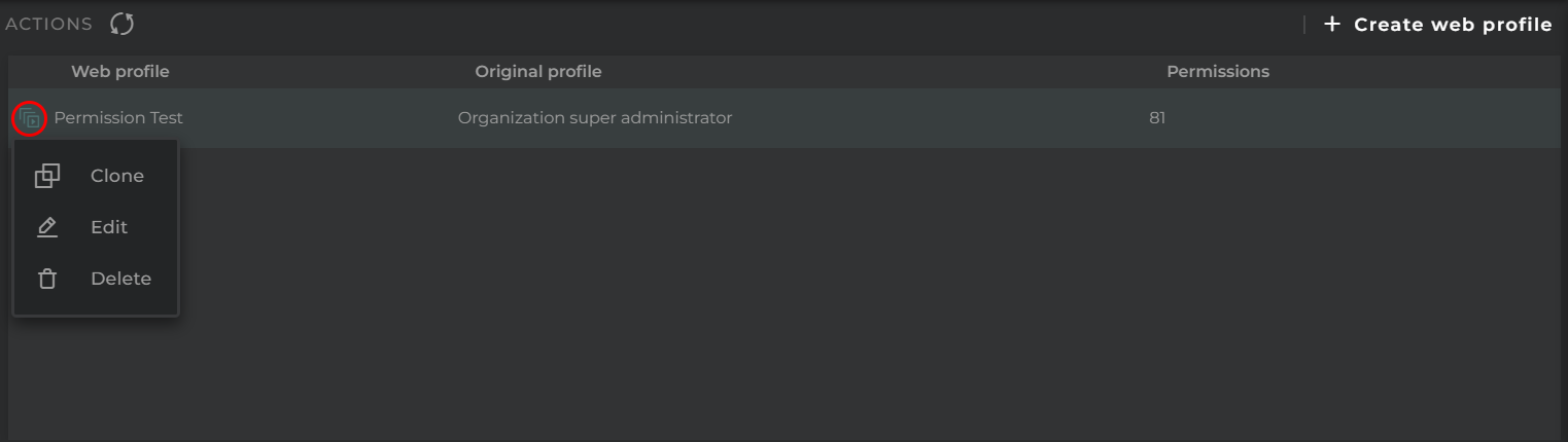
Actions on Roles
For each item on the list, the following actions can be performed:
Clone allows creating a new role based on the current one
Edit opens the role’s configuration for modification
Delete removes the selected role
Navigation Bar
In the navigation bar, the following actions can be performed:
Search allows applying a filter to the list
Refresh refreshes the content of the list
New opens the form for creating a new role
New Role Form
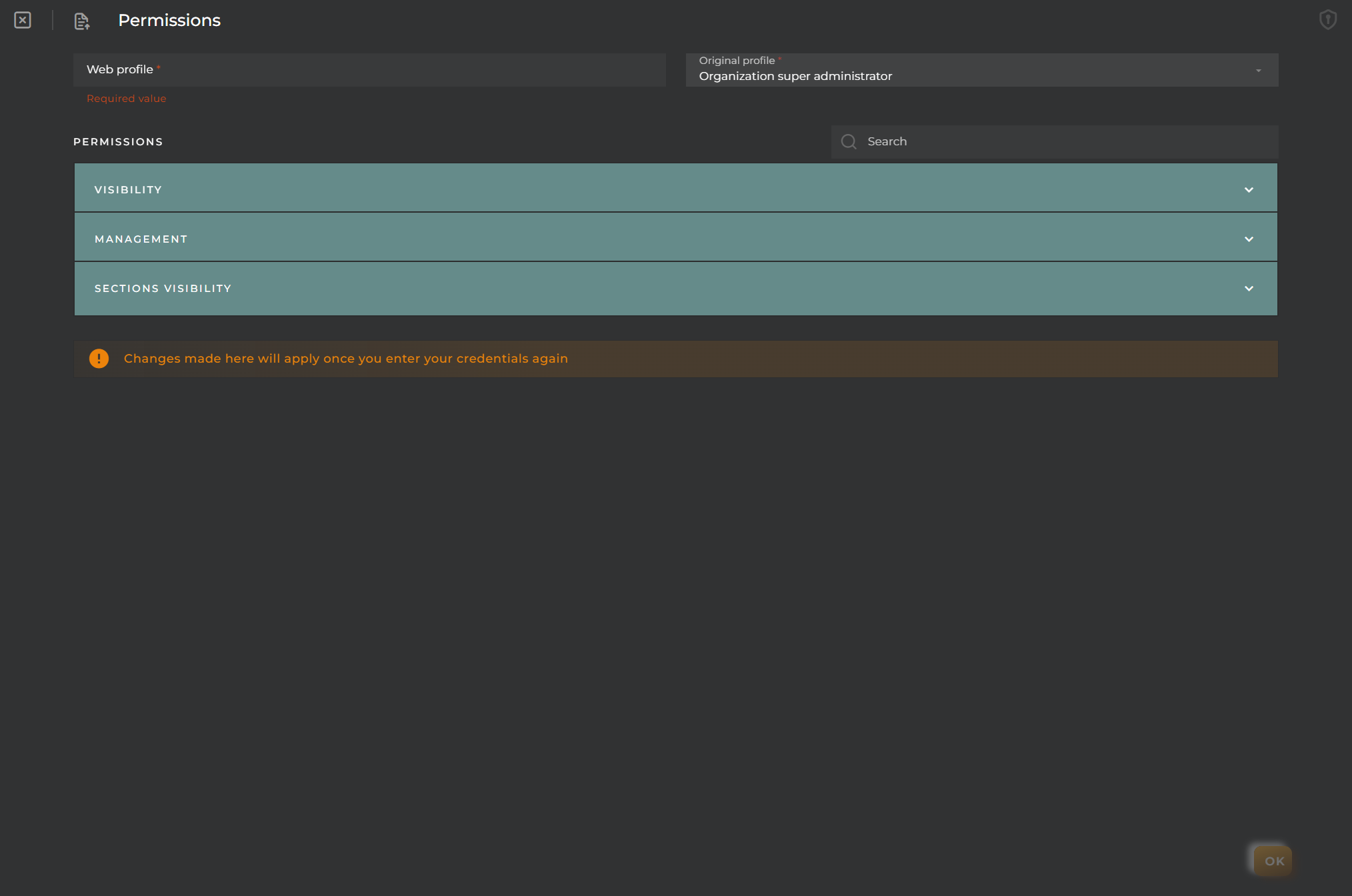
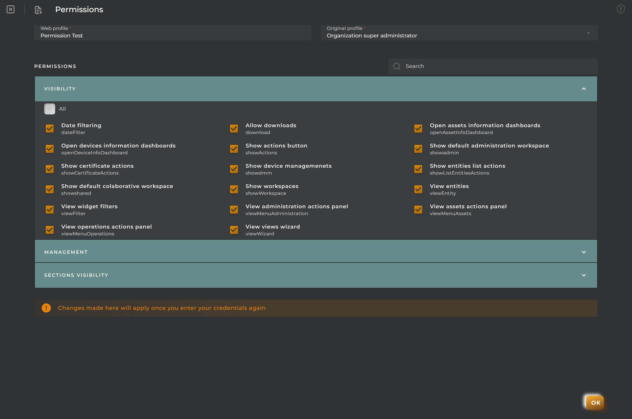
The form for the creation/modification of roles contains the following information:
Name unique identifying value of the role
Original Profile indicates which OpenGate profile is taken as a base for this role
Lastly, there are various layers of role customization. There are 4 groups:
Visibility allows hiding/showing common elements of the menu, widgets, workspaces, and dashboards
Management groups everything related to wizards and action forms for elements on the platform
Sections from here you can manage which web sections you want to enable for the role
Views allows selecting which provisioning/collection wizards should be displayed/hidden for the role. This option will only be visible if any of these elements are configured
IMPORTANT NOTE: To make use of this new role, it will be necessary to log out and log back into the platform.
Common Elements
At the top of the form, we can find the following elements:
Search With this, you can filter the permissions to be selected, facilitating their identification
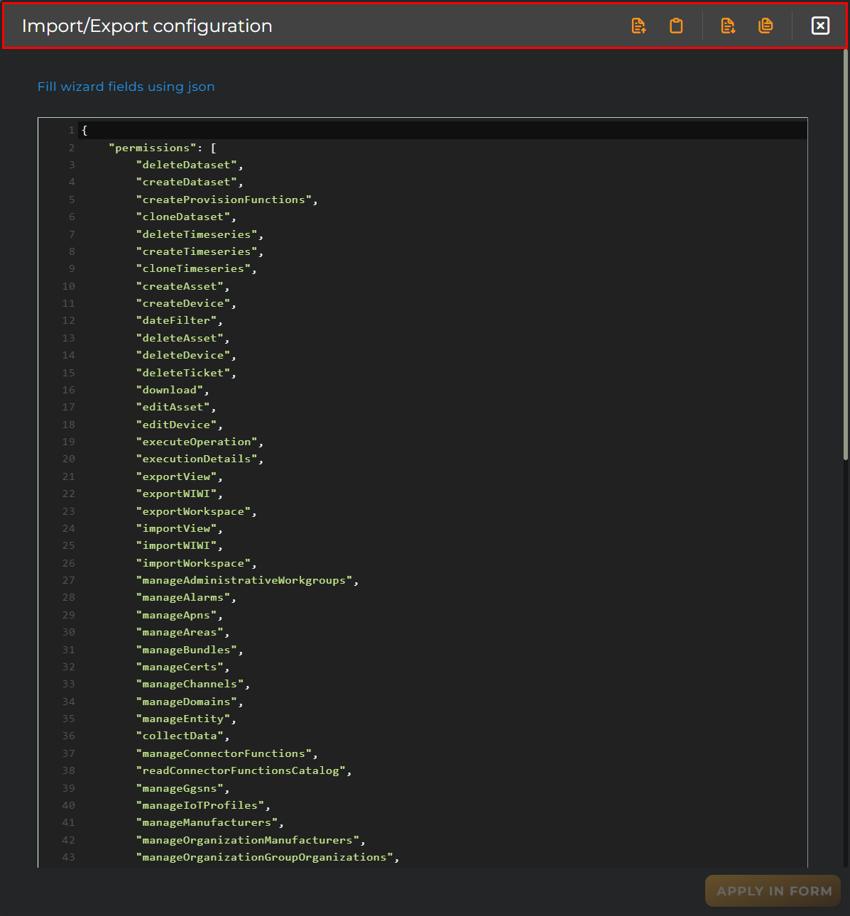
Import/Export Configuration Allows importing and exporting the wizard configuration via JSON.
Import/Export Configuration
When accessing the import and export functionality, it displays a window with various actions. Additionally, it presents the configuration of the wizard in JSON format.
The available actions are as follows:
Upload Json: Uploads a JSON file and replaces the previous JSON configuration.
Paste from clipboard: Pastes JSON data from the clipboard and replaces the previous JSON configuration.
Download Json: Downloads the JSON configuration as a file with the wizard’s name.
Copy to clipboard: Copies the JSON configuration to the clipboard.
Web Preferences
Here you can configure everything related to the web for your organization.
How it Works
Within the configuration, we can distinguish three parts:
Organization Logo where an identifying image can be uploaded that will always be displayed on the navigation bar of the website.
Themes allows the selection of the color and overall appearance of the website.
Other Configs here, specific parameters can be configured that will affect the content displayed across the website. Their use is detailed below:
Google Key enables the use of Google’s localization tools. For example, in the tracking widget, it enables route calculations for device location points.
Weather Key allows activation of weather layers in the map widget. A free key can be created at OpenWeatherMaps.
Date Formatting this allows setting the desired format for the dates displayed across the website (to the extent possible). This relies on Moment.js.
Storage Limit indicates the maximum storage available for uploading files to the organization. With sufficient permissions, this can be modified.
Navigation Bar
In the navigation bar, the following actions can be performed:
Refresh refreshes the content of the listing.
Cancel cancel changes.
Save saves the current changes so they are not lost.