In this widget, you will be able to see the devices related to an asset.
How it works
Widget Menu
The following actions can be performed:
Open entity information: Opens a temporary dashboard with information about the asset.
Edit: Opens the asset wizard.
Generate QR: Generates a QR code that will provide basic information about the asset.
Capture screen: Takes a screenshot of the widget.
Duplicate widget: Creates a duplicate of the widget on the dashboard.
Copy widget: Copies the widget to another dashboard.
Change widget location: Moves the widget to another dashboard.
Configuration
General
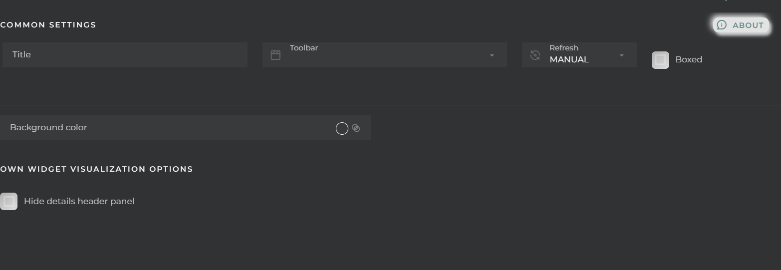
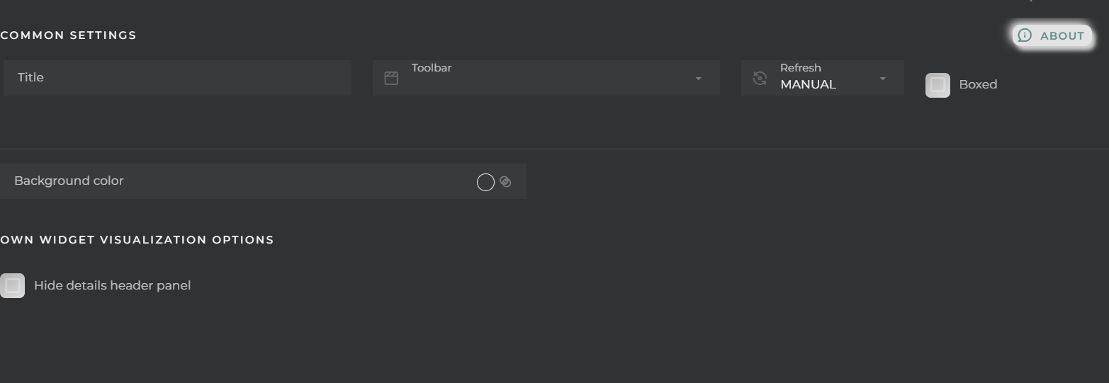
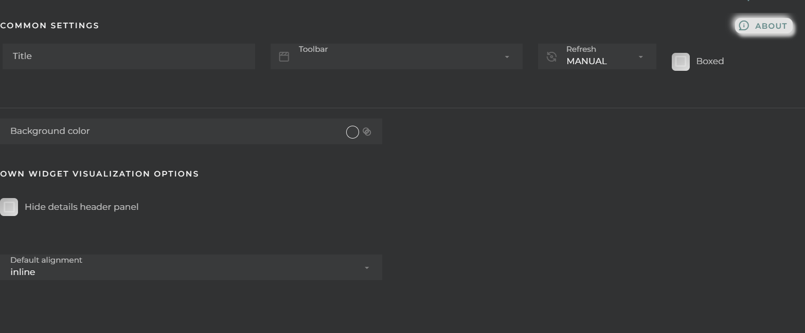
Boxed: widget will be displayed with background in dahsboard.
About: widget description in Markdown format.
Title: widget title. It can be configured to remain fixed in the widget or only be displayed when it receives focus.
Toolbar: configures the behavior of the widget bar on the dashboard, allowing you to hide it, hide it when not in use, or leave it always visible.
Refresh Frequency: allows configuring the data refresh frequency displayed in the list.
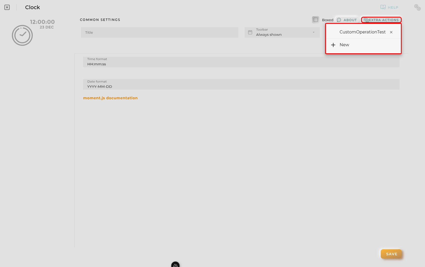
Extra actions: allows user to add new specific actions to the widget with your own code.
You can add a new one by pressing the New button.
Once you added a custom action it can be modified later by pressing the name in the list.
In order to remove the custom action click the delete icon button on the right.
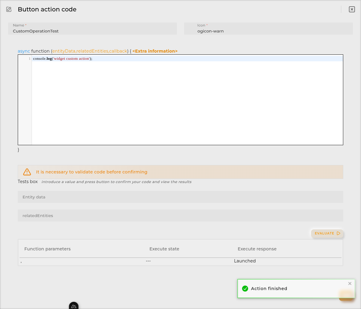
In extra actions you can write your own code were you can open other dashboards, entities dashboards or execute wizards.
You can find all available functions and methods in Extra Information
Selection of the asset to display.
Visualization
Settings that can be configured:
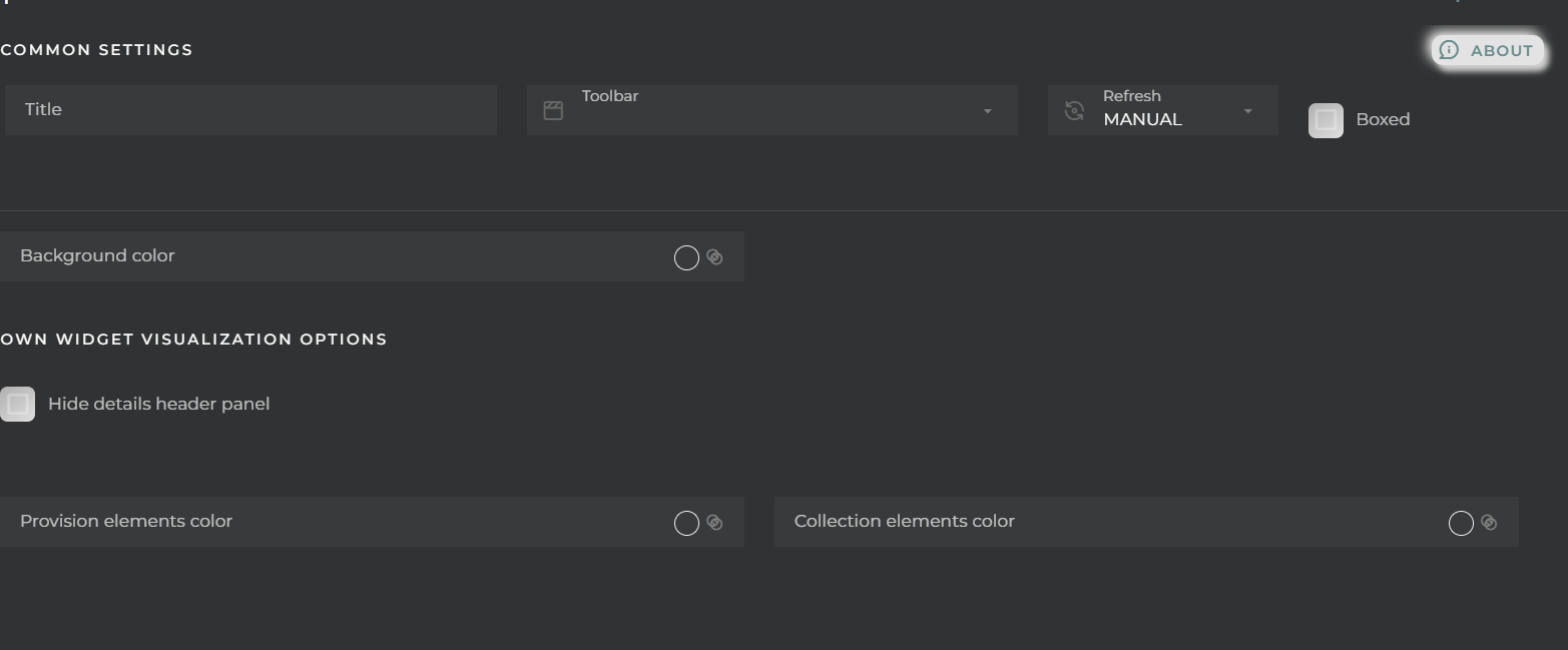
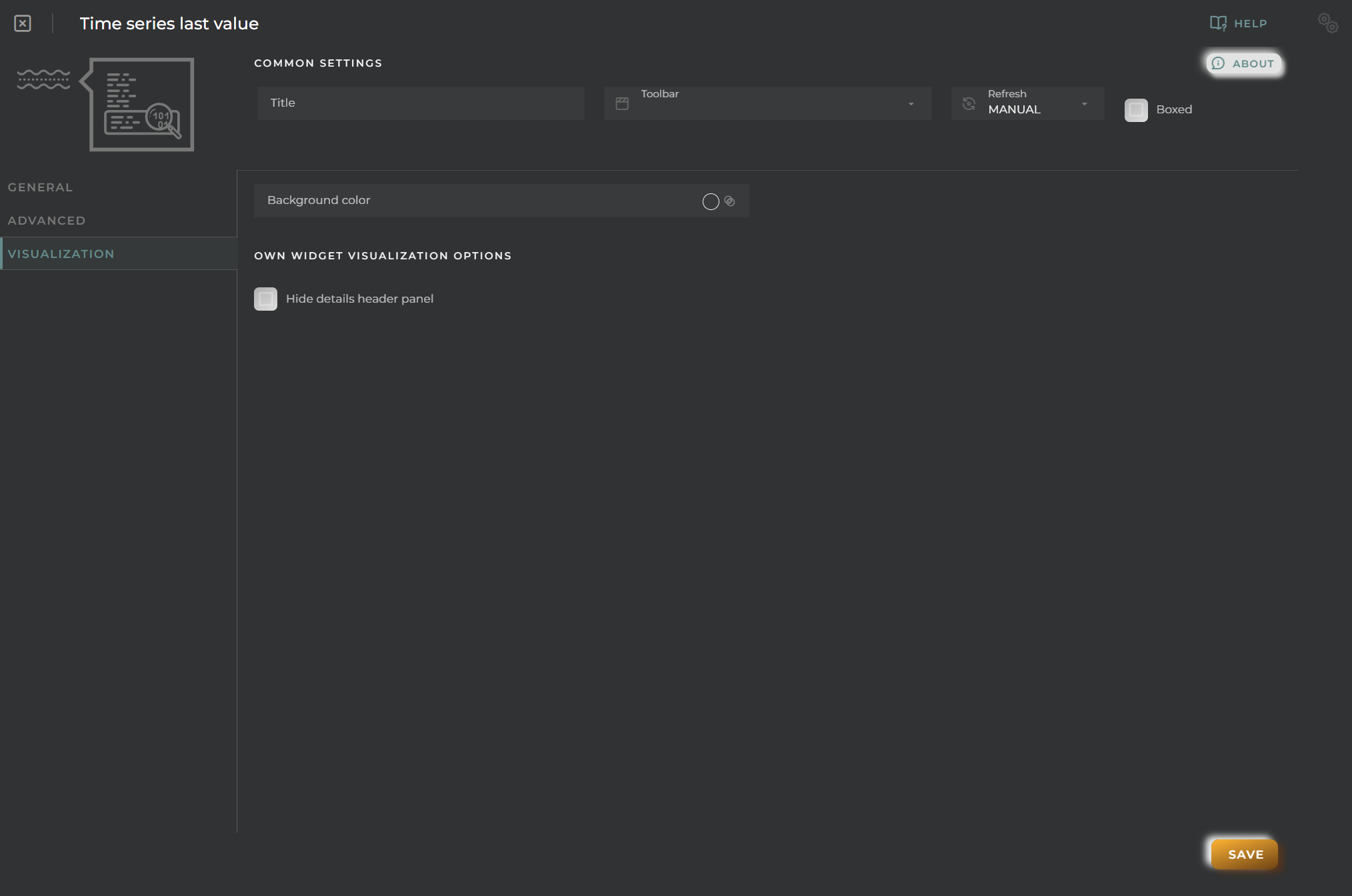
Background color: Sets the background color of the widget.
Hide details header panel: Hides the title with the asset identifier.
Data stream Last Value
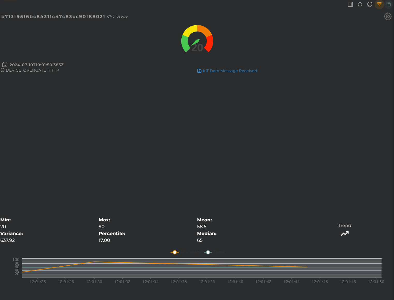
Widget that displays the last value obtained for a data stream.
How it works
The information can be displayed in various formats: graphically, symbolically, and textually.
We can also check its history and statistics: trend, maximum and minimum, percentile, mean, and median.
Widget Menu
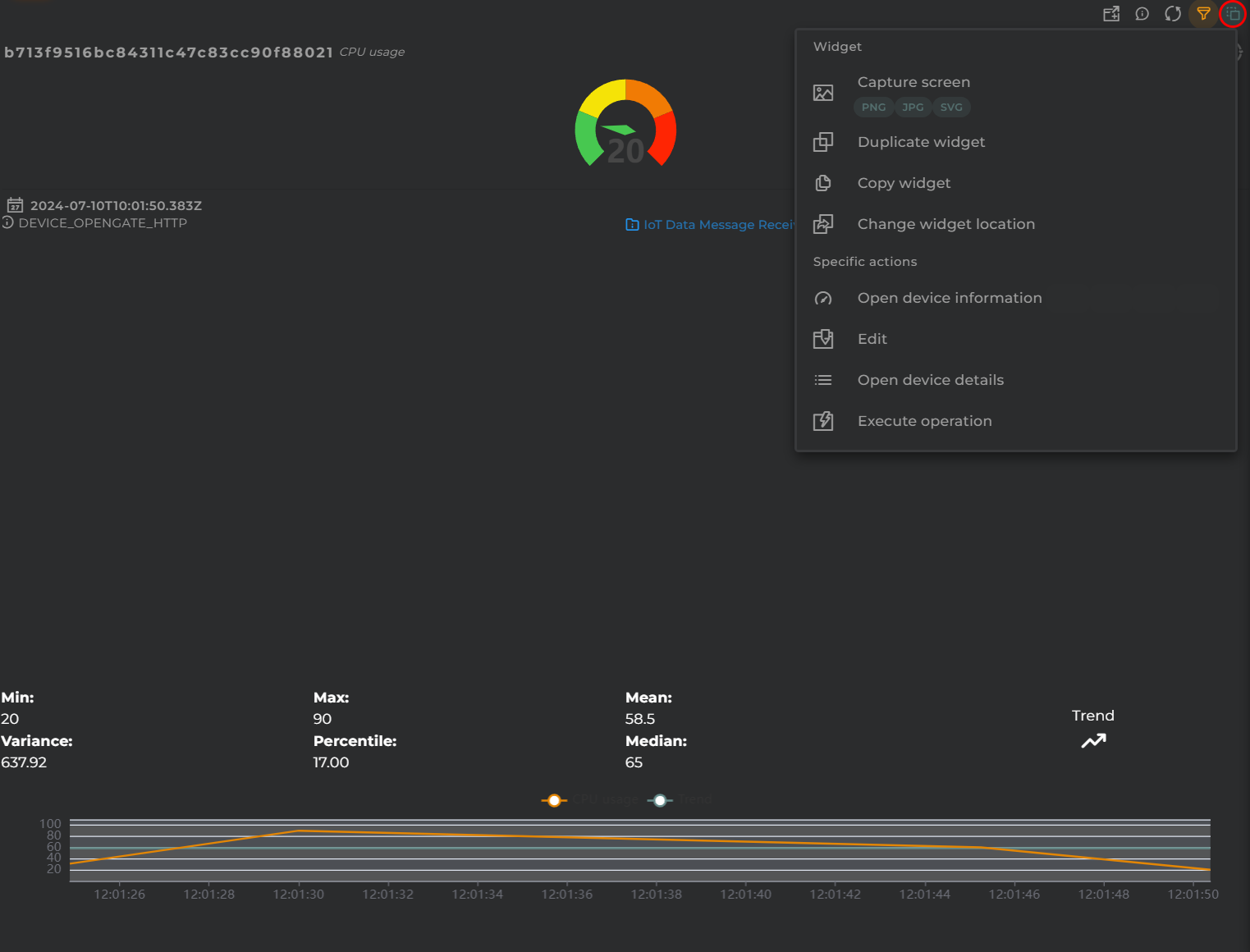
The following actions can be performed:
Open device information: opens a temporary dashboard with device information
Edit: opens the device wizard
Open device details: opens the device information wizard
Generate QR: generates a QR code that will return basic information about the device
Historical data: “Data Points” widget in table format, showing the data stream’s history
View Chart: “Data Stream history” widget that displays the evolution of the data stream
Execute operation: opens the operation execution wizard to perform an operation on the device
Capture screen: Takes a screenshot of the widget.
Duplicate widget: Creates a duplicate of the widget on the dashboard.
Copy widget: Copies the widget to another dashboard.
Change widget location: Moves the widget to another dashboard.
Configuration
General
Boxed: widget will be displayed with background in dahsboard.
About: widget description in Markdown format.
Title: widget title. It can be configured to remain fixed in the widget or only be displayed when it receives focus.
Toolbar: configures the behavior of the widget bar on the dashboard, allowing you to hide it, hide it when not in use, or leave it always visible.
Refresh Frequency: allows configuring the data refresh frequency displayed in the list.
Extra actions: allows user to add new specific actions to the widget with your own code.
You can add a new one by pressing the New button.
Once you added a custom action it can be modified later by pressing the name in the list.
In order to remove the custom action click the delete icon button on the right.
In extra actions you can write your own code were you can open other dashboards, entities dashboards or execute wizards.
You can find all available functions and methods in Extra Information
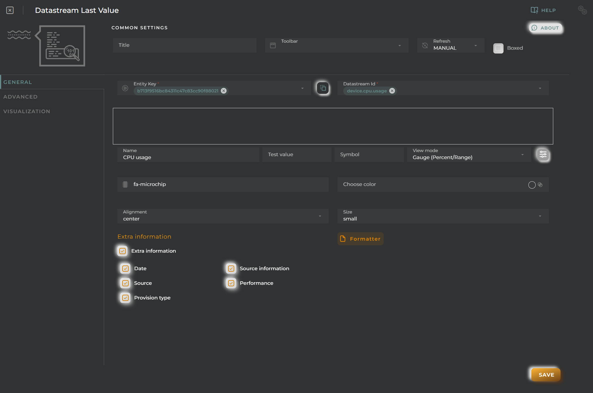
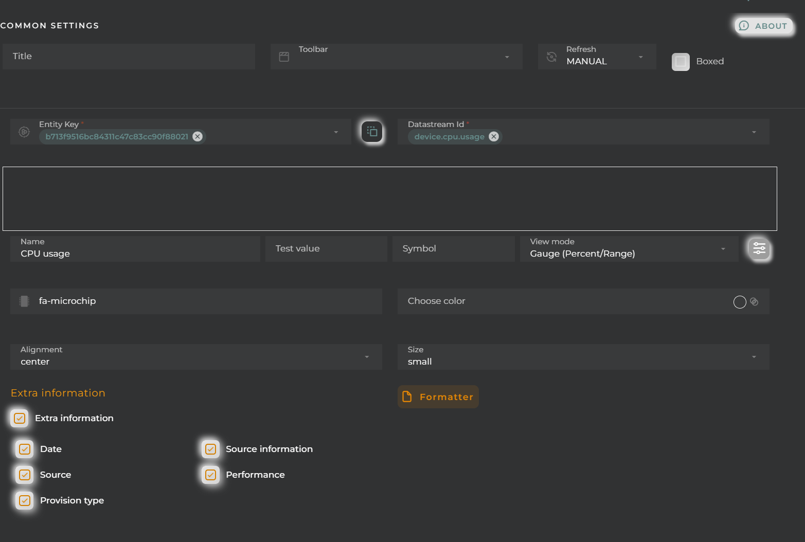
Entity key: Device to display
DatastreamId: Data stream whose last value (and its statistics) will be displayed
Name: Alias for the selected field to display
Test Value: If this data is filled in, a preview of how the widget will look with the value given to the datastream will be displayed in the configuration.
Symbol: Unit for the value
View mode: Type of data visualization
Value: Value in text format (default mode).
Icon: Display an icon (Symbol field) along with the value in text mode.
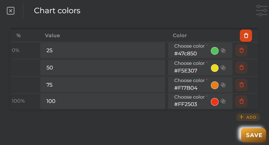
Battery (Percent): Display the value within a battery. Reference values will be configured in the “Chart colors” panel.
Bar (Percent/Range): Display the value in a bar. Reference values will be configured in the “Chart colors” panel.
Gauge (Percent/Range): Display the value in a gauge-type graph. Reference values will be configured in the “Chart colors” panel.
Choose an icon: Icon to display (for Icon mode).
Choose color: Icon color.
Alignment: Alignment of the value (Value and Icon modes) in the widget.
Size: Value size.
Extra information: Extra information to display in the widget along with the value.
FORMATTER: Opens a panel where you can format the value.
dataFormatter: Value format
tooltip: Tooltip value format that appears when hovering over the value
In this case, the barBeginCircle option should always be set to false. If it is necessary to modify this option, it is recommended to use the thermometer chart type.
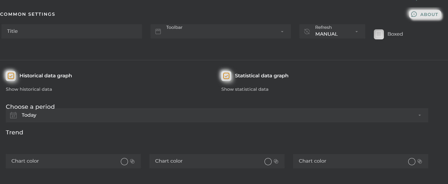
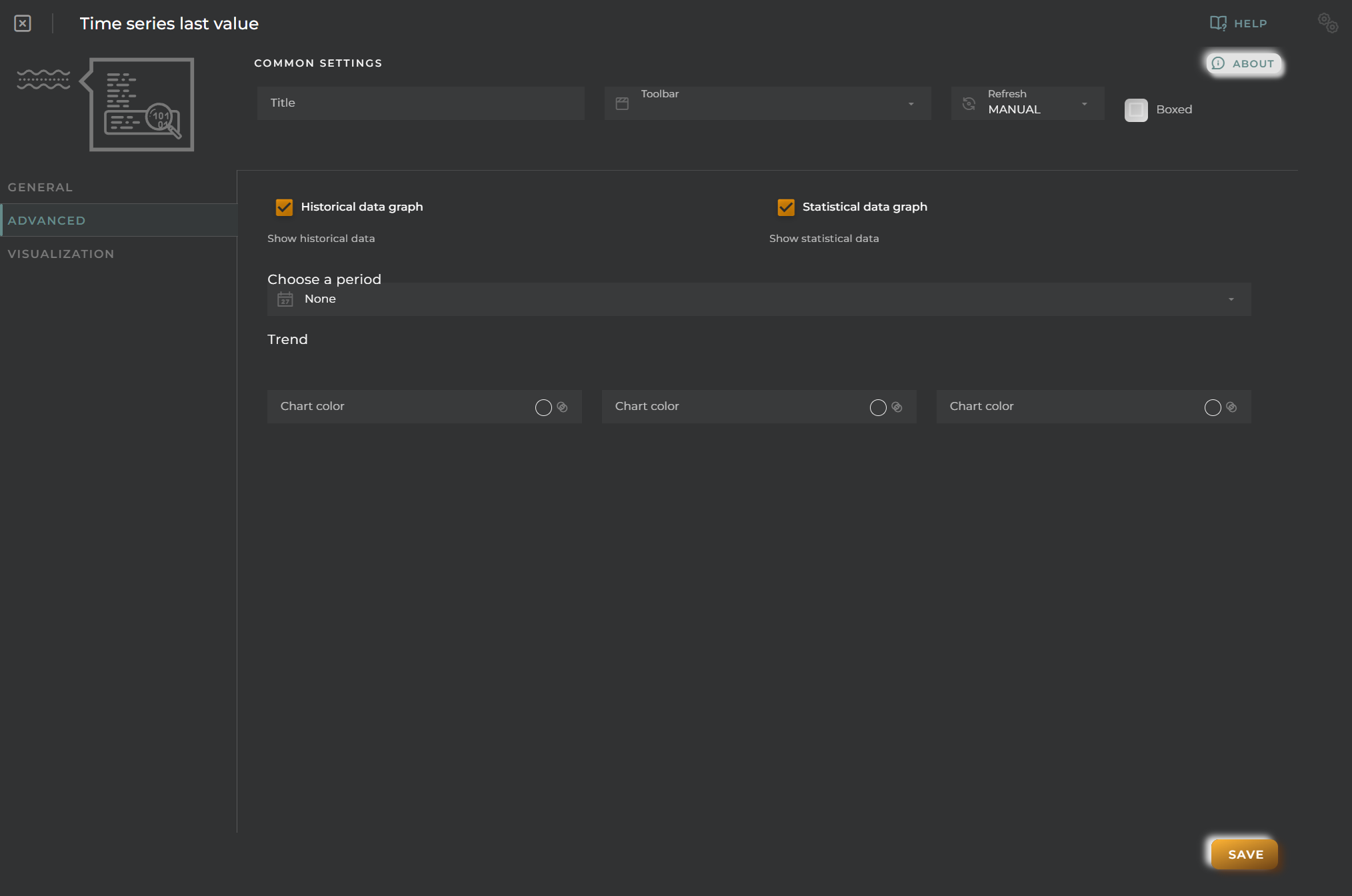
Historical data graph: Display a graph showing the value’s evolution over time
Statistical data graph: Display statistical data
Choose a period: Time frame for sampling the statistical data and its visualization in the value evolution graph
Trend: Assign a color based on the value’s trend
Visualization
We can configure certain elements of the graphs displayed in the widget:
Background color
Hide details header panel: Removes the menu allowing for the modification of the type of visualization as well as the type of value to display.
Device Hierarchy Graph
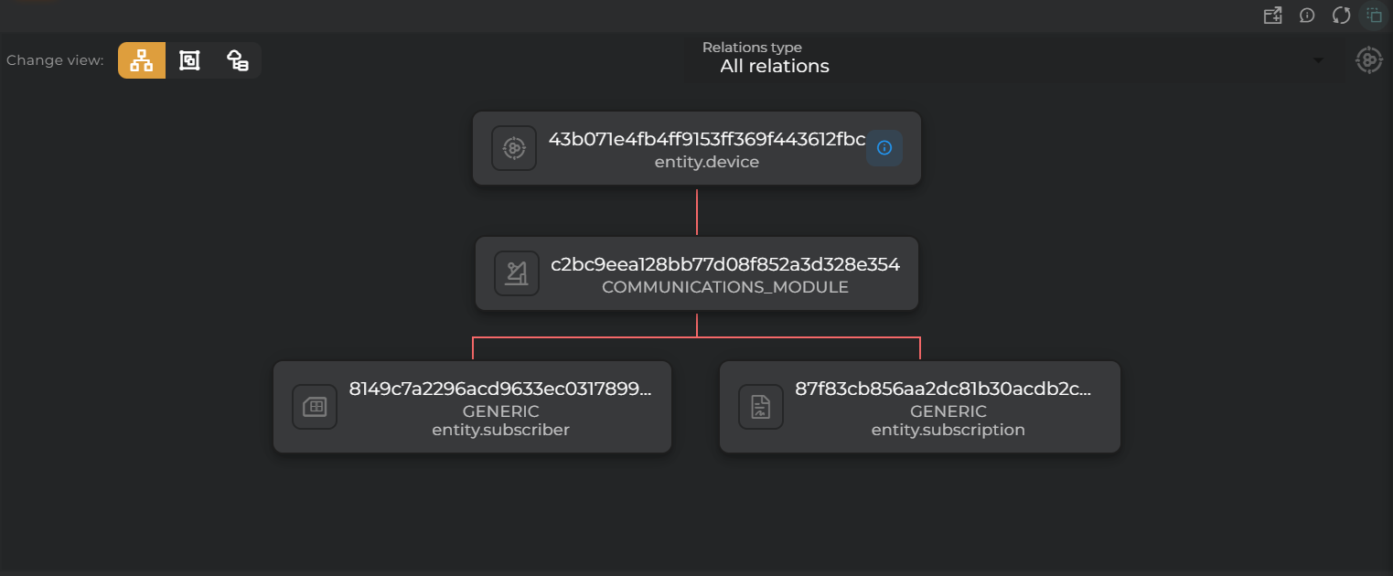
In this widget, you will be able to graphically view the hierarchy of a device within the organization.
How it works
You will be able to view its communication modules, related assets, and its topology.
You can choose between displaying:
provisioned values
collected values
both types of values
Communications Module
In this view, you will be able to see the communication modules available on the device.
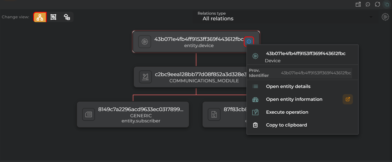
By clicking on the device card, you can:
view pre-configured information in the widget
perform actions on the device
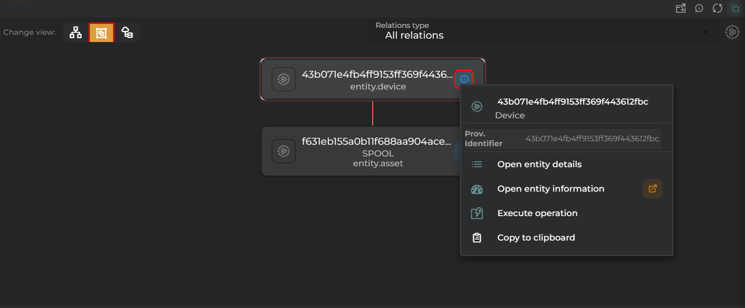
Related
In this view, you can see the assets related to the device.
By clicking on either the device card or the asset cards, you can:
view pre-configured information in the widget
perform actions on the device or asset
Topology
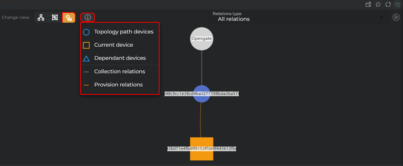
In this view, you can see the topology of the device.
A panel will be available to indicate the relationships between different entities.
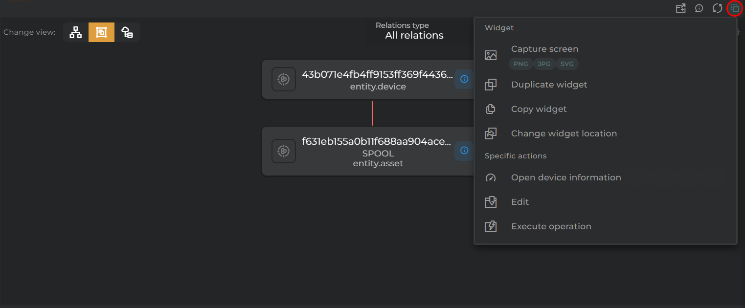
Widget Menu
The following actions can be performed:
Open device information: Opens a temporary dashboard with the device information
Edit: Opens the device wizard
Generate QR: Generates a QR code that will provide basic information about the device
Execute operation: Opens an operation execution wizard to perform an operation on the device
Capture screen: Takes a screenshot of the widget.
Duplicate widget: Creates a duplicate of the widget on the dashboard.
Copy widget: Copies the widget to another dashboard.
Change widget location: Moves the widget to another dashboard.
Configuration
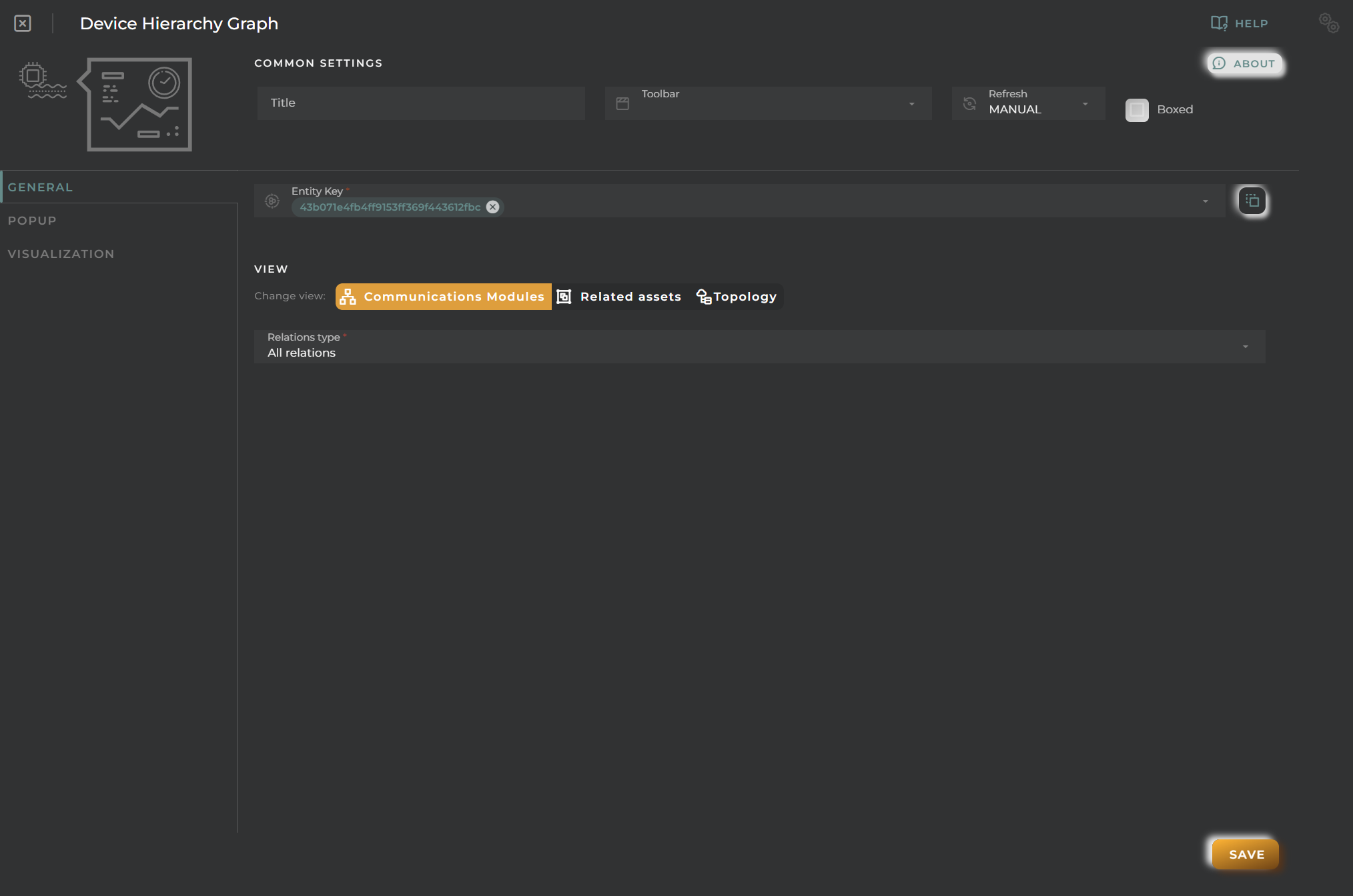
General
Boxed: widget will be displayed with background in dahsboard.
About: widget description in Markdown format.
Title: widget title. It can be configured to remain fixed in the widget or only be displayed when it receives focus.
Toolbar: configures the behavior of the widget bar on the dashboard, allowing you to hide it, hide it when not in use, or leave it always visible.
Refresh Frequency: allows configuring the data refresh frequency displayed in the list.
Extra actions: allows user to add new specific actions to the widget with your own code.
You can add a new one by pressing the New button.
Once you added a custom action it can be modified later by pressing the name in the list.
In order to remove the custom action click the delete icon button on the right.
In extra actions you can write your own code were you can open other dashboards, entities dashboards or execute wizards.
You can find all available functions and methods in Extra Information
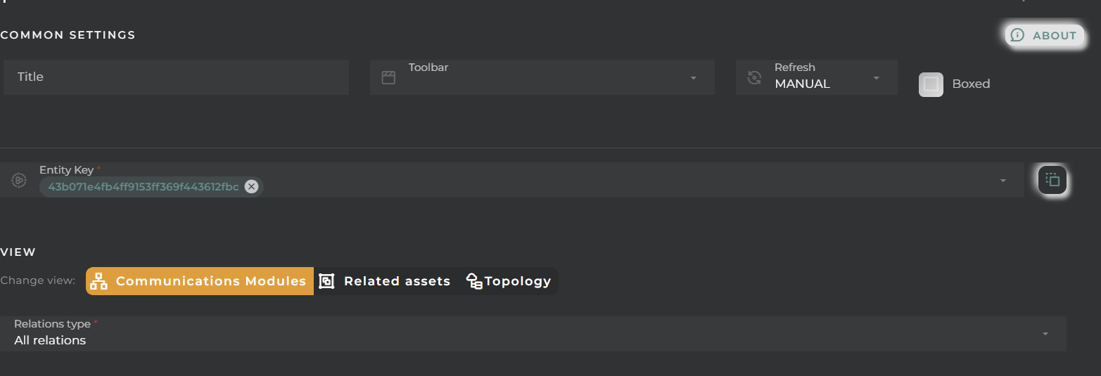
Entity key: Device to display
View: Default view to display
Relations type: Type of values to display: collected, provisioned, or both
Popup
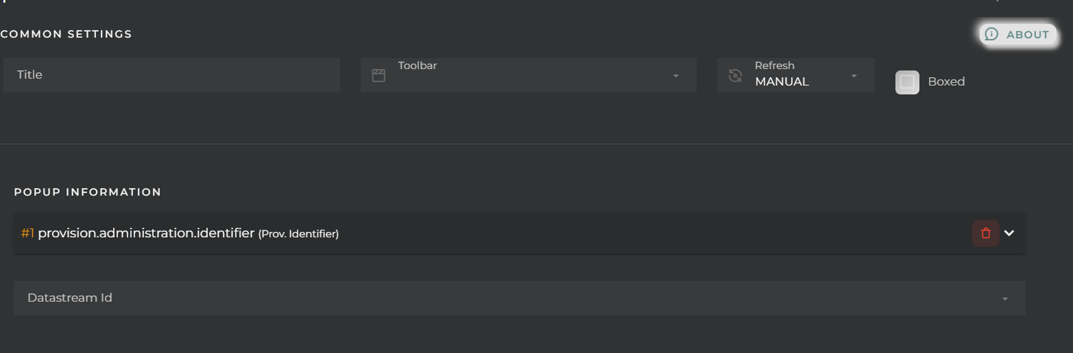
You can configure the information to display in the popup that appears when clicking on the cards displayed in the widget, selecting values from the available data streams.
Visualization
You can configure certain elements of the graphs displayed in the widget:
Background color
Hide details header panel: Removes the menu that allows changing the type of visualization as well as the type of value to display.
Provision elements color
Collection elements color
Entity Information Details
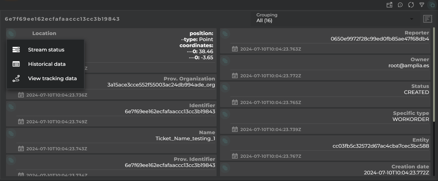
A widget that displays information about each of the data streams that make up the entity in a card format.
How it works
On each card, you will be able to see:
the current value
the date when the value was taken
the source of the information
the type of provisioning (for provisioned data)
identifying icon
Target menu
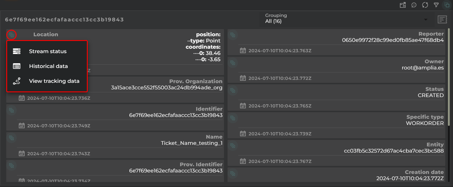
From each of the cards, you can open various widgets (varying depending on the type of data stream value):
Stream status: “Last Value” widget displaying datastream information, such as the last value and trends.
Historical data: “Data Points” widget in table format, showing the data stream’s historical data.
View Chart: “Data Stream history” widget displaying the data stream’s evolution in chart form.
View tracking data: “Tracking” widget showing the entity’s location on a map (only applicable if it’s a location-type data stream).
Change value (provision datastreams only): Allows the user to change the value of the datastream without having to open the corresponding wizard.
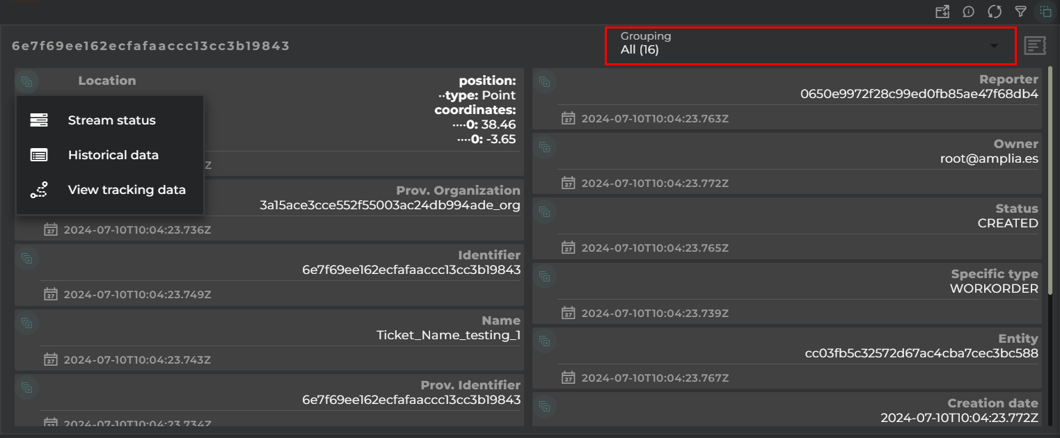
Grouping
Choice of type of grouping.
Depending on its configuration, it can be by:
data model
categories of a data model
tags
whether the value is provisioned or collected
Performance
Graph showing the performance of the data stream.
Widget Menu
The following actions can be performed:
Open device information: Opens a temporary dashboard with device information
Edit: Opens the device wizard
Execute operation: Opens an operation execution wizard to perform an operation on the device
Capture screen: Takes a screenshot of the widget.
Duplicate widget: Creates a duplicate of the widget on the dashboard.
Copy widget: Copies the widget to another dashboard.
Change widget location: Moves the widget to another dashboard.
Configuration
General
Boxed: widget will be displayed with background in dahsboard.
About: widget description in Markdown format.
Title: widget title. It can be configured to remain fixed in the widget or only be displayed when it receives focus.
Toolbar: configures the behavior of the widget bar on the dashboard, allowing you to hide it, hide it when not in use, or leave it always visible.
Refresh Frequency: allows configuring the data refresh frequency displayed in the list.
Extra actions: allows user to add new specific actions to the widget with your own code.
You can add a new one by pressing the New button.
Once you added a custom action it can be modified later by pressing the name in the list.
In order to remove the custom action click the delete icon button on the right.
In extra actions you can write your own code were you can open other dashboards, entities dashboards or execute wizards.
You can find all available functions and methods in Extra Information
Entity key: Device to display
Extra information: Choice of data to display within the card
Grouping: Choice of type of grouping:
data model
categories of a data model
tags
whether the value is provisioned or collected
DatastreamId: Choice and format of the displayed data streams
Choose whether to only view the selected data streams
Format the selected data streams
Alias
Category: a new category can be created for grouping the data streams
Position: position of the value on the card
Icon: representative icon that will be displayed on the card
Format: format the value of the displayed data stream
Advanced
Visualization
Certain elements of the graphs displayed in the widget can be configured:
Background color
Hide details header panel: Removes the menu that allows modifying the type of visualization and the type of value to display.
Default alignment: position of the value on the cards
Image Widget
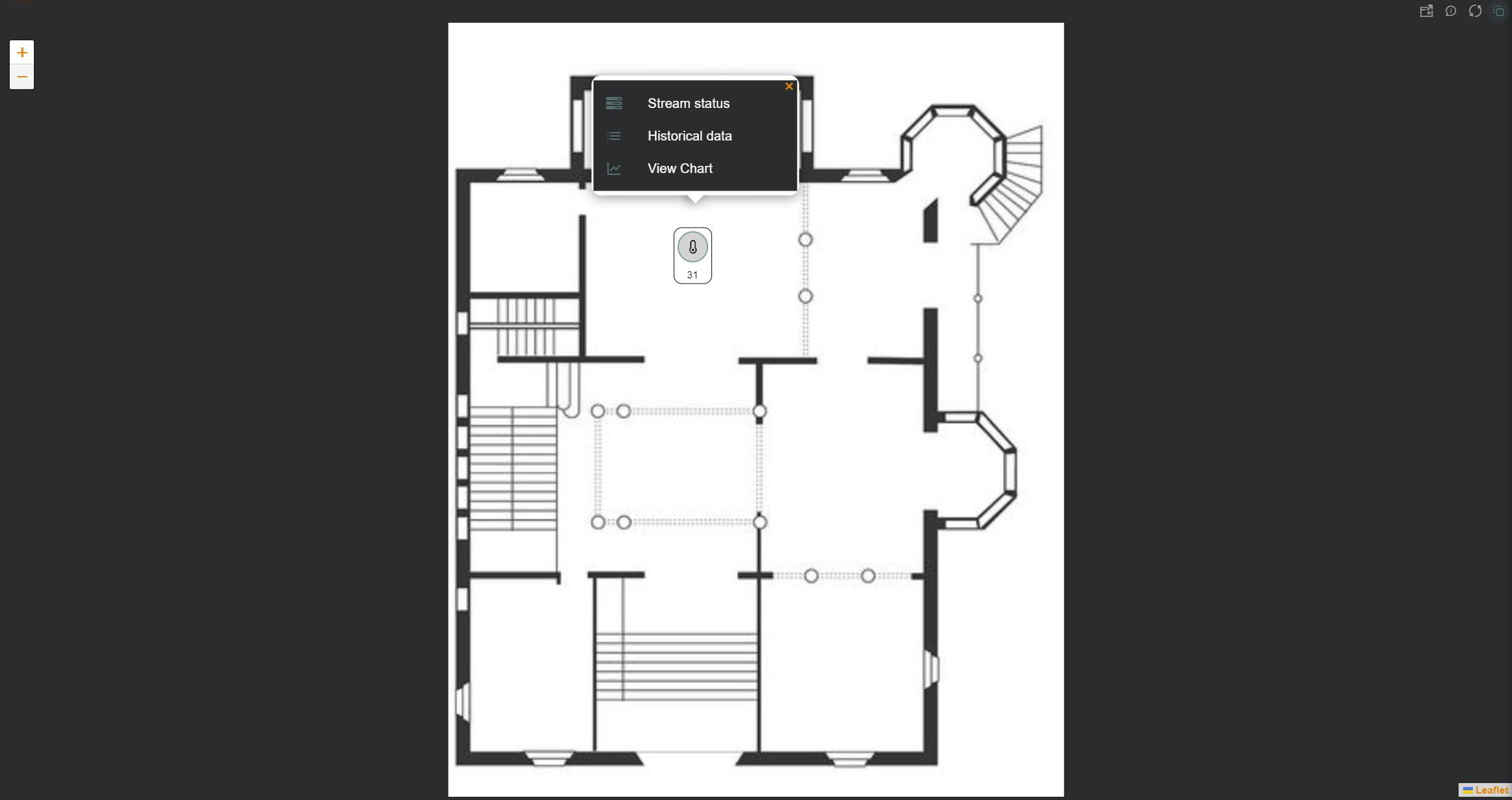
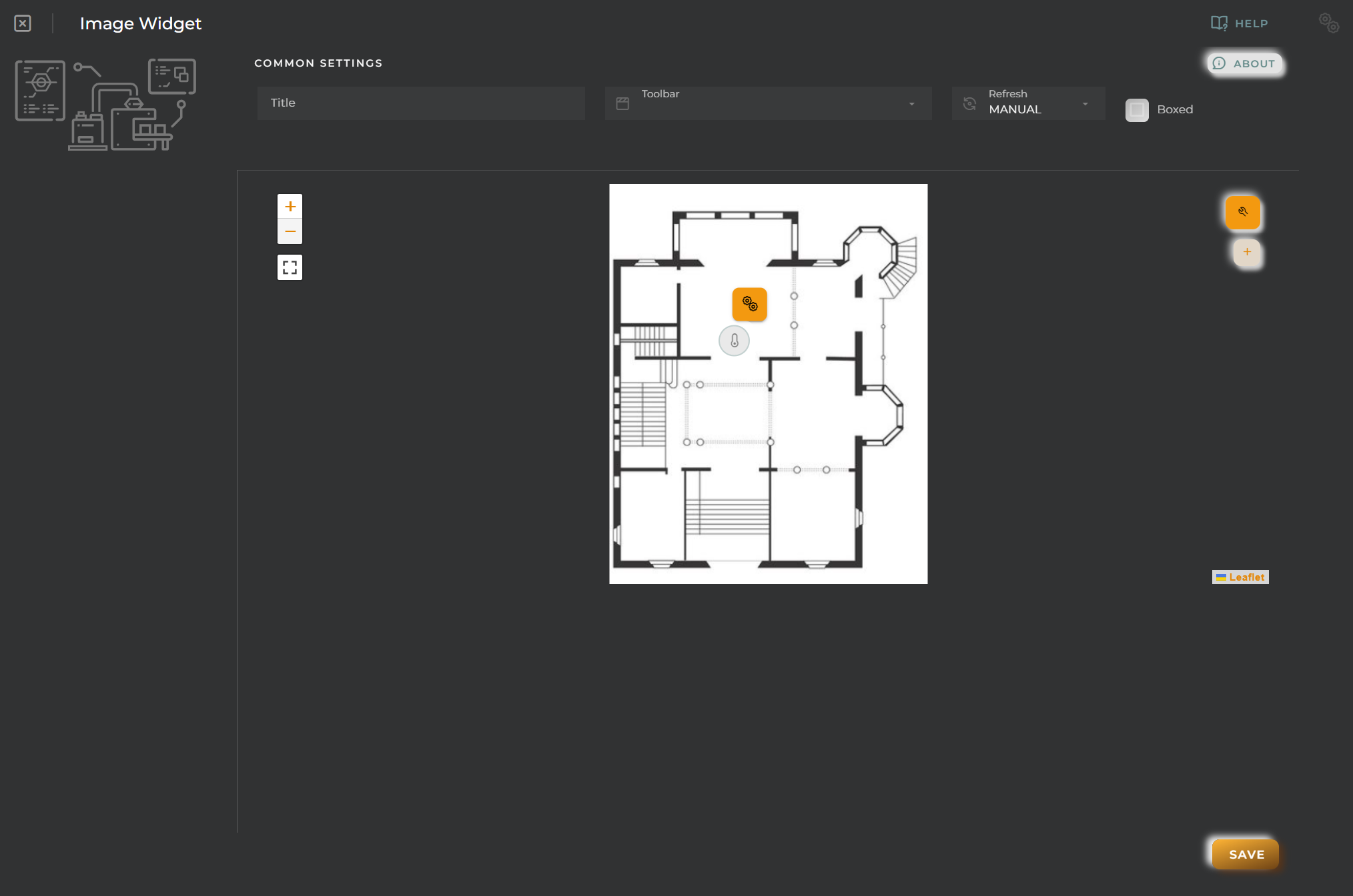
The widget allows you to upload and configure an image with data icons overlaid on it.
How it works
Once the widget is configured, an image will be displayed with the configured data.
Icon Menu
Data can be viewed as icons positioned over the image, which we can interact with to view information about them:
Stream status: “Last Value” widget displaying datastream information, such as the last value and trends.
Historical data: “Data Points” widget in table format, showing the data stream’s historical data.
View Chart: “Data Stream history” widget displaying the data stream’s evolution in chart form.
View tracking data: “Tracking” widget showing the entity’s location on a map (only applicable if it’s a location-type data stream).
Change value (provision datastreams only): Allows the user to change the value of the datastream without having to open the corresponding wizard.
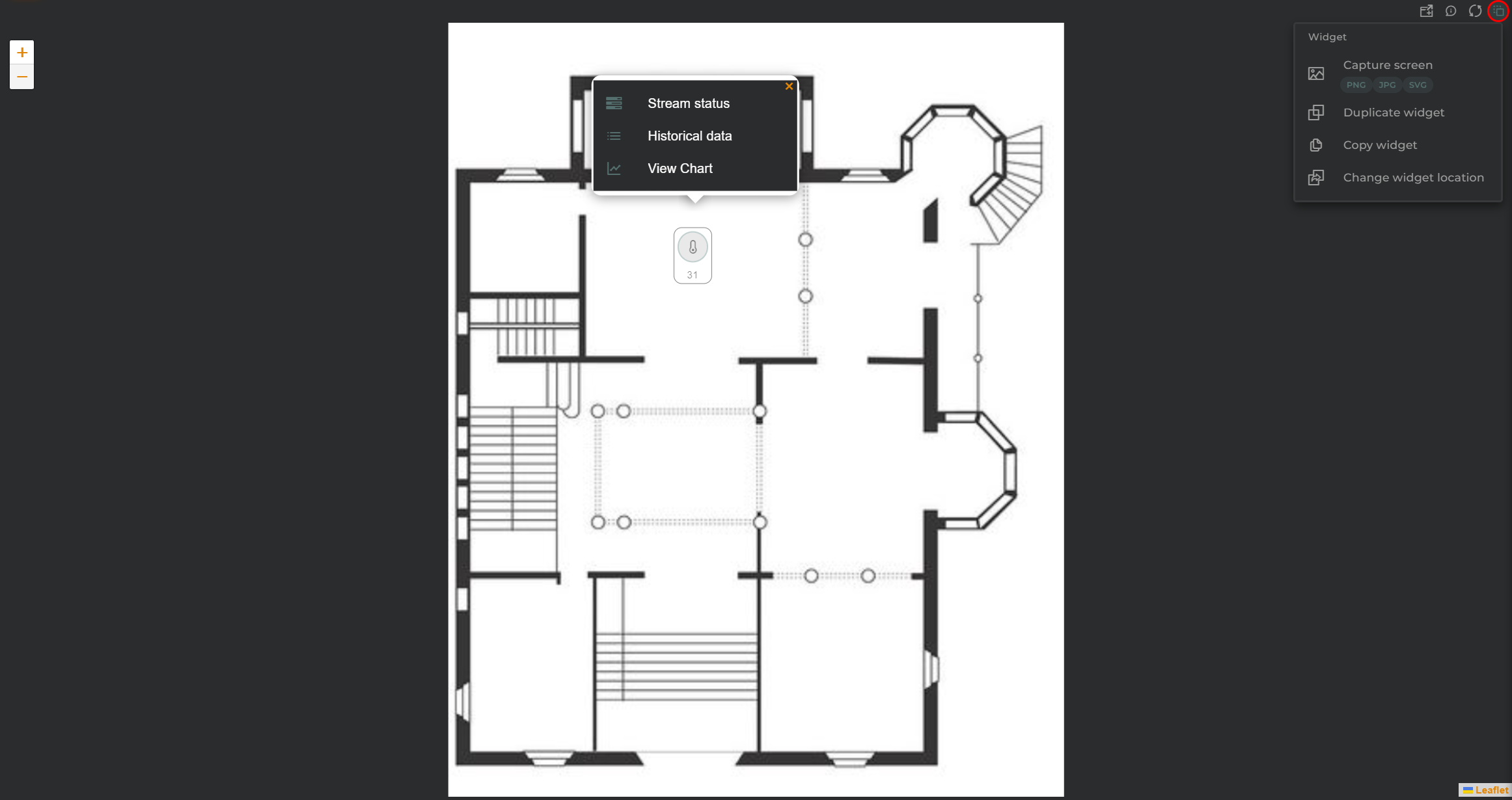
Widget Menu
The following actions can be performed:
Capture screen: Takes a screenshot of the widget.
Duplicate widget: Creates a duplicate of the widget on the dashboard.
Copy widget: Copies the widget to another dashboard.
Change widget location: Moves the widget to another dashboard.
Configuration
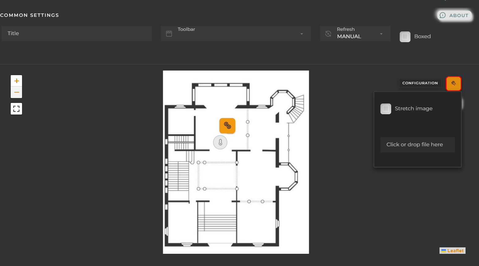
Image Upload
From here, we can upload the image to display and its format.
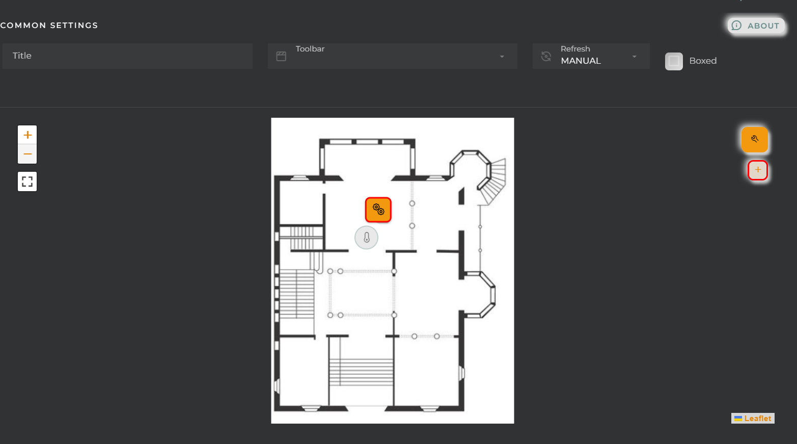
Icon Configuration
Using the + button, we can add icons to the image.
Existing icons can also be edited by clicking on them.
We can configure:
General:
Entity key: Device from which we will obtain the data
DatastreamId: Data stream whose value will be displayed on the icon
View:
Name: Alias for the selected field to display
Test Value: If this data is filled in, a preview of how the widget will look with the value given to the datastream will be displayed in the configuration.
Symbol: Unit for the value
View mode: Type of data visualization
Value: Value in text format (default mode).
Icon: Display an icon (Symbol field) along with the value in text mode.
Battery (Percent): Display the value within a battery. Reference values will be configured in the “Chart colors” panel.
Bar (Percent/Range): Display the value in a bar. Reference values will be configured in the “Chart colors” panel.
Gauge (Percent/Range): Display the value in a gauge-type graph. Reference values will be configured in the “Chart colors” panel.
Choose an icon: Icon to display (for Icon mode).
Choose color: Icon color.
Alignment: Alignment of the value (Value and Icon modes) in the widget.
Size: Value size.
Extra information: Extra information to display in the widget along with the value.
FORMATTER: Opens a panel where you can format the value.
dataFormatter: Value format
tooltip: Tooltip value format that appears when hovering over the value
In this case, the barBeginCircle option should always be set to false. If it is necessary to modify this option, it is recommended to use the thermometer chart type.
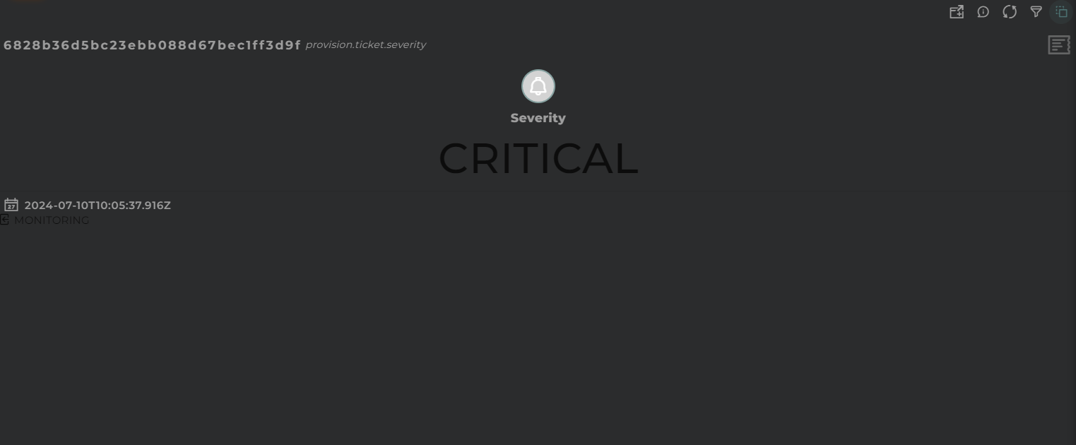
Widget that displays the last value obtained for a data stream.
How it works
The information can be displayed in various ways: graphical, symbolic, and text-based.
We can also review its history and statistics: trend, maximum and minimum, percentile, mean, and median.
Widget Menu
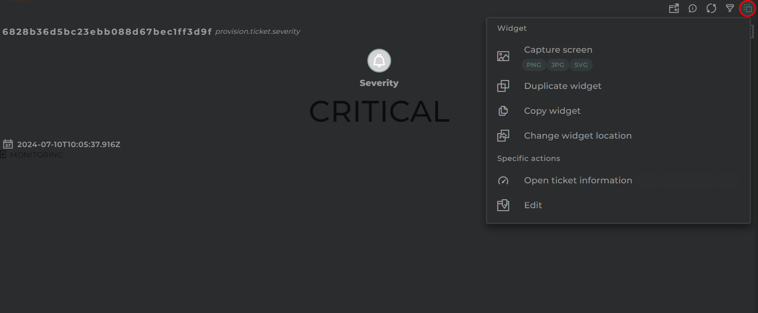
The following actions can be performed:
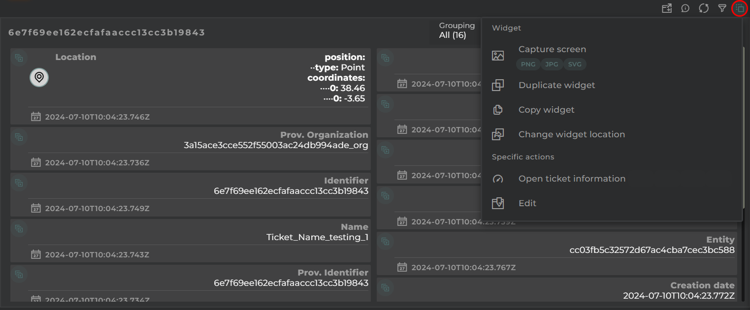
Open ticket information: opens a temporary dashboard with information on the ticket.
Edit: opens the ticket wizard.
Capture screen: Takes a screenshot of the widget.
Duplicate widget: Creates a duplicate of the widget on the dashboard.
Copy widget: Copies the widget to another dashboard.
Change widget location: Moves the widget to another dashboard.
Configuration
General
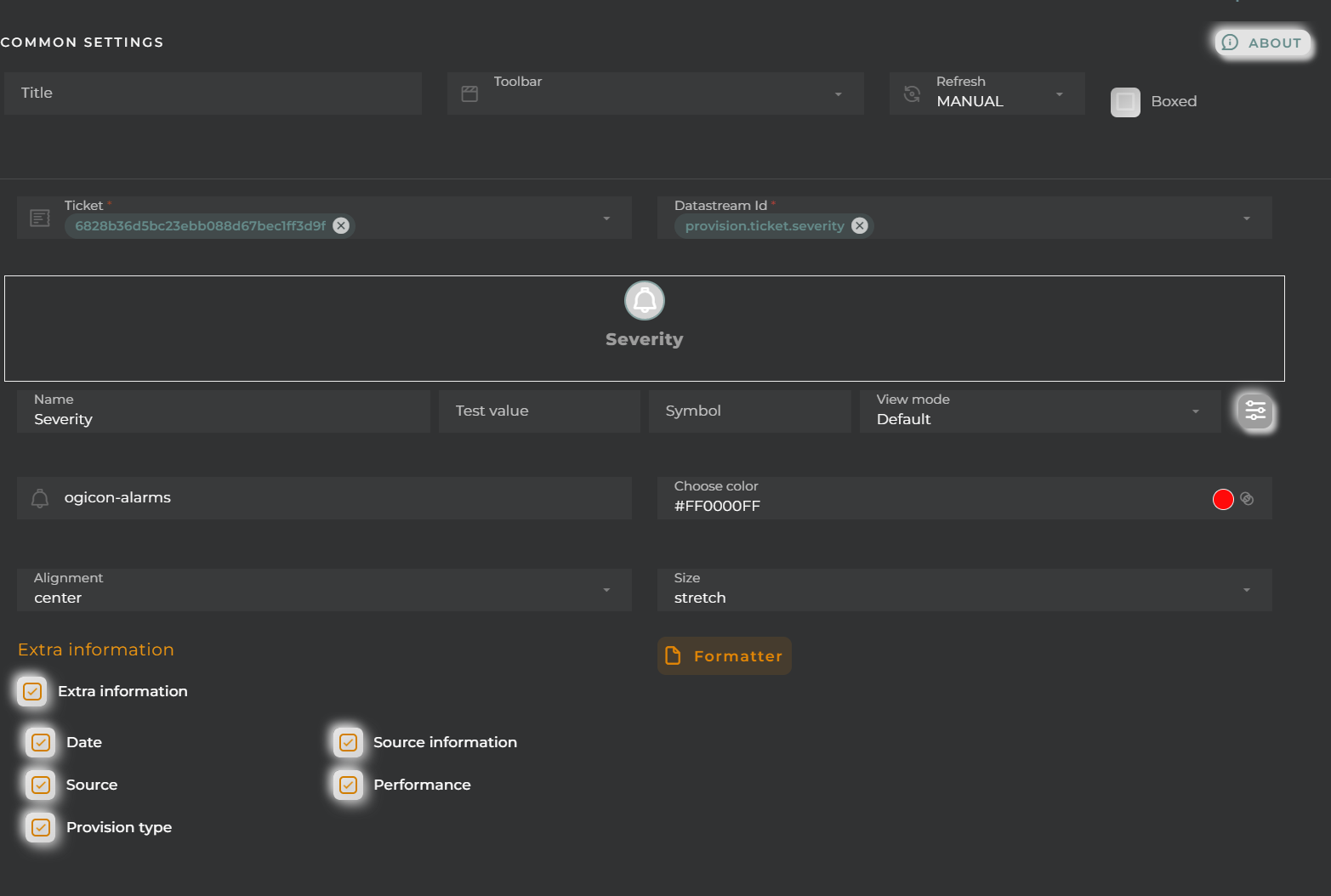
Boxed: widget will be displayed with background in dahsboard.
About: widget description in Markdown format.
Title: widget title. It can be configured to remain fixed in the widget or only be displayed when it receives focus.
Toolbar: configures the behavior of the widget bar on the dashboard, allowing you to hide it, hide it when not in use, or leave it always visible.
Refresh Frequency: allows configuring the data refresh frequency displayed in the list.
Extra actions: allows user to add new specific actions to the widget with your own code.
You can add a new one by pressing the New button.
Once you added a custom action it can be modified later by pressing the name in the list.
In order to remove the custom action click the delete icon button on the right.
In extra actions you can write your own code were you can open other dashboards, entities dashboards or execute wizards.
You can find all available functions and methods in Extra Information
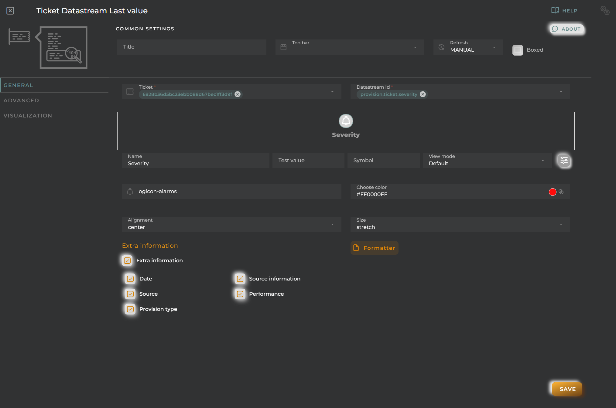
Ticket: The ticket to display.
DatastreamId: Data stream whose last value (and its statistics) will be displayed.
Name: Alias for the selected field to display
Test Value: If this data is filled in, a preview of how the widget will look with the value given to the datastream will be displayed in the configuration.
Symbol: Unit for the value
View mode: Type of data visualization
Value: Value in text format (default mode).
Icon: Display an icon (Symbol field) along with the value in text mode.
Battery (Percent): Display the value within a battery. Reference values will be configured in the “Chart colors” panel.
Bar (Percent/Range): Display the value in a bar. Reference values will be configured in the “Chart colors” panel.
Gauge (Percent/Range): Display the value in a gauge-type graph. Reference values will be configured in the “Chart colors” panel.
Choose an icon: Icon to display (for Icon mode).
Choose color: Icon color.
Alignment: Alignment of the value (Value and Icon modes) in the widget.
Size: Value size.
Extra information: Extra information to display in the widget along with the value.
FORMATTER: Opens a panel where you can format the value.
dataFormatter: Value format
tooltip: Tooltip value format that appears when hovering over the value
In this case, the barBeginCircle option should always be set to false. If it is necessary to modify this option, it is recommended to use the thermometer chart type.
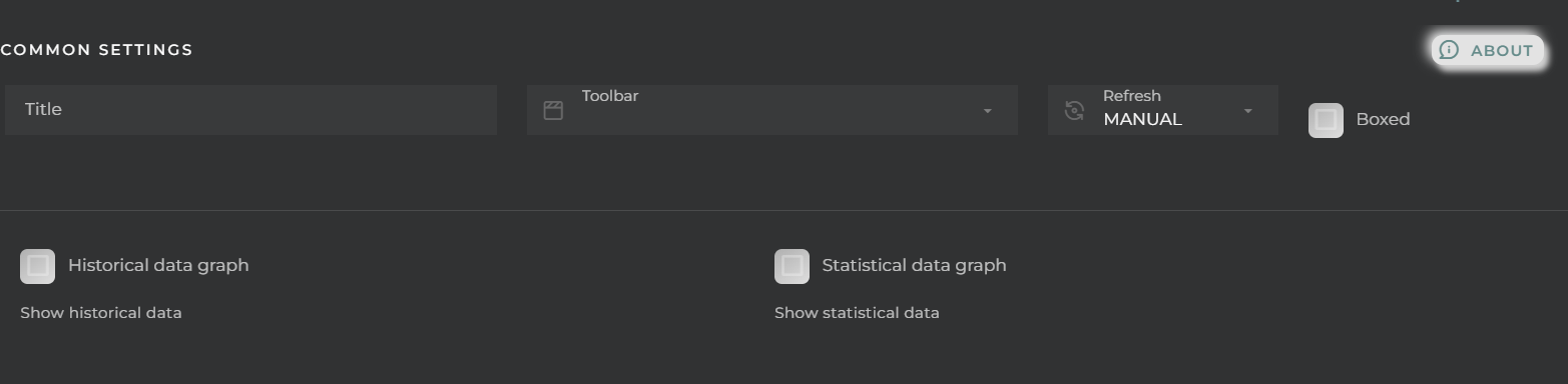
Historical data graph: Display a graph showing the value’s evolution over time.
Statistical data graph: Display statistical data.
Visualization
We can configure certain elements of the graphs displayed in the widget:
Background color
Hide details header panel: Removes the menu allowing for the modification of the type of visualization as well as the type of value to display.
Ticket Information Details
Widget that displays the information for each of the data streams that make up the ticket in card format.
How it works
On each card, we can see:
the current value
the date the value was taken
the source of the information
the type of provision (for provisioned data)
identifying icon
Target Menu
From each card, we can open various widgets (varying depending on the type of value of the data stream):
Stream status: “Last Value” widget displaying datastream information, such as the last value and trends.
Historical data: “Data Points” widget in table format, showing the data stream’s historical data.
View Chart: “Data Stream history” widget displaying the data stream’s evolution in chart form.
View tracking data: “Tracking” widget showing the entity’s location on a map (only applicable if it’s a location-type data stream).
Change value (provision datastreams only): Allows the user to change the value of the datastream without having to open the corresponding wizard.
Grouping
Selection of the type of grouping.
Depending on its configuration, it could be by:
data model
categories of a data model
tags
whether the value is provisioned or collected
Widget Menu
The following actions can be performed:
Open ticket information: opens a temporary dashboard with ticket information
Edit: opens the ticket wizard
Capture screen: Takes a screenshot of the widget.
Duplicate widget: Creates a duplicate of the widget on the dashboard.
Copy widget: Copies the widget to another dashboard.
Change widget location: Moves the widget to another dashboard.
Configuration
General
Boxed: widget will be displayed with background in dahsboard.
About: widget description in Markdown format.
Title: widget title. It can be configured to remain fixed in the widget or only be displayed when it receives focus.
Toolbar: configures the behavior of the widget bar on the dashboard, allowing you to hide it, hide it when not in use, or leave it always visible.
Refresh Frequency: allows configuring the data refresh frequency displayed in the list.
Extra actions: allows user to add new specific actions to the widget with your own code.
You can add a new one by pressing the New button.
Once you added a custom action it can be modified later by pressing the name in the list.
In order to remove the custom action click the delete icon button on the right.
In extra actions you can write your own code were you can open other dashboards, entities dashboards or execute wizards.
You can find all available functions and methods in Extra Information
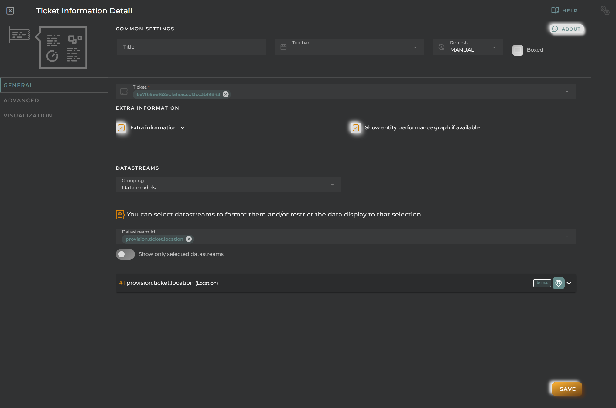
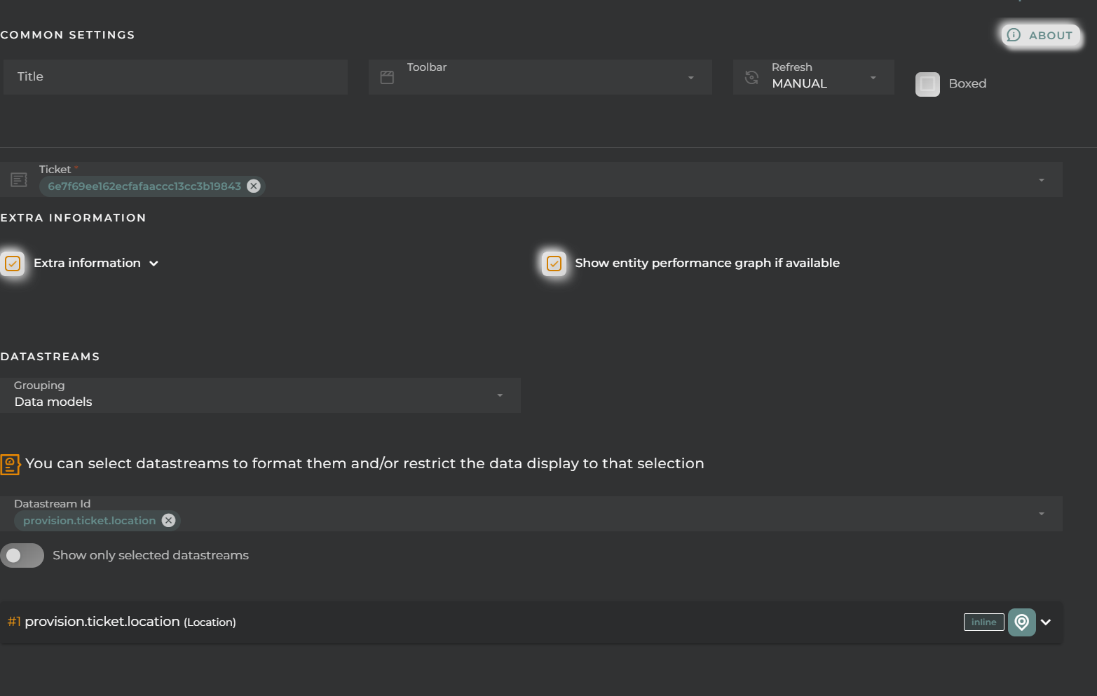
Ticket: Ticket to display
Extra Information: Selection of data to be displayed within the card
Grouping: Selection of the type of grouping:
data model
categories of a data model
tags
whether the value is provisioned or collected
DatastreamId: Selection and format of displayed data streams
Choose whether to view only the selected data streams
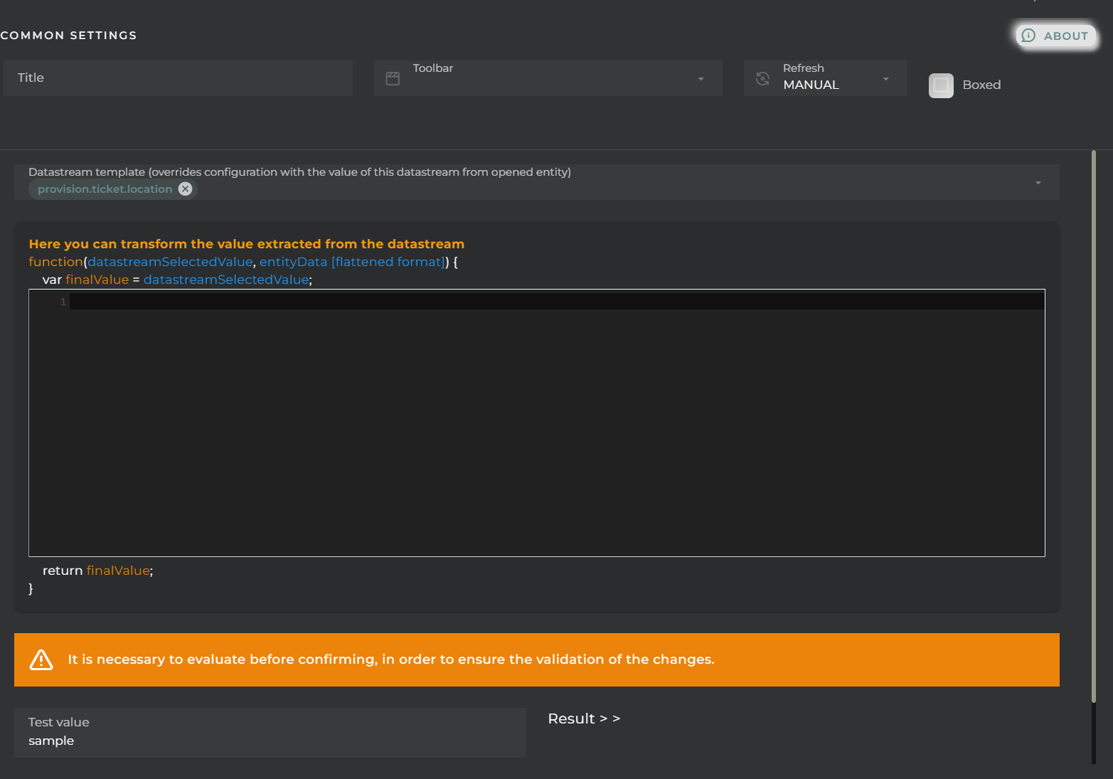
Format the selected data streams
Alias
Category: a new category can be created to group the data streams
Position: placement of the value on the card
Icon: representative icon to be displayed on the card
Format: formatting the value of the data stream to be displayed
Advanced
Visualization
We can configure certain elements of the graphs displayed in the widget:
Background color
Hide details header panel: Removes the menu allowing the modification of the type of visualization as well as the type of value to display.
Default alignment: placement of the value on the cards
Time series last value
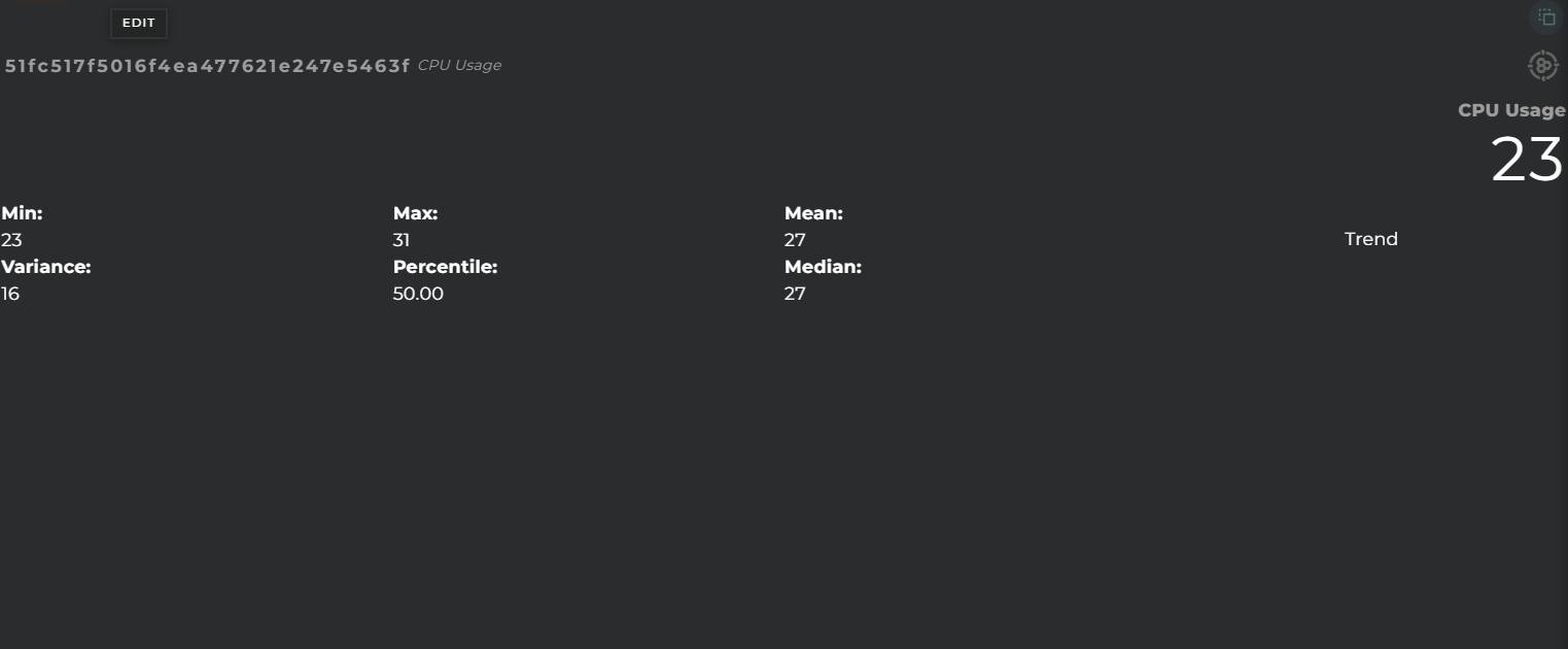
Widget that displays the last value obtained in a time series.
How it works
The information can be displayed in various formats: graphically, symbolically, and textually.
We can also check its history and statistics: trend, maximum and minimum, percentile, mean, and median.
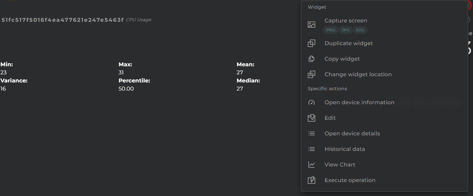
Widget Menu
The following actions can be performed:
Open device information: opens a temporary dashboard with device information
Edit: opens the device wizard
Open device details: opens the device information wizard
Generate QR: generates a QR code that will return basic information about the device
Historical data: “Time Series data list” widget in table format, showing the time series’ history
View Chart: “Time Series history” widget that displays the evolution of the time series
Execute operation: opens the operation execution wizard to perform an operation on the device
Capture screen: Takes a screenshot of the widget.
Duplicate widget: Creates a duplicate of the widget on the dashboard.
Copy widget: Copies the widget to another dashboard.
Change widget location: Moves the widget to another dashboard.
Configuration
General
Boxed: widget will be displayed with background in dahsboard.
About: widget description in Markdown format.
Title: widget title. It can be configured to remain fixed in the widget or only be displayed when it receives focus.
Toolbar: configures the behavior of the widget bar on the dashboard, allowing you to hide it, hide it when not in use, or leave it always visible.
Refresh Frequency: allows configuring the data refresh frequency displayed in the list.
Extra actions: allows user to add new specific actions to the widget with your own code.
You can add a new one by pressing the New button.
Once you added a custom action it can be modified later by pressing the name in the list.
In order to remove the custom action click the delete icon button on the right.
In extra actions you can write your own code were you can open other dashboards, entities dashboards or execute wizards.
You can find all available functions and methods in Extra Information
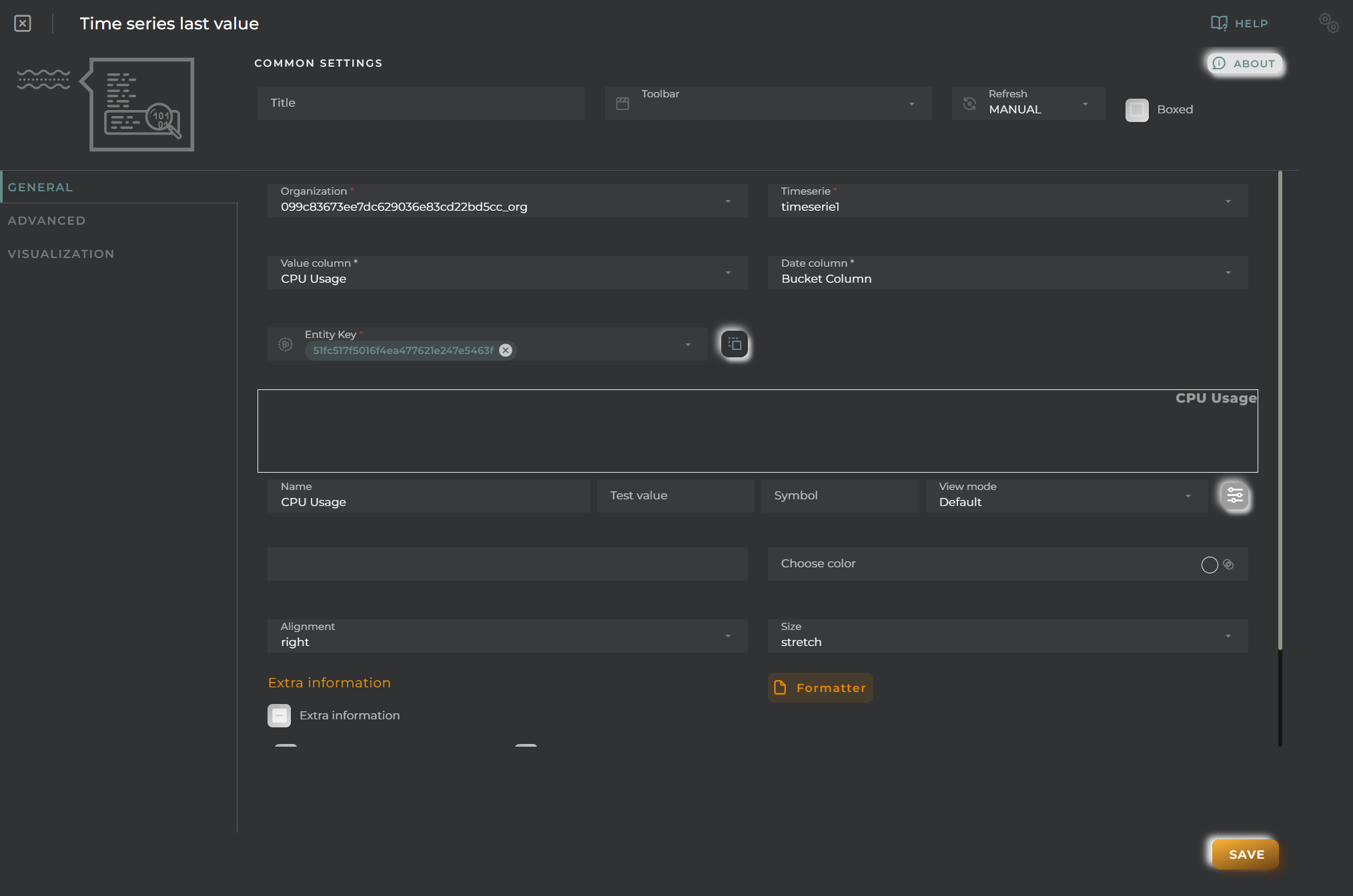
Organization: Organization of the desired time series
Time Series: Time Series source
Value column: Column to read the value
Date column: Column to read the date of the value and for stats
Entity key: Device to display
DatastreamId: Data stream whose last value (and its statistics) will be displayed
Name: Alias for the selected field to display
Test Value: If this data is filled in, a preview of how the widget will look with the value given to the datastream will be displayed in the configuration.
Symbol: Unit for the value
View mode: Type of data visualization
Value: Value in text format (default mode).
Icon: Display an icon (Symbol field) along with the value in text mode.
Battery (Percent): Display the value within a battery. Reference values will be configured in the “Chart colors” panel.
Bar (Percent/Range): Display the value in a bar. Reference values will be configured in the “Chart colors” panel.
Gauge (Percent/Range): Display the value in a gauge-type graph. Reference values will be configured in the “Chart colors” panel.
Choose an icon: Icon to display (for Icon mode).
Choose color: Icon color.
Alignment: Alignment of the value (Value and Icon modes) in the widget.
Size: Value size.
Extra information: Extra information to display in the widget along with the value.
FORMATTER: Opens a panel where you can format the value.
dataFormatter: Value format
tooltip: Tooltip value format that appears when hovering over the value
In this case, the barBeginCircle option should always be set to false. If it is necessary to modify this option, it is recommended to use the thermometer chart type.