Image Widget
The widget allows you to build and/or modify.
How it works
Once the widget is configured, an image will be displayed with the configured data.
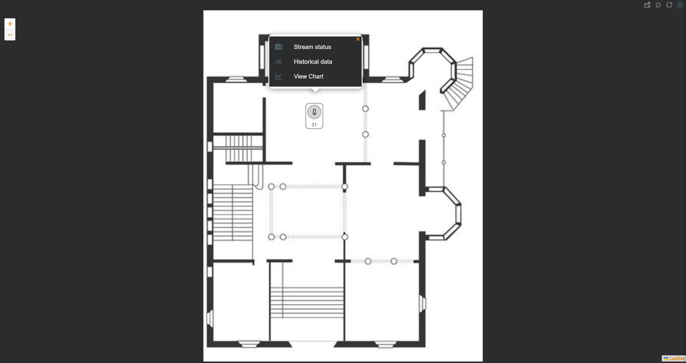
Icon Menu
Data can be viewed as icons positioned over the image, which we can interact with to view information about them:
- Stream status: “Last Value” widget displaying datastream information, such as the last value and trends.
- Historical data: “Data Points” widget in table format, showing the data stream’s historical data.
- View Chart: “Data Stream history” widget displaying the data stream’s evolution in chart form.
- View tracking data: “Tracking” widget showing the entity’s location on a map (only applicable if it’s a location-type data stream).
- Change value (provision datastreams only): Allows the user to change the value of the datastream without having to open the corresponding wizard.
Widget Menu
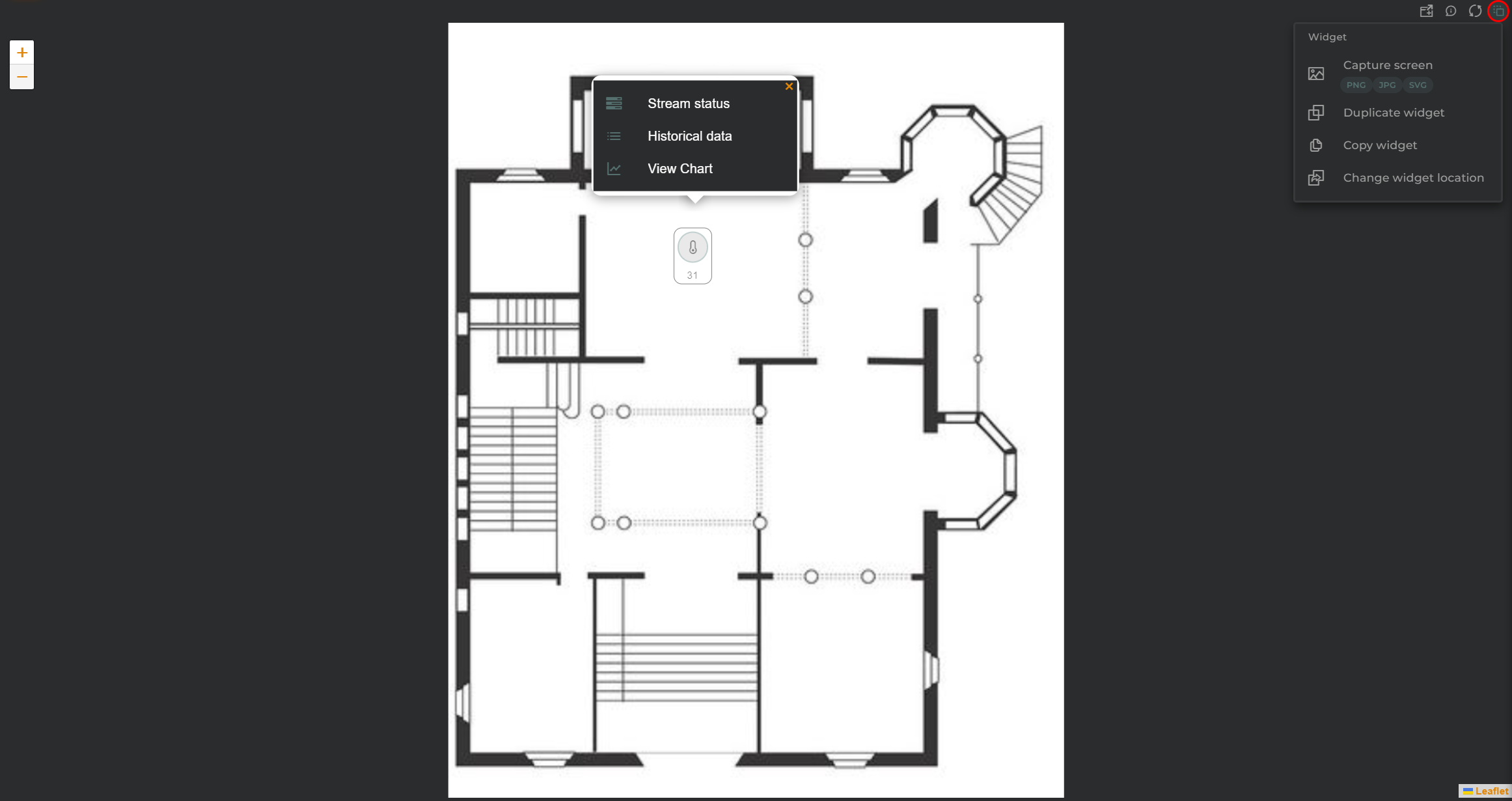
The following actions can be performed:
- Capture screen: Takes a screenshot of the widget.
- Duplicate widget: Creates a duplicate of the widget on the dashboard.
- Copy widget: Copies the widget to another dashboard.
- Change widget location: Moves the widget to another dashboard.
Configuration
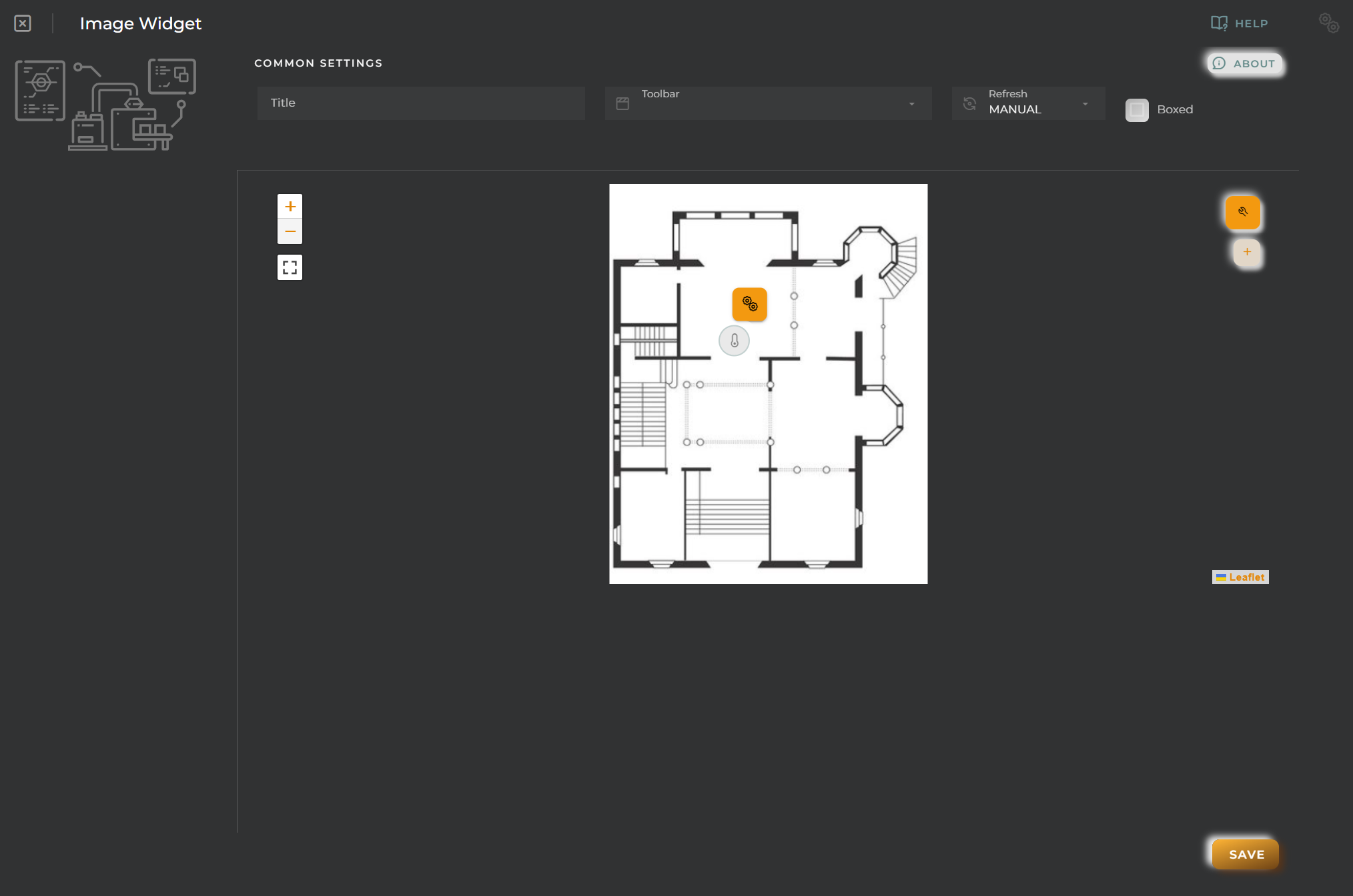
Image Upload
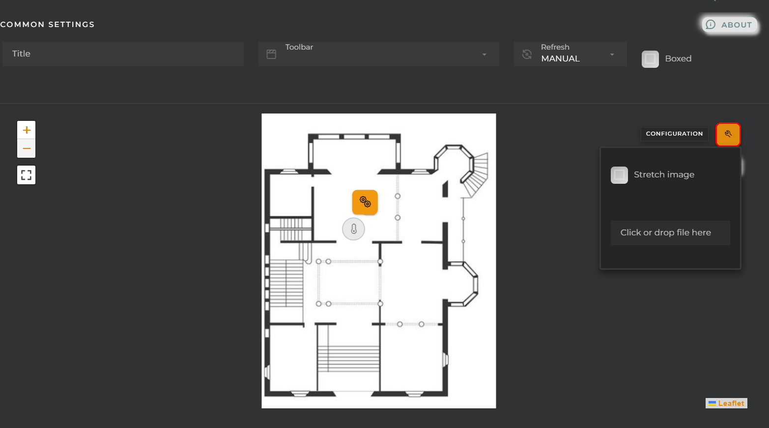
From here, we can upload the image to display and its format.
Icon Configuration
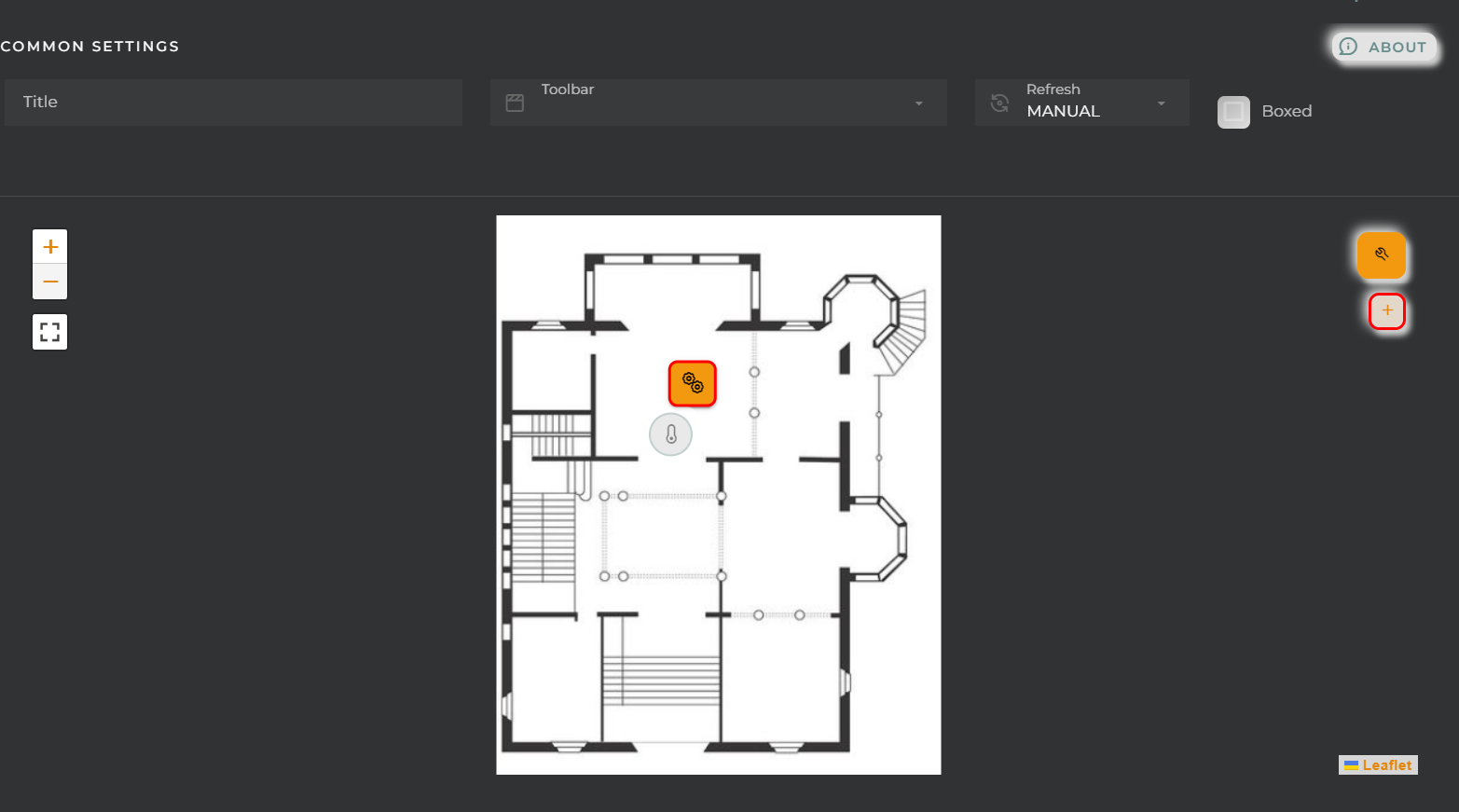
Using the + button, we can add icons to the image.
Existing icons can also be edited by clicking on them.
We can configure:
-
General:

- Entity key: Device from which we will obtain the data
- DatastreamId: Data stream whose value will be displayed on the icon
-
View:

- Name: Alias for the selected field to display
- Test Value: If this data is filled in, a preview of how the widget will look with the value given to the datastream will be displayed in the configuration.
- Symbol: Unit for the value
- View mode: Type of data visualization

-
Value: Value in text format (default mode).
-
Icon: Display an icon (Symbol field) along with the value in text mode.
-
Battery (Percent): Display the value within a battery. Reference values will be configured in the “Chart colors” panel.
-
Bar (Percent/Range): Display the value in a bar. Reference values will be configured in the “Chart colors” panel.
-
Gauge (Percent/Range): Display the value in a gauge-type graph. Reference values will be configured in the “Chart colors” panel.
-
Choose an icon: Icon to display (for Icon mode).
-
Choose color: Icon color.
-
Alignment: Alignment of the value (Value and Icon modes) in the widget.
-
Size: Value size.
-
Extra information: Extra information to display in the widget along with the value.
-
FORMATTER: Opens a panel where you can format the value.

-
dataFormatter: Value format
-
tooltip: Tooltip value format that appears when hovering over the value
-
box: Tooltip box style
-
char: Graphic value format:
- battery: https://github.com/larsmars/vuejs-progress-bar#usage. For proper visualization of this chart, the following configuration is recommended for all sizes other than small:
formatter.chart.battery.text = { color: "red" };- bar: https://canvas-gauges.com/documentation/user-guide/configuration (https://canvas-gauges.com/documentation/examples/ See “Other Custom Linear Gauges”):
formatter.chart.bar.options = {
  units: "GB",
  minValue: 0,
  maxValue: 100,
  majorTicks: [0, 10, 20, 30, 40, 50, 60, 70, 80, 90, 100],
  minorTicks: 5,
  barBeginCircle: false,
};
In this case, the barBeginCircle option should always be set to false. If it is necessary to modify this option, it is recommended to use the thermometer chart type.
- circularGauge: https://echarts.apache.org/examples/en/index.html#chart-type-gauge. The properties of this chart are the same as those of gauge, but these options should be added:
formatter.chart.gaugeCircular = {
  series: [
    {
      detail: {
        formatter: "{value} GB",
      },
    },
  ],
};
series[0].startAngle = 90;
series[0].endAngle = -269;
Do not modify these properties unless necessary. If necessary, it is recommended to use the gauge chart type.
- thermometer: https://canvas-gauges.com/documentation/user-guide/configuration (https://canvas-gauges.com/documentation/examples/ See “Other Custom Linear Gauges”)
formatter.chart.thermometer.options = {
  units: "ºC",
  minValue: 0,
  maxValue: 100,
  majorTicks: [0, 10, 20, 30, 40, 50, 60, 70, 80, 90, 100],
  minorTicks: 5,
};
-
-
Advanced:

- Prevent override entity identifier in templates