Subsections of Charts

Data Stream history

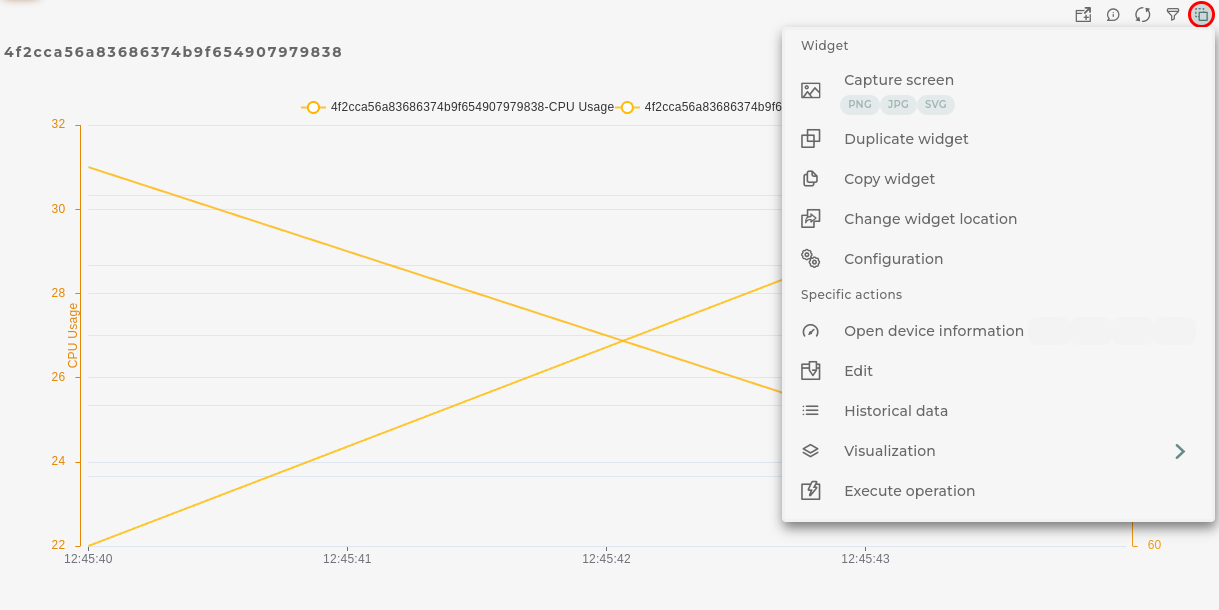
Graphical representation of data stream information

How it works
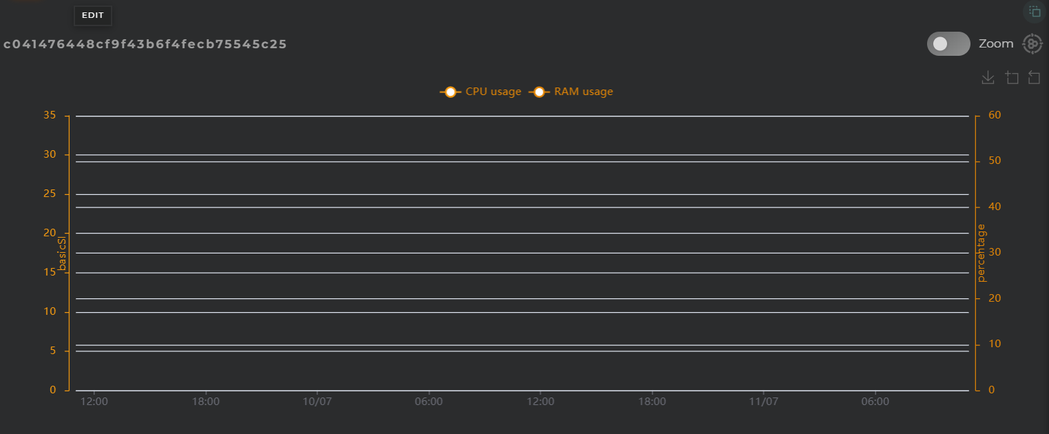
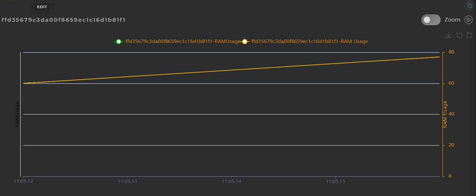
Data Streams History widget

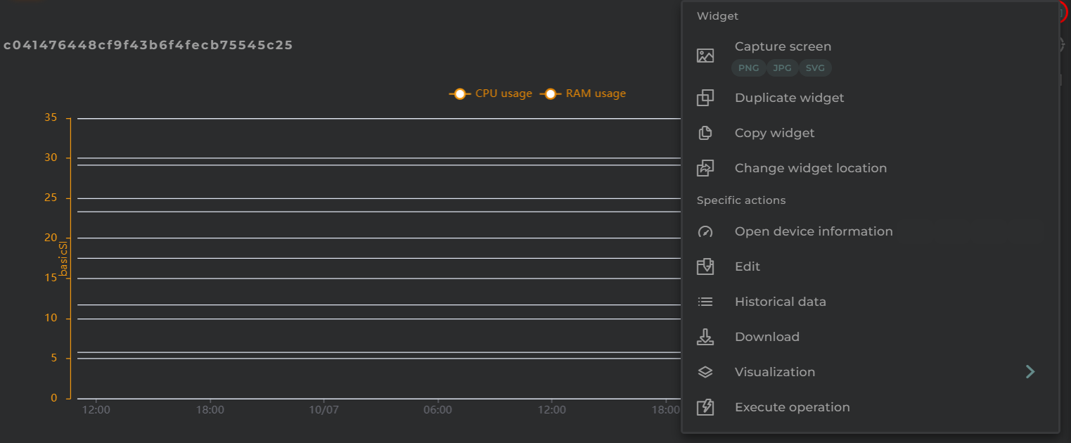
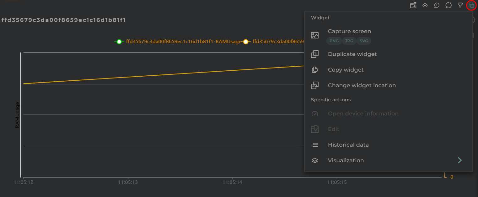
Widget Menu

Data Streams History Actions

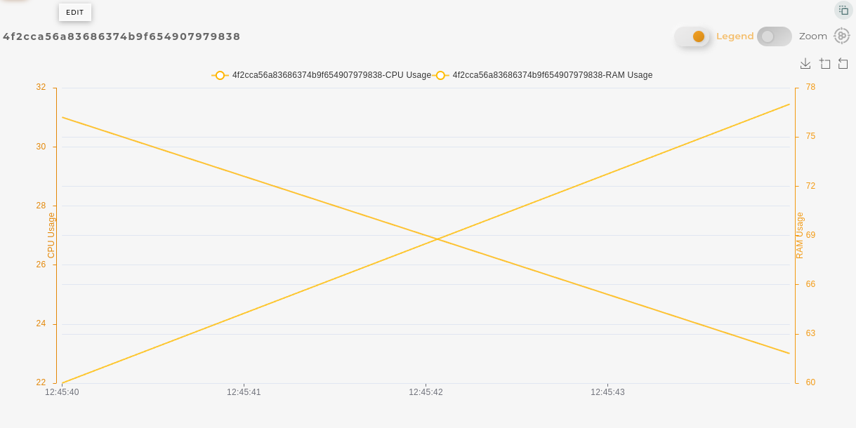
From here, the following actions can be performed:

  • Open device information allows for the opening of a temporary dashboard associated with the selected entity
  • Edit allows the editing of the selected entity
  • Historical data displays the chart data in a list format (requires selecting a grouping parameter)
  • Download downloads the data displayed in the chart in CSV format
  • Visualization toggles between different data visualization options on the chart
  • Capture screen: Takes a screenshot of the widget.
  • Duplicate widget: Creates a duplicate of the widget on the dashboard.
  • Copy widget: Copies the widget to another dashboard.
  • Change widget location: Moves the widget to another dashboard.

Configuration

General

  • Boxed: widget will be displayed with background in dahsboard.
  • About: widget description in Markdown format.
  • Title: widget title. It can be configured to remain fixed in the widget or only be displayed when it receives focus.
  • Toolbar: configures the behavior of the widget bar on the dashboard, allowing you to hide it, hide it when not in use, or leave it always visible.
  • Refresh Frequency: allows configuring the data refresh frequency displayed in the list.
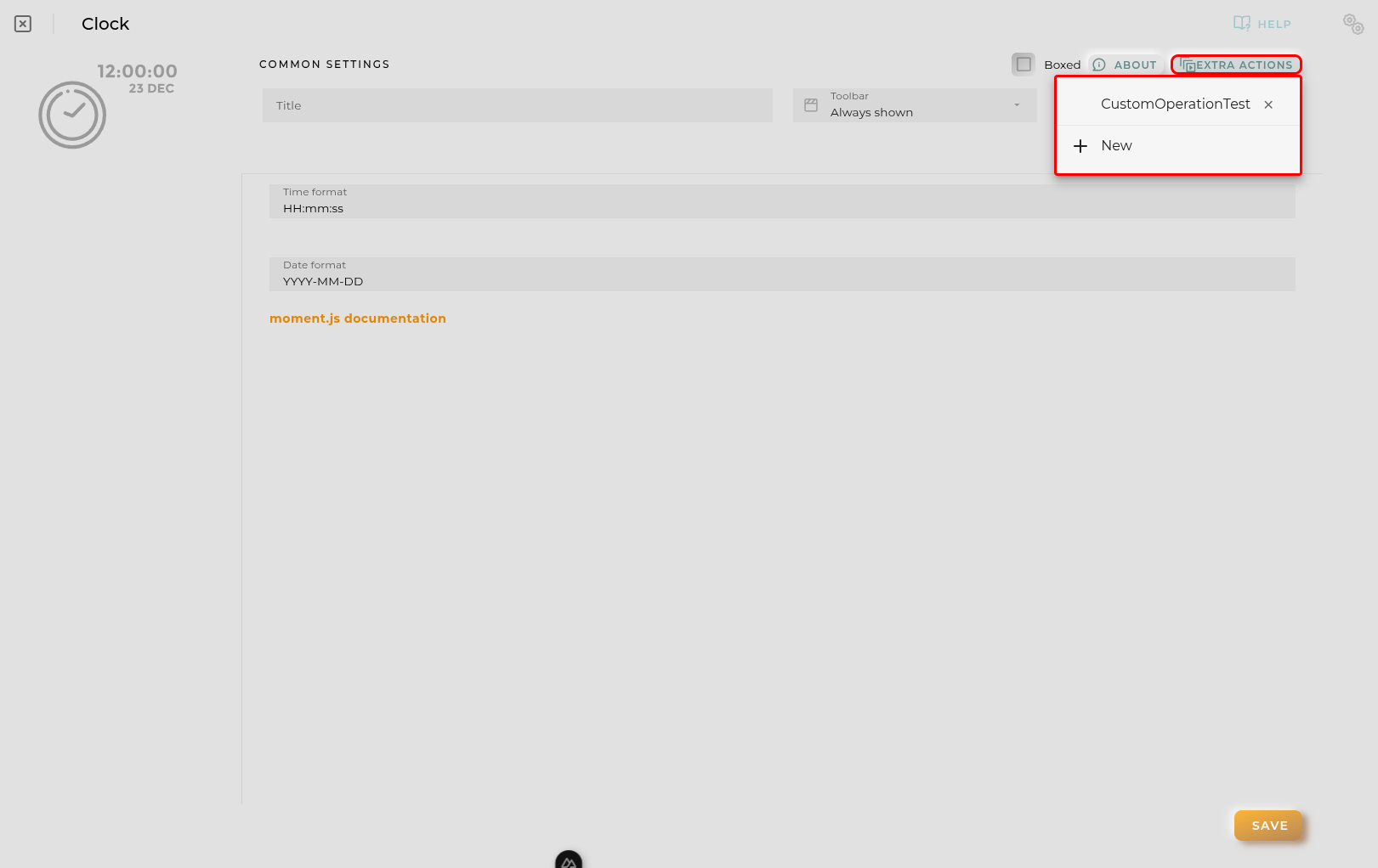
  • Extra actions: allows user to add new specific actions to the widget with your own code.
Extra action config

You can add a new one by pressing the New button.

Once you added a custom action it can be modified later by pressing the name in the list.

In order to remove the custom action click the delete icon button on the right.

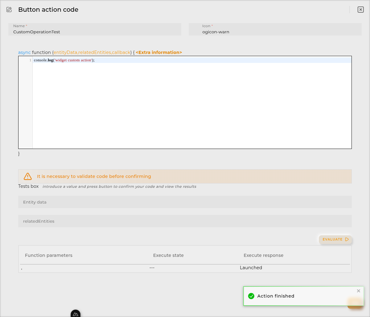
In extra actions you can write your own code were you can open other dashboards, entities dashboards or execute wizards.
Extra action code

You can find all available functions and methods in Extra parameters

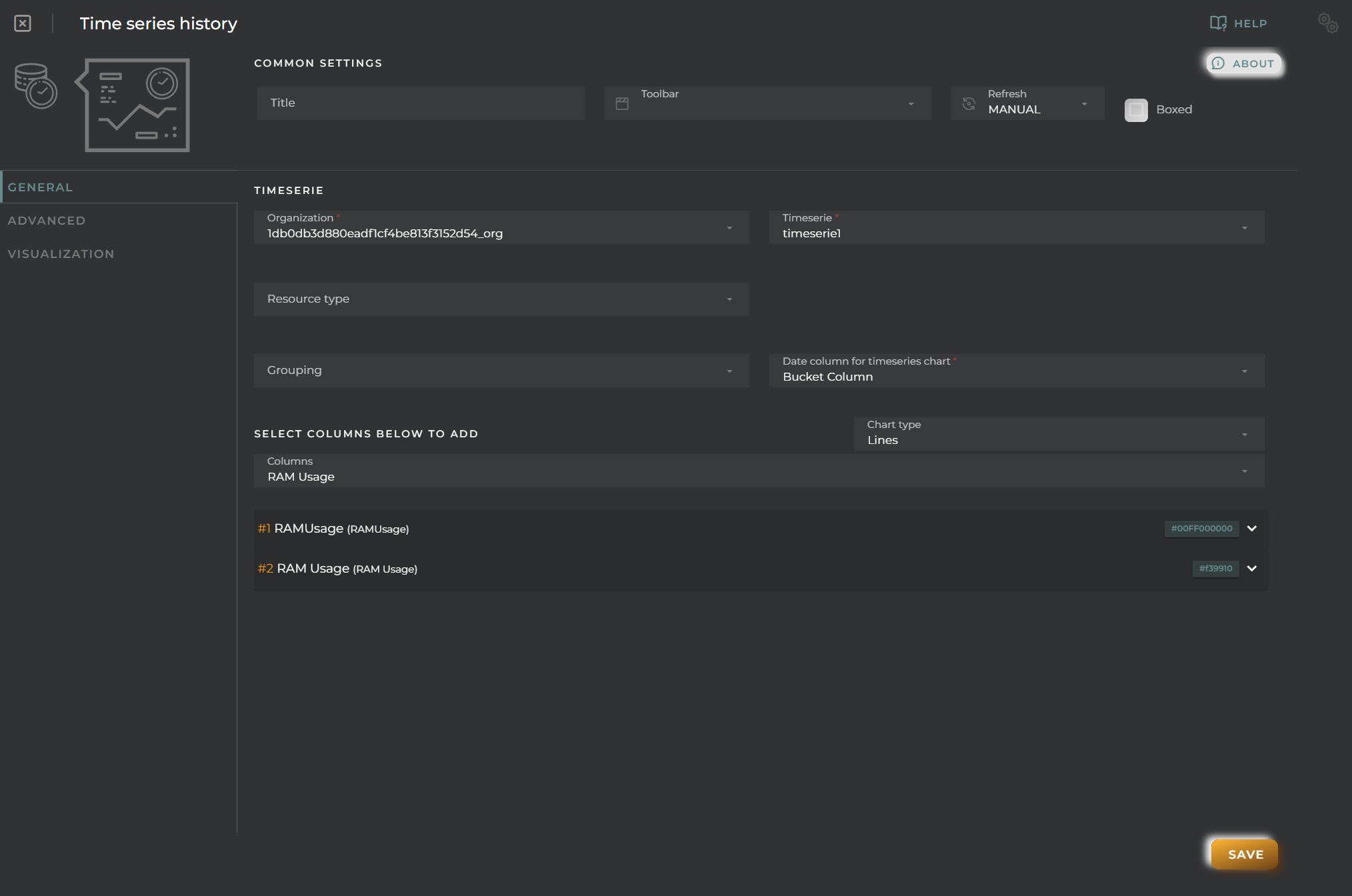
  • Resource Type + EntityKey(s) specifies the resource type and identifier of the entities to be queried (not required)

Columns from which to extract data to display on the graph must be configured. A graph will be generated for each column.

For each piece of data, the following can be configured:

  • Alias a representative name for the column data on the chart
  • Color to distinguish it on the graph
  • Intensity allows for the graph to change shades depending on the value
  • Unit indicates the measurement being displayed on the corresponding axis
  • Chart Type toggles between different data visualization possibilities. Can also be configured globally for all metrics.
  • Axis editor enables the configuration of the Y-axis on the chart to assign discrete values to specific values
  • Formatter tool is a utility that processes each data point, allowing for its modification and/or calculation before it is displayed on the graph. For instance, it can convert discrete data into numerical data for representation.
  • Reduce tool allows code-based reformulation of series data by grouping and similar operations.
  • Remove removes the data stream from the chart
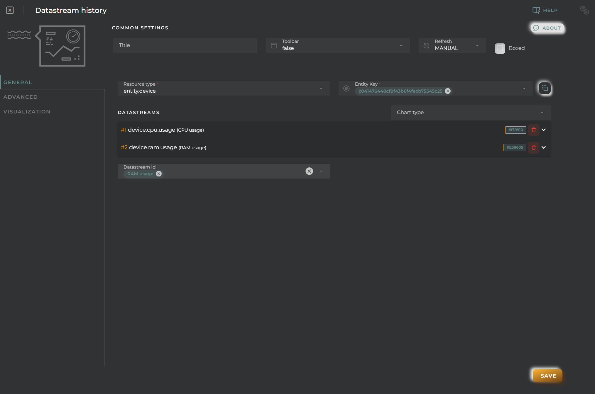
Datastreams History General Configuration

Advanced

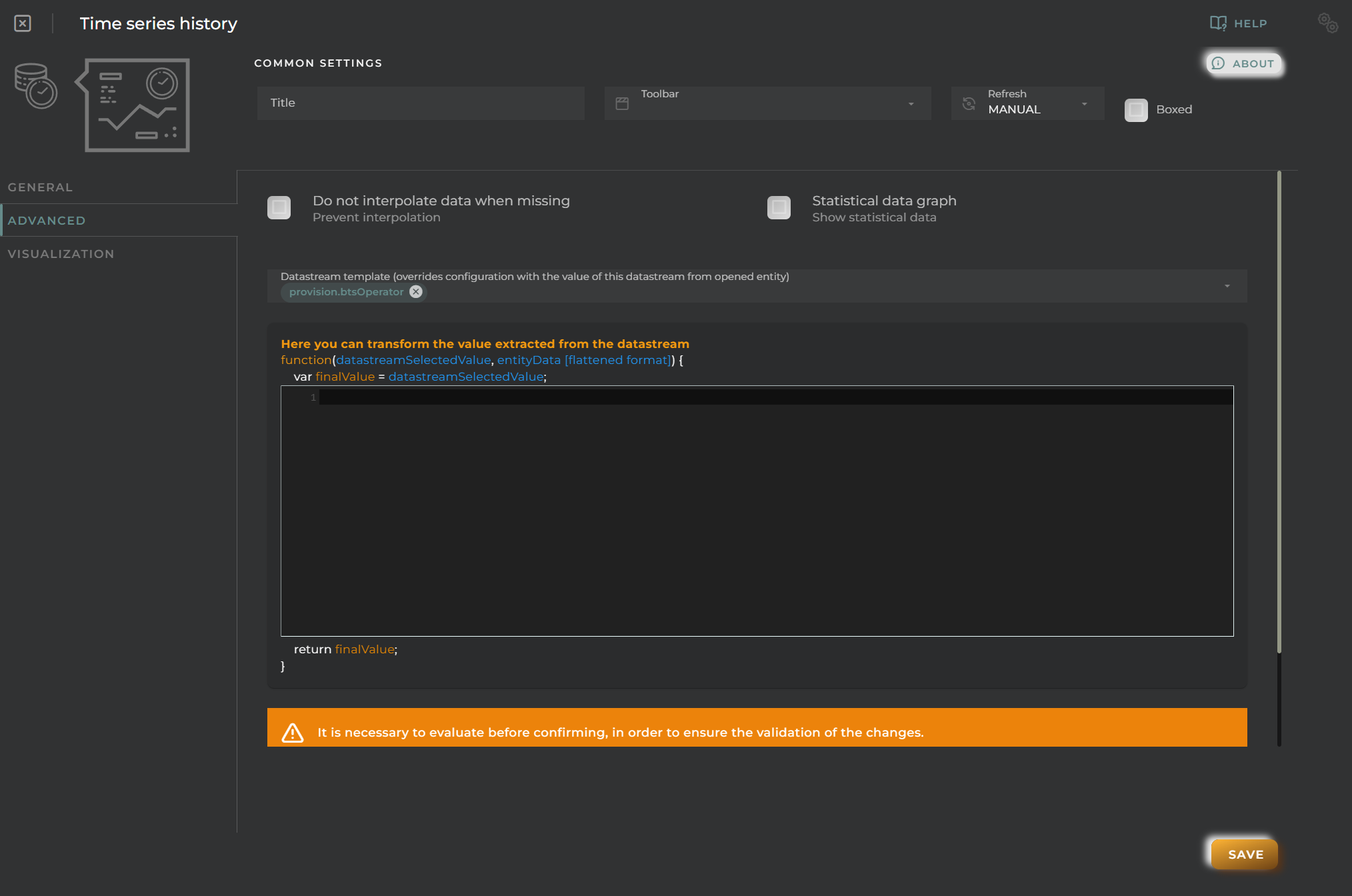
From here, you can configure the widget’s behavior while plotting the graph as well as when it is opened within a temporary dashboard.
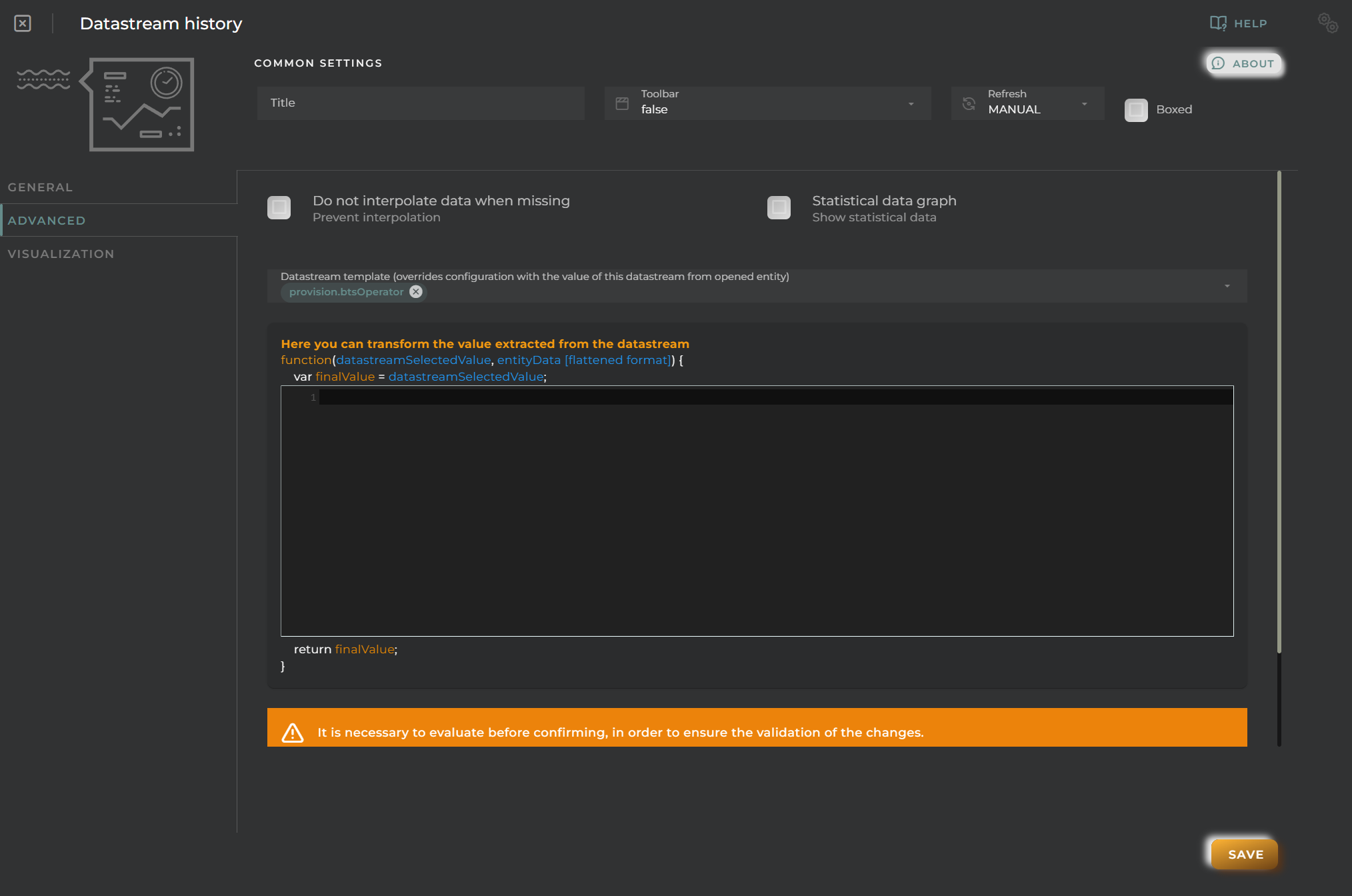
Datastreams History Advanced Configuration
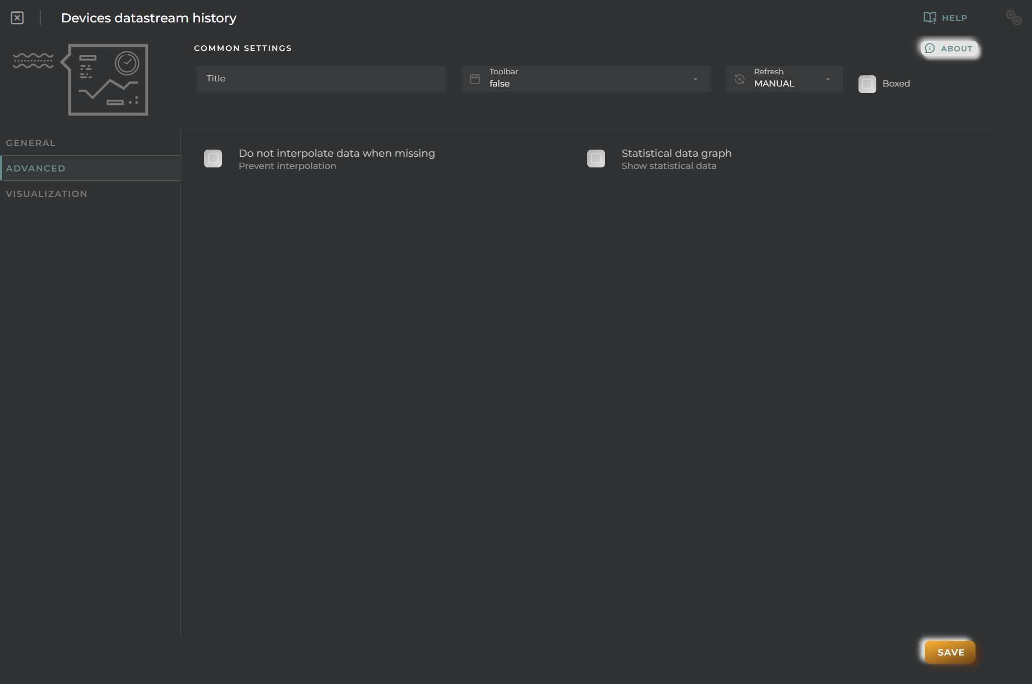
  • Prevent interpolation allows the avoidance of data interpolation where possible
  • Statistical data graph displays a panel with basic statistical values
  • Data Stream template activates the override of the EntityKey in the widget when the dashboard is opened in a device template, taking a data stream from the entity itself at the time of loading

Visualization
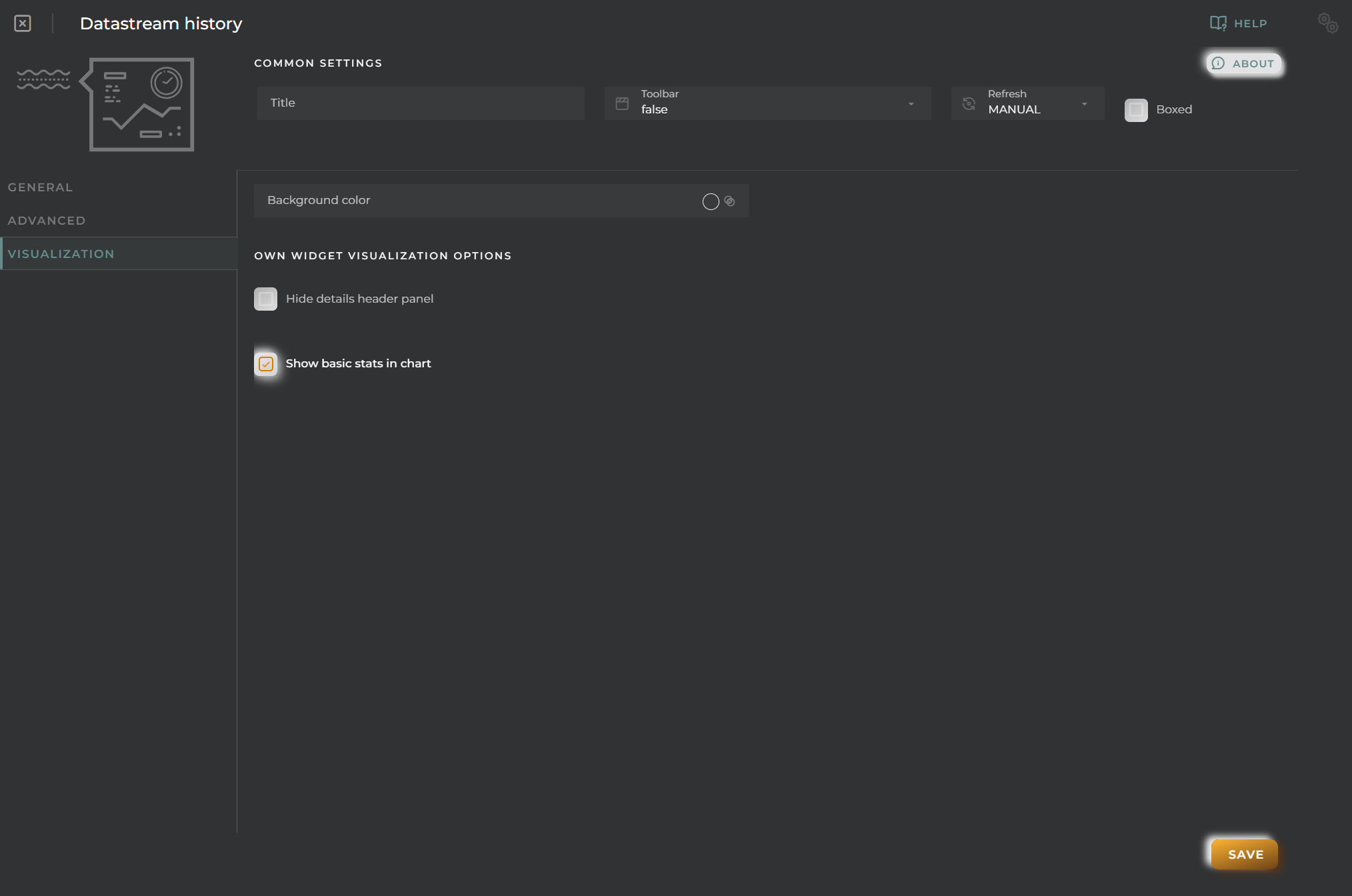
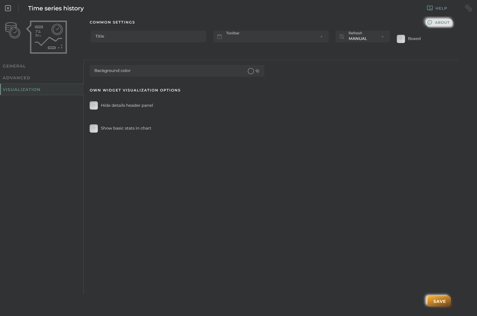
Datastreams History Visualization

From here, you can change some visual aspects of the widget.

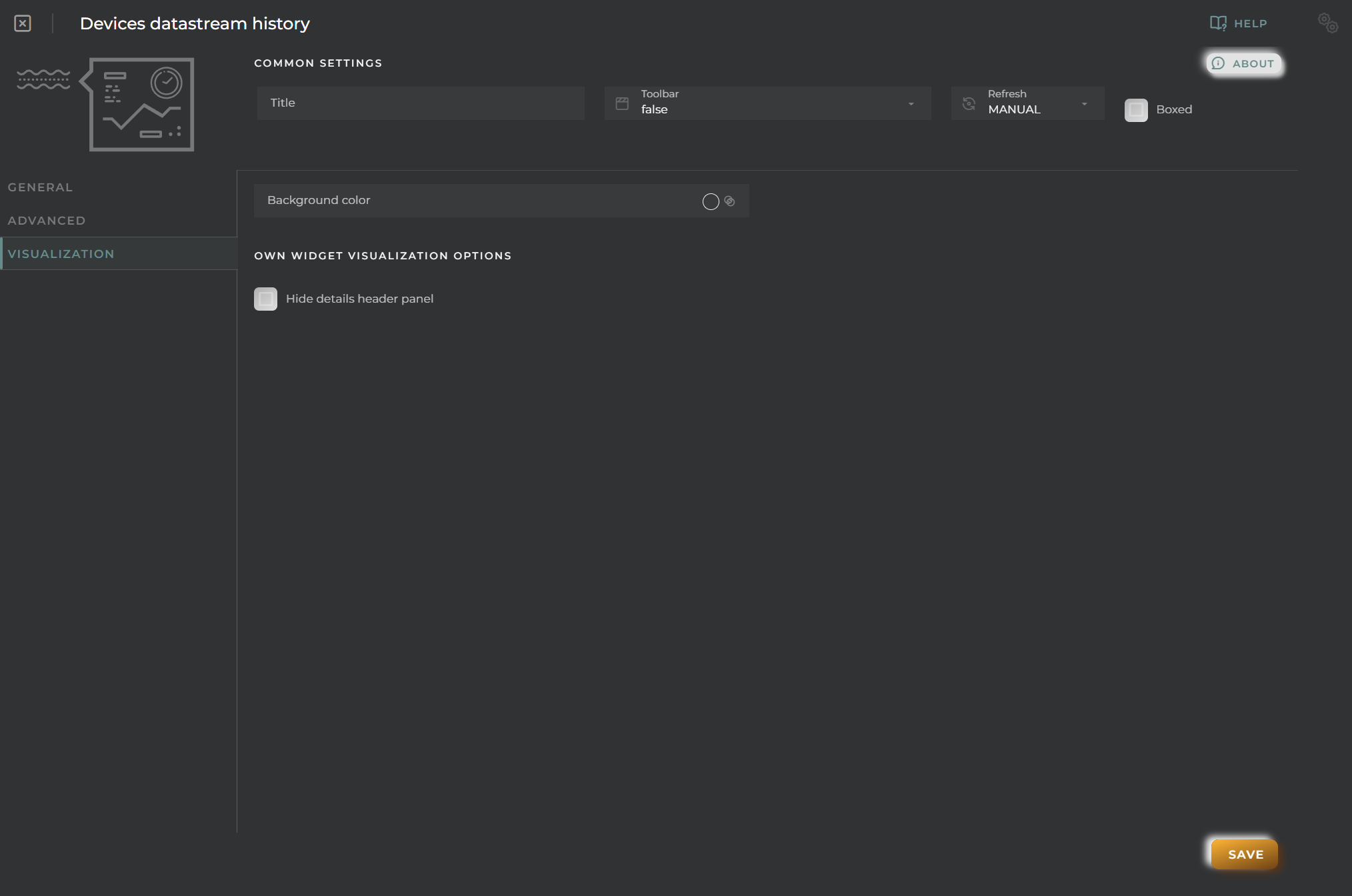
  • Background color allows setting a distinctive color for the widget
  • Hide details header panel hides the upper information panel of the widget, freeing up that space
  • Show basic stats in chart displays basic statistics on the chart data as long as only one series is being represented
Data Stream timeline

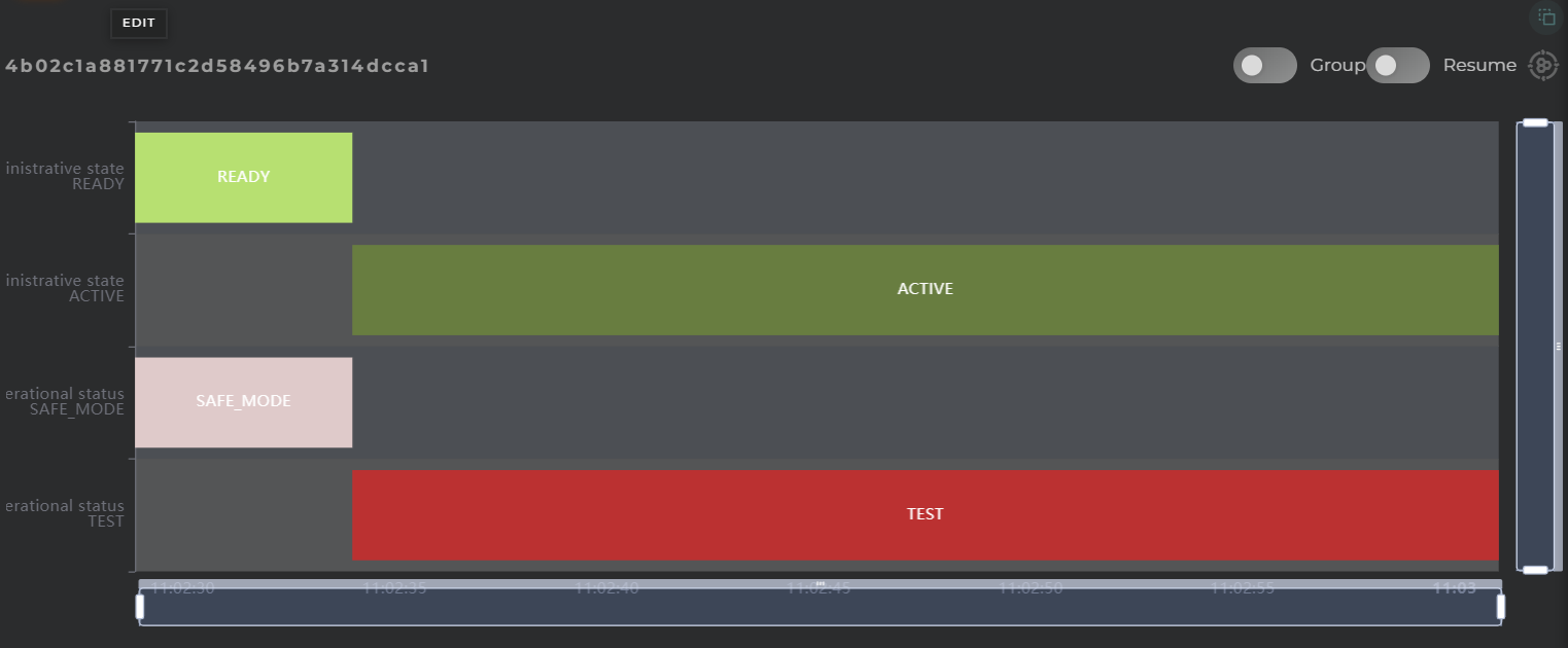
Graphical representation of the timeline of historical data from a data stream

How it works

Data Stream Timeline widget

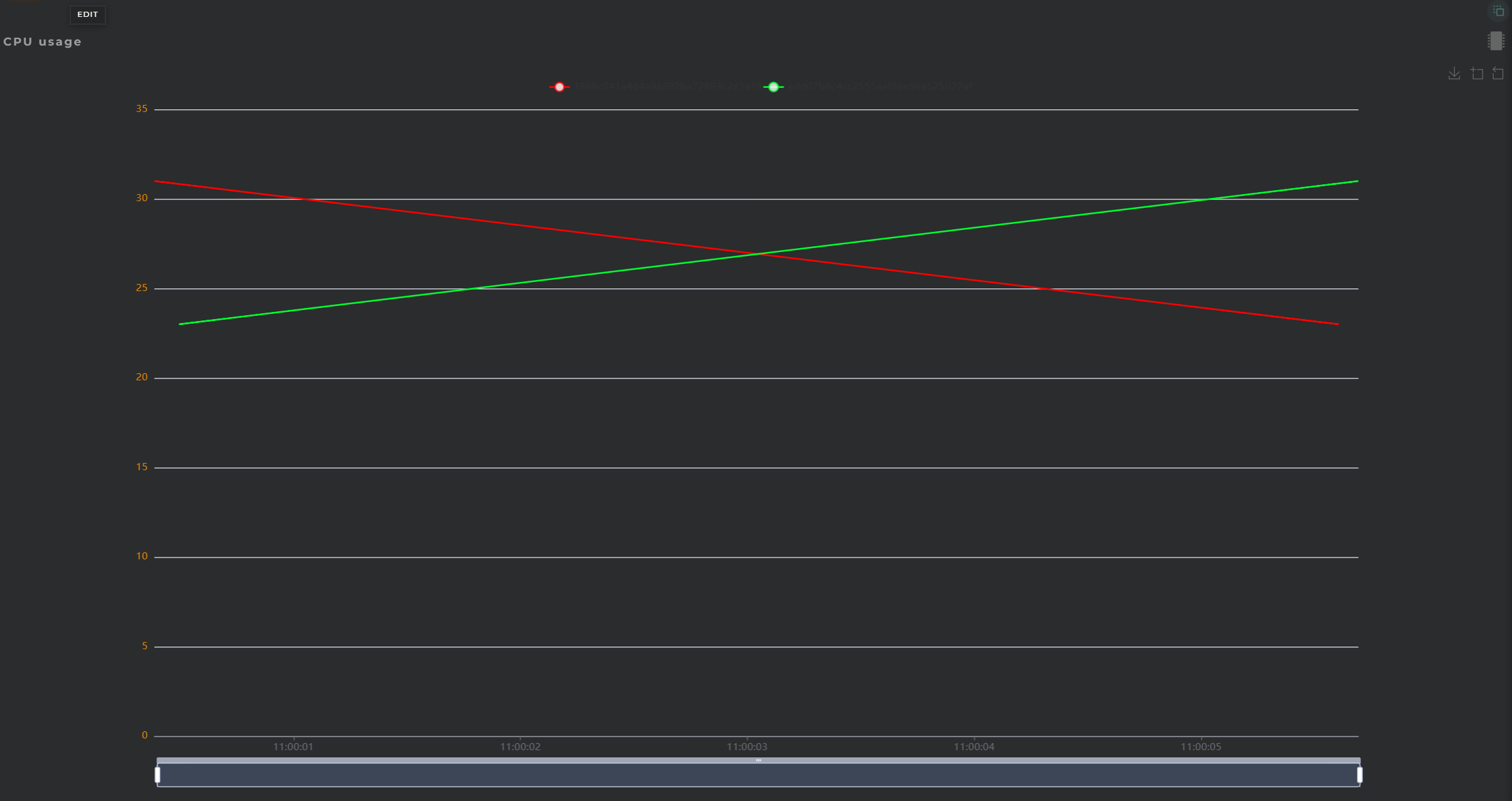
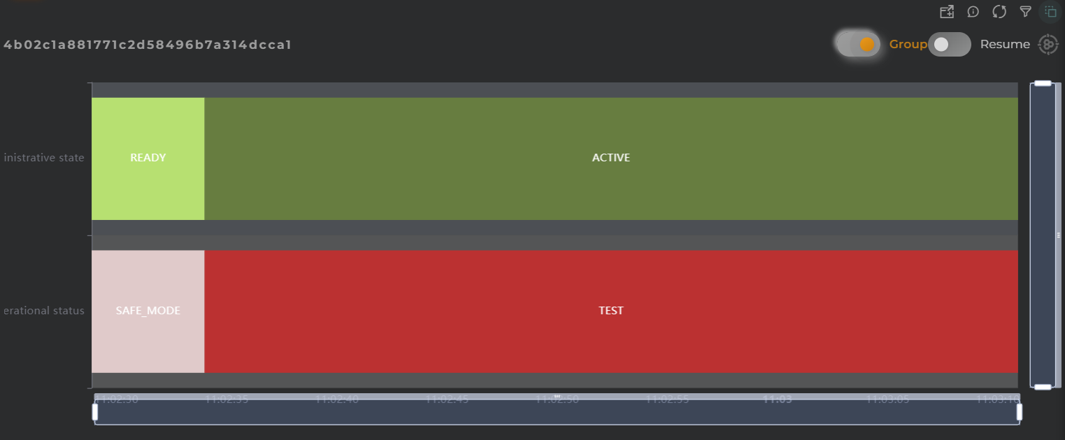
This widget facilitates the visualization of value changes in a field over time.

Each timeline will display the name of the data stream along with the represented value, arranged as follows:
  • field
  • value

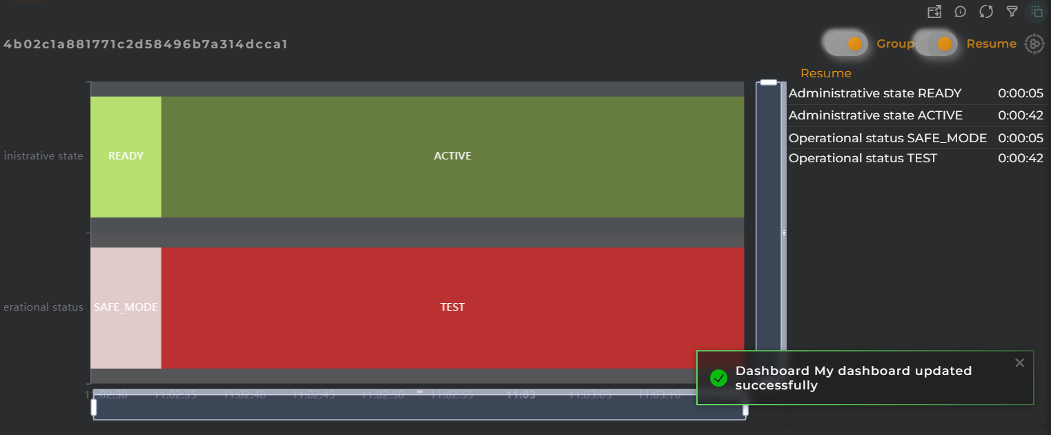
Grouping

Data Stream Timeline grouped information

By enabling the grouping of timelines, one can view all represented states on a single timeline (without separation).
When data are grouped, the representation of the timeline will change, displaying the value on the same timeline, and each bar will contain the following:

  • field

Summary

Data Stream Timeline information summary

The summary panel allows you to observe the total time each value has been maintained.

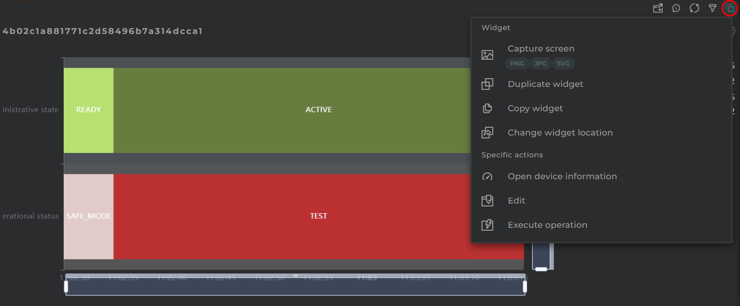
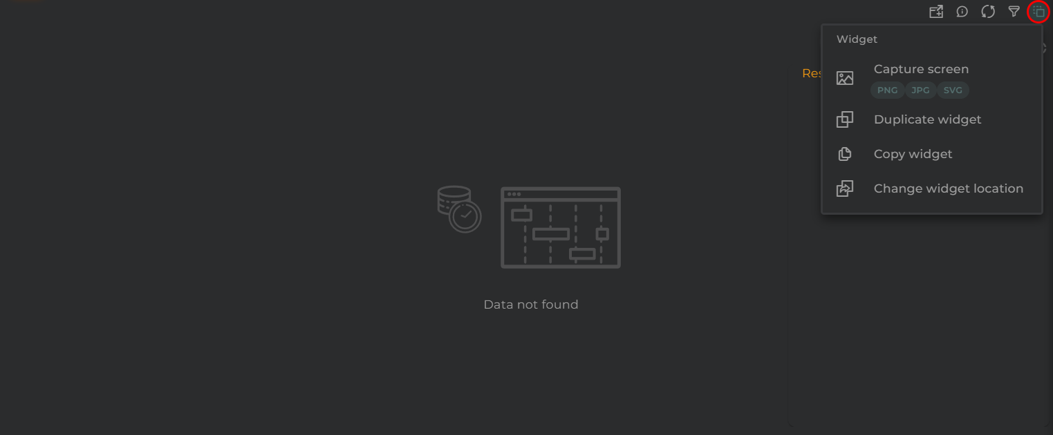
Widget Menu

Data Stream Timeline Actions

From here, the following actions can be performed:

  • Open device information opens the corresponding temporary panel with the selected entity
  • Edit opens the wizard corresponding to the selected entity
  • Generate QR generates a QR code that will return basic information about the asset
  • Execute operation opens the pre-configured operation launcher for the selected entity
  • Capture screen: Takes a screenshot of the widget.
  • Duplicate widget: Creates a duplicate of the widget on the dashboard.
  • Copy widget: Copies the widget to another dashboard.
  • Change widget location: Moves the widget to another dashboard.

Configuration

General

  • Boxed: widget will be displayed with background in dahsboard.
  • About: widget description in Markdown format.
  • Title: widget title. It can be configured to remain fixed in the widget or only be displayed when it receives focus.
  • Toolbar: configures the behavior of the widget bar on the dashboard, allowing you to hide it, hide it when not in use, or leave it always visible.
  • Refresh Frequency: allows configuring the data refresh frequency displayed in the list.
  • Extra actions: allows user to add new specific actions to the widget with your own code.

Extra action config

You can add a new one by pressing the New button.

Once you added a custom action it can be modified later by pressing the name in the list.

In order to remove the custom action click the delete icon button on the right.

In extra actions you can write your own code were you can open other dashboards, entities dashboards or execute wizards.

Extra action code

You can find all available functions and methods in Extra parameters

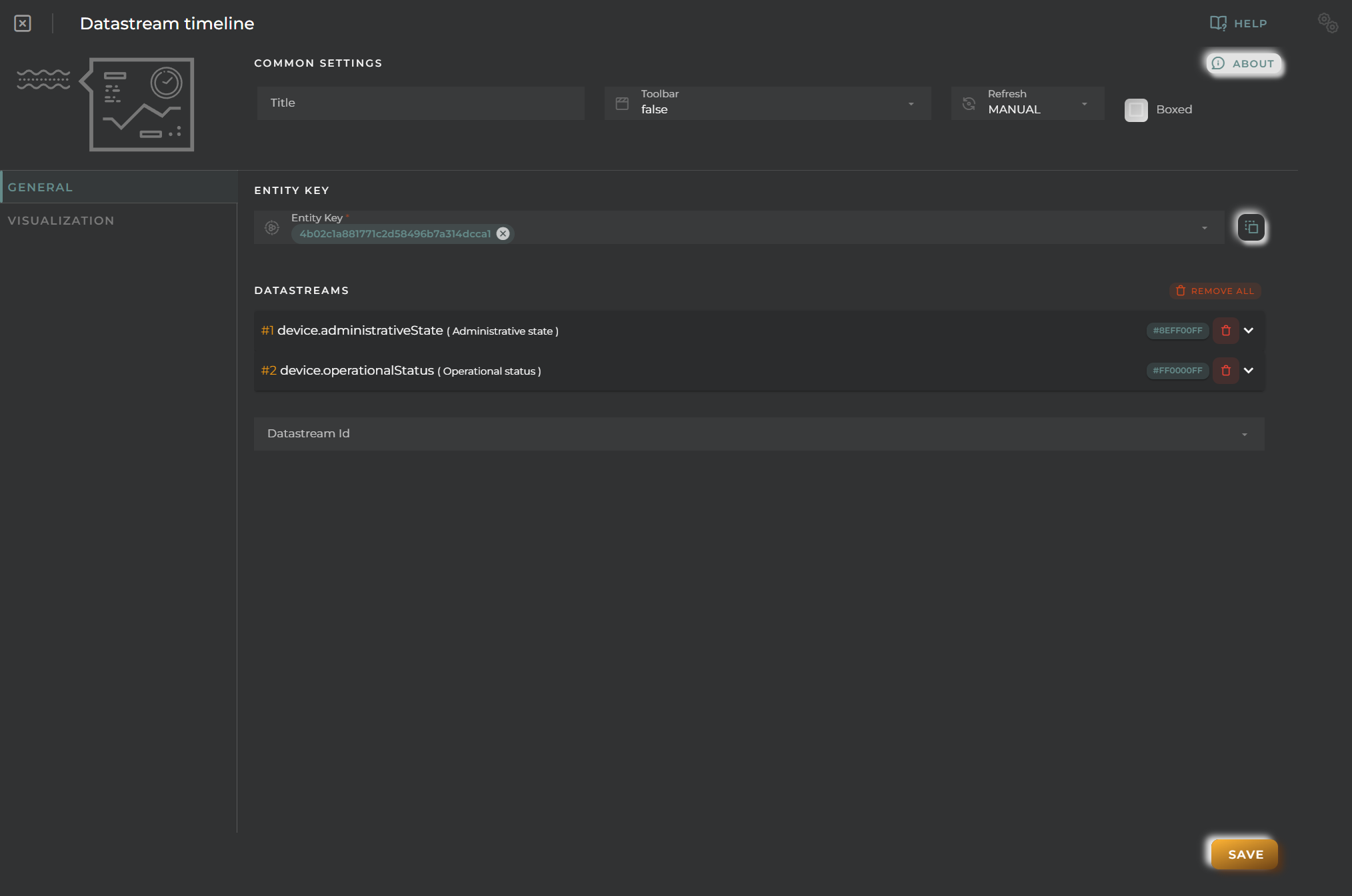
  • Entity key of the desired entity to obtain the data
Data Stream Timeline General Configuration

Finally, those columns from which to extract data to display on the graph must be configured. A timeline will be generated for each of them.

For each piece of data, the following can be configured:

  • Alias a representative name for the column data on the graph
  • Color to distinguish it within the graph
  • Formatter tool is a tool that will process each piece of data, allowing for its modification and/or any calculation to ultimately display it on the graph. For example, it can convert numerical data into discrete data for representation.
  • Remove will remove the column from the configuration

Visualization

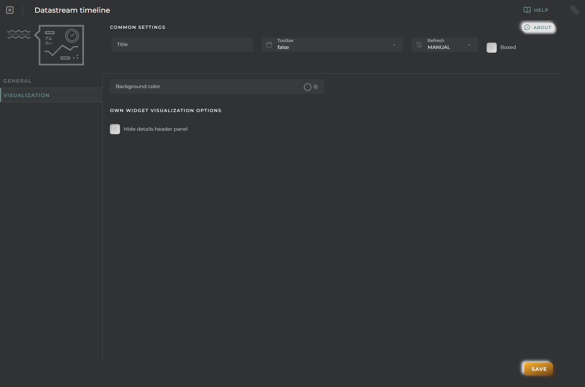
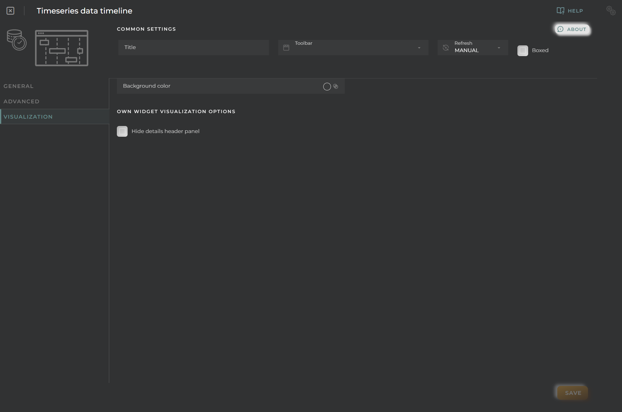
Data Stream Timeline Visualization

From here, some visual aspects of the widget can be changed.

  • Background color allows you to set a distinctive color for the widget
  • Hide details header panel hides the upper information panel of the widget, freeing up that space

Devices data stream history

Graphical representation of data from a data stream for multiple devices simultaneously

How it works

Data Streams Devices widget

Widget Menu

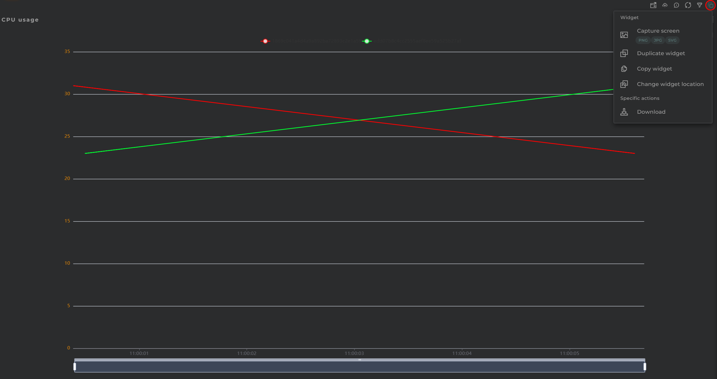
Data Streams Devices Actions

From here, the following actions can be executed:

  • Download allows for downloading the data displayed on the chart in CSV format
  • Capture screen: Takes a screenshot of the widget.
  • Duplicate widget: Creates a duplicate of the widget on the dashboard.
  • Copy widget: Copies the widget to another dashboard.
  • Change widget location: Moves the widget to another dashboard.

Configuration

General

  • Boxed: widget will be displayed with background in dahsboard.
  • About: widget description in Markdown format.
  • Title: widget title. It can be configured to remain fixed in the widget or only be displayed when it receives focus.
  • Toolbar: configures the behavior of the widget bar on the dashboard, allowing you to hide it, hide it when not in use, or leave it always visible.
  • Refresh Frequency: allows configuring the data refresh frequency displayed in the list.
  • Extra actions: allows user to add new specific actions to the widget with your own code.

Extra action config

You can add a new one by pressing the New button.

Once you added a custom action it can be modified later by pressing the name in the list.

In order to remove the custom action click the delete icon button on the right.

In extra actions you can write your own code were you can open other dashboards, entities dashboards or execute wizards.

Extra action code

You can find all available functions and methods in Extra parameters

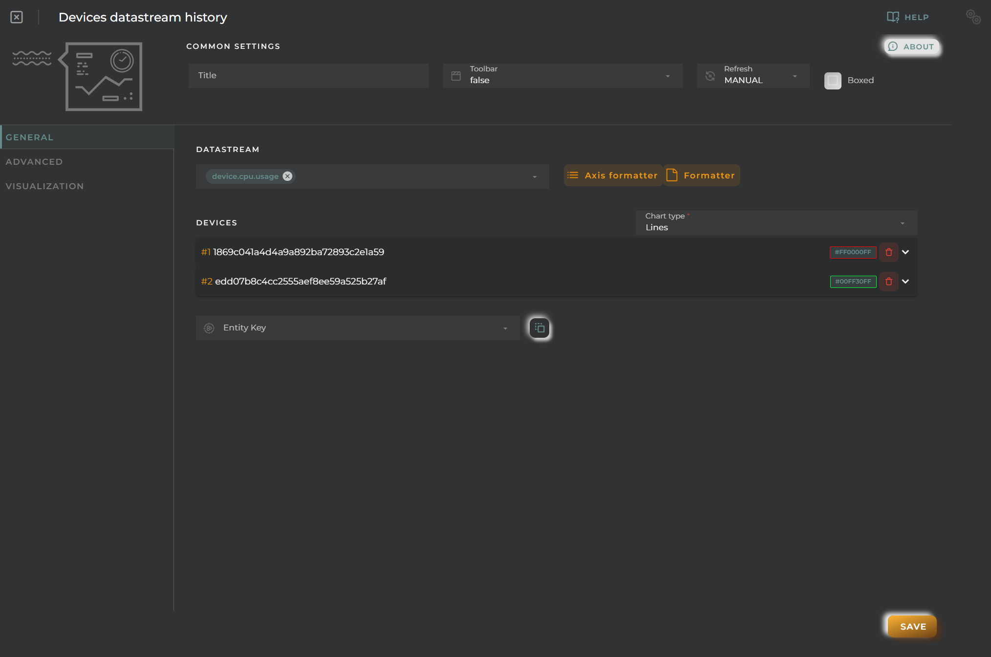
  • Data Stream Id is the data stream you wish to represent on the chart for various entities

  • Axis formatter allows for the representation of discrete values on the Y-axis of the chart Data Streams Devices Axis Formatter

  • Values formatter enables alteration of the obtained values for the chart. This allows for the representation of discrete values by assigning them a numerical value. Data Streams Devices Values Formatter

  • Chart type is the kind of charts to display

  • EntityKey(s) type of resource and identifier of the entities you wish to consult (not required)

For each entity, the following options are available:

  • Color an identifying color on the chart
  • Remove deletes the configuration of the entity from the widget
Data Streams Devices General Configuration

Advanced

From here, you can configure how the widget behaves when rendering the chart.

Data Streams Devices Advanced Configuration
  • Prevent interpolation allows for avoiding data interpolation when possible
  • Statistical data graph displays a panel with basic statistical values

Visualization

Data Streams Devices Visualization

From this point, some visual aspects of the widget can be changed.

  • Background color allows for setting a distinctive color for the widget
  • Hide details header panel hides the top information panel of the widget, freeing up that space

Multiple Time Series history

Graphical representation of data from multiple time series.

How it works

Multiple Time Series History widget

Widget Menu

Multiple Time Series History Actions

From this section, the following actions can be performed:

  • Open device information allows opening the temporary dashboard of the selected entity

  • Edit enables the editing of the selected entity

  • Historical data displays the graph data in list format

  • Visualization allows toggling between different data visualization options in the graph.

  • Capture screen: Takes a screenshot of the widget.

  • Duplicate widget: Creates a duplicate of the widget on the dashboard.

  • Copy widget: Copies the widget to another dashboard.

  • Change widget location: Moves the widget to another dashboard.

Configuration

General

  • Boxed: widget will be displayed with background in dahsboard.
  • About: widget description in Markdown format.
  • Title: widget title. It can be configured to remain fixed in the widget or only be displayed when it receives focus.
  • Toolbar: configures the behavior of the widget bar on the dashboard, allowing you to hide it, hide it when not in use, or leave it always visible.
  • Refresh Frequency: allows configuring the data refresh frequency displayed in the list.
  • Extra actions: allows user to add new specific actions to the widget with your own code.

Extra action config

You can add a new one by pressing the New button.

Once you added a custom action it can be modified later by pressing the name in the list.

In order to remove the custom action click the delete icon button on the right.

In extra actions you can write your own code were you can open other dashboards, entities dashboards or execute wizards.

Extra action code

You can find all available functions and methods in Extra parameters

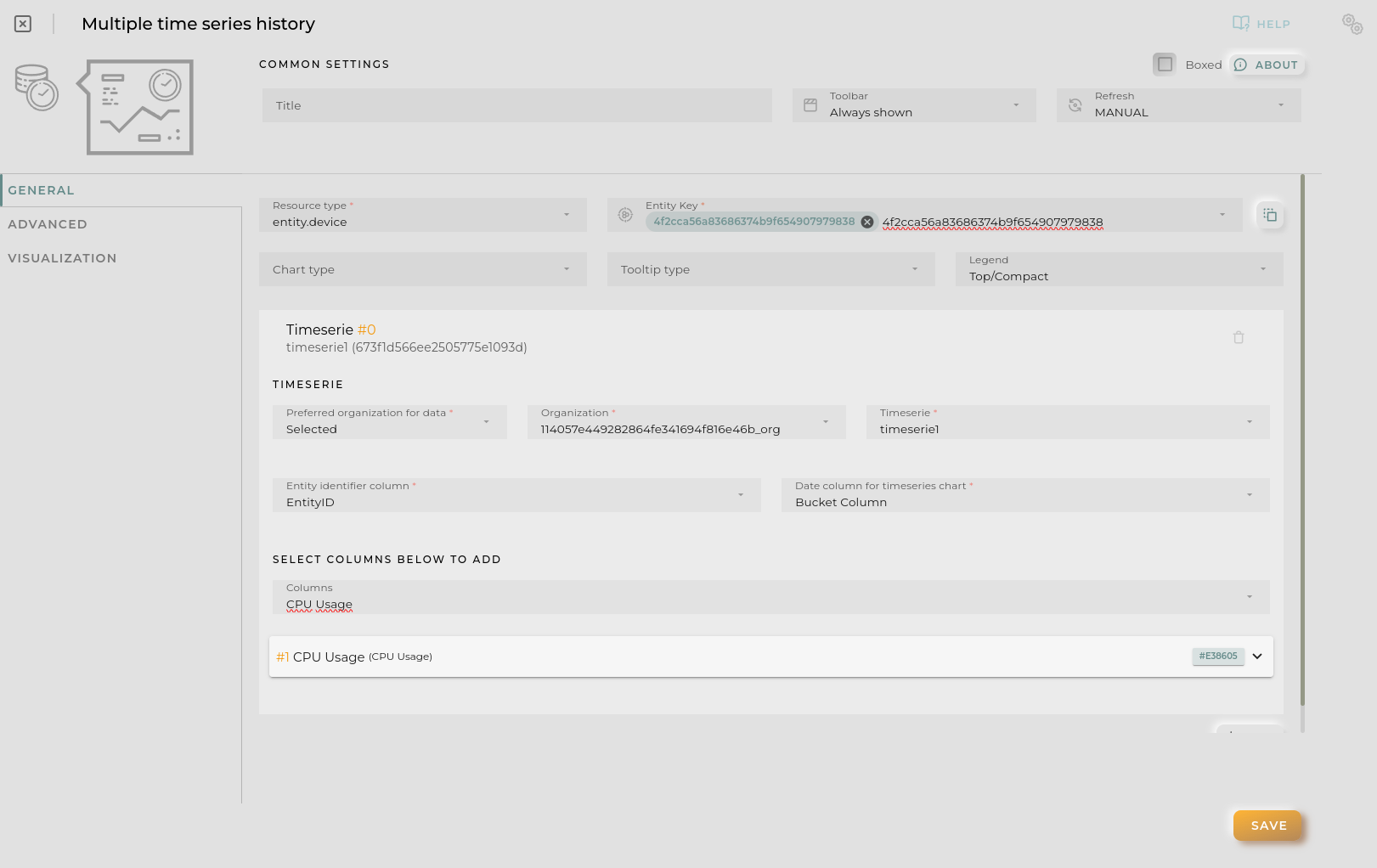
  • Resource Type + EntityKey(s) specifies the resource type and identifiers for the entities to be queried.
  • Chart type (outside of time series) forces same chart type to all series
  • Tooltip type determines how chart tooltip values will be displayed on mouse over
  • New timeserie allows user the addition of a new time serie configuration with its values.

For each time series you must configure the next:

  • Preferred organization allows user to configure how the time series organization will be selected
    • Selected organization selected by the user is the valid
    • User user organization will be used for the timeserie (important for shared dashboards)
    • Entity the organization of the opened entity in templates will be used for the timeserie, user’s otherwise
  • Organization + Time Series provides data of the time series to be queried
  • Identifier field tells the widget which column to use for data grouping
  • Date field specifies which column will serve as the temporal indicator for the data.

Lastly, columns must be configured to extract data to display on the graph. For each of these and the identifier, a graph will be generated.

For each piece of data, the following can be configured:

  • Alias specifies a representative name for the column data on the graph.
  • Color provides a way to distinguish data within the graph.
  • Intensity allows the graph to change shades depending on the value.
  • Unit indicates the measurement being displayed on the corresponding axis.
  • Chart type switches between different data visualization options. This can also be set globally for all measurements.
  • Axis editor allows configuring the Y-axis to assign discrete values to specific data points.
  • Formatter tool is a tool that treats each piece of data individually, allowing modifications and/or calculations to be performed before displaying it on the graph.
  • Reduce tool permits data reshaping through code, allowing for grouping and similar operations.
Time Series History General Configuration

Advanced

From this section, the widget’s behavior when rendering the graph as well as when it is opened within a temporary dashboard can be configured.

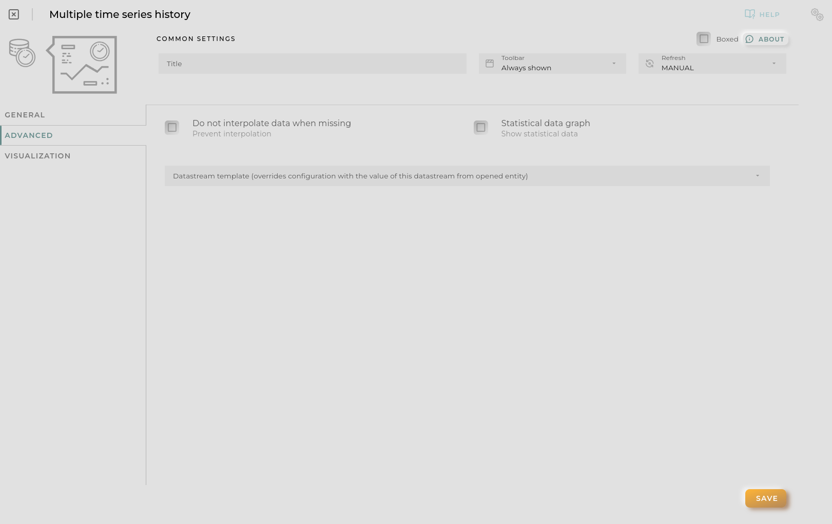
Time Series History Advanced Configuration
  • Prevent interpolation avoids data interpolation when possible.
  • Statistical data graph displays a panel with basic statistical values.
  • Datastream template enables the overriding of the EntityKey in the widget when the dashboard is opened in a device template, using a datastream from the entity at the time of loading.

Visualization

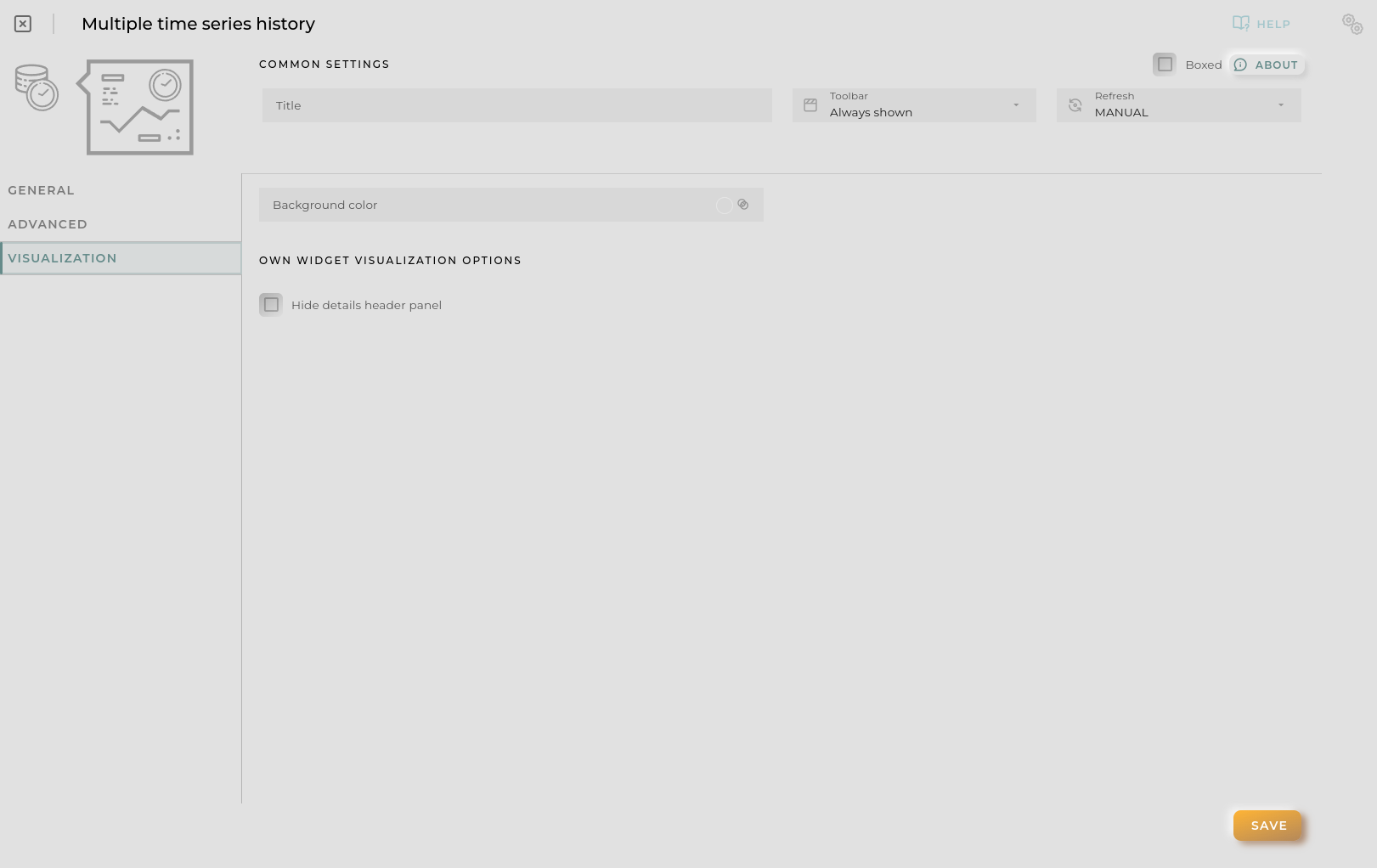
Time Series History Visualization

From this section, some visual aspects of the widget can be modified.

  • Background color allows setting a distinctive color for the widget.
  • Hide details header panel hides the top information panel of the widget, freeing up that space.

Summary Chart

This widget displays graphs of summaries provided by the platform.

How it works

Summary Chart widget

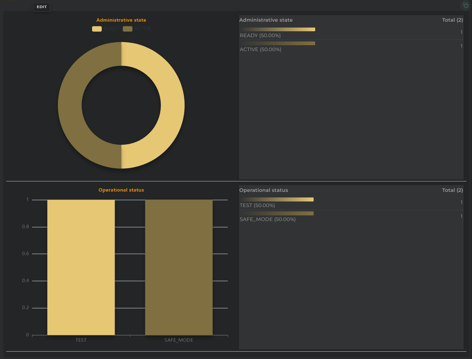
This widget facilitates the graphical visualization of summarized data.

Data can be displayed graphically, in table form, or both simultaneously.

Widget Menu

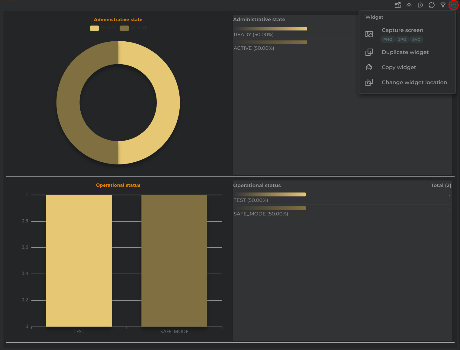
Summary Chart Actions

From this section, the following actions can be performed:

  • Capture screen: Takes a screenshot of the widget.
  • Duplicate widget: Creates a duplicate of the widget on the dashboard.
  • Copy widget: Copies the widget to another dashboard.
  • Change widget location: Moves the widget to another dashboard.

Widget Filter

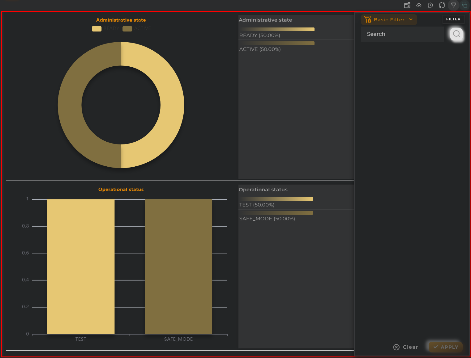
Summary Chart Filters

With the filter, one can narrow down the number of results and obtain new metrics.

There are three types of filters: basic, advanced, or linked.

  • Basic allows the entry of any text and will filter by predetermined fields.
  • Advanced allows configuring a custom filter based on the displayed graph.
  • Linked ties the filter with that of another compatible widget, inheriting its query and refreshing both simultaneously.

Configuration

General

  • Boxed: widget will be displayed with background in dahsboard.
  • About: widget description in Markdown format.
  • Title: widget title. It can be configured to remain fixed in the widget or only be displayed when it receives focus.
  • Toolbar: configures the behavior of the widget bar on the dashboard, allowing you to hide it, hide it when not in use, or leave it always visible.
  • Refresh Frequency: allows configuring the data refresh frequency displayed in the list.
  • Extra actions: allows user to add new specific actions to the widget with your own code.

Extra action config

You can add a new one by pressing the New button.

Once you added a custom action it can be modified later by pressing the name in the list.

In order to remove the custom action click the delete icon button on the right.

In extra actions you can write your own code were you can open other dashboards, entities dashboards or execute wizards.

Extra action code

You can find all available functions and methods in Extra parameters

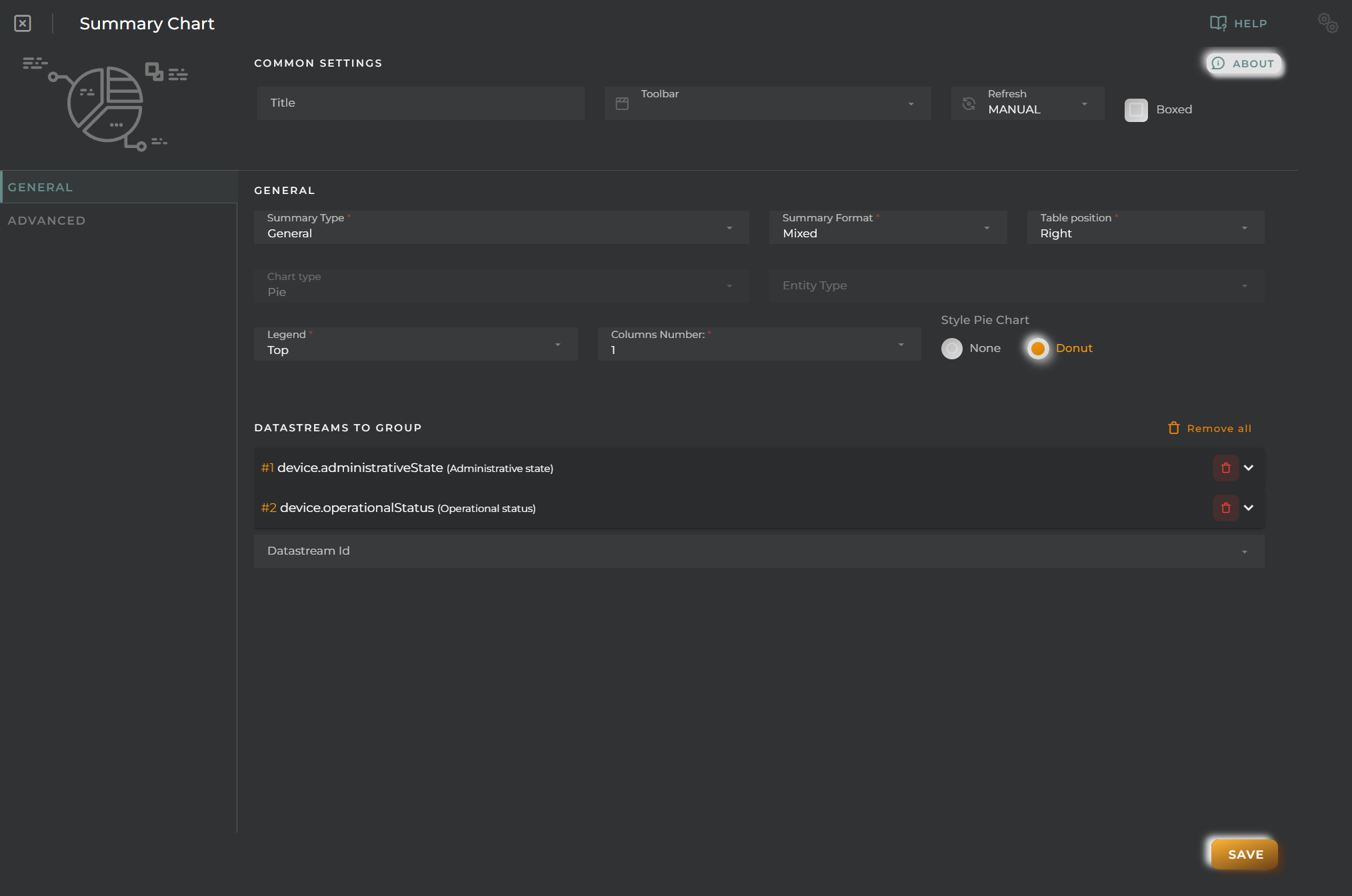
  • Summary type allows selection among different types of summaries.
  • Summary format specifies the type of representation: graphical, table, or mixed (both simultaneously).
  • Table position allows specifying the table’s position in mixed mode.
  • Legend enables or disables the display of graph legends and their position.
  • Columns number tells the widget into how many columns the graphs should be distributed.
  • Style pie chart instructs the widget whether to display pie charts in donut format or regular (no format).
Summary Chart General Configuration

Finally, one must configure the data streams to summarize. The following must be indicated for each:

  • Column 1 specifies the type of graph to represent for the selected data stream.
  • Column 2, field allows choosing a field within a complex data stream.
  • Column 3, alias allows specifying the name of the data stream on the graph.
  • Formatter tool is a tool that allows formatting and altering the information returned by the platform to meet specific needs.
  • Remove will remove the column from the configuration.

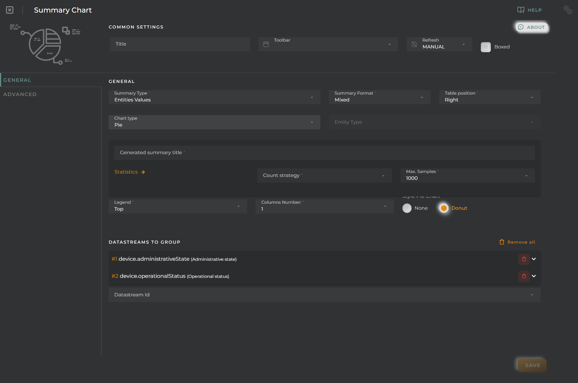
When the summary type is “Entities Values,” additional configuration parameters will be activated. This is because this option calculates graph data based on a sample of the overall entities.

Summary Chart Entities Values summary

The global chart type field will be activated, and a new panel appears where the following will be configured:

  • Generated summary title is the name to display on the generated graph.
  • Statistics: count strategy specifies the operation to perform on the read data: total, median, mean, maximum, minimum, variance, and standard deviation.
  • Statistics: max samples specifies the number of samples to take for generating the graph.

The list of data streams will indicate on which data the indicated count strategy will act.

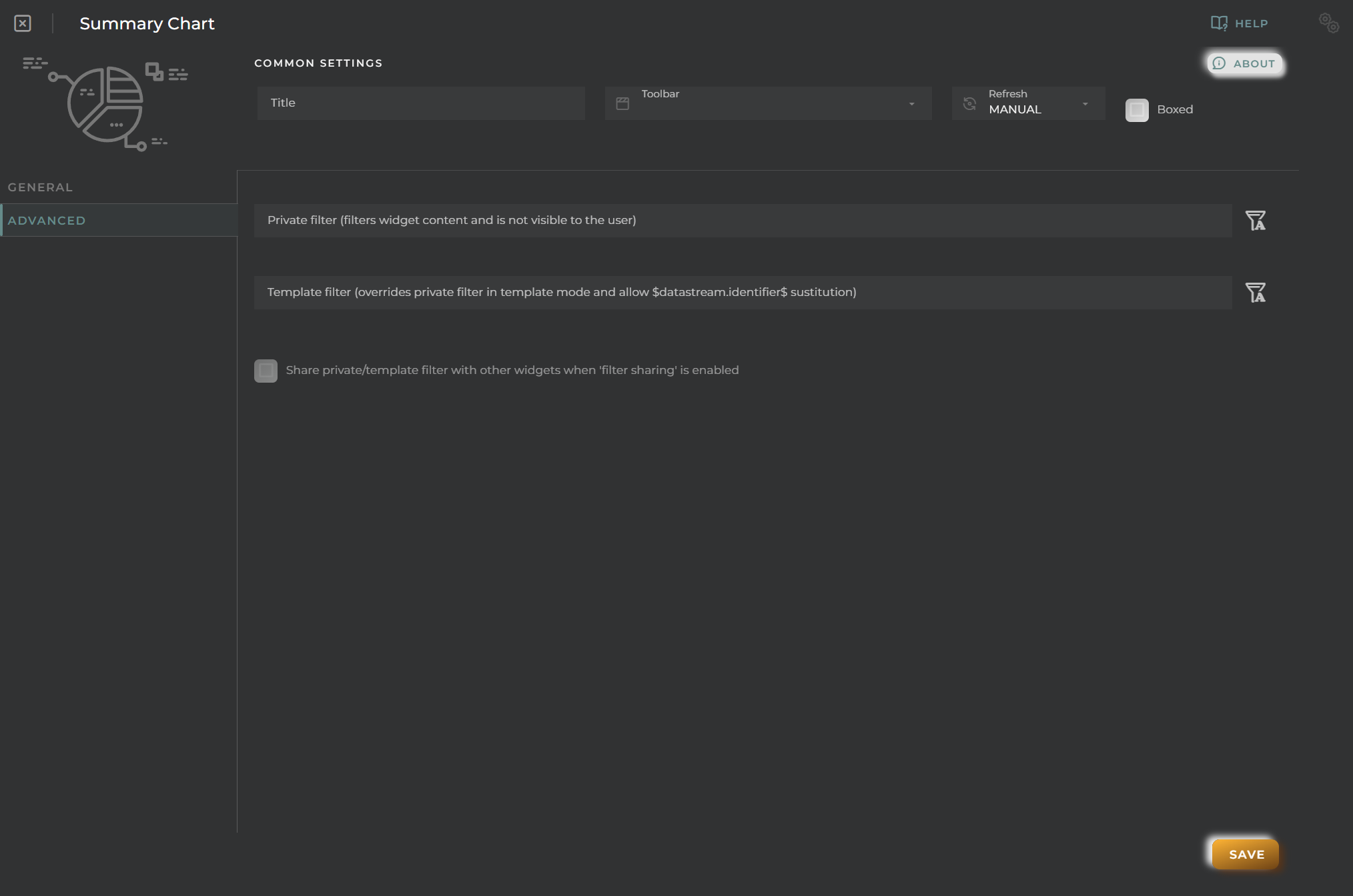
Advanced

From here, internal filters that would always apply regardless of user actions can be configured.

Summary Chart Advanced
  • Private filter will always execute unless there is a template filter.
  • Template filter allows configuring a filter that will overwrite the private one when the dashboard opens in a temporary template.
  • Share filter tells the widget to share the private/template filter when this widget is selected in another widget via linked filter.

Time Series data timeline

Graphical representation of a time series data timeline.

How it works

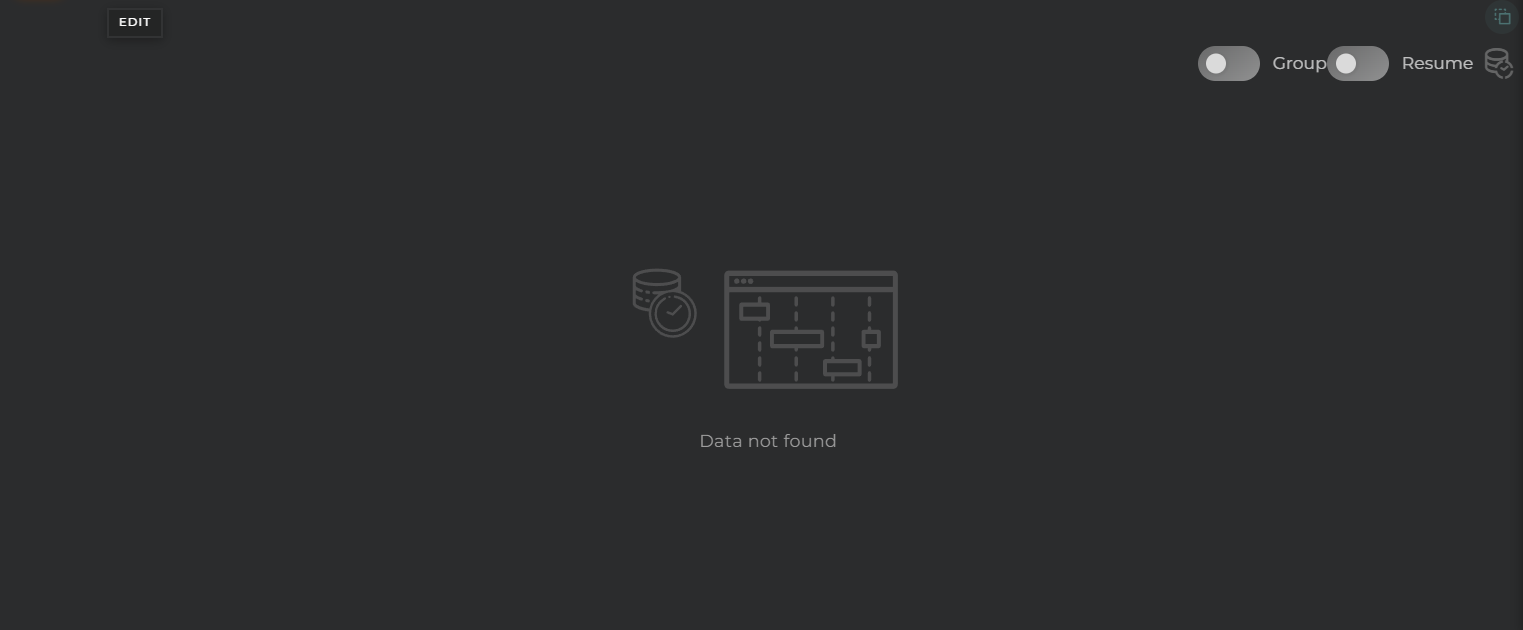
Time Series Timeline widget

This widget facilitates the visualization of value changes in a field over time within a time series.

Each timeline will display the group, the field, and the represented value, arranged as follows:
  • Group
  • Field
  • Value

Grouping

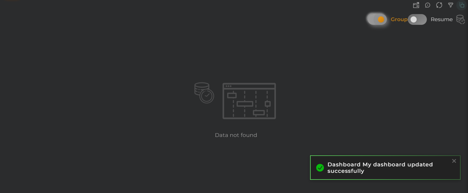
Time Series Timeline grouped information

By enabling the grouping of timelines, you can view all represented states on a single timeline (without separation).
When the data is grouped, the representation of the timeline changes, displaying the value on the same timeline, and each bar will contain the following:

  • Group
  • Field

Resume

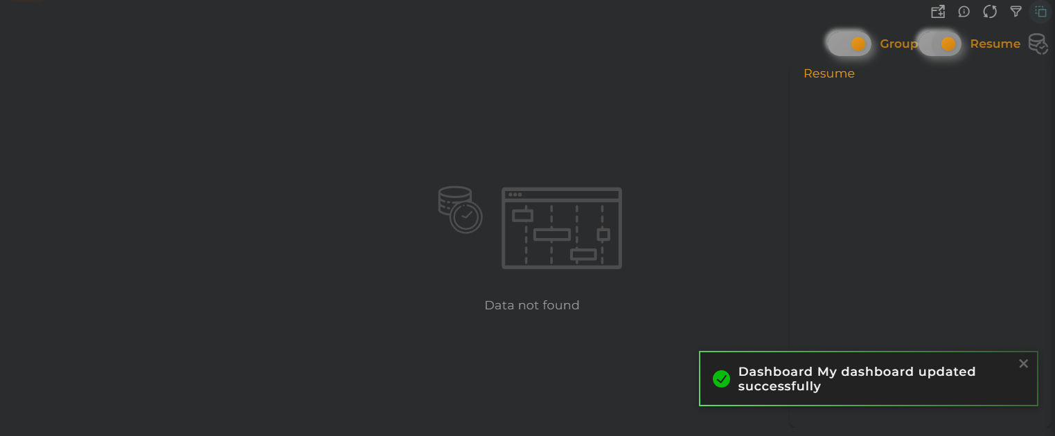
Time Series Timeline information resume

With the summary panel, you can observe the total time each value has been maintained.

Widget Menu

Time Series Timeline Actions

From here, the following actions can be performed:

  • Capture screen: Takes a screenshot of the widget.
  • Duplicate widget: Creates a duplicate of the widget on the dashboard.
  • Copy widget: Copies the widget to another dashboard.
  • Change widget location: Moves the widget to another dashboard.

Configuration

General

  • Boxed: widget will be displayed with background in dahsboard.
  • About: widget description in Markdown format.
  • Title: widget title. It can be configured to remain fixed in the widget or only be displayed when it receives focus.
  • Toolbar: configures the behavior of the widget bar on the dashboard, allowing you to hide it, hide it when not in use, or leave it always visible.
  • Refresh Frequency: allows configuring the data refresh frequency displayed in the list.
  • Extra actions: allows user to add new specific actions to the widget with your own code.

Extra action config

You can add a new one by pressing the New button.

Once you added a custom action it can be modified later by pressing the name in the list.

In order to remove the custom action click the delete icon button on the right.

In extra actions you can write your own code were you can open other dashboards, entities dashboards or execute wizards.

Extra action code

You can find all available functions and methods in Extra parameters

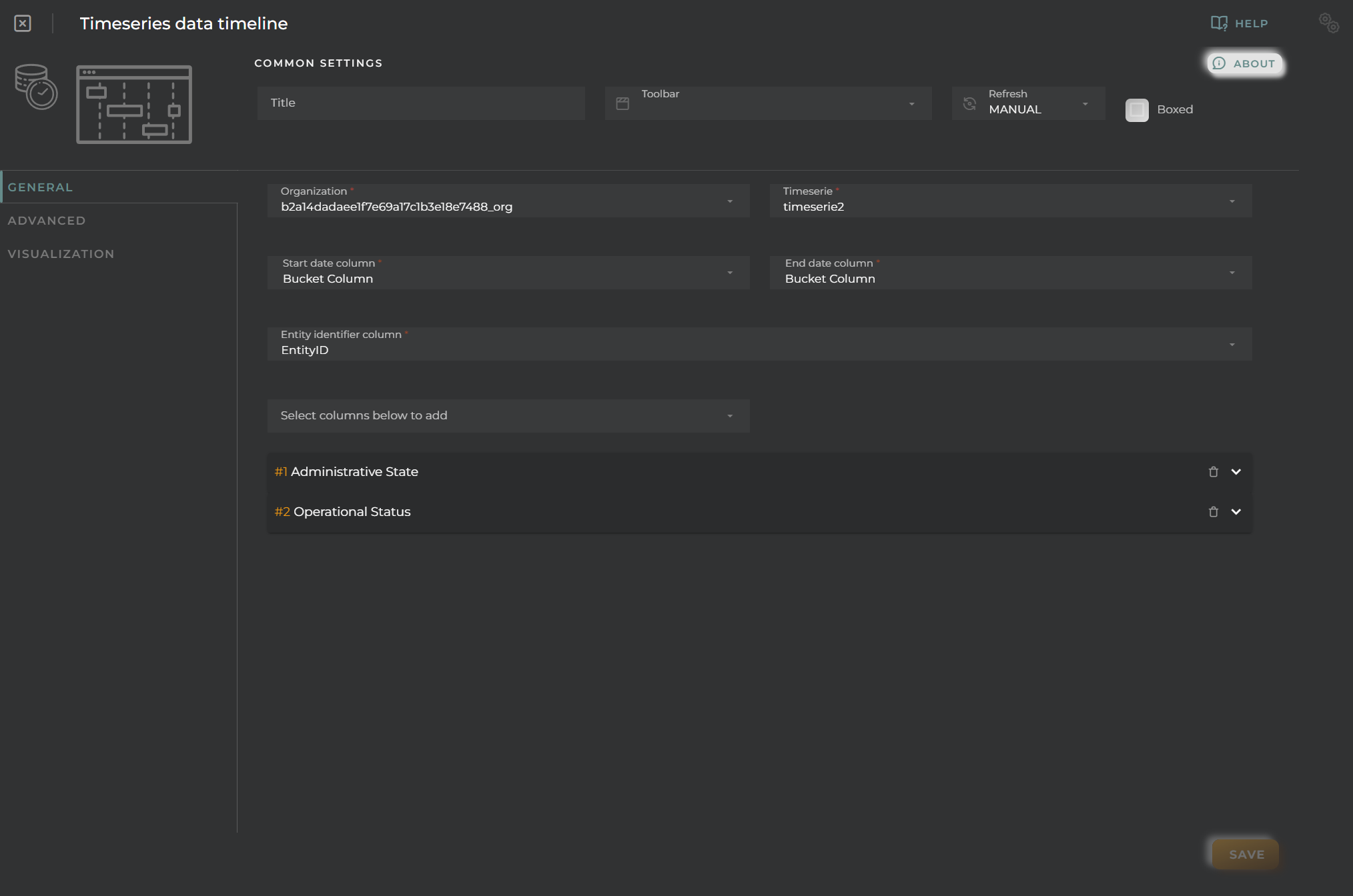
  • Organization + Time Series provides data of the time series to be queried.
  • Start date field specifies which date-type column should be used to indicate the beginning of the period (*).
  • End date field specifies which date-type column should be used to indicate the end of the period (*).
  • Identifier field tells the widget which column to use for data grouping.

(*) If both dates use the same field, the start of the next state will be used to calculate the period.

Time Series Timeline General Configuration

Lastly, columns must be configured to extract data to display on the graph. For each of these and the group/identifier, a graph will be generated.

For each piece of data, the following can be configured:

  • Alias specifies a representative name for the column data on the graph.
  • Color provides a way to distinguish data within the graph.
  • Formatter tool is a tool that treats each piece of data individually, allowing for modifications and/or calculations before displaying it on the graph. For example, you can convert numerical data into discrete data for representation.
  • Remove will remove the column from the configuration.

Advanced

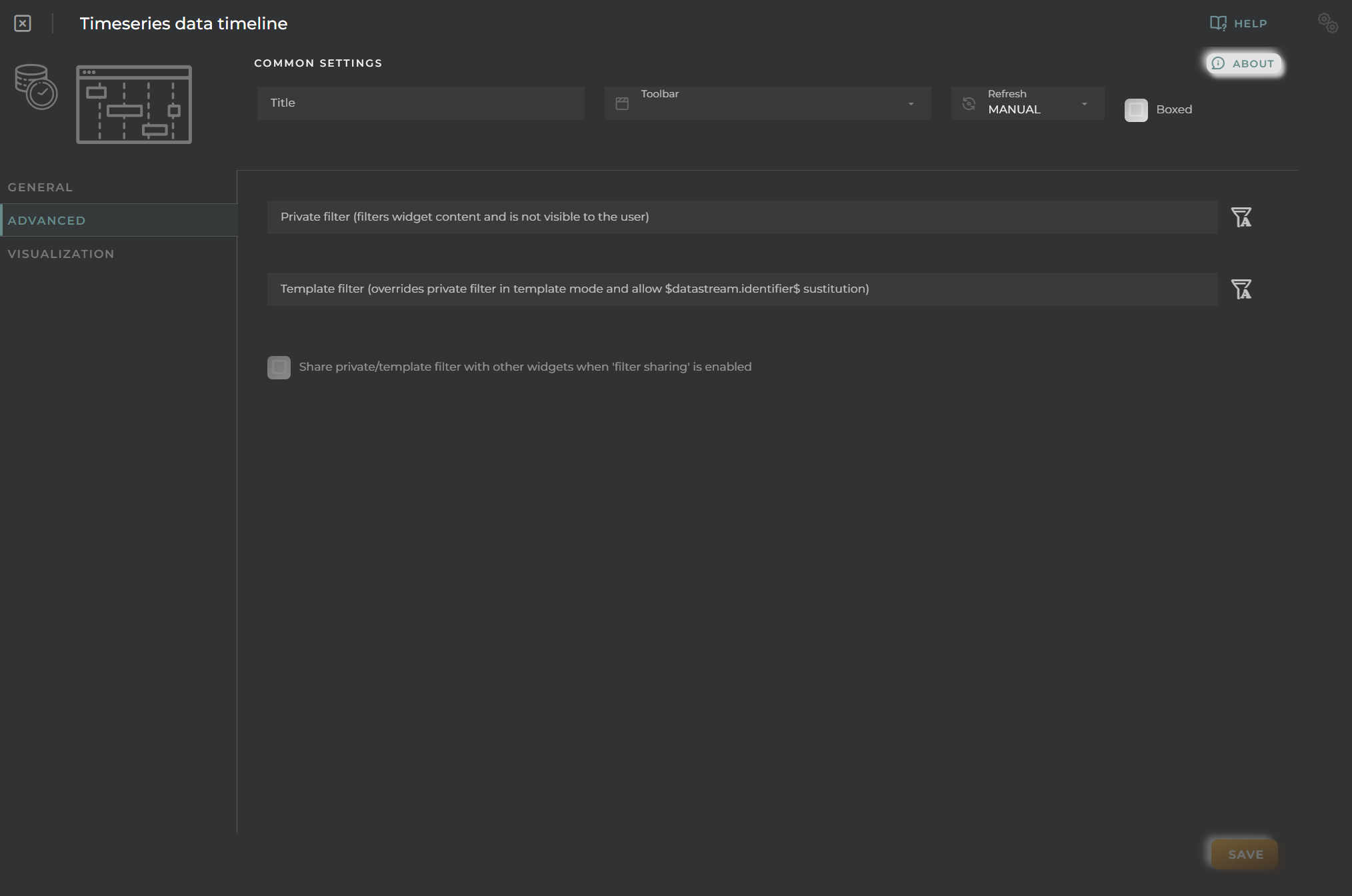
In this section, various filters that will be applied to queries will be configured, regardless of what the user may wish to filter subsequently.

Time Series Timeline Advanced Configuration

Visualization

Time Series Timeline Visualization

From here, some visual aspects of the widget can be modified.

  • Background color allows setting a distinctive color for the widget.
  • Hide details header panel hides the top information panel of the widget, freeing up that space.

Time Series history

Graphical representation of data from a time series.

How it works

Time Series History widget

Widget Menu

Time Series History Actions

From this section, the following actions can be performed:

  • Open device information allows opening the temporary dashboard associated with the selected entity (only available when entities have been preselected).

  • Edit enables the editing of the selected entity (only available when entities have been preselected).

  • Historical data displays the graph data in list format (requires selecting a grouping field).

  • Visualization allows toggling between different data visualization options in the graph.

  • Capture screen: Takes a screenshot of the widget.

  • Duplicate widget: Creates a duplicate of the widget on the dashboard.

  • Copy widget: Copies the widget to another dashboard.

  • Change widget location: Moves the widget to another dashboard.

Configuration

General

  • Boxed: widget will be displayed with background in dahsboard.
  • About: widget description in Markdown format.
  • Title: widget title. It can be configured to remain fixed in the widget or only be displayed when it receives focus.
  • Toolbar: configures the behavior of the widget bar on the dashboard, allowing you to hide it, hide it when not in use, or leave it always visible.
  • Refresh Frequency: allows configuring the data refresh frequency displayed in the list.
  • Extra actions: allows user to add new specific actions to the widget with your own code.

Extra action config

You can add a new one by pressing the New button.

Once you added a custom action it can be modified later by pressing the name in the list.

In order to remove the custom action click the delete icon button on the right.

In extra actions you can write your own code were you can open other dashboards, entities dashboards or execute wizards.

Extra action code

You can find all available functions and methods in Extra parameters

  • Chart type (outside of series) forces same chart type to all series
  • Tooltip type determines how chart tooltip values will be displayed on mouse over
  • Preferred organization allows user to configure how the time series organization will be selected
    • Selected organization selected by the user is the valid
    • User user organization will be used for the timeserie (important for shared dashboards)
    • Entity the organization of the opened entity in templates will be used for the timeserie, user’s otherwise
  • Organization + Time Series provides data of the time series to be queried.
  • Resource Type + EntityKey(s) specifies the resource type and identifiers for the entities to be queried (not required).
  • Grouping/Identifier field tells the widget which column to use for data grouping. If none is selected, all data will be grouped as one.
  • Date field specifies which column will serve as the temporal indicator for the data.

Lastly, columns must be configured to extract data to display on the graph. For each of these and the grouping/identifier, a graph will be generated.

For each piece of data, the following can be configured:

  • Alias specifies a representative name for the column data on the graph.
  • Color provides a way to distinguish data within the graph.
  • Intensity allows the graph to change shades depending on the value.
  • Unit indicates the measurement being displayed on the corresponding axis.
  • Chart type switches between different data visualization options. This can also be set globally for all measurements.
  • Axis editor allows configuring the Y-axis to assign discrete values to specific data points.
  • Formatter tool is a tool that treats each piece of data individually, allowing modifications and/or calculations to be performed before displaying it on the graph.
  • Reduce tool permits data reshaping through code, allowing for grouping and similar operations.
Time Series History General Configuration

Advanced

From this section, the widget’s behavior when rendering the graph as well as when it is opened within a temporary dashboard can be configured.

Time Series History Advanced Configuration
  • Prevent interpolation avoids data interpolation when possible.
  • Statistical data graph displays a panel with basic statistical values.
  • Datastream template enables the overriding of the EntityKey in the widget when the dashboard is opened in a device template, using a datastream from the entity at the time of loading.

Visualization

Time Series History Visualization

From this section, some visual aspects of the widget can be modified.

  • Background color allows setting a distinctive color for the widget.
  • Hide details header panel hides the top information panel of the widget, freeing up that space.
  • Show basic stats in chart displays basic statistics on the graph itself when only one series is represented.