The BIM/IFC widget allows you to configure a 3D model under the BIM/IFC standard and add sensors to the desired elements of the model.
How it Works
The widget displays the selected model, covering the widget area. To the left of the widget is a panel with available actions, and to the right are listed the selected and monitored elements.
Actions Panel
With the Actions Panel, you can:
All elements displays a list of all elements in the model, allowing you to search and select an element quickly
Show/Hide list allows you to show/hide the right panel of elements
Highlight elements will select all preconfigured elements from the right panel in the model
Capture an image downloads a snapshot of only the model in its current state
Create clipping plane enables the option to select an element in the model to create a cutting layer that allows you to cut the model and see elements inside
Remove clipping plane removes the selected cutting layer
Enable/disable clipping planes activates/deactivates the cutting layers without needing to remove and add
Clear cache and reload clears the cache and reloads the image to return it to its initial state
Elements Panel
With the Elements Panel, you can select an element to highlight it in the model for more precise location.
States are also represented here as established by the configured code.
Configuration
General
Boxed: widget will be displayed with background in dahsboard.
About: widget description in Markdown format.
Title: widget title. It can be configured to remain fixed in the widget or only be displayed when it receives focus.
Toolbar: configures the behavior of the widget bar on the dashboard, allowing you to hide it, hide it when not in use, or leave it always visible.
Refresh Frequency: allows configuring the data refresh frequency displayed in the list.
Extra actions: allows user to add new specific actions to the widget with your own code.
You can add a new one by pressing the New button.
Once you added a custom action it can be modified later by pressing the name in the list.
In order to remove the custom action click the delete icon button on the right.
In extra actions you can write your own code were you can open other dashboards, entities dashboards or execute wizards.
You can find all available functions and methods in Extra Information
Organization files allows you to select a file to add to our widget
Preview here, you can see the loaded model and preselect those elements you want to highlight/monitor
In the preview panel, the following actions are found:
[…The actions are similar to the Actions Panel section…]
Items Tab
From here, you can alter the values of the elements selected in the model preview:
Express ID allows you to modify the ID of the selected element if it has changed in the model
Alias you can assign an alternative display name
Code Tab
Here, you configure the logic needed for the identification of different values and to display them on the elements of the model.
IMPORTANT NOTE: Whenever code is modified, it must be evaluated to save the changes
Function
Depending of the configuration receives the following parameters:
entityData contains the data of the opened entity
NOTE: only available when the user opens an entity dashboard template
Promise -> allows easy execution of multiple promises
http -> javascript encapsulation of a useFetch (Nuxt 4) instance doc. Returns { data, error, status, refresh, clear } where data and error are reactive Refs.
alert -> alert navigator method
setValueToItem -> Sets a value to the selected item
setValueToItem(itemID, alias, value [,style, datetime, deviceId, datastreamId])
/**
* Logic:
* 1. Queries a sample of maximum 50 entities.
* 2. Calculates the average of the `device.powersupply.battery.charge` values.
* 3. Update "VentanaPrincipal" value with the average.
* 4. If the floor of average is even, changes "VentanaPrincipal" status to Red (#FF0000).
* 5. If the floor of average is odd, changes "VentanaPrincipal" status to Green (#00FF00).
*/// 1. Create the builder to search for entities, limiting to 50
varbuilder=$api.entitiesSearchBuilder()
.limit(50)
.flattened();
// 2. Execute the query
varresponse=awaitbuilder.build().execute();
vartotalCharge=0;
varcount=0;
// 3. Iterate through the results and sum the battery charge
if (response&&response.data&&response.data.entities) {
response.data.entities.forEach(function(entity) {
// Access the battery charge field
// Field: device.powersupply.battery.charge
varbatteryField=entity['device.powersupply.battery.charge'];
if (batteryField&&batteryField._value&&batteryField._value._current&&batteryField._value._current.value) {
varval= parseFloat(batteryField._value._current.value);
if (!isNaN(val)) {
totalCharge+=val;
count++;
}
}
});
}
// 4. Calculate Average
varaverage=count>0?totalCharge/count:0;
// 5. Determine color based on parity of the floor of the average
// Even -> Red "#FF0000"
// Odd -> Green "#00FF00"
varfloorAvg= Math.floor(average);
varisEven=floorAvg%2===0;
varcolor=isEven?"#FF0000":"#00FF00";
// 6. Set the item status and value
// setItemStatus(itemID, [rgbColor(string format)|null])
setItemStatus("VentanaPrincipal", color);
// setValueToItem(itemID, alias, value)
setValueToItem("VentanaPrincipal", "Battery Avg", average.toFixed(2));
// Use return as the function is async
return;
All Entities Average Battery
Code
/**
* Logic:
* 1. Iterates through ALL entities in the platform using `executeWithAsyncPaging` (efficient pagination).
* 2. Calculates the average of the `device.powersupply.battery.charge` values across all entities.
* 3. Update "VentanaPrincipal" value with the global average.
* 4. If the floor of average is even, changes "VentanaPrincipal" status to Red (#FF0000).
* 5. If the floor of average is odd, changes "VentanaPrincipal" status to Green (#00FF00).
*/vartotalCharge=0;
varcount=0;
// 1. Create the builder
varbuilder=$api.entitiesSearchBuilder()
.limit(2000) // Max limit per page
.flattened();
// 2. Execute with async paging
// executeWithAsyncPaging(resourceName) returns a Promise
returnbuilder.build().executeWithAsyncPaging('entities').then(
// Success Callback (called when all pages are processed)
function() {
// 4. Calculate Average
varaverage=count>0?totalCharge/count:0;
// 5. Determine color based on parity of the floor of the average
varfloorAvg= Math.floor(average);
varisEven=floorAvg%2===0;
varcolor=isEven?"#FF0000":"#00FF00";
// 6. Set the item status and value
setItemStatus("VentanaPrincipal", color);
setValueToItem("VentanaPrincipal", "Battery Avg", average.toFixed(2));
},
// Error Callback
function(err) {
console.error("Error in paging:", err);
},
// Notify Callback (called for each page of results)
function(pageData) {
if (pageData&&pageData.length>0) {
pageData.forEach(function(entity) {
// Access the battery charge field
varbatteryField=entity['device.powersupply.battery.charge'];
if (batteryField&&batteryField._value&&batteryField._value._current&&batteryField._value._current.value) {
varval= parseFloat(batteryField._value._current.value);
if (!isNaN(val)) {
totalCharge+=val;
count++;
}
}
});
}
}
);
Custom Action
Custom action widgets allow you to code an action to be performed, which will be triggered by a button or a form.
How it Works
This widget will display a form or button that will execute the user-coded action.
In the case of using a form, the action will receive the form values and any desired logic can be applied to them.
Additionally, this widget can be configured so that the action executes within a dialog box as an independent form.
Once the execution is initiated, a progress box will appear displaying the result of the action.
The execution will be successful as long as no exception is thrown in the source code.
Configuration
General
Boxed: widget will be displayed with background in dahsboard.
About: widget description in Markdown format.
Title: widget title. It can be configured to remain fixed in the widget or only be displayed when it receives focus.
Toolbar: configures the behavior of the widget bar on the dashboard, allowing you to hide it, hide it when not in use, or leave it always visible.
Refresh Frequency: allows configuring the data refresh frequency displayed in the list.
Extra actions: allows user to add new specific actions to the widget with your own code.
You can add a new one by pressing the New button.
Once you added a custom action it can be modified later by pressing the name in the list.
In order to remove the custom action click the delete icon button on the right.
In extra actions you can write your own code were you can open other dashboards, entities dashboards or execute wizards.
You can find all available functions and methods in Extra Information
Description here you will write what action will be executed when the corresponding button is pressed
Icon determines the type of desired visualization: a button with an icon, an image, or a custom form. In the case of a form, it can also be specified if you want to display it as a dialog box.
If it’s a form, you must enter a JSON schema that determines what will be drawn.
Expert
Here you can configure source code that will run before the widget is loaded, allowing for the dynamic construction of the JSON schema of the form to be displayed, thereby facilitating the construction of dynamic forms based on platform data.
Available utils
$api -> use it to create http petitions to OpenGate Api Rest doc
Promise -> allows easy execution of multiple promises
http -> javascript encapsulation of a useFetch (Nuxt 4) instance doc. Returns { data, error, status, refresh, clear } where data and error are reactive Refs.
Function
Depending of the configuration receives the following parameters:
entityData contains the data of the opened entity
NOTE: only available when the user opens an entity dashboard template
// Check if a value is provided
if (!value) {
console.warn("No value provided for search.");
return;
}
// Define the API endpoint (JSONPlaceholder)
// We'll filter todos by userId based on the input value
varapiUrl="https://jsonplaceholder.typicode.com/todos?userId="+value;
console.log("Fetching data from: "+apiUrl);
try {
// Perform the request using the platform's http utility (encapsulation of Nuxt 4 useFetch)
// useFetch typically parses JSON automatically.
// We await the result.
// Note: useFetch in Nuxt returns { data, error, ... }
const { data, error } =awaithttp(apiUrl);
if (error&&error.value) {
thrownew Error("Generic Error: "+error.value);
}
// Access the data (Ref value if it's a ref, or direct if the utility un-refs it)
// Assuming standard Nuxt composition API behavior where top level properties are Refs
constresults=data.value||data;
console.log("--- Search Results (User ID: "+value+") ---");
// Check if we got any results
if (results&&results.length>0) {
console.table(results); // Display as a table for better readability
console.log("Total records found: "+results.length);
} else {
console.log("No records found for User ID: "+value);
}
} catch (err) {
console.error("Fetch error:", err);
}
Custom Action Entity Search Example
Code
// Check if model is provided
if (!model) {
console.warn("No form data (model) provided.");
return;
}
const { name, specificType } =model;
console.log("Searching entities with Name:", name, "and Specific Type:", specificType);
// Create the builder
varbuilder=$api.entitiesSearchBuilder().flattened();
// Define filters based on model values
varfilter= {
and: [
{
eq: {
'resourceType':'entity.device' }
}
]
};
if (name) {
filter.and.push({
like: {
'provision.administration.identifier':name// Assuming 'name' maps to identifier for this example, or use 'provision.device.name' if appropriate
}
});
}
if (specificType) {
filter.and.push({
eq: {
'provision.device.specificType':specificType }
});
}
// Apply filter if any conditions were added
if (filter.and.length>0) {
builder.filter(filter);
}
try {
// Execute the search
// await is supported in this context
constresponse=awaitbuilder.build().execute();
if (response.statusCode===200) {
console.log("--- Entity Search Results ---");
constentities=response.data.entities;
if (entities&&entities.length>0) {
console.table(entities.map(e => ({
id:e['provision.administration.identifier']._value._current.value,
specificType:e['provision.device.specificType'] ?e['provision.device.specificType']._value._current.value:'N/A' })));
console.log("Total entities found:", entities.length);
} else {
console.log("No entities match the criteria.");
}
} else {
console.error("Search failed with status:", response.statusCode);
}
} catch (err) {
console.error("Error executing entity search:", err);
}
Custom Chart
Custom charts allow for the display of data in graphical format based on user-defined logic.
How it Works
Once the logic for data retrieval is entered, the data will be displayed on the widget.
What sets the custom chart apart from others is that the data source can be external, internal, both, or even fabricated. Moreover, multiple charts can be combined within the same widget.
This widget is compatible with eCharts library version 5. Multiple examples can be accessed via the following link: eCharts
Configuration
General
Boxed: widget will be displayed with background in dahsboard.
About: widget description in Markdown format.
Title: widget title. It can be configured to remain fixed in the widget or only be displayed when it receives focus.
Toolbar: configures the behavior of the widget bar on the dashboard, allowing you to hide it, hide it when not in use, or leave it always visible.
Refresh Frequency: allows configuring the data refresh frequency displayed in the list.
Extra actions: allows user to add new specific actions to the widget with your own code.
You can add a new one by pressing the New button.
Once you added a custom action it can be modified later by pressing the name in the list.
In order to remove the custom action click the delete icon button on the right.
In extra actions you can write your own code were you can open other dashboards, entities dashboards or execute wizards.
You can find all available functions and methods in Extra Information
Show widget filters instructs the widget to display its filters. These filters will be passed as an additional parameter to the data retrieval function.
Here, you input the necessary code to obtain the information to be displayed.
Depending on the selected options, the parameters received by the function will be displayed.
The function must always return a JSON object that is compatible with eCharts’ chart configuration.
Every time the code is updated, it must be evaluated where a preview of the result can be seen.
Function
Depending of the configuration receives the following parameters:
entityData contains the data of the opened entity
NOTE: only available when the user opens an entity dashboard template
filters introduced by the user. These filters are:
generic widget generic filter
period widget date period filter
inherit json object with inherited filter if ‘shared filter’ is enabled. This filter is composed by ‘and’ filter that contains standar filter, private/template filter and headers filters from the source widget.
Promise -> allows easy execution of multiple promises
http -> javascript encapsulation of a useFetch (Nuxt 4) instance doc. Returns { data, error, status, refresh, clear } where data and error are reactive Refs.
Custom tables allow you to display data in a list format based on logic encoded by the user.
How it Works
Once the logic for data retrieval is entered, the data will be displayed in the table.
What sets the custom table apart is that the data source can be external, internal, both, or even fabricated. Moreover, custom charts can be mixed in, and additional information can be included in the expandable panel.
Configuration
General
Boxed: widget will be displayed with background in dahsboard.
About: widget description in Markdown format.
Title: widget title. It can be configured to remain fixed in the widget or only be displayed when it receives focus.
Toolbar: configures the behavior of the widget bar on the dashboard, allowing you to hide it, hide it when not in use, or leave it always visible.
Refresh Frequency: allows configuring the data refresh frequency displayed in the list.
Extra actions: allows user to add new specific actions to the widget with your own code.
You can add a new one by pressing the New button.
Once you added a custom action it can be modified later by pressing the name in the list.
In order to remove the custom action click the delete icon button on the right.
In extra actions you can write your own code were you can open other dashboards, entities dashboards or execute wizards.
You can find all available functions and methods in Extra Information
Pagination type allows you to specify the kind of pagination you want. There may be no pagination, pagination handled by the table component (local), or server-side pagination.
If server-side pagination is chosen, the script will receive parameters like the number of elements and the page, allowing the user to decide.
Page elements specifies the number of elements to show per page.
Allow data grouping enables the table to group items by elements in a column.
Show widget filters instructs the widget to display its filters. These filters will be passed as an additional parameter to the data retrieval function.
Compact the size of the table rows will make the table rows more compact to save vertical space.
Expandable rows enables an information button for expanded data on each row. The code must fill this information, or an empty space will be displayed.
Column Configuration
The data that will be displayed in table. In order to finish the configuration for this you must add one column at least and select a primary key.
For every column you can define the next data:
Name to show in headers
JSON field is the field to read in data returned by the function. Primary key use that field
Sortable permits sorting for this column
Groupable allow group by this field in table
Filterable allow filter by this field in table
Data type of the filter (only when filterable)
Divisor draws a separator between this column and the next
Show entity actions enables context menu for the column allowing to perform some actions depending of the item value.
Columns supports drag&drop in order to determine the position in the table.
Code Tab
This is where you input the necessary code to retrieve the data to be displayed.
Depending on the options selected in the general tab, the parameters received by the function will be displayed.
The function must always return an array of JSON objects compatible with the specified configuration for the component to be able to render them.
Each time the code is updated, it must be evaluated where a preview of the result can be seen.
Finally you MUST return an array with a json that matches the columns configuration.
Function
Depending of the configuration receives the following parameters:
entityData contains the data of the opened entity
NOTE: only available when the user opens an entity dashboard template
filters introduced by the user. These filters are:
generic widget generic filter
period widget date period filter
column json object with each column filter
sort an array containing every sorted column with its direction sorted by user preferences
inherit json object with inherited filter if ‘shared filter’ is enabled. This filter is composed by ‘and’ filter that contains standar filter, private/template filter and headers filters from the source widget.
An example:
{
"filters": {
"generic": "filter introduced by the user",
"period": {"from":"2023-03-27T10:59:27+02:00","to":null},
"column": {
[columnvaluefield]:{operator:"eq",
value:"filter introduced by the user in colum" },
[columnvaluefield]:{operator:"gt",
value:"filter introduced by the user in colum" }
},"sort": [
{
column:"column value field",
direction:"asc"or"desc" },
{
column:"column value field",
direction:"asc"or"desc" }
],"inherit": {
"and": [
{ "eq": {"field.identifier._current.value": "value"}},
{ "eq": {"field2.identifier._current.value": "value2"}}
]
}
}}
pageElements and page that determines the current page to display. Only enabled when server pagination enabled in table parameters. Disabling server pagination quits this parameters and function must be evaluated again.
callback function used to send table data only when the api/http petitions are promised
Promise -> allows easy execution of multiple promises
http -> javascript encapsulation of a useFetch (Nuxt 4) instance doc. Returns { data, error, status, refresh, clear } where data and error are reactive Refs.
openDashboard -> (workspaceId, dashboardId, newPage) -> Opens the selected dashboard in selected workspace
openEntityDashboard -> (entityIdentifier[, organization[user if empty], resourceType[’entity.device’ if empty] , newPage]) -> Opens the entity’s temporary dashboard
Data format
Returned data must have one of the following formats (per item):
simple json data
{
    "jsonfield": "value to display. It can be HTML."
}
‘complex’ json data
{
    "jsonfield": {
        "value": "value to display. It can be HTML",
        "_style": "cell custom style",
        "_chart": "displays an echarts chart. Overrides others in this item",
        "_extension": "jsonfield like (value, _style, _chart)  plus _table. Only enabled when expandable rows enabled"
    }
}
NOTE _extension field can combine _chart and _table elements in the same item
Element _chart
Must have an echarts config json.
Element _table
Displays a table inside the column and overrides others in this item.
This example demonstrates how to fetch data from the USGS Earthquake Hazards Program API.
This service supports server-side date filtering, which aligns perfectly with the widget’s Period Filter.
Function Explanation
Date Filtering: The code checks the filters.period object.
If from and to are present, they are formatted to ISO 8601 strings (YYYY-MM-DD) and sent as starttime and endtime parameters.
If no period is selected, it defaults to the last 24 hours.
Name/Text Filtering: The filters.generic (search text) is used to filter the results client-side (searching within the place field), as the API does not support a direct “text search” parameter for this endpoint.
Code
// Main function executed by the Custom Table widget
// parameters: entityData, filters, page, pageElements, callback
// Base URL for USGS Earthquake API (GeoJSON format)
leturl='https://earthquake.usgs.gov/fdsnws/event/1/query?format=geojson&limit=200';
// 1. Handle Date Filters (Server-Side)
if (filters&&filters.period&&filters.period.from&&filters.period.to) {
// Helper to format date as YYYY-MM-DD
constformatDate= (dateStr) => new Date(dateStr).toISOString().split('T')[0];
conststart=formatDate(filters.period.from);
constend=formatDate(filters.period.to);
url+=`&starttime=${start}&endtime=${end}`;
} else {
// Default to 'now' if no filter (API defaults to last 30 days usually, let's limit to recent)
// Actually, let's explicitely ask for last 2 days to keep data manageable if no filter
// But for simplicity, we rely on the API defaults or a 'limit' param already added above.
}
try {
// 2. Fetch Data
constresponse=awaithttp(url);
letfeatures= [];
if (response&&response.features) {
features=response.features;
} elseif (response&&response.json) {
constjson=awaitresponse.json();
features=json.features|| [];
}
// 3. Handle Name/Text Filter (Client-Side)
// filtering by 'place' property
if (filters&&filters.generic&&filters.generic.length>0) {
constsearch=filters.generic.toLowerCase();
features=features.filter(f =>
f.properties.place&&f.properties.place.toLowerCase().includes(search)
);
}
// 4. Map to Table Columns
// Configured Columns hint: 'place', 'magnitude', 'time', 'status'
consttableData=features.map(f => {
constprops=f.properties;
constdateObj=new Date(props.time);
// Determine color based on magnitude
letmagColor='green';
if (props.mag>=5) magColor='red';
elseif (props.mag>=3) magColor='orange';
return {
place:props.place,
magnitude: {
value:props.mag?props.mag.toFixed(1) :'0.0',
_style:`font-weight:bold; color: ${magColor};` },
time:dateObj.toLocaleString(),
status:`<a href="${props.url}" target="_blank">Ver Detalles</a>` };
});
callback(tableData);
} catch (error) {
console.error("Error fetching earthquake data:", error);
callback([]);
}
Filtered Entity Retrieval
Description
This example shows how to retrieve entities filtering by a parameter and sorting by name.
Code
/**
* Main function to retrieve and display entities
* @param {Object} entityData - Context entity data
* @param {Object} filters - Filters passed from the widget
*/varbuilder=$api.entitiesSearchBuilder().limit(100).flattened();
// 1. Filter by parameter (assuming it comes in filters.generic or a specific field)
// Here we assume filters.generic contains a string to filter by name
if (filters&&filters.generic) {
builder.filter({
like: {
'provision.asset.name':filters.generic// Adjust field as needed (e.g., provision.device.name)
}
});
}
// 2. Sort by name
builder.sort([
{
column:'provision.asset.name',
direction:'asc' }
]);
// 3. Execute query
varresponse=awaitbuilder.build().execute();
// 4. Transform results
varresults= [];
if (response&&response.data&&response.data.entities) {
response.data.entities.forEach(function(entity) {
// Extract identifier (using bracket notation for flattened keys)
varid=entity['provision.administration.identifier'] ?entity['provision.administration.identifier']._value._current.value:"Unknown";
// Extract name (handle if it doesn't exist)
varname="N/A";
if (entity['provision.asset.name']) {
name=entity['provision.asset.name']._value._current.value;
}
results.push({
identifier:id,
name:name });
});
}
returnresults;
Server Pagination Example (Reqres)
Static content
This example demonstrates how to implement server-side pagination using an external API (reqres.in).
When “Server Pagination” is enabled in the widget configuration, the script receives page and pageElements parameters.
Function Explanation
Page Parameters: The page and pageElements arguments act as the current page number and the page size (limit), respectively.
API Request: The code constructs a request to reqres.in passing page and per_page query parameters.
Callback: The function processes the response and sends the array of users to the widget via the callback.
Code
// Main function executed by the Custom Table widget
// parameters: entityData, filters, page, pageElements, callback
// 1. Prepare Pagination Parameters
// Ensure we have defaults if arguments are missing (safeguard)
constcurrentPage=page||1;
constperPage=pageElements||5;
// 2. Construct URL with pagination params
// reqres.in uses 'page' (1-based) and 'per_page'
consturl=`https://reqres.in/api/users?page=${currentPage}&per_page=${perPage}`;
try {
// 3. Fetch Data
constresponse=awaithttp(url);
// 4. Extract Data
// reqres.in returns: { page: 1, per_page: 6, total: 12, total_pages: 2, data: [...] }
letusers= [];
// Check various response wrappers as 'http' might auto-parse JSON
if (response&&response.data&& Array.isArray(response.data)) {
users=response.data;
} elseif (response&&response.json) {
constjson=awaitresponse.json();
users=json.data|| [];
} elseif (response&& Array.isArray(response)) {
users=response;
}
// 5. Format for Table
// Configured Columns hint: 'id', 'avatar', 'first_name', 'last_name'
consttableData=users.map(user => {
return {
id:user.id,
avatar:`<img src="${user.avatar}" style="width: 30px; border-radius: 50%;">`,
first_name:user.first_name,
last_name:user.last_name,
email:user.email };
});
// 6. Return Data
// We return the array of items for the current page.
callback(tableData);
} catch (error) {
console.error("Error fetching paged data:", error);
callback([]);
}
Battery Level Pie Chart
Description
This example shows how to retrieve entities and display their battery level as a Pie Chart within the table row.
Code
varbuilder=$api.entitiesSearchBuilder().limit(100).flattened();
// Handle generic filter if present
if (filters&&filters.generic) {
builder.filter({
like: {
'provision.administration.identifier':filters.generic }
});
}
varresponse=awaitbuilder.build().execute();
varresults= [];
if (response&&response.data&&response.data.entities) {
response.data.entities.forEach(function(entity) {
// Get identifier
varid=entity['provision.administration.identifier'] ?entity['provision.administration.identifier']._value._current.value:"Unknown";
// Get battery charge (default to 0 if not present)
varcharge=0;
if (entity['device.powersupply.battery.charge']) {
charge=entity['device.powersupply.battery.charge']._value._current.value;
}
// Create the chart configuration
varpieOption= {
color: ['#91c7ae', '#c23531'],
series: [
{
type:'pie',
radius: ['50%', '70%'],
avoidLabelOverlap:false,
label: {
show:false,
position:'center' },
emphasis: {
label: {
show:true,
fontSize:'10',
fontWeight:'bold' }
},
labelLine: {
show:false },
data: [
{ value:charge, name:'Charge' },
{ value:100-charge, name:'Empty' }
]
}
]
};
results.push({
identifier:id,
battery: {
"_chart":pieOption,
"_style":"height: 50px; width: 50px;"// Optional styling for the cell
}
});
});
}
returnresults;
Custom Widget
This widget allows to create a full widget by using the van js templating system and echarts
How it Works
Once the code is entered, the coded form will be displayed on the widget.
This widget is compatible with eCharts library version 6. Multiple examples can be accessed via the following link: eCharts
Configuration
General
Boxed: widget will be displayed with background in dahsboard.
About: widget description in Markdown format.
Title: widget title. It can be configured to remain fixed in the widget or only be displayed when it receives focus.
Toolbar: configures the behavior of the widget bar on the dashboard, allowing you to hide it, hide it when not in use, or leave it always visible.
Refresh Frequency: allows configuring the data refresh frequency displayed in the list.
Extra actions: allows user to add new specific actions to the widget with your own code.
You can add a new one by pressing the New button.
Once you added a custom action it can be modified later by pressing the name in the list.
In order to remove the custom action click the delete icon button on the right.
In extra actions you can write your own code were you can open other dashboards, entities dashboards or execute wizards.
You can find all available functions and methods in Extra Information
Here, you input the necessary code to obtain the information to be displayed.
The function must always return a van ui object.
Every time the code is updated, it must be evaluated where a preview of the result can be seen.
Function
Depending of the configuration receives the following parameters:
entityData contains the data of the opened entity
NOTE: only available when the user opens an entity dashboard template
Promise -> allows easy execution of multiple promises
http -> javascript encapsulation of a useFetch (Nuxt 4) instance doc. Returns { data, error, status, refresh, clear } where data and error are reactive Refs.
openWidget -> (widgetId[, entityKey, title, extraConf]) -> Opens the selected widget in a modal panel
openDashboard -> (workspaceId, dashboardId, newPage) -> Opens the selected dashboard in selected workspace
openEntityDashboard -> (entityIdentifier[, organization[user if empty], resourceType[’entity.device’ if empty] , newPage]) -> Opens the entity’s temporary dashboard
openWizard -> (wizardId[, wizardData, isEdit]) -> Opens the selected wizard in a modal panel. A list of available wizards will be available to use directly.
Final code structure build by the application
asyncfunctionmain(entityData,relatedEntities,timeserieData,alarmData,dashboardFilters,callback) {
// YOUR CODE HERE WITH RETURN OR CALLBACK (function is declared automatically)
}
// 1. Importar tags de VanJS
const { div, input, button, ul, li, span, p } =van.tags;
// 2. Extraer el ID por defecto si entityData está presente en el contexto
constdefaultDeviceId=entityData?.['provision.administration.identifier']?._value?._current?.value||"";
// 3. Estados reactivos de VanJS
conststatusText=van.state(defaultDeviceId?"Cargando datos...":"Introduce un ID de dispositivo y pulsa Consultar");
constfieldsList=van.state([]);
constloadedEntity=van.state(null); // Guardará la entidad en modo flattened
constcurrentDeviceId=van.state(defaultDeviceId);
// 4. Estilos en línea
conststyles= {
container:"padding: 14px; font-family: system-ui, -apple-system, sans-serif; color: #1e293b; height: 100%; box-sizing: border-box; overflow-y: auto;",
searchBox:"display: flex; gap: 8px; margin-bottom: 12px;",
input:"flex: 1; padding: 8px 12px; border: 1px solid #cbd5e1; border-radius: 6px; font-size: 0.875rem; outline: none;",
primaryBtn:"padding: 8px 16px; background-color: #2563eb; color: white; border: none; border-radius: 6px; font-size: 0.875rem; font-weight: 500; cursor: pointer;",
actionsBox:"display: flex; gap: 8px; margin-bottom: 14px; flex-wrap: wrap;",
actionBtn:"padding: 6px 12px; background-color: #0f766e; color: white; border: none; border-radius: 6px; font-size: 0.8125rem; font-weight: 500; cursor: pointer; display: flex; align-items: center; gap: 6px;",
secondaryActionBtn:"padding: 6px 12px; background-color: #475569; color: white; border: none; border-radius: 6px; font-size: 0.8125rem; font-weight: 500; cursor: pointer; display: flex; align-items: center; gap: 6px;",
list:"list-style: none; padding: 0; margin: 0; display: flex; flex-direction: column; gap: 8px;",
item:"display: flex; justify-content: space-between; align-items: center; padding: 8px 12px; background: #f8fafc; border-radius: 6px; border: 1px solid #e2e8f0; font-size: 0.875rem;",
key:"color: #64748b; font-weight: 500;",
value:"font-weight: 600; color: #0f172a; word-break: break-all;",
status:"color: #64748b; font-size: 0.875rem; text-align: center; padding: 16px 0; margin: 0;"};
// 5. Función asíncrona para consultar el dispositivo usando $api
asyncfunctionsearchDevice(id) {
consttargetId= (id||"").trim();
if (!targetId) {
statusText.val="⚠️ Por favor, introduce un identificador de dispositivo válido.";
fieldsList.val= [];
loadedEntity.val=null;
return;
}
statusText.val=`Buscando dispositivo "${targetId}"...`;
fieldsList.val= [];
loadedEntity.val=null;
currentDeviceId.val=targetId;
try {
// Consulta en modo .flattened()
constresponse=await$api.entitiesSearchBuilder()
.filter({
eq: {
'provision.administration.identifier':targetId }
})
.flattened()
.limit(1)
.build()
.execute();
constentity=response?.data?.entities?.[0];
if (!entity) {
statusText.val=`❌ No se encontró ningún dispositivo con ID: "${targetId}"`;
return;
}
// Guardar la entidad en modo flattened en el estado
loadedEntity.val=entity;
statusText.val="";
// Mapeo de campos simples a mostrar
fieldsList.val= [
{ label:"Identificador", value:entity['provision.administration.identifier']?._value?._current?.value||targetId },
{ label:"Organización", value:entity['provision.administration.organization']?._value?._current?.value||"N/A" },
{ label:"Canal", value:entity['provision.administration.channel']?._value?._current?.value||"N/A" },
{ label:"Grupo de Servicio", value:entity['provision.administration.serviceGroup']?._value?._current?.value||"N/A" },
{ label:"Tipo Específico", value:entity['provision.device.specificType']?._value?._current?.value||"N/A" },
{ label:"Número de Serie", value:entity['provision.device.serialNumber']?._value?._current?.value||"N/A" },
{ label:"Estado Operacional", value:entity['device.operationalStatus']?._value?._current?.value||"N/A" }
];
} catch (error) {
console.error("Error al consultar el dispositivo:", error);
statusText.val=`❌ Error en la consulta: ${error.message||error}`;
}
}
// 6. Funciones para ejecutar las acciones sobre el dispositivo cargado
functionhandleOpenDeviceDetails() {
if (!currentDeviceId.val) {
return;
}
// Abrir widget deviceInfoDetails con el identificador del dispositivo
openWidget('deviceInfoDetails', currentDeviceId.val, `Detalles: ${currentDeviceId.val}`);
}
functionhandleOpenEntitiesWizard() {
if (!loadedEntity.val) {
return;
}
// Abrir wizard entities pasando el objeto de la entidad en modo flattened
openWizard('entities', loadedEntity.val, true);
}
// 7. Input de texto pre-rellenado
consttextInput=input({
type:"text",
placeholder:"Identificador del dispositivo...",
value:defaultDeviceId,
style:styles.input,
onkeydown: (e) => {
if (e.key==="Enter") {
searchDevice(textInput.value);
}
}
});
// 8. Búsqueda automática inicial si entityData contenía un ID
if (defaultDeviceId) {
searchDevice(defaultDeviceId);
}
// 9. Retorno del componente reactivo VanJS
returndiv({ style:styles.container },
// Barra de búsqueda
div({ style:styles.searchBox },
textInput,
button({
style:styles.primaryBtn,
onclick: () => {
searchDevice(textInput.value);
}
}, "Consultar")
),
// Contenido reactivo: Estado o Botones de Acción + Listado
() => {
if (statusText.val) {
returnp({ style:styles.status }, statusText.val);
}
returndiv(
// Barra de acciones disponibles para el dispositivo cargado
div({ style:styles.actionsBox },
button({
style:styles.actionBtn,
onclick: () => {
handleOpenDeviceDetails();
}
}, "📱 Abrir 'deviceInfoDetails'"),
button({
style:styles.secondaryActionBtn,
onclick: () => {
handleOpenEntitiesWizard();
}
}, "🧙 Abrir Wizard 'entities'")
),
// Listado de datos simples
ul({ style:styles.list },
fieldsList.val.map((field) => {
returnli({ style:styles.item },
span({ style:styles.key }, field.label),
span({ style:styles.value }, String(field.value))
);
})
)
);
}
);
Open HMI/Custom Image
Programmable HMIs allow for the construction and modification of the interface.
How it Works
Once the logic for data retrieval and SVG painting/modification has been entered, it will be displayed on the widget.
What distinguishes this widget from the original HMI is that data sources can be external, and the widget’s content is built/modified through coding.
Configuration
General
Boxed: widget will be displayed with background in dahsboard.
About: widget description in Markdown format.
Title: widget title. It can be configured to remain fixed in the widget or only be displayed when it receives focus.
Toolbar: configures the behavior of the widget bar on the dashboard, allowing you to hide it, hide it when not in use, or leave it always visible.
Refresh Frequency: allows configuring the data refresh frequency displayed in the list.
Extra actions: allows user to add new specific actions to the widget with your own code.
You can add a new one by pressing the New button.
Once you added a custom action it can be modified later by pressing the name in the list.
In order to remove the custom action click the delete icon button on the right.
In extra actions you can write your own code were you can open other dashboards, entities dashboards or execute wizards.
You can find all available functions and methods in Extra Information
SVG Content allows you to input the source code of an SVG as a starting point. The SVG content can be manipulated with the svgDom object of the editor. Content can either be entered directly or by selecting a file.
CSS Content allows you to apply styles to the SVG. Content can be entered directly or by selecting a file.
Preview shows a live preview resulting from the combination of the previously entered values, without running any code.
Code Tab
This is where you enter the code required for SVG manipulation. It is not necessary to enter code, but you must at least return the svgDom object for it to be able to render.
For SVG manipulation, standard HTML manipulation libraries will be used. Interactions can also be added to the SVG itself to integrate it with the platform’s data, linking it to device data and providing access to it.
Every time the code is updated, it must be evaluated, where a preview of the result will be shown. For this preview, the entered code is indeed evaluated, so the outcome will vary based on its execution.
Available utils
$api -> use it to create http petitions to OpenGate Api Rest doc
Promise -> allows easy execution of multiple promises
http -> javascript encapsulation of a useFetch (Nuxt 4) instance doc. Returns { data, error, status, refresh, clear } where data and error are reactive Refs.
alert -> javascript alert function
document -> javascript document object
domParser -> javascript DOMParser object
showPopup -> shows options for the selected entity: showPopup(entityId[,datastreamId])
Function
Depending of the configuration receives the following parameters:
entityData contains the data of the opened entity
NOTE: only available when the user opens an entity dashboard template
The certificate browser allows you to view/manage the different certificates available to my organization.
How it works
From the browser, you can view the certificates provided by Opengate as well as those managed directly by my organization.
Widget Menu
From the action menu of the widget, you can perform the following:
New certificate: launches the certificate configuration wizard as long as you have the necessary permissions.
Capture screen: Takes a screenshot of the widget.
Duplicate widget: Creates a duplicate of the widget on the dashboard.
Copy widget: Copies the widget to another dashboard.
Change widget location: Moves the widget to another dashboard.
Certificate Details
To view the details of a certificate, clicking on the arrow located to the right of each will enable the details panel.
Actions per Certificate
The following are the possible actions to perform for each of the organization’s own certificates.
Download allows you to download the selected certificate
Edit enables the editing of a certificate, including uploading an updated version of it
Delete deletes the selected certificate
Configuration
General
Boxed: widget will be displayed with background in dahsboard.
About: widget description in Markdown format.
Title: widget title. It can be configured to remain fixed in the widget or only be displayed when it receives focus.
Toolbar: configures the behavior of the widget bar on the dashboard, allowing you to hide it, hide it when not in use, or leave it always visible.
Refresh Frequency: allows configuring the data refresh frequency displayed in the list.
Extra actions: allows user to add new specific actions to the widget with your own code.
You can add a new one by pressing the New button.
Once you added a custom action it can be modified later by pressing the name in the list.
In order to remove the custom action click the delete icon button on the right.
In extra actions you can write your own code were you can open other dashboards, entities dashboards or execute wizards.
You can find all available functions and methods in Extra Information
Configured Operations Navigator
The Operation Types browser allows you to view and manage the operations that have been configured for your organization.
How it Works
Each of the configured operations will be displayed in the browser along with some details about them, such as the type of operation and the types of entities to which they apply and the available launchers if any.
Widget Menu
From the action menu of the widget, it will be possible to do the following:
Operations wizard: allows you to run the creation wizard for a new type of operation (provided you have the necessary permissions).
Execute operation: launches the operation execution wizard.
Capture screen: Takes a screenshot of the widget.
Duplicate widget: Creates a duplicate of the widget on the dashboard.
Copy widget: Copies the widget to another dashboard.
Change widget location: Moves the widget to another dashboard.
Actions by Operation Type
The following are the possible actions that can be performed for each of the configured operations:
Edit: Opens the operation configurator to change various parameters.
Remove: Deletes the selected operation.
Operations launchers
For each of the operation type, it will be possible to create launchers that will allow you to run them with different parameters. By creating one, default operation will not be displayed in wizard.
Each launcher can be executed, edited or deleted.
Configuration
General
Boxed: widget will be displayed with background in dahsboard.
About: widget description in Markdown format.
Title: widget title. It can be configured to remain fixed in the widget or only be displayed when it receives focus.
Toolbar: configures the behavior of the widget bar on the dashboard, allowing you to hide it, hide it when not in use, or leave it always visible.
Refresh Frequency: allows configuring the data refresh frequency displayed in the list.
Extra actions: allows user to add new specific actions to the widget with your own code.
You can add a new one by pressing the New button.
Once you added a custom action it can be modified later by pressing the name in the list.
In order to remove the custom action click the delete icon button on the right.
In extra actions you can write your own code were you can open other dashboards, entities dashboards or execute wizards.
You can find all available functions and methods in Extra Information
Connector functions browser
In this widget, you will find the connector functions configured for your organization.
How it works
In the browser, you will find a list of connector functions along with the actions available for each one, depending on the permissions you have.
Next to the name, you can find the type of connector function as well as its operational status.
By pressing expand button you can see criteria selectors for each item.
Widget Menu
From the action menu of the widget, it will be possible to do the following:
New connector function: allows you to run the creation wizard for connector functions (provided you have the necessary permissions).
Capture screen: Takes a screenshot of the widget.
Duplicate widget: Creates a duplicate of the widget on the dashboard.
Copy widget: Copies the widget to another dashboard.
Change widget location: Moves the widget to another dashboard.
Channel Selector
A user can manage connector functions for those channels that are dependent on the user’s organization. To switch between channels, you can use the selector available at the top of the widget.
Actions on Connector Functions
For each connector function, you can perform the following actions:
Logger: opens a new window showing execution logs for the connector function.
Edit: opens the editing wizard to change the parameters of the element.
Clone: opens the creation wizard with a copy of the element’s data.
Delete: removes the element.
Expand: toggle criteria selectors display.
Configuration
General
Boxed: widget will be displayed with background in dahsboard.
About: widget description in Markdown format.
Title: widget title. It can be configured to remain fixed in the widget or only be displayed when it receives focus.
Toolbar: configures the behavior of the widget bar on the dashboard, allowing you to hide it, hide it when not in use, or leave it always visible.
Refresh Frequency: allows configuring the data refresh frequency displayed in the list.
Extra actions: allows user to add new specific actions to the widget with your own code.
You can add a new one by pressing the New button.
Once you added a custom action it can be modified later by pressing the name in the list.
In order to remove the custom action click the delete icon button on the right.
In extra actions you can write your own code were you can open other dashboards, entities dashboards or execute wizards.
You can find all available functions and methods in Extra Information
Data models Browser
From the data models browser, you can view/modify the data models of your organization, allowing for customization of entity data on the platform.
How it Works
Widget Menu
The following actions can be performed directly from the widget:
New Datamodel: Launches the data models configuration wizard, provided the necessary permissions are available.
Editable/All: Toggles between displaying all data models (both inherited from catalog and own) or only the editable ones (those owned by you, which can be deleted).
Capture screen: Takes a screenshot of the widget.
Duplicate widget: Creates a duplicate of the widget on the dashboard.
Copy widget: Copies the widget to another dashboard.
Change widget location: Moves the widget to another dashboard.
Data Model Details
To view the data streams of a data model, click on the arrow located to the right of each one to enable the navigation panel. The first level will display the categories followed by the data streams assigned to each of them.
Actions per Data Model
The following are the possible actions that can be performed for each of the organization’s own data models:
Download: Allows downloading of the selected data model.
Edit: Enables editing of a data model.
Remove: Deletes the selected data model (only those that are not inherited).
Configuration
General
Boxed: widget will be displayed with background in dahsboard.
About: widget description in Markdown format.
Title: widget title. It can be configured to remain fixed in the widget or only be displayed when it receives focus.
Toolbar: configures the behavior of the widget bar on the dashboard, allowing you to hide it, hide it when not in use, or leave it always visible.
Refresh Frequency: allows configuring the data refresh frequency displayed in the list.
Extra actions: allows user to add new specific actions to the widget with your own code.
You can add a new one by pressing the New button.
Once you added a custom action it can be modified later by pressing the name in the list.
In order to remove the custom action click the delete icon button on the right.
In extra actions you can write your own code were you can open other dashboards, entities dashboards or execute wizards.
You can find all available functions and methods in Extra Information
Items Per Page: Indicates the number of data models that will be displayed per page while navigating.
Search by All Organizations: When enabled, the widget will display all data models from all my organizations.
Data sets Browser
In this widget, you will find the data sets configured for your organization.
How it Works
In the browser, you will find a list of data sets along with the available actions for each, based on the permissions you have.
Widget Menu
From the action menu of the widget, you can perform the following:
New Data Set: This allows you to run the data set creation wizard (provided you have the necessary permissions).
Capture screen: Takes a screenshot of the widget.
Duplicate widget: Creates a duplicate of the widget on the dashboard.
Copy widget: Copies the widget to another dashboard.
Change widget location: Moves the widget to another dashboard.
Organization Selector
A user can manage the data sets for those organizations that are dependent on the user’s own organization. To switch between organizations, you must select it from the selector available at the top of the widget.
Actions on Data Set
For each data set, you can perform the following actions:
View Data: This will open a list widget where you can view the data of the selected data set.
Edit: Allows you to initiate a data set update wizard with the configuration data of the current one.
Clone: Allows you to initiate a data set creation wizard with the configuration data of the current one.
Columns: Displays, within the widget itself, the columns configured for the data set.
Delete: Removes the selected data set and all its associated data.
Configuration
General
Boxed: widget will be displayed with background in dahsboard.
About: widget description in Markdown format.
Title: widget title. It can be configured to remain fixed in the widget or only be displayed when it receives focus.
Toolbar: configures the behavior of the widget bar on the dashboard, allowing you to hide it, hide it when not in use, or leave it always visible.
Refresh Frequency: allows configuring the data refresh frequency displayed in the list.
Extra actions: allows user to add new specific actions to the widget with your own code.
You can add a new one by pressing the New button.
Once you added a custom action it can be modified later by pressing the name in the list.
In order to remove the custom action click the delete icon button on the right.
In extra actions you can write your own code were you can open other dashboards, entities dashboards or execute wizards.
You can find all available functions and methods in Extra Information
Device Plans Browser
In this widget, you can navigate through different device plans within your organization. Actions can be performed on each of the identifying elements within each organization.
How it Works
By selecting an organization, the plans belonging to it will be displayed in the browser, showing some details about them.
Widget Menu
From the widget’s action menu, you can perform the following:
New Device Plan: Allows the execution of the wizard for creating a new plan (provided the necessary permissions are available).
Capture screen: Takes a screenshot of the widget.
Duplicate widget: Creates a duplicate of the widget on the dashboard.
Copy widget: Copies the widget to another dashboard.
Change widget location: Moves the widget to another dashboard.
Device Plans Actions
The following are the actions that can be performed on each plan:
Edit: Opens device plans wizard in order to edit the selected plan.
Clone: Opens device plans wizard in order to clone the selected plan.
Remove: Removes the selected plan.
Configuration
General
Boxed: widget will be displayed with background in dahsboard.
About: widget description in Markdown format.
Title: widget title. It can be configured to remain fixed in the widget or only be displayed when it receives focus.
Toolbar: configures the behavior of the widget bar on the dashboard, allowing you to hide it, hide it when not in use, or leave it always visible.
Refresh Frequency: allows configuring the data refresh frequency displayed in the list.
Extra actions: allows user to add new specific actions to the widget with your own code.
You can add a new one by pressing the New button.
Once you added a custom action it can be modified later by pressing the name in the list.
In order to remove the custom action click the delete icon button on the right.
In extra actions you can write your own code were you can open other dashboards, entities dashboards or execute wizards.
You can find all available functions and methods in Extra Information
Entities Software Browser
Here, you can consult and/or manage the software of your organizations.
How it Works
Widget Menu
From the action menu of the widget, it will be possible to do the following:
New software: allows you to run the creation wizard for organization software (provided you have the necessary permissions).
Capture screen: Takes a screenshot of the widget.
Duplicate widget: Creates a duplicate of the widget on the dashboard.
Copy widget: Copies the widget to another dashboard.
Change widget location: Moves the widget to another dashboard.
Actions by Software
The following are the possible actions to be taken for each software:
Edit: Opens the organization software wizard where you can change the software details.
Remove: Deletes the selected software. This action allows you to delete references in devices by selecting “Delete all”. Another confirmation popup will be opened.
Configuration
General
Boxed: widget will be displayed with background in dahsboard.
About: widget description in Markdown format.
Title: widget title. It can be configured to remain fixed in the widget or only be displayed when it receives focus.
Toolbar: configures the behavior of the widget bar on the dashboard, allowing you to hide it, hide it when not in use, or leave it always visible.
Refresh Frequency: allows configuring the data refresh frequency displayed in the list.
Extra actions: allows user to add new specific actions to the widget with your own code.
You can add a new one by pressing the New button.
Once you added a custom action it can be modified later by pressing the name in the list.
In order to remove the custom action click the delete icon button on the right.
In extra actions you can write your own code were you can open other dashboards, entities dashboards or execute wizards.
You can find all available functions and methods in Extra Information
Items per Page: Configures the number of software items to be displayed per page.
Image Execution Scheduler Browser
The Image Execution Scheduler Browser allows you to view/manage the image execution schedulers configured in your organization.
How it Works
Each image execution scheduler will be displayed in the browser, showing some details about them such as the type of image execution scheduler and the configuration mode used.
Widget Menu
From the widget’s action menu, you can perform the following:
Executions history: Shows the executions history for all image execution scheduled.
Image Execution Scheduler wizard: Allows the execution of the wizard for creating a new image execution scheduler (provided the necessary permissions are available).
Capture screen: Takes a screenshot of the widget.
Duplicate widget: Creates a duplicate of the widget on the dashboard.
Copy widget: Copies the widget to another dashboard.
Change widget location: Moves the widget to another dashboard.
Actions per Image Execution Scheduler
The following are the possible actions to be performed for each of the schedulers:
History opens image execution executions history in a modal.
Clone will open the image execution scheduler wizard for creating a new image execution scheduler that will contain the configuration of the selected one.
Remove deletes the selected scheduler.
Configuration
General
Boxed: widget will be displayed with background in dahsboard.
About: widget description in Markdown format.
Title: widget title. It can be configured to remain fixed in the widget or only be displayed when it receives focus.
Toolbar: configures the behavior of the widget bar on the dashboard, allowing you to hide it, hide it when not in use, or leave it always visible.
Refresh Frequency: allows configuring the data refresh frequency displayed in the list.
Extra actions: allows user to add new specific actions to the widget with your own code.
You can add a new one by pressing the New button.
Once you added a custom action it can be modified later by pressing the name in the list.
In order to remove the custom action click the delete icon button on the right.
In extra actions you can write your own code were you can open other dashboards, entities dashboards or execute wizards.
You can find all available functions and methods in Extra Information
Manufacturers and Models Browser
Here, you can consult and/or manage the manufacturers and models on the platform.
How it Works
Widget Menu
From the action menu of the widget, it will be possible to do the following:
New manufacturer: allows you to run the creation wizard for manufacturer (provided you have the necessary permissions).
New model: allows you to run the creation wizard for manufacturer model (provided you have the necessary permissions).
Capture screen: Takes a screenshot of the widget.
Duplicate widget: Creates a duplicate of the widget on the dashboard.
Copy widget: Copies the widget to another dashboard.
Change widget location: Moves the widget to another dashboard.
Any changes made will affect all organizations; therefore, maintenance is restricted to platform administrators.
Actions by Manufacturer
The following are the possible actions to be taken for each manufacturer:
Images: If the manufacturer has attached images, this option will be displayed to view them in full screen.
New Model: Opens the model creation wizard with the selected manufacturer pre-filled.
Edit: Opens the manufacturer wizard where you can change the manufacturer’s details.
Remove: Deletes the selected manufacturer as well as all the models associated with it.
By clicking the expand button, you can see the manufacturer’s details as well as a list of all available models, if any exist.
Actions by Model
The following are the possible actions for each of the available models for the manufacturer:
Change Manufacturer: Allows you to directly move the model to another manufacturer.
Edit: Opens the model configuration wizard to change its parameters.
Remove: Deletes the selected item.
Configuration
General
Boxed: widget will be displayed with background in dahsboard.
About: widget description in Markdown format.
Title: widget title. It can be configured to remain fixed in the widget or only be displayed when it receives focus.
Toolbar: configures the behavior of the widget bar on the dashboard, allowing you to hide it, hide it when not in use, or leave it always visible.
Refresh Frequency: allows configuring the data refresh frequency displayed in the list.
Extra actions: allows user to add new specific actions to the widget with your own code.
You can add a new one by pressing the New button.
Once you added a custom action it can be modified later by pressing the name in the list.
In order to remove the custom action click the delete icon button on the right.
In extra actions you can write your own code were you can open other dashboards, entities dashboards or execute wizards.
You can find all available functions and methods in Extra Information
Items per Page: Configures the number of manufacturers to be displayed per page.
Notebooks scheduler
The notebooks scheduler allows you to execute and manage schedulers for datalab notebooks
How it works
From the browser, you can view the notebooks created in Opengate Data lab
Widget Menu
From the action menu of the widget, it will be possible to do the following:
New notebook scheduler: allows you to run the notebook scheduler wizard
Open Opengate Datalab: allows you to open the Opengate Datalab tool if available
Capture screen: Takes a screenshot of the widget.
Duplicate widget: Creates a duplicate of the widget on the dashboard.
Copy widget: Copies the widget to another dashboard.
Change widget location: Moves the widget to another dashboard.
Notebook actions
The following are the possible actions to perform for each of the organization’s own certificates.
Execute allows you to execute once the selected notebook (same as scheduler but without time settings)
Open in datalab opens notebook in the Opengate Datalab tool
Schedule opens notebook scheduler wizard in order to create a new schedule
Schedulers lists available schedulers for the selected notebook
For each scheduler you can do the following
Scheduler identifier for scheduler
Report shows if execution generates report
Report retention days days to expire report
Parameters list of configured parameters
Last execution date last time scheduler runs
Next execution date date for the next execution
Cron pattern
Configuration
General
Boxed: widget will be displayed with background in dahsboard.
About: widget description in Markdown format.
Title: widget title. It can be configured to remain fixed in the widget or only be displayed when it receives focus.
Toolbar: configures the behavior of the widget bar on the dashboard, allowing you to hide it, hide it when not in use, or leave it always visible.
Refresh Frequency: allows configuring the data refresh frequency displayed in the list.
Extra actions: allows user to add new specific actions to the widget with your own code.
You can add a new one by pressing the New button.
Once you added a custom action it can be modified later by pressing the name in the list.
In order to remove the custom action click the delete icon button on the right.
In extra actions you can write your own code were you can open other dashboards, entities dashboards or execute wizards.
You can find all available functions and methods in Extra Information
Organization Plans Browser
In this widget, you can navigate through different plans within your organization. Actions can be performed on each of the identifying elements within each organization.
How it Works
By selecting an organization, the plans belonging to it will be displayed in the browser, showing some details about them.
Widget Menu
From the widget’s action menu, you can perform the following:
New Organization Plan: Allows the execution of the wizard for creating a new plan (provided the necessary permissions are available).
Capture screen: Takes a screenshot of the widget.
Duplicate widget: Creates a duplicate of the widget on the dashboard.
Copy widget: Copies the widget to another dashboard.
Change widget location: Moves the widget to another dashboard.
Organization Plans Actions
The following are the actions that can be performed on each plan:
Edit: Opens organization plans wizard in order to edit the selected plan.
Clone: Opens organization plans wizard in order to clone the selected plan.
Remove: Removes the selected plan.
Configuration
General
Boxed: widget will be displayed with background in dahsboard.
About: widget description in Markdown format.
Title: widget title. It can be configured to remain fixed in the widget or only be displayed when it receives focus.
Toolbar: configures the behavior of the widget bar on the dashboard, allowing you to hide it, hide it when not in use, or leave it always visible.
Refresh Frequency: allows configuring the data refresh frequency displayed in the list.
Extra actions: allows user to add new specific actions to the widget with your own code.
You can add a new one by pressing the New button.
Once you added a custom action it can be modified later by pressing the name in the list.
In order to remove the custom action click the delete icon button on the right.
In extra actions you can write your own code were you can open other dashboards, entities dashboards or execute wizards.
You can find all available functions and methods in Extra Information
Organizations Browser
In this widget, you can navigate through different organizations within your own. Actions can be performed on each of the identifying elements within each organization.
How it Works
Organization Actions
The following are the actions that can be performed on the selected organization:
Edit: Allows management of the organization data.
New Suborganization: Creates a new organization under the current organization.
New Workgroup: Opens the workgroup wizard filtered by the selected organization.
New Channel: Opens the channels wizard filtered by the selected organization.
Open Users List: Opens a user list widget in a popup, filtered by the selected organization.
Open Entities List: Opens an entities list widget in a popup, filtered by the selected organization.
Remove: Deletes the current organization.
Channels
From the Channels tab, you can see which channels exist for that organization and perform actions on them.
The following are the actions that can be performed:
Edit: Allows management of the channel data.
New Entity: Opens the entity wizard to create a new one in this channel.
New Asset: Opens the asset wizard to create a new one in this channel.
Remove: Deletes the current channel.
Workgroups
From the Workgroups tab, you can see which workgroups exist for that organization and perform actions on them.
The following are the actions that can be performed:
Edit: Allows management of the workgroup data.
Open Users List: Opens a user list widget in a popup, filtered by the selected organization.
New User: Opens the users wizard to create a new one in this workgroup.
Remove: Deletes the current workgroup.
Navigation Between Organizations
You can navigate directly to the desired organization in the organizations tree.
Configuration
General
Boxed: widget will be displayed with background in dahsboard.
About: widget description in Markdown format.
Title: widget title. It can be configured to remain fixed in the widget or only be displayed when it receives focus.
Toolbar: configures the behavior of the widget bar on the dashboard, allowing you to hide it, hide it when not in use, or leave it always visible.
Refresh Frequency: allows configuring the data refresh frequency displayed in the list.
Extra actions: allows user to add new specific actions to the widget with your own code.
You can add a new one by pressing the New button.
Once you added a custom action it can be modified later by pressing the name in the list.
In order to remove the custom action click the delete icon button on the right.
In extra actions you can write your own code were you can open other dashboards, entities dashboards or execute wizards.
You can find all available functions and methods in Extra Information
Periodic Operations Browser
In this widget, you can view/manage the periodic operations configured within the organization.
How it Works
The browser will display the name assigned to the periodic operation as well as its current status and the type of operation it performs.
Widget Menu
From the action menu of the widget, the following activities can be performed:
Download: Allows you to download the list of available periodic operations.
Download Page: Enables you to download the list of periodic operations that are visible at that moment.
Execute Operation: Opens the wizard to execute a new operation, provided the necessary permissions are available.
Toggle Selection: Allows you to toggle the selection of tasks using checkboxes. This enables you to view in other compatible widgets the content filtered by this information.
Capture screen: Takes a screenshot of the widget.
Duplicate widget: Creates a duplicate of the widget on the dashboard.
Copy widget: Copies the widget to another dashboard.
Change widget location: Moves the widget to another dashboard.
At the top of the widget, the following options are available:
Selection Edit: Displays the elements selected by the user and allows for their quick removal.
Show Active (Toggle): Instructs the widget to display only those operations that are currently active, rather than all of them.
Actions on Periodic Operations
For each periodic operation, you can perform the following actions:
Active Switch: Enables you to activate/deactivate the periodic operation (required for changing its parameters).
Summary: Displays a panel containing details of the periodic operation.
Operations List: Opens a widget that lists operations executed by the selected periodic operation.
Cancel: Cancels the periodic operation so that it will not be executed again. This requires it to be deactivated.
Configuration
General
Boxed: widget will be displayed with background in dahsboard.
About: widget description in Markdown format.
Title: widget title. It can be configured to remain fixed in the widget or only be displayed when it receives focus.
Toolbar: configures the behavior of the widget bar on the dashboard, allowing you to hide it, hide it when not in use, or leave it always visible.
Refresh Frequency: allows configuring the data refresh frequency displayed in the list.
Extra actions: allows user to add new specific actions to the widget with your own code.
You can add a new one by pressing the New button.
Once you added a custom action it can be modified later by pressing the name in the list.
In order to remove the custom action click the delete icon button on the right.
In extra actions you can write your own code were you can open other dashboards, entities dashboards or execute wizards.
You can find all available functions and methods in Extra Information
Items per Page: Specifies the number of elements to be displayed per page.
Periodic operations calendar
In this widget, you can view the executions of periodic operations in a calendar format.
How it Works
The calendar for periodic operations will display the operations that correspond to the selected periodicities.
Widget Menu
From the widget’s action menu, it will be possible to perform the following:
Execute Operation: Opens the wizard to execute a new operation, provided the necessary permissions are available.
Capture screen: Takes a screenshot of the widget.
Duplicate widget: Creates a duplicate of the widget on the dashboard.
Copy widget: Copies the widget to another dashboard.
Change widget location: Moves the widget to another dashboard.
In the widget’s toolbar, we find the following options (in order of appearance):
Today (Button): Allows quick navigation to the current day on the calendar.
Previous/Next Arrows (Buttons): Navigate to the previous/next item in the current calendar depending on its type.
Current Month: Displays the month and year of the calendar being viewed.
Selected Tasks List: A list of tasks selected for display on the calendar.
Tasks List: Opens a widget with a list of configured periodic operations. This is used to select what to display on the calendar.
Zoom In/Out (Buttons): Controls the zoom level of the displayed data.
Period Selector: Allows the selection of the period to be displayed.
The different periods to be displayed are:
Day: Displays all planned and executed operations for the selected periodic operations.
Day/Operation: Displays all planned and executed operations for the selected periodic operations, allocating a column for each periodicity.
Week: Displays all operations planned for the selected week.
Month: Displays all operations planned for the selected month.
Actions on Periodic Operations
By clicking on an operation, you can view its configuration data.
The displayed information is categorized as follows:
Execution Details: Here the summary of the selected operation is shown.
Parameters: Displays the operation’s parameters.
Configured Times: Details the times set for the operation.
Scheduled: Displays the periodicity settings for the operation.
If the selected item has already been executed, the following additional data will be displayed:
Execution Details: Here the summary of the executed operation is shown.
Parameters: Displays the operation’s parameters.
Timing: Details the timing of the operation.
Result: Provides a summary of how the operation has transpired.
Configuration
General
Boxed: widget will be displayed with background in dahsboard.
About: widget description in Markdown format.
Title: widget title. It can be configured to remain fixed in the widget or only be displayed when it receives focus.
Toolbar: configures the behavior of the widget bar on the dashboard, allowing you to hide it, hide it when not in use, or leave it always visible.
Refresh Frequency: allows configuring the data refresh frequency displayed in the list.
Extra actions: allows user to add new specific actions to the widget with your own code.
You can add a new one by pressing the New button.
Once you added a custom action it can be modified later by pressing the name in the list.
In order to remove the custom action click the delete icon button on the right.
In extra actions you can write your own code were you can open other dashboards, entities dashboards or execute wizards.
You can find all available functions and methods in Extra Information
Pipeline Scheduler Browser
The Pipeline Scheduler Browser allows you to view/manage the pipeline schedulers configured in your organization.
How it Works
Each pipeline scheduler will be displayed in the browser, showing some details about them such as the type of pipeline scheduler and the configuration mode used.
Widget Menu
From the widget’s action menu, you can perform the following:
Executions history: Shows the executions history for all pipeline scheduled.
Pipeline Scheduler wizard: Allows the execution of the wizard for creating a new pipeline scheduler (provided the necessary permissions are available).
Capture screen: Takes a screenshot of the widget.
Duplicate widget: Creates a duplicate of the widget on the dashboard.
Copy widget: Copies the widget to another dashboard.
Change widget location: Moves the widget to another dashboard.
Actions per Pipeline Scheduler
The following are the possible actions to be performed for each of the schedulers:
History opens pipeline executions history in a modal.
Clone will open the pipeline scheduler wizard for creating a new pipeline scheduler that will contain the configuration of the selected one.
Remove deletes the selected scheduler.
Configuration
General
Boxed: widget will be displayed with background in dahsboard.
About: widget description in Markdown format.
Title: widget title. It can be configured to remain fixed in the widget or only be displayed when it receives focus.
Toolbar: configures the behavior of the widget bar on the dashboard, allowing you to hide it, hide it when not in use, or leave it always visible.
Refresh Frequency: allows configuring the data refresh frequency displayed in the list.
Extra actions: allows user to add new specific actions to the widget with your own code.
You can add a new one by pressing the New button.
Once you added a custom action it can be modified later by pressing the name in the list.
In order to remove the custom action click the delete icon button on the right.
In extra actions you can write your own code were you can open other dashboards, entities dashboards or execute wizards.
You can find all available functions and methods in Extra Information
Provisioning Functions Navigator
In this widget, you will find the provisioning functions configured for your organization.
How it Works
In the browser, you will find a list of provisioning functions along with the available actions for each, depending on the permissions you hold.
Widget Menu
From the widget’s action menu, you can perform the following:
New provision function: Allows the execution of the wizard for creating provisioning functions (provided the necessary permissions are available).
Capture screen: Takes a screenshot of the widget.
Duplicate widget: Creates a duplicate of the widget on the dashboard.
Copy widget: Copies the widget to another dashboard.
Change widget location: Moves the widget to another dashboard.
Organization Selector
A user can manage the provisioning functions for organizations that are dependent on the user’s own organization. To switch between organizations, you must use the selector available at the top of the widget.
Actions on Time Series
For each time series, you can perform the following actions:
Edit: Opens the editing wizard to modify the parameters of the provisioning function.
Summary: Displays information on the configuration of the provisioning function within the widget itself.
Delete: Removes the selected item.
Configuration
General
Boxed: widget will be displayed with background in dahsboard.
About: widget description in Markdown format.
Title: widget title. It can be configured to remain fixed in the widget or only be displayed when it receives focus.
Toolbar: configures the behavior of the widget bar on the dashboard, allowing you to hide it, hide it when not in use, or leave it always visible.
Refresh Frequency: allows configuring the data refresh frequency displayed in the list.
Extra actions: allows user to add new specific actions to the widget with your own code.
You can add a new one by pressing the New button.
Once you added a custom action it can be modified later by pressing the name in the list.
In order to remove the custom action click the delete icon button on the right.
In extra actions you can write your own code were you can open other dashboards, entities dashboards or execute wizards.
You can find all available functions and methods in Extra Information
Rest Request Scheduler Browser
The Rest Request Scheduler Browser allows you to view/manage the rest request schedulers configured in your organization.
How it Works
Each rest request scheduler will be displayed in the browser, showing some details about them such as the type of rest request scheduler and the configuration mode used.
Widget Menu
From the widget’s action menu, you can perform the following:
Executions history: Shows the executions history for all rest request scheduled.
Rest Request Scheduler wizard: Allows the execution of the wizard for creating a new rest request scheduler (provided the necessary permissions are available).
Capture screen: Takes a screenshot of the widget.
Duplicate widget: Creates a duplicate of the widget on the dashboard.
Copy widget: Copies the widget to another dashboard.
Change widget location: Moves the widget to another dashboard.
Actions per RestRequest
The following are the possible actions to be performed for each of the schedulers:
History opens rest request executions history in a modal.
Clone will open the rest request scheduler wizard for creating a new rest request scheduler that will contain the configuration of the selected one.
Remove deletes the selected scheduler.
Configuration
General
Boxed: widget will be displayed with background in dahsboard.
About: widget description in Markdown format.
Title: widget title. It can be configured to remain fixed in the widget or only be displayed when it receives focus.
Toolbar: configures the behavior of the widget bar on the dashboard, allowing you to hide it, hide it when not in use, or leave it always visible.
Refresh Frequency: allows configuring the data refresh frequency displayed in the list.
Extra actions: allows user to add new specific actions to the widget with your own code.
You can add a new one by pressing the New button.
Once you added a custom action it can be modified later by pressing the name in the list.
In order to remove the custom action click the delete icon button on the right.
In extra actions you can write your own code were you can open other dashboards, entities dashboards or execute wizards.
You can find all available functions and methods in Extra Information
Rules Configuration Browser
The Rules Browser allows you to view/manage the rules configured in your organization.
How it Works
Each rule will be displayed in the browser, showing some details about them such as the type of rule and the configuration mode used.
Widget Menu
From the widget’s action menu, you can perform the following:
Rules wizard: Allows the execution of the wizard for creating a new rule (provided the necessary permissions are available).
Capture screen: Takes a screenshot of the widget.
Duplicate widget: Creates a duplicate of the widget on the dashboard.
Copy widget: Copies the widget to another dashboard.
Change widget location: Moves the widget to another dashboard.
Additionally, you can toggle between active and inactive rules to facilitate sampling according to needs.
Channel Selector
A user can manage the connector functions for those channels that depend on the user’s organization. To switch between channels, you must use the selector available at the top of the widget.
Actions per Rule
The following are the possible actions to be performed for each of the rules:
Activation toggle allows the immediate activation and deactivation of the rule.
Edit opens the rules configurator to modify the parameters of the rule.
Clone will open the rules configurator for creating a new rule that will contain the configuration of the selected one.
Remove deletes the selected rule.
Configuration
General
Boxed: widget will be displayed with background in dahsboard.
About: widget description in Markdown format.
Title: widget title. It can be configured to remain fixed in the widget or only be displayed when it receives focus.
Toolbar: configures the behavior of the widget bar on the dashboard, allowing you to hide it, hide it when not in use, or leave it always visible.
Refresh Frequency: allows configuring the data refresh frequency displayed in the list.
Extra actions: allows user to add new specific actions to the widget with your own code.
You can add a new one by pressing the New button.
Once you added a custom action it can be modified later by pressing the name in the list.
In order to remove the custom action click the delete icon button on the right.
In extra actions you can write your own code were you can open other dashboards, entities dashboards or execute wizards.
You can find all available functions and methods in Extra Information
Specific types Browser
In this widget, you will find the Specific types configured for your organization.
How it Works
In the browser, you will find a list of Specific types along with the available actions for each, based on the permissions you have.
Browser allows to view the data in 2 different modes:
Grid: shows the complete list of specific types with the resource types supported in a grid of checkboxes (default view)
List: shows a list with the different resource types and their supported specific types.
Widget Menu
From the action menu of the widget, you can perform the following:
Capture screen: Takes a screenshot of the widget.
Duplicate widget: Creates a duplicate of the widget on the dashboard.
Copy widget: Copies the widget to another dashboard.
Change widget location: Moves the widget to another dashboard.
Edit opens Specific Type manager modal.
Organization Selector
A user can manage the Specific types for those organizations that are dependent on the user’s own organization. To switch between organizations, you must select it from the selector available at the top of the widget.
Actions on Specific types
A user with privileges can add new Specific Types and edit and/or delete existing ones.
Every Specific Type must have one resource type selected and cannot be duplicated.
Configuration
General
Boxed: widget will be displayed with background in dahsboard.
About: widget description in Markdown format.
Title: widget title. It can be configured to remain fixed in the widget or only be displayed when it receives focus.
Toolbar: configures the behavior of the widget bar on the dashboard, allowing you to hide it, hide it when not in use, or leave it always visible.
Refresh Frequency: allows configuring the data refresh frequency displayed in the list.
Extra actions: allows user to add new specific actions to the widget with your own code.
You can add a new one by pressing the New button.
Once you added a custom action it can be modified later by pressing the name in the list.
In order to remove the custom action click the delete icon button on the right.
In extra actions you can write your own code were you can open other dashboards, entities dashboards or execute wizards.
You can find all available functions and methods in Extra Information
Time Series Browser
In this widget, you will find the time series configured for your organization.
How it Works
In the browser, you will find a list of time series along with the available actions for each, depending on the permissions you hold.
Widget Menu
From the widget’s action menu, you can perform the following:
New time series: Allows the execution of the wizard for creating new time series (provided the necessary permissions are available).
Capture screen: Takes a screenshot of the widget.
Duplicate widget: Creates a duplicate of the widget on the dashboard.
Copy widget: Copies the widget to another dashboard.
Change widget location: Moves the widget to another dashboard.
Organization Selector
A user can manage the time series for organizations that are dependent on the user’s own organization. To switch between organizations, you must use the selector available at the top of the widget.
Actions on Time Series
For each time series, you can perform the following actions:
View data: Opens a time series listing widget where you can view the data of the selected time series.
Edit: Initiates a wizard for editing the time series using the configuration data of the current one.
Clone: Initiates a wizard for creating a new time series using the configuration data of the current one.
Columns: Displays within the widget itself information on the time series configuration as well as the configured columns.
Delete: Removes the selected time series and all its data.
Configuration
General
Boxed: widget will be displayed with background in dahsboard.
About: widget description in Markdown format.
Title: widget title. It can be configured to remain fixed in the widget or only be displayed when it receives focus.
Toolbar: configures the behavior of the widget bar on the dashboard, allowing you to hide it, hide it when not in use, or leave it always visible.
Refresh Frequency: allows configuring the data refresh frequency displayed in the list.
Extra actions: allows user to add new specific actions to the widget with your own code.
You can add a new one by pressing the New button.
Once you added a custom action it can be modified later by pressing the name in the list.
In order to remove the custom action click the delete icon button on the right.
In extra actions you can write your own code were you can open other dashboards, entities dashboards or execute wizards.
You can find all available functions and methods in Extra Information
Time series function Browser
In this widget, you will find the time series functions configured for your organization.
How it Works
In the browser, you will find a list of time series functions along with the available actions for each, based on the permissions you have.
You can see this information for each function:
Name: function name
Origin: who provides the function. It can be PLATFORM (product preconfigured) and ORGANIZATION (user created).
Value Types: input value types allowed by the function
Description: the function algorithm description
Widget Menu
From the action menu of the widget, you can perform the following:
New Time Series Function: This allows you to run the time series function creation wizard (provided you have the necessary permissions).
Capture screen: Takes a screenshot of the widget.
Duplicate widget: Creates a duplicate of the widget on the dashboard.
Copy widget: Copies the widget to another dashboard.
Change widget location: Moves the widget to another dashboard.
Organization Selector
A user can manage the time series functions for those organizations that are dependent on the user’s own organization. To switch between organizations, you must select it from the selector available at the top of the widget.
Actions on Time Series Function
For each time series function, you can perform the following actions:
Clone: Allows you to initiate a time series function creation wizard with the configuration data of the current one.
Edit: Allows you to initiate a time series function update wizard with the configuration data of the current one. Only ORGANIZATION functions.
Delete: Removes the selected time series function and all its associated data. Only ORGANIZATION functions.
Configuration
General
Boxed: widget will be displayed with background in dahsboard.
About: widget description in Markdown format.
Title: widget title. It can be configured to remain fixed in the widget or only be displayed when it receives focus.
Toolbar: configures the behavior of the widget bar on the dashboard, allowing you to hide it, hide it when not in use, or leave it always visible.
Refresh Frequency: allows configuring the data refresh frequency displayed in the list.
Extra actions: allows user to add new specific actions to the widget with your own code.
You can add a new one by pressing the New button.
Once you added a custom action it can be modified later by pressing the name in the list.
In order to remove the custom action click the delete icon button on the right.
In extra actions you can write your own code were you can open other dashboards, entities dashboards or execute wizards.
You can find all available functions and methods in Extra Information
Graphical representation of data stream information
How it works
Widget Menu
From here, the following actions can be performed:
Open device information allows for the opening of a temporary dashboard associated with the selected entity
Edit allows the editing of the selected entity
Historical data displays the chart data in a list format (requires selecting a grouping parameter)
Download downloads the data displayed in the chart in CSV format
Visualization toggles between different data visualization options on the chart
Capture screen: Takes a screenshot of the widget.
Duplicate widget: Creates a duplicate of the widget on the dashboard.
Copy widget: Copies the widget to another dashboard.
Change widget location: Moves the widget to another dashboard.
Configuration
General
Boxed: widget will be displayed with background in dahsboard.
About: widget description in Markdown format.
Title: widget title. It can be configured to remain fixed in the widget or only be displayed when it receives focus.
Toolbar: configures the behavior of the widget bar on the dashboard, allowing you to hide it, hide it when not in use, or leave it always visible.
Refresh Frequency: allows configuring the data refresh frequency displayed in the list.
Extra actions: allows user to add new specific actions to the widget with your own code.
You can add a new one by pressing the New button.
Once you added a custom action it can be modified later by pressing the name in the list.
In order to remove the custom action click the delete icon button on the right.
In extra actions you can write your own code were you can open other dashboards, entities dashboards or execute wizards.
You can find all available functions and methods in Extra Information
Resource Type + EntityKey(s) specifies the resource type and identifier of the entities to be queried (not required)
Columns from which to extract data to display on the graph must be configured. A graph will be generated for each column.
For each piece of data, the following can be configured:
Alias a representative name for the column data on the chart
Color to distinguish it on the graph
Intensity allows for the graph to change shades depending on the value
Unit indicates the measurement being displayed on the corresponding axis
Chart Type toggles between different data visualization possibilities. Can also be configured globally for all metrics.
Axis editor enables the configuration of the Y-axis on the chart to assign discrete values to specific values
Formatter tool is a utility that processes each data point, allowing for its modification and/or calculation before it is displayed on the graph. For instance, it can convert discrete data into numerical data for representation.
Reduce tool allows code-based reformulation of series data by grouping and similar operations.
Remove removes the data stream from the chart
Advanced
From here, you can configure the widget’s behavior while plotting the graph as well as when it is opened within a temporary dashboard.
Prevent interpolation allows the avoidance of data interpolation where possible
Statistical data graph displays a panel with basic statistical values
Data Stream template activates the override of the EntityKey in the widget when the dashboard is opened in a device template, taking a data stream from the entity itself at the time of loading
Visualization
From here, you can change some visual aspects of the widget.
Background color allows setting a distinctive color for the widget
Hide details header panel hides the upper information panel of the widget, freeing up that space
Show basic stats in chart displays basic statistics on the chart data as long as only one series is being represented
Data Stream timeline
Graphical representation of the timeline of historical data from a data stream
How it works
This widget facilitates the visualization of value changes in a field over time.
Each timeline will display the name of the data stream along with the represented value, arranged as follows:
field
value
Grouping
By enabling the grouping of timelines, one can view all represented states on a single timeline (without separation).
When data are grouped, the representation of the timeline will change, displaying the value on the same timeline, and each bar will contain the following:
field
Summary
The summary panel allows you to observe the total time each value has been maintained.
Widget Menu
From here, the following actions can be performed:
Open device information opens the corresponding temporary panel with the selected entity
Edit opens the wizard corresponding to the selected entity
Generate QR generates a QR code that will return basic information about the asset
Execute operation opens the pre-configured operation launcher for the selected entity
Capture screen: Takes a screenshot of the widget.
Duplicate widget: Creates a duplicate of the widget on the dashboard.
Copy widget: Copies the widget to another dashboard.
Change widget location: Moves the widget to another dashboard.
Configuration
General
Boxed: widget will be displayed with background in dahsboard.
About: widget description in Markdown format.
Title: widget title. It can be configured to remain fixed in the widget or only be displayed when it receives focus.
Toolbar: configures the behavior of the widget bar on the dashboard, allowing you to hide it, hide it when not in use, or leave it always visible.
Refresh Frequency: allows configuring the data refresh frequency displayed in the list.
Extra actions: allows user to add new specific actions to the widget with your own code.
You can add a new one by pressing the New button.
Once you added a custom action it can be modified later by pressing the name in the list.
In order to remove the custom action click the delete icon button on the right.
In extra actions you can write your own code were you can open other dashboards, entities dashboards or execute wizards.
You can find all available functions and methods in Extra Information
Entity key of the desired entity to obtain the data
Finally, those columns from which to extract data to display on the graph must be configured. A timeline will be generated for each of them.
For each piece of data, the following can be configured:
Alias a representative name for the column data on the graph
Color to distinguish it within the graph
Formatter tool is a tool that will process each piece of data, allowing for its modification and/or any calculation to ultimately display it on the graph. For example, it can convert numerical data into discrete data for representation.
Remove will remove the column from the configuration
Visualization
From here, some visual aspects of the widget can be changed.
Background color allows you to set a distinctive color for the widget
Hide details header panel hides the upper information panel of the widget, freeing up that space
Devices data stream history
Graphical representation of data from a data stream for multiple devices simultaneously
How it works
Widget Menu
From here, the following actions can be executed:
Download allows for downloading the data displayed on the chart in CSV format
Capture screen: Takes a screenshot of the widget.
Duplicate widget: Creates a duplicate of the widget on the dashboard.
Copy widget: Copies the widget to another dashboard.
Change widget location: Moves the widget to another dashboard.
Configuration
General
Boxed: widget will be displayed with background in dahsboard.
About: widget description in Markdown format.
Title: widget title. It can be configured to remain fixed in the widget or only be displayed when it receives focus.
Toolbar: configures the behavior of the widget bar on the dashboard, allowing you to hide it, hide it when not in use, or leave it always visible.
Refresh Frequency: allows configuring the data refresh frequency displayed in the list.
Extra actions: allows user to add new specific actions to the widget with your own code.
You can add a new one by pressing the New button.
Once you added a custom action it can be modified later by pressing the name in the list.
In order to remove the custom action click the delete icon button on the right.
In extra actions you can write your own code were you can open other dashboards, entities dashboards or execute wizards.
You can find all available functions and methods in Extra Information
Data Stream Id is the data stream you wish to represent on the chart for various entities
Axis formatter allows for the representation of discrete values on the Y-axis of the chart
Values formatter enables alteration of the obtained values for the chart. This allows for the representation of discrete values by assigning them a numerical value.
Chart type is the kind of charts to display
EntityKey(s) type of resource and identifier of the entities you wish to consult (not required)
For each entity, the following options are available:
Color an identifying color on the chart
Remove deletes the configuration of the entity from the widget
Advanced
From here, you can configure how the widget behaves when rendering the chart.
Prevent interpolation allows for avoiding data interpolation when possible
Statistical data graph displays a panel with basic statistical values
Visualization
From this point, some visual aspects of the widget can be changed.
Background color allows for setting a distinctive color for the widget
Hide details header panel hides the top information panel of the widget, freeing up that space
Multiple Time Series history
Graphical representation of data from multiple time series.
How it works
Widget Menu
From this section, the following actions can be performed:
Open device information allows opening the temporary dashboard of the selected entity
Edit enables the editing of the selected entity
Historical data displays the graph data in list format
Visualization allows toggling between different data visualization options in the graph.
Capture screen: Takes a screenshot of the widget.
Duplicate widget: Creates a duplicate of the widget on the dashboard.
Copy widget: Copies the widget to another dashboard.
Change widget location: Moves the widget to another dashboard.
Configuration
General
Boxed: widget will be displayed with background in dahsboard.
About: widget description in Markdown format.
Title: widget title. It can be configured to remain fixed in the widget or only be displayed when it receives focus.
Toolbar: configures the behavior of the widget bar on the dashboard, allowing you to hide it, hide it when not in use, or leave it always visible.
Refresh Frequency: allows configuring the data refresh frequency displayed in the list.
Extra actions: allows user to add new specific actions to the widget with your own code.
You can add a new one by pressing the New button.
Once you added a custom action it can be modified later by pressing the name in the list.
In order to remove the custom action click the delete icon button on the right.
In extra actions you can write your own code were you can open other dashboards, entities dashboards or execute wizards.
You can find all available functions and methods in Extra Information
Resource Type + EntityKey(s) specifies the resource type and identifiers for the entities to be queried.
Chart type (outside of time series) forces same chart type to all series
Tooltip type determines how chart tooltip values will be displayed on mouse over
New timeserie allows user the addition of a new time serie configuration with its values.
For each time series you must configure the next:
Preferred organization allows user to configure how the time series organization will be selected
Selected organization selected by the user is the valid
User user organization will be used for the timeserie (important for shared dashboards)
Entity the organization of the opened entity in templates will be used for the timeserie, user’s otherwise
Organization + Time Series provides data of the time series to be queried
Identifier field tells the widget which column to use for data grouping
Date field specifies which column will serve as the temporal indicator for the data.
Lastly, columns must be configured to extract data to display on the graph. For each of these and the identifier, a graph will be generated.
For each piece of data, the following can be configured:
Alias specifies a representative name for the column data on the graph.
Color provides a way to distinguish data within the graph.
Intensity allows the graph to change shades depending on the value.
Unit indicates the measurement being displayed on the corresponding axis.
Chart type switches between different data visualization options. This can also be set globally for all measurements.
Axis editor allows configuring the Y-axis to assign discrete values to specific data points.
Formatter tool is a tool that treats each piece of data individually, allowing modifications and/or calculations to be performed before displaying it on the graph.
Reduce tool permits data reshaping through code, allowing for grouping and similar operations.
Advanced
From this section, the widget’s behavior when rendering the graph as well as when it is opened within a temporary dashboard can be configured.
Prevent interpolation avoids data interpolation when possible.
Statistical data graph displays a panel with basic statistical values.
Datastream template enables the overriding of the EntityKey in the widget when the dashboard is opened in a device template, using a datastream from the entity at the time of loading.
Visualization
From this section, some visual aspects of the widget can be modified.
Background color allows setting a distinctive color for the widget.
Hide details header panel hides the top information panel of the widget, freeing up that space.
Summary Chart
This widget displays graphs of summaries provided by the platform.
How it works
This widget facilitates the graphical visualization of summarized data.
Data can be displayed graphically, in table form, or both simultaneously.
Widget Menu
From this section, the following actions can be performed:
Capture screen: Takes a screenshot of the widget.
Duplicate widget: Creates a duplicate of the widget on the dashboard.
Copy widget: Copies the widget to another dashboard.
Change widget location: Moves the widget to another dashboard.
Widget Filter
With the filter, one can narrow down the number of results and obtain new metrics.
There are three types of filters: basic, advanced, or linked.
Basic allows the entry of any text and will filter by predetermined fields.
Advanced allows configuring a custom filter based on the displayed graph.
Linked ties the filter with that of another compatible widget, inheriting its query and refreshing both simultaneously.
Configuration
General
Boxed: widget will be displayed with background in dahsboard.
About: widget description in Markdown format.
Title: widget title. It can be configured to remain fixed in the widget or only be displayed when it receives focus.
Toolbar: configures the behavior of the widget bar on the dashboard, allowing you to hide it, hide it when not in use, or leave it always visible.
Refresh Frequency: allows configuring the data refresh frequency displayed in the list.
Extra actions: allows user to add new specific actions to the widget with your own code.
You can add a new one by pressing the New button.
Once you added a custom action it can be modified later by pressing the name in the list.
In order to remove the custom action click the delete icon button on the right.
In extra actions you can write your own code were you can open other dashboards, entities dashboards or execute wizards.
You can find all available functions and methods in Extra Information
Summary type allows selection among different types of summaries.
Summary format specifies the type of representation: graphical, table, or mixed (both simultaneously).
Table position allows specifying the table’s position in mixed mode.
Legend enables or disables the display of graph legends and their position.
Columns number tells the widget into how many columns the graphs should be distributed.
Style pie chart instructs the widget whether to display pie charts in donut format or regular (no format).
Finally, one must configure the data streams to summarize. The following must be indicated for each:
Column 1 specifies the type of graph to represent for the selected data stream.
Column 2, field allows choosing a field within a complex data stream.
Column 3, alias allows specifying the name of the data stream on the graph.
Formatter tool is a tool that allows formatting and altering the information returned by the platform to meet specific needs.
Remove will remove the column from the configuration.
When the summary type is “Entities Values,” additional configuration parameters will be activated. This is because this option calculates graph data based on a sample of the overall entities.
The global chart type field will be activated, and a new panel appears where the following will be configured:
Generated summary title is the name to display on the generated graph.
Statistics: count strategy specifies the operation to perform on the read data: total, median, mean, maximum, minimum, variance, and standard deviation.
Statistics: max samples specifies the number of samples to take for generating the graph.
The list of data streams will indicate on which data the indicated count strategy will act.
Advanced
From here, internal filters that would always apply regardless of user actions can be configured.
Private filter will always execute unless there is a template filter.
Template filter allows configuring a filter that will overwrite the private one when the dashboard opens in a temporary template.
Share filter tells the widget to share the private/template filter when this widget is selected in another widget via linked filter.
Time Series data timeline
Graphical representation of a time series data timeline.
How it works
This widget facilitates the visualization of value changes in a field over time within a time series.
Each timeline will display the group, the field, and the represented value, arranged as follows:
Group
Field
Value
Grouping
By enabling the grouping of timelines, you can view all represented states on a single timeline (without separation).
When the data is grouped, the representation of the timeline changes, displaying the value on the same timeline, and each bar will contain the following:
Group
Field
Resume
With the summary panel, you can observe the total time each value has been maintained.
Widget Menu
From here, the following actions can be performed:
Capture screen: Takes a screenshot of the widget.
Duplicate widget: Creates a duplicate of the widget on the dashboard.
Copy widget: Copies the widget to another dashboard.
Change widget location: Moves the widget to another dashboard.
Configuration
General
Boxed: widget will be displayed with background in dahsboard.
About: widget description in Markdown format.
Title: widget title. It can be configured to remain fixed in the widget or only be displayed when it receives focus.
Toolbar: configures the behavior of the widget bar on the dashboard, allowing you to hide it, hide it when not in use, or leave it always visible.
Refresh Frequency: allows configuring the data refresh frequency displayed in the list.
Extra actions: allows user to add new specific actions to the widget with your own code.
You can add a new one by pressing the New button.
Once you added a custom action it can be modified later by pressing the name in the list.
In order to remove the custom action click the delete icon button on the right.
In extra actions you can write your own code were you can open other dashboards, entities dashboards or execute wizards.
You can find all available functions and methods in Extra Information
Organization + Time Series provides data of the time series to be queried.
Start date field specifies which date-type column should be used to indicate the beginning of the period (*).
End date field specifies which date-type column should be used to indicate the end of the period (*).
Identifier field tells the widget which column to use for data grouping.
(*) If both dates use the same field, the start of the next state will be used to calculate the period.
Lastly, columns must be configured to extract data to display on the graph. For each of these and the group/identifier, a graph will be generated.
For each piece of data, the following can be configured:
Alias specifies a representative name for the column data on the graph.
Color provides a way to distinguish data within the graph.
Formatter tool is a tool that treats each piece of data individually, allowing for modifications and/or calculations before displaying it on the graph. For example, you can convert numerical data into discrete data for representation.
Remove will remove the column from the configuration.
Advanced
In this section, various filters that will be applied to queries will be configured, regardless of what the user may wish to filter subsequently.
Visualization
From here, some visual aspects of the widget can be modified.
Background color allows setting a distinctive color for the widget.
Hide details header panel hides the top information panel of the widget, freeing up that space.
Time Series history
Graphical representation of data from a time series.
How it works
Widget Menu
From this section, the following actions can be performed:
Open device information allows opening the temporary dashboard associated with the selected entity (only available when entities have been preselected).
Edit enables the editing of the selected entity (only available when entities have been preselected).
Historical data displays the graph data in list format (requires selecting a grouping field).
Visualization allows toggling between different data visualization options in the graph.
Capture screen: Takes a screenshot of the widget.
Duplicate widget: Creates a duplicate of the widget on the dashboard.
Copy widget: Copies the widget to another dashboard.
Change widget location: Moves the widget to another dashboard.
Configuration
General
Boxed: widget will be displayed with background in dahsboard.
About: widget description in Markdown format.
Title: widget title. It can be configured to remain fixed in the widget or only be displayed when it receives focus.
Toolbar: configures the behavior of the widget bar on the dashboard, allowing you to hide it, hide it when not in use, or leave it always visible.
Refresh Frequency: allows configuring the data refresh frequency displayed in the list.
Extra actions: allows user to add new specific actions to the widget with your own code.
You can add a new one by pressing the New button.
Once you added a custom action it can be modified later by pressing the name in the list.
In order to remove the custom action click the delete icon button on the right.
In extra actions you can write your own code were you can open other dashboards, entities dashboards or execute wizards.
You can find all available functions and methods in Extra Information
Chart type (outside of series) forces same chart type to all series
Tooltip type determines how chart tooltip values will be displayed on mouse over
Preferred organization allows user to configure how the time series organization will be selected
Selected organization selected by the user is the valid
User user organization will be used for the timeserie (important for shared dashboards)
Entity the organization of the opened entity in templates will be used for the timeserie, user’s otherwise
Organization + Time Series provides data of the time series to be queried.
Resource Type + EntityKey(s) specifies the resource type and identifiers for the entities to be queried (not required).
Grouping/Identifier field tells the widget which column to use for data grouping. If none is selected, all data will be grouped as one.
Date field specifies which column will serve as the temporal indicator for the data.
Lastly, columns must be configured to extract data to display on the graph. For each of these and the grouping/identifier, a graph will be generated.
For each piece of data, the following can be configured:
Alias specifies a representative name for the column data on the graph.
Color provides a way to distinguish data within the graph.
Intensity allows the graph to change shades depending on the value.
Unit indicates the measurement being displayed on the corresponding axis.
Chart type switches between different data visualization options. This can also be set globally for all measurements.
Axis editor allows configuring the Y-axis to assign discrete values to specific data points.
Formatter tool is a tool that treats each piece of data individually, allowing modifications and/or calculations to be performed before displaying it on the graph.
Reduce tool permits data reshaping through code, allowing for grouping and similar operations.
Advanced
From this section, the widget’s behavior when rendering the graph as well as when it is opened within a temporary dashboard can be configured.
Prevent interpolation avoids data interpolation when possible.
Statistical data graph displays a panel with basic statistical values.
Datastream template enables the overriding of the EntityKey in the widget when the dashboard is opened in a device template, using a datastream from the entity at the time of loading.
Visualization
From this section, some visual aspects of the widget can be modified.
Background color allows setting a distinctive color for the widget.
Hide details header panel hides the top information panel of the widget, freeing up that space.
Show basic stats in chart displays basic statistics on the graph itself when only one series is represented.
Entity Details
Widgets that display detailed information about a single entity or ticket.
In this widget, you will be able to see the devices related to an asset.
How it works
Widget Menu
The following actions can be performed:
Open entity information: Opens a temporary dashboard with information about the asset.
Edit: Opens the asset wizard.
Generate QR: Generates a QR code that will provide basic information about the asset.
Capture screen: Takes a screenshot of the widget.
Duplicate widget: Creates a duplicate of the widget on the dashboard.
Copy widget: Copies the widget to another dashboard.
Change widget location: Moves the widget to another dashboard.
Configuration
General
Boxed: widget will be displayed with background in dahsboard.
About: widget description in Markdown format.
Title: widget title. It can be configured to remain fixed in the widget or only be displayed when it receives focus.
Toolbar: configures the behavior of the widget bar on the dashboard, allowing you to hide it, hide it when not in use, or leave it always visible.
Refresh Frequency: allows configuring the data refresh frequency displayed in the list.
Extra actions: allows user to add new specific actions to the widget with your own code.
You can add a new one by pressing the New button.
Once you added a custom action it can be modified later by pressing the name in the list.
In order to remove the custom action click the delete icon button on the right.
In extra actions you can write your own code were you can open other dashboards, entities dashboards or execute wizards.
You can find all available functions and methods in Extra Information
Selection of the asset to display.
Visualization
Settings that can be configured:
Background color: Sets the background color of the widget.
Hide details header panel: Hides the title with the asset identifier.
Data stream Last Value
Widget that displays the last value obtained for a data stream.
How it works
The information can be displayed in various formats: graphically, symbolically, and textually.
We can also check its history and statistics: trend, maximum and minimum, percentile, mean, and median.
Widget Menu
The following actions can be performed:
Open device information: opens a temporary dashboard with device information
Edit: opens the device wizard
Open device details: opens the device information wizard
Generate QR: generates a QR code that will return basic information about the device
Historical data: “Data Points” widget in table format, showing the data stream’s history
View Chart: “Data Stream history” widget that displays the evolution of the data stream
Execute operation: opens the operation execution wizard to perform an operation on the device
Capture screen: Takes a screenshot of the widget.
Duplicate widget: Creates a duplicate of the widget on the dashboard.
Copy widget: Copies the widget to another dashboard.
Change widget location: Moves the widget to another dashboard.
Configuration
General
Boxed: widget will be displayed with background in dahsboard.
About: widget description in Markdown format.
Title: widget title. It can be configured to remain fixed in the widget or only be displayed when it receives focus.
Toolbar: configures the behavior of the widget bar on the dashboard, allowing you to hide it, hide it when not in use, or leave it always visible.
Refresh Frequency: allows configuring the data refresh frequency displayed in the list.
Extra actions: allows user to add new specific actions to the widget with your own code.
You can add a new one by pressing the New button.
Once you added a custom action it can be modified later by pressing the name in the list.
In order to remove the custom action click the delete icon button on the right.
In extra actions you can write your own code were you can open other dashboards, entities dashboards or execute wizards.
You can find all available functions and methods in Extra Information
Entity key: Device to display
DatastreamId: Data stream whose last value (and its statistics) will be displayed
Name: Alias for the selected field to display
Test Value: If this data is filled in, a preview of how the widget will look with the value given to the datastream will be displayed in the configuration.
Symbol: Unit for the value
View mode: Type of data visualization
Value: Value in text format (default mode).
Icon: Display an icon (Symbol field) along with the value in text mode.
Battery (Percent): Display the value within a battery. Reference values will be configured in the “Chart colors” panel.
Bar (Percent/Range): Display the value in a bar. Reference values will be configured in the “Chart colors” panel.
Gauge (Percent/Range): Display the value in a gauge-type graph. Reference values will be configured in the “Chart colors” panel.
Choose an icon: Icon to display (for Icon mode).
Choose color: Icon color.
Alignment: Alignment of the value (Value and Icon modes) in the widget.
Size: Value size.
Extra information: Extra information to display in the widget along with the value.
FORMATTER: Opens a panel where you can format the value.
dataFormatter: Value format
tooltip: Tooltip value format that appears when hovering over the value
In this case, the barBeginCircle option should always be set to false. If it is necessary to modify this option, it is recommended to use the thermometer chart type.
Historical data graph: Display a graph showing the value’s evolution over time
Statistical data graph: Display statistical data
Choose a period: Time frame for sampling the statistical data and its visualization in the value evolution graph
Trend: Assign a color based on the value’s trend
Visualization
We can configure certain elements of the graphs displayed in the widget:
Background color
Hide details header panel: Removes the menu allowing for the modification of the type of visualization as well as the type of value to display.
Device Hierarchy Graph
In this widget, you will be able to graphically view the hierarchy of a device within the organization.
How it works
You will be able to view its communication modules, related assets, and its topology.
You can choose between displaying:
provisioned values
collected values
both types of values
Communications Module
In this view, you will be able to see the communication modules available on the device.
By clicking on the device card, you can:
view pre-configured information in the widget
perform actions on the device
Related
In this view, you can see the assets related to the device.
By clicking on either the device card or the asset cards, you can:
view pre-configured information in the widget
perform actions on the device or asset
Topology
In this view, you can see the topology of the device.
A panel will be available to indicate the relationships between different entities.
Widget Menu
The following actions can be performed:
Open device information: Opens a temporary dashboard with the device information
Edit: Opens the device wizard
Generate QR: Generates a QR code that will provide basic information about the device
Execute operation: Opens an operation execution wizard to perform an operation on the device
Capture screen: Takes a screenshot of the widget.
Duplicate widget: Creates a duplicate of the widget on the dashboard.
Copy widget: Copies the widget to another dashboard.
Change widget location: Moves the widget to another dashboard.
Configuration
General
Boxed: widget will be displayed with background in dahsboard.
About: widget description in Markdown format.
Title: widget title. It can be configured to remain fixed in the widget or only be displayed when it receives focus.
Toolbar: configures the behavior of the widget bar on the dashboard, allowing you to hide it, hide it when not in use, or leave it always visible.
Refresh Frequency: allows configuring the data refresh frequency displayed in the list.
Extra actions: allows user to add new specific actions to the widget with your own code.
You can add a new one by pressing the New button.
Once you added a custom action it can be modified later by pressing the name in the list.
In order to remove the custom action click the delete icon button on the right.
In extra actions you can write your own code were you can open other dashboards, entities dashboards or execute wizards.
You can find all available functions and methods in Extra Information
Entity key: Device to display
View: Default view to display
Relations type: Type of values to display: collected, provisioned, or both
Popup
You can configure the information to display in the popup that appears when clicking on the cards displayed in the widget, selecting values from the available data streams.
Visualization
You can configure certain elements of the graphs displayed in the widget:
Background color
Hide details header panel: Removes the menu that allows changing the type of visualization as well as the type of value to display.
Provision elements color
Collection elements color
Entity Information Details
A widget that displays information about each of the data streams that make up the entity in a card format.
How it works
On each card, you will be able to see:
the current value
the date when the value was taken
the source of the information
the type of provisioning (for provisioned data)
identifying icon
Target menu
From each of the cards, you can open various widgets (varying depending on the type of data stream value):
Stream status: “Last Value” widget displaying datastream information, such as the last value and trends.
Historical data: “Data Points” widget in table format, showing the data stream’s historical data.
View Chart: “Data Stream history” widget displaying the data stream’s evolution in chart form.
View tracking data: “Tracking” widget showing the entity’s location on a map (only applicable if it’s a location-type data stream).
Change value (provision datastreams only): Allows the user to change the value of the datastream without having to open the corresponding wizard.
Grouping
Choice of type of grouping.
Depending on its configuration, it can be by:
data model
categories of a data model
tags
whether the value is provisioned or collected
Performance
Graph showing the performance of the data stream.
Widget Menu
The following actions can be performed:
Open device information: Opens a temporary dashboard with device information
Edit: Opens the device wizard
Execute operation: Opens an operation execution wizard to perform an operation on the device
Capture screen: Takes a screenshot of the widget.
Duplicate widget: Creates a duplicate of the widget on the dashboard.
Copy widget: Copies the widget to another dashboard.
Change widget location: Moves the widget to another dashboard.
Configuration
General
Boxed: widget will be displayed with background in dahsboard.
About: widget description in Markdown format.
Title: widget title. It can be configured to remain fixed in the widget or only be displayed when it receives focus.
Toolbar: configures the behavior of the widget bar on the dashboard, allowing you to hide it, hide it when not in use, or leave it always visible.
Refresh Frequency: allows configuring the data refresh frequency displayed in the list.
Extra actions: allows user to add new specific actions to the widget with your own code.
You can add a new one by pressing the New button.
Once you added a custom action it can be modified later by pressing the name in the list.
In order to remove the custom action click the delete icon button on the right.
In extra actions you can write your own code were you can open other dashboards, entities dashboards or execute wizards.
You can find all available functions and methods in Extra Information
Entity key: Device to display
Extra information: Choice of data to display within the card
Grouping: Choice of type of grouping:
data model
categories of a data model
tags
whether the value is provisioned or collected
DatastreamId: Choice and format of the displayed data streams
Choose whether to only view the selected data streams
Format the selected data streams
Alias
Category: a new category can be created for grouping the data streams
Position: position of the value on the card
Icon: representative icon that will be displayed on the card
Format: format the value of the displayed data stream
Advanced
Visualization
Certain elements of the graphs displayed in the widget can be configured:
Background color
Hide details header panel: Removes the menu that allows modifying the type of visualization and the type of value to display.
Default alignment: position of the value on the cards
Image Widget
The widget allows you to upload and configure an image with data icons overlaid on it.
How it works
Once the widget is configured, an image will be displayed with the configured data.
Icon Menu
Data can be viewed as icons positioned over the image, which we can interact with to view information about them:
Stream status: “Last Value” widget displaying datastream information, such as the last value and trends.
Historical data: “Data Points” widget in table format, showing the data stream’s historical data.
View Chart: “Data Stream history” widget displaying the data stream’s evolution in chart form.
View tracking data: “Tracking” widget showing the entity’s location on a map (only applicable if it’s a location-type data stream).
Change value (provision datastreams only): Allows the user to change the value of the datastream without having to open the corresponding wizard.
Widget Menu
The following actions can be performed:
Capture screen: Takes a screenshot of the widget.
Duplicate widget: Creates a duplicate of the widget on the dashboard.
Copy widget: Copies the widget to another dashboard.
Change widget location: Moves the widget to another dashboard.
Configuration
Image Upload
From here, we can upload the image to display and its format.
Icon Configuration
Using the + button, we can add icons to the image.
Existing icons can also be edited by clicking on them.
We can configure:
General:
Entity key: Device from which we will obtain the data
DatastreamId: Data stream whose value will be displayed on the icon
View:
Name: Alias for the selected field to display
Test Value: If this data is filled in, a preview of how the widget will look with the value given to the datastream will be displayed in the configuration.
Symbol: Unit for the value
View mode: Type of data visualization
Value: Value in text format (default mode).
Icon: Display an icon (Symbol field) along with the value in text mode.
Battery (Percent): Display the value within a battery. Reference values will be configured in the “Chart colors” panel.
Bar (Percent/Range): Display the value in a bar. Reference values will be configured in the “Chart colors” panel.
Gauge (Percent/Range): Display the value in a gauge-type graph. Reference values will be configured in the “Chart colors” panel.
Choose an icon: Icon to display (for Icon mode).
Choose color: Icon color.
Alignment: Alignment of the value (Value and Icon modes) in the widget.
Size: Value size.
Extra information: Extra information to display in the widget along with the value.
FORMATTER: Opens a panel where you can format the value.
dataFormatter: Value format
tooltip: Tooltip value format that appears when hovering over the value
In this case, the barBeginCircle option should always be set to false. If it is necessary to modify this option, it is recommended to use the thermometer chart type.
Widget that displays the last value obtained for a data stream.
How it works
The information can be displayed in various ways: graphical, symbolic, and text-based.
We can also review its history and statistics: trend, maximum and minimum, percentile, mean, and median.
Widget Menu
The following actions can be performed:
Open ticket information: opens a temporary dashboard with information on the ticket.
Edit: opens the ticket wizard.
Capture screen: Takes a screenshot of the widget.
Duplicate widget: Creates a duplicate of the widget on the dashboard.
Copy widget: Copies the widget to another dashboard.
Change widget location: Moves the widget to another dashboard.
Configuration
General
Boxed: widget will be displayed with background in dahsboard.
About: widget description in Markdown format.
Title: widget title. It can be configured to remain fixed in the widget or only be displayed when it receives focus.
Toolbar: configures the behavior of the widget bar on the dashboard, allowing you to hide it, hide it when not in use, or leave it always visible.
Refresh Frequency: allows configuring the data refresh frequency displayed in the list.
Extra actions: allows user to add new specific actions to the widget with your own code.
You can add a new one by pressing the New button.
Once you added a custom action it can be modified later by pressing the name in the list.
In order to remove the custom action click the delete icon button on the right.
In extra actions you can write your own code were you can open other dashboards, entities dashboards or execute wizards.
You can find all available functions and methods in Extra Information
Ticket: The ticket to display.
DatastreamId: Data stream whose last value (and its statistics) will be displayed.
Name: Alias for the selected field to display
Test Value: If this data is filled in, a preview of how the widget will look with the value given to the datastream will be displayed in the configuration.
Symbol: Unit for the value
View mode: Type of data visualization
Value: Value in text format (default mode).
Icon: Display an icon (Symbol field) along with the value in text mode.
Battery (Percent): Display the value within a battery. Reference values will be configured in the “Chart colors” panel.
Bar (Percent/Range): Display the value in a bar. Reference values will be configured in the “Chart colors” panel.
Gauge (Percent/Range): Display the value in a gauge-type graph. Reference values will be configured in the “Chart colors” panel.
Choose an icon: Icon to display (for Icon mode).
Choose color: Icon color.
Alignment: Alignment of the value (Value and Icon modes) in the widget.
Size: Value size.
Extra information: Extra information to display in the widget along with the value.
FORMATTER: Opens a panel where you can format the value.
dataFormatter: Value format
tooltip: Tooltip value format that appears when hovering over the value
In this case, the barBeginCircle option should always be set to false. If it is necessary to modify this option, it is recommended to use the thermometer chart type.
Historical data graph: Display a graph showing the value’s evolution over time.
Statistical data graph: Display statistical data.
Visualization
We can configure certain elements of the graphs displayed in the widget:
Background color
Hide details header panel: Removes the menu allowing for the modification of the type of visualization as well as the type of value to display.
Ticket Information Details
Widget that displays the information for each of the data streams that make up the ticket in card format.
How it works
On each card, we can see:
the current value
the date the value was taken
the source of the information
the type of provision (for provisioned data)
identifying icon
Target Menu
From each card, we can open various widgets (varying depending on the type of value of the data stream):
Stream status: “Last Value” widget displaying datastream information, such as the last value and trends.
Historical data: “Data Points” widget in table format, showing the data stream’s historical data.
View Chart: “Data Stream history” widget displaying the data stream’s evolution in chart form.
View tracking data: “Tracking” widget showing the entity’s location on a map (only applicable if it’s a location-type data stream).
Change value (provision datastreams only): Allows the user to change the value of the datastream without having to open the corresponding wizard.
Grouping
Selection of the type of grouping.
Depending on its configuration, it could be by:
data model
categories of a data model
tags
whether the value is provisioned or collected
Widget Menu
The following actions can be performed:
Open ticket information: opens a temporary dashboard with ticket information
Edit: opens the ticket wizard
Capture screen: Takes a screenshot of the widget.
Duplicate widget: Creates a duplicate of the widget on the dashboard.
Copy widget: Copies the widget to another dashboard.
Change widget location: Moves the widget to another dashboard.
Configuration
General
Boxed: widget will be displayed with background in dahsboard.
About: widget description in Markdown format.
Title: widget title. It can be configured to remain fixed in the widget or only be displayed when it receives focus.
Toolbar: configures the behavior of the widget bar on the dashboard, allowing you to hide it, hide it when not in use, or leave it always visible.
Refresh Frequency: allows configuring the data refresh frequency displayed in the list.
Extra actions: allows user to add new specific actions to the widget with your own code.
You can add a new one by pressing the New button.
Once you added a custom action it can be modified later by pressing the name in the list.
In order to remove the custom action click the delete icon button on the right.
In extra actions you can write your own code were you can open other dashboards, entities dashboards or execute wizards.
You can find all available functions and methods in Extra Information
Ticket: Ticket to display
Extra Information: Selection of data to be displayed within the card
Grouping: Selection of the type of grouping:
data model
categories of a data model
tags
whether the value is provisioned or collected
DatastreamId: Selection and format of displayed data streams
Choose whether to view only the selected data streams
Format the selected data streams
Alias
Category: a new category can be created to group the data streams
Position: placement of the value on the card
Icon: representative icon to be displayed on the card
Format: formatting the value of the data stream to be displayed
Advanced
Visualization
We can configure certain elements of the graphs displayed in the widget:
Background color
Hide details header panel: Removes the menu allowing the modification of the type of visualization as well as the type of value to display.
Default alignment: placement of the value on the cards
Time series last value
Widget that displays the last value obtained in a time series.
How it works
The information can be displayed in various formats: graphically, symbolically, and textually.
We can also check its history and statistics: trend, maximum and minimum, percentile, mean, and median.
Widget Menu
The following actions can be performed:
Open device information: opens a temporary dashboard with device information
Edit: opens the device wizard
Open device details: opens the device information wizard
Generate QR: generates a QR code that will return basic information about the device
Historical data: “Time Series data list” widget in table format, showing the time series’ history
View Chart: “Time Series history” widget that displays the evolution of the time series
Execute operation: opens the operation execution wizard to perform an operation on the device
Capture screen: Takes a screenshot of the widget.
Duplicate widget: Creates a duplicate of the widget on the dashboard.
Copy widget: Copies the widget to another dashboard.
Change widget location: Moves the widget to another dashboard.
Configuration
General
Boxed: widget will be displayed with background in dahsboard.
About: widget description in Markdown format.
Title: widget title. It can be configured to remain fixed in the widget or only be displayed when it receives focus.
Toolbar: configures the behavior of the widget bar on the dashboard, allowing you to hide it, hide it when not in use, or leave it always visible.
Refresh Frequency: allows configuring the data refresh frequency displayed in the list.
Extra actions: allows user to add new specific actions to the widget with your own code.
You can add a new one by pressing the New button.
Once you added a custom action it can be modified later by pressing the name in the list.
In order to remove the custom action click the delete icon button on the right.
In extra actions you can write your own code were you can open other dashboards, entities dashboards or execute wizards.
You can find all available functions and methods in Extra Information
Organization: Organization of the desired time series
Time Series: Time Series source
Value column: Column to read the value
Date column: Column to read the date of the value and for stats
Entity key: Device to display
DatastreamId: Data stream whose last value (and its statistics) will be displayed
Name: Alias for the selected field to display
Test Value: If this data is filled in, a preview of how the widget will look with the value given to the datastream will be displayed in the configuration.
Symbol: Unit for the value
View mode: Type of data visualization
Value: Value in text format (default mode).
Icon: Display an icon (Symbol field) along with the value in text mode.
Battery (Percent): Display the value within a battery. Reference values will be configured in the “Chart colors” panel.
Bar (Percent/Range): Display the value in a bar. Reference values will be configured in the “Chart colors” panel.
Gauge (Percent/Range): Display the value in a gauge-type graph. Reference values will be configured in the “Chart colors” panel.
Choose an icon: Icon to display (for Icon mode).
Choose color: Icon color.
Alignment: Alignment of the value (Value and Icon modes) in the widget.
Size: Value size.
Extra information: Extra information to display in the widget along with the value.
FORMATTER: Opens a panel where you can format the value.
dataFormatter: Value format
tooltip: Tooltip value format that appears when hovering over the value
In this case, the barBeginCircle option should always be set to false. If it is necessary to modify this option, it is recommended to use the thermometer chart type.
Historical data graph: Display a graph showing the value’s evolution over time
Statistical data graph: Display statistical data
Choose a period: Time frame for sampling the statistical data and its visualization in the value evolution graph
Trend: Assign a color based on the value’s trend
Visualization
We can configure certain elements of the graphs displayed in the widget:
Background color background color for the widget
Hide details header panel: Removes the menu allowing for the modification of the type of visualization as well as the type of value to display.
Listings
The website features listings, widgets that will display information in a table format.
Columns to display and the format of the data can be configured. One can filter by content, dates, and perform various actions such as executing operations on the displayed entities.
The listing of areas allows you to view/manage the areas within the organization.
How it works
Below are the actions that can be performed both within the widget and on the displayed data.
Filter by Columns
Basic Filter
Perform a basic search by entering text that will filter by predefined fields.
Advanced Filter
Perform a search by selecting the fields to filter by and how to filter by them.
Save and Restore Filters
Basic and Advanced filters can be saved in order to preconfigure a list of filters and restore them at any time. This feature is only available in own dashboards but can be shared with other users.
You can save a filter by fullfilling the filter name in the field at the bottom of the filter panel and clicking on the save button. When a filter is saved, it is stored in the widget’s filter list and can be restored at any time by selecting it from the saved filters list located at the top of the filter panel.
Filters can be saved only when a new filter is created.
This can be useful when you want to save a list of filters that you use frequently and restore them at any time.
Widget Menu
The following actions can be performed:
New area: Opens the area creation wizard
Capture screen: Takes a screenshot of the widget.
Duplicate widget: Creates a duplicate of the widget on the dashboard.
Copy widget: Copies the widget to another dashboard.
Change widget location: Moves the widget to another dashboard.
Temporarily Sort and Hide Column
Actions Per Entity
The following actions can be performed:
Edit: Opens the area editing wizard
Delete: Deletes the user
Configuration
General
Boxed: widget will be displayed with background in dahsboard.
About: widget description in Markdown format.
Title: widget title. It can be configured to remain fixed in the widget or only be displayed when it receives focus.
Toolbar: configures the behavior of the widget bar on the dashboard, allowing you to hide it, hide it when not in use, or leave it always visible.
Refresh Frequency: allows configuring the data refresh frequency displayed in the list.
Extra actions: allows user to add new specific actions to the widget with your own code.
You can add a new one by pressing the New button.
Once you added a custom action it can be modified later by pressing the name in the list.
In order to remove the custom action click the delete icon button on the right.
In extra actions you can write your own code were you can open other dashboards, entities dashboards or execute wizards.
You can find all available functions and methods in Extra Information
Cell Configuration
Alias: Modify the column name. If nothing is added, it will use the default configured name.
Show entity actions: Allow displaying the actions menu when selecting its value in the cell. If the column is an identifier, this field will be enabled.
Hidden column: Enabling this option will hide the column from the user. This is useful when you need the data for formatting purposes, as only the data required in the list will be available.
Options:
Modify the cell’s width and horizontal alignment of its content.
Format the cell’s value.
Pagination: Configure the number of rows to display per page.
Virtual columns
Also you can add virtual columns to lists.
These columns do not have their own values and must be configured in the column formatter once added.
Please note that the contents of this column will never be output to CSV, as it is calculated on the fly and does not rely on any native platform resources.
Button columns
Also you can add button columns to lists in order to execute some custom action related with the row data.
Button label can be setted in normal or virtual columns. Label will be the value.
Button action code receives the complete rowData and you can open other dashboards, entities dashboards or execute wizards.
You can find all available functions and methods in Extra Information
Advanced
In this section, you will configure various filters that will be applied to queries regardless of the user’s specific filtering preferences.
Widget Filters Configuration
Here you can define how widget filters should behave when sharing the dashboard with other users/organizations. This means that when sharing, a user opens these dashboards and won’t see the filters applied to the original dashboard in the specified widgets, preventing the information displayed from changing after a dashboard refresh.
The three possible options are:
Don’t share the widget’s general filter
Don’t share header filters in lists
Don’t share sorting in lists
Bulk List
The listing of bulks allows you to view the executed bulks within the organization and their outcomes.
How it works
Below are the actions that can be performed both within the widget and on the displayed data.
Widget Menu
The following actions can be undertaken:
Upload Bulk File: Opens the bulk upload wizard
Capture screen: Takes a screenshot of the widget.
Duplicate widget: Creates a duplicate of the widget on the dashboard.
Copy widget: Copies the widget to another dashboard.
Change widget location: Moves the widget to another dashboard.
Download Result
From here, you can download the result of the bulk operation.
Configuration
General
Boxed: widget will be displayed with background in dahsboard.
About: widget description in Markdown format.
Title: widget title. It can be configured to remain fixed in the widget or only be displayed when it receives focus.
Toolbar: configures the behavior of the widget bar on the dashboard, allowing you to hide it, hide it when not in use, or leave it always visible.
Refresh Frequency: allows configuring the data refresh frequency displayed in the list.
Extra actions: allows user to add new specific actions to the widget with your own code.
You can add a new one by pressing the New button.
Once you added a custom action it can be modified later by pressing the name in the list.
In order to remove the custom action click the delete icon button on the right.
In extra actions you can write your own code were you can open other dashboards, entities dashboards or execute wizards.
You can find all available functions and methods in Extra Information
Cell Configuration
Alias: Modify the column name. If nothing is added, it will use the default configured name.
Show entity actions: Allow displaying the actions menu when selecting its value in the cell. If the column is an identifier, this field will be enabled.
Hidden column: Enabling this option will hide the column from the user. This is useful when you need the data for formatting purposes, as only the data required in the list will be available.
Options:
Modify the cell’s width and horizontal alignment of its content.
Format the cell’s value.
Pagination: Configure the number of rows to display per page.
Virtual columns
Also you can add virtual columns to lists.
These columns do not have their own values and must be configured in the column formatter once added.
Please note that the contents of this column will never be output to CSV, as it is calculated on the fly and does not rely on any native platform resources.
Button columns
Also you can add button columns to lists in order to execute some custom action related with the row data.
Button label can be setted in normal or virtual columns. Label will be the value.
Button action code receives the complete rowData and you can open other dashboards, entities dashboards or execute wizards.
You can find all available functions and methods in Extra Information
Advanced
In this section, you will configure various filters that will be applied to queries regardless of the user’s specific filtering preferences.
Widget Filters Configuration
Here you can define how widget filters should behave when sharing the dashboard with other users/organizations. This means that when sharing, a user opens these dashboards and won’t see the filters applied to the original dashboard in the specified widgets, preventing the information displayed from changing after a dashboard refresh.
The three possible options are:
Don’t share the widget’s general filter
Don’t share header filters in lists
Don’t share sorting in lists
Bulk List (Advanced)
The listing of advanced bulks allows you to view executed bulks, using provisioning features, within the organization and their outcomes.
How it works
Below are the actions that can be performed both within the widget and on the displayed data.
Duplicate widget: Creates a duplicate of the widget on the dashboard.
Copy widget: Copies the widget to another dashboard.
Change widget location: Moves the widget to another dashboard.
Download Result
From here, you can download the result of the bulk operation.
Configuration
General
Boxed: widget will be displayed with background in dahsboard.
About: widget description in Markdown format.
Title: widget title. It can be configured to remain fixed in the widget or only be displayed when it receives focus.
Toolbar: configures the behavior of the widget bar on the dashboard, allowing you to hide it, hide it when not in use, or leave it always visible.
Refresh Frequency: allows configuring the data refresh frequency displayed in the list.
Extra actions: allows user to add new specific actions to the widget with your own code.
You can add a new one by pressing the New button.
Once you added a custom action it can be modified later by pressing the name in the list.
In order to remove the custom action click the delete icon button on the right.
In extra actions you can write your own code were you can open other dashboards, entities dashboards or execute wizards.
You can find all available functions and methods in Extra Information
Cell Configuration
Alias: Modify the column name. If nothing is added, it will use the default configured name.
Show entity actions: Allow displaying the actions menu when selecting its value in the cell. If the column is an identifier, this field will be enabled.
Hidden column: Enabling this option will hide the column from the user. This is useful when you need the data for formatting purposes, as only the data required in the list will be available.
Options:
Modify the cell’s width and horizontal alignment of its content.
Format the cell’s value.
Pagination: Configure the number of rows to display per page.
Virtual columns
Also you can add virtual columns to lists.
These columns do not have their own values and must be configured in the column formatter once added.
Please note that the contents of this column will never be output to CSV, as it is calculated on the fly and does not rely on any native platform resources.
Button columns
Also you can add button columns to lists in order to execute some custom action related with the row data.
Button label can be setted in normal or virtual columns. Label will be the value.
Button action code receives the complete rowData and you can open other dashboards, entities dashboards or execute wizards.
You can find all available functions and methods in Extra Information
Advanced
In this section, you will configure various filters that will be applied to queries regardless of the user’s specific filtering preferences.
Widget Filters Configuration
Here you can define how widget filters should behave when sharing the dashboard with other users/organizations. This means that when sharing, a user opens these dashboards and won’t see the filters applied to the original dashboard in the specified widgets, preventing the information displayed from changing after a dashboard refresh.
The three possible options are:
Don’t share the widget’s general filter
Don’t share header filters in lists
Don’t share sorting in lists
Bundles List
The listing of bundles allows you to view/manage the bundles within an organization.
How it works
Below are the actions that can be performed both within the widget and on the displayed data.
Filter by Columns
Basic Filter
Perform a basic search by entering text that will filter by predefined fields.
Advanced Filter
Perform a search by selecting the fields to filter by and how to filter by them.
Save and Restore Filters
Basic and Advanced filters can be saved in order to preconfigure a list of filters and restore them at any time. This feature is only available in own dashboards but can be shared with other users.
You can save a filter by fullfilling the filter name in the field at the bottom of the filter panel and clicking on the save button. When a filter is saved, it is stored in the widget’s filter list and can be restored at any time by selecting it from the saved filters list located at the top of the filter panel.
Filters can be saved only when a new filter is created.
This can be useful when you want to save a list of filters that you use frequently and restore them at any time.
Widget Menu
The following actions can be performed:
New bundle: Opens the bundle creation wizard.
Capture screen: Takes a screenshot of the widget.
Duplicate widget: Creates a duplicate of the widget on the dashboard.
Copy widget: Copies the widget to another dashboard.
Change widget location: Moves the widget to another dashboard.
Sort and Temporarily Hide Columns
Entity Actions
The following actions can be performed:
Edit: Opens the bundle editing wizard. Only if the bundle is deactivated.
Activate/Deactivate: Activates or deactivates the bundle.
Delete: Deletes the bundle.
Configuration
General
Boxed: widget will be displayed with background in dahsboard.
About: widget description in Markdown format.
Title: widget title. It can be configured to remain fixed in the widget or only be displayed when it receives focus.
Toolbar: configures the behavior of the widget bar on the dashboard, allowing you to hide it, hide it when not in use, or leave it always visible.
Refresh Frequency: allows configuring the data refresh frequency displayed in the list.
Extra actions: allows user to add new specific actions to the widget with your own code.
You can add a new one by pressing the New button.
Once you added a custom action it can be modified later by pressing the name in the list.
In order to remove the custom action click the delete icon button on the right.
In extra actions you can write your own code were you can open other dashboards, entities dashboards or execute wizards.
You can find all available functions and methods in Extra Information
Cell Configuration
Alias: Modify the column name. If nothing is added, it will use the default configured name.
Show entity actions: Allow displaying the actions menu when selecting its value in the cell. If the column is an identifier, this field will be enabled.
Hidden column: Enabling this option will hide the column from the user. This is useful when you need the data for formatting purposes, as only the data required in the list will be available.
Options:
Modify the cell’s width and horizontal alignment of its content.
Format the cell’s value.
Pagination: Configure the number of rows to display per page.
Virtual columns
Also you can add virtual columns to lists.
These columns do not have their own values and must be configured in the column formatter once added.
Please note that the contents of this column will never be output to CSV, as it is calculated on the fly and does not rely on any native platform resources.
Button columns
Also you can add button columns to lists in order to execute some custom action related with the row data.
Button label can be setted in normal or virtual columns. Label will be the value.
Button action code receives the complete rowData and you can open other dashboards, entities dashboards or execute wizards.
You can find all available functions and methods in Extra Information
Advanced
In this section, you will configure various filters that will be applied to queries regardless of the user’s specific filtering preferences.
Widget Filters Configuration
Here you can define how widget filters should behave when sharing the dashboard with other users/organizations. This means that when sharing, a user opens these dashboards and won’t see the filters applied to the original dashboard in the specified widgets, preventing the information displayed from changing after a dashboard refresh.
The three possible options are:
Don’t share the widget’s general filter
Don’t share header filters in lists
Don’t share sorting in lists
Data Points List
The listing of data points allows you to view the data of various entities within an organization.
How it works
Below are the actions that can be performed both within the widget and on the displayed data.
Filter by Columns
Basic Filter
Perform a basic search by entering text that will filter by predefined fields.
Advanced Filter
Perform a search by selecting the fields to filter by and how to filter by them.
Save and Restore Filters
Basic and Advanced filters can be saved in order to preconfigure a list of filters and restore them at any time. This feature is only available in own dashboards but can be shared with other users.
You can save a filter by fullfilling the filter name in the field at the bottom of the filter panel and clicking on the save button. When a filter is saved, it is stored in the widget’s filter list and can be restored at any time by selecting it from the saved filters list located at the top of the filter panel.
Filters can be saved only when a new filter is created.
This can be useful when you want to save a list of filters that you use frequently and restore them at any time.
Widget Menu
The following actions can be performed:
Download: Download data in CSV format.
Capture screen: Takes a screenshot of the widget.
Duplicate widget: Creates a duplicate of the widget on the dashboard.
Copy widget: Copies the widget to another dashboard.
Change widget location: Moves the widget to another dashboard.
Sort and Temporarily Hide Columns
Configuration
General
Boxed: widget will be displayed with background in dahsboard.
About: widget description in Markdown format.
Title: widget title. It can be configured to remain fixed in the widget or only be displayed when it receives focus.
Toolbar: configures the behavior of the widget bar on the dashboard, allowing you to hide it, hide it when not in use, or leave it always visible.
Refresh Frequency: allows configuring the data refresh frequency displayed in the list.
Extra actions: allows user to add new specific actions to the widget with your own code.
You can add a new one by pressing the New button.
Once you added a custom action it can be modified later by pressing the name in the list.
In order to remove the custom action click the delete icon button on the right.
In extra actions you can write your own code were you can open other dashboards, entities dashboards or execute wizards.
You can find all available functions and methods in Extra Information
Cell Configuration
Alias: Modify the column name. If nothing is added, it will use the default configured name.
Show entity actions: Allow displaying the actions menu when selecting its value in the cell. If the column is an identifier, this field will be enabled.
Hidden column: Enabling this option will hide the column from the user. This is useful when you need the data for formatting purposes, as only the data required in the list will be available.
Options:
Modify the cell’s width and horizontal alignment of its content.
Format the cell’s value.
Pagination: Configure the number of rows to display per page.
Virtual columns
Also you can add virtual columns to lists.
These columns do not have their own values and must be configured in the column formatter once added.
Please note that the contents of this column will never be output to CSV, as it is calculated on the fly and does not rely on any native platform resources.
Button columns
Also you can add button columns to lists in order to execute some custom action related with the row data.
Button label can be setted in normal or virtual columns. Label will be the value.
Button action code receives the complete rowData and you can open other dashboards, entities dashboards or execute wizards.
You can find all available functions and methods in Extra Information
Advanced
In this section, you will configure various filters that will be applied to queries regardless of the user’s specific filtering preferences.
Widget Filters Configuration
Here you can define how widget filters should behave when sharing the dashboard with other users/organizations. This means that when sharing, a user opens these dashboards and won’t see the filters applied to the original dashboard in the specified widgets, preventing the information displayed from changing after a dashboard refresh.
The three possible options are:
Don’t share the widget’s general filter
Don’t share header filters in lists
Don’t share sorting in lists
Data Set data List
The listing allows us to view the values provided by a data set and manage the entities related to it.
How it works
Below are the actions that can be performed both within the widget and on the displayed data.
Filter by Columns
Advanced Filter
Perform a search by selecting the fields to filter by and how to filter by them.
Save and Restore Filters
Basic and Advanced filters can be saved in order to preconfigure a list of filters and restore them at any time. This feature is only available in own dashboards but can be shared with other users.
You can save a filter by fullfilling the filter name in the field at the bottom of the filter panel and clicking on the save button. When a filter is saved, it is stored in the widget’s filter list and can be restored at any time by selecting it from the saved filters list located at the top of the filter panel.
Filters can be saved only when a new filter is created.
This can be useful when you want to save a list of filters that you use frequently and restore them at any time.
Widget Menu
The following actions can be performed:
Download: Download data in CSV format
Capture screen: Takes a screenshot of the widget.
Duplicate widget: Creates a duplicate of the widget on the dashboard.
Copy widget: Copies the widget to another dashboard.
Change widget location: Moves the widget to another dashboard.
Sort
If data set has sorting columns configured, the sort menu will display the configured sorting columns.
You can apply the sorting configuration by clicking on the sorting configuration desired and remove with the clean button.
Entity Actions
The actions to be performed will depend on the type of entity configured as the identifying column:
Edit: Edit the entity by opening the corresponding wizard for that entity type
Execute operation: Perform an operation on the displayed entity
Collect: Simulate data collection on an entity (if the entity type supports this action)
Open device/asset/subscriber/subscription information: Opens a temporary dashboard that will display information related to the entity
Open device/asset/subscriber/subscription details: Opens the information widget of an entity with the data of the entity
View hierarchy of the entity: Opens the hierarchy widget to display the hierarchy of the entity (if the entity type supports this action)
Delete: Delete the entity
Configuration
General
Boxed: widget will be displayed with background in dahsboard.
About: widget description in Markdown format.
Title: widget title. It can be configured to remain fixed in the widget or only be displayed when it receives focus.
Toolbar: configures the behavior of the widget bar on the dashboard, allowing you to hide it, hide it when not in use, or leave it always visible.
Refresh Frequency: allows configuring the data refresh frequency displayed in the list.
Extra actions: allows user to add new specific actions to the widget with your own code.
You can add a new one by pressing the New button.
Once you added a custom action it can be modified later by pressing the name in the list.
In order to remove the custom action click the delete icon button on the right.
In extra actions you can write your own code were you can open other dashboards, entities dashboards or execute wizards.
You can find all available functions and methods in Extra Information
Data Set and Column Selection
Organization: Select the organization to which the data set belongs
Data set: Select the data set
Columns: Select columns configured in the data set
Column Identifier Selection
Selection of the identifying column.
Based on the value of this column, the table will display different actions to perform on each of its rows.
Cell Configuration
Alias: Modify the column name. If nothing is added, it will use the default configured name.
Show entity actions: Allow displaying the actions menu when selecting its value in the cell. If the column is an identifier, this field will be enabled.
Hidden column: Enabling this option will hide the column from the user. This is useful when you need the data for formatting purposes, as only the data required in the list will be available.
Options:
Modify the cell’s width and horizontal alignment of its content.
Format the cell’s value.
Pagination: Configure the number of rows to display per page.
Virtual columns
Also you can add virtual columns to lists.
These columns do not have their own values and must be configured in the column formatter once added.
Please note that the contents of this column will never be output to CSV, as it is calculated on the fly and does not rely on any native platform resources.
Button columns
Also you can add button columns to lists in order to execute some custom action related with the row data.
Button label can be setted in normal or virtual columns. Label will be the value.
Button action code receives the complete rowData and you can open other dashboards, entities dashboards or execute wizards.
You can find all available functions and methods in Extra Information
Advanced
In this section, you will configure various filters that will be applied to queries regardless of the user’s specific filtering preferences.
Widget Filters Configuration
Here you can define how widget filters should behave when sharing the dashboard with other users/organizations. This means that when sharing, a user opens these dashboards and won’t see the filters applied to the original dashboard in the specified widgets, preventing the information displayed from changing after a dashboard refresh.
The three possible options are:
Don’t share the widget’s general filter
Don’t share header filters in lists
Don’t share sorting in lists
Entities Alarms List
The alarm list allows you to view/manage alarms generated by the system in your organization.
How it works
Below are the actions that can be performed both within the widget and on the displayed data.
Filter by Columns
Basic Filter
Perform a basic search by entering text that will filter by predefined fields.
Advanced Filter
Perform a search by selecting the fields to filter by and how to filter by them.
Save and Restore Filters
Basic and Advanced filters can be saved in order to preconfigure a list of filters and restore them at any time. This feature is only available in own dashboards but can be shared with other users.
You can save a filter by fullfilling the filter name in the field at the bottom of the filter panel and clicking on the save button. When a filter is saved, it is stored in the widget’s filter list and can be restored at any time by selecting it from the saved filters list located at the top of the filter panel.
Filters can be saved only when a new filter is created.
This can be useful when you want to save a list of filters that you use frequently and restore them at any time.
Widget Menu
The following actions can be performed:
Download: Data download in CSV format
Capture screen: Takes a screenshot of the widget.
Duplicate widget: Creates a duplicate of the widget on the dashboard.
Copy widget: Copies the widget to another dashboard.
Change widget location: Moves the widget to another dashboard.
Selection and Operations on Entities
The following actions can be performed on the selected alarm entities:
Filter: Data will be displayed after filtering on the selected alarm entities
Execute Operations: Perform an operation on the selected alarm entities
Temporarily Sort and Hide Column
Actions Per Entity
The following actions can be performed:
Alarm detail: Opens the information widget for an alarm
Execute operation: Perform an operation on the selected alarm entity
Close: Opens the alarm wizard to close the selected alarm
Attend: Opens the alarm wizard to address the selected alarm
Open alarm information: Opens a temporary dashboard that will display information related to the alarm
Open device details: Opens the information widget for an entity with the entity’s data
Edit entity: Edits the entity by opening the corresponding wizard for the type of alarm entity selected
Open device information: Opens a temporary dashboard that will display information related to the alarm entity
Configuration
General
Boxed: widget will be displayed with background in dahsboard.
About: widget description in Markdown format.
Title: widget title. It can be configured to remain fixed in the widget or only be displayed when it receives focus.
Toolbar: configures the behavior of the widget bar on the dashboard, allowing you to hide it, hide it when not in use, or leave it always visible.
Refresh Frequency: allows configuring the data refresh frequency displayed in the list.
Extra actions: allows user to add new specific actions to the widget with your own code.
You can add a new one by pressing the New button.
Once you added a custom action it can be modified later by pressing the name in the list.
In order to remove the custom action click the delete icon button on the right.
In extra actions you can write your own code were you can open other dashboards, entities dashboards or execute wizards.
You can find all available functions and methods in Extra Information
Cell Configuration
Alias: Modify the column name. If nothing is added, it will use the default configured name.
Show entity actions: Allow displaying the actions menu when selecting its value in the cell. If the column is an identifier, this field will be enabled.
Hidden column: Enabling this option will hide the column from the user. This is useful when you need the data for formatting purposes, as only the data required in the list will be available.
Options:
Modify the cell’s width and horizontal alignment of its content.
Format the cell’s value.
Pagination: Configure the number of rows to display per page.
Virtual columns
Also you can add virtual columns to lists.
These columns do not have their own values and must be configured in the column formatter once added.
Please note that the contents of this column will never be output to CSV, as it is calculated on the fly and does not rely on any native platform resources.
Button columns
Also you can add button columns to lists in order to execute some custom action related with the row data.
Button label can be setted in normal or virtual columns. Label will be the value.
Button action code receives the complete rowData and you can open other dashboards, entities dashboards or execute wizards.
You can find all available functions and methods in Extra Information
Advanced
In this section, you will configure various filters that will be applied to queries regardless of the user’s specific filtering preferences.
Widget Filters Configuration
Here you can define how widget filters should behave when sharing the dashboard with other users/organizations. This means that when sharing, a user opens these dashboards and won’t see the filters applied to the original dashboard in the specified widgets, preventing the information displayed from changing after a dashboard refresh.
The three possible options are:
Don’t share the widget’s general filter
Don’t share header filters in lists
Don’t share sorting in lists
Entities List
The list of entities allows you to view and manage various types of entities: asset, device, subscriber, subscription; created within your organization.
How it works
Below are the actions that can be performed both within the widget and on the displayed data.
Filter by Columns
Basic Filter
Perform a basic search by entering text that will filter by predefined fields.
Advanced Filter
Perform a search by selecting the fields to filter by and how to filter by them.
Save and Restore Filters
Basic and Advanced filters can be saved in order to preconfigure a list of filters and restore them at any time. This feature is only available in own dashboards but can be shared with other users.
You can save a filter by fullfilling the filter name in the field at the bottom of the filter panel and clicking on the save button. When a filter is saved, it is stored in the widget’s filter list and can be restored at any time by selecting it from the saved filters list located at the top of the filter panel.
Filters can be saved only when a new filter is created.
This can be useful when you want to save a list of filters that you use frequently and restore them at any time.
Widget Menu
The following actions can be performed:
Download: Download data in CSV format
Create Device: Opens the device creation wizard
Create Asset: Opens the asset creation wizard
Create Subscription: Opens the subscription creation wizard
Create Subscriber: Opens the subscriber creation wizard
View in map: Opens the Maps widget, displaying the location of the entities shown in the table
Capture screen: Takes a screenshot of the widget.
Duplicate widget: Creates a duplicate of the widget on the dashboard.
Copy widget: Copies the widget to another dashboard.
Change widget location: Moves the widget to another dashboard.
Selection and Operations on Entities
The following actions can be performed on the selected entities:
Filter: Will display data filtered based on the selected entities
Execute operations: Execute an operation on the selected entities
Delete: Delete all selected entities and entities related to them
Sort and Temporarily Hide Columns
Actions per Entity
The following actions can be performed:
Edit: Edit the entity by opening the corresponding wizard for the type of entity
Execute operation: Execute an operation on the displayed entity
Collect: Simulate data collection on an entity
Open device information: Opens a temporary dashboard displaying information related to the entity
Open device details: Opens the information widget of an entity with the entity’s data
View hierarchy of the entity: Opens the hierarchy widget to display the hierarchy of the entity
Delete: Deletes the entity
Configuration
General
Boxed: widget will be displayed with background in dahsboard.
About: widget description in Markdown format.
Title: widget title. It can be configured to remain fixed in the widget or only be displayed when it receives focus.
Toolbar: configures the behavior of the widget bar on the dashboard, allowing you to hide it, hide it when not in use, or leave it always visible.
Refresh Frequency: allows configuring the data refresh frequency displayed in the list.
Extra actions: allows user to add new specific actions to the widget with your own code.
You can add a new one by pressing the New button.
Once you added a custom action it can be modified later by pressing the name in the list.
In order to remove the custom action click the delete icon button on the right.
In extra actions you can write your own code were you can open other dashboards, entities dashboards or execute wizards.
You can find all available functions and methods in Extra Information
Column Selection
Steps to select and configure the value of a datastream in a column:
Select one or more data streams.
Choose which values from these data streams to display; these will become different columns.
Once selected, click the + button.
Cell Configuration
Alias: Modify the column name. If nothing is added, it will use the default configured name.
Show entity actions: Allow displaying the actions menu when selecting its value in the cell. If the column is an identifier, this field will be enabled.
Hidden column: Enabling this option will hide the column from the user. This is useful when you need the data for formatting purposes, as only the data required in the list will be available.
Options:
Modify the cell’s width and horizontal alignment of its content.
Format the cell’s value.
Pagination: Configure the number of rows to display per page.
Virtual columns
Also you can add virtual columns to lists.
These columns do not have their own values and must be configured in the column formatter once added.
Please note that the contents of this column will never be output to CSV, as it is calculated on the fly and does not rely on any native platform resources.
Button columns
Also you can add button columns to lists in order to execute some custom action related with the row data.
Button label can be setted in normal or virtual columns. Label will be the value.
Button action code receives the complete rowData and you can open other dashboards, entities dashboards or execute wizards.
You can find all available functions and methods in Extra Information
Advanced
In this section, you will configure various filters that will be applied to queries regardless of the user’s specific filtering preferences.
Widget Filters Configuration
Here you can define how widget filters should behave when sharing the dashboard with other users/organizations. This means that when sharing, a user opens these dashboards and won’t see the filters applied to the original dashboard in the specified widgets, preventing the information displayed from changing after a dashboard refresh.
The three possible options are:
Don’t share the widget’s general filter
Don’t share header filters in lists
Don’t share sorting in lists
Executions List
The list of operation executions allows you to view and manage the operation executions performed on various types of OpenGate entities: devices, subscribers, and subscriptions.
How it works
Below are the actions that can be performed both within the widget and on the displayed data.
Filter by Columns
Basic Filter
Perform a basic search by entering text that will filter by predefined fields.
Advanced Filter
Perform a search by selecting the fields to filter by and how to filter by them.
Save and Restore Filters
Basic and Advanced filters can be saved in order to preconfigure a list of filters and restore them at any time. This feature is only available in own dashboards but can be shared with other users.
You can save a filter by fullfilling the filter name in the field at the bottom of the filter panel and clicking on the save button. When a filter is saved, it is stored in the widget’s filter list and can be restored at any time by selecting it from the saved filters list located at the top of the filter panel.
Filters can be saved only when a new filter is created.
This can be useful when you want to save a list of filters that you use frequently and restore them at any time.
Widget Menu
The following actions can be performed:
Download: Download data in CSV format
Execute operation: Opens the operation execution wizard
Show history operation: A switch that allows viewing either in-progress or completed executions.
Capture screen: Takes a screenshot of the widget.
Duplicate widget: Creates a duplicate of the widget on the dashboard.
Copy widget: Copies the widget to another dashboard.
Change widget location: Moves the widget to another dashboard.
Selection and Operations on Entities
The following actions can be performed on the selected entities of the executions:
Filter: Data will be displayed filtered based on the selected entities
Execute operations: Execute an operation on the entities
Sort and Temporarily Hide Columns
Actions per Entity
The following actions can be performed:
Execute operation: Execute an operation on the execution’s entity
Open device information: Opens a temporary dashboard displaying information related to the execution’s entity
Open device details: Opens the information widget of an entity with the execution entity’s data
Execution details: Opens the execution information widget
Edit entity: Edit the entity by opening the corresponding wizard for the type of the execution’s entity
Configuration
General
Boxed: widget will be displayed with background in dahsboard.
About: widget description in Markdown format.
Title: widget title. It can be configured to remain fixed in the widget or only be displayed when it receives focus.
Toolbar: configures the behavior of the widget bar on the dashboard, allowing you to hide it, hide it when not in use, or leave it always visible.
Refresh Frequency: allows configuring the data refresh frequency displayed in the list.
Extra actions: allows user to add new specific actions to the widget with your own code.
You can add a new one by pressing the New button.
Once you added a custom action it can be modified later by pressing the name in the list.
In order to remove the custom action click the delete icon button on the right.
In extra actions you can write your own code were you can open other dashboards, entities dashboards or execute wizards.
You can find all available functions and methods in Extra Information
Cell Configuration
Alias: Modify the column name. If nothing is added, it will use the default configured name.
Show entity actions: Allow displaying the actions menu when selecting its value in the cell. If the column is an identifier, this field will be enabled.
Hidden column: Enabling this option will hide the column from the user. This is useful when you need the data for formatting purposes, as only the data required in the list will be available.
Options:
Modify the cell’s width and horizontal alignment of its content.
Format the cell’s value.
Pagination: Configure the number of rows to display per page.
Virtual columns
Also you can add virtual columns to lists.
These columns do not have their own values and must be configured in the column formatter once added.
Please note that the contents of this column will never be output to CSV, as it is calculated on the fly and does not rely on any native platform resources.
Button columns
Also you can add button columns to lists in order to execute some custom action related with the row data.
Button label can be setted in normal or virtual columns. Label will be the value.
Button action code receives the complete rowData and you can open other dashboards, entities dashboards or execute wizards.
You can find all available functions and methods in Extra Information
Resource Configuration
Execution listings will be displayed for only one type of entity.
By default, entities of the type Device will be displayed.
Advanced
In this section, you will configure various filters that will be applied to queries regardless of the user’s specific filtering preferences.
Widget Filters Configuration
Here you can define how widget filters should behave when sharing the dashboard with other users/organizations. This means that when sharing, a user opens these dashboards and won’t see the filters applied to the original dashboard in the specified widgets, preventing the information displayed from changing after a dashboard refresh.
The three possible options are:
Don’t share the widget’s general filter
Don’t share header filters in lists
Don’t share sorting in lists
Operations List
The list of operations allows you to view/manage operations performed on various types of entities: device, subscriber, and subscription.
How it works
Below are the actions that can be performed both within the widget and on the displayed data.
Filter by Columns
Basic Filter
Perform a basic search by entering text that will filter by predefined fields.
Advanced Filter
Perform a search by selecting the fields to filter by and how to filter by them.
Save and Restore Filters
Basic and Advanced filters can be saved in order to preconfigure a list of filters and restore them at any time. This feature is only available in own dashboards but can be shared with other users.
You can save a filter by fullfilling the filter name in the field at the bottom of the filter panel and clicking on the save button. When a filter is saved, it is stored in the widget’s filter list and can be restored at any time by selecting it from the saved filters list located at the top of the filter panel.
Filters can be saved only when a new filter is created.
This can be useful when you want to save a list of filters that you use frequently and restore them at any time.
Widget Menu
The following actions can be performed:
Download: Download data in CSV format
Execute operation: Opens the operation execution wizard
Toggle selection: Allows toggling the selection of operations via check. This enables viewing in other compatible widgets the content filtered by this information.
Capture screen: Takes a screenshot of the widget.
Duplicate widget: Creates a duplicate of the widget on the dashboard.
Copy widget: Copies the widget to another dashboard.
Change widget location: Moves the widget to another dashboard.
Sort and Temporarily Hide Columns
Actions per Entity
The following actions can be performed:
Device execution list: Opens the execution listing widget, filtering by the operation and selecting the entity type ‘device’
Subscription execution list: Opens the execution listing widget, filtering by the operation and selecting the entity type ‘subscription’
Subscriber execution list: Opens the execution listing widget, filtering by the operation and selecting the entity type ‘subscriber’
Configuration
General
Boxed: widget will be displayed with background in dahsboard.
About: widget description in Markdown format.
Title: widget title. It can be configured to remain fixed in the widget or only be displayed when it receives focus.
Toolbar: configures the behavior of the widget bar on the dashboard, allowing you to hide it, hide it when not in use, or leave it always visible.
Refresh Frequency: allows configuring the data refresh frequency displayed in the list.
Extra actions: allows user to add new specific actions to the widget with your own code.
You can add a new one by pressing the New button.
Once you added a custom action it can be modified later by pressing the name in the list.
In order to remove the custom action click the delete icon button on the right.
In extra actions you can write your own code were you can open other dashboards, entities dashboards or execute wizards.
You can find all available functions and methods in Extra Information
Cell Configuration
Alias: Modify the column name. If nothing is added, it will use the default configured name.
Show entity actions: Allow displaying the actions menu when selecting its value in the cell. If the column is an identifier, this field will be enabled.
Hidden column: Enabling this option will hide the column from the user. This is useful when you need the data for formatting purposes, as only the data required in the list will be available.
Options:
Modify the cell’s width and horizontal alignment of its content.
Format the cell’s value.
Pagination: Configure the number of rows to display per page.
Virtual columns
Also you can add virtual columns to lists.
These columns do not have their own values and must be configured in the column formatter once added.
Please note that the contents of this column will never be output to CSV, as it is calculated on the fly and does not rely on any native platform resources.
Button columns
Also you can add button columns to lists in order to execute some custom action related with the row data.
Button label can be setted in normal or virtual columns. Label will be the value.
Button action code receives the complete rowData and you can open other dashboards, entities dashboards or execute wizards.
You can find all available functions and methods in Extra Information
Advanced
In this section, you will configure various filters that will be applied to queries regardless of the user’s specific filtering preferences.
Widget Filters Configuration
Here you can define how widget filters should behave when sharing the dashboard with other users/organizations. This means that when sharing, a user opens these dashboards and won’t see the filters applied to the original dashboard in the specified widgets, preventing the information displayed from changing after a dashboard refresh.
The three possible options are:
Don’t share the widget’s general filter
Don’t share header filters in lists
Don’t share sorting in lists
Organization Files List
From here, you can manage the files uploaded to the private storage of the organization.
These are the same files managed in Organization Files, in the administration section of the organization.
How it Works
The file listing displays information for each of the stored files.
Files are grouped into 6 categories, which help the user identify the type of files and where they can be used. These categories are as follows:
BIM/IFC files in this category contain 3D models compatible with the BIM/IFC standard and are ready to be used in the corresponding widget (will be converted into fragments files when uploaded).
FRAG fragments files for the Advanced BIM widget to create an own BIM model with no need of external sources.
SVG vector files that can be used in image widgets or any configuration that allows image import.
Image image files that can be used in image widgets or in any configuration that allows image import.
Documents any type of documentation files can be placed here, especially to be used in iframe widgets and to be displayed.
JSON plain JSON files. These files are not processed by the platform in any way.
The following information is shown in the listing:
Unique Identifier the unique identifier of the file.
Name the name of the file.
Owner the organization where this file is located.
Category indicates the category where the file is placed.
Size (KB) the size of the file in kilobytes.
Updated date and time of the last file update.
Shared displays the number of users and organizations the file is shared with.
Uploading a file
First, it is necessary to click on the “Upload File” button in the navigation bar. This will open the file selection dialog.
Here you must select the category for the file to upload. Once selected, you can enter a callback URL to be invoked once the file is uploaded. Finally, you must click on the “Click or drop file here” button to select the file to upload.
The callback URL is invoked with a POST request carrying the following body:
For each item in the listing, the following actions can be performed:
Download opens the file for downloading.
Copy to Clipboard copies the unique URL of the file for use on the platform.
Share allows viewing and sharing the script for other users to use.
Choose File to Upload allows updating the uploaded file with another. This does not affect the generated link, so the change will be reflected wherever it was being used.
Delete removes the selected file.
Filters
Filters allow applying a filter on the listing.
You can use these filters:
Name filters by file name (like search).
Identifier filters by file identifier (like search).
Category filters by file category (list of predefined options).
List can be sorted by clicking on the column headers. This configuration will be saved if dashboard settings are saved. Default sort is by last updated date, descending.
Configuration
The widget can be configured with a predefined filter. In that case the inline filters are replaced by the configuration options, so the user browses the prefiltered listing without being able to change it.
Schedulers History List
The schedulers history list allows you to view the execution history of the schedulers configured in your organization.
How it works
Below are the actions that can be performed both within the widget and on the displayed data.
Filter by Columns
Basic Filter
Perform a basic search by entering text that will filter by predefined fields.
Widget Menu
The following actions can be performed:
Capture screen: Takes a screenshot of the widget.
Duplicate widget: Creates a duplicate of the widget on the dashboard.
Copy widget: Copies the widget to another dashboard.
Change widget location: Moves the widget to another dashboard.
Configuration
General
Boxed: widget will be displayed with background in dahsboard.
About: widget description in Markdown format.
Title: widget title. It can be configured to remain fixed in the widget or only be displayed when it receives focus.
Toolbar: configures the behavior of the widget bar on the dashboard, allowing you to hide it, hide it when not in use, or leave it always visible.
Refresh Frequency: allows configuring the data refresh frequency displayed in the list.
Extra actions: allows user to add new specific actions to the widget with your own code.
You can add a new one by pressing the New button.
Once you added a custom action it can be modified later by pressing the name in the list.
In order to remove the custom action click the delete icon button on the right.
In extra actions you can write your own code were you can open other dashboards, entities dashboards or execute wizards.
You can find all available functions and methods in Extra Information
Cell Configuration
Alias: Modify the column name. If nothing is added, it will use the default configured name.
Show entity actions: Allow displaying the actions menu when selecting its value in the cell. If the column is an identifier, this field will be enabled.
Hidden column: Enabling this option will hide the column from the user. This is useful when you need the data for formatting purposes, as only the data required in the list will be available.
Options:
Modify the cell’s width and horizontal alignment of its content.
Format the cell’s value.
Pagination: Configure the number of rows to display per page.
Virtual columns
Also you can add virtual columns to lists.
These columns do not have their own values and must be configured in the column formatter once added.
Please note that the contents of this column will never be output to CSV, as it is calculated on the fly and does not rely on any native platform resources.
Button columns
Also you can add button columns to lists in order to execute some custom action related with the row data.
Button label can be setted in normal or virtual columns. Label will be the value.
Button action code receives the complete rowData and you can open other dashboards, entities dashboards or execute wizards.
You can find all available functions and methods in Extra Information
Advanced
In this section, you will configure various filters that will be applied to queries regardless of the user’s specific filtering preferences.
Widget Filters Configuration
Here you can define how widget filters should behave when sharing the dashboard with other users/organizations. This means that when sharing, a user opens these dashboards and won’t see the filters applied to the original dashboard in the specified widgets, preventing the information displayed from changing after a dashboard refresh.
The three possible options are:
Don’t share the widget’s general filter
Don’t share header filters in lists
Don’t share sorting in lists
Tickets List
The list of tickets allows you to view/manage the tickets created within your organization.
How it works
Below are the actions that can be performed both within the widget and on the displayed data.
Filter by Columns
Basic Filter
Perform a basic search by entering text that will filter by predefined fields.
Advanced Filter
Perform a search by selecting the fields to filter by and how to filter by them.
Save and Restore Filters
Basic and Advanced filters can be saved in order to preconfigure a list of filters and restore them at any time. This feature is only available in own dashboards but can be shared with other users.
You can save a filter by fullfilling the filter name in the field at the bottom of the filter panel and clicking on the save button. When a filter is saved, it is stored in the widget’s filter list and can be restored at any time by selecting it from the saved filters list located at the top of the filter panel.
Filters can be saved only when a new filter is created.
This can be useful when you want to save a list of filters that you use frequently and restore them at any time.
Widget Menu
The following actions can be performed:
Download: Download data in CSV format
Create Ticket: Opens the ticket creation wizard
View in map: Opens the Maps widget, displaying the locations of the entities shown in the table
Capture screen: Takes a screenshot of the widget.
Duplicate widget: Creates a duplicate of the widget on the dashboard.
Copy widget: Copies the widget to another dashboard.
Change widget location: Moves the widget to another dashboard.
Sort and Temporarily Hide Columns
Actions per Entity
The following actions can be performed:
Open ticket information: Opens a temporary dashboard displaying information related to the ticket
Open ticket details: Opens the widget with ticket information and details
Edit ticket: Opens the ticket wizard to edit the ticket
Open device information: Opens a temporary dashboard displaying information related to the device associated with the ticket
Open device details: Opens the widget with information about the entity and details of the device associated with the ticket
Edit device: Opens the device wizard to edit the device associated with the entity
Execute operation: Executes an operation on the device associated with the ticket
Delete: Deletes the ticket
Configuration
General
Boxed: widget will be displayed with background in dahsboard.
About: widget description in Markdown format.
Title: widget title. It can be configured to remain fixed in the widget or only be displayed when it receives focus.
Toolbar: configures the behavior of the widget bar on the dashboard, allowing you to hide it, hide it when not in use, or leave it always visible.
Refresh Frequency: allows configuring the data refresh frequency displayed in the list.
Extra actions: allows user to add new specific actions to the widget with your own code.
You can add a new one by pressing the New button.
Once you added a custom action it can be modified later by pressing the name in the list.
In order to remove the custom action click the delete icon button on the right.
In extra actions you can write your own code were you can open other dashboards, entities dashboards or execute wizards.
You can find all available functions and methods in Extra Information
Column Selection
Steps to select and configure the value of a datastream in a column:
Select one or more data streams.
Choose which values from these data streams to display; these will become different columns.
Once selected, click the + button.
Cell Configuration
Alias: Modify the column name. If nothing is added, it will use the default configured name.
Show entity actions: Allow displaying the actions menu when selecting its value in the cell. If the column is an identifier, this field will be enabled.
Hidden column: Enabling this option will hide the column from the user. This is useful when you need the data for formatting purposes, as only the data required in the list will be available.
Options:
Modify the cell’s width and horizontal alignment of its content.
Format the cell’s value.
Pagination: Configure the number of rows to display per page.
Virtual columns
Also you can add virtual columns to lists.
These columns do not have their own values and must be configured in the column formatter once added.
Please note that the contents of this column will never be output to CSV, as it is calculated on the fly and does not rely on any native platform resources.
Button columns
Also you can add button columns to lists in order to execute some custom action related with the row data.
Button label can be setted in normal or virtual columns. Label will be the value.
Button action code receives the complete rowData and you can open other dashboards, entities dashboards or execute wizards.
You can find all available functions and methods in Extra Information
Advanced
In this section, you will configure various filters that will be applied to queries regardless of the user’s specific filtering preferences.
Widget Filters Configuration
Here you can define how widget filters should behave when sharing the dashboard with other users/organizations. This means that when sharing, a user opens these dashboards and won’t see the filters applied to the original dashboard in the specified widgets, preventing the information displayed from changing after a dashboard refresh.
The three possible options are:
Don’t share the widget’s general filter
Don’t share header filters in lists
Don’t share sorting in lists
Time Series data List
The listing allows us to see the values provided by a time series and manage the entities related to it.
How it works
Below are the actions that can be performed both within the widget and on the displayed data.
Filter by Columns
Advanced Filter
Perform a search by selecting the fields to filter by and how to filter by them.
Save and Restore Filters
Basic and Advanced filters can be saved in order to preconfigure a list of filters and restore them at any time. This feature is only available in own dashboards but can be shared with other users.
You can save a filter by fullfilling the filter name in the field at the bottom of the filter panel and clicking on the save button. When a filter is saved, it is stored in the widget’s filter list and can be restored at any time by selecting it from the saved filters list located at the top of the filter panel.
Filters can be saved only when a new filter is created.
This can be useful when you want to save a list of filters that you use frequently and restore them at any time.
Widget Menu
The following actions can be performed:
Download: Data download in CSV format
Capture screen: Takes a screenshot of the widget.
Duplicate widget: Creates a duplicate of the widget on the dashboard.
Copy widget: Copies the widget to another dashboard.
Change widget location: Moves the widget to another dashboard.
Sorting
If time series has sorting columns configured, the sort menu will display the configured sorting columns.
You can apply the sorting configuration by clicking on the sorting configuration desired and remove with the clean button.
Actions by Entity
The actions to be performed will depend on the type of entity that is set as the identifying column:
Edit: Edit the entity by opening the corresponding wizard for that entity type
Execute operation: Perform an operation on the displayed entity
Collect: Simulate data collection on an entity (if the entity type supports this action)
Open device/asset/subscriber/subscription information: Open a temporary dashboard that will display information related to the entity
Open device/asset/subscriber/subscription details: Open the information widget for an entity with the entity’s details
View hierarchy of the entity: Open the hierarchy widget to display the hierarchy of the entity (if the entity type supports this action)
Delete: Delete the entity
Configuration
General
Boxed: widget will be displayed with background in dahsboard.
About: widget description in Markdown format.
Title: widget title. It can be configured to remain fixed in the widget or only be displayed when it receives focus.
Toolbar: configures the behavior of the widget bar on the dashboard, allowing you to hide it, hide it when not in use, or leave it always visible.
Refresh Frequency: allows configuring the data refresh frequency displayed in the list.
Extra actions: allows user to add new specific actions to the widget with your own code.
You can add a new one by pressing the New button.
Once you added a custom action it can be modified later by pressing the name in the list.
In order to remove the custom action click the delete icon button on the right.
In extra actions you can write your own code were you can open other dashboards, entities dashboards or execute wizards.
You can find all available functions and methods in Extra Information
Dataset and Column Selection
Organization: Select the organization to which the dataset belongs
Data set: Select the dataset
Columns: Select the configured columns in the dataset
Column Identifier Selection
Select the identifying column.
Based on the value of this column, the table will display different actions to be performed on each of its rows.
Cell Configuration
Alias: Modify the column name. If nothing is added, it will use the default configured name.
Show entity actions: Allow displaying the actions menu when selecting its value in the cell. If the column is an identifier, this field will be enabled.
Hidden column: Enabling this option will hide the column from the user. This is useful when you need the data for formatting purposes, as only the data required in the list will be available.
Options:
Modify the cell’s width and horizontal alignment of its content.
Format the cell’s value.
Pagination: Configure the number of rows to display per page.
Virtual columns
Also you can add virtual columns to lists.
These columns do not have their own values and must be configured in the column formatter once added.
Please note that the contents of this column will never be output to CSV, as it is calculated on the fly and does not rely on any native platform resources.
Button columns
Also you can add button columns to lists in order to execute some custom action related with the row data.
Button label can be setted in normal or virtual columns. Label will be the value.
Button action code receives the complete rowData and you can open other dashboards, entities dashboards or execute wizards.
You can find all available functions and methods in Extra Information
Advanced
In this section, you will configure various filters that will be applied to queries regardless of the user’s specific filtering preferences.
Widget Filters Configuration
Here you can define how widget filters should behave when sharing the dashboard with other users/organizations. This means that when sharing, a user opens these dashboards and won’t see the filters applied to the original dashboard in the specified widgets, preventing the information displayed from changing after a dashboard refresh.
The three possible options are:
Don’t share the widget’s general filter
Don’t share header filters in lists
Don’t share sorting in lists
Users List
The user listing allows for viewing/managing the users of the organization.
How it works
Below are the actions that can be performed both within the widget and on the displayed data.
Filter by Columns
Basic Filter
Perform a basic search by entering text that will filter by predefined fields.
Advanced Filter
Perform a search by selecting the fields to filter by and how to filter by them.
Save and Restore Filters
Basic and Advanced filters can be saved in order to preconfigure a list of filters and restore them at any time. This feature is only available in own dashboards but can be shared with other users.
You can save a filter by fullfilling the filter name in the field at the bottom of the filter panel and clicking on the save button. When a filter is saved, it is stored in the widget’s filter list and can be restored at any time by selecting it from the saved filters list located at the top of the filter panel.
Filters can be saved only when a new filter is created.
This can be useful when you want to save a list of filters that you use frequently and restore them at any time.
Widget Menu
The following actions can be performed:
New user: Opens the user creation wizard
Capture screen: Takes a screenshot of the widget.
Duplicate widget: Creates a duplicate of the widget on the dashboard.
Copy widget: Copies the widget to another dashboard.
Change widget location: Moves the widget to another dashboard.
Sort and Temporarily Hide Columns
Actions by Entity
The following actions can be performed:
Edit: Opens the user editing wizard
Delete: Deletes the user
Configuration
General
Boxed: widget will be displayed with background in dahsboard.
About: widget description in Markdown format.
Title: widget title. It can be configured to remain fixed in the widget or only be displayed when it receives focus.
Toolbar: configures the behavior of the widget bar on the dashboard, allowing you to hide it, hide it when not in use, or leave it always visible.
Refresh Frequency: allows configuring the data refresh frequency displayed in the list.
Extra actions: allows user to add new specific actions to the widget with your own code.
You can add a new one by pressing the New button.
Once you added a custom action it can be modified later by pressing the name in the list.
In order to remove the custom action click the delete icon button on the right.
In extra actions you can write your own code were you can open other dashboards, entities dashboards or execute wizards.
You can find all available functions and methods in Extra Information
Cell Configuration
Alias: Modify the column name. If nothing is added, it will use the default configured name.
Show entity actions: Allow displaying the actions menu when selecting its value in the cell. If the column is an identifier, this field will be enabled.
Hidden column: Enabling this option will hide the column from the user. This is useful when you need the data for formatting purposes, as only the data required in the list will be available.
Options:
Modify the cell’s width and horizontal alignment of its content.
Format the cell’s value.
Pagination: Configure the number of rows to display per page.
Virtual columns
Also you can add virtual columns to lists.
These columns do not have their own values and must be configured in the column formatter once added.
Please note that the contents of this column will never be output to CSV, as it is calculated on the fly and does not rely on any native platform resources.
Button columns
Also you can add button columns to lists in order to execute some custom action related with the row data.
Button label can be setted in normal or virtual columns. Label will be the value.
Button action code receives the complete rowData and you can open other dashboards, entities dashboards or execute wizards.
You can find all available functions and methods in Extra Information
Advanced
In this section, you will configure various filters that will be applied to queries regardless of the user’s specific filtering preferences.
Widget Filters Configuration
Here you can define how widget filters should behave when sharing the dashboard with other users/organizations. This means that when sharing, a user opens these dashboards and won’t see the filters applied to the original dashboard in the specified widgets, preventing the information displayed from changing after a dashboard refresh.
Widget that displays the areas provisioned for an organization.
How it works
Popup
The popup will display relevant information about the area as well as certain actions:
edit area
delete area
Basic Filter
Perform a basic search by entering text that will filter by predefined fields.
Advanced Filter
Perform a search by selecting the fields to filter by and how to filter by them.
Save and Restore Filters
Basic and Advanced filters can be saved in order to preconfigure a list of filters and restore them at any time. This feature is only available in own dashboards but can be shared with other users.
You can save a filter by fullfilling the filter name in the field at the bottom of the filter panel and clicking on the save button. When a filter is saved, it is stored in the widget’s filter list and can be restored at any time by selecting it from the saved filters list located at the top of the filter panel.
Filters can be saved only when a new filter is created.
This can be useful when you want to save a list of filters that you use frequently and restore them at any time.
Widget Menu
The following actions can be performed:
New area: will open the area wizard to create a new area
Capture screen: Takes a screenshot of the widget.
Duplicate widget: Creates a duplicate of the widget on the dashboard.
Copy widget: Copies the widget to another dashboard.
Change widget location: Moves the widget to another dashboard.
Configuration
General
Boxed: widget will be displayed with background in dahsboard.
About: widget description in Markdown format.
Title: widget title. It can be configured to remain fixed in the widget or only be displayed when it receives focus.
Toolbar: configures the behavior of the widget bar on the dashboard, allowing you to hide it, hide it when not in use, or leave it always visible.
Refresh Frequency: allows configuring the data refresh frequency displayed in the list.
Extra actions: allows user to add new specific actions to the widget with your own code.
You can add a new one by pressing the New button.
Once you added a custom action it can be modified later by pressing the name in the list.
In order to remove the custom action click the delete icon button on the right.
In extra actions you can write your own code were you can open other dashboards, entities dashboards or execute wizards.
You can find all available functions and methods in Extra Information
Maps
Widget that displays entities with location, both provisioned and collected.
How it works
Basic Filter
Perform a basic search by entering text that will filter by predefined fields.
Advanced Filter
Perform a search by selecting the fields to filter by and how to filter by them.
Save and Restore Filters
Basic and Advanced filters can be saved in order to preconfigure a list of filters and restore them at any time. This feature is only available in own dashboards but can be shared with other users.
You can save a filter by fullfilling the filter name in the field at the bottom of the filter panel and clicking on the save button. When a filter is saved, it is stored in the widget’s filter list and can be restored at any time by selecting it from the saved filters list located at the top of the filter panel.
Filters can be saved only when a new filter is created.
This can be useful when you want to save a list of filters that you use frequently and restore them at any time.
Popup
The popup will display relevant information about the device as well as certain actions:
edit entity
view entity details
open a temporary dashboard with information about the entity
Widget Menu
The following actions can be performed:
Capture screen: Takes a screenshot of the widget.
Duplicate widget: Creates a duplicate of the widget on the dashboard.
Copy widget: Copies the widget to another dashboard.
Change widget location: Moves the widget to another dashboard.
Configuration
General
Boxed: widget will be displayed with background in dahsboard.
About: widget description in Markdown format.
Title: widget title. It can be configured to remain fixed in the widget or only be displayed when it receives focus.
Toolbar: configures the behavior of the widget bar on the dashboard, allowing you to hide it, hide it when not in use, or leave it always visible.
Refresh Frequency: allows configuring the data refresh frequency displayed in the list.
Extra actions: allows user to add new specific actions to the widget with your own code.
You can add a new one by pressing the New button.
Once you added a custom action it can be modified later by pressing the name in the list.
In order to remove the custom action click the delete icon button on the right.
In extra actions you can write your own code were you can open other dashboards, entities dashboards or execute wizards.
You can find all available functions and methods in Extra Information
View Devices
Show Heat Map
Override colors with qRating performance
Override colors with entity alarms
Trackers: each of the points to display can be configured based on the data streams from which the location is retrieved. It is selected from the Datastream Id combo
- alias: modification of the popup title for the pin - icon: pin icon - color: pin color - formatter: pin formatter
Areas
Configuration of area display and management.
Popup configuration
Configuration of the data to be displayed in the popup.
External resources
Advanced
Editing of clusters and configuring various filters that will be applied to queries regardless of what the user may wish to filter later on.
Tracking
Widget for tracking an entity on the map.
How it works
Trackers
Allows us to select a tracker from the list of configured trackers.
Basic Filter
Searches can be conducted by date.
Widget Menu
The following actions can be performed:
Open device information: opens the temporary panel corresponding to the selected entity
Edit: opens the wizard corresponding to the selected entity
Execute operation: opens the pre-configured operation launcher for the selected entity
Capture screen: Takes a screenshot of the widget.
Duplicate widget: Creates a duplicate of the widget on the dashboard.
Copy widget: Copies the widget to another dashboard.
Change widget location: Moves the widget to another dashboard.
Configuration
General
Boxed: widget will be displayed with background in dahsboard.
About: widget description in Markdown format.
Title: widget title. It can be configured to remain fixed in the widget or only be displayed when it receives focus.
Toolbar: configures the behavior of the widget bar on the dashboard, allowing you to hide it, hide it when not in use, or leave it always visible.
Refresh Frequency: allows configuring the data refresh frequency displayed in the list.
Extra actions: allows user to add new specific actions to the widget with your own code.
You can add a new one by pressing the New button.
Once you added a custom action it can be modified later by pressing the name in the list.
In order to remove the custom action click the delete icon button on the right.
In extra actions you can write your own code were you can open other dashboards, entities dashboards or execute wizards.
You can find all available functions and methods in Extra Information
Entity key: entity to be displayed on the map
Trackers: configuration of each of the data streams from which we retrieve the collected and/or provisioned location information
- alias: modification of the title of the pin’s popup - color: color of the tracker - route simulation: route simulation


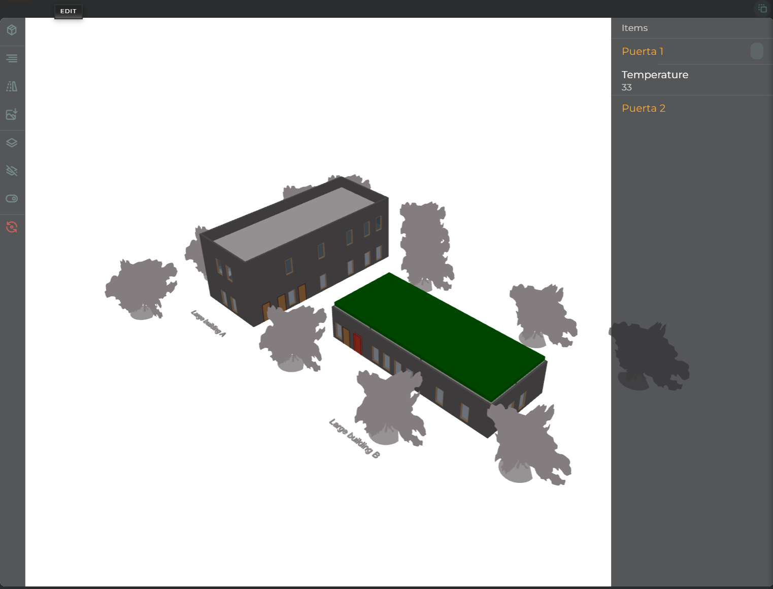
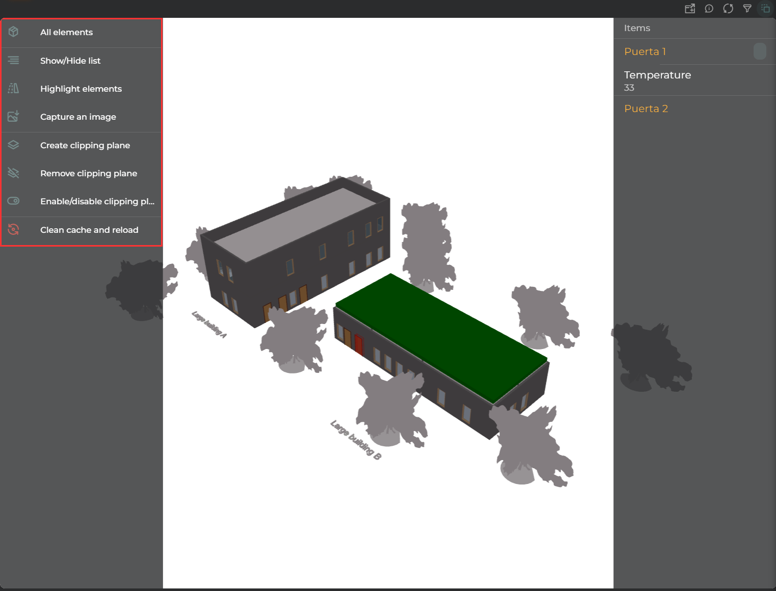
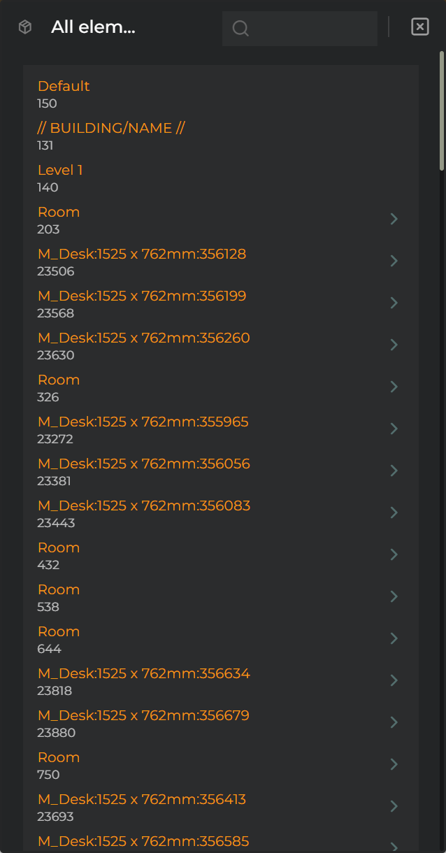
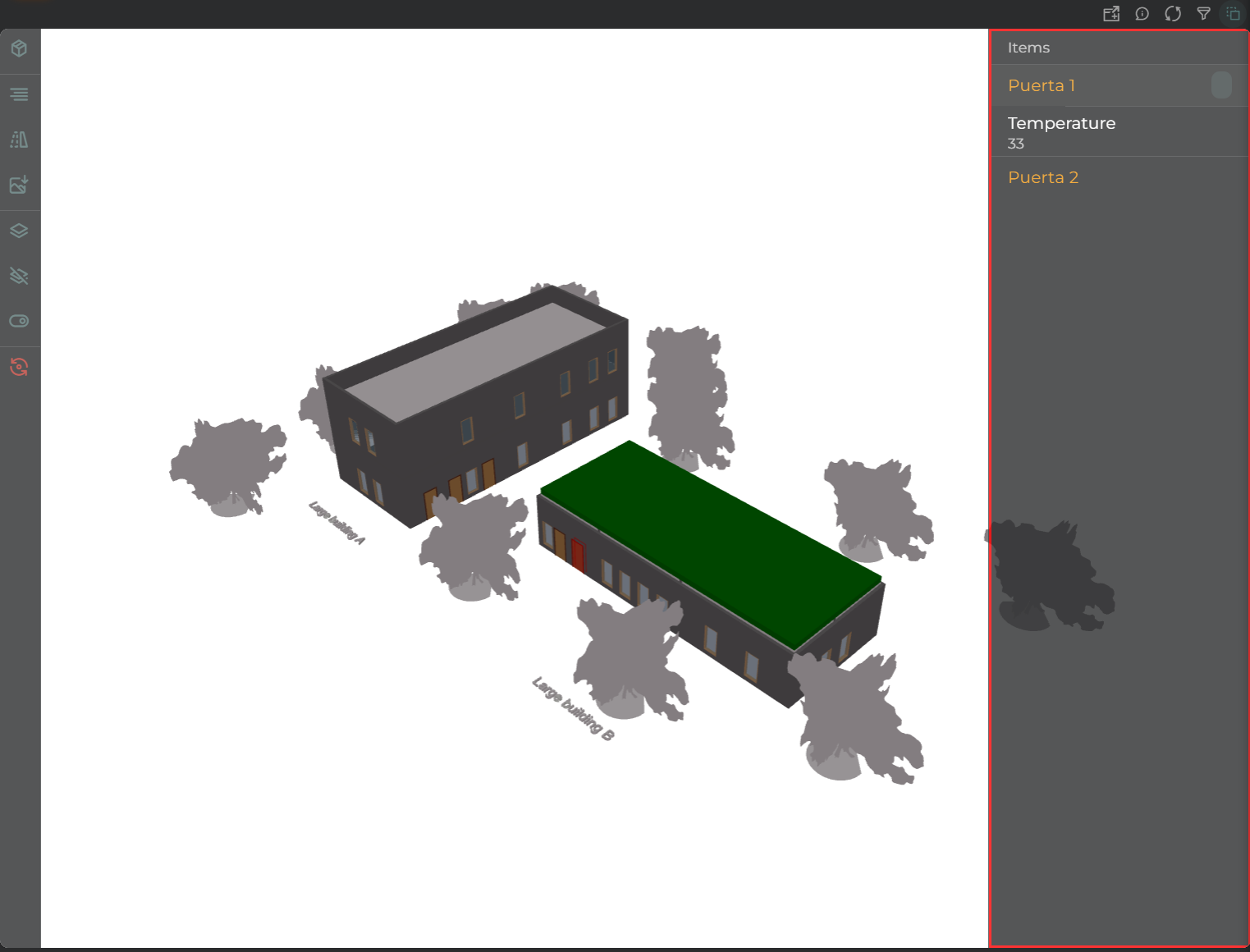
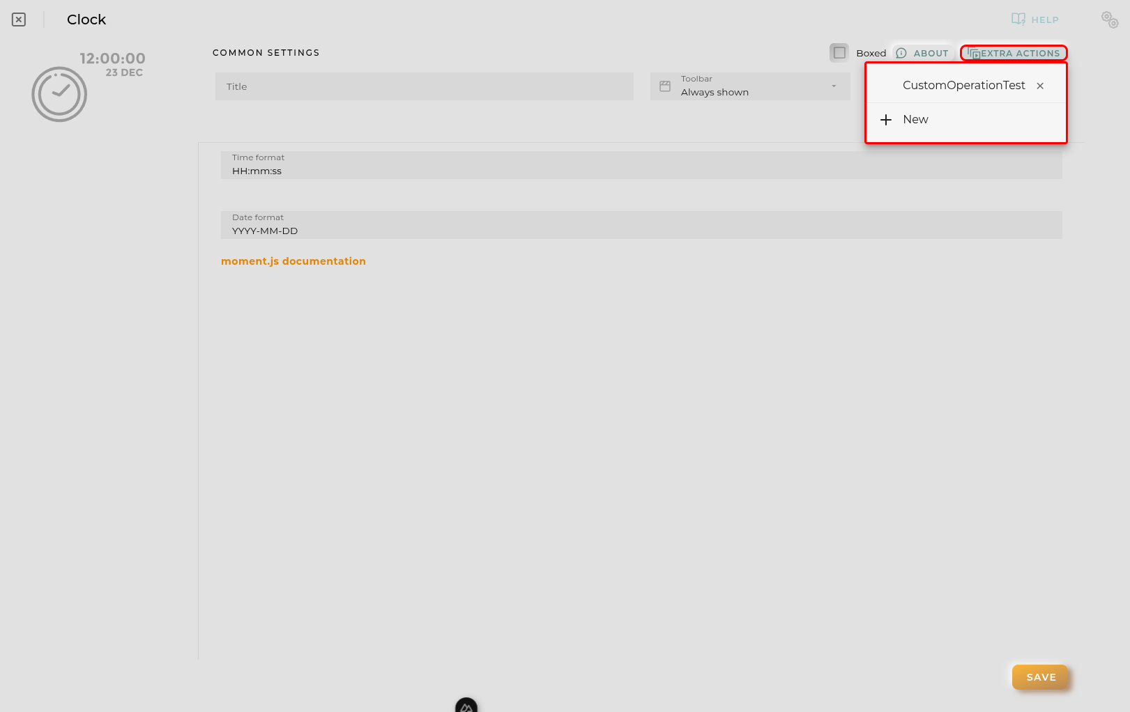
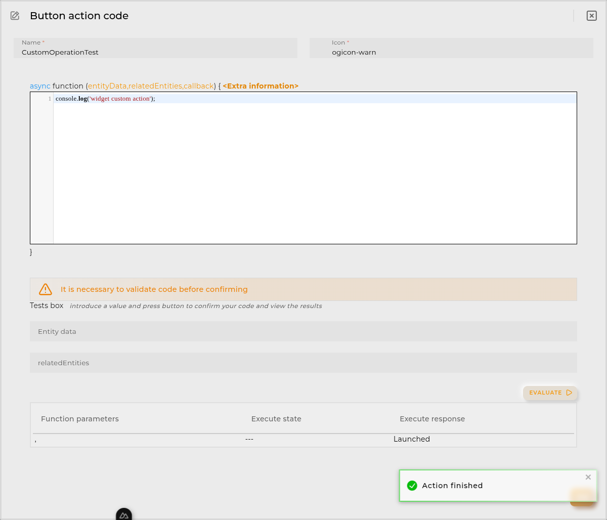
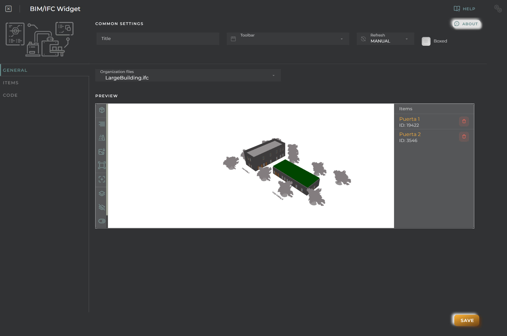
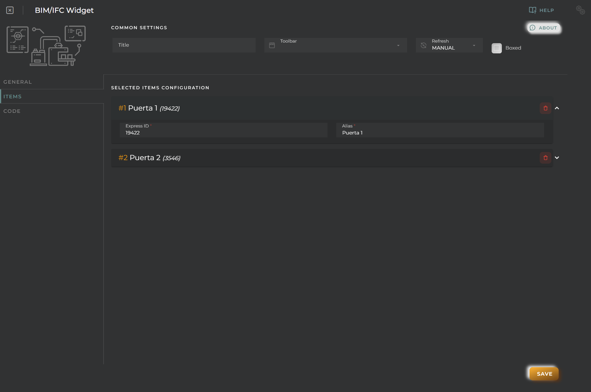
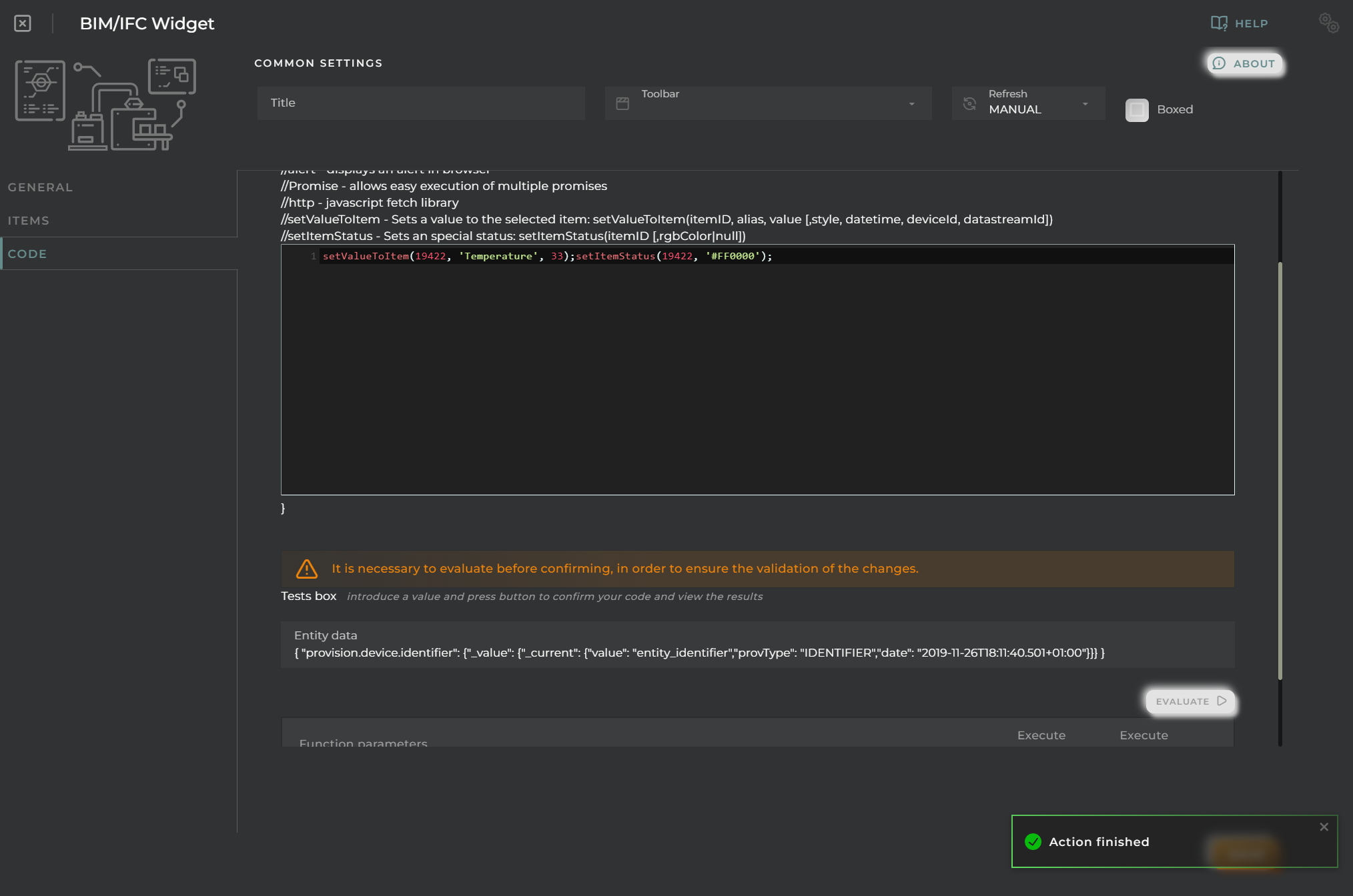


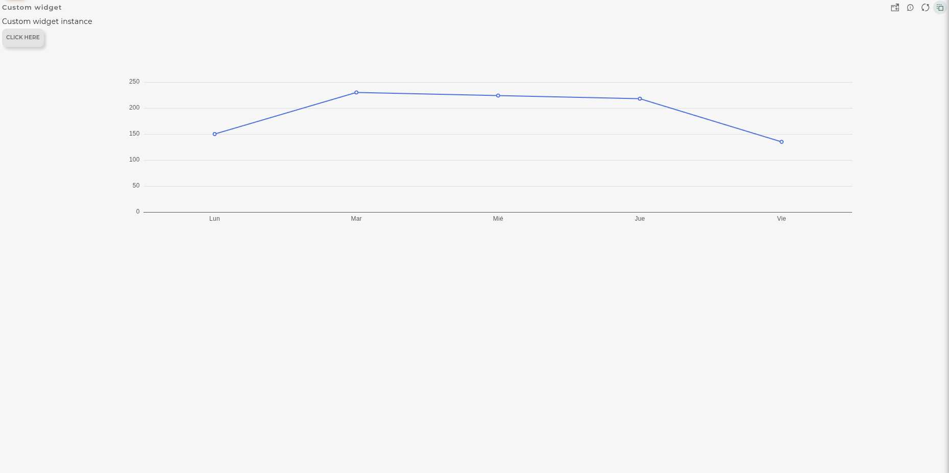
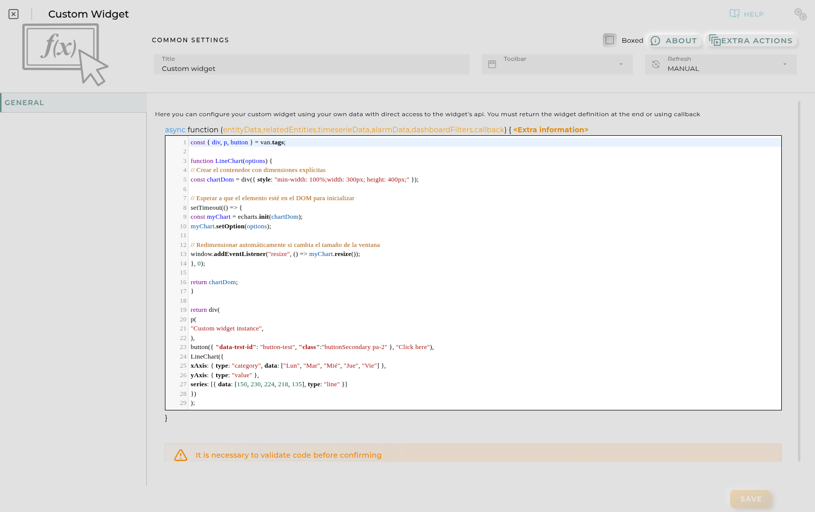
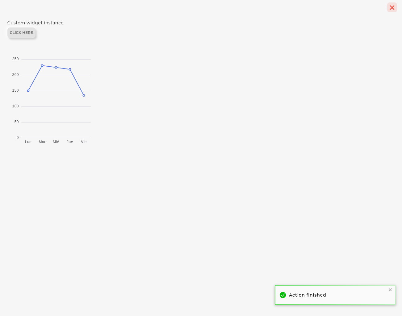


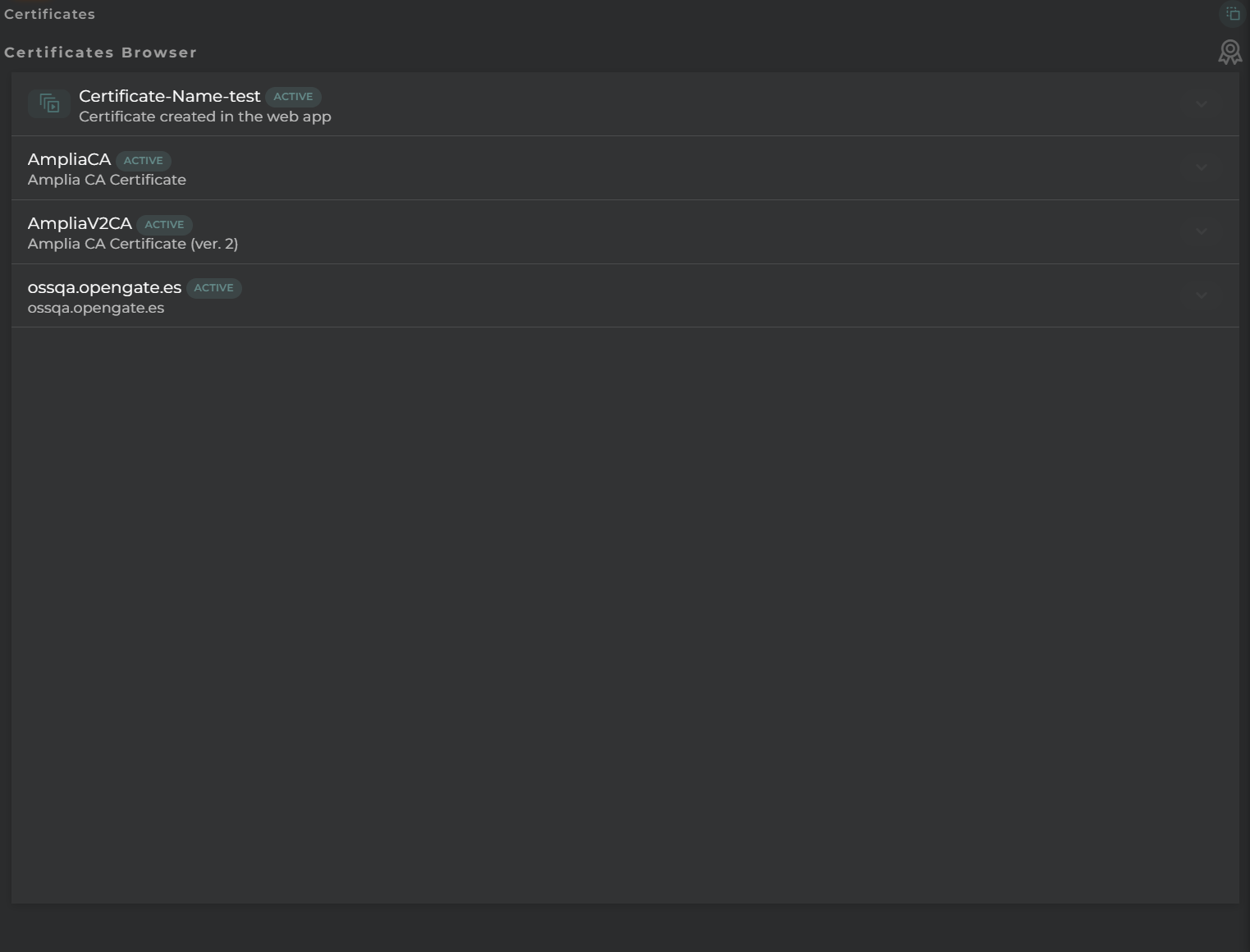
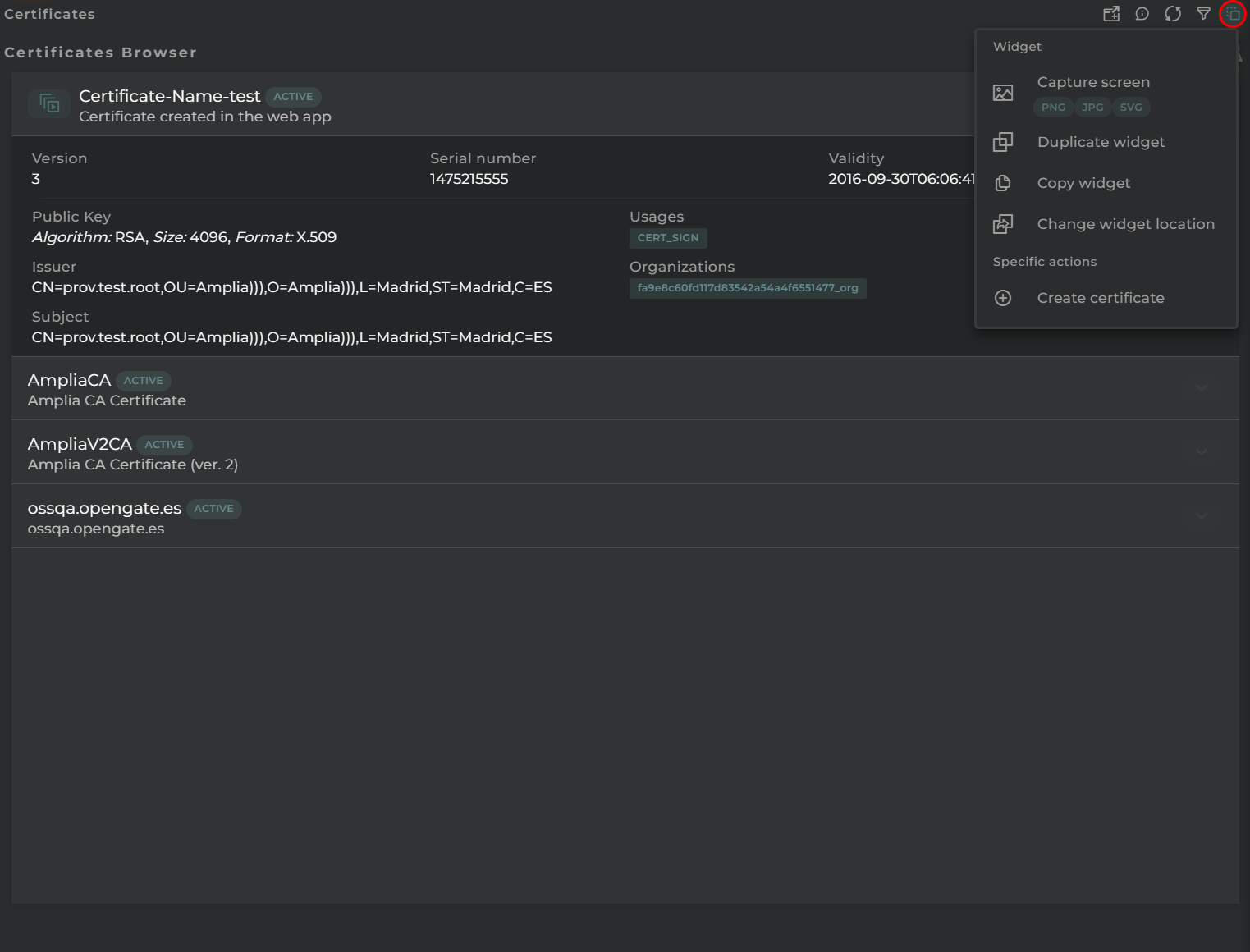
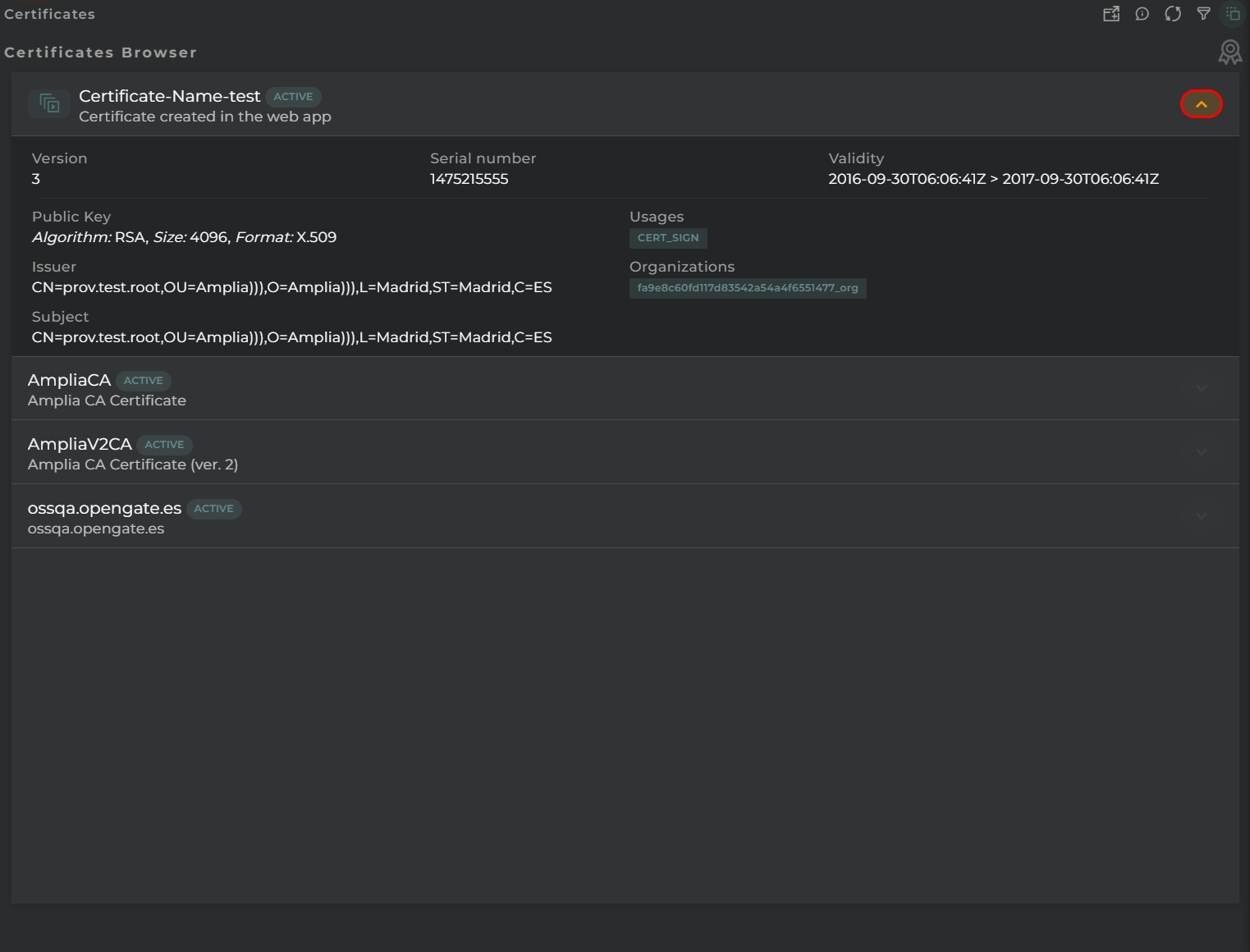
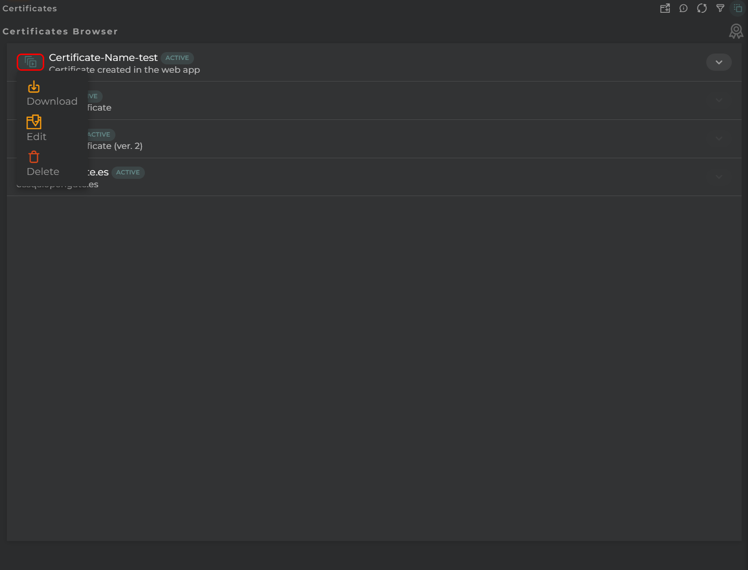
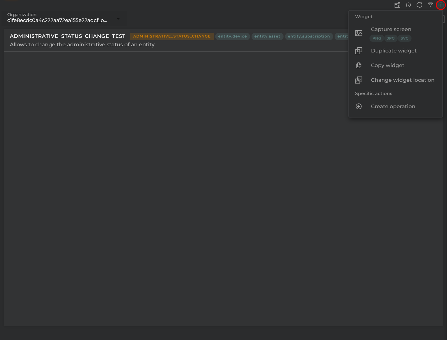
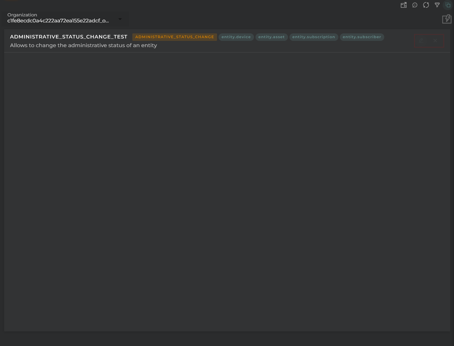
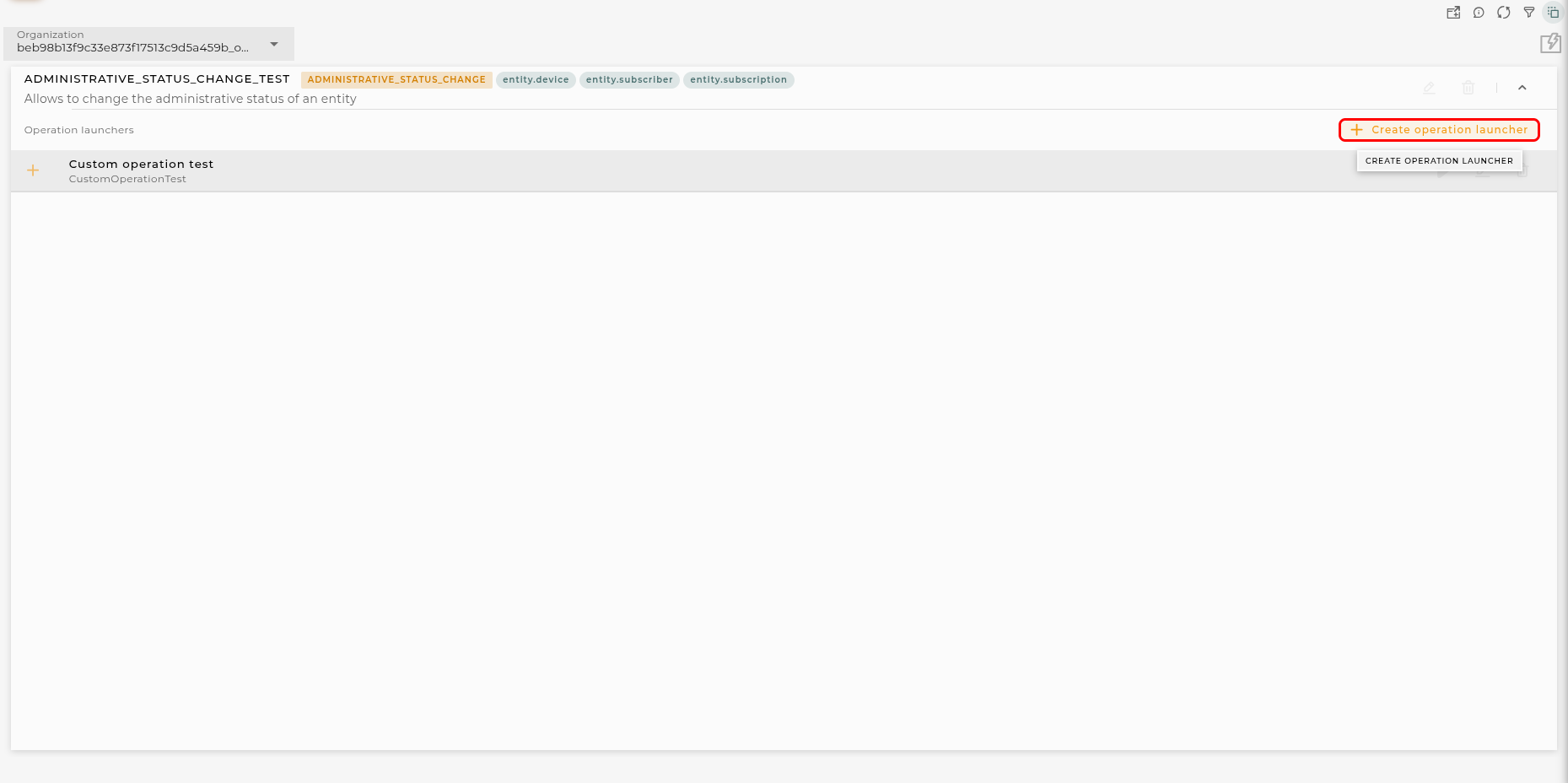
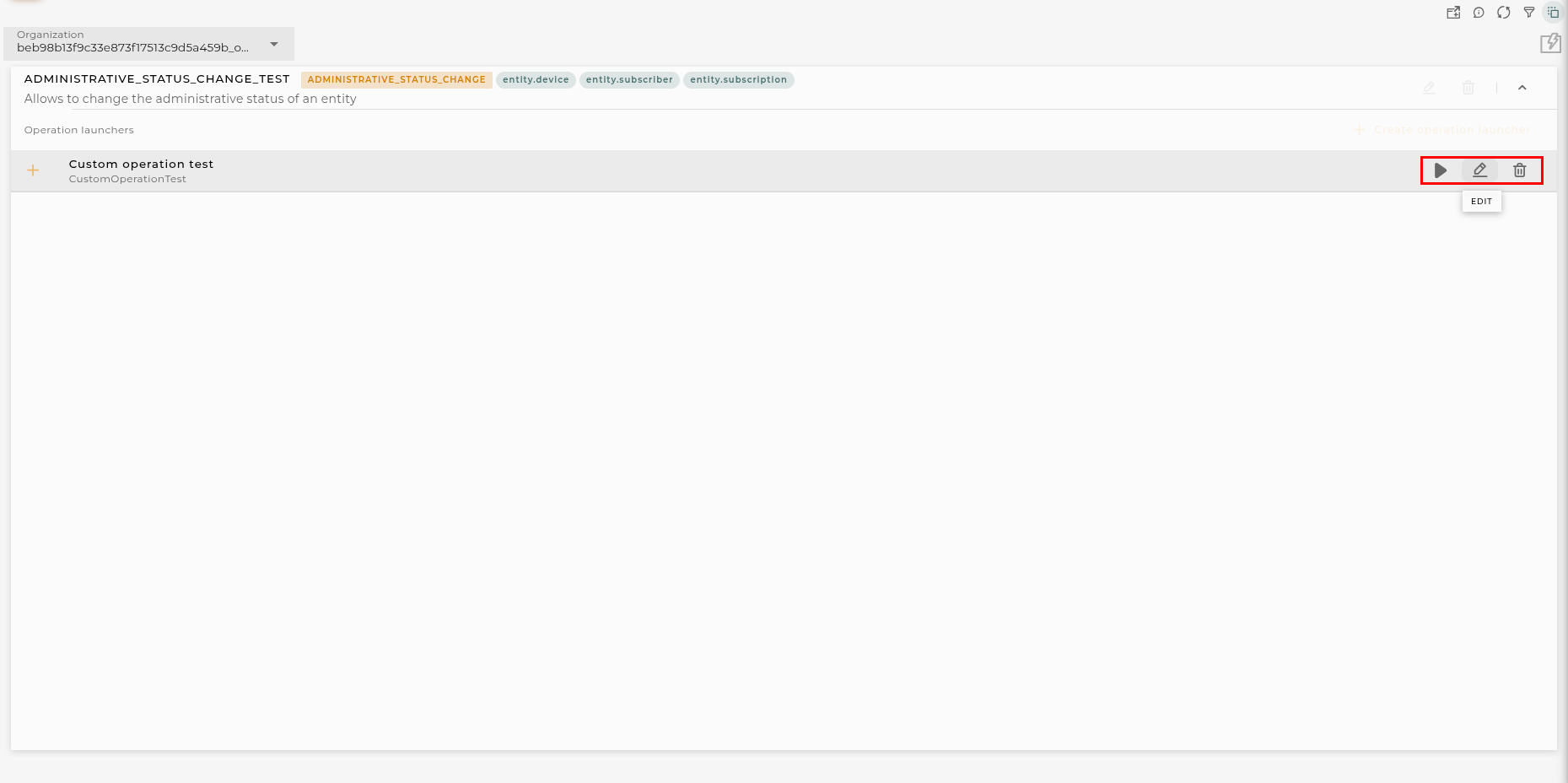
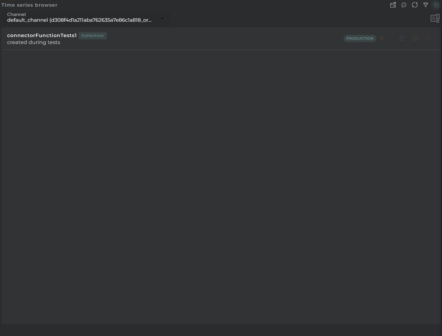
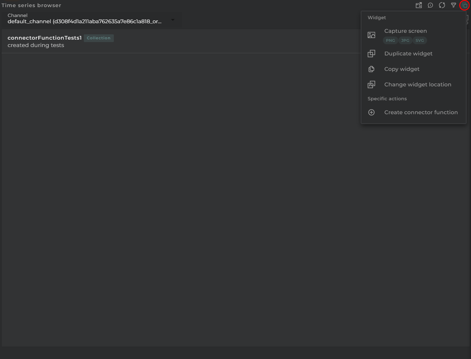
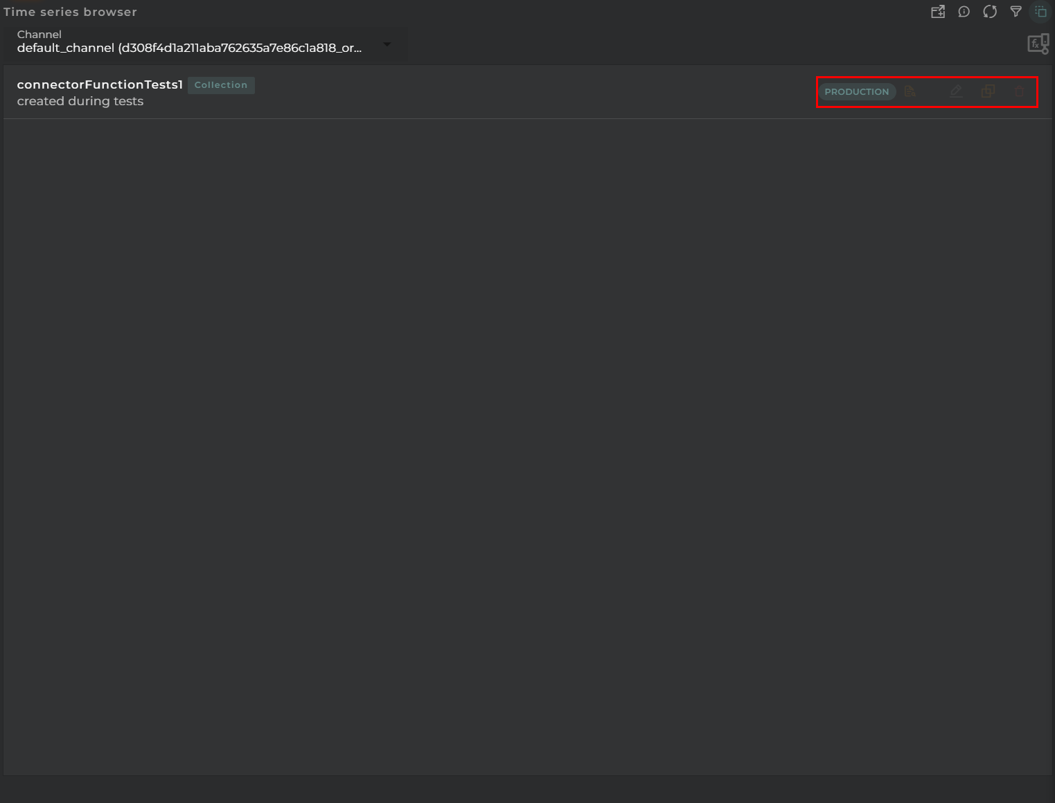
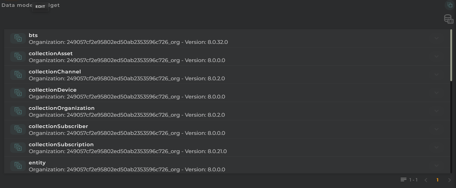
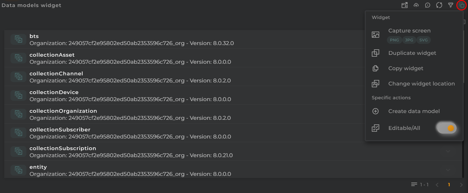
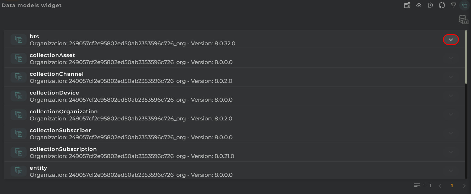
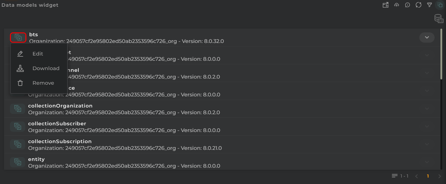
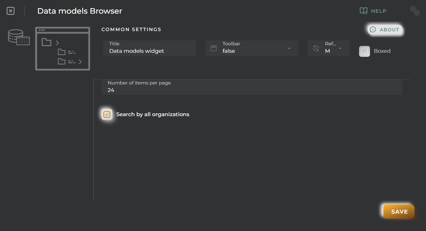
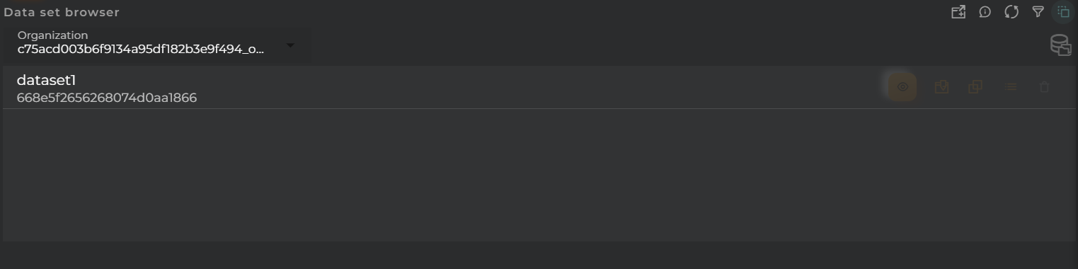
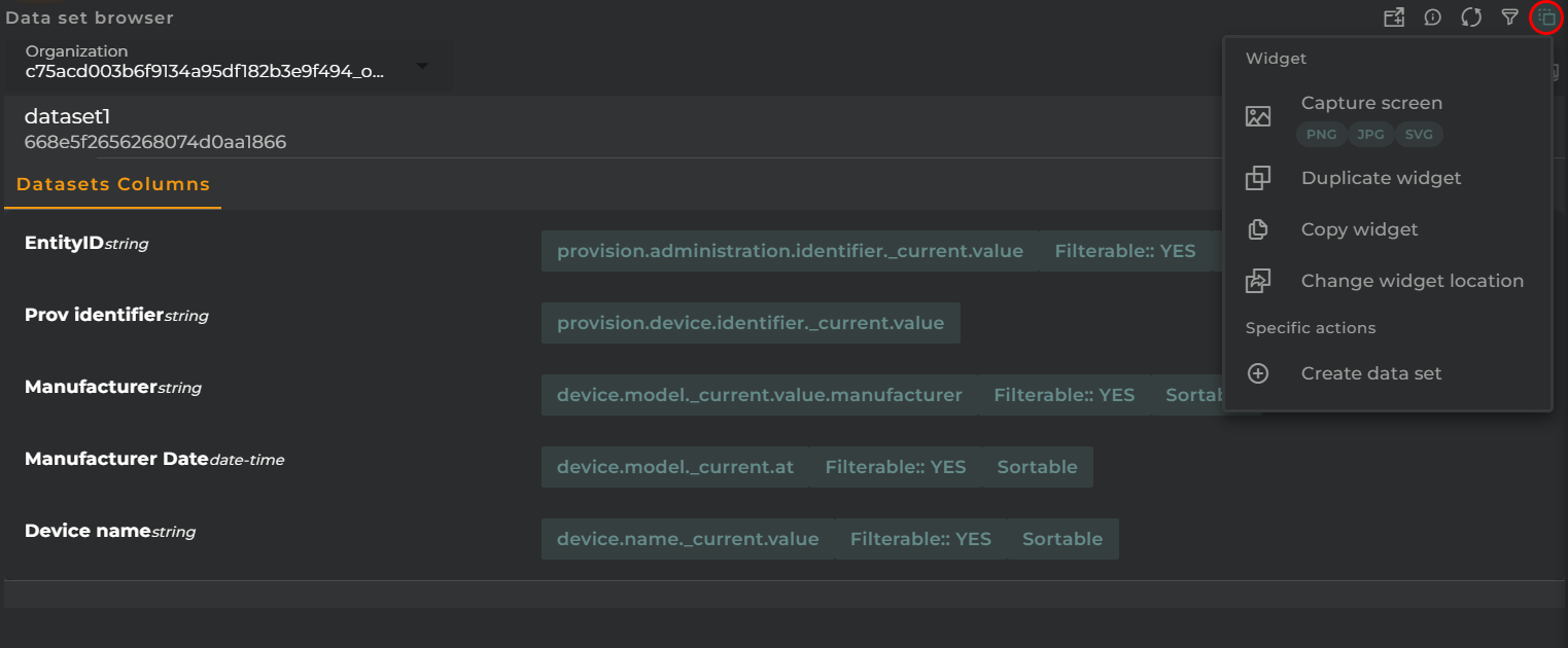
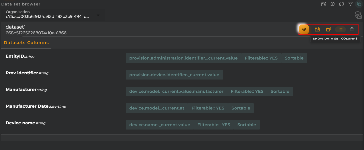
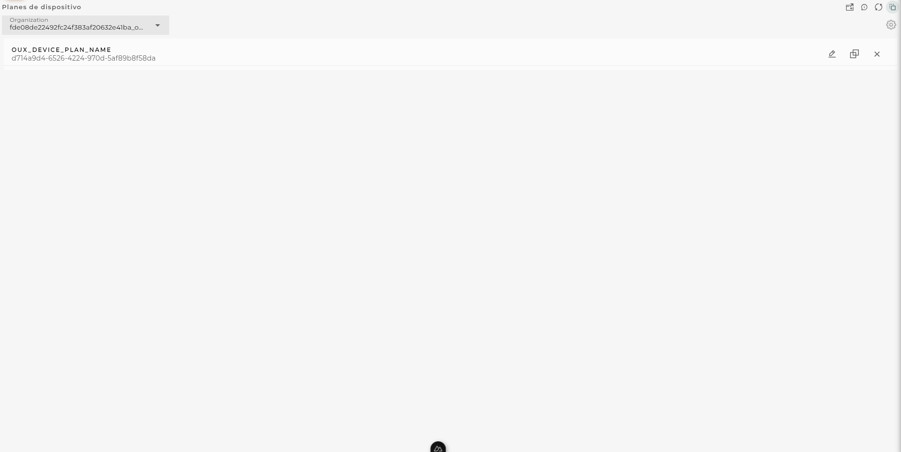
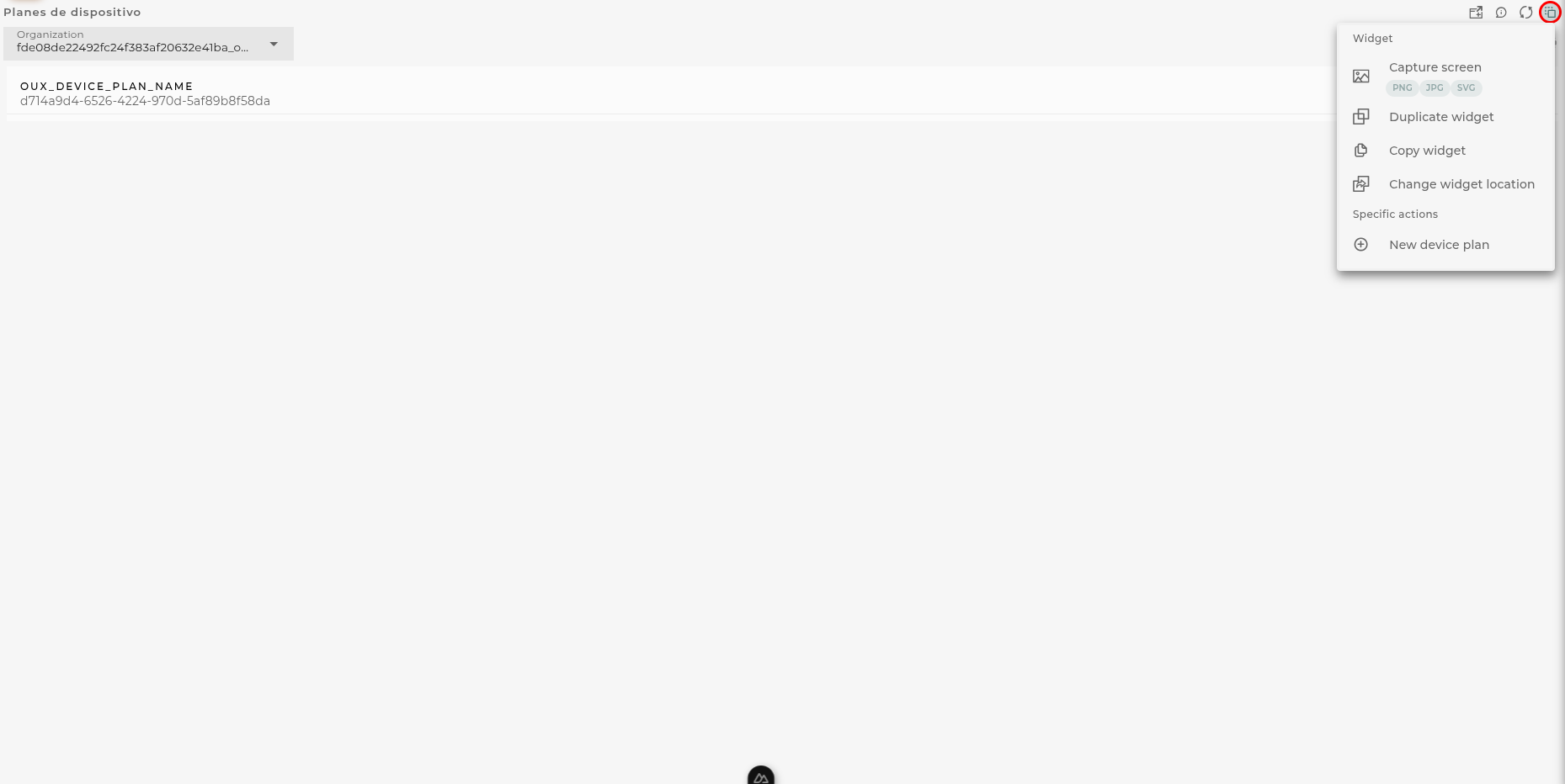
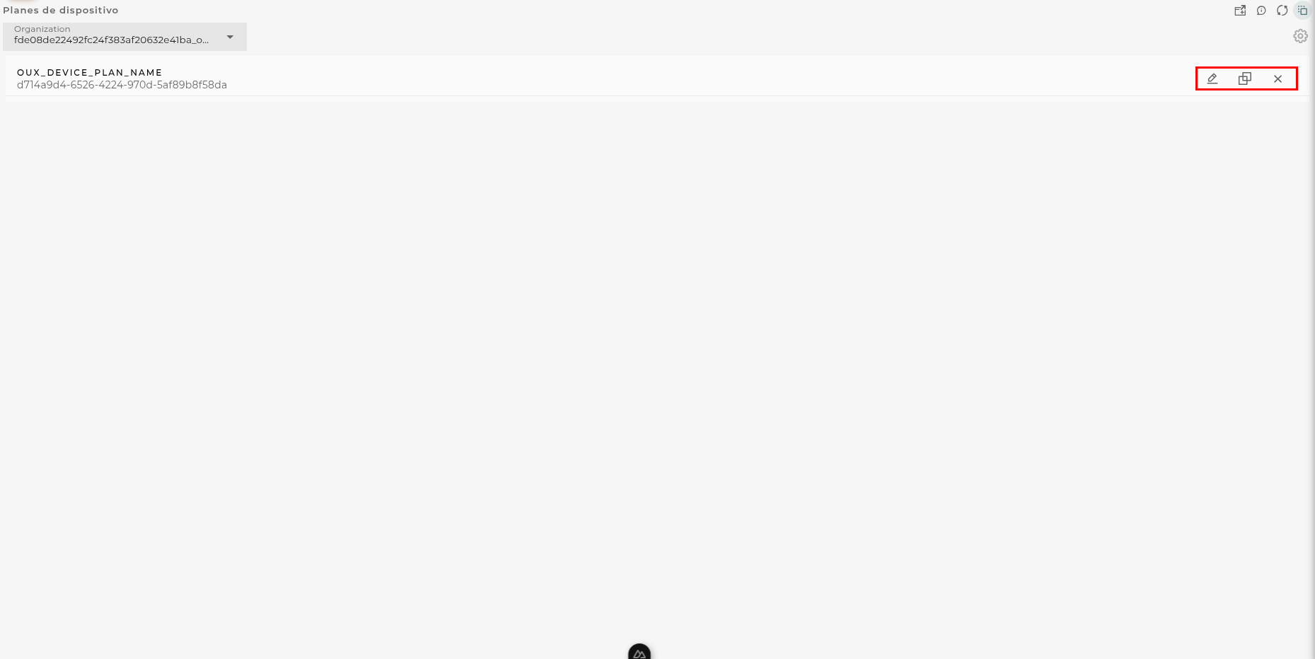
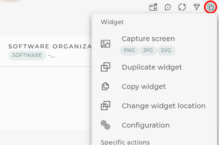
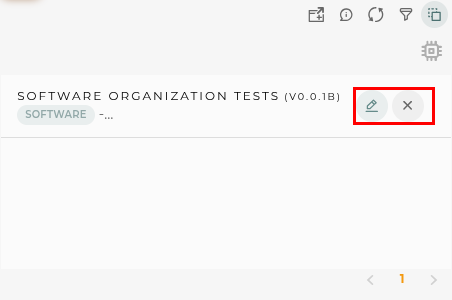
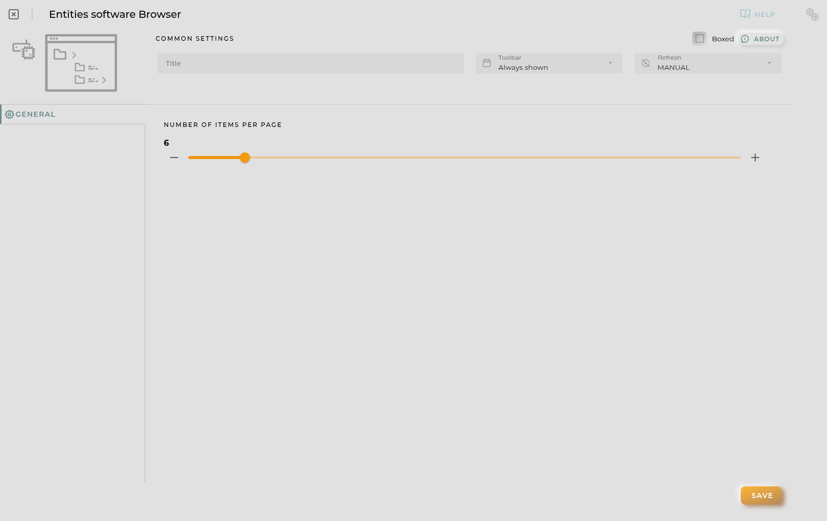
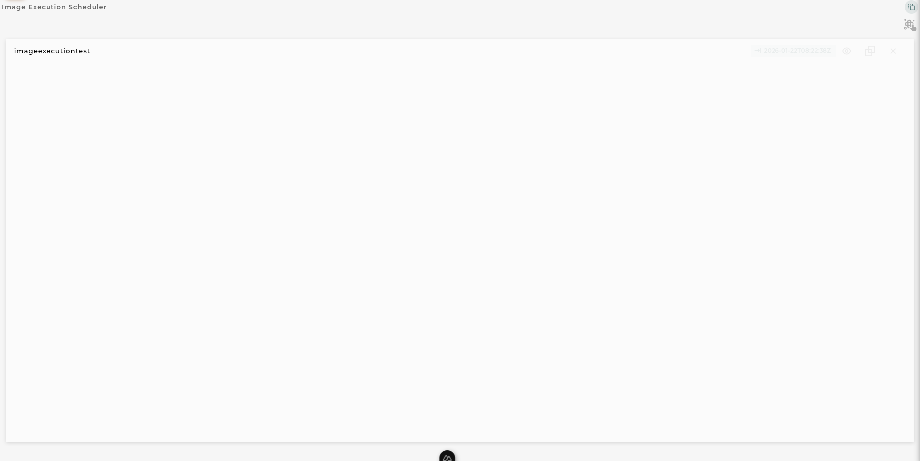
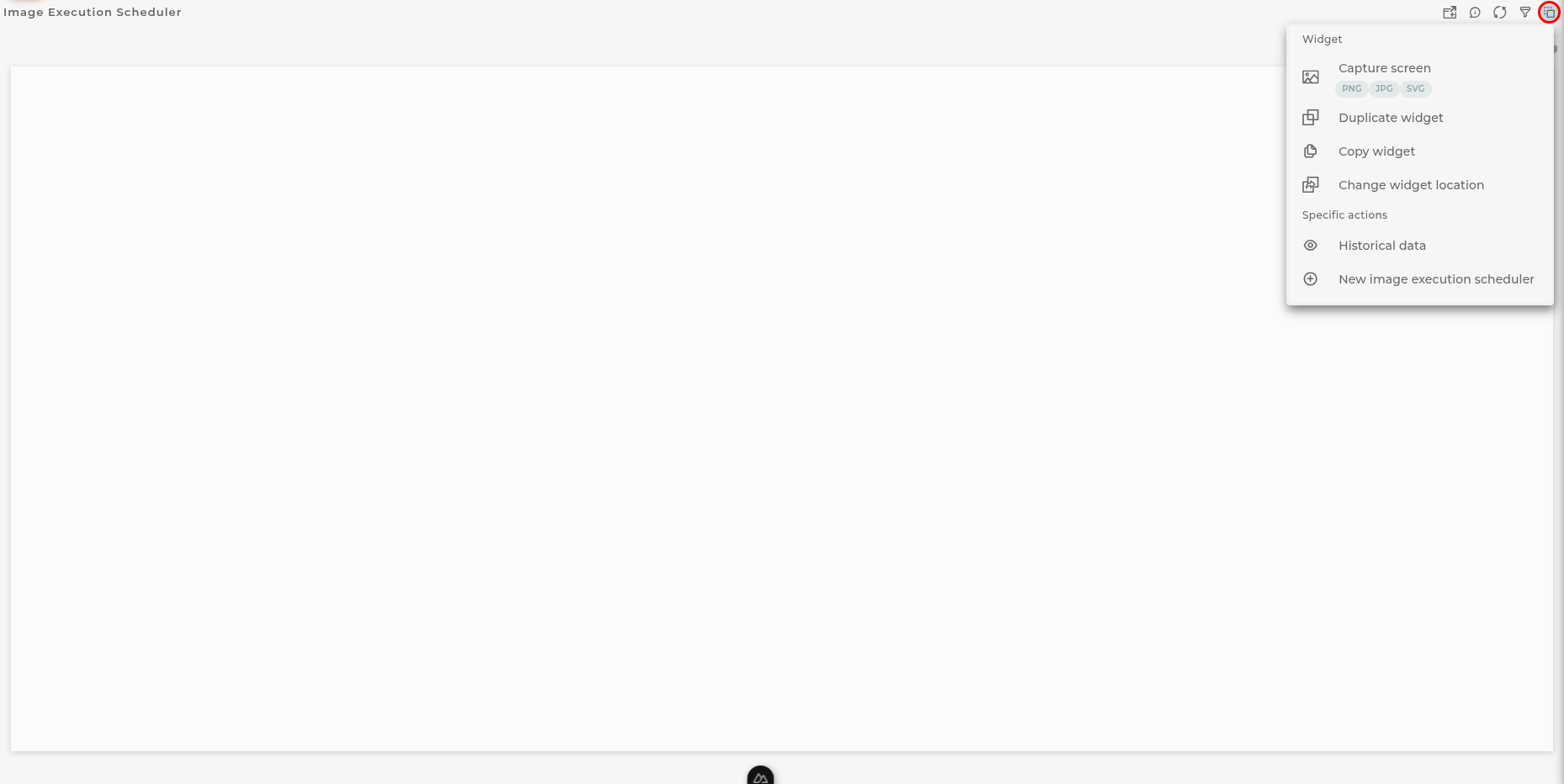
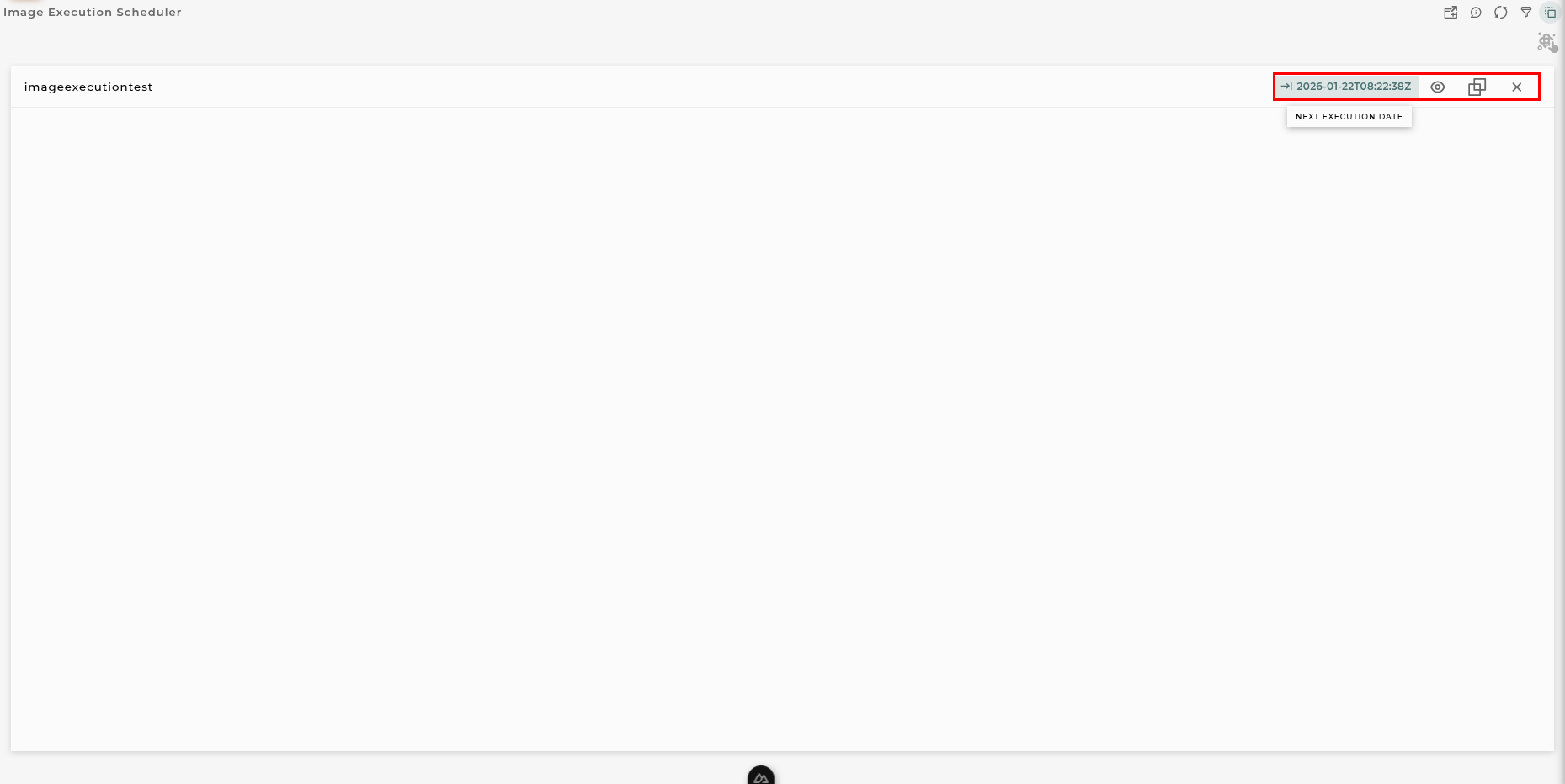
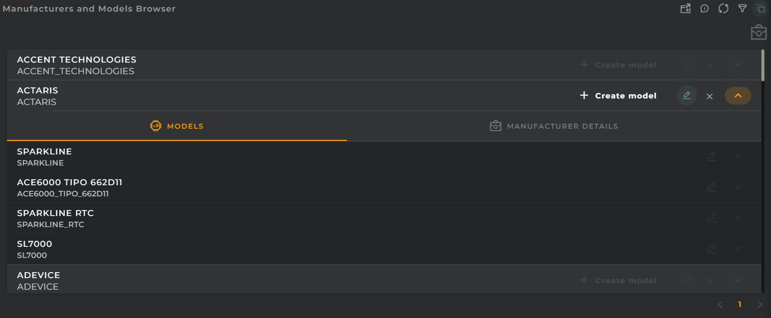
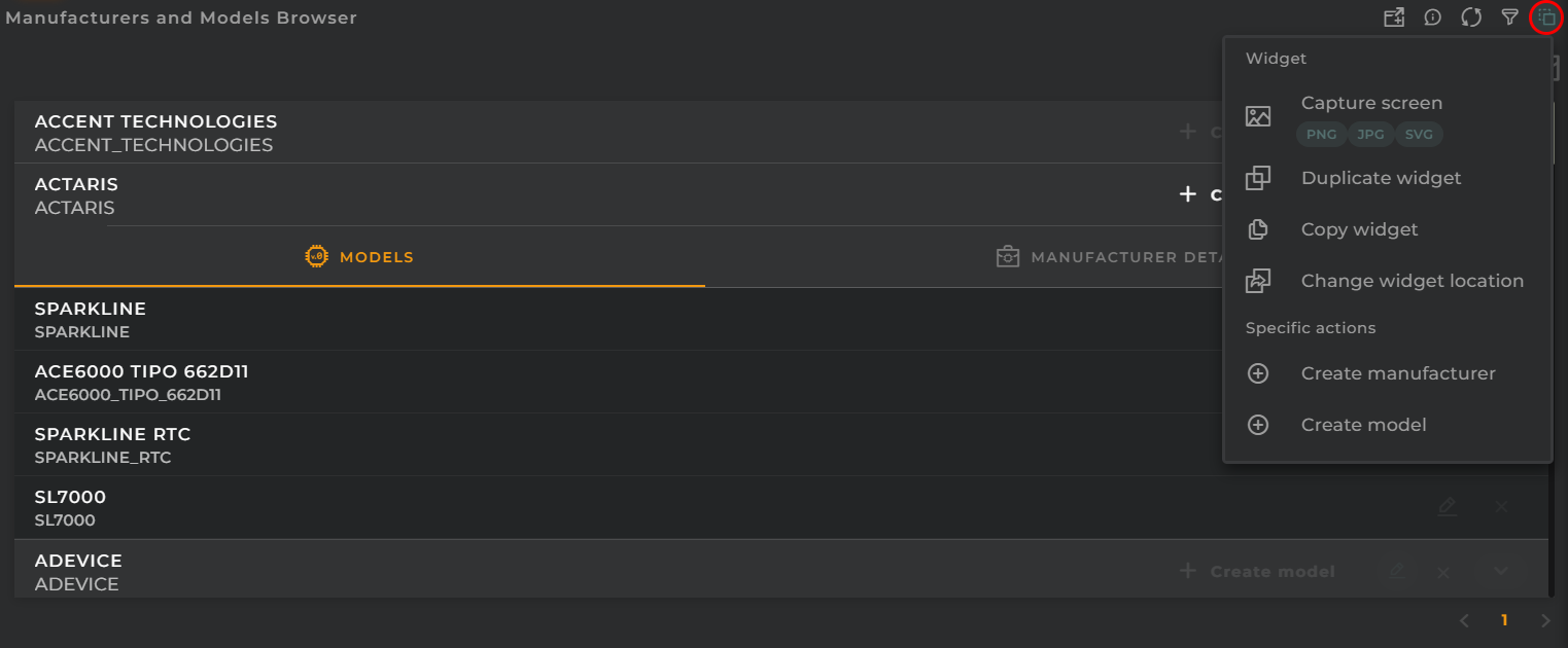
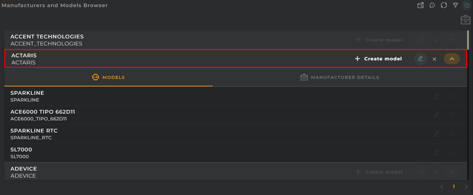
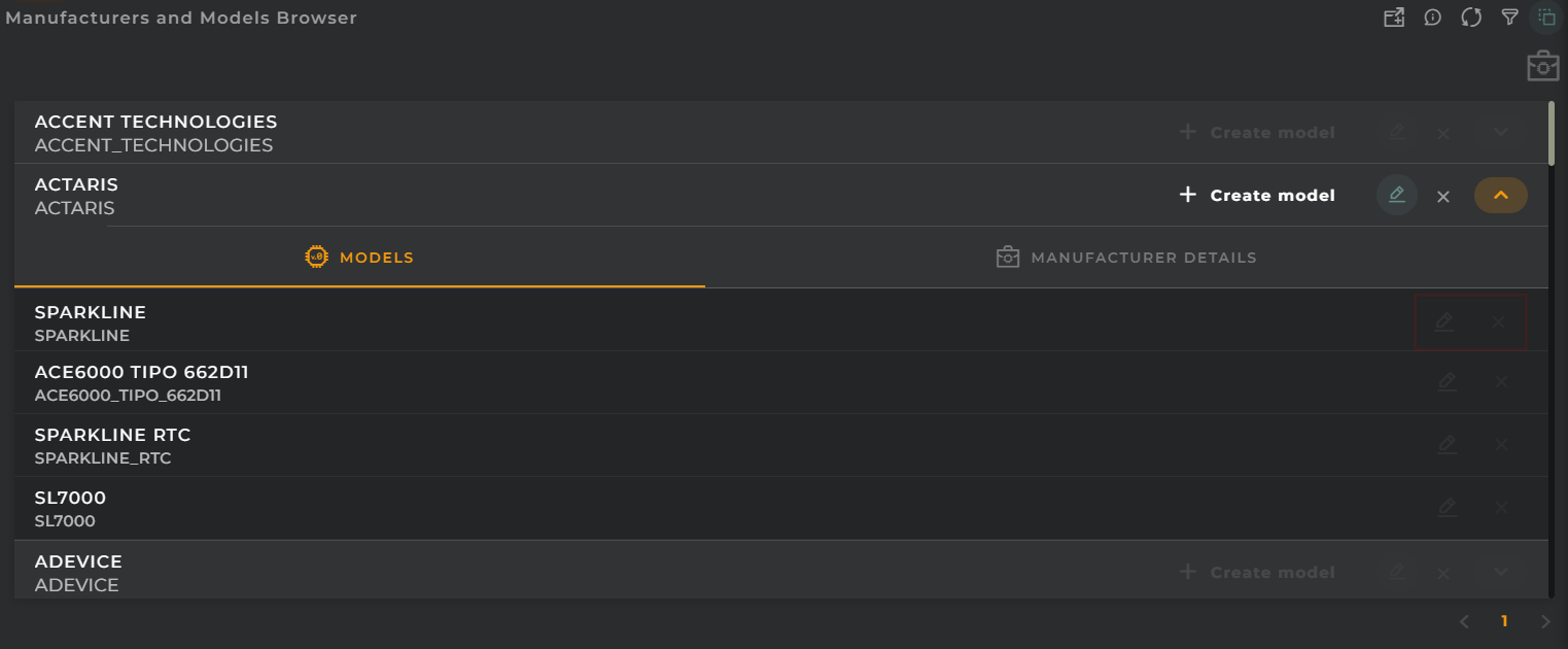
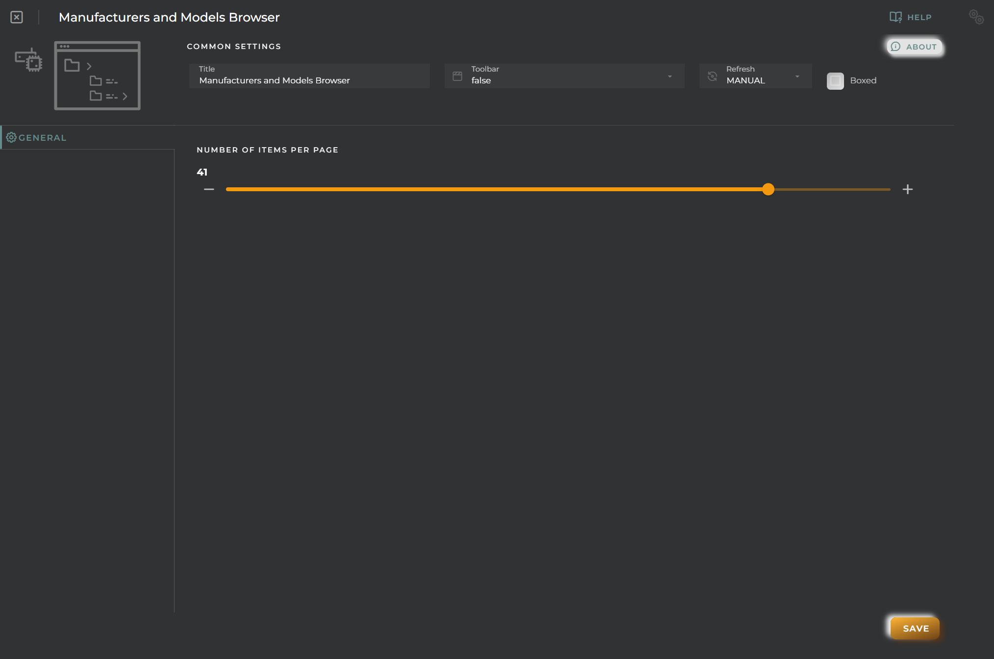
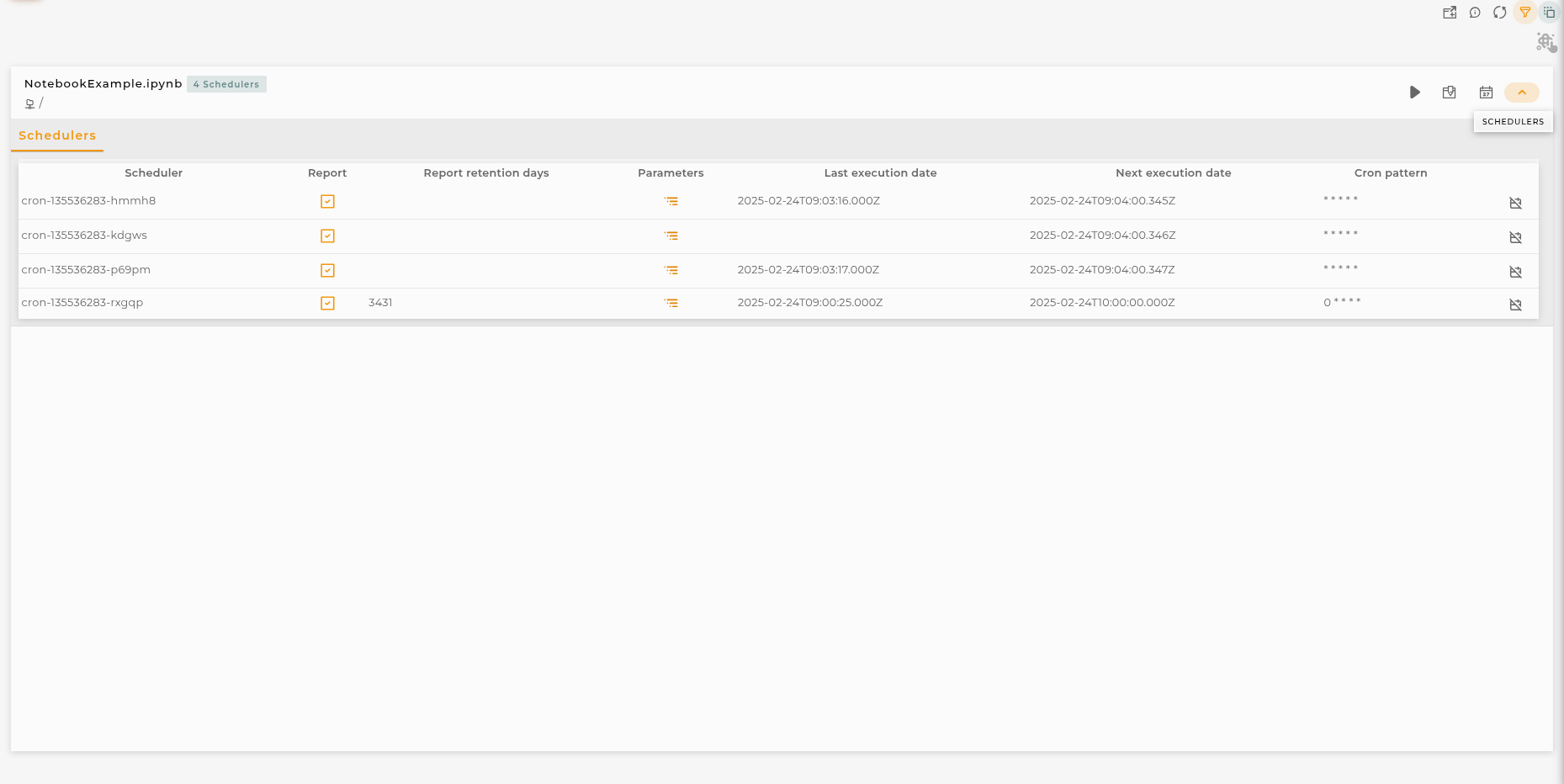
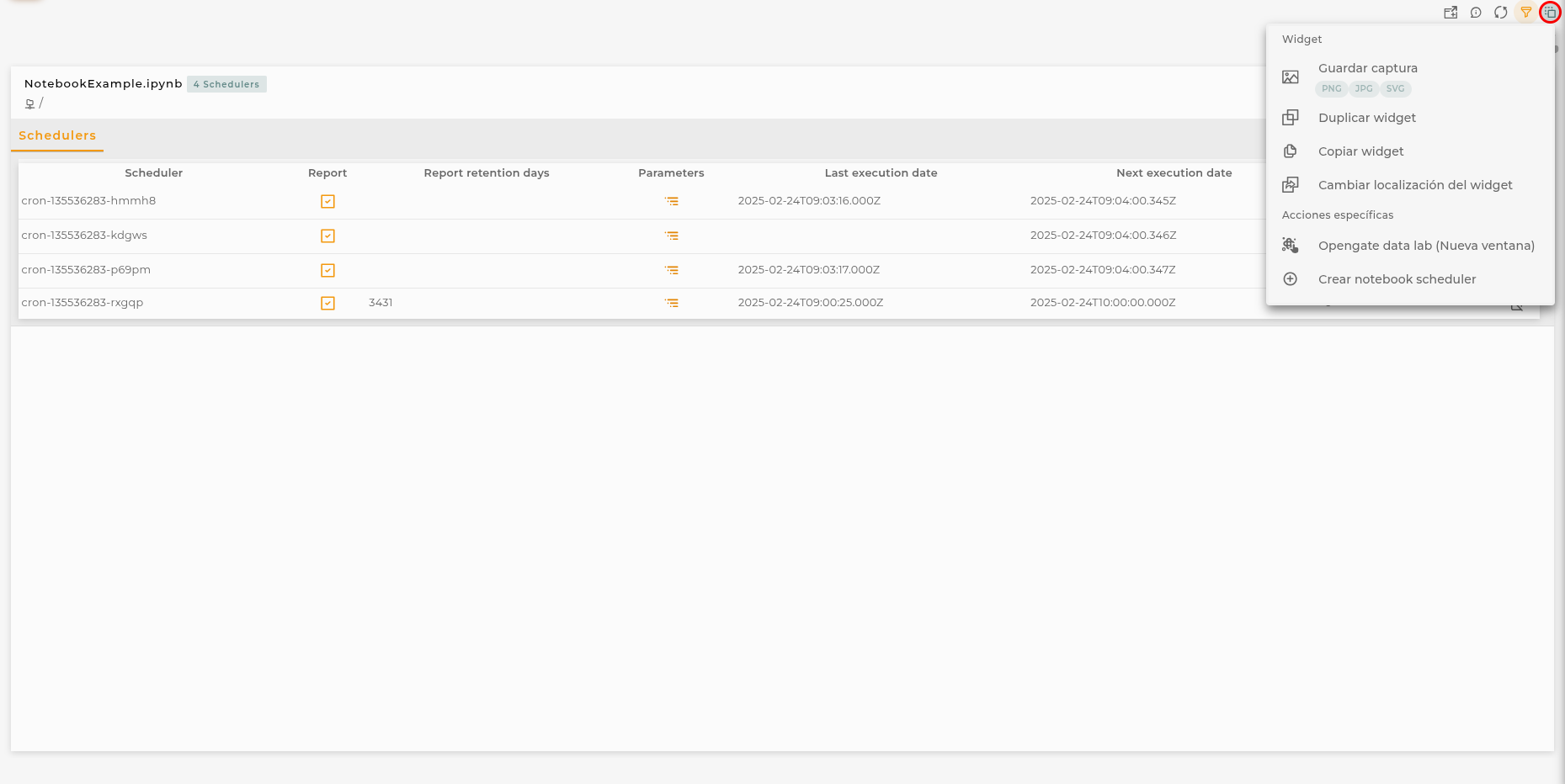
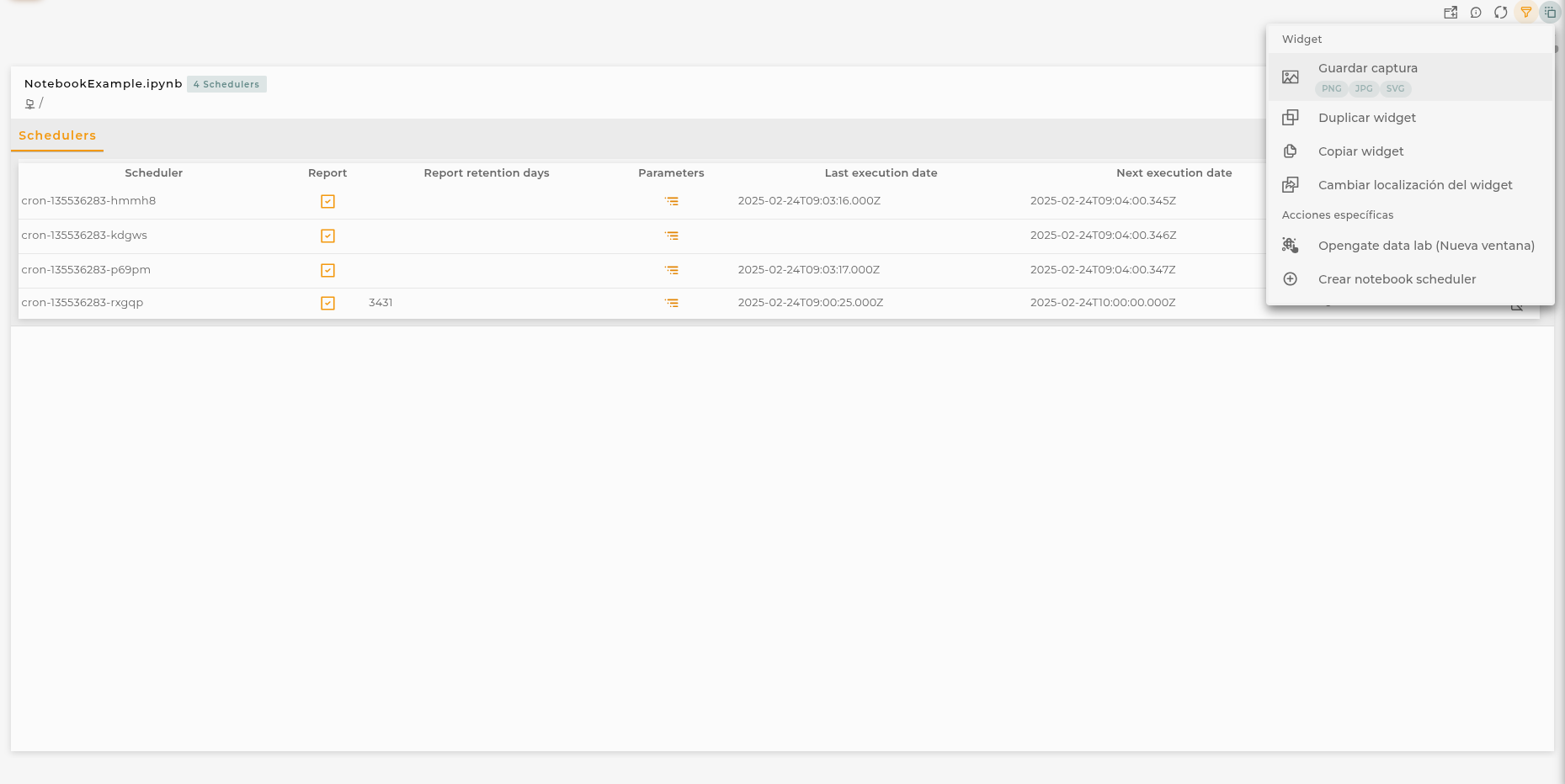
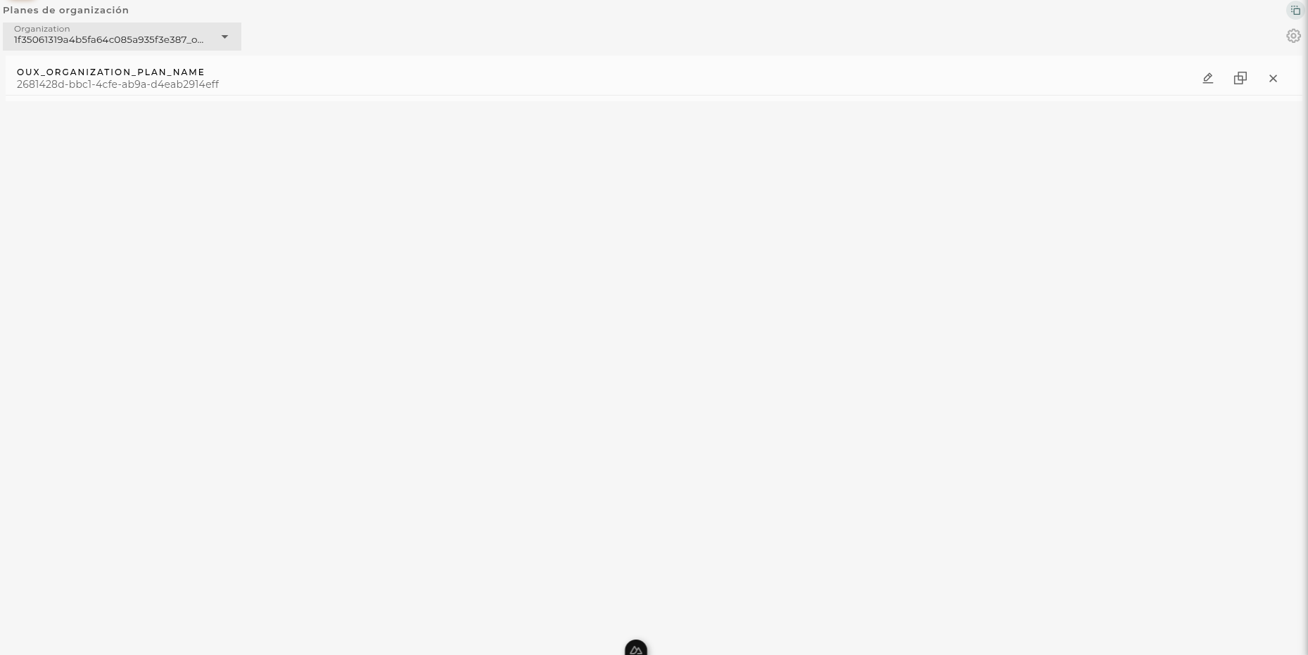
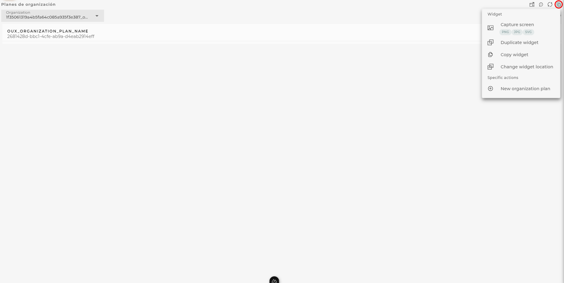
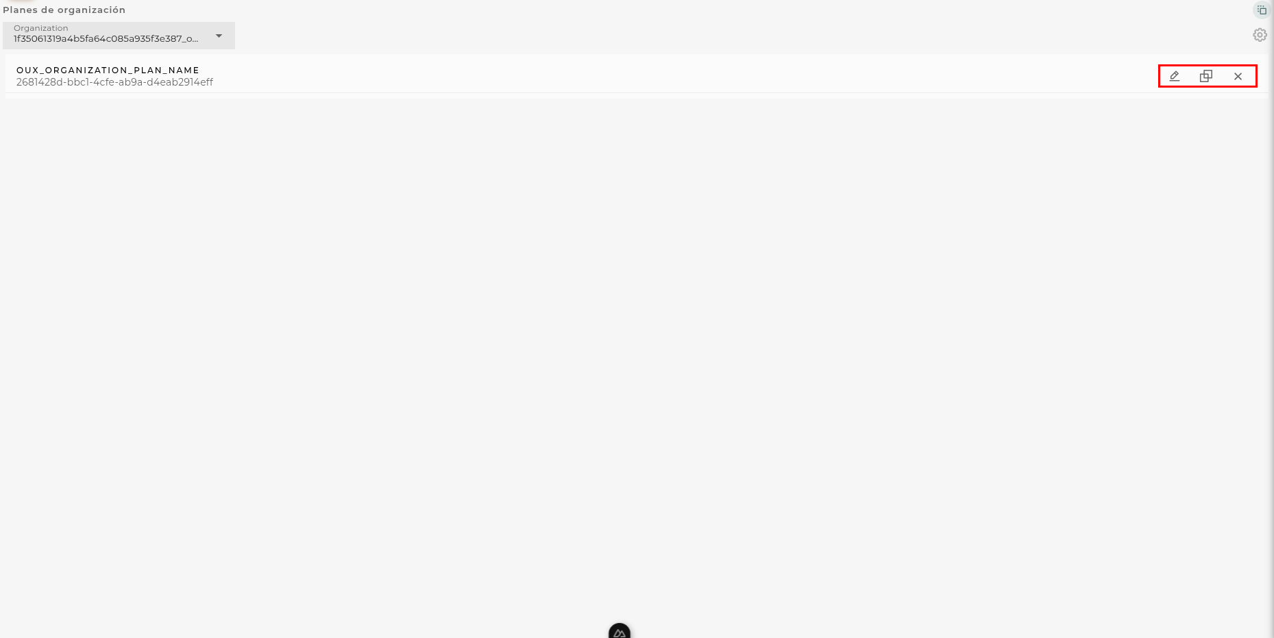


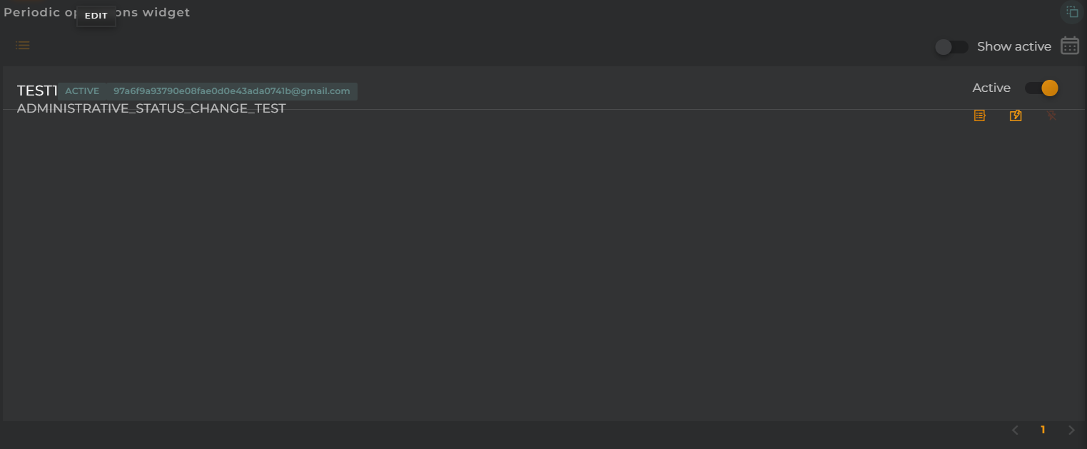
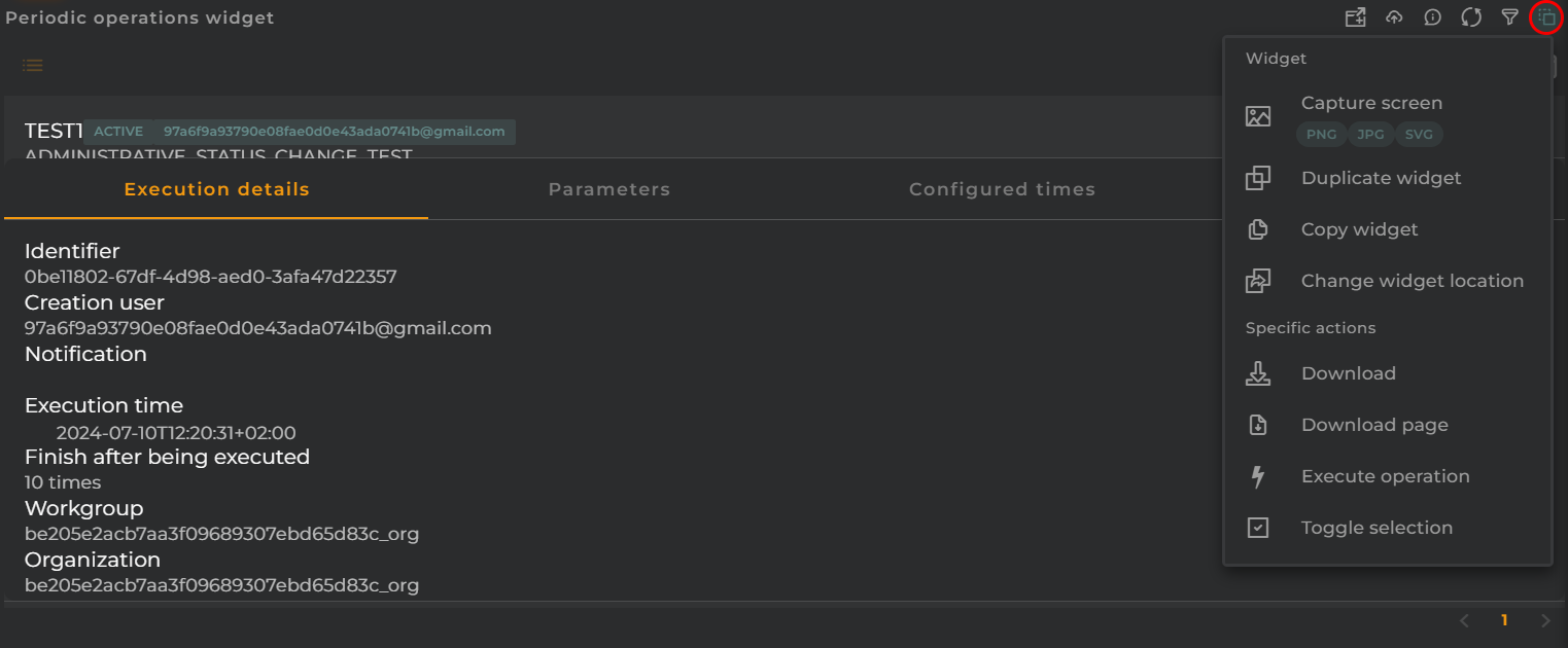
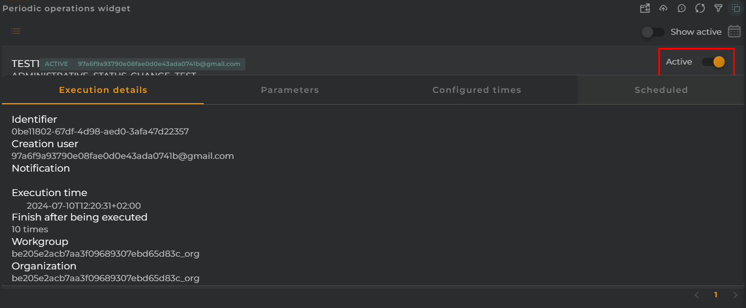
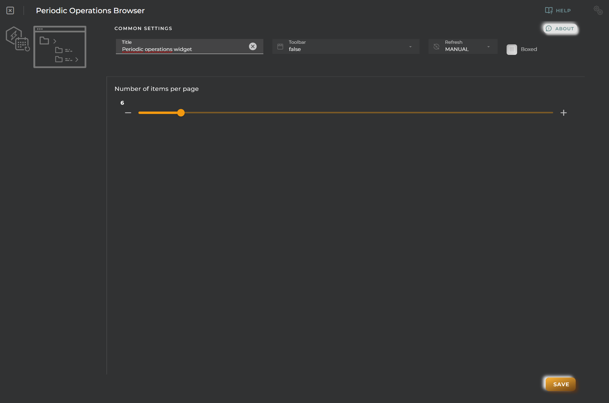
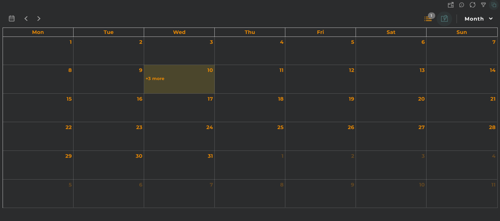
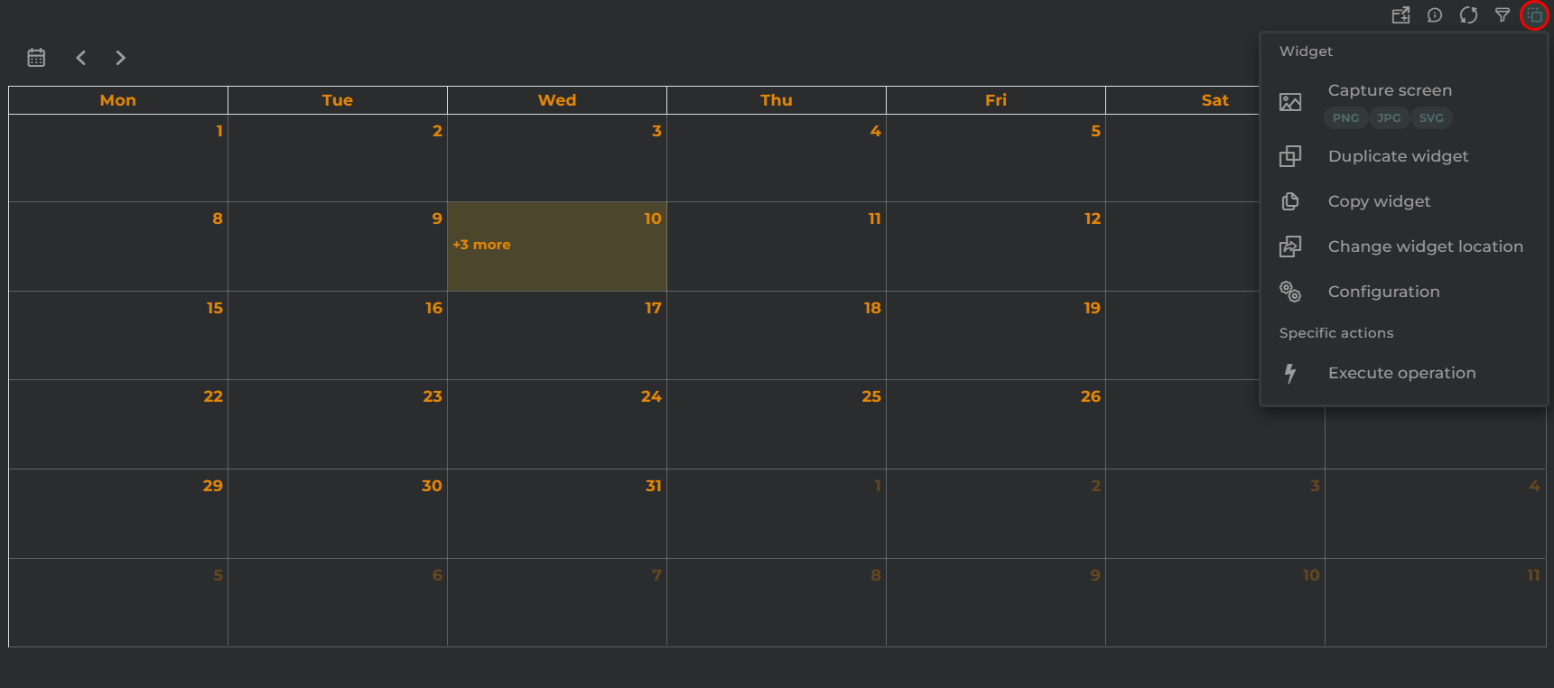
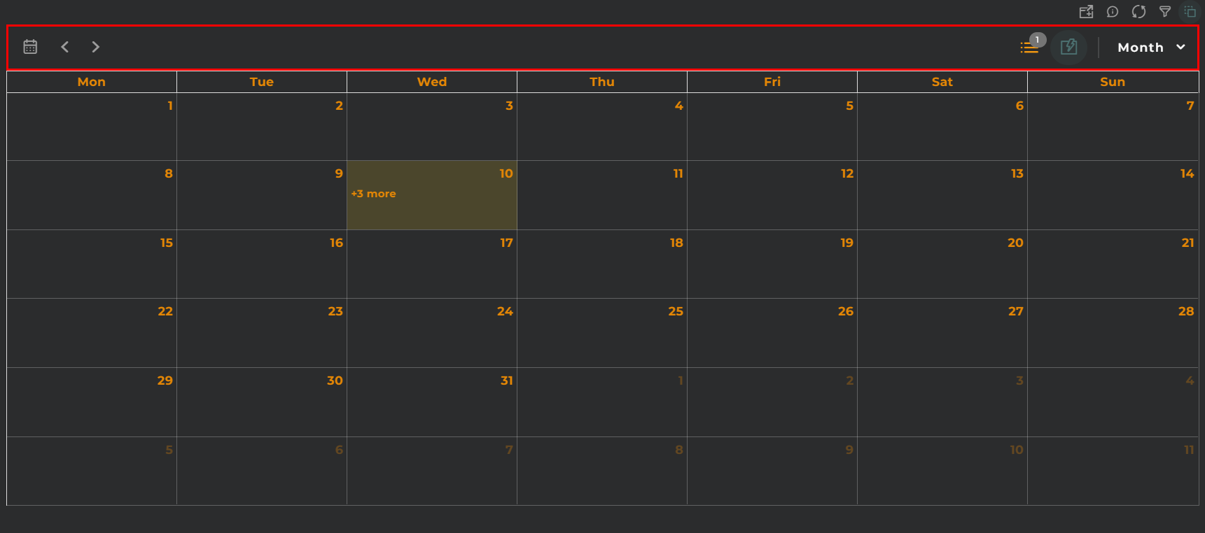
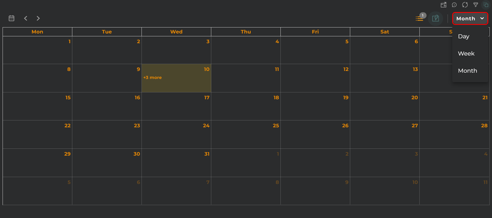
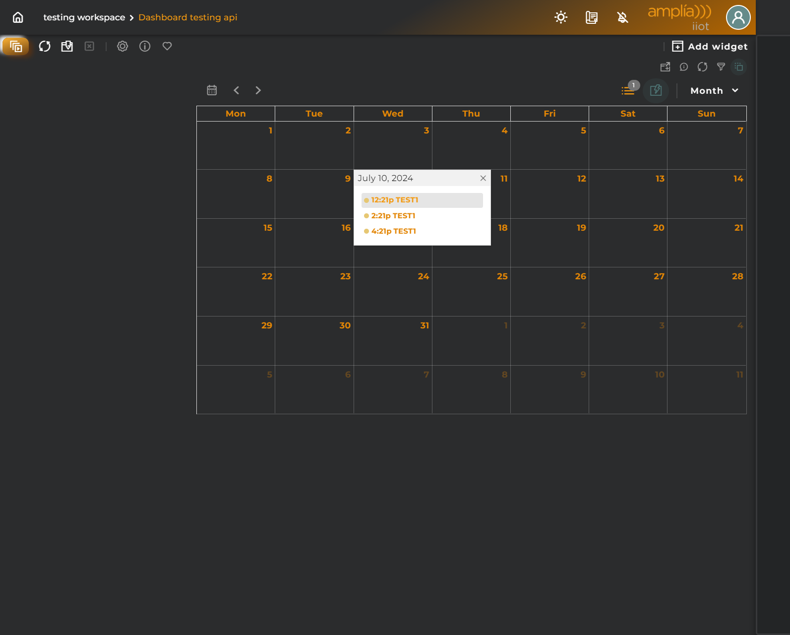
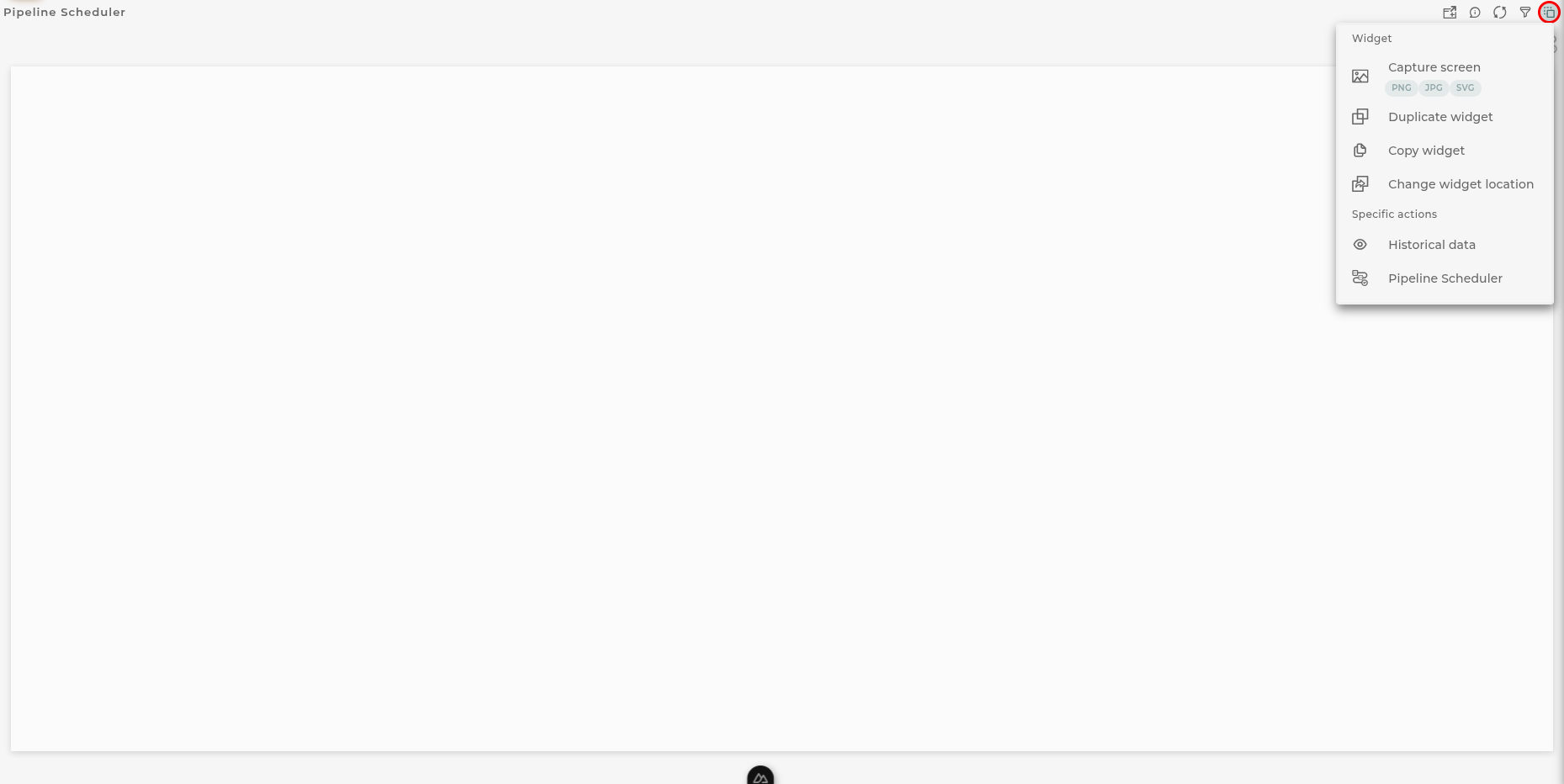
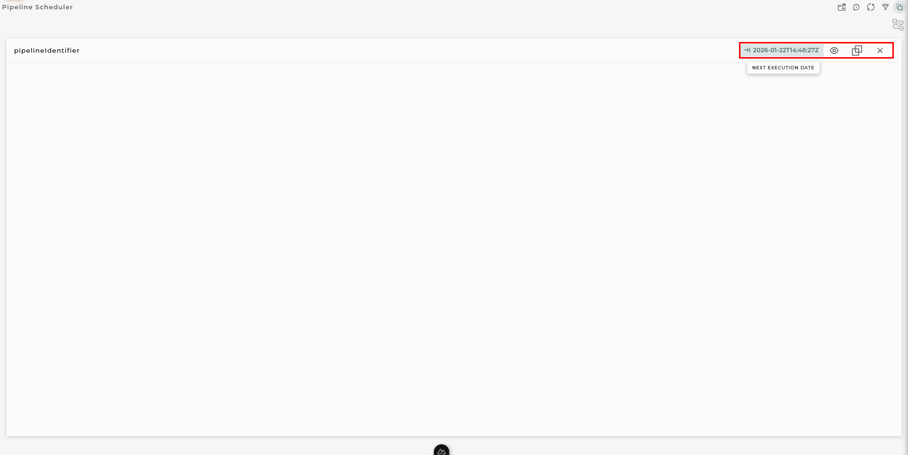


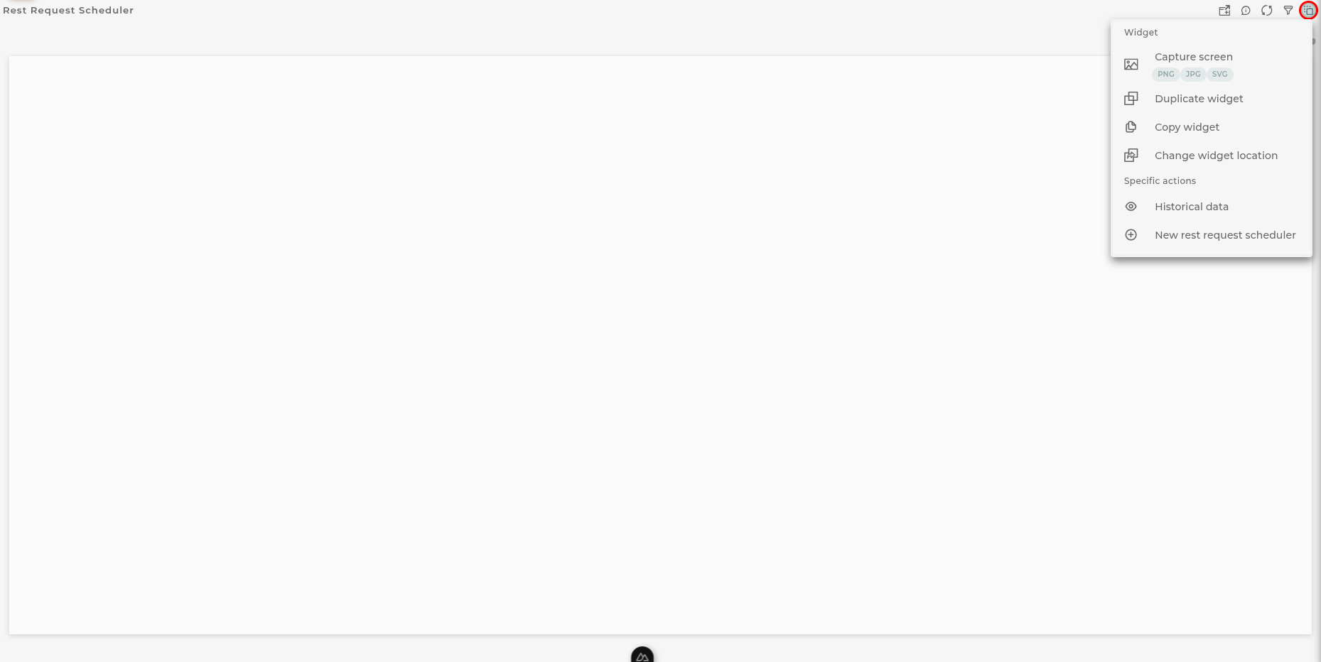
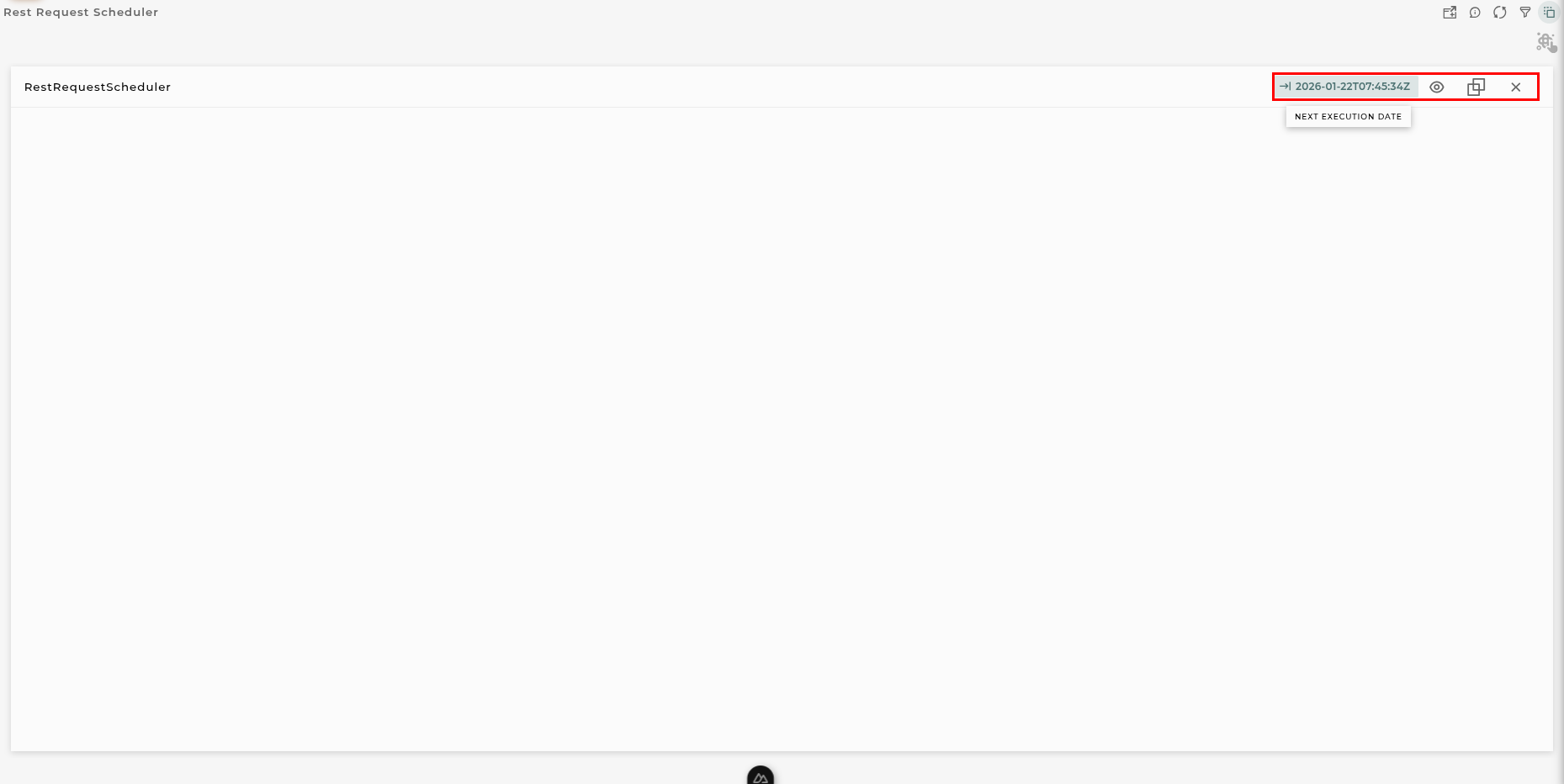
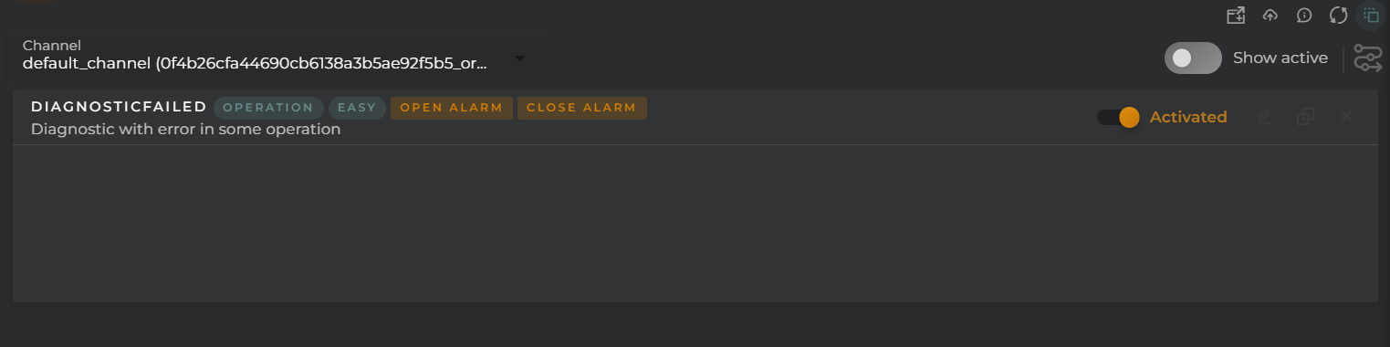
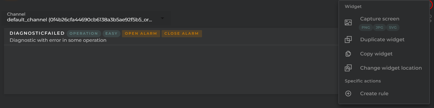
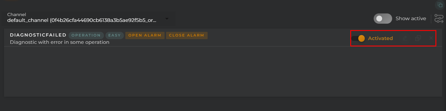
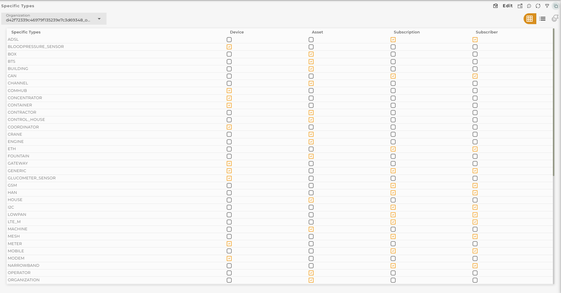
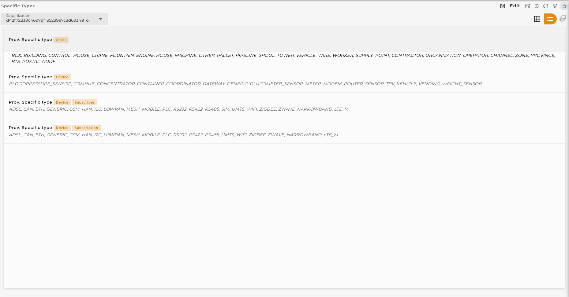
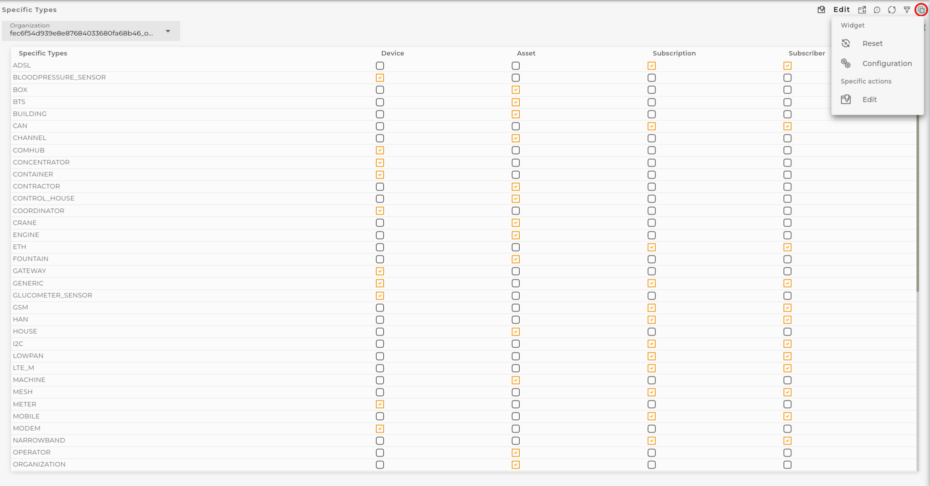
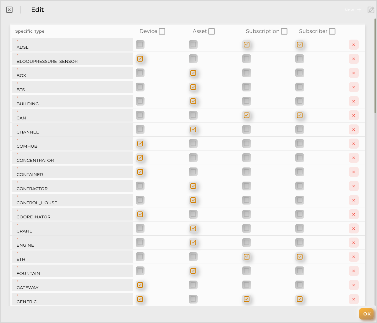
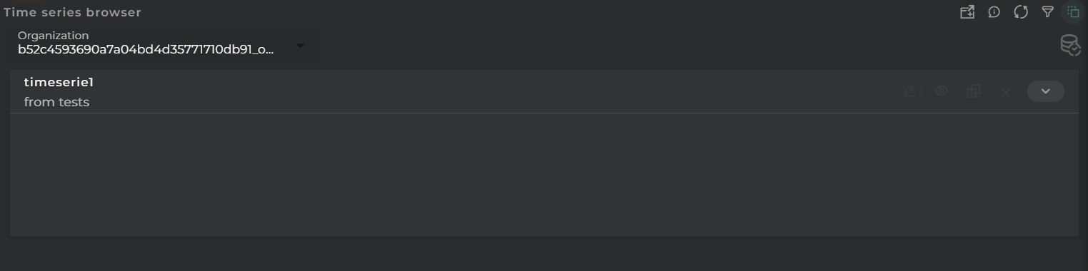
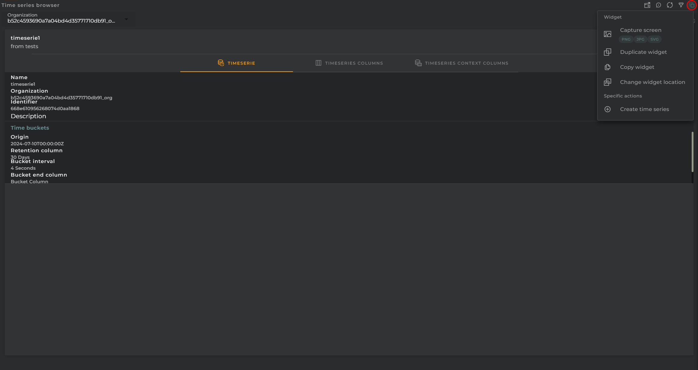
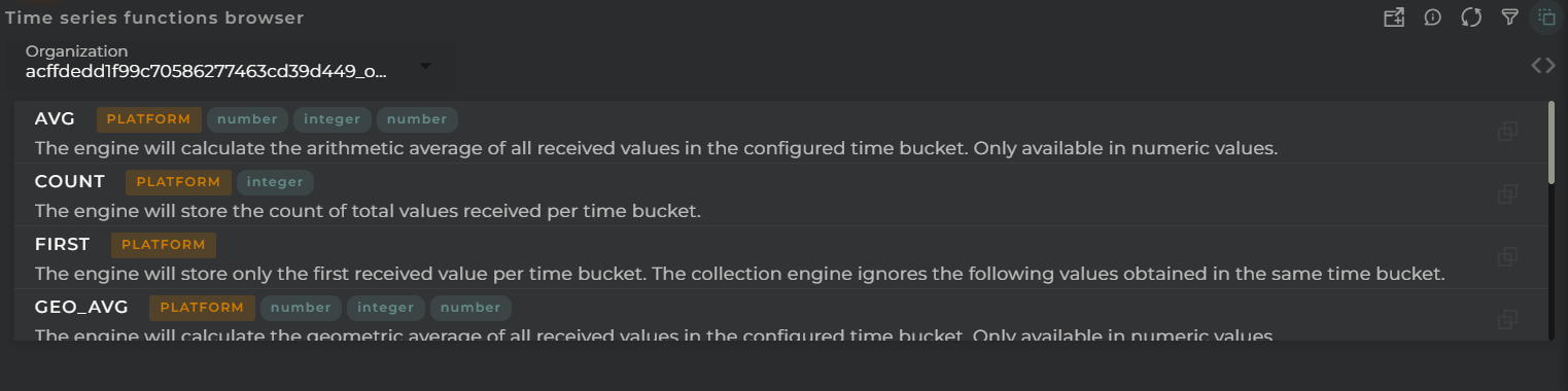
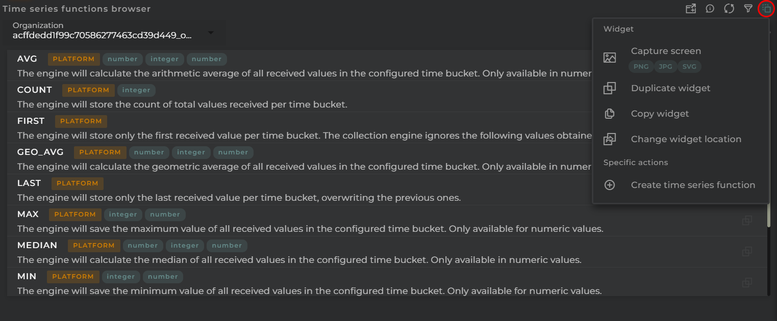
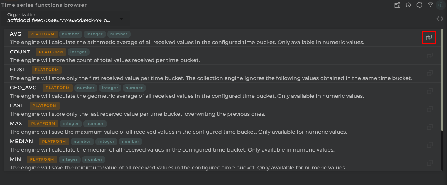
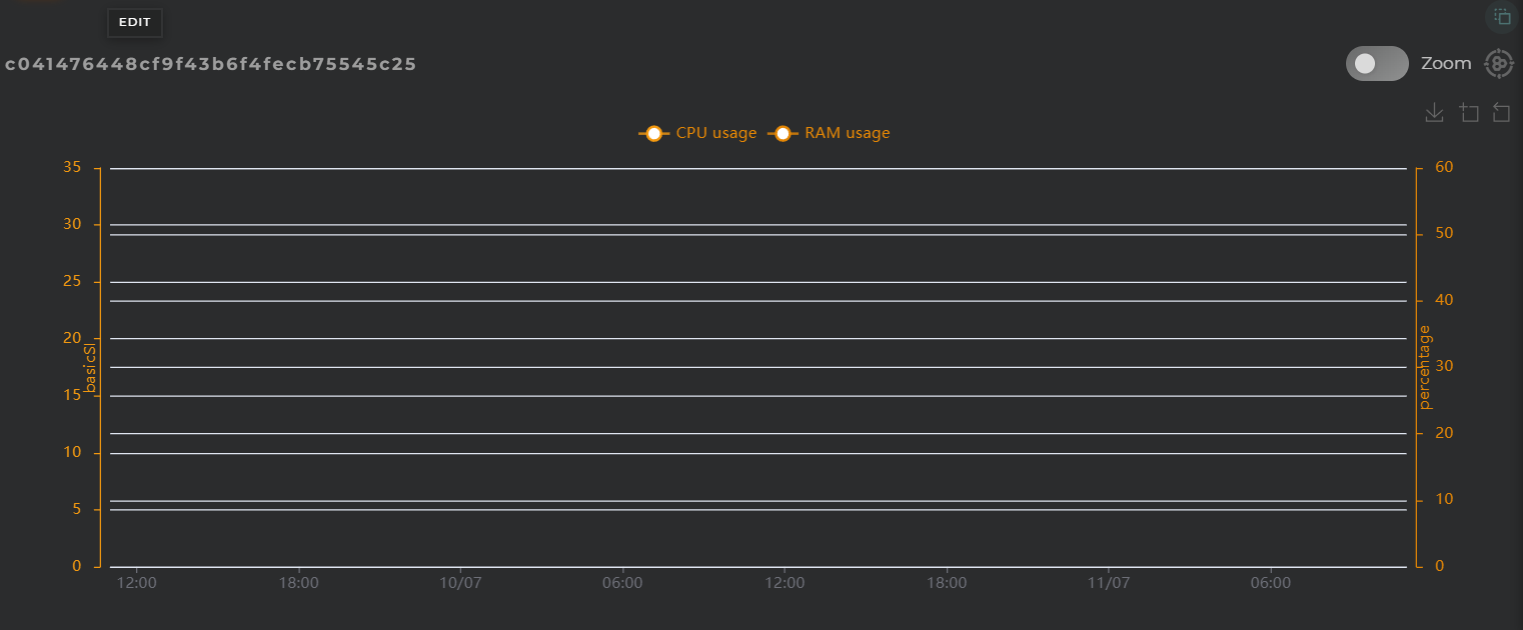
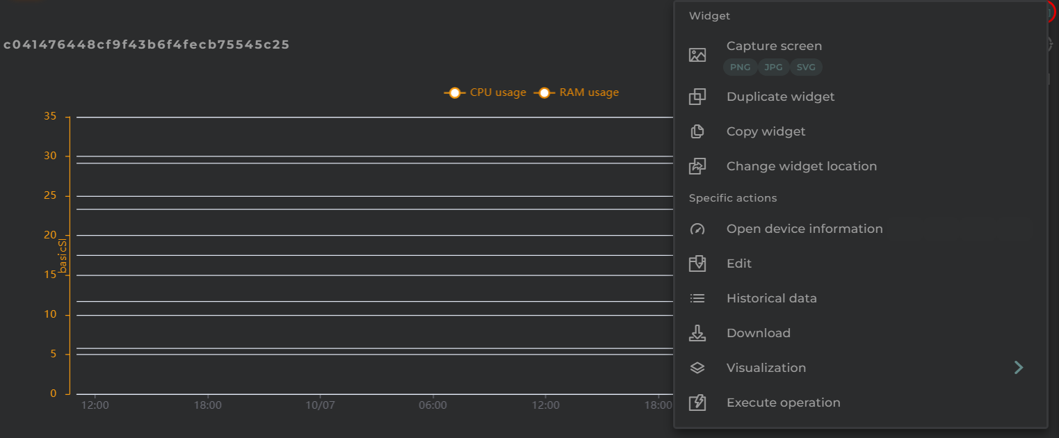
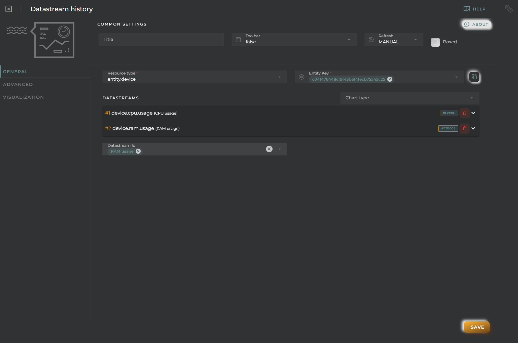
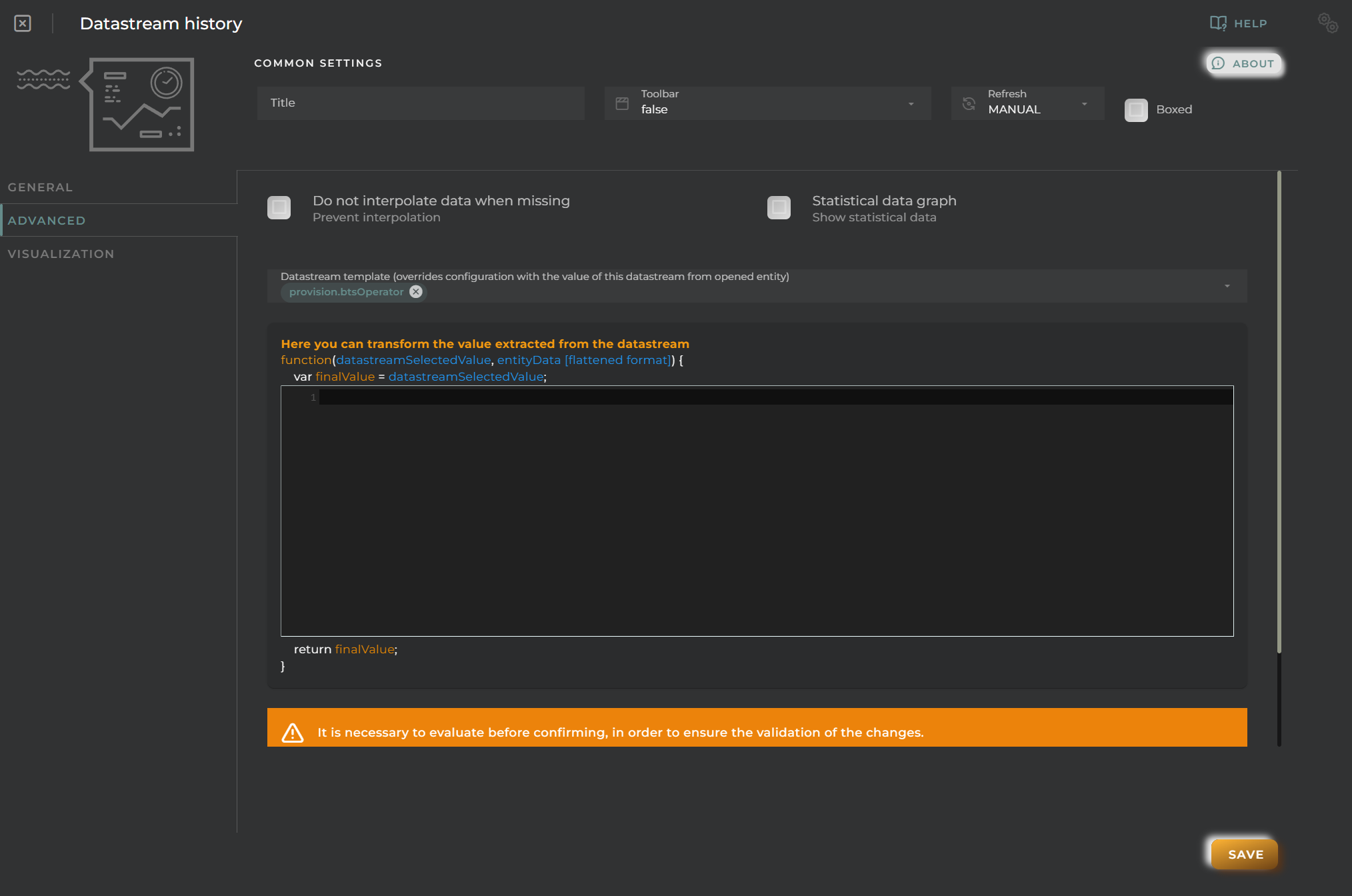
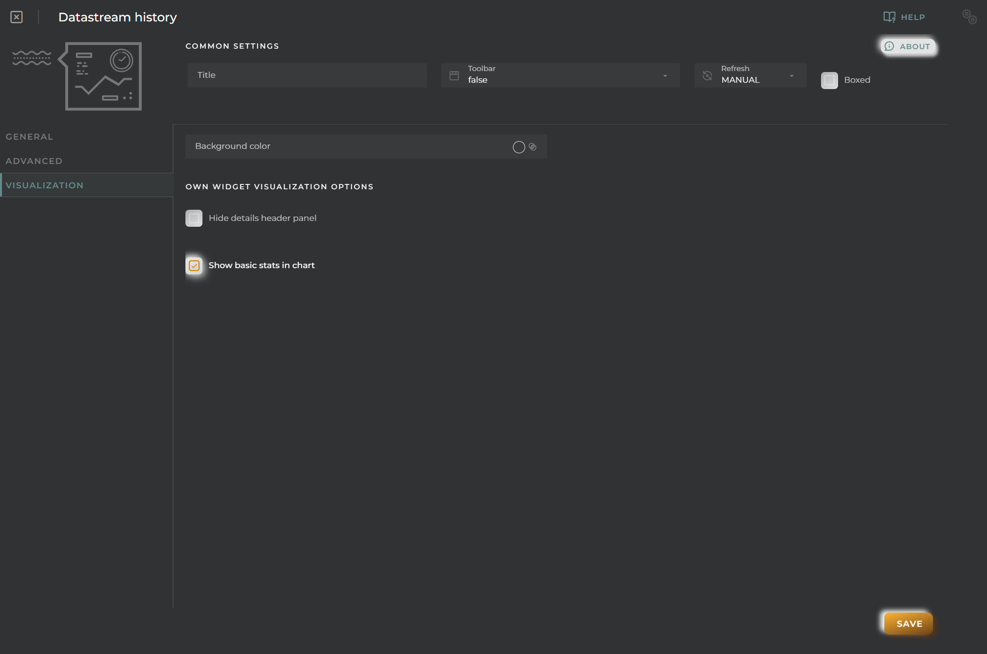
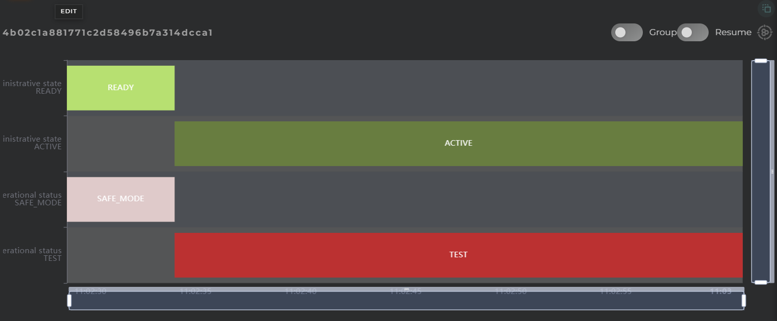
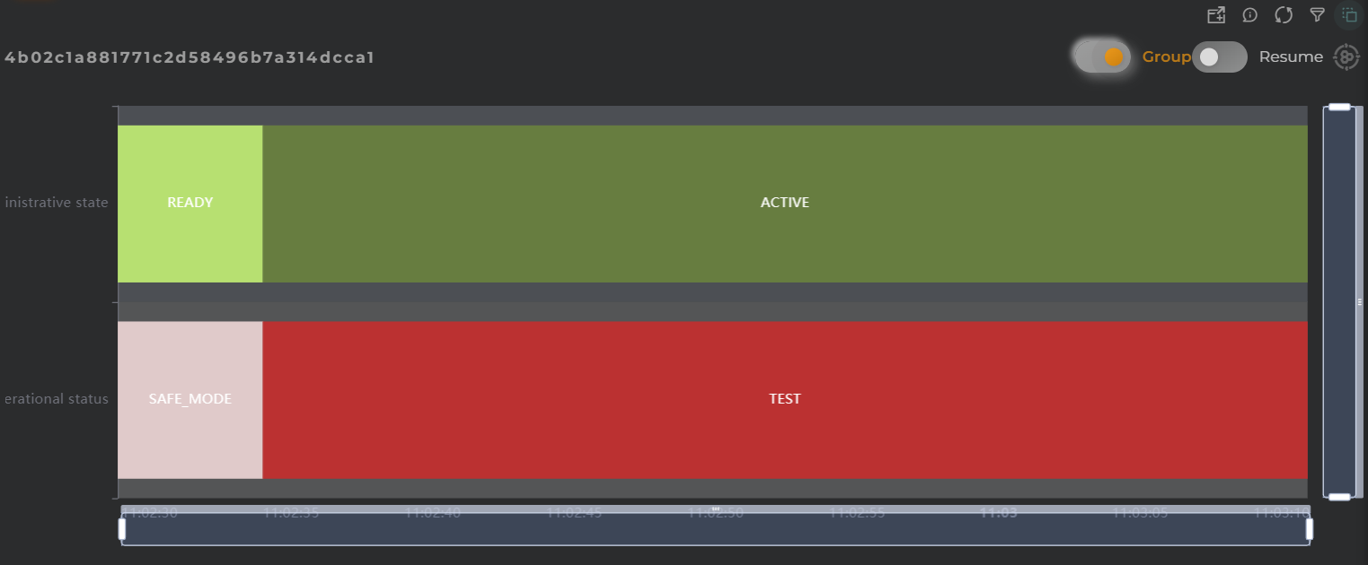
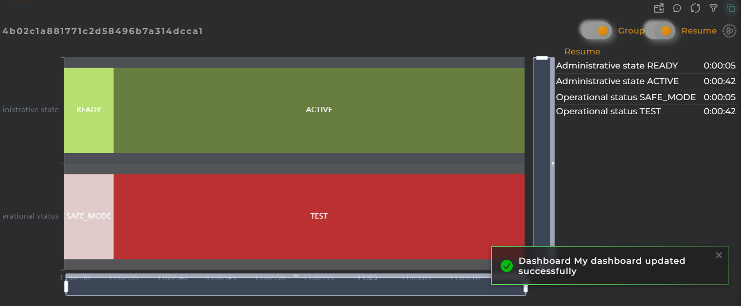
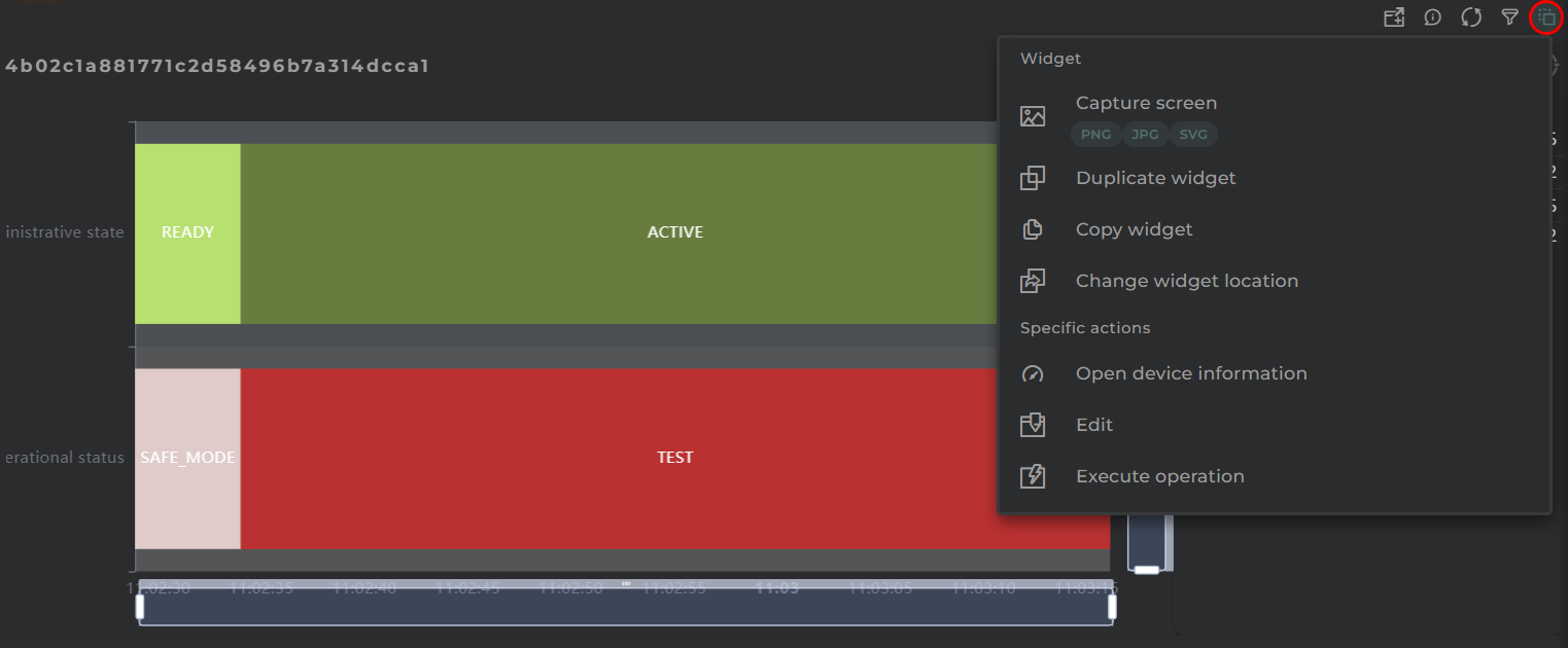
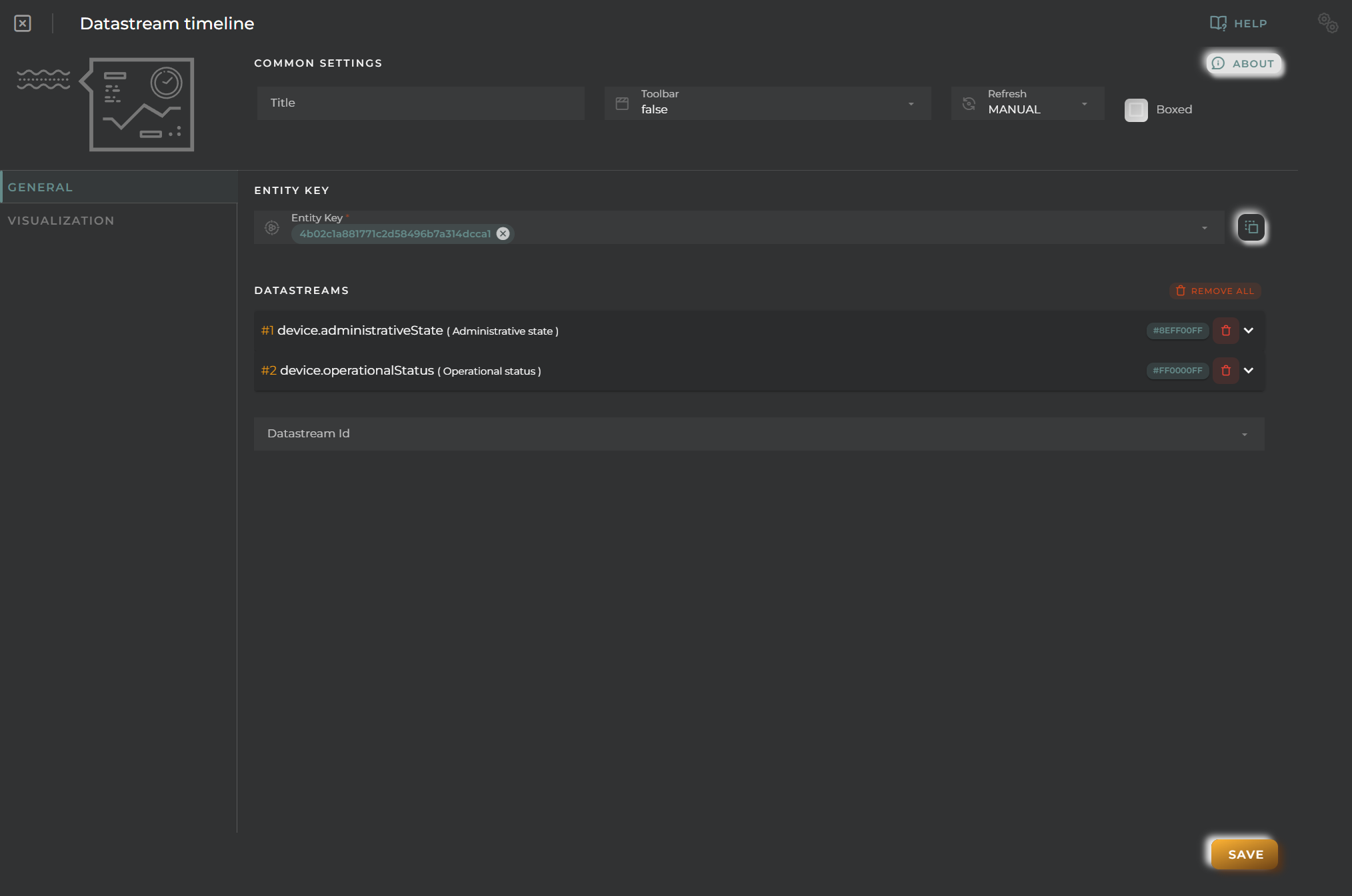
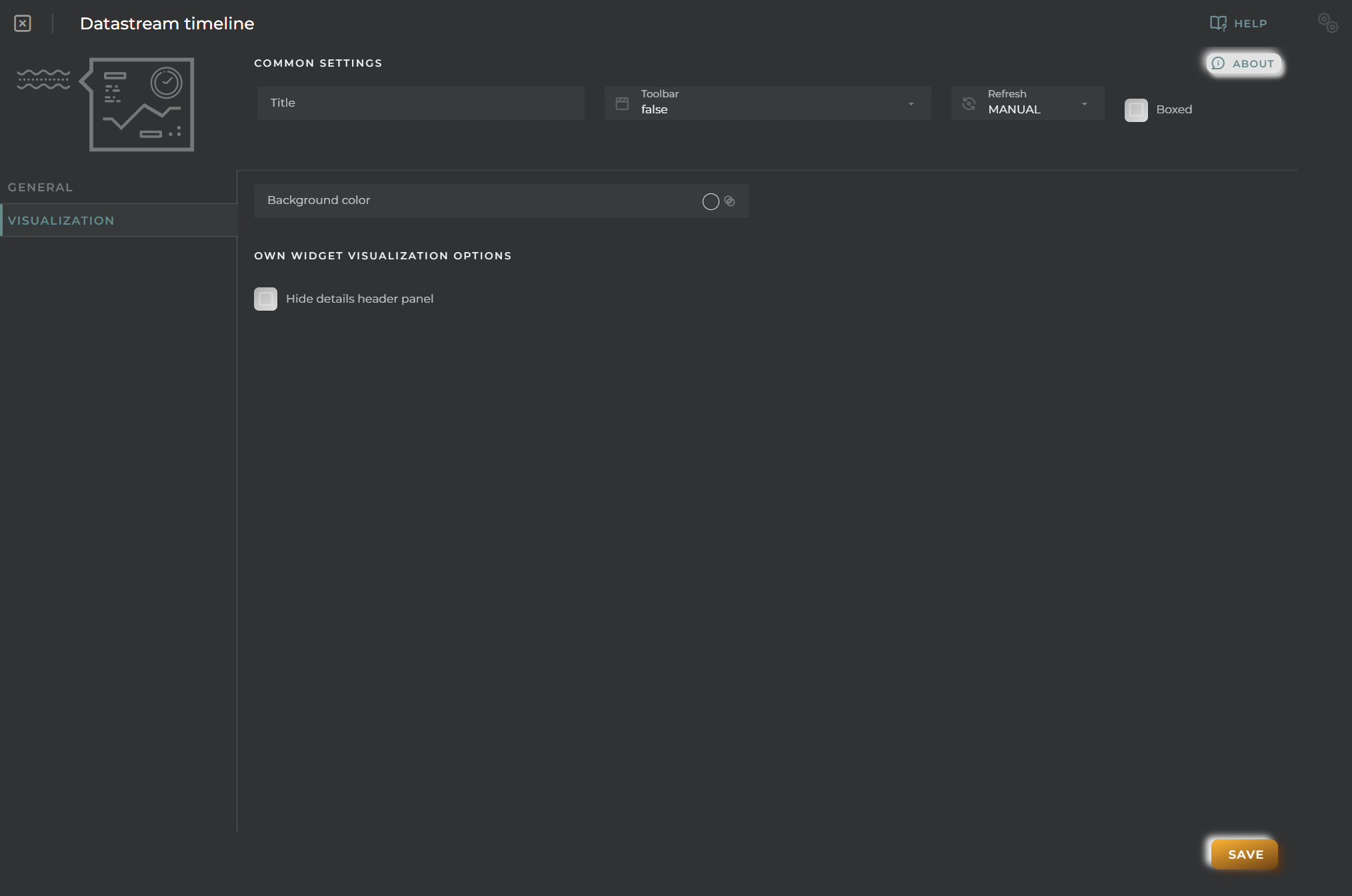
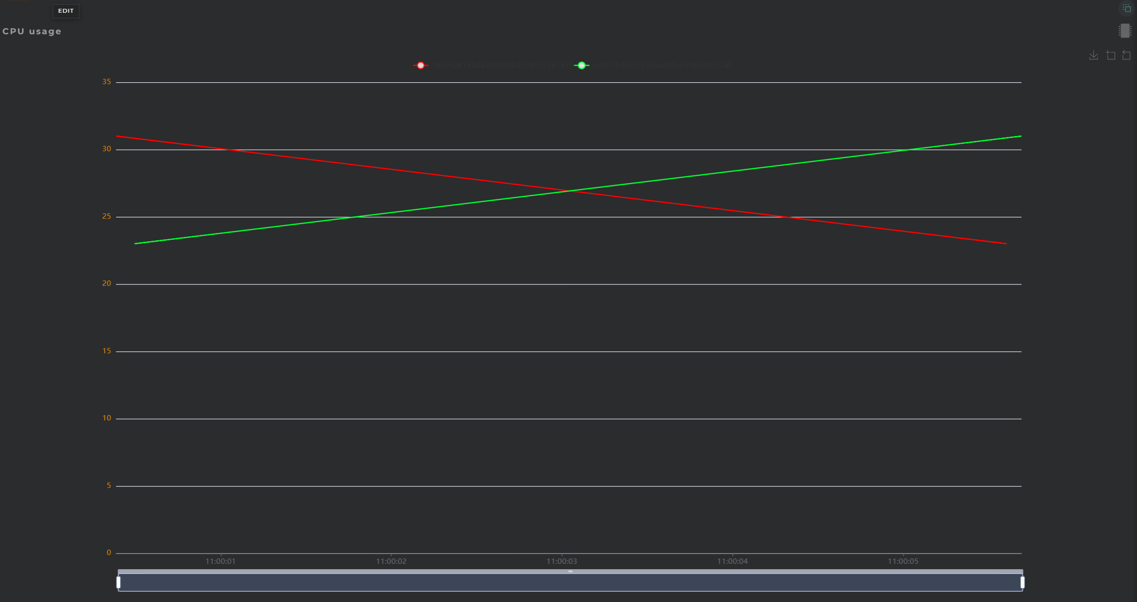
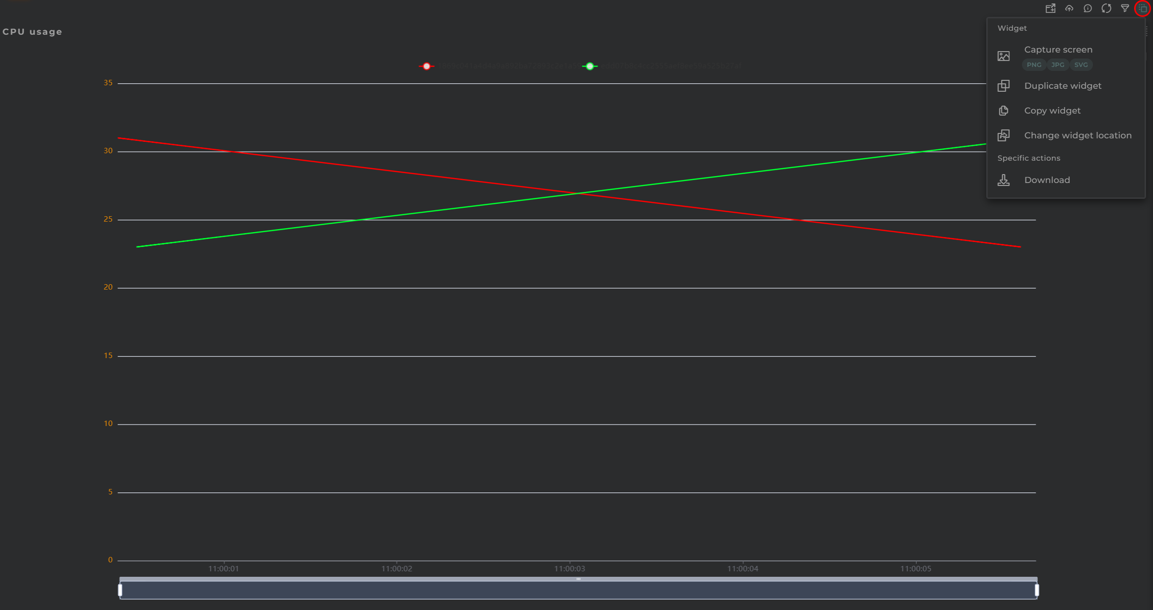


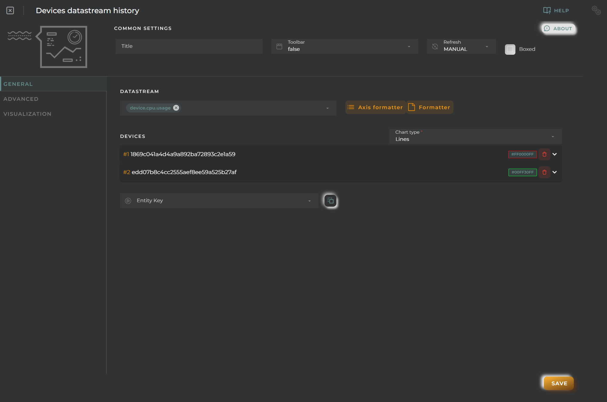
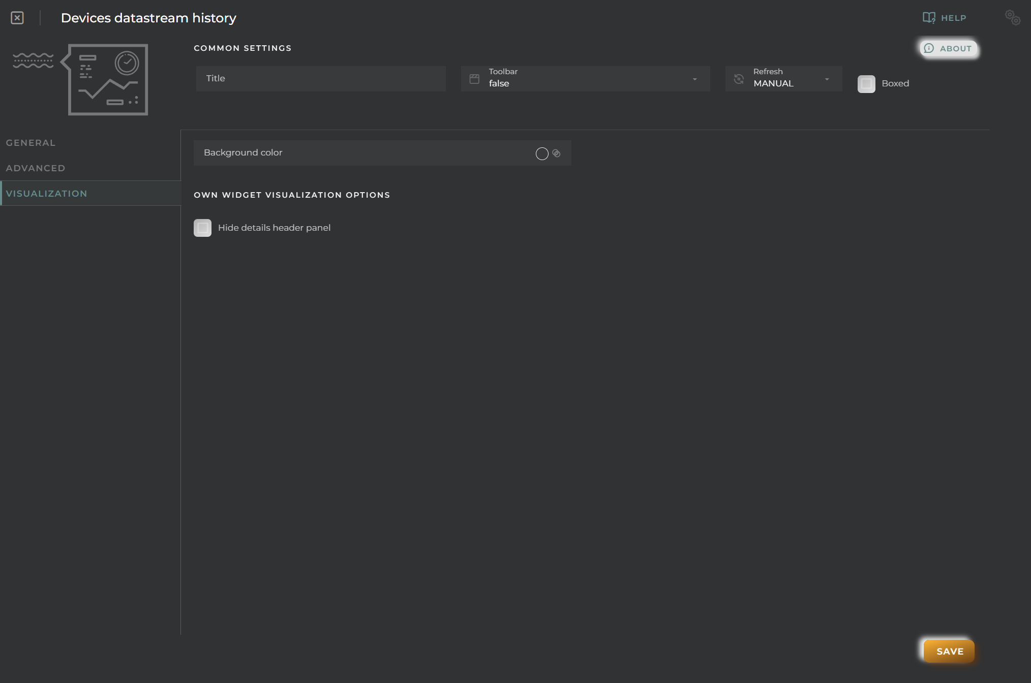
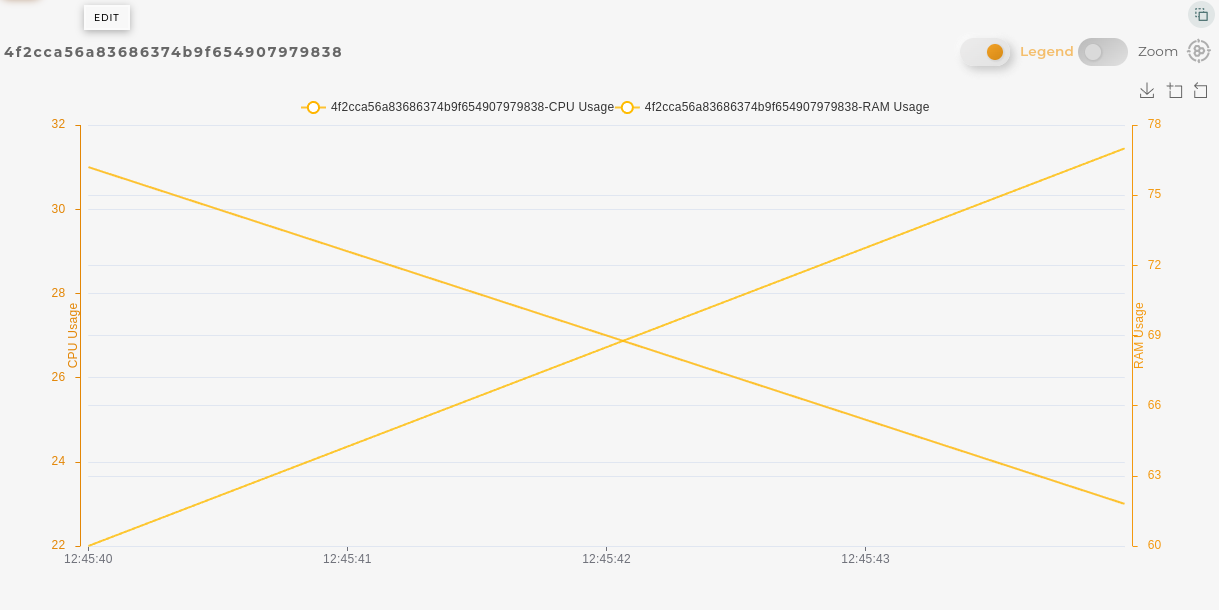
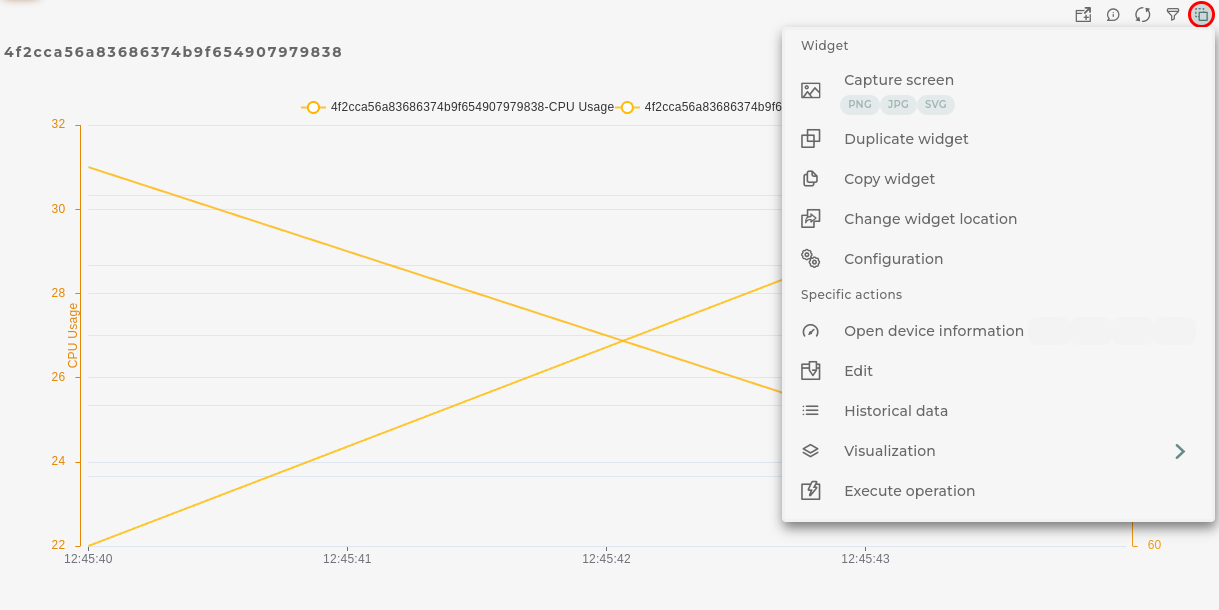
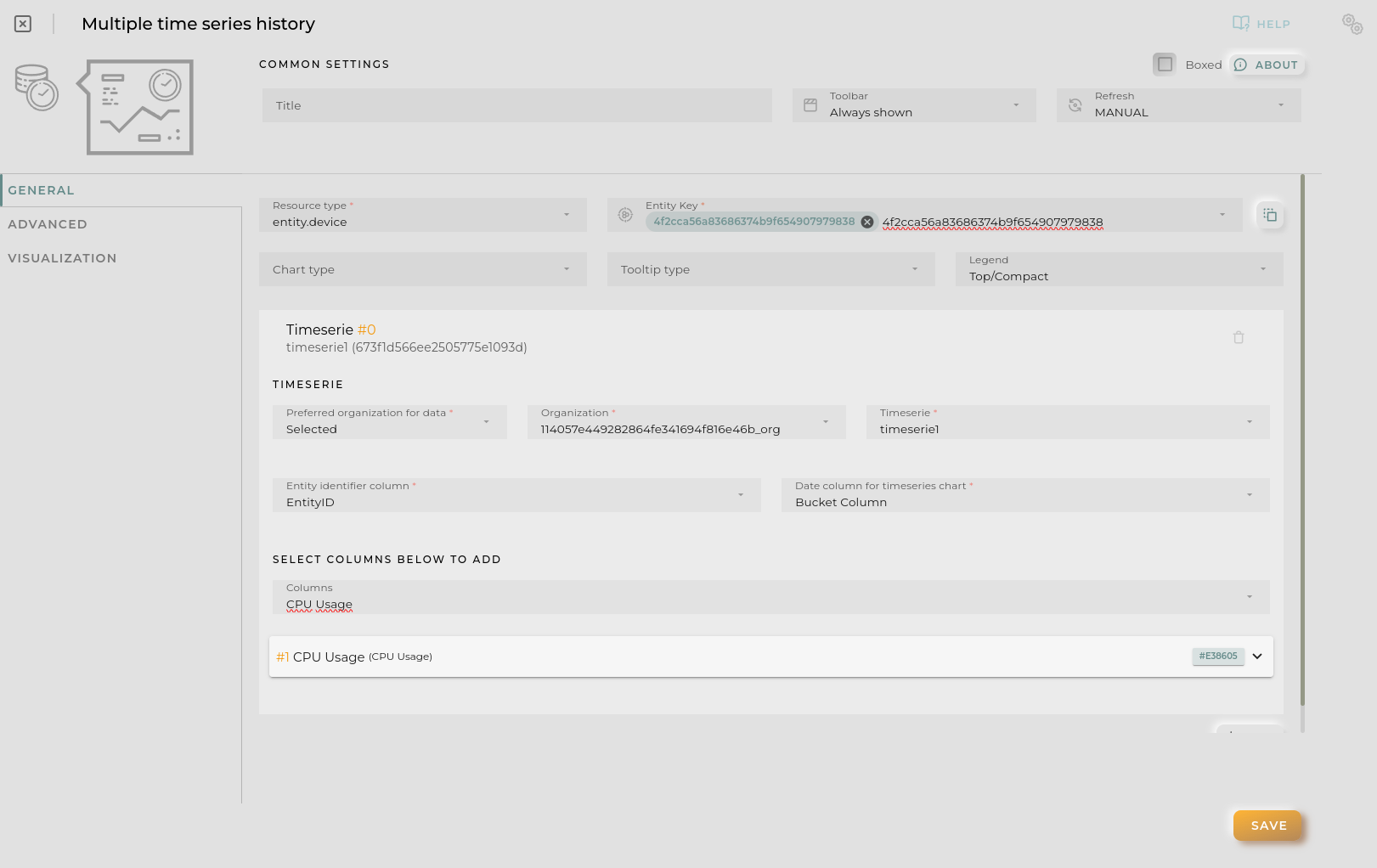
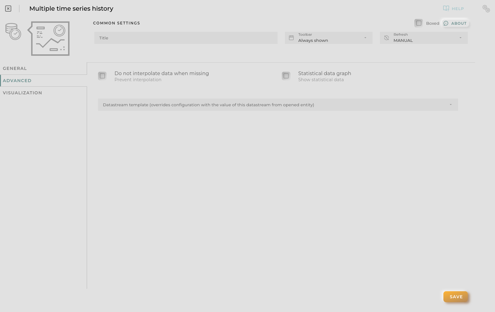
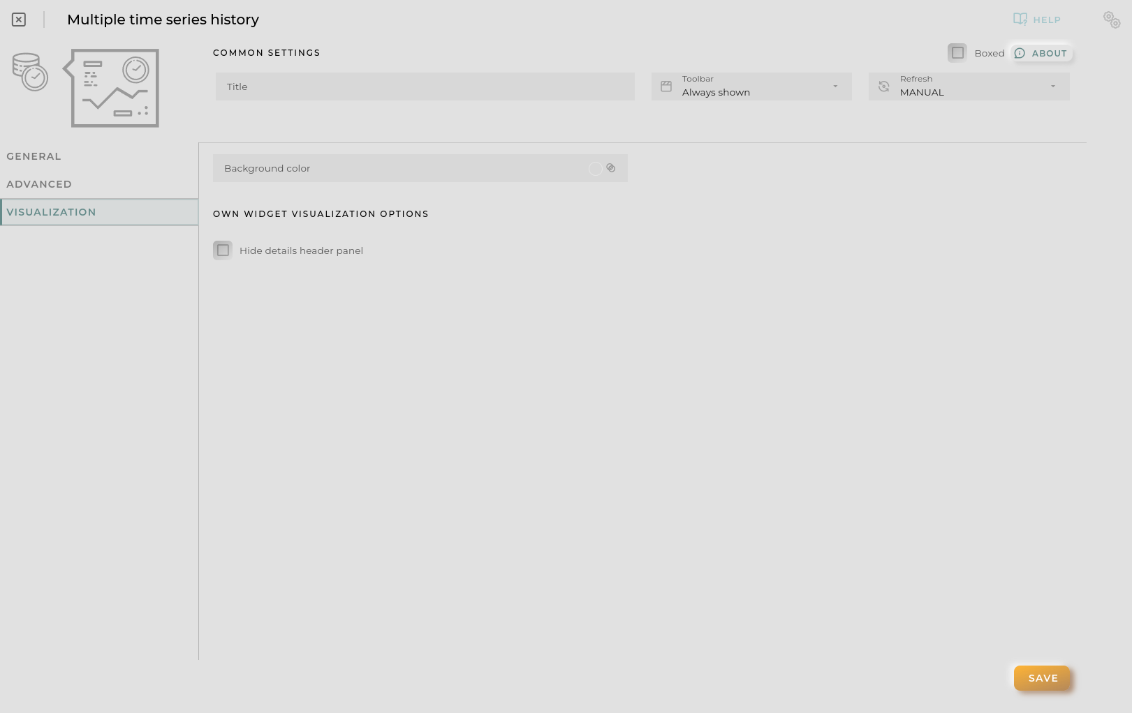
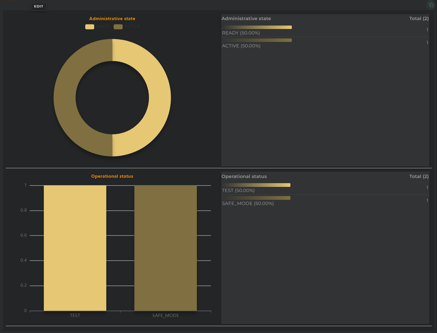
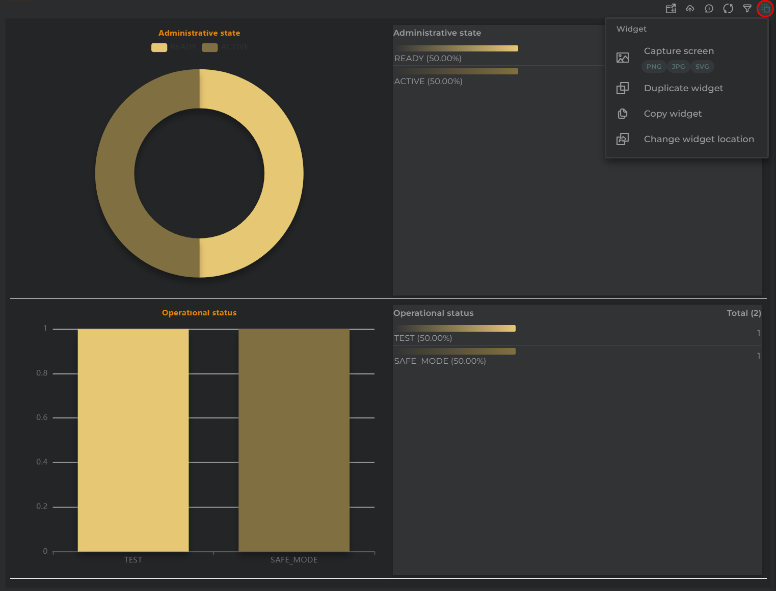
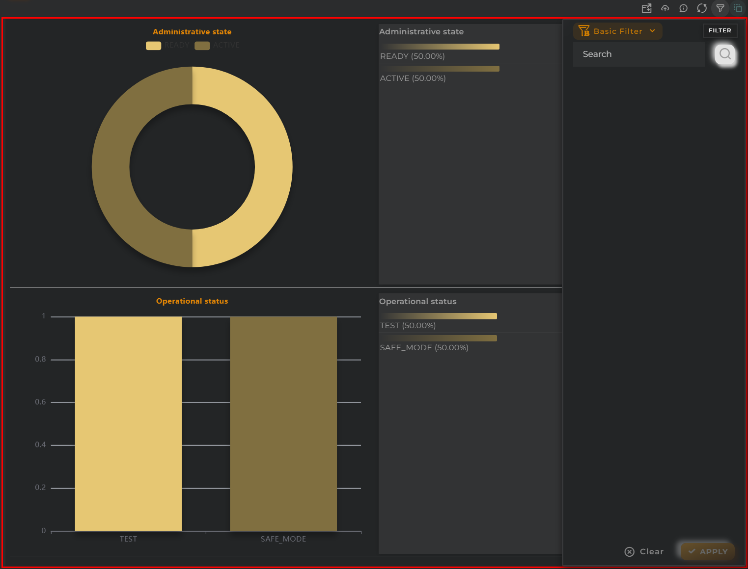
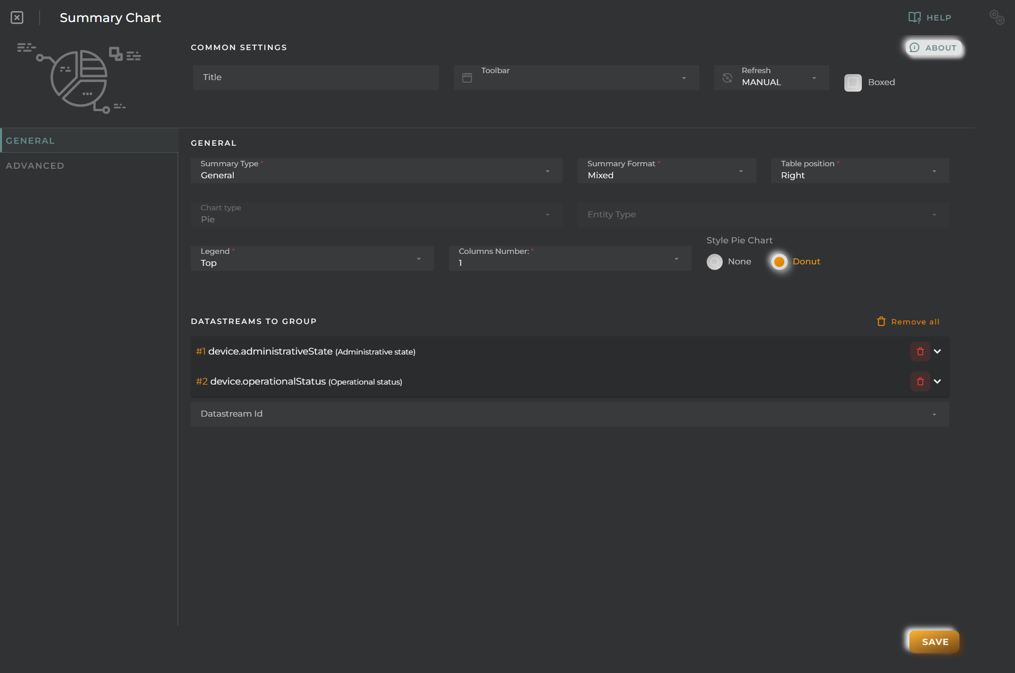
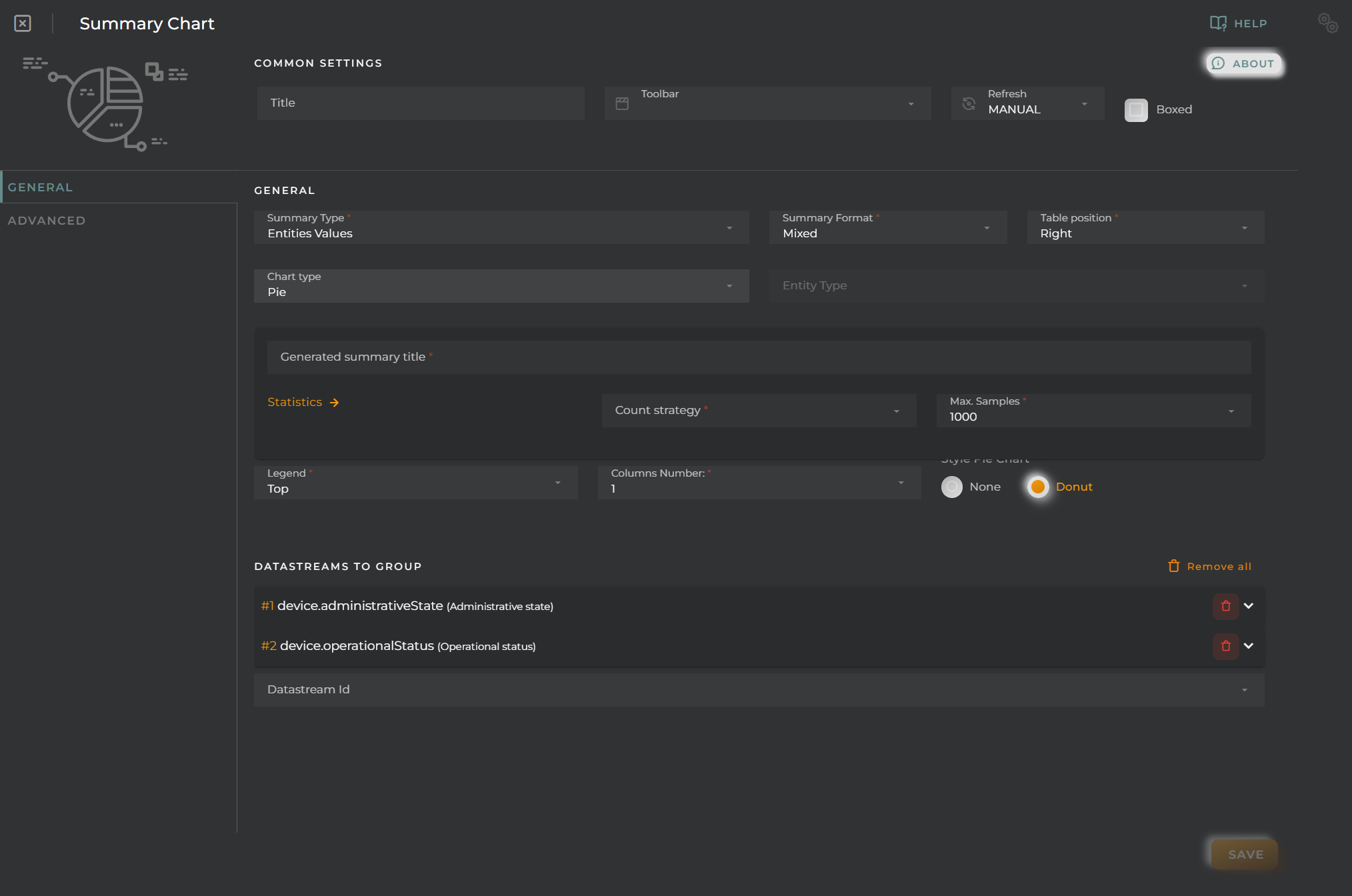
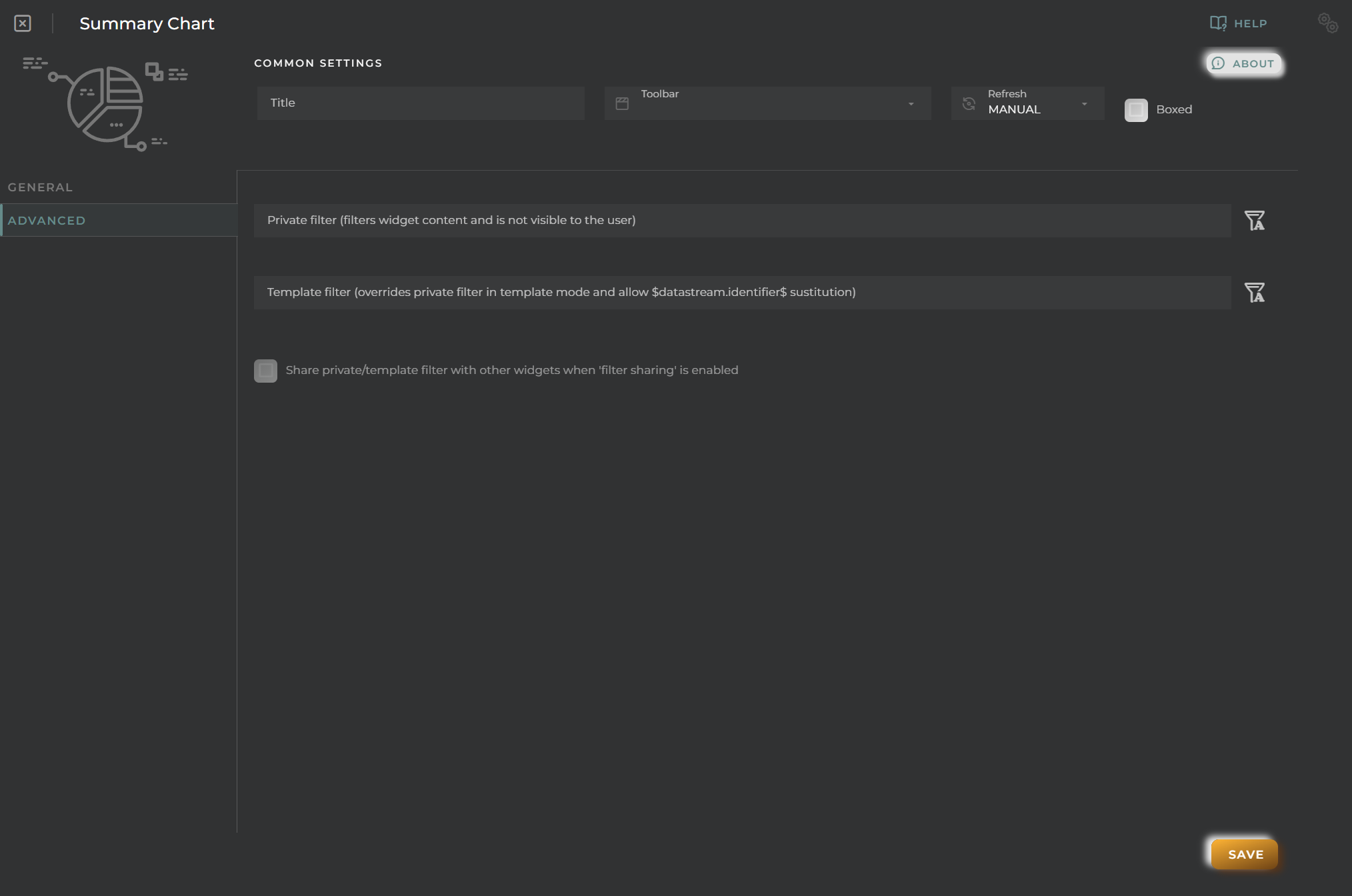
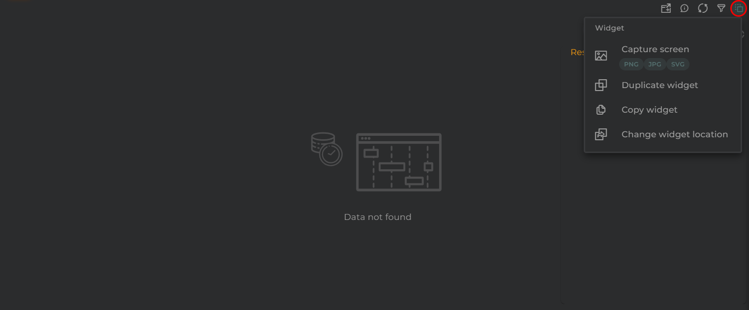
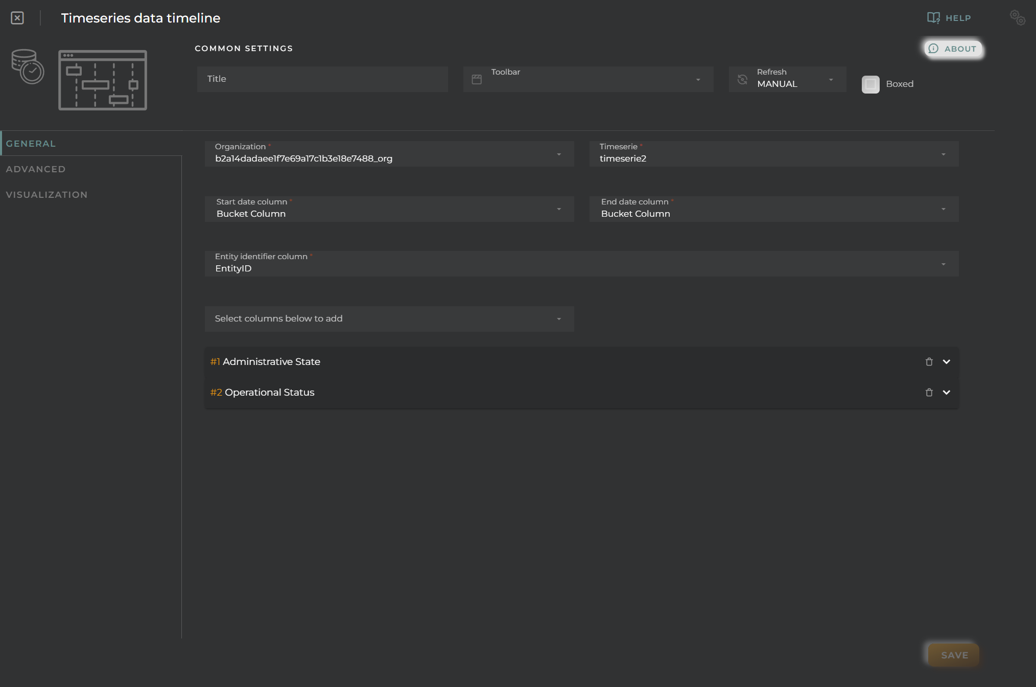
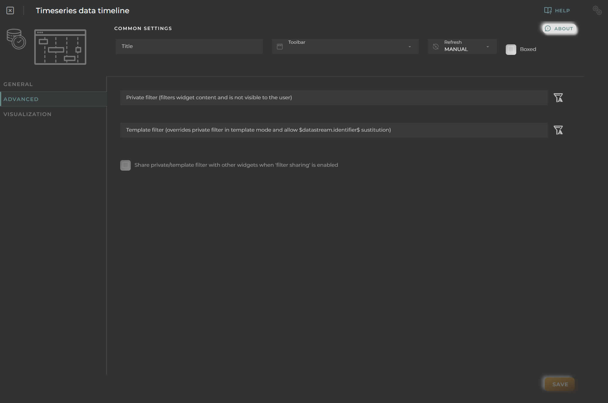
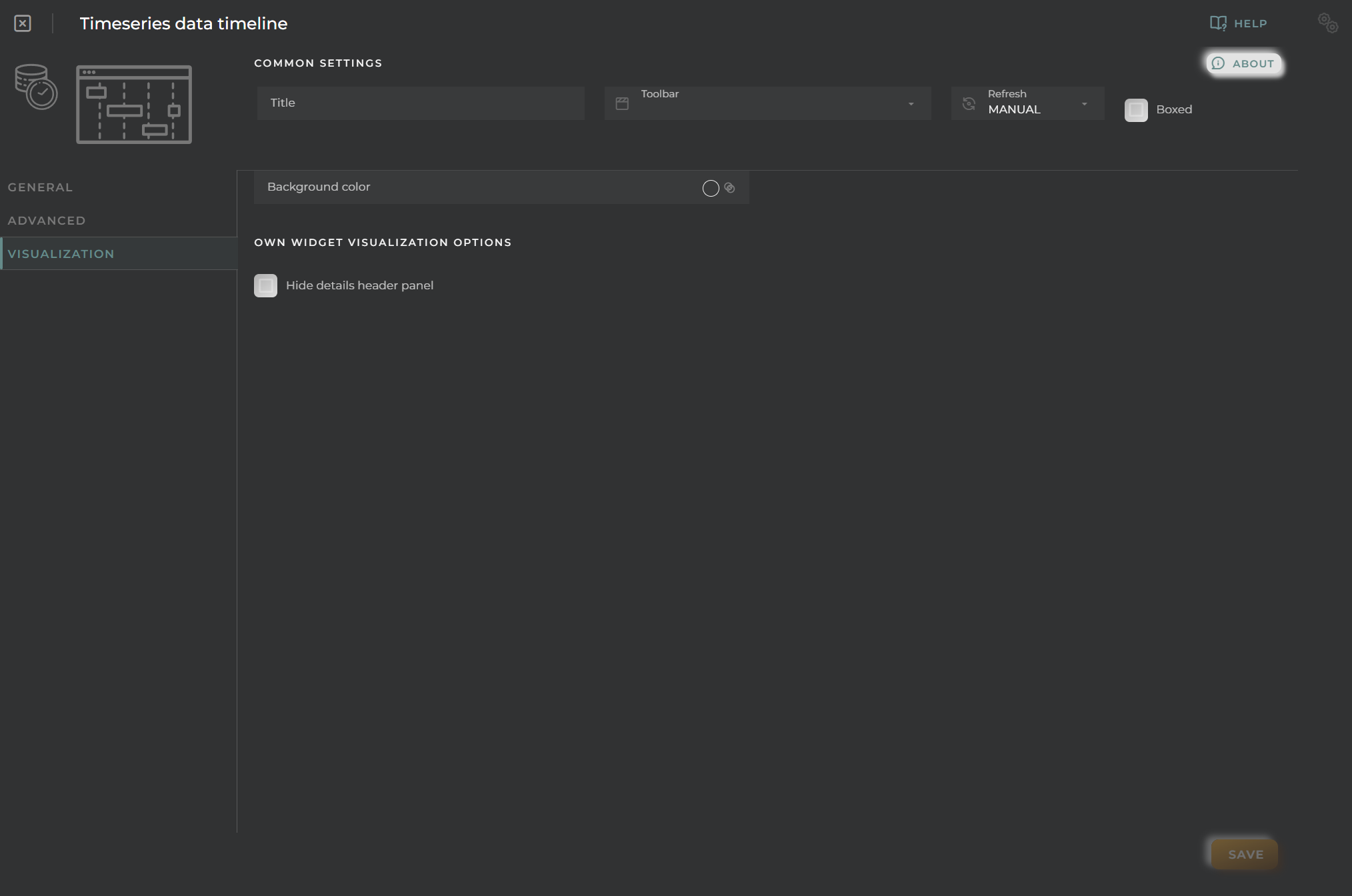
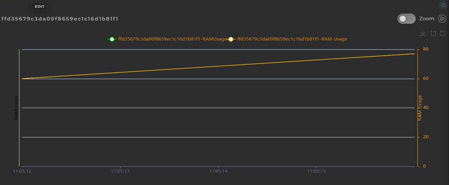
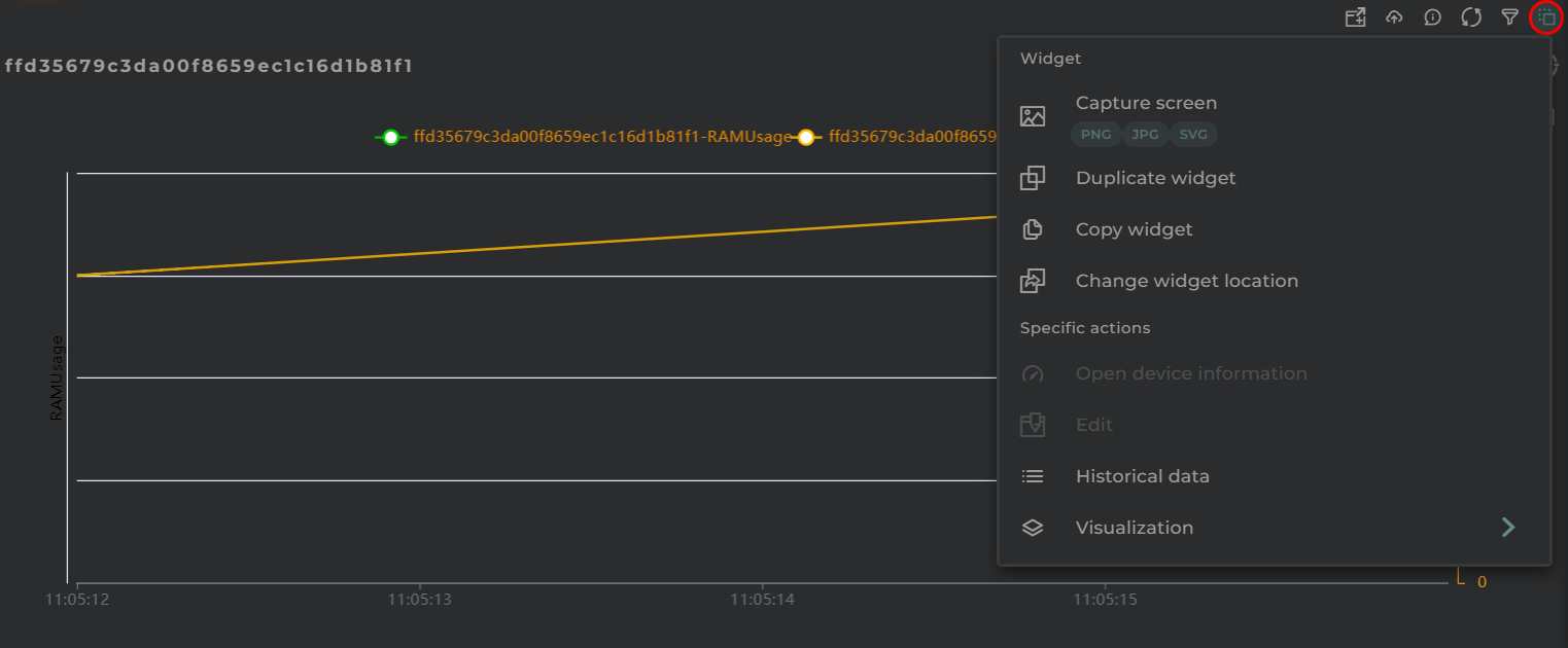
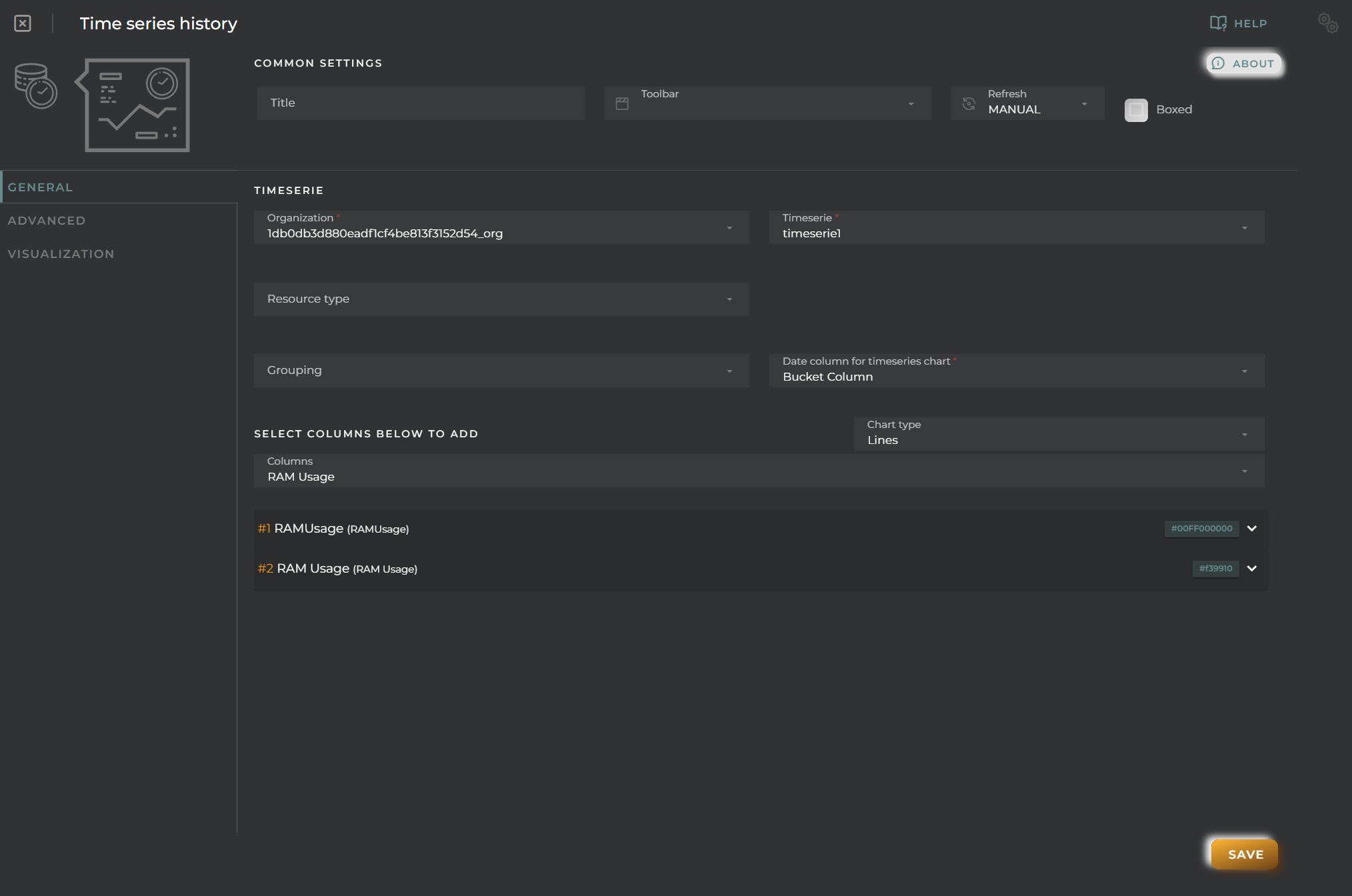
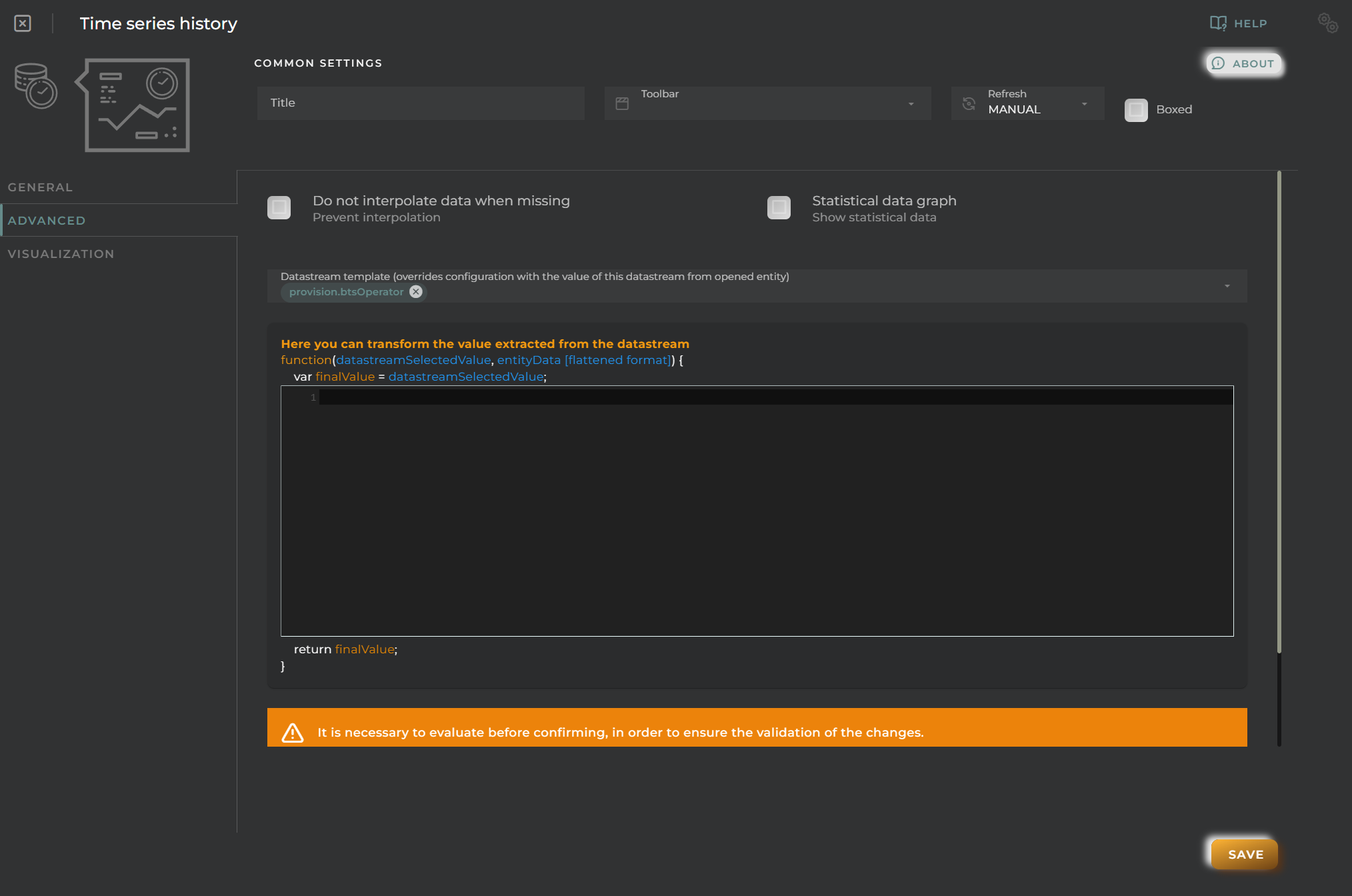
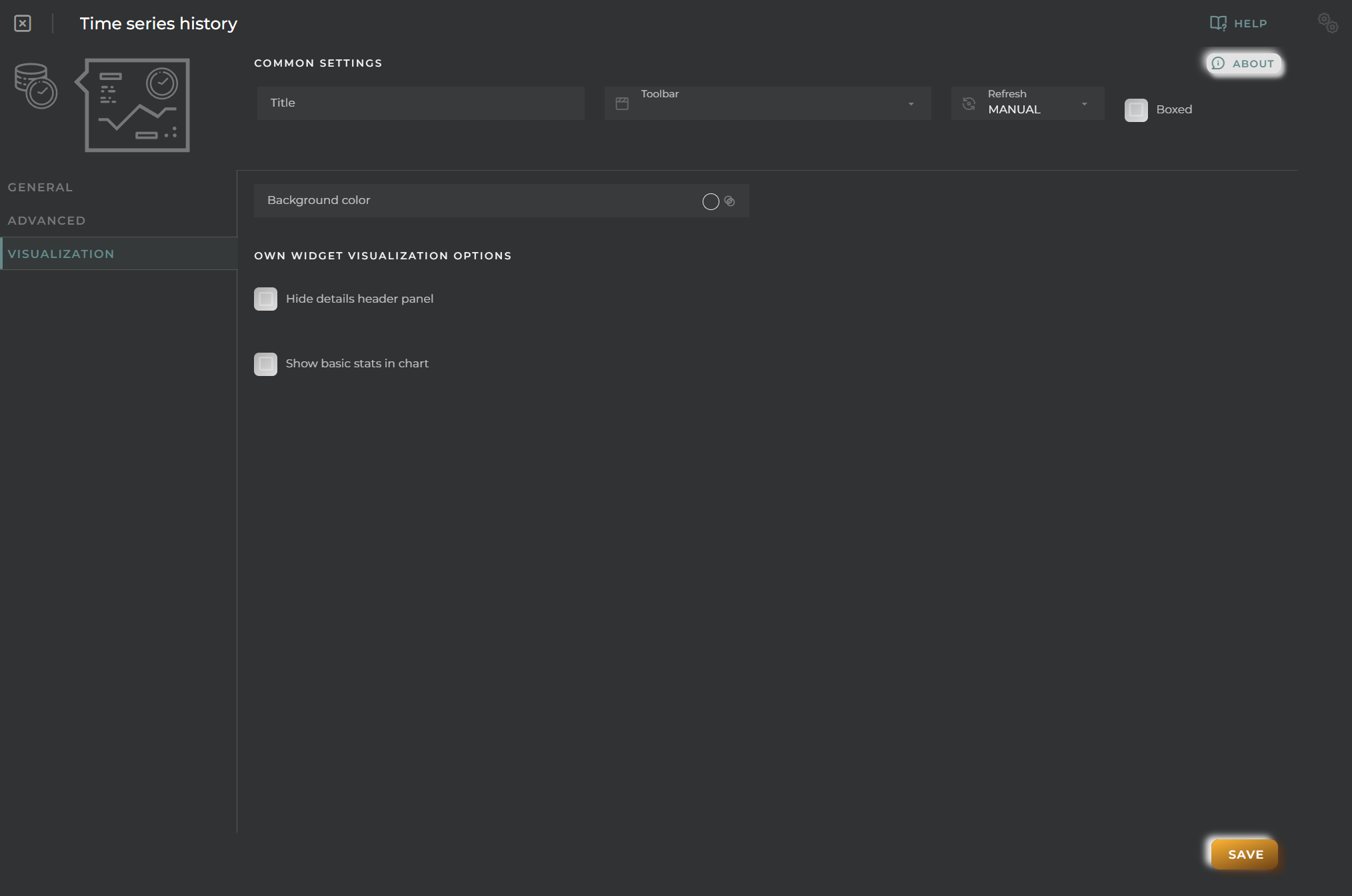


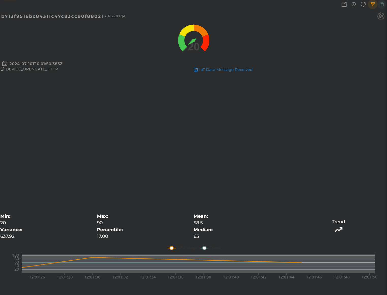
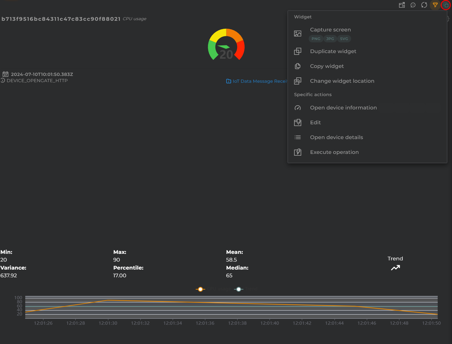
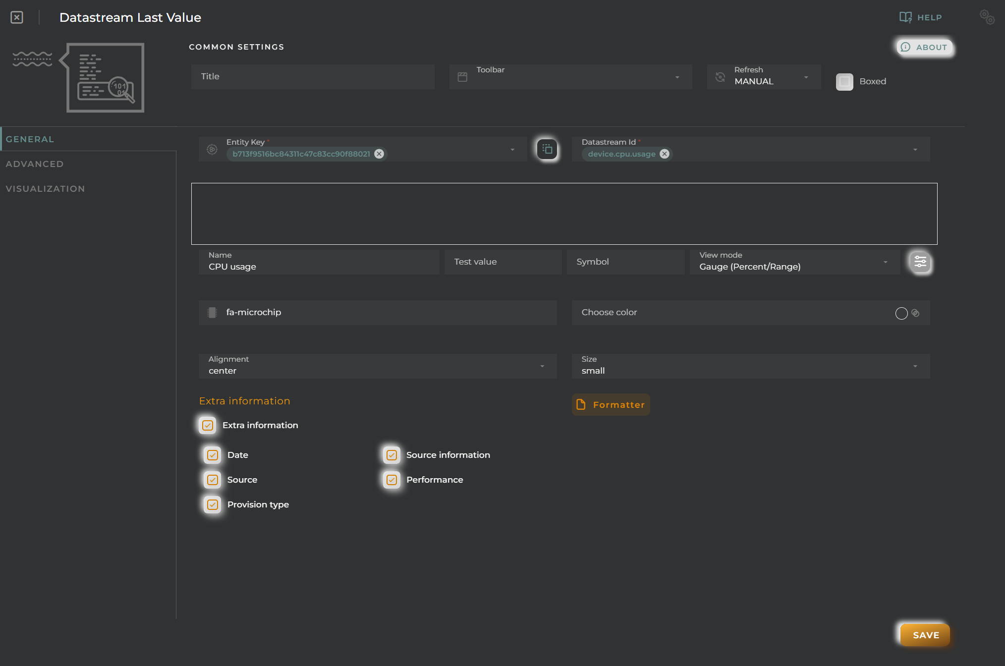
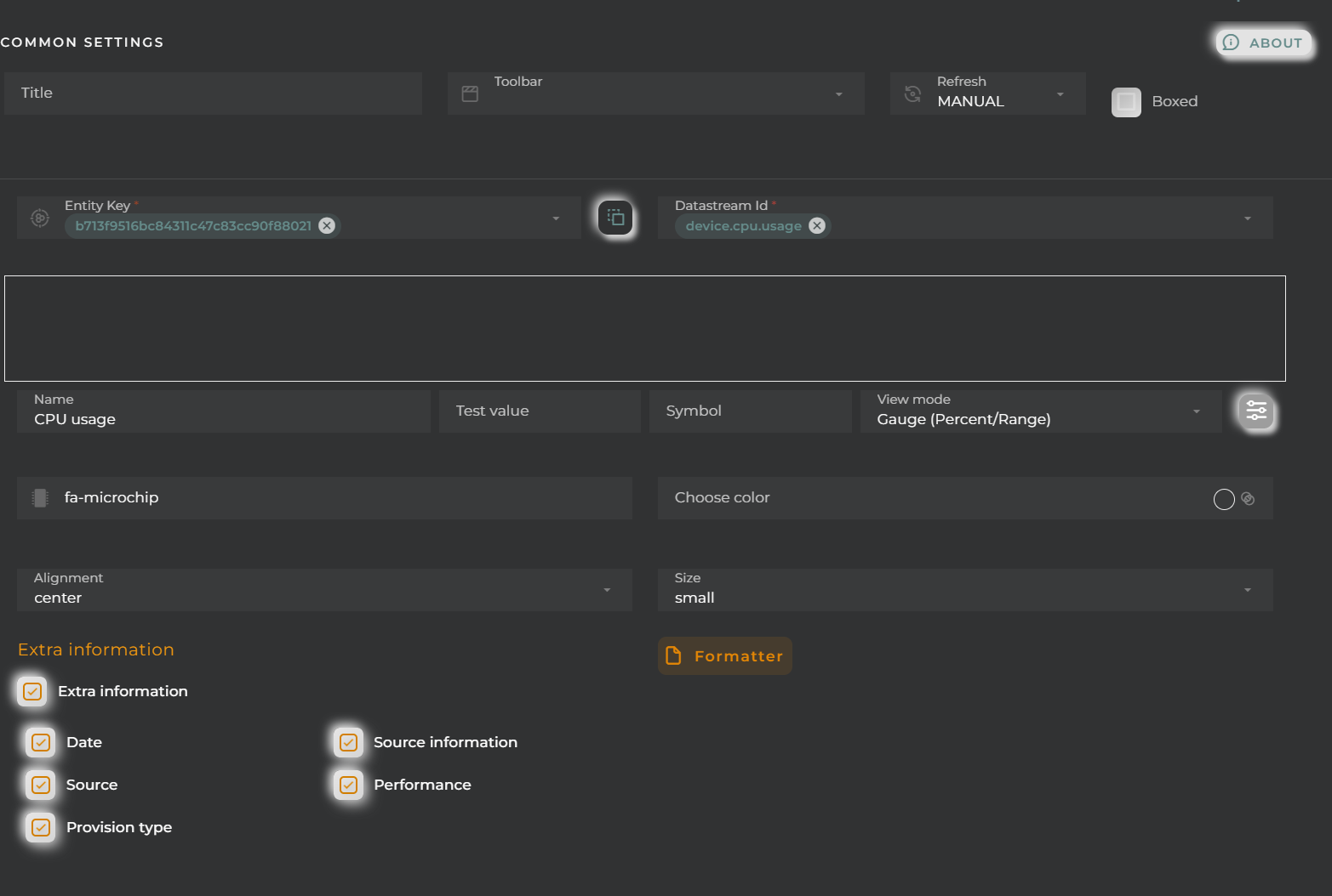
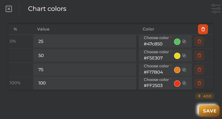

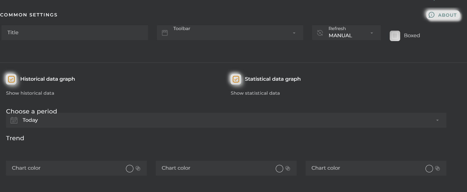
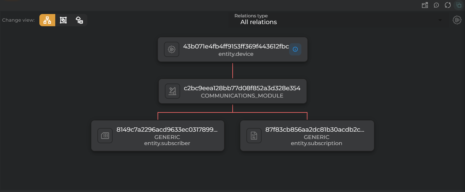
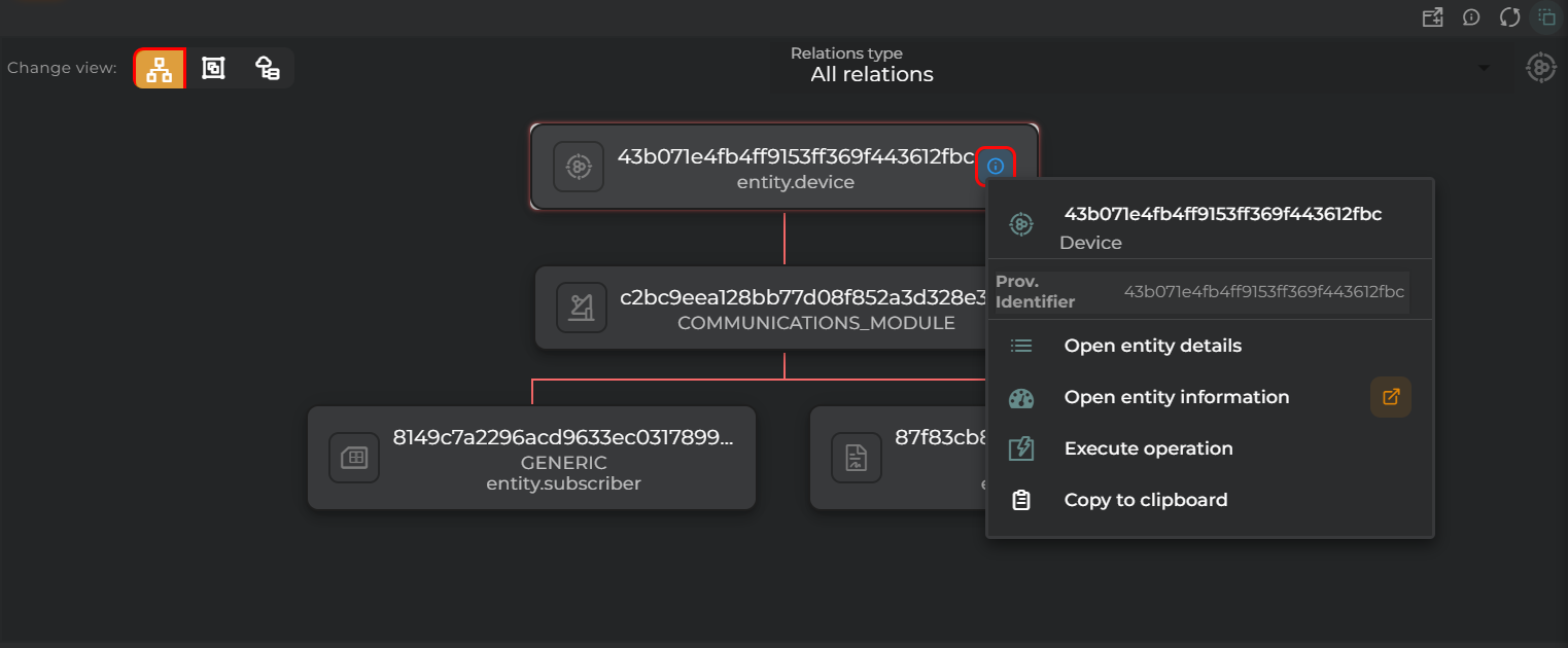
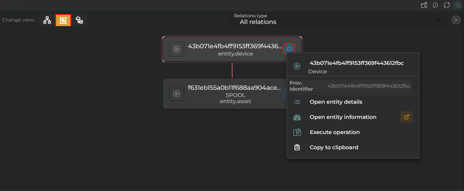
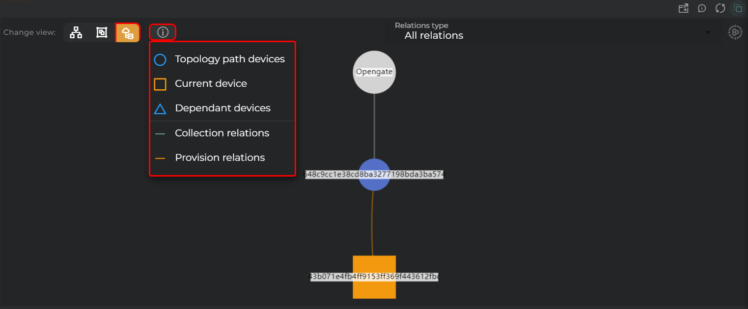
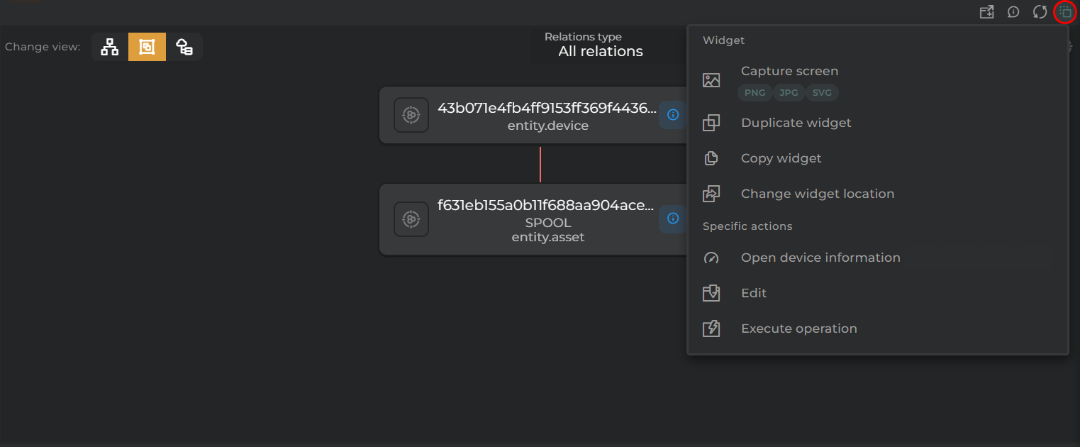
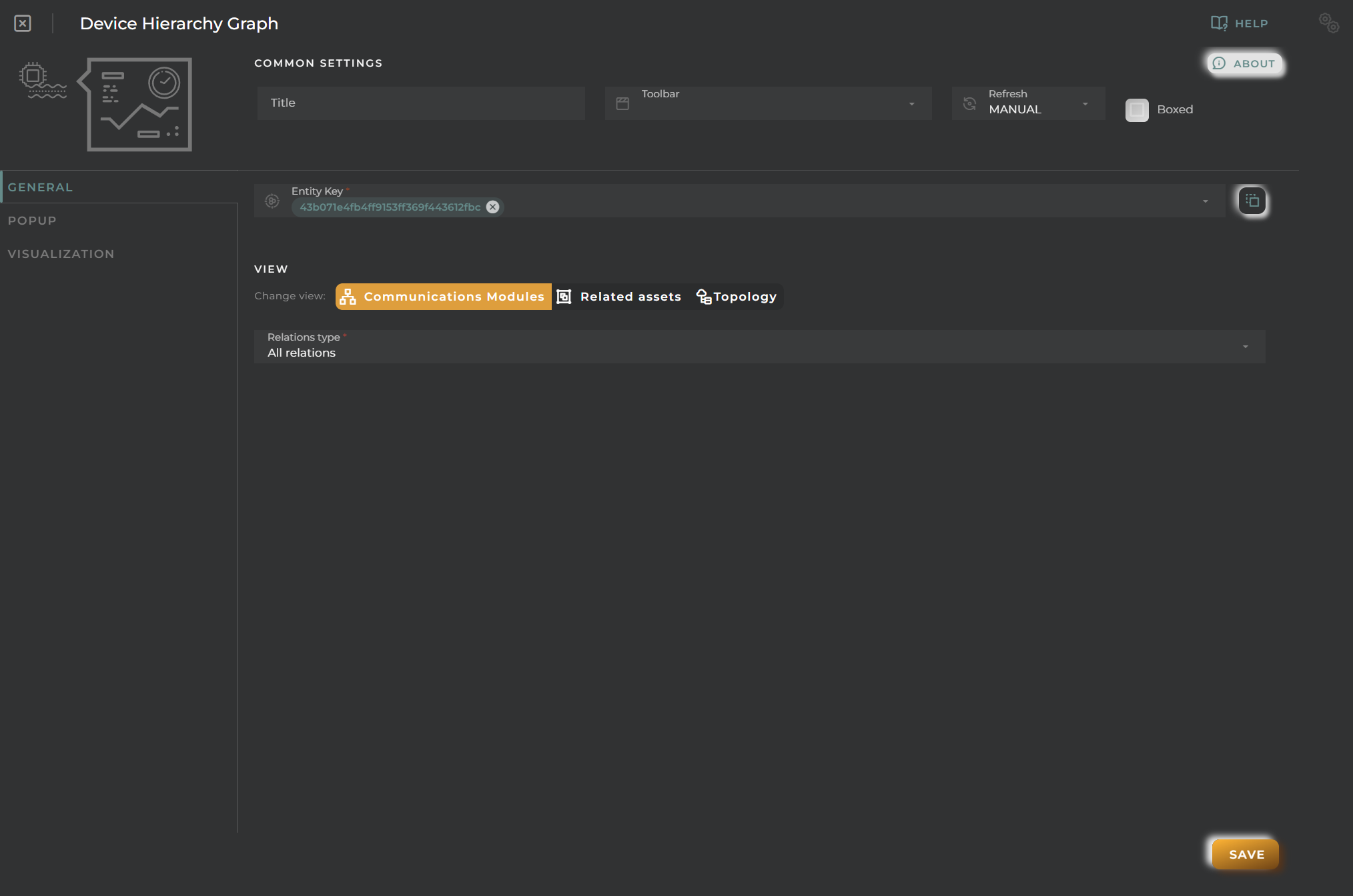
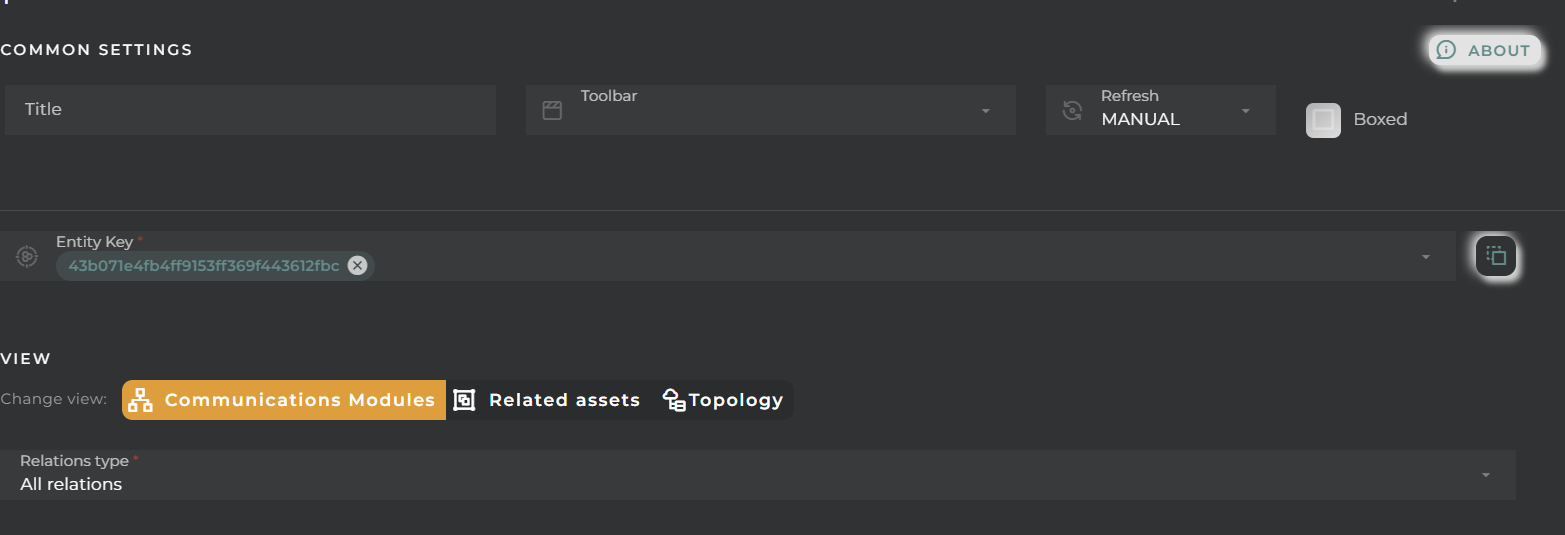
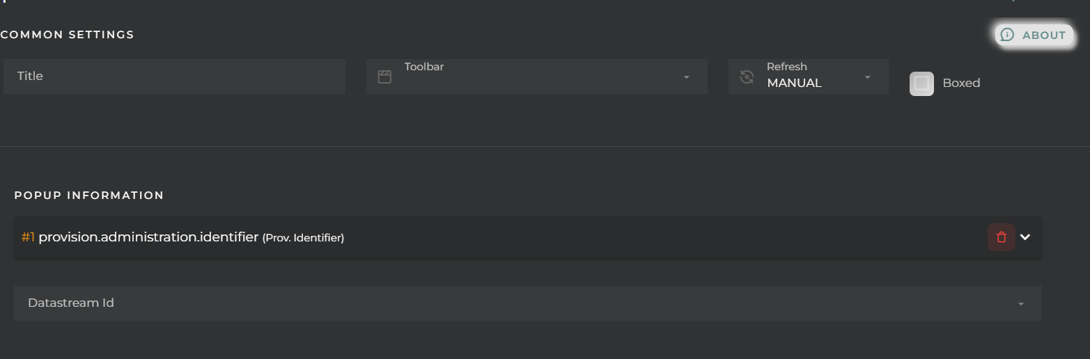
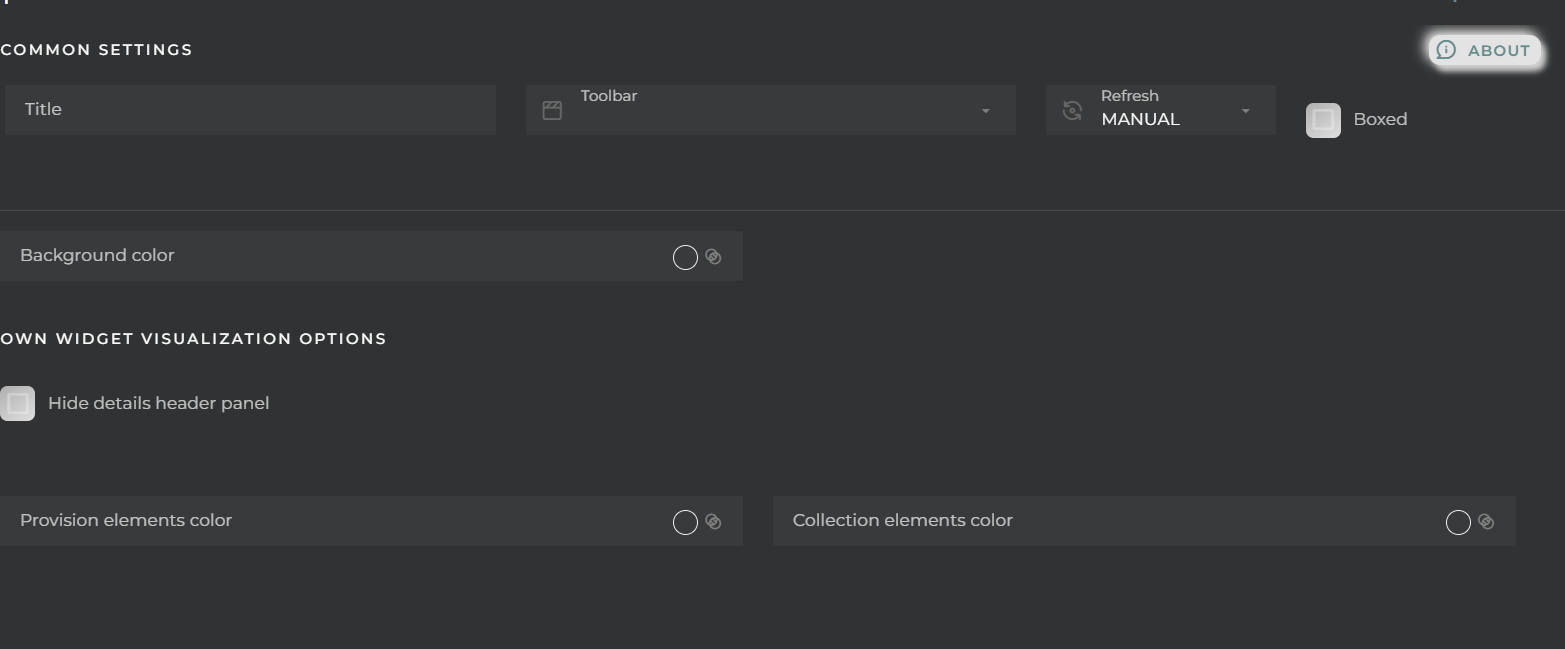


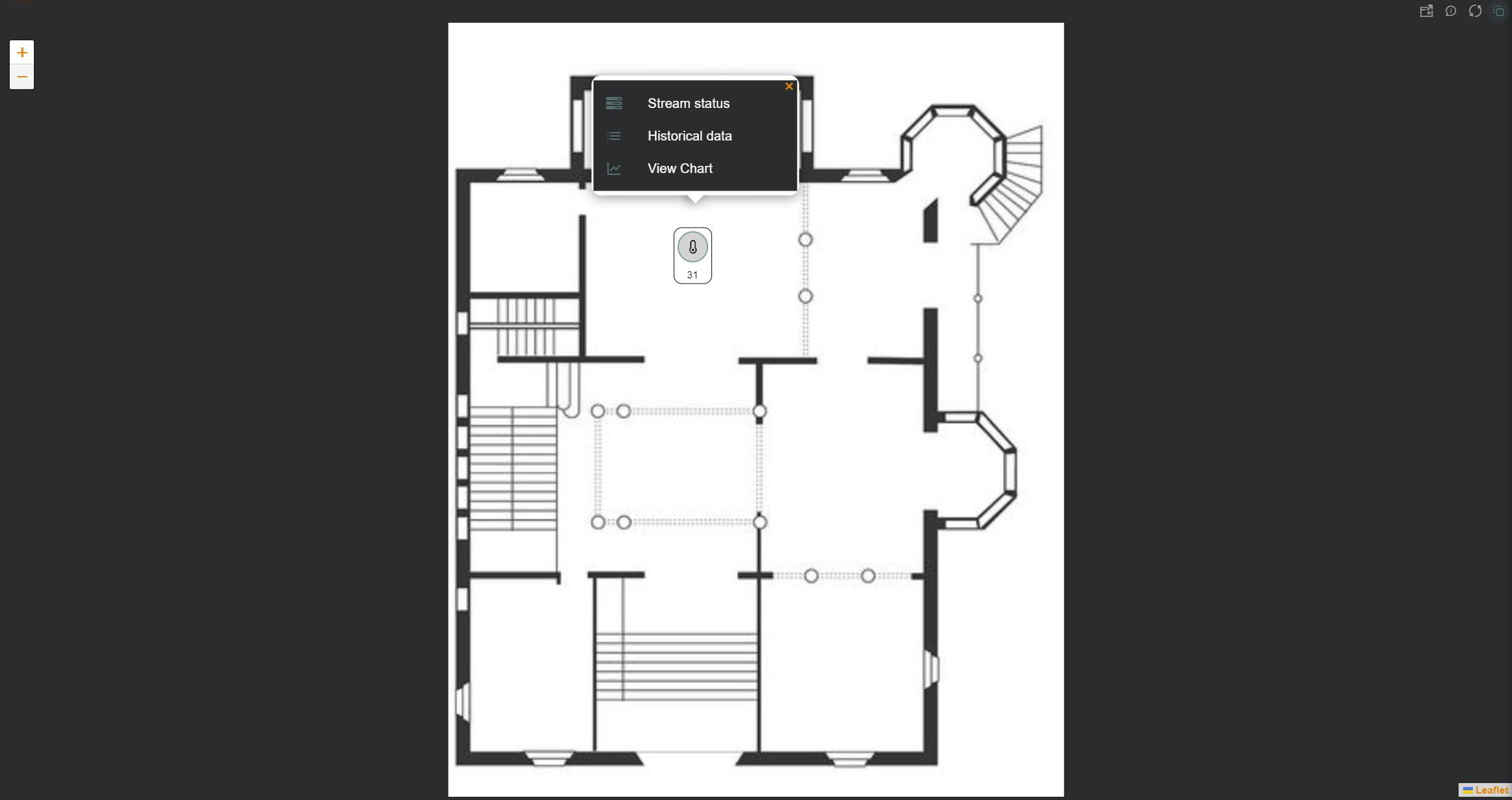
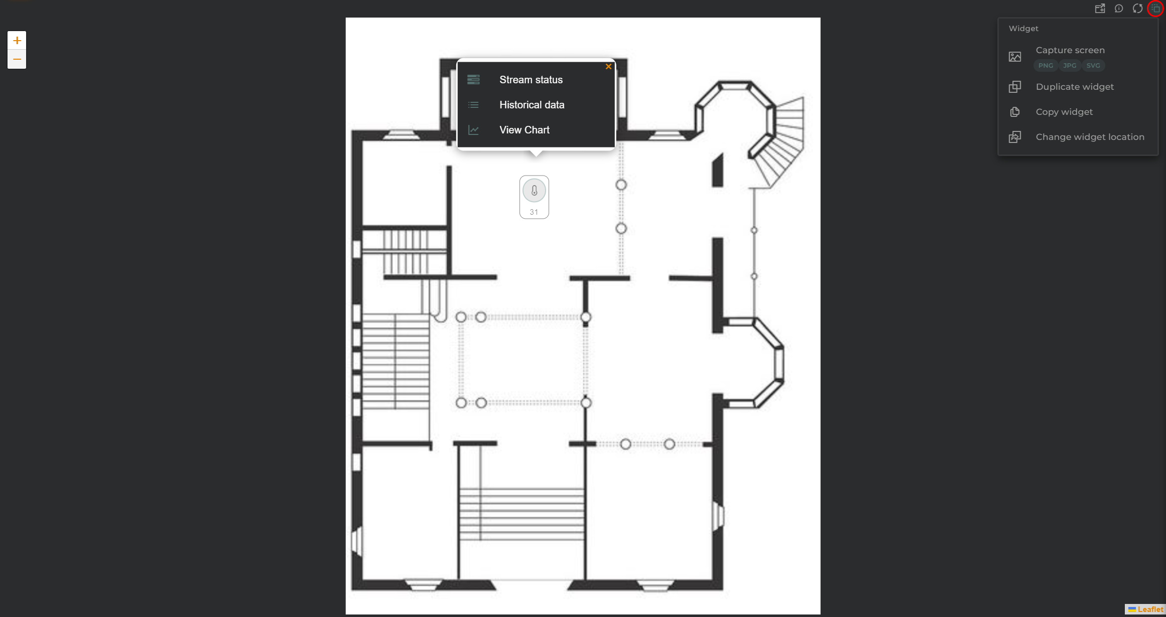
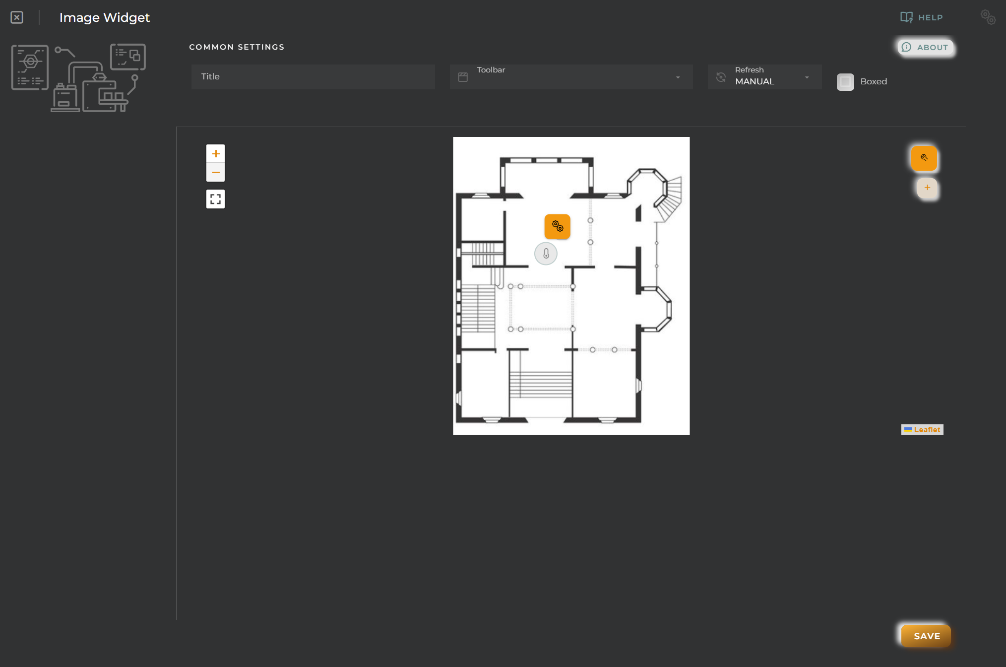
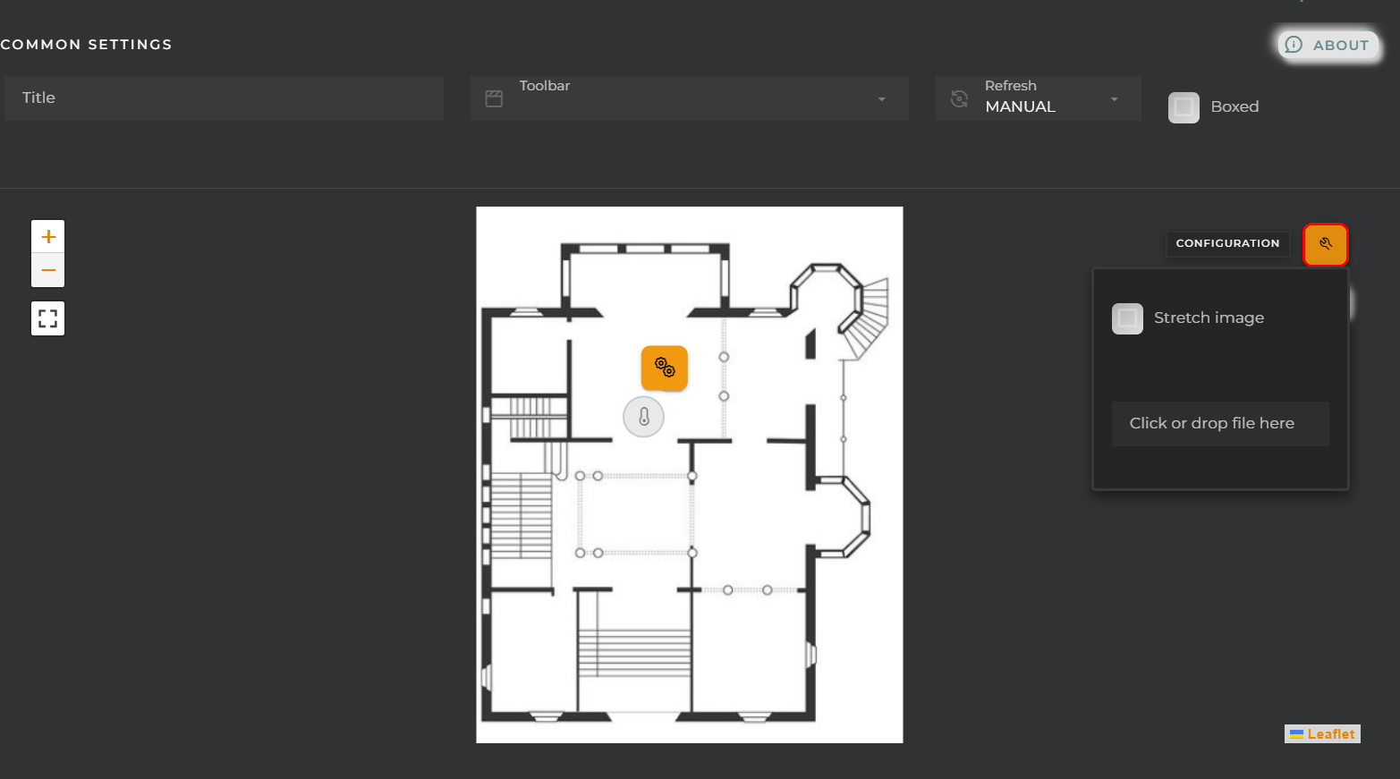
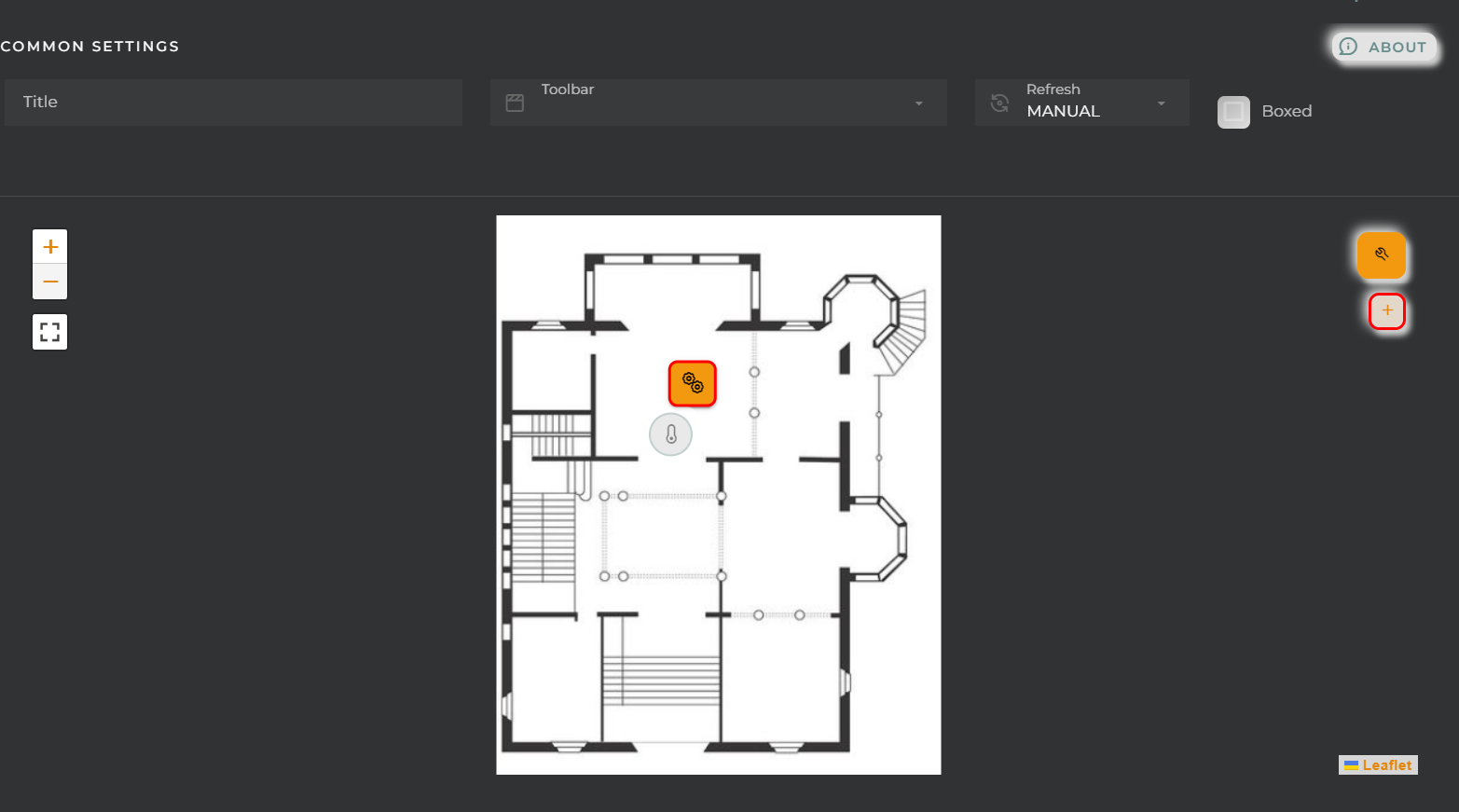


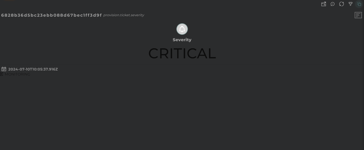
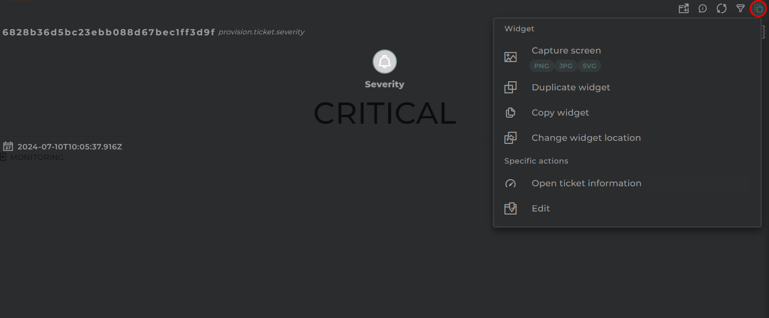
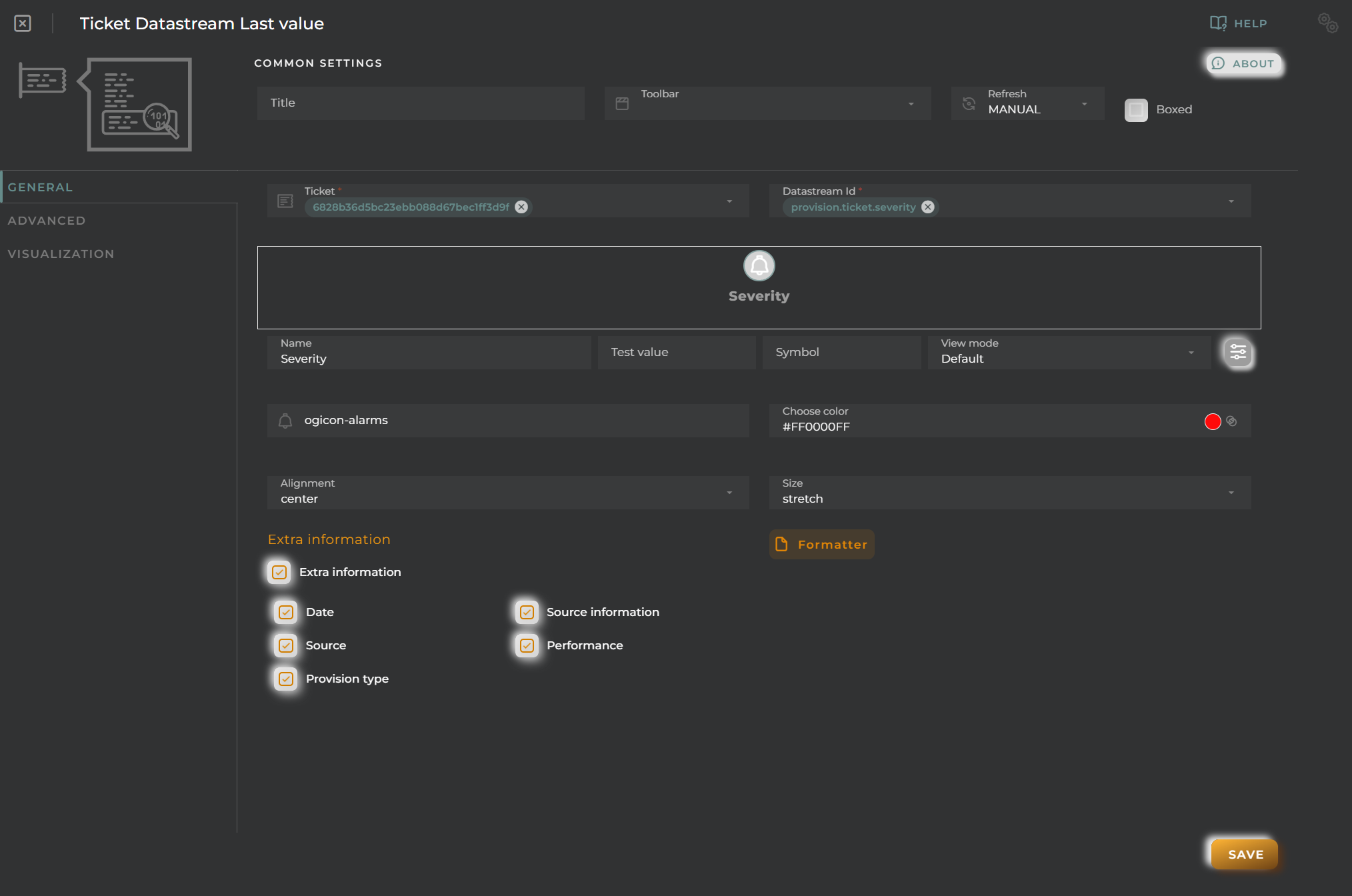
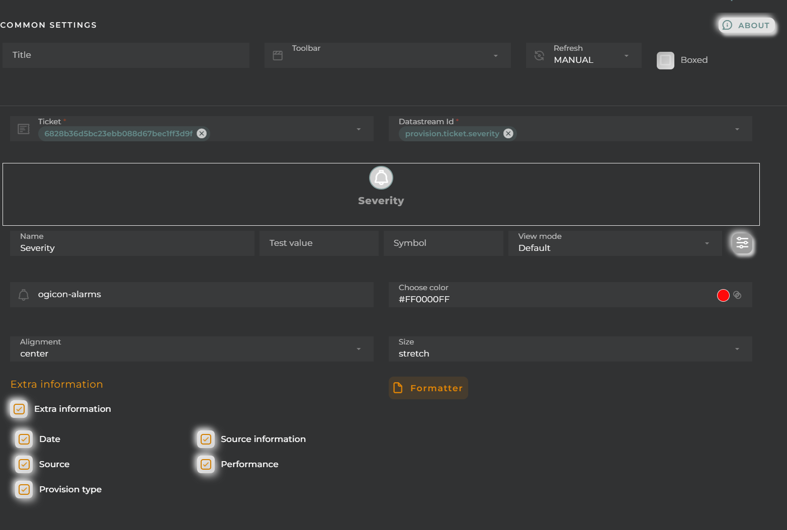

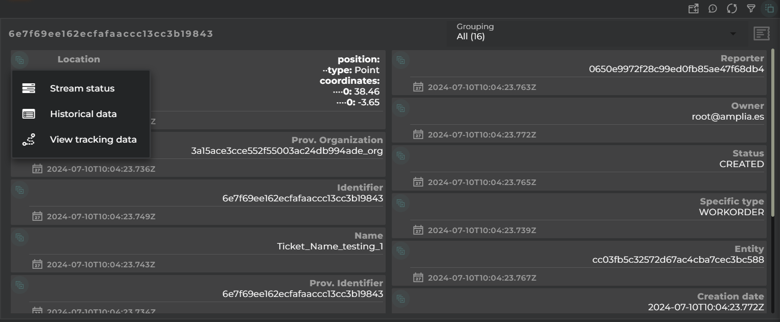
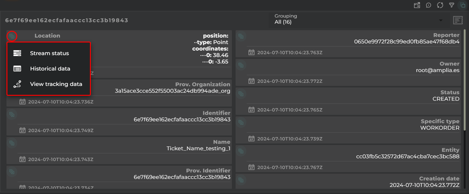
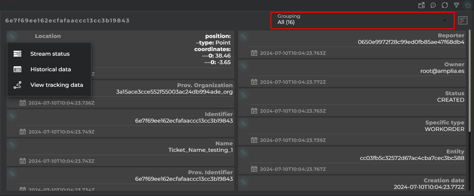
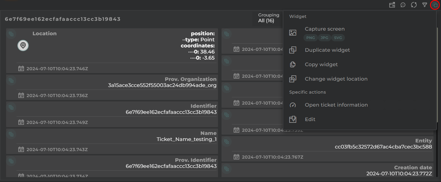
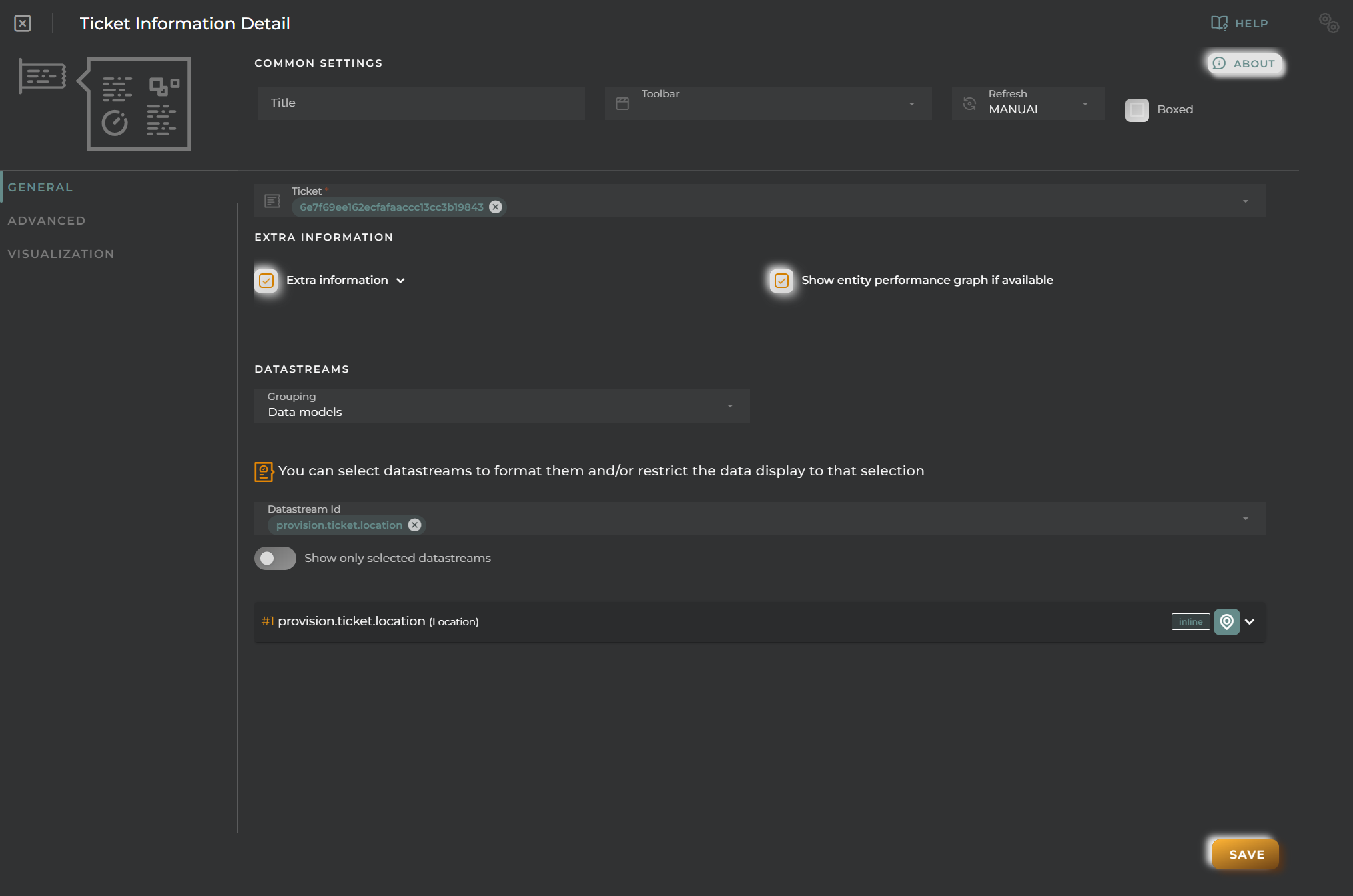
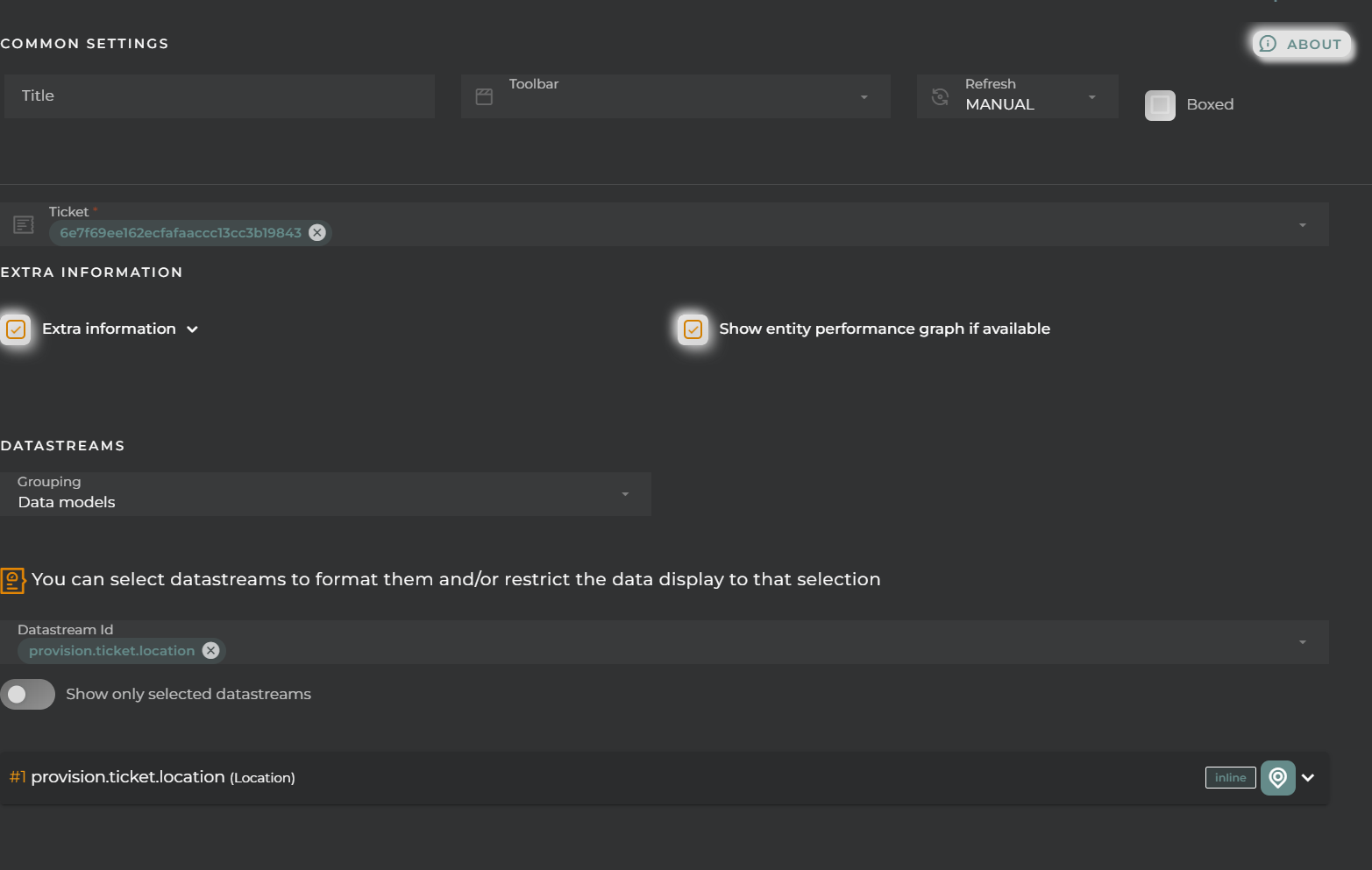

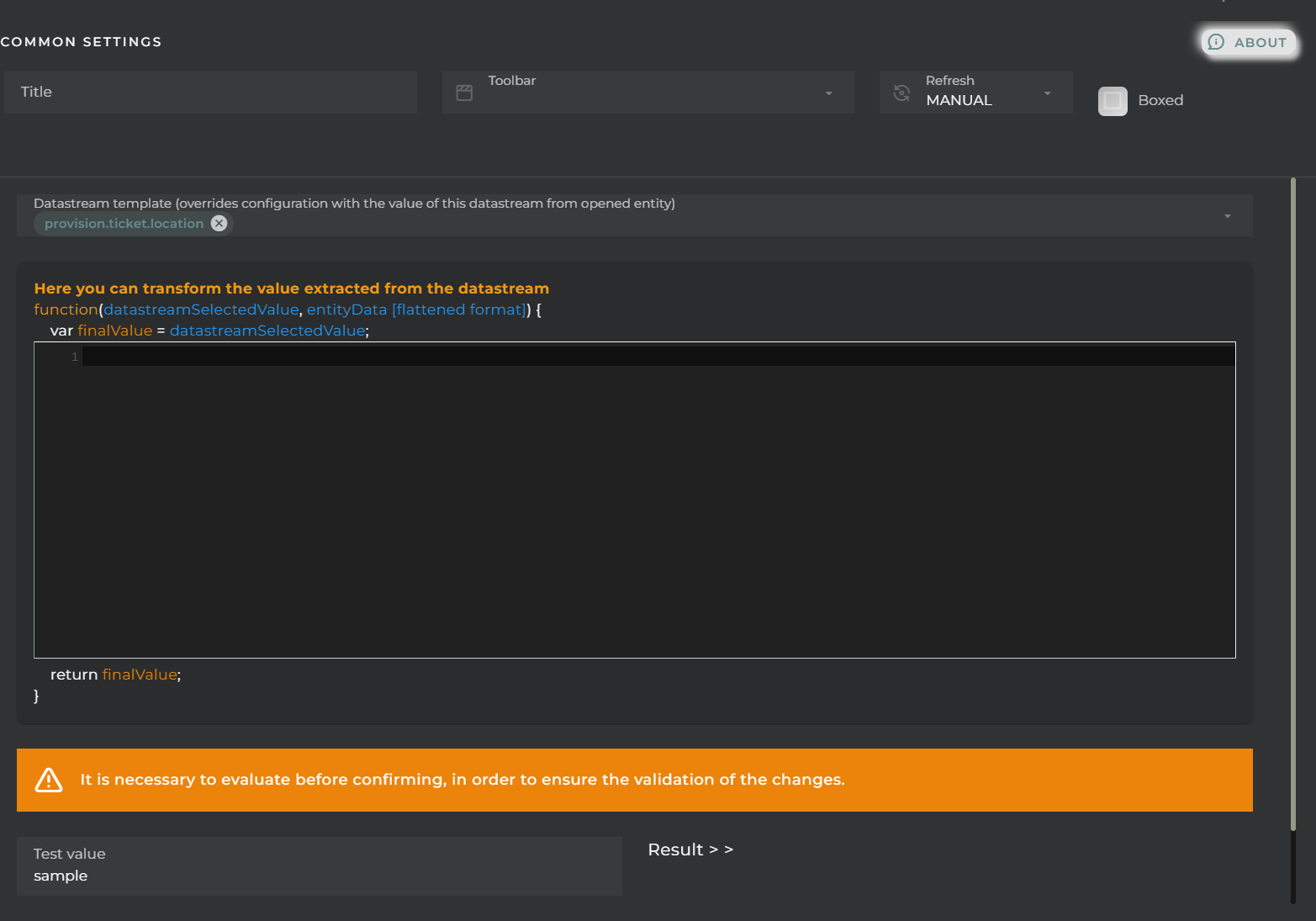
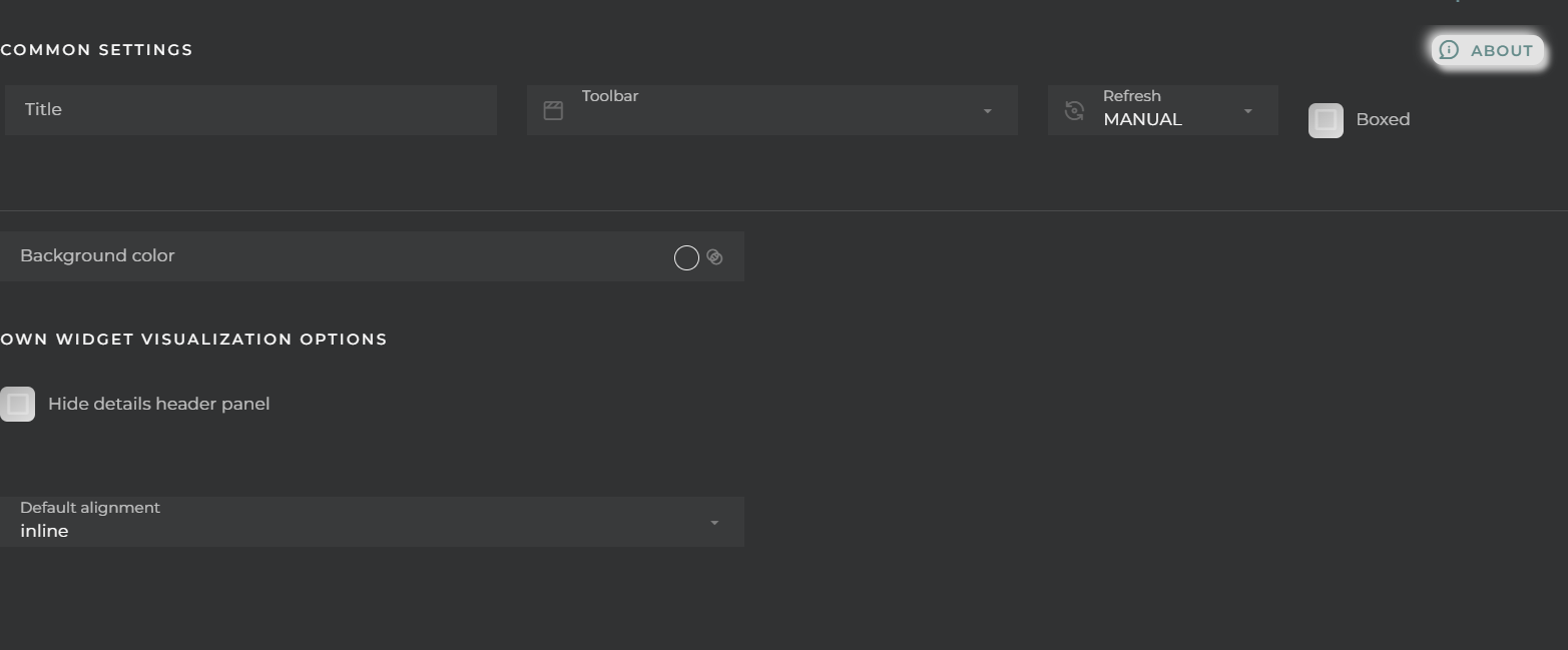
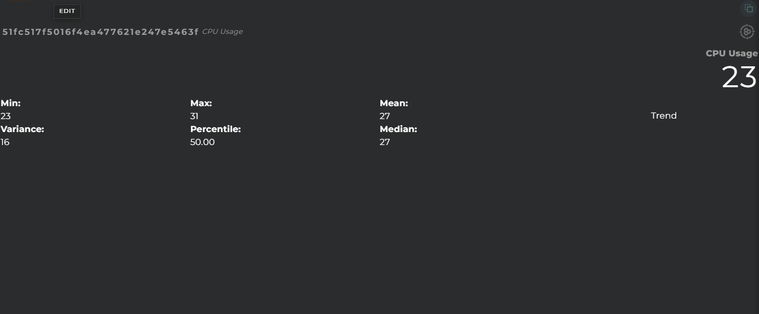
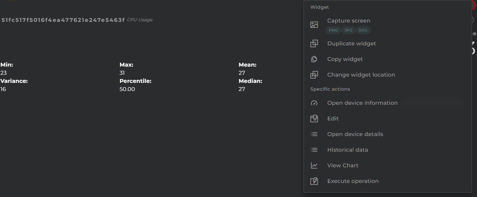
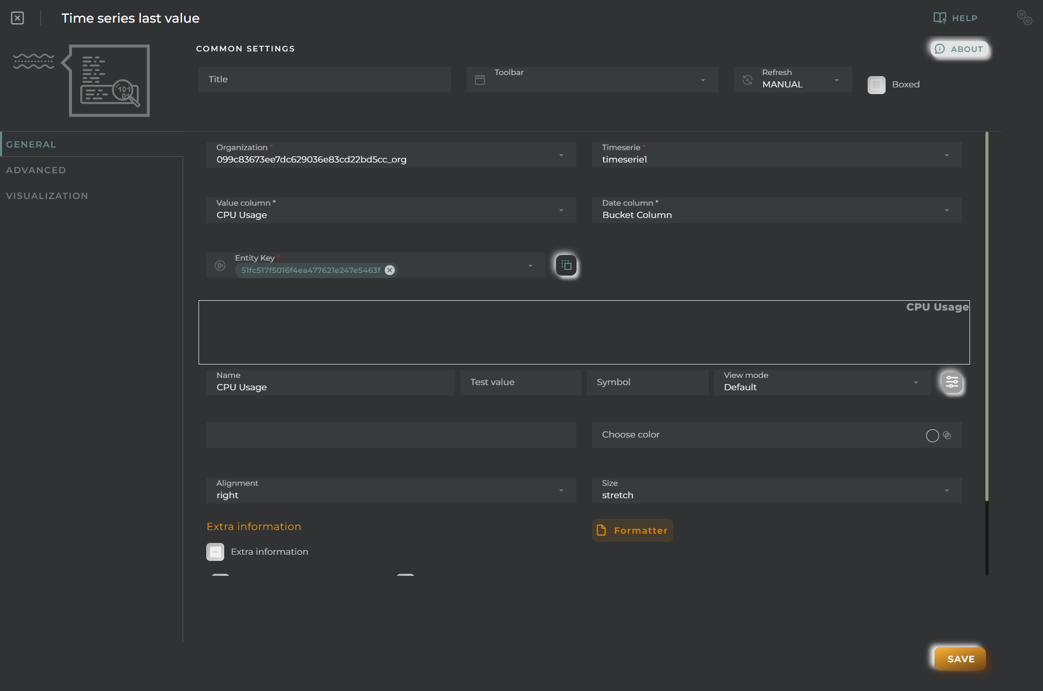
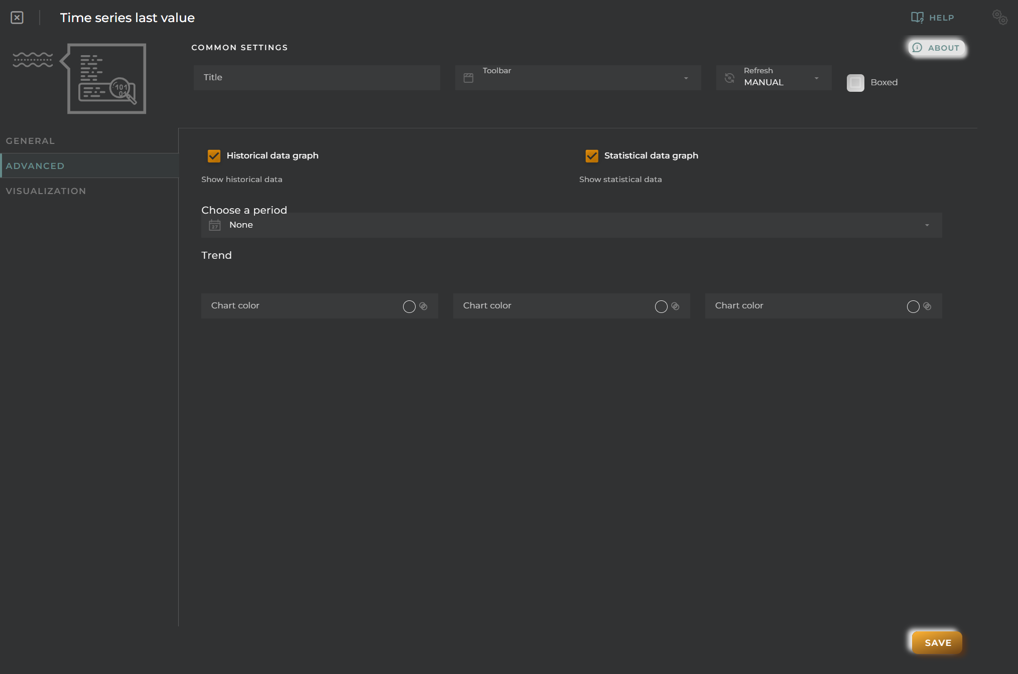
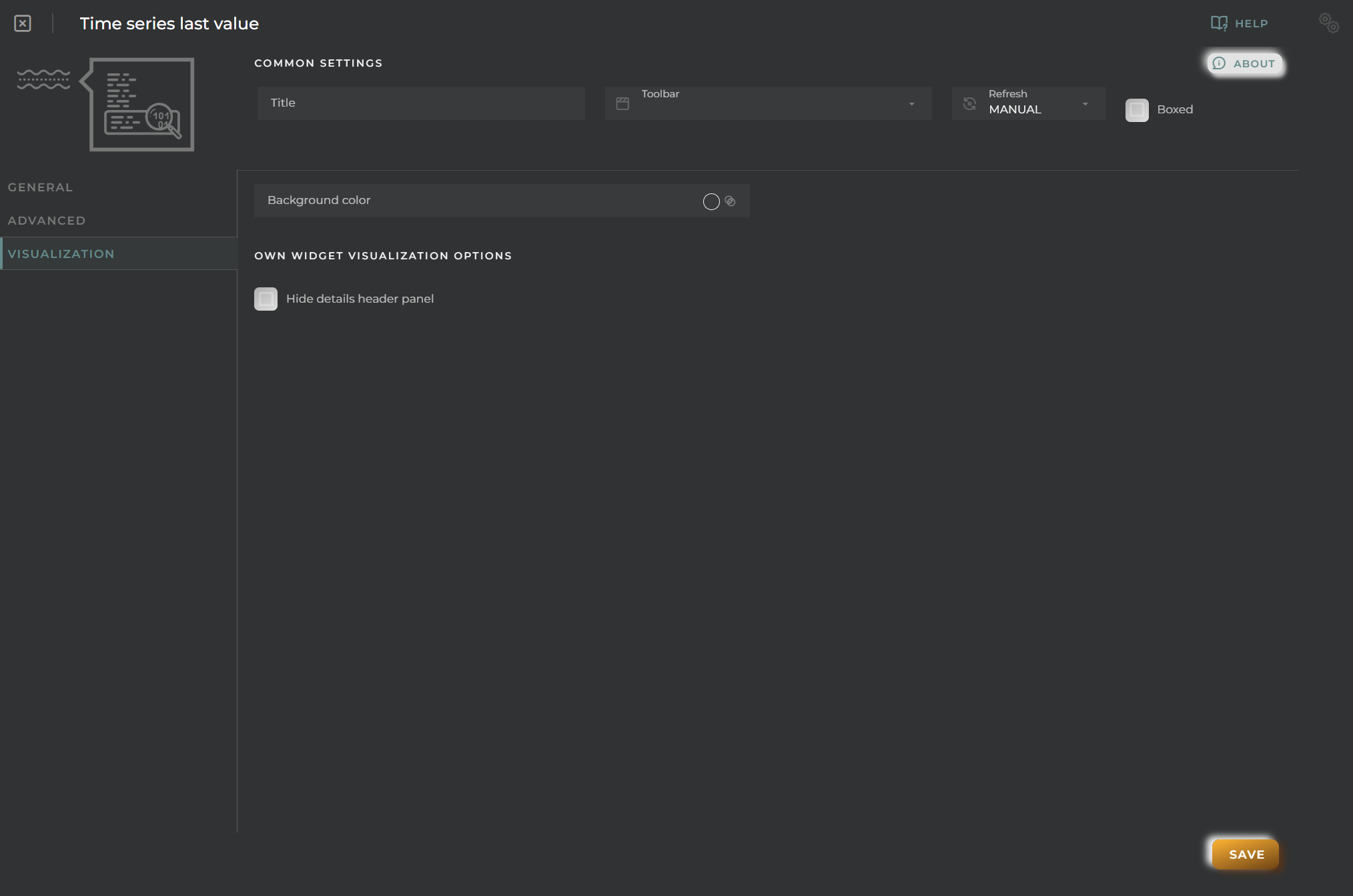
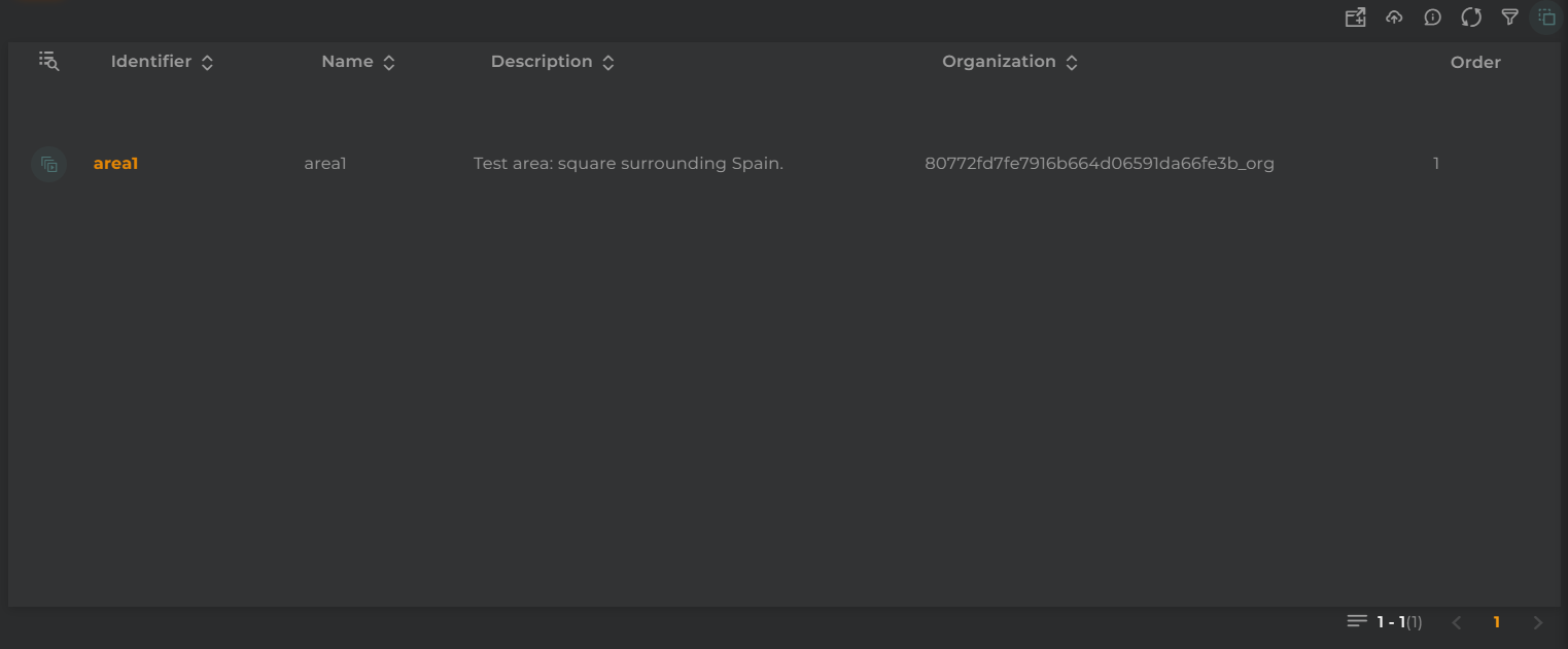
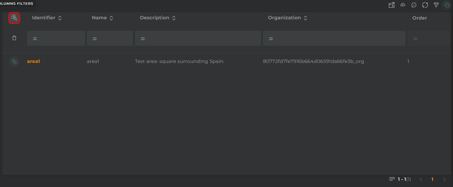
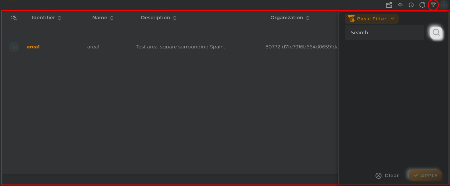
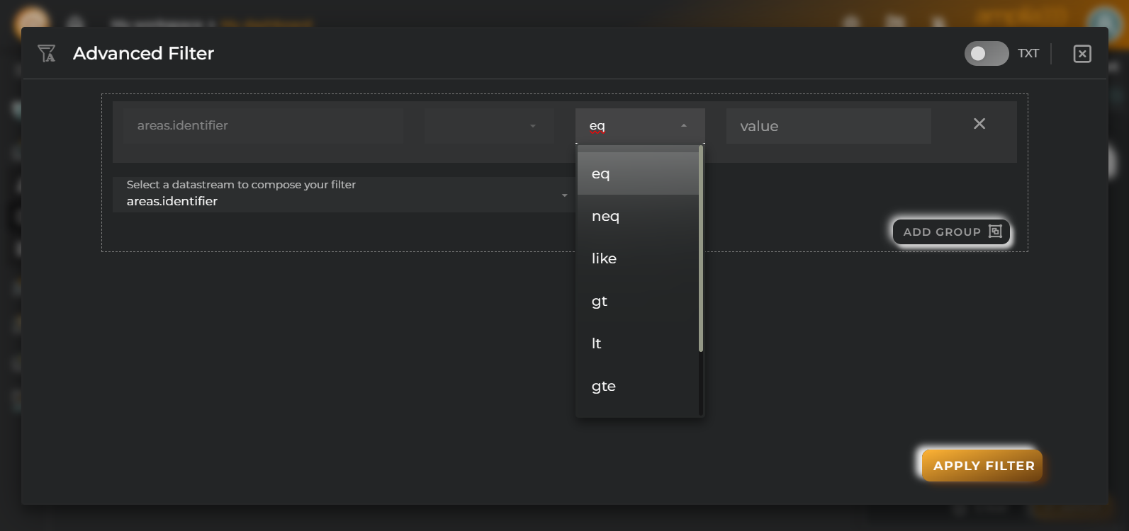
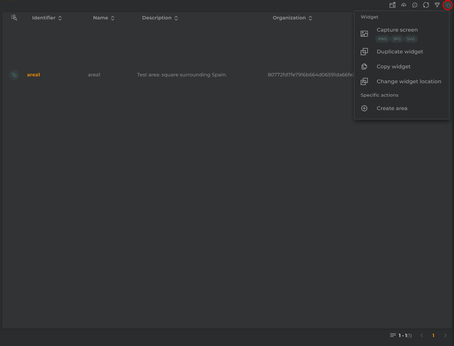
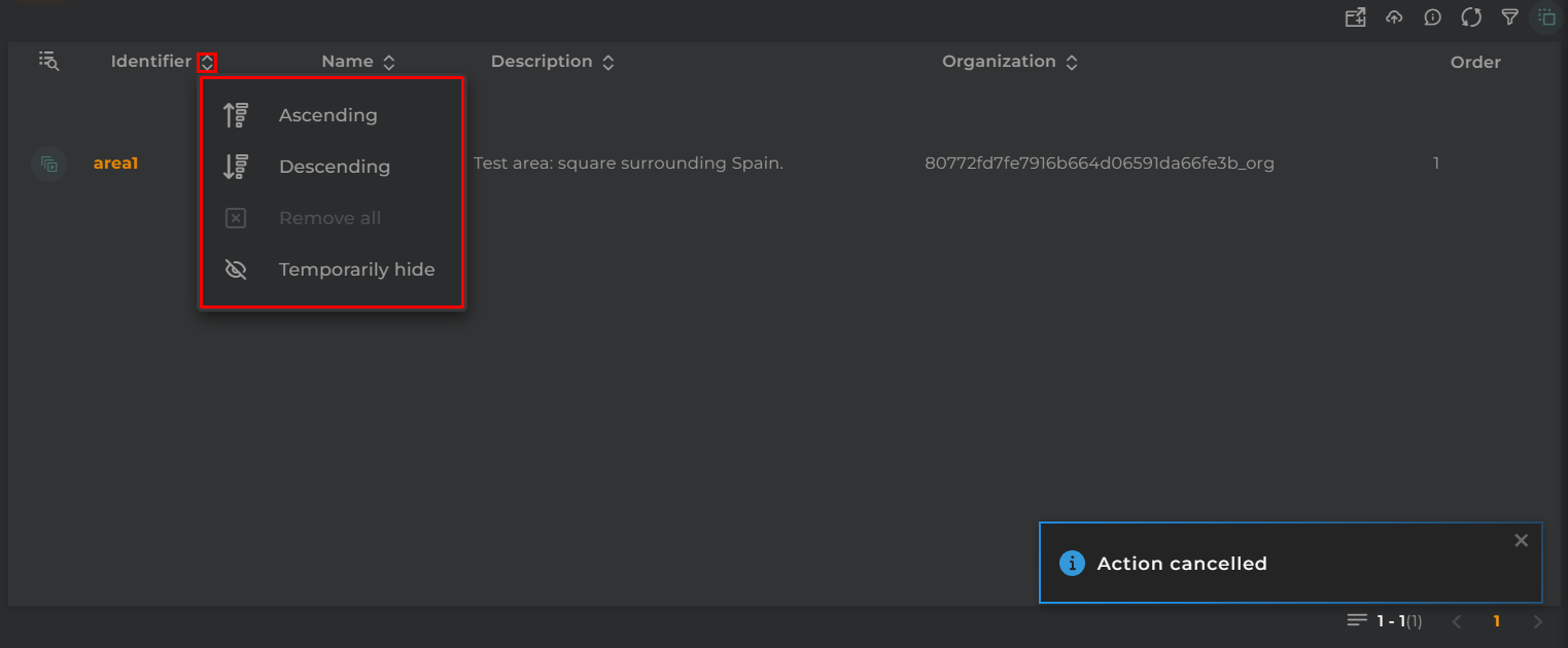
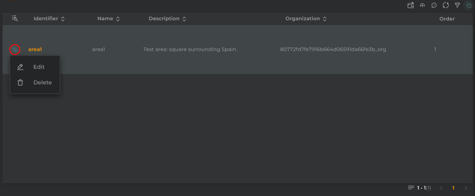
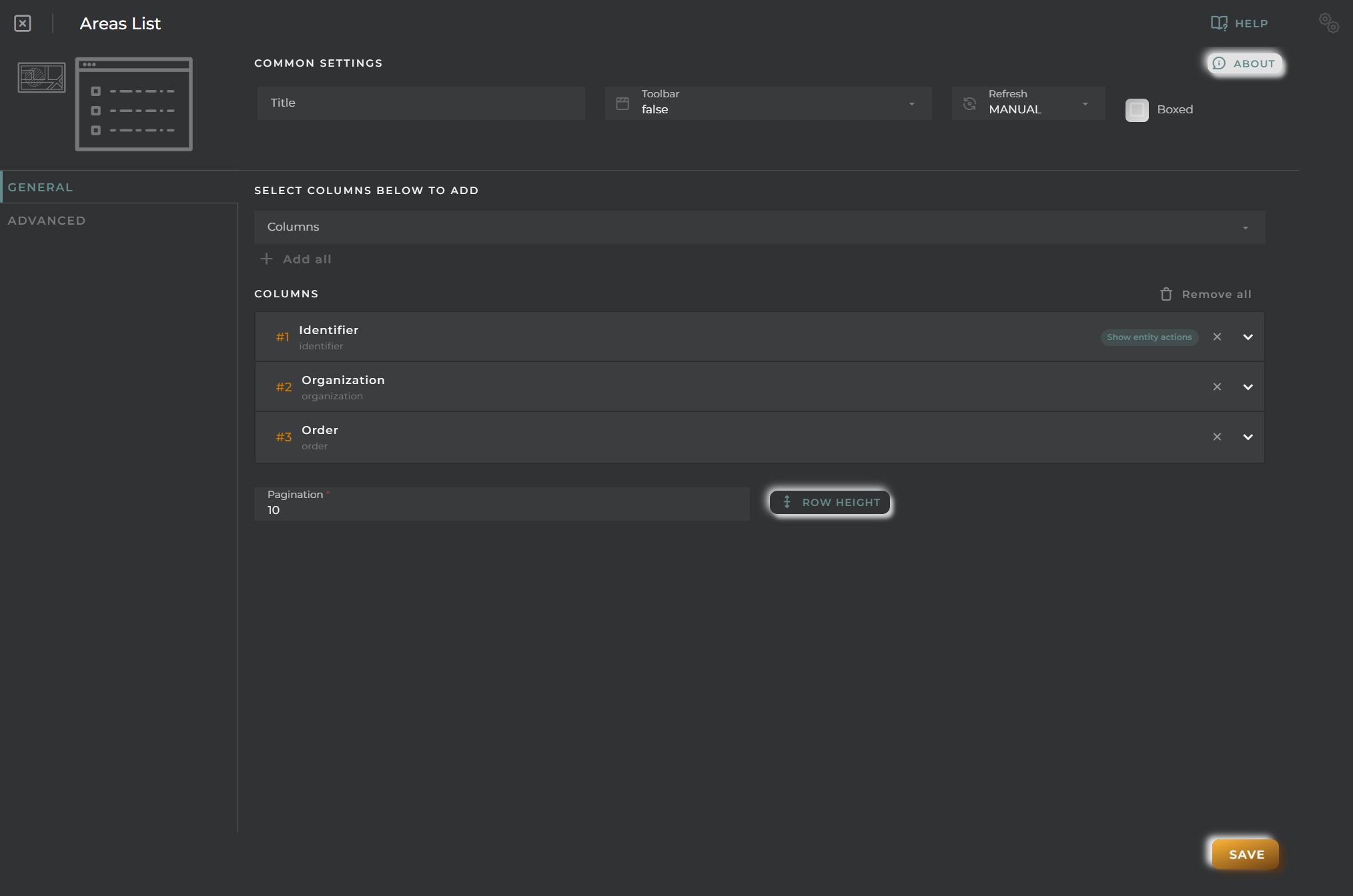



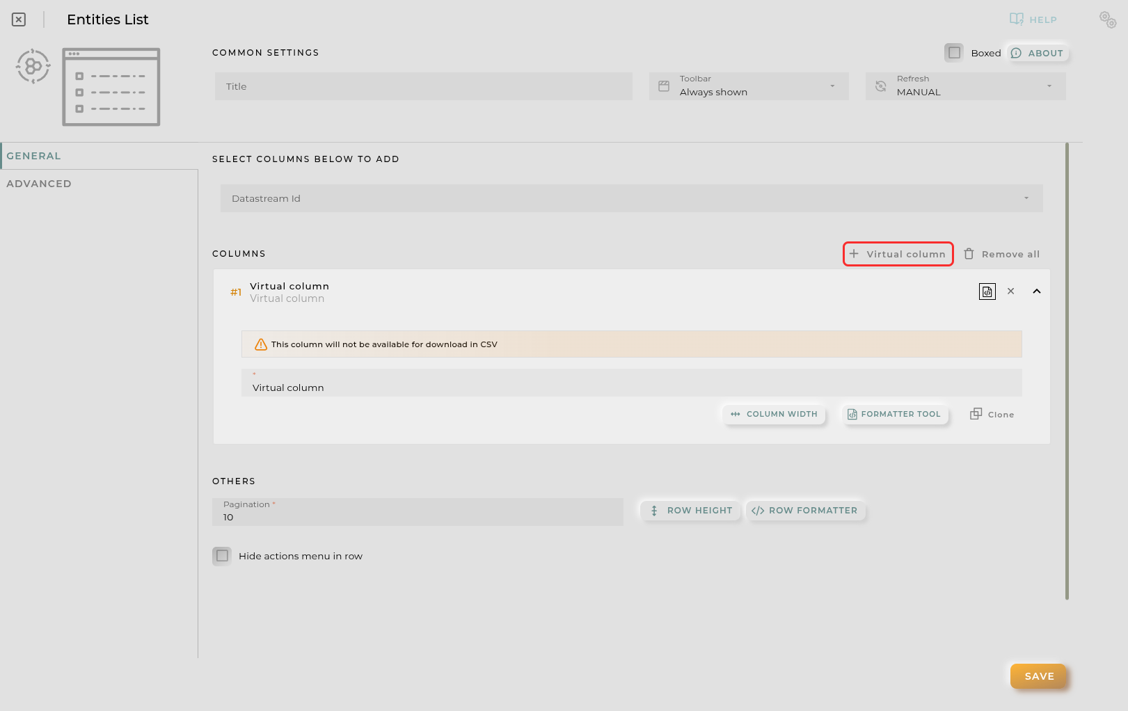
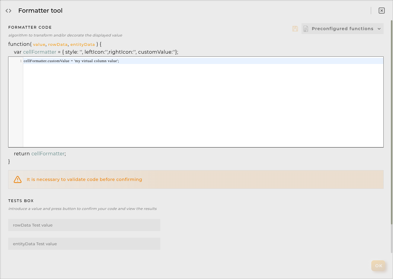
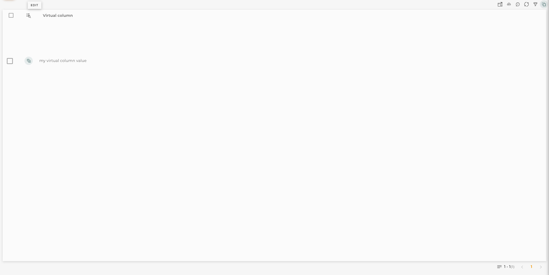
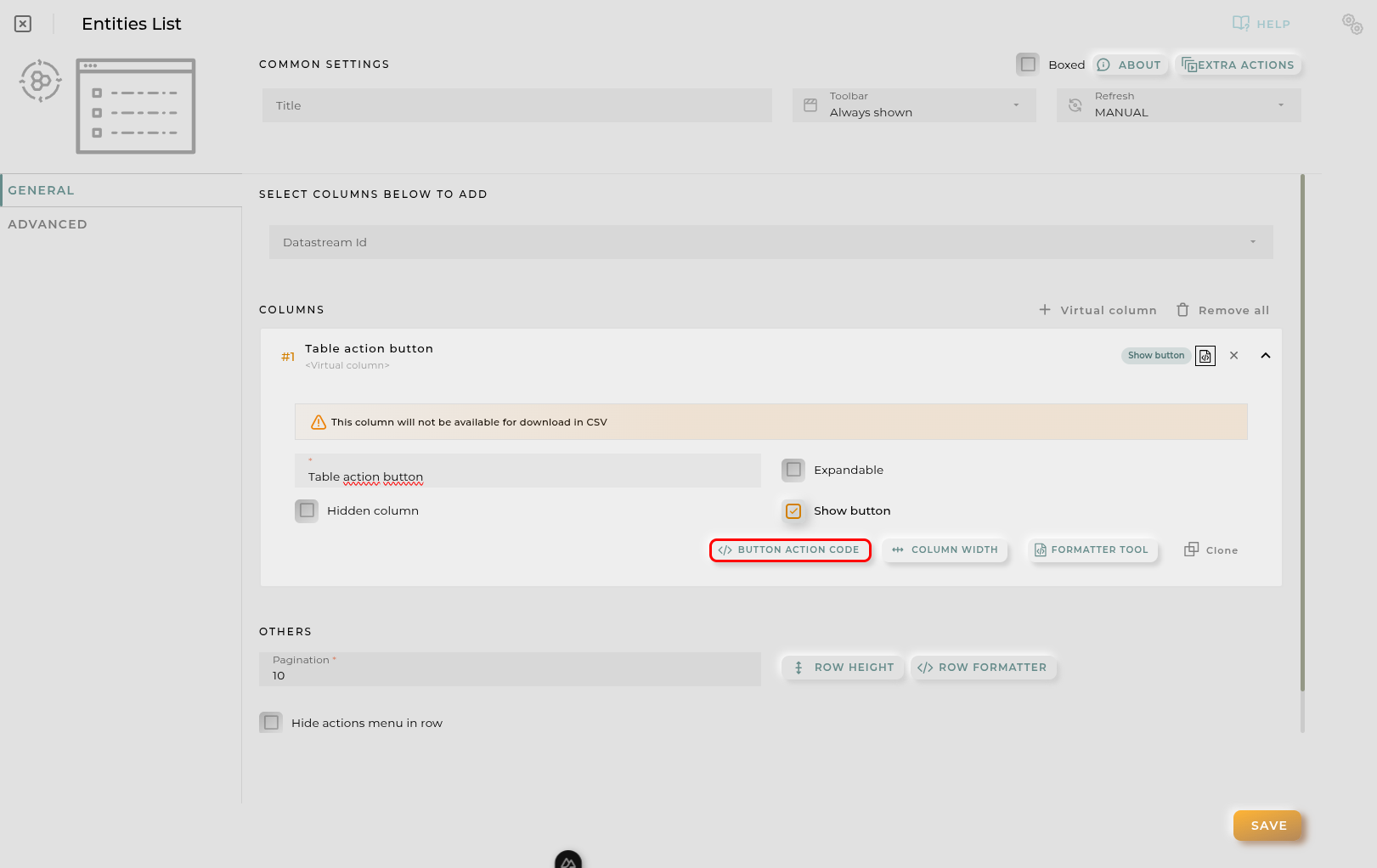
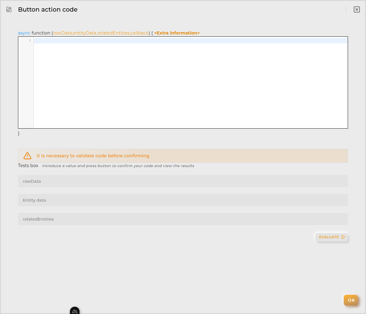

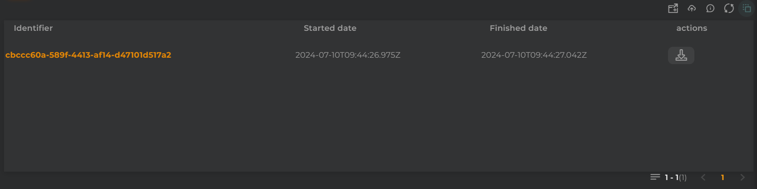
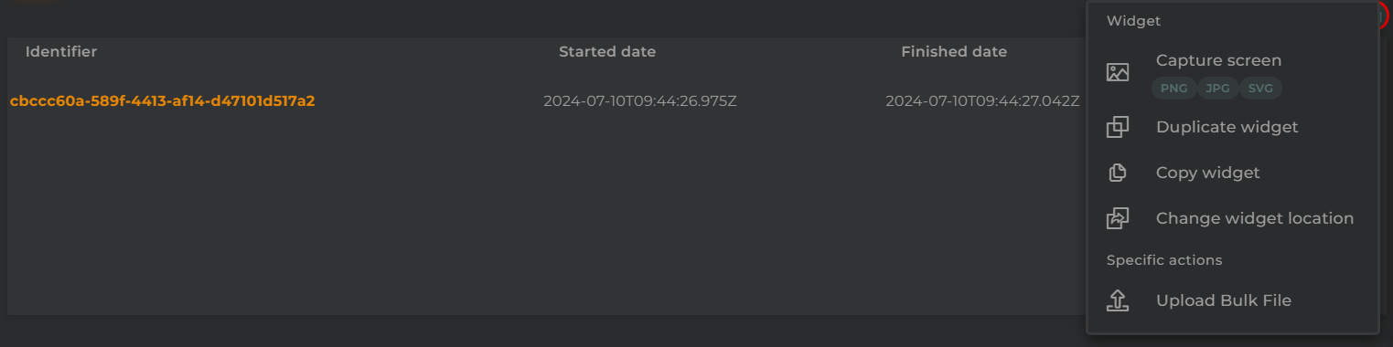
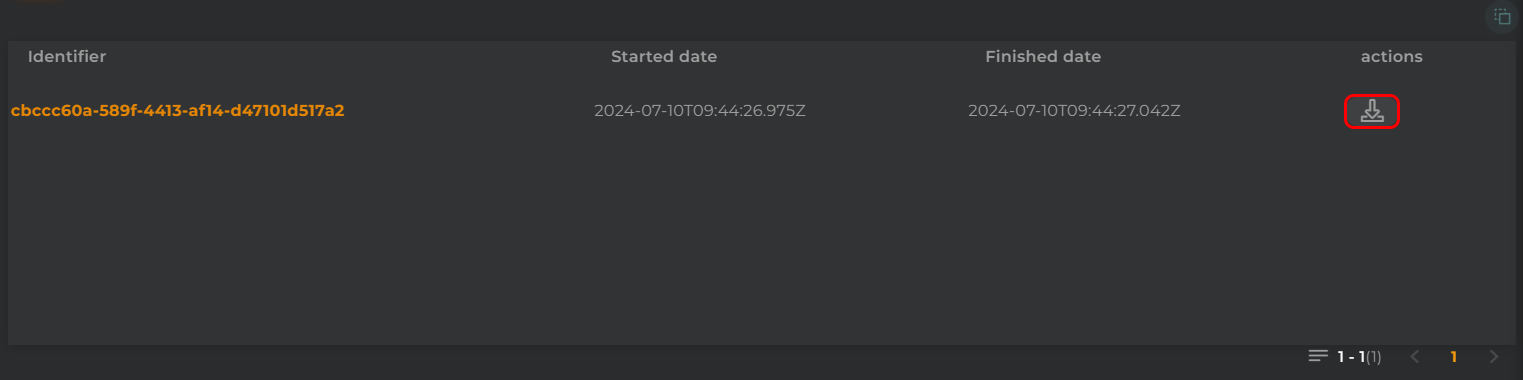
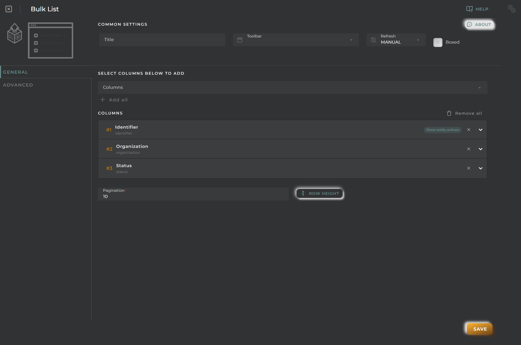

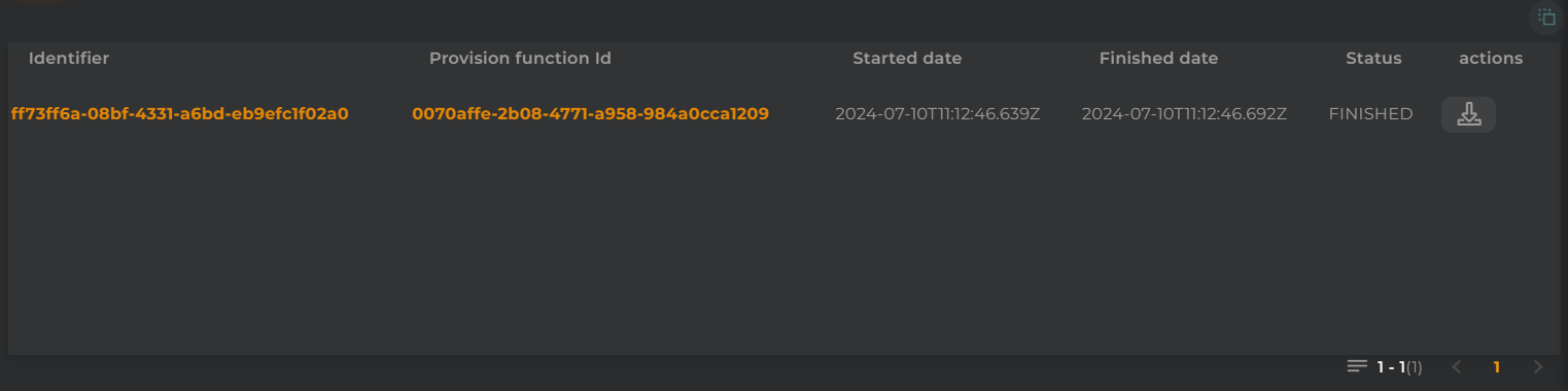
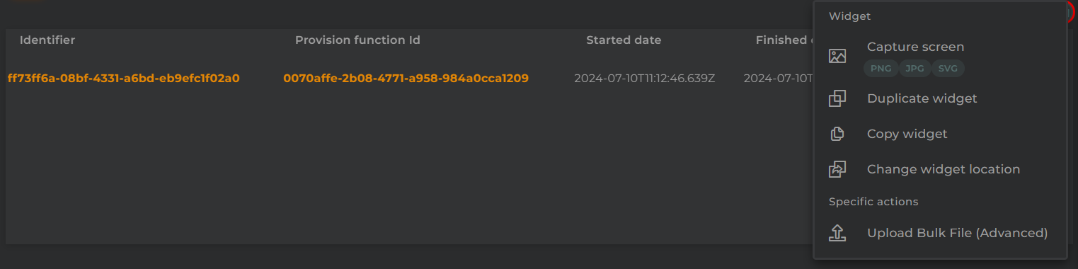
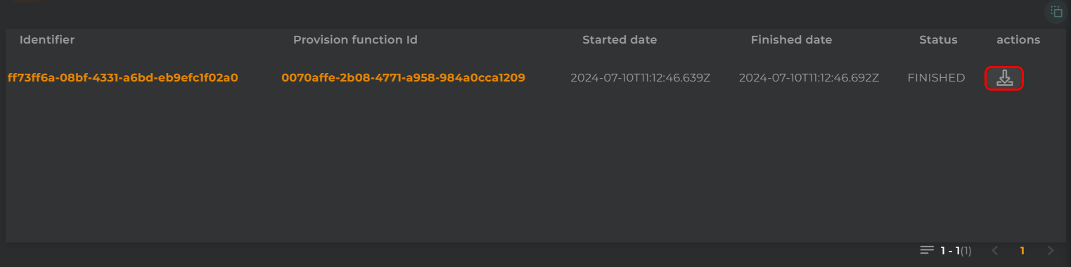
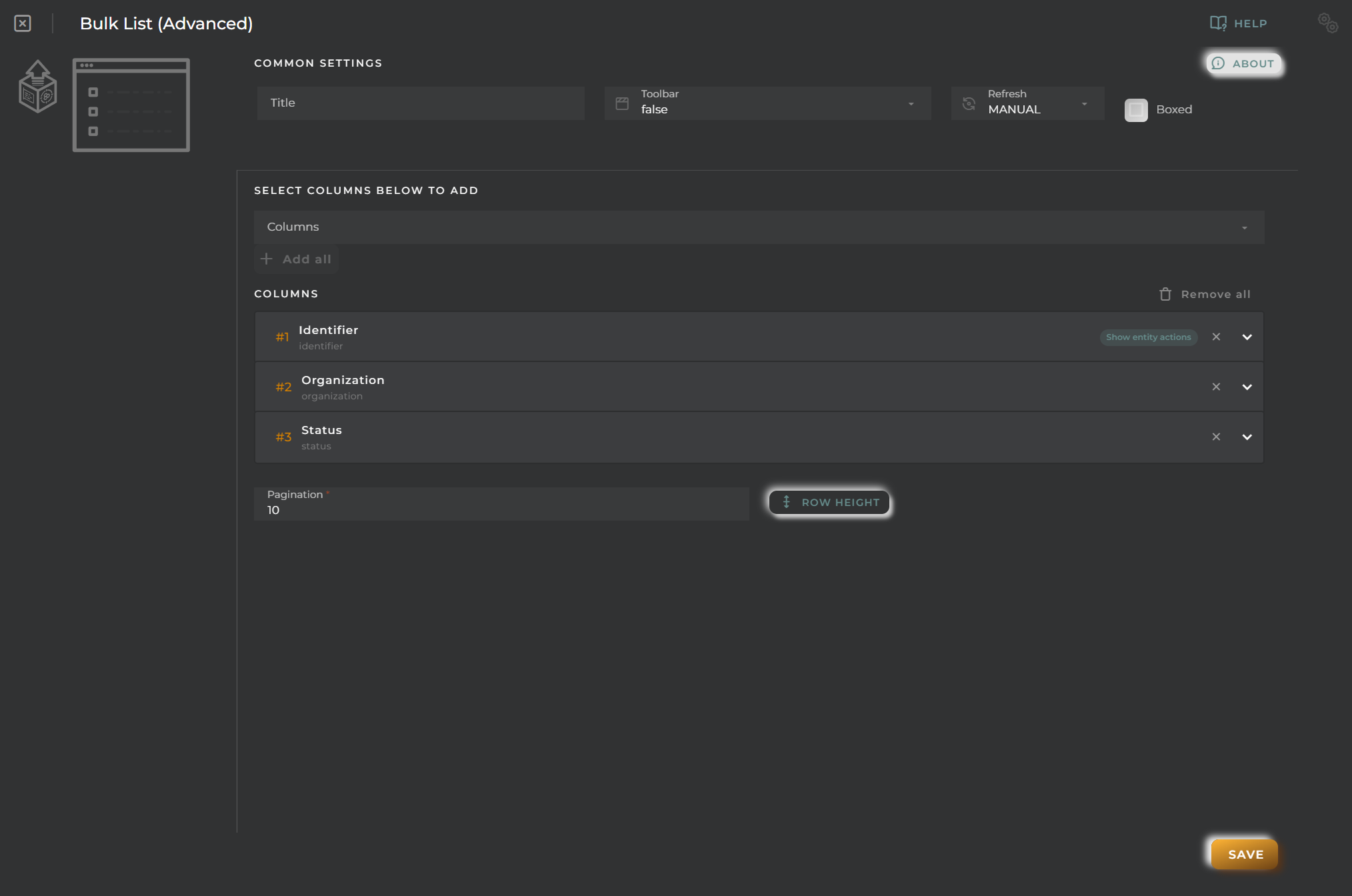



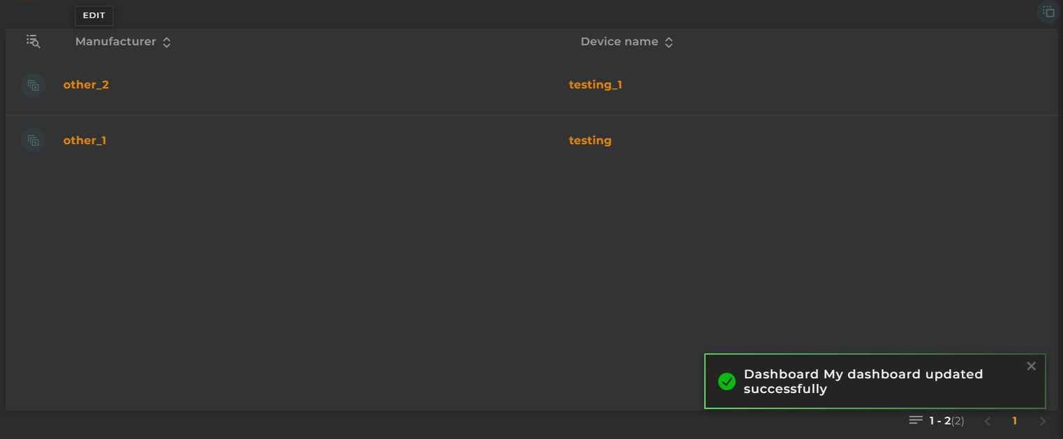
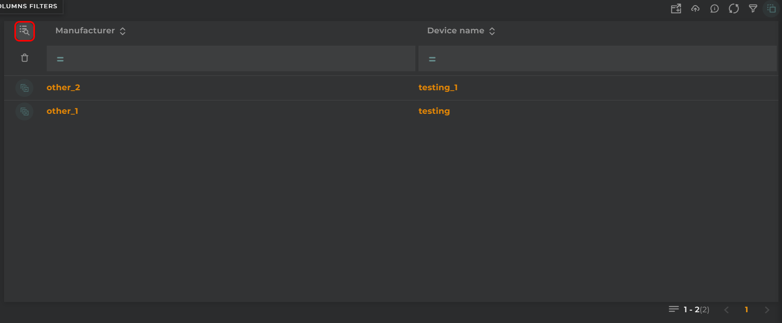
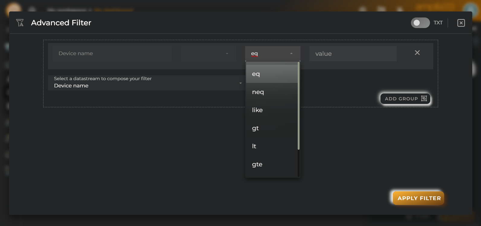
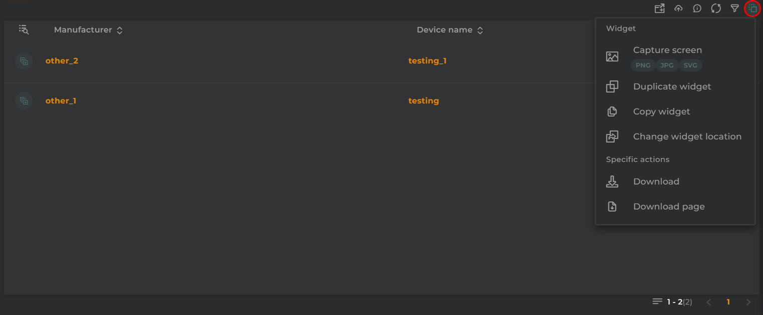
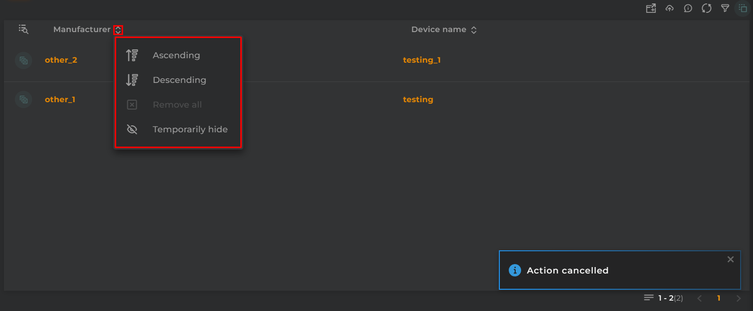
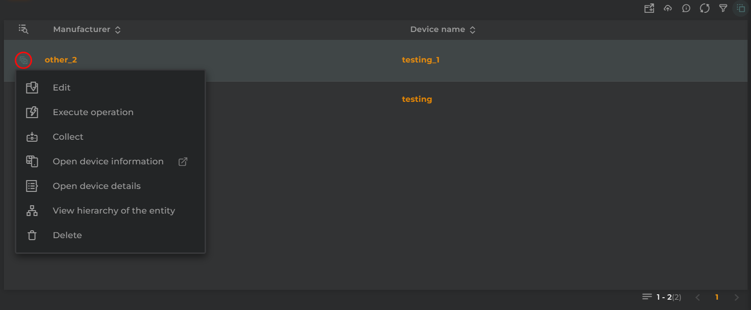
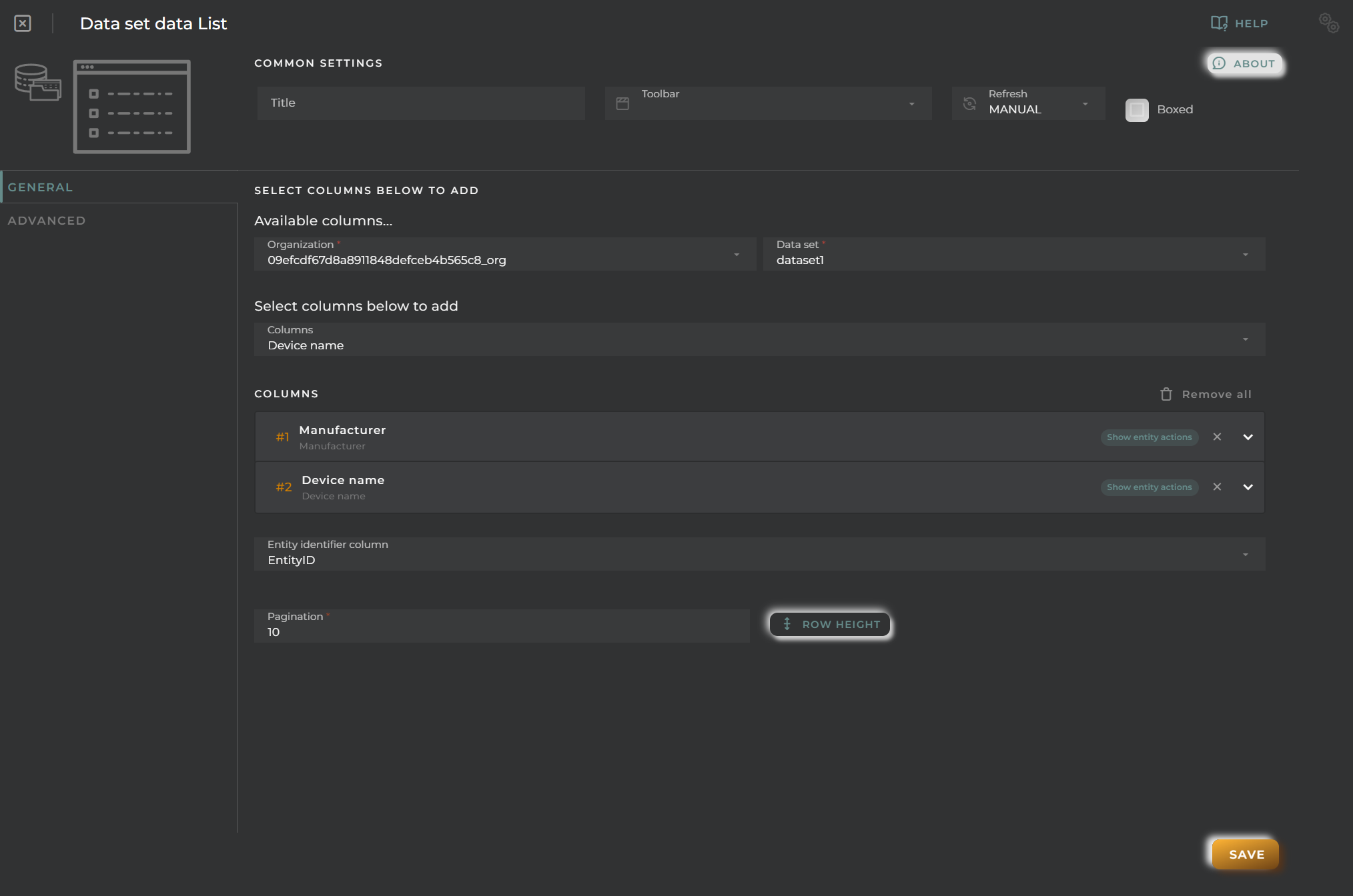



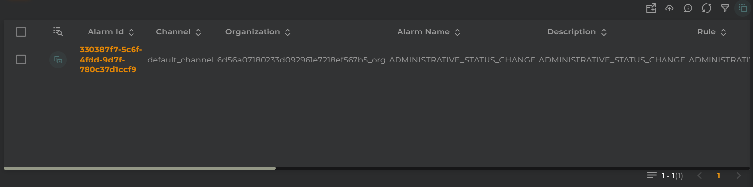
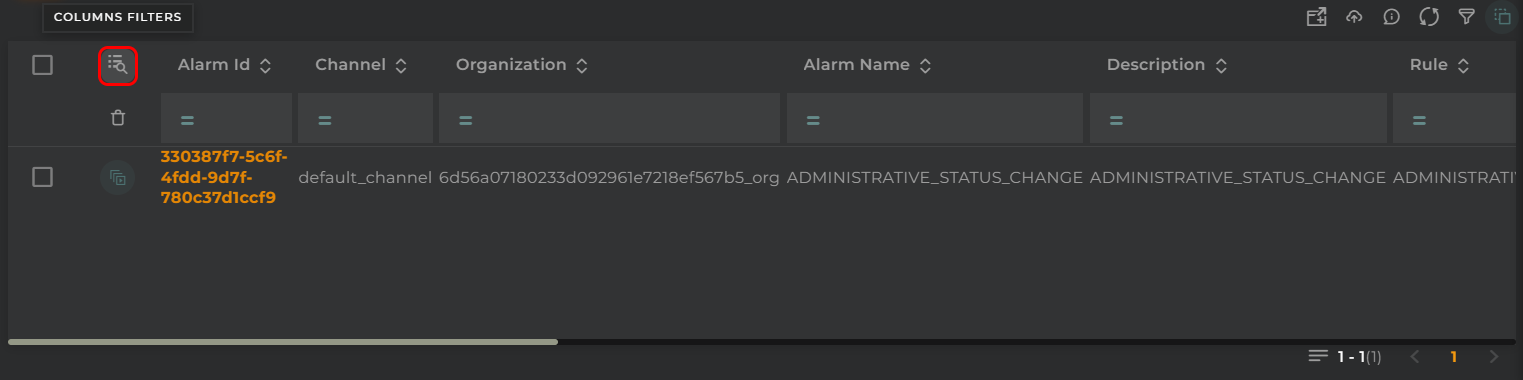
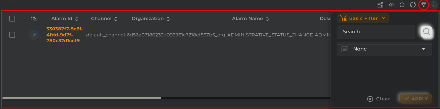
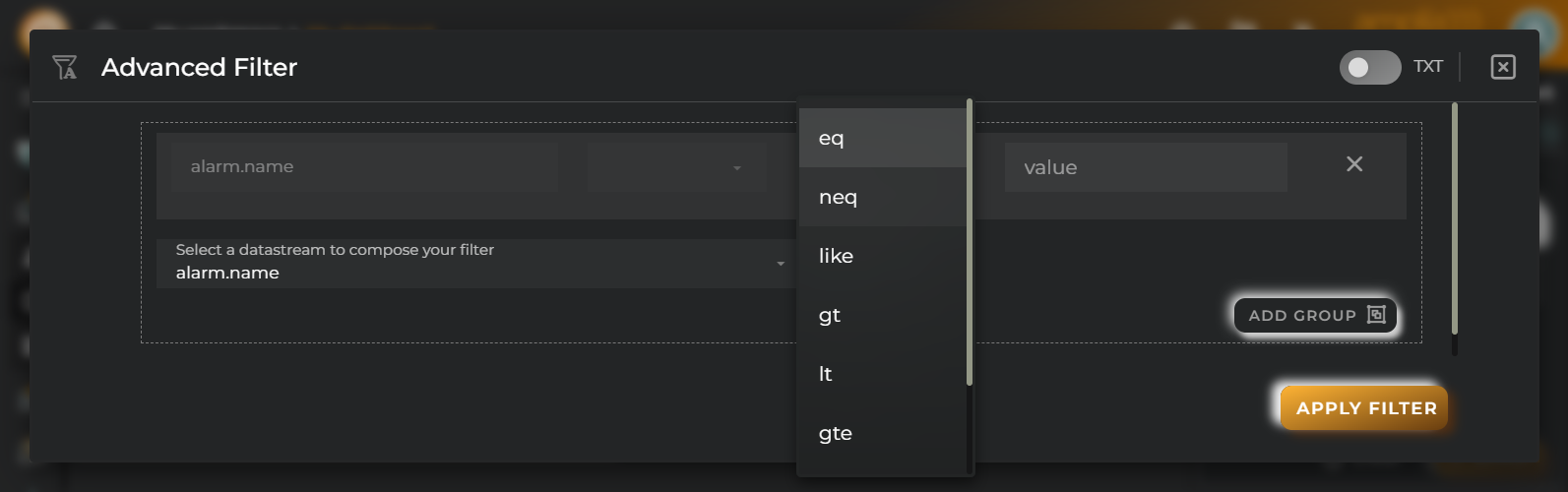
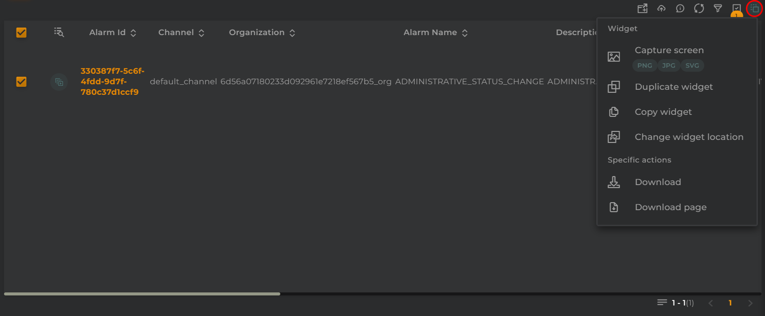
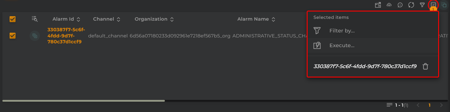
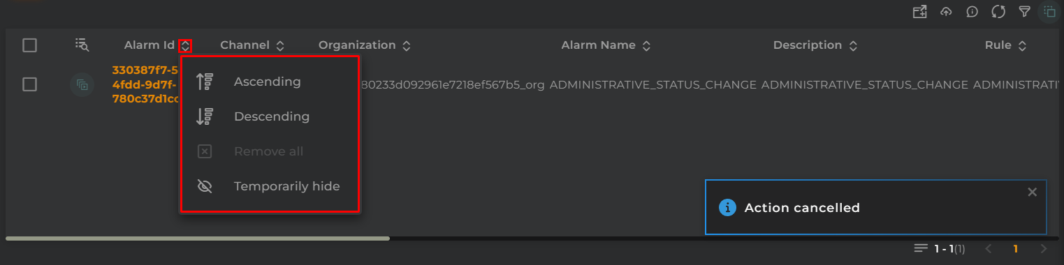
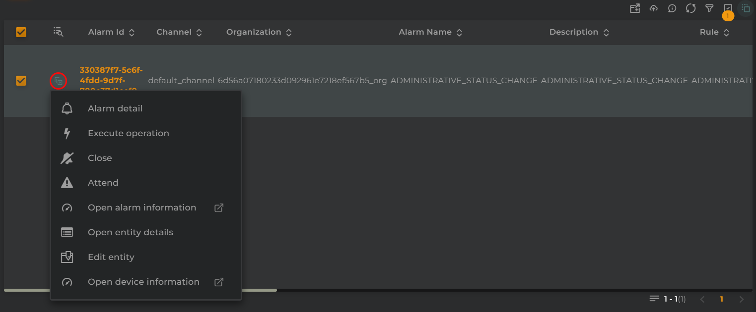
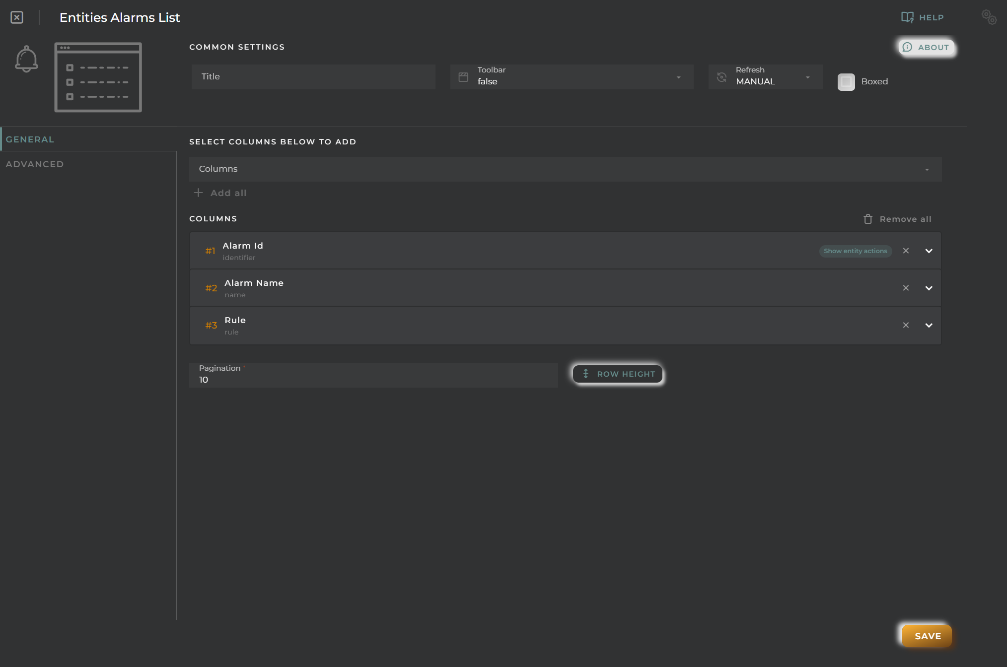

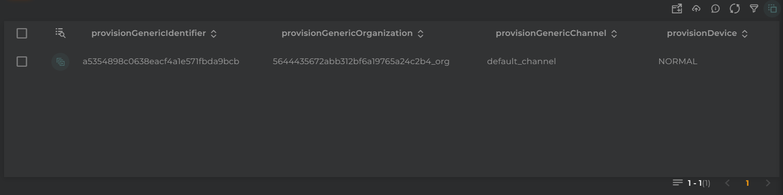
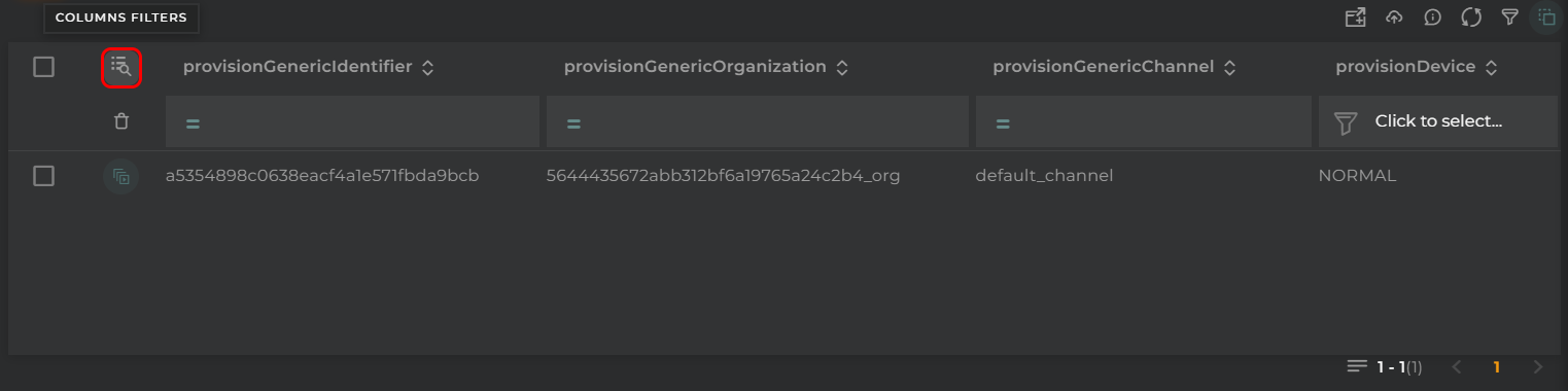
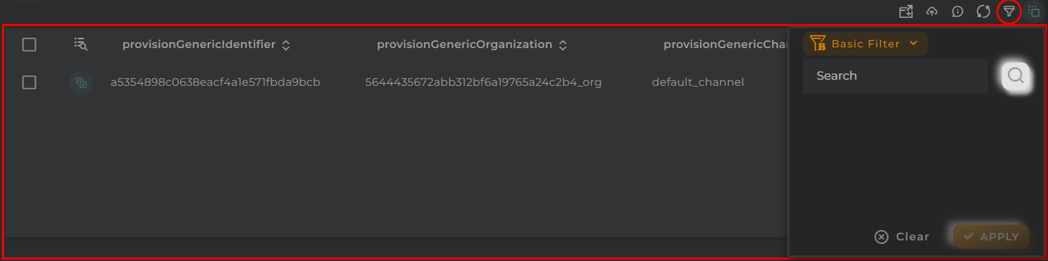
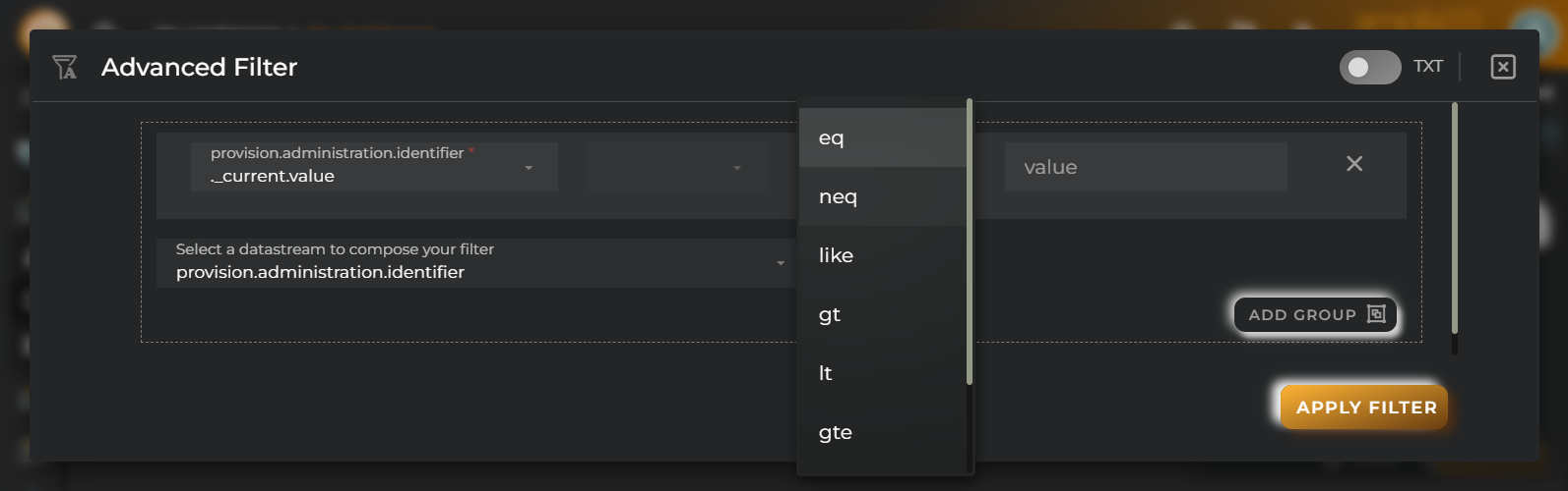
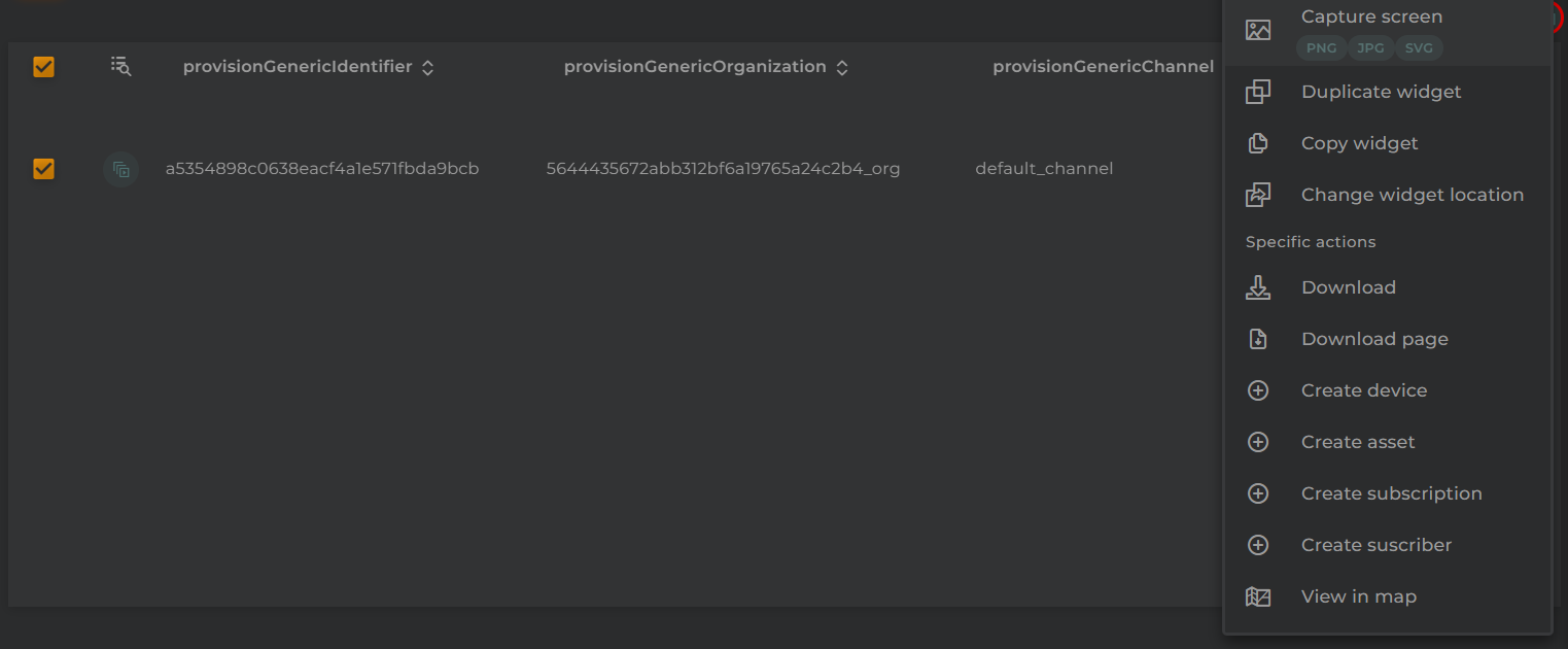
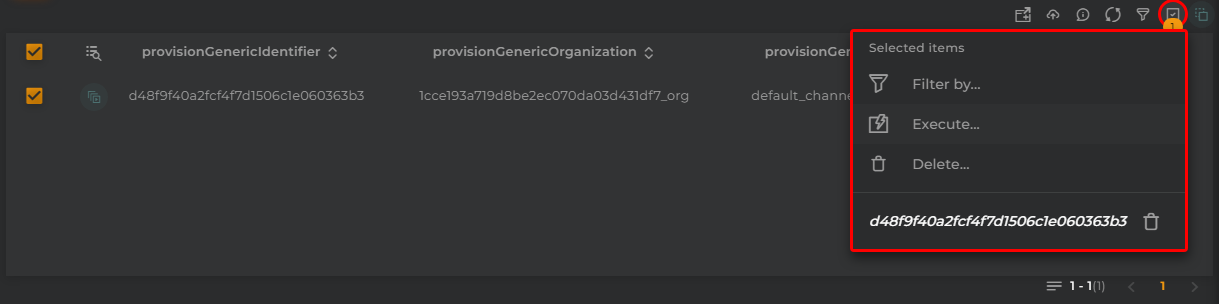
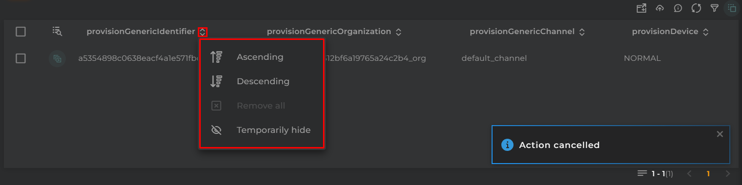
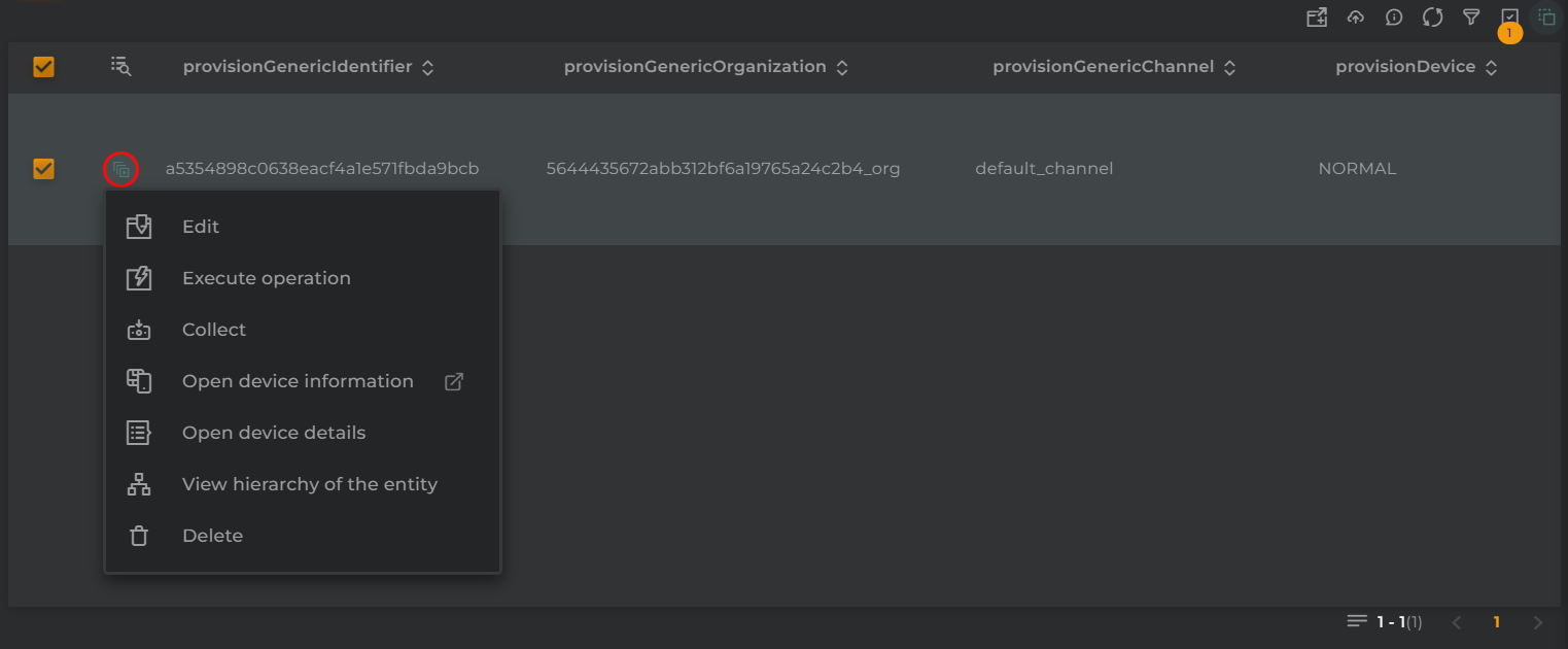
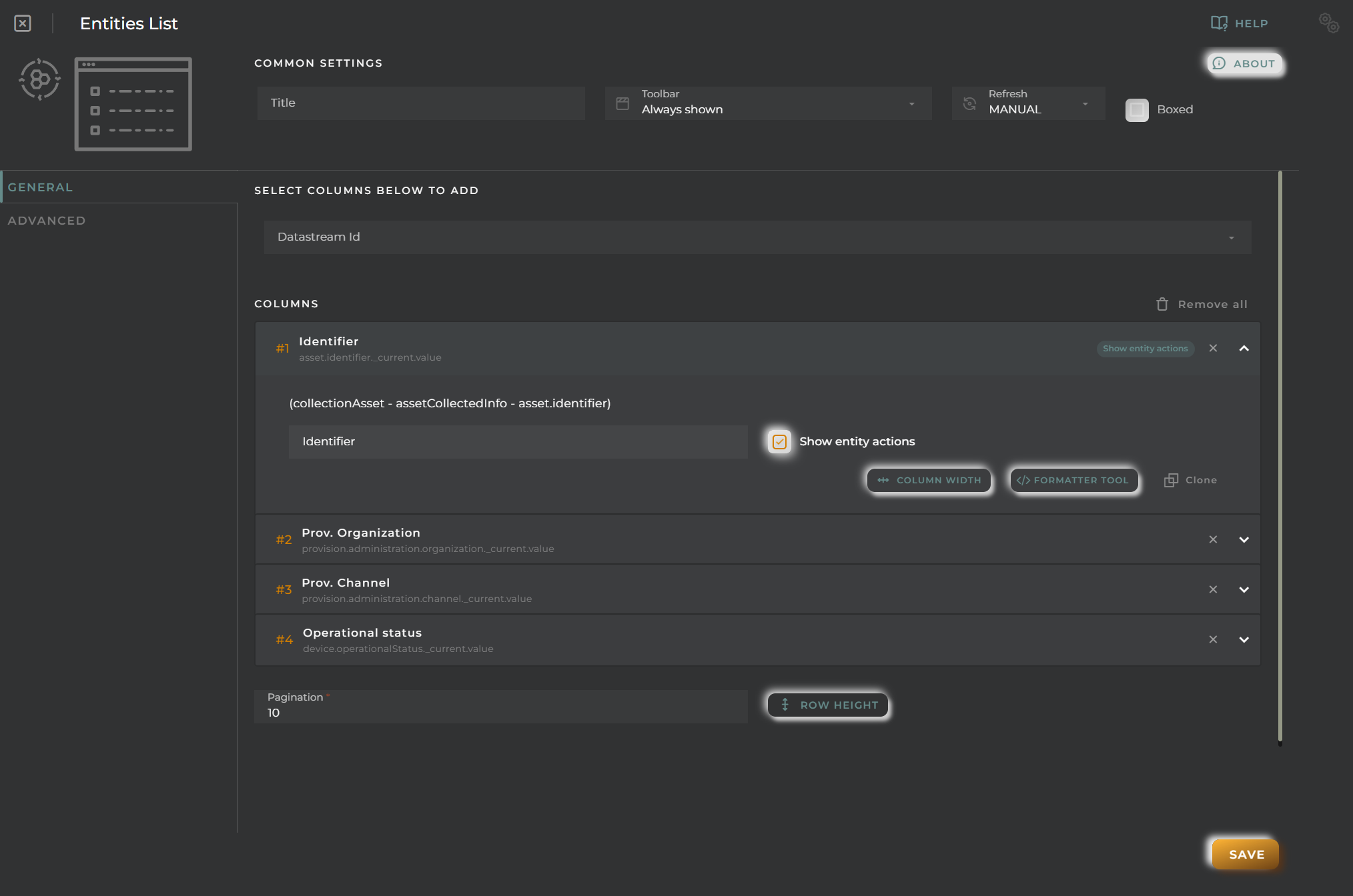
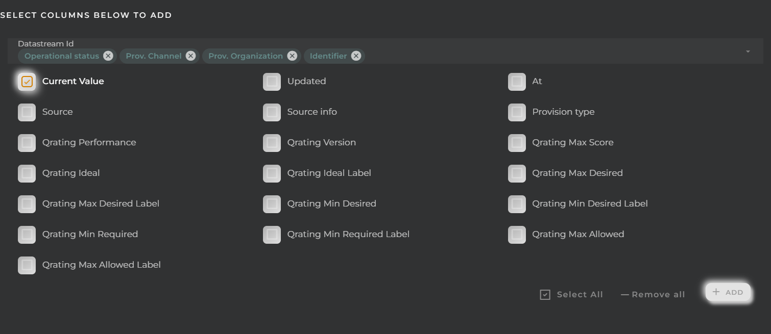
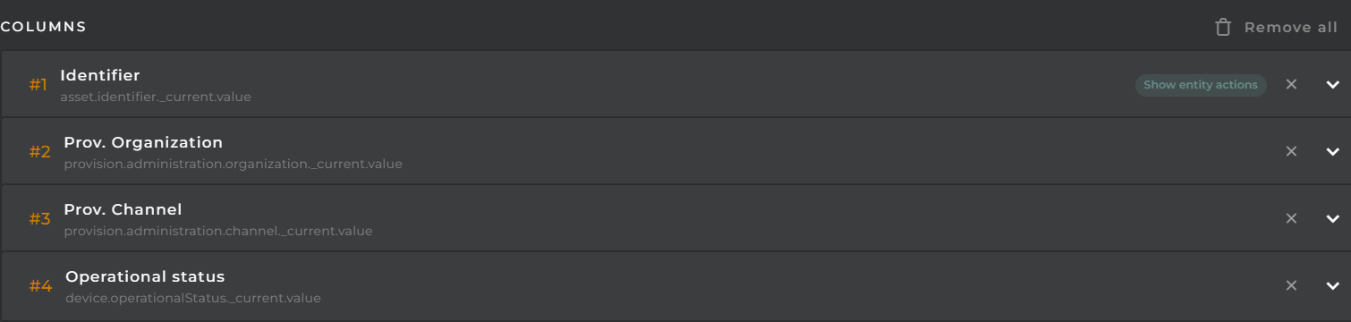
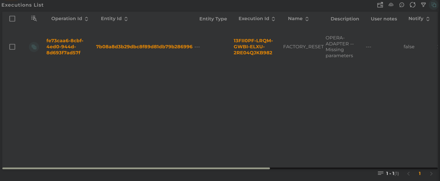
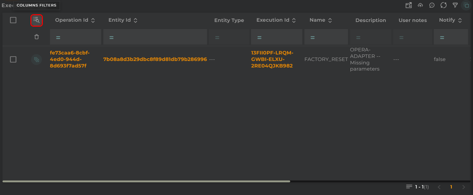
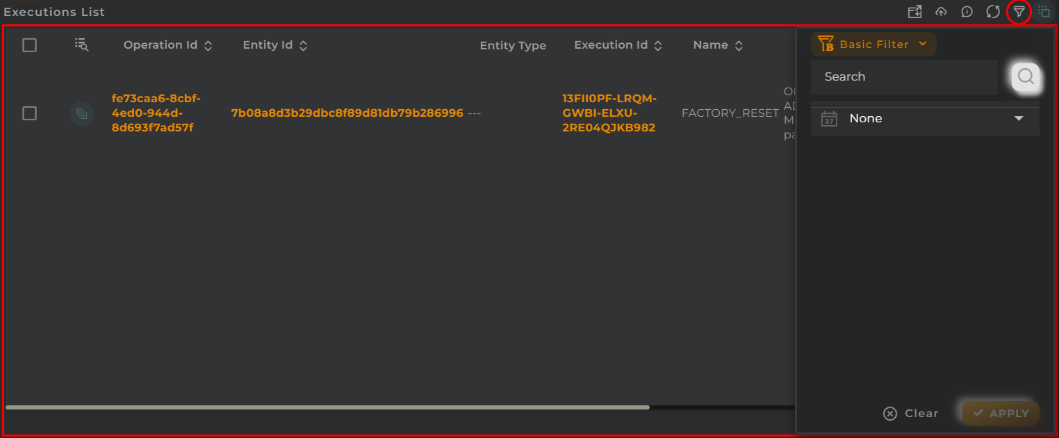
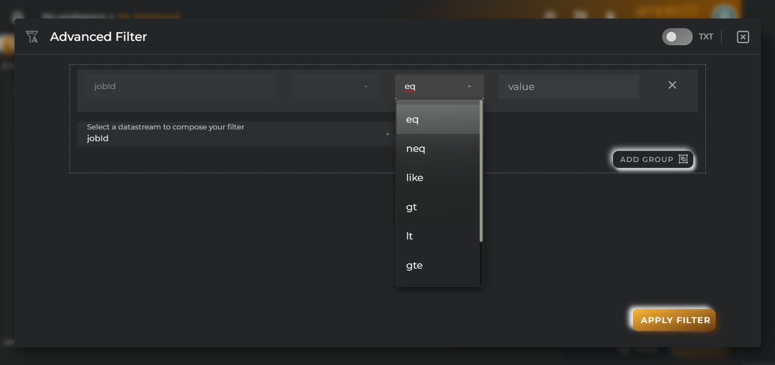
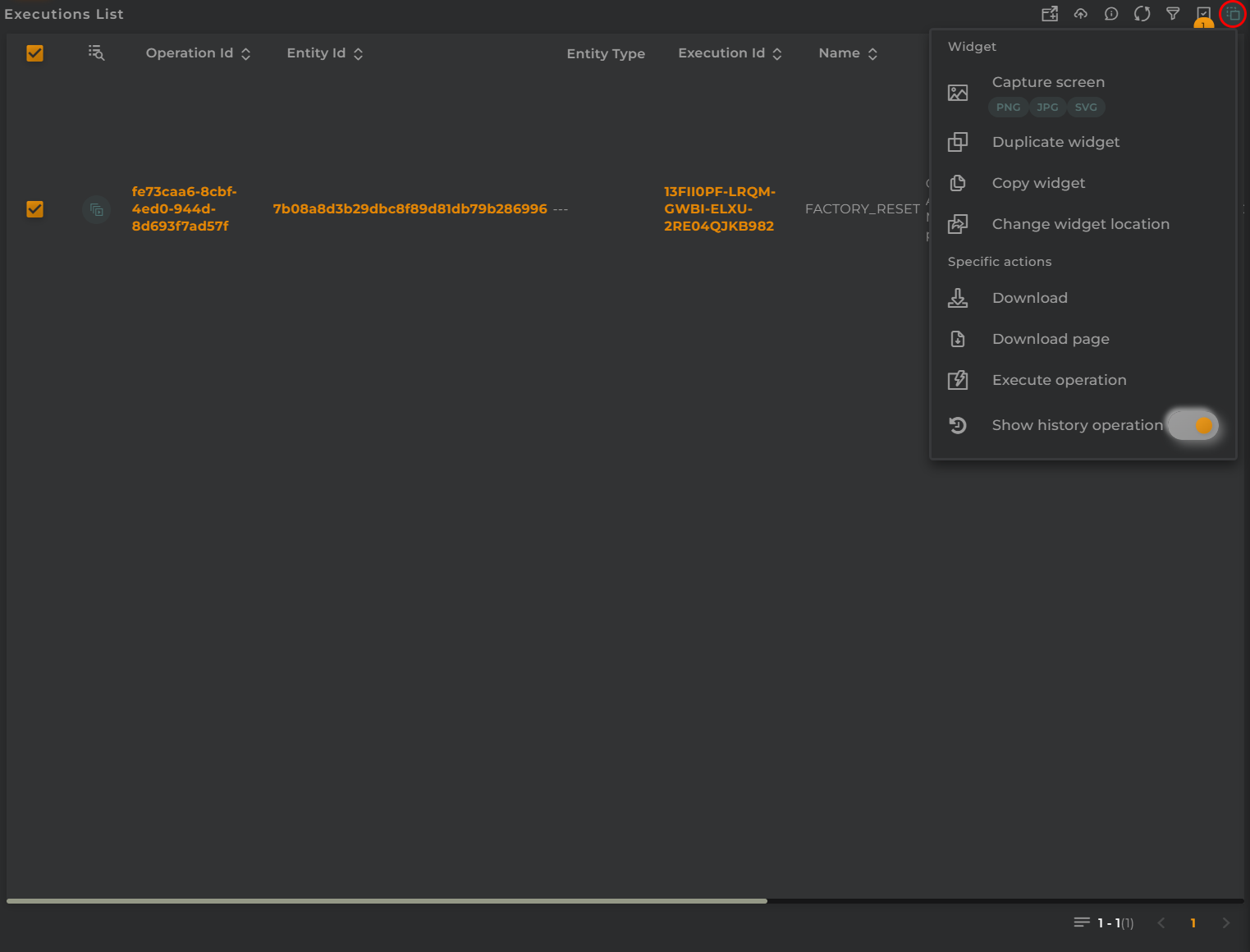
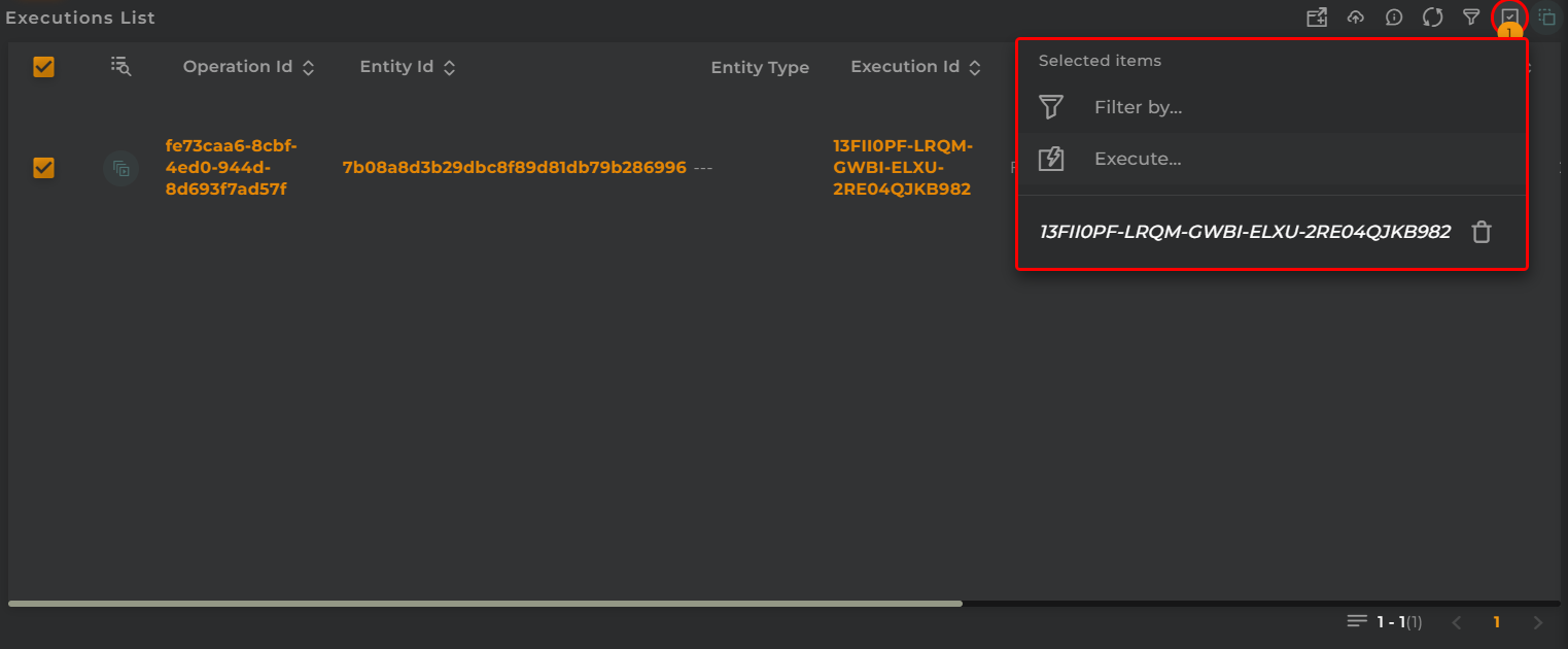
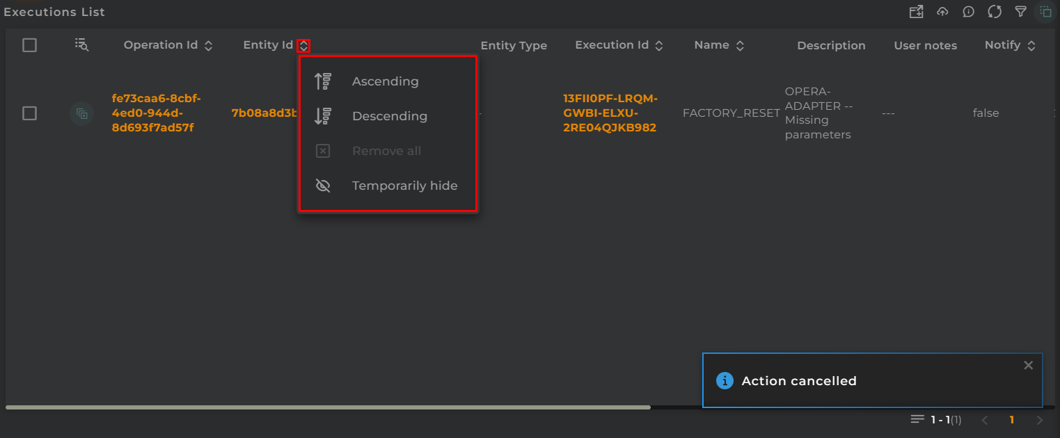
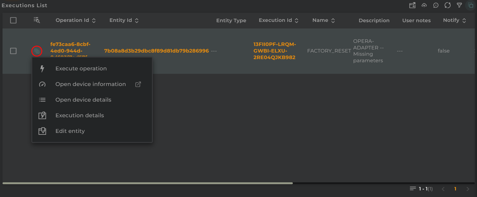
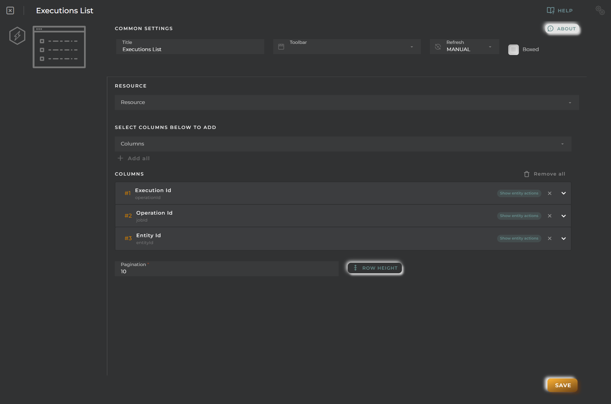


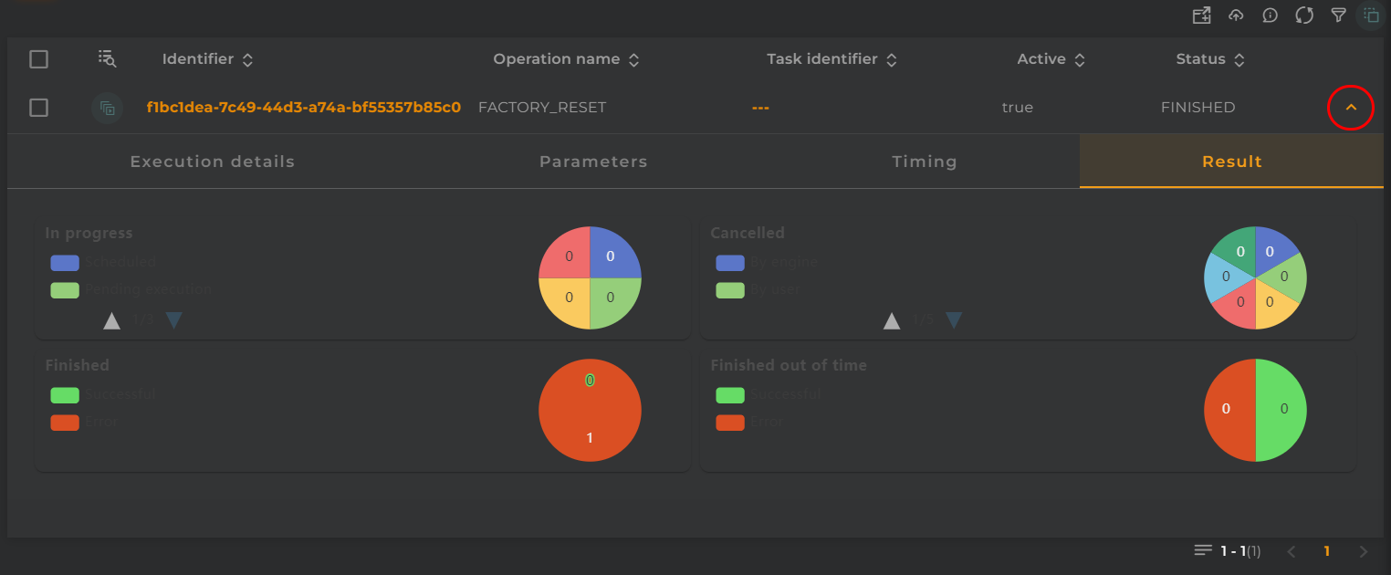
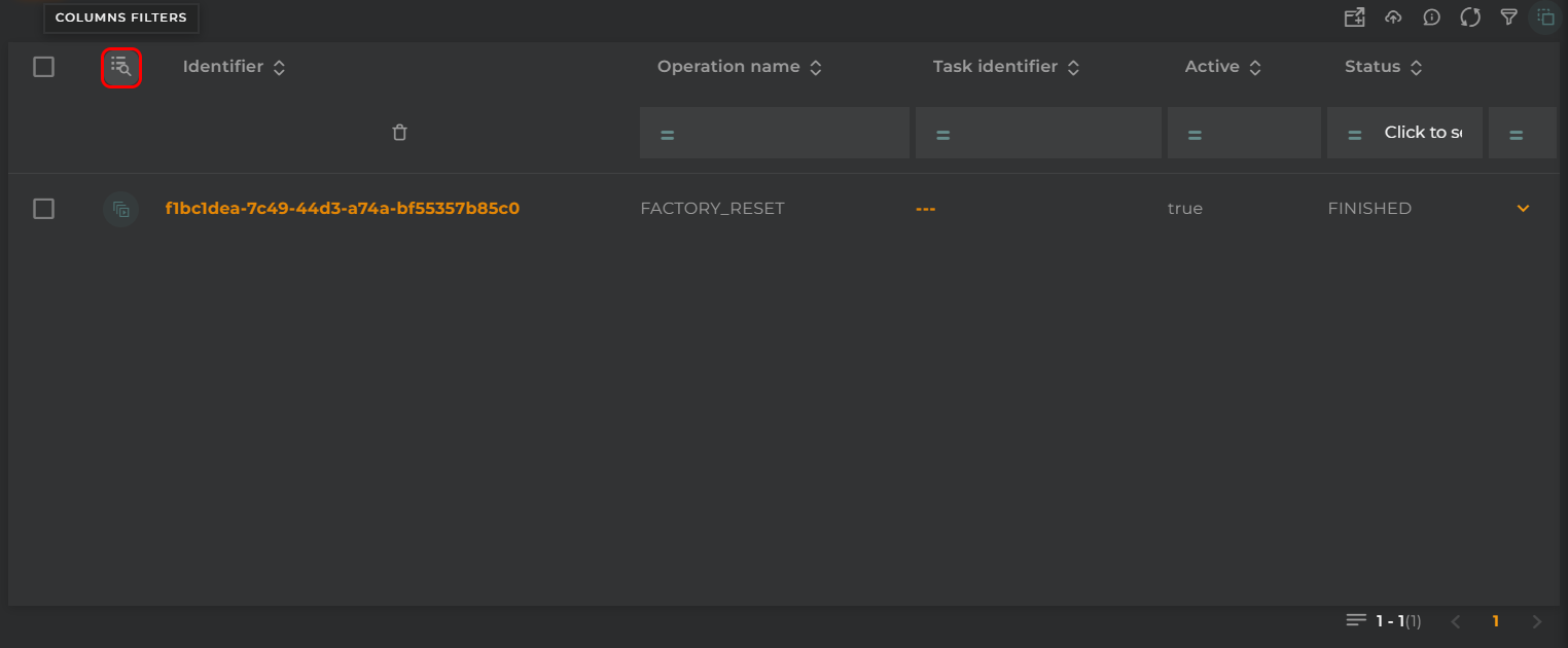
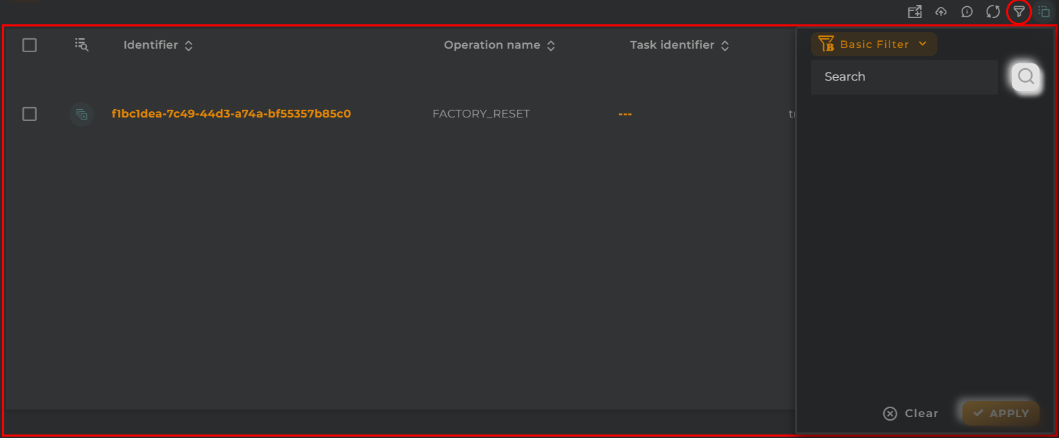
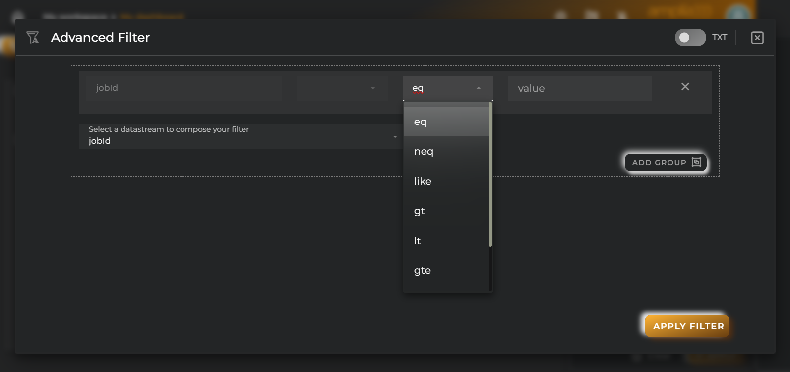
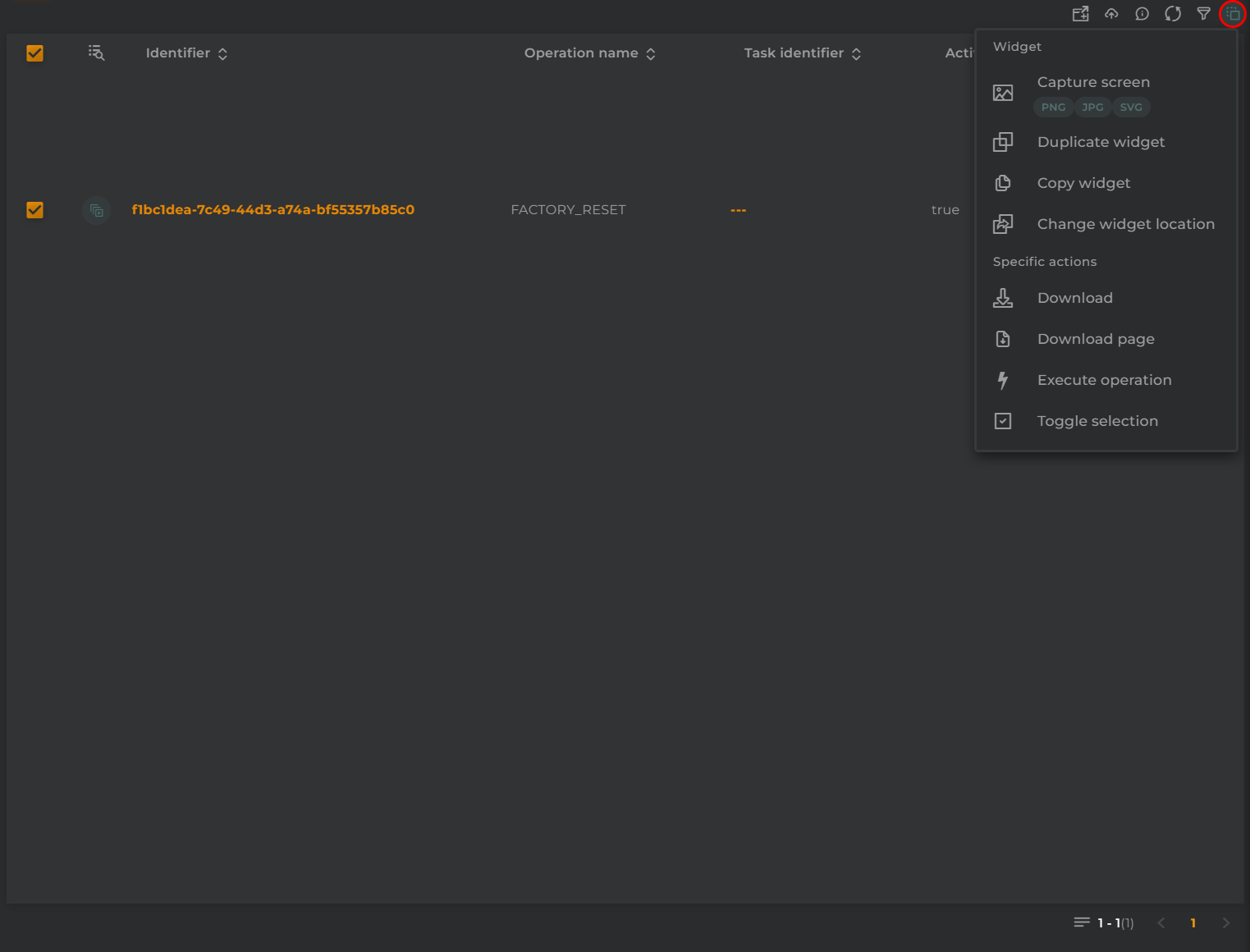
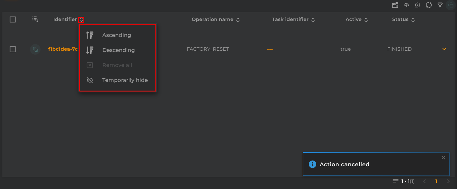
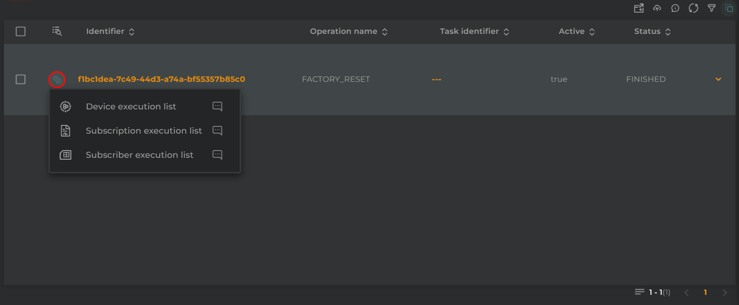
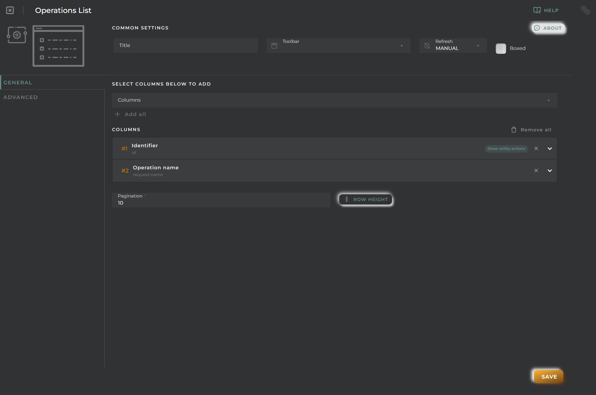

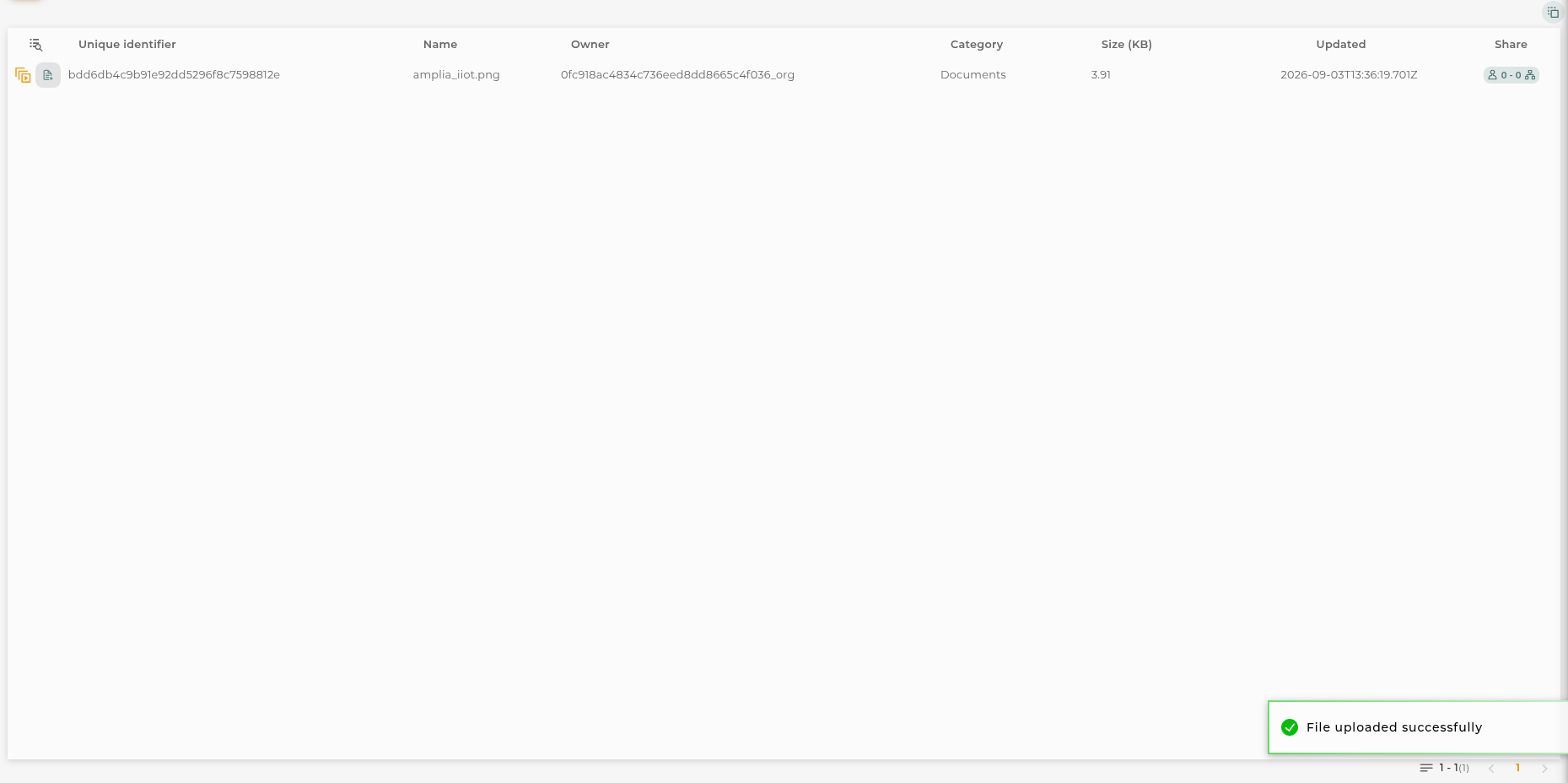
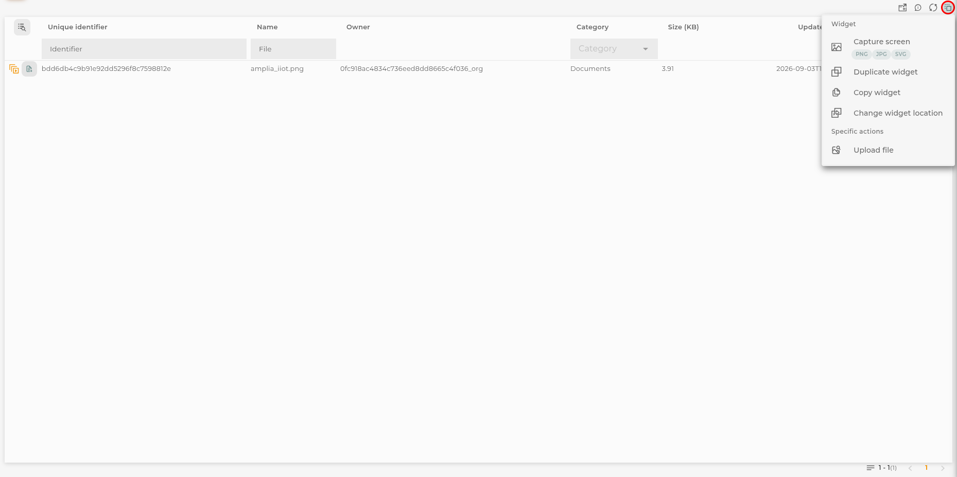
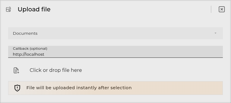
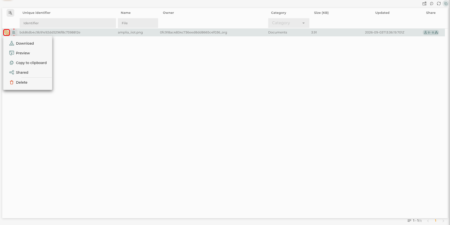
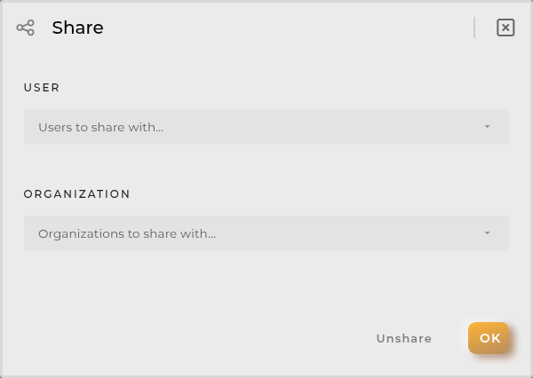
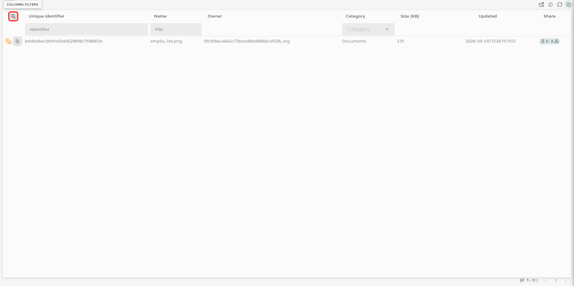
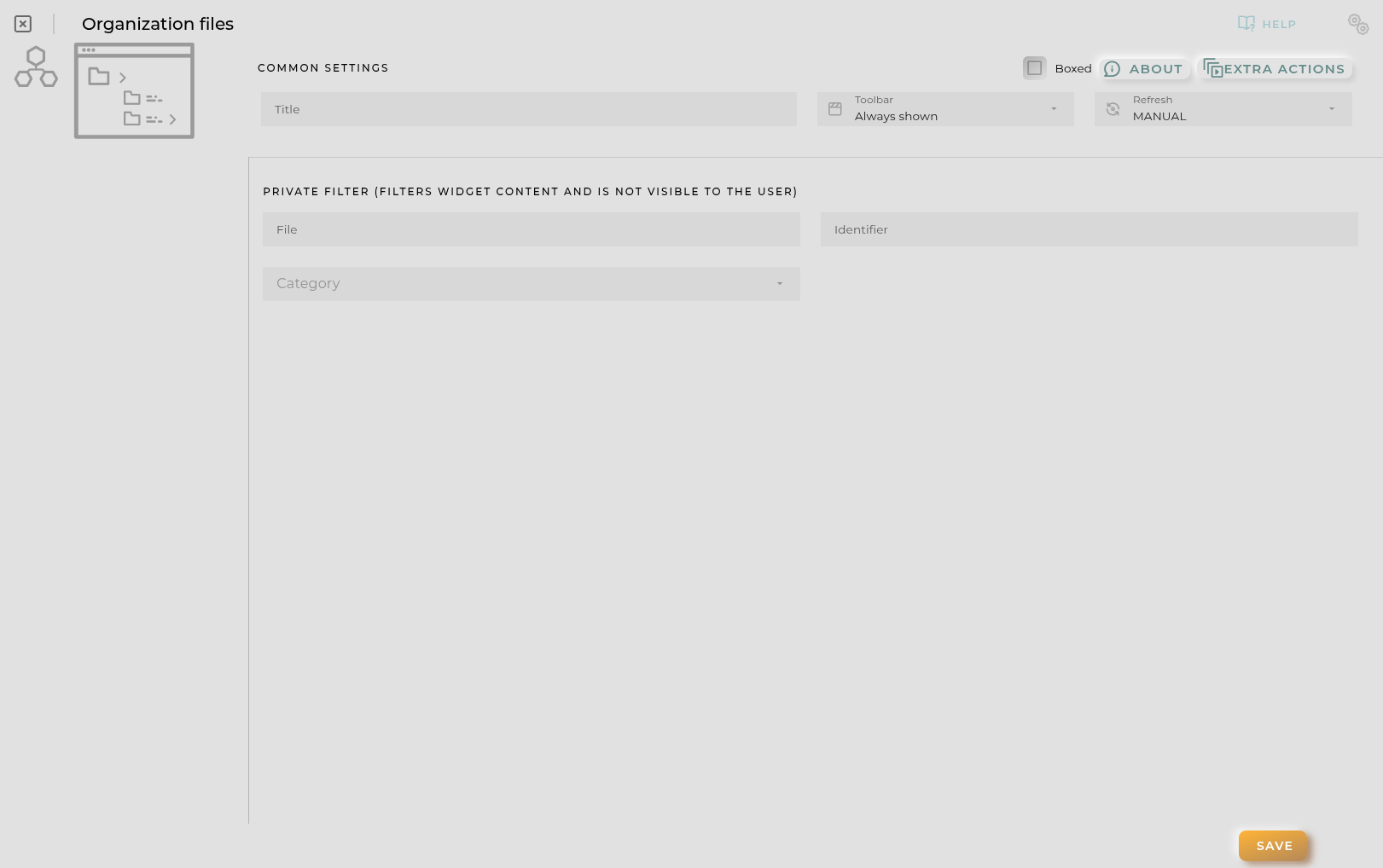
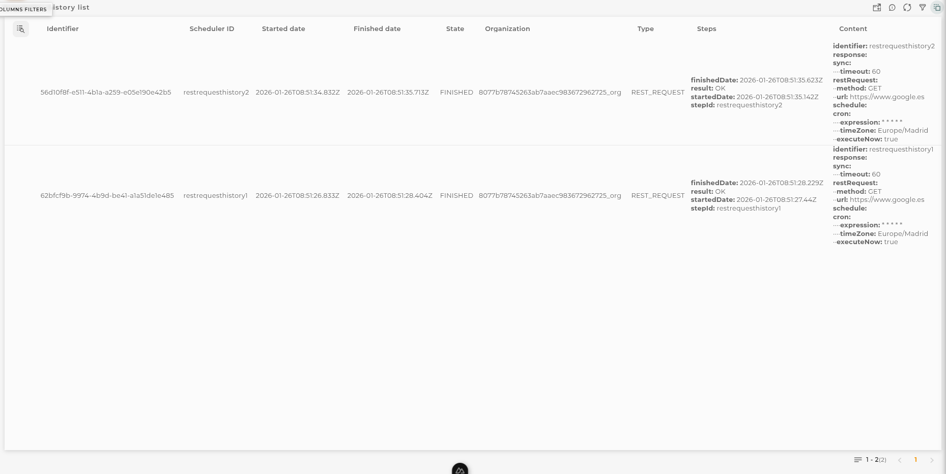
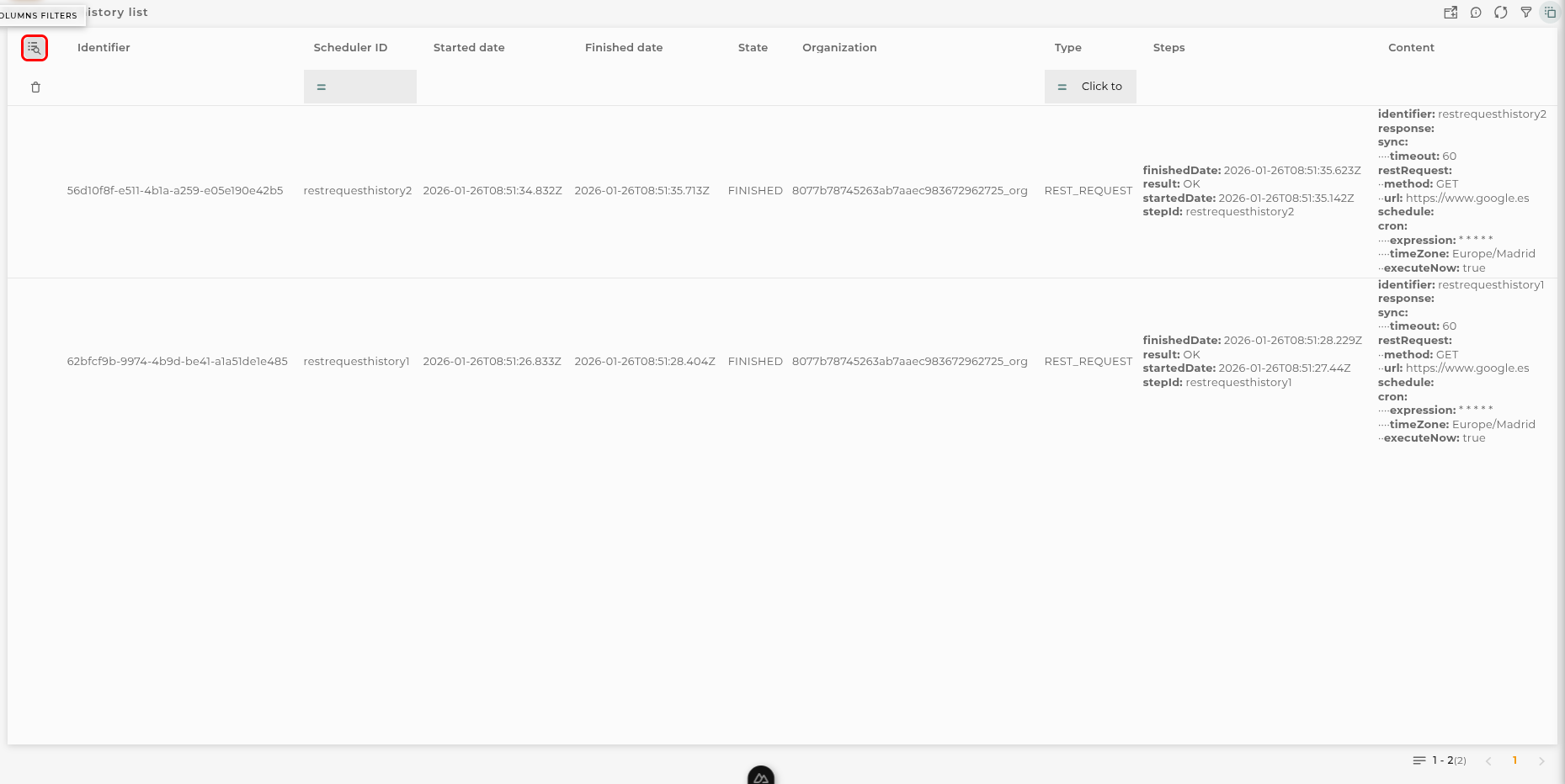
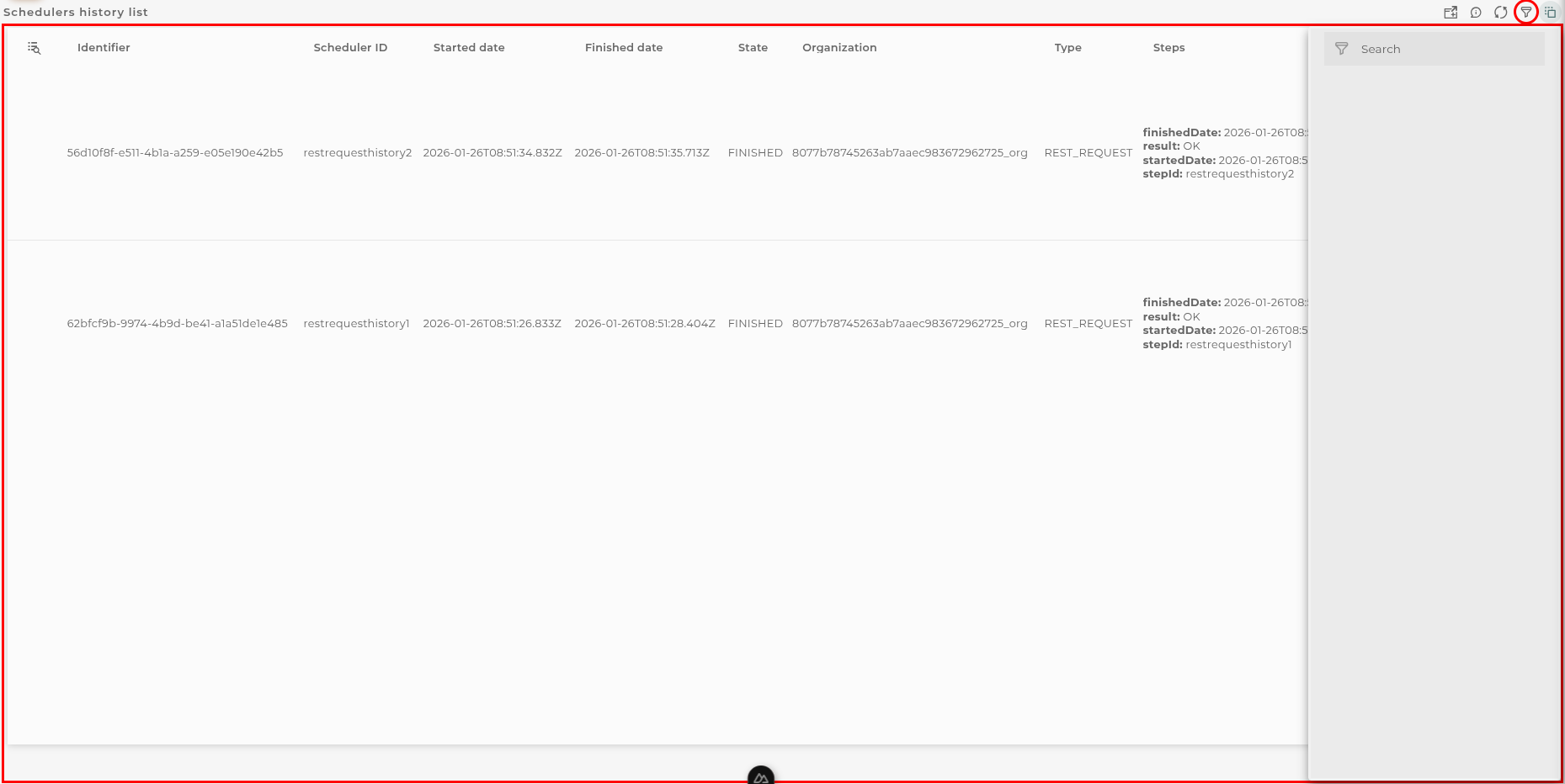
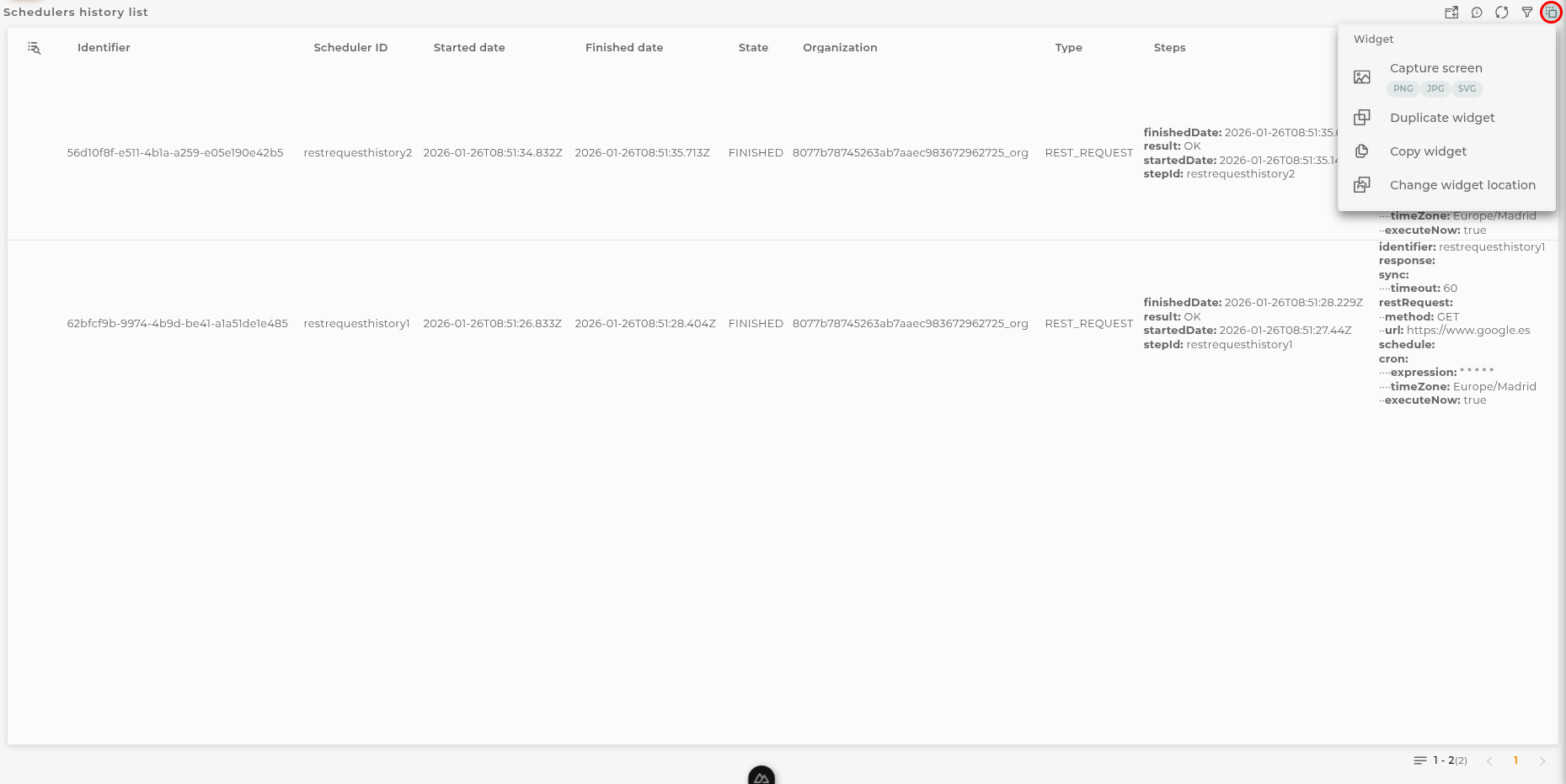
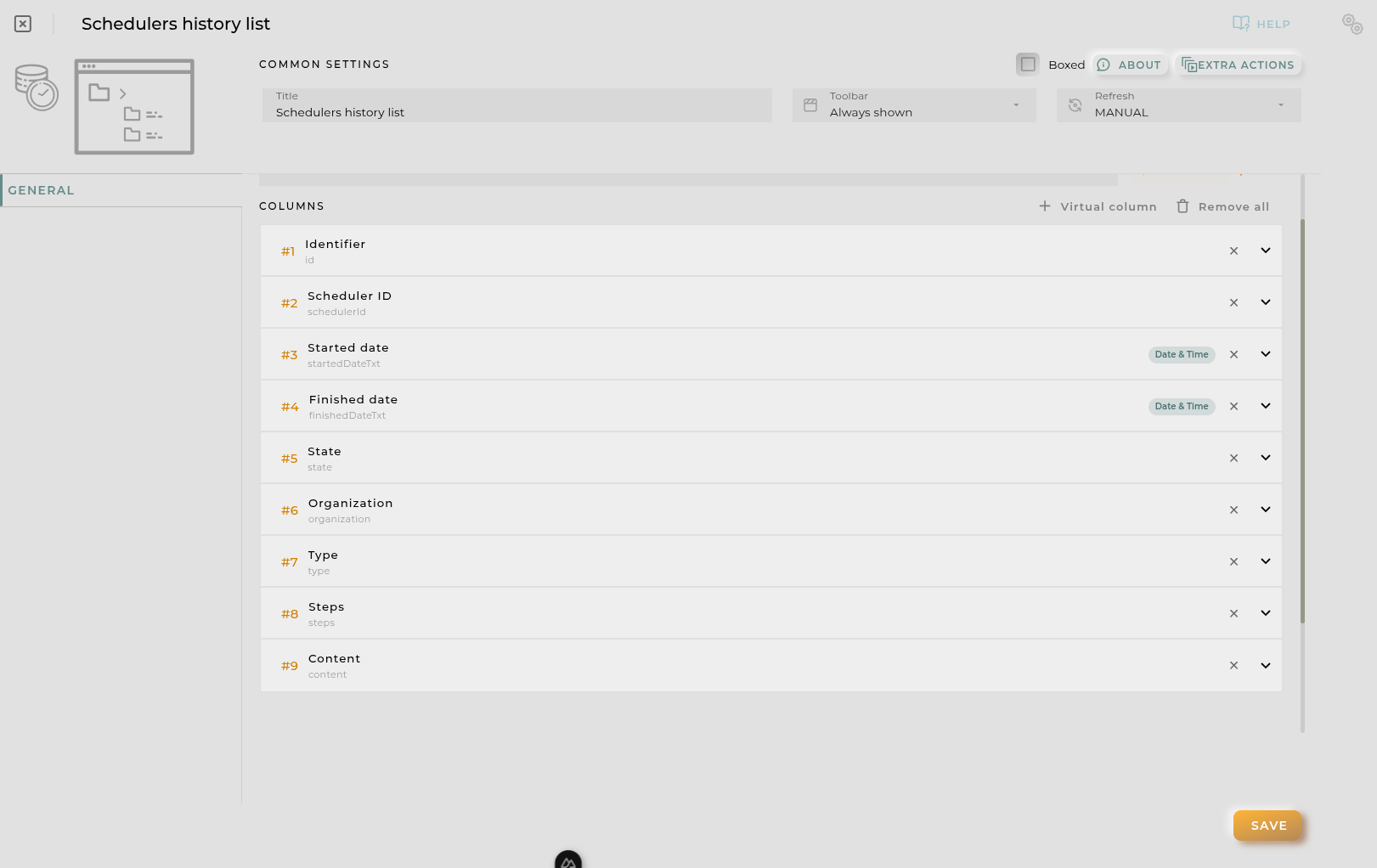
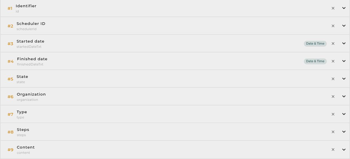
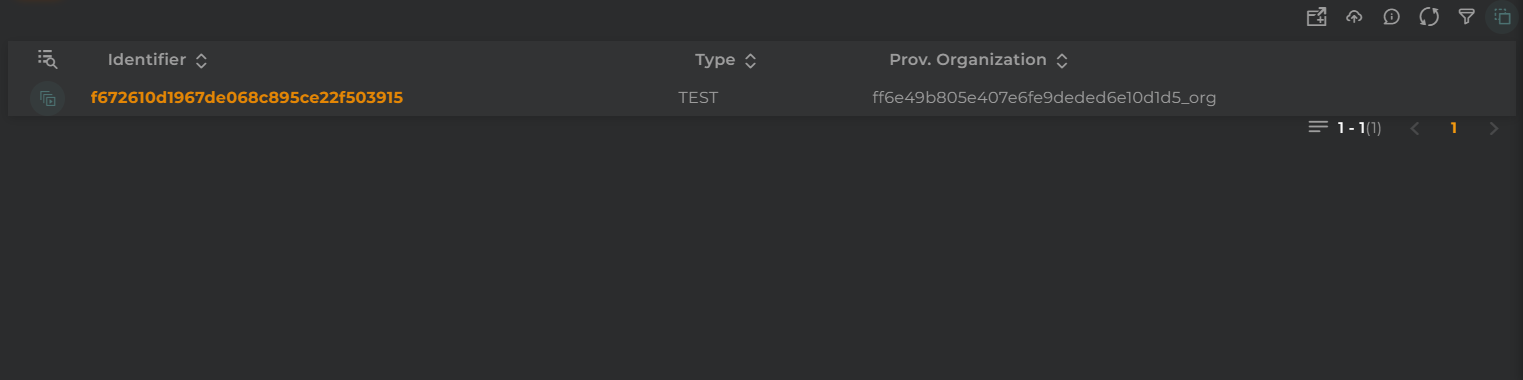
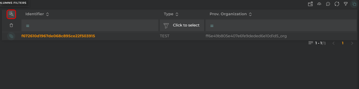
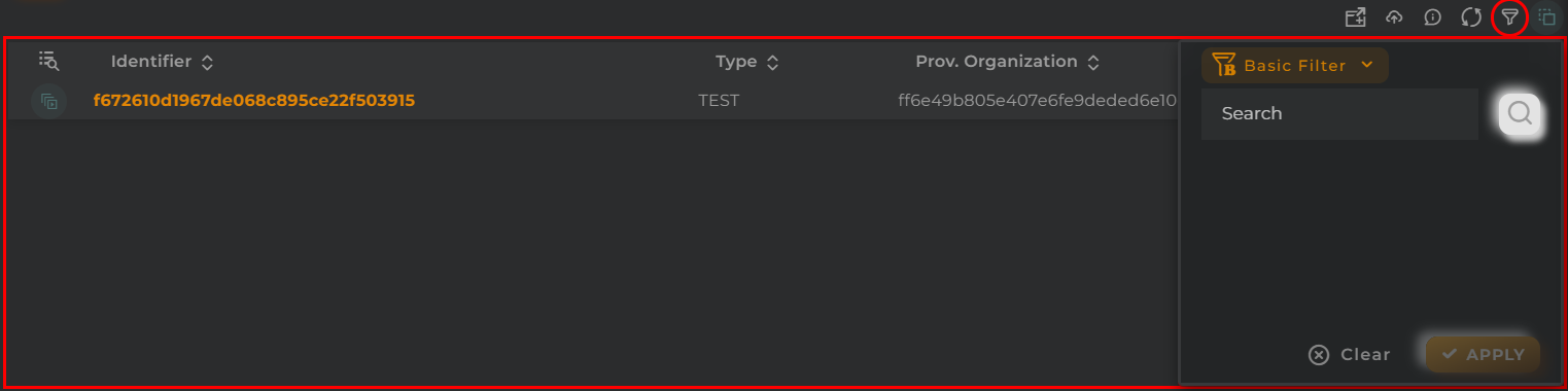
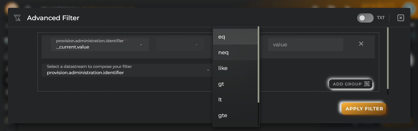
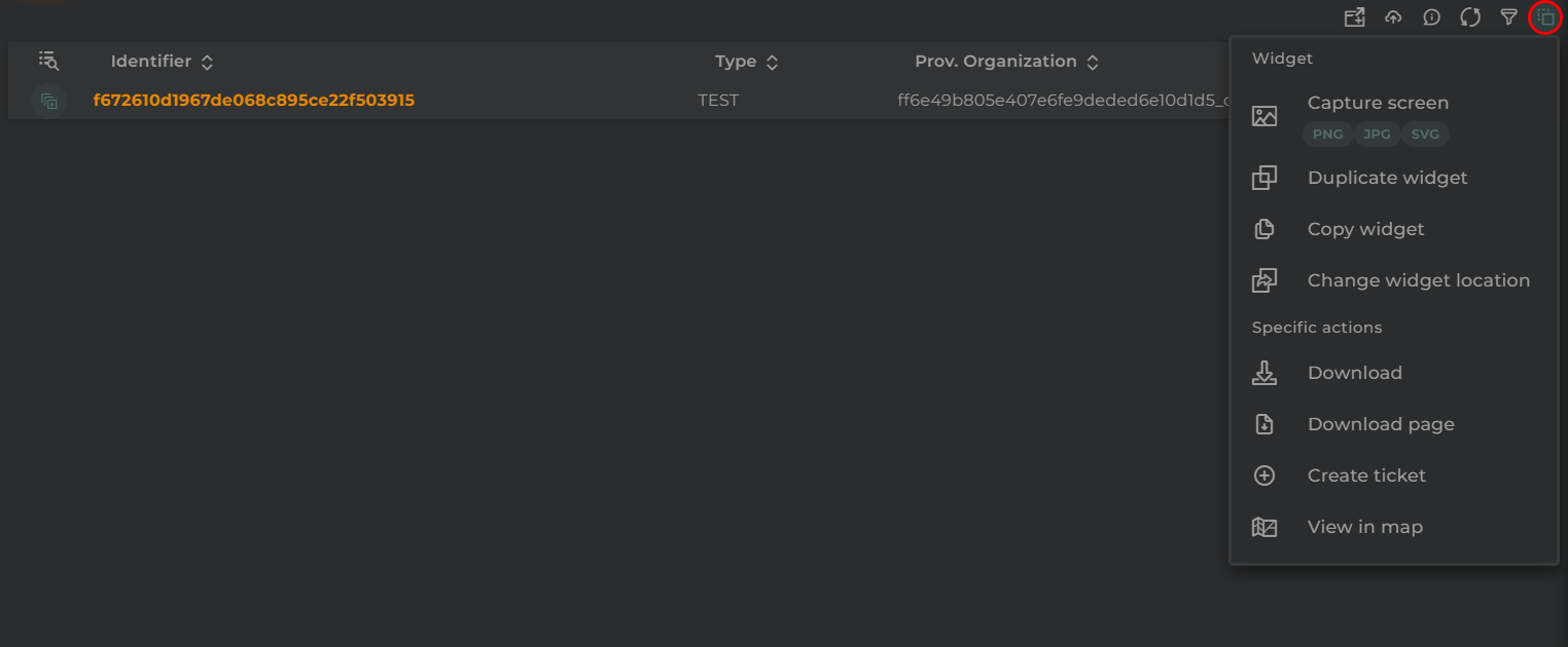
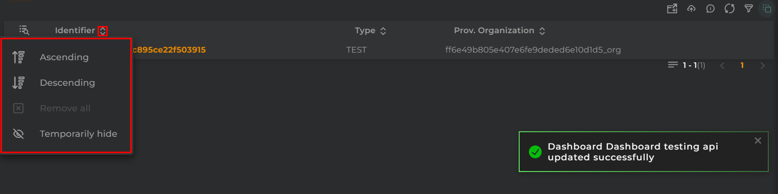
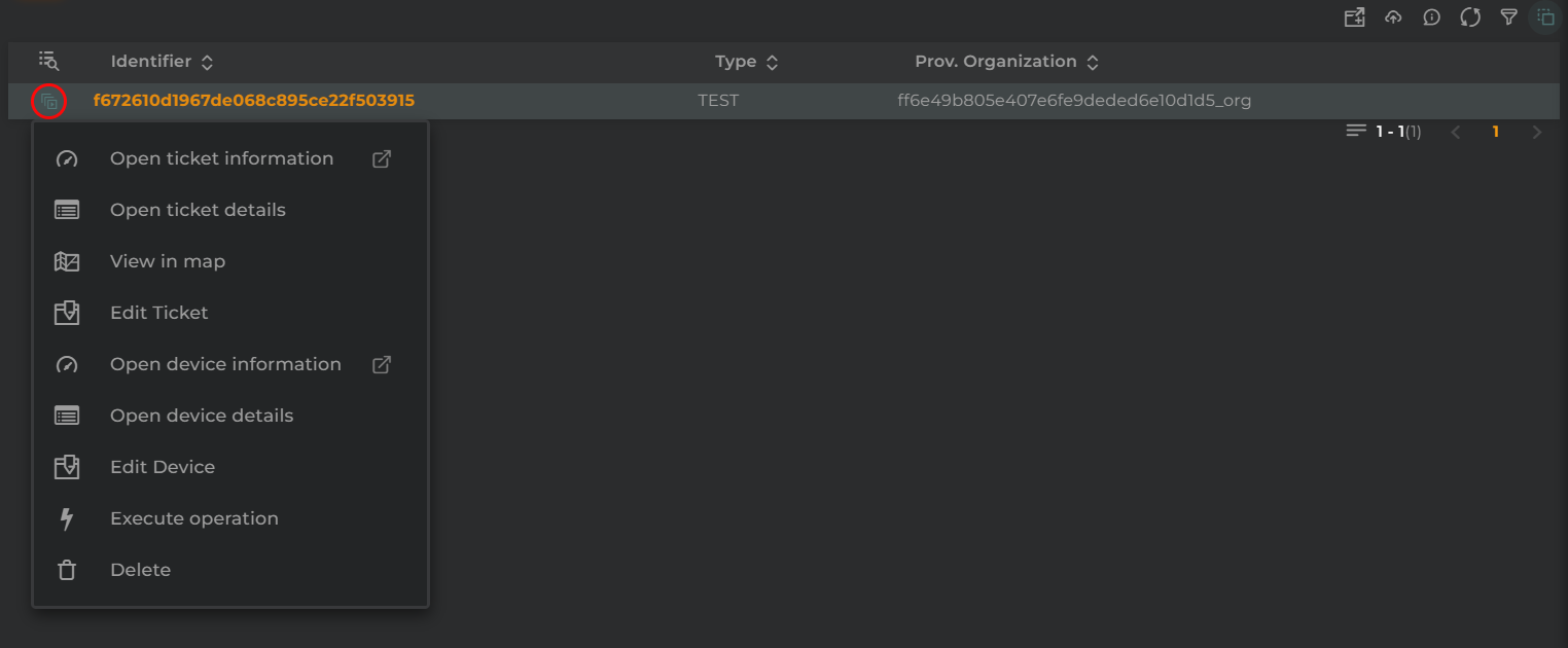
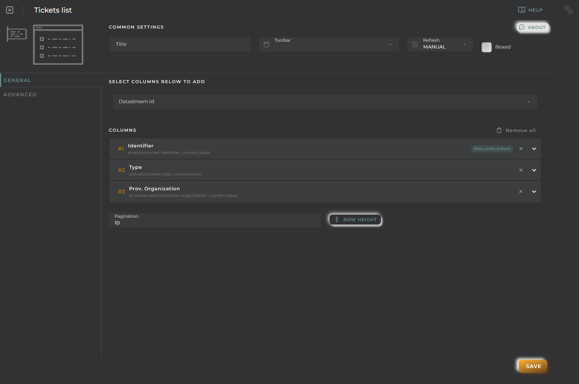
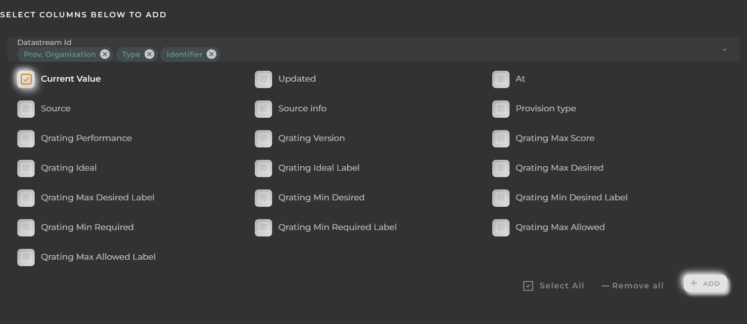

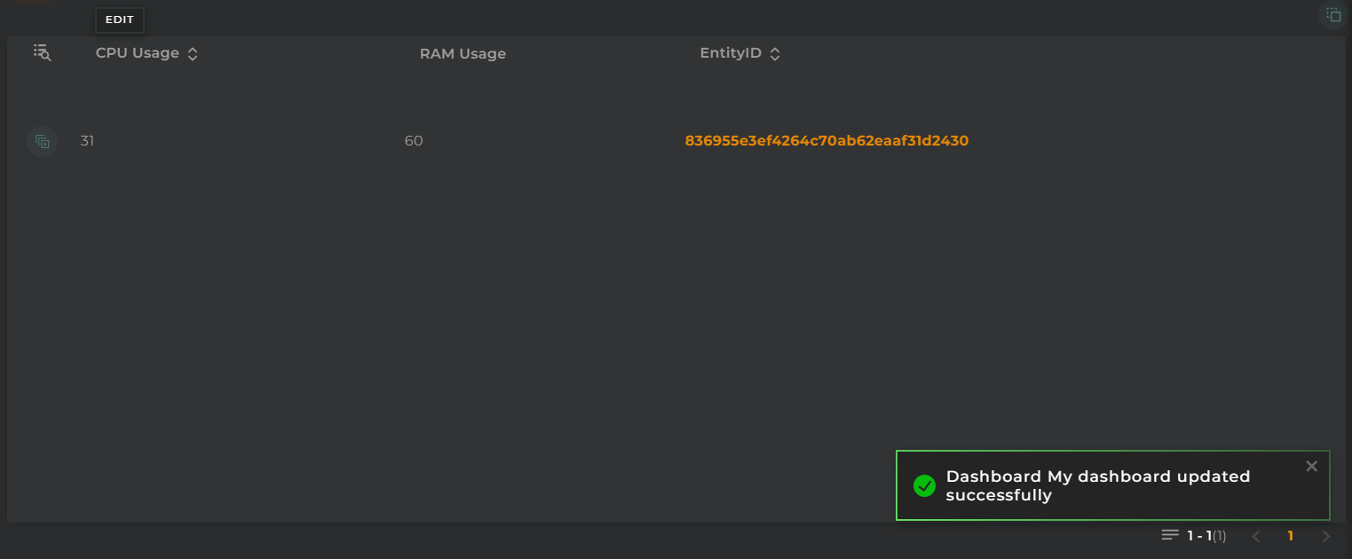
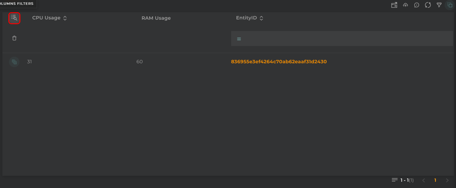
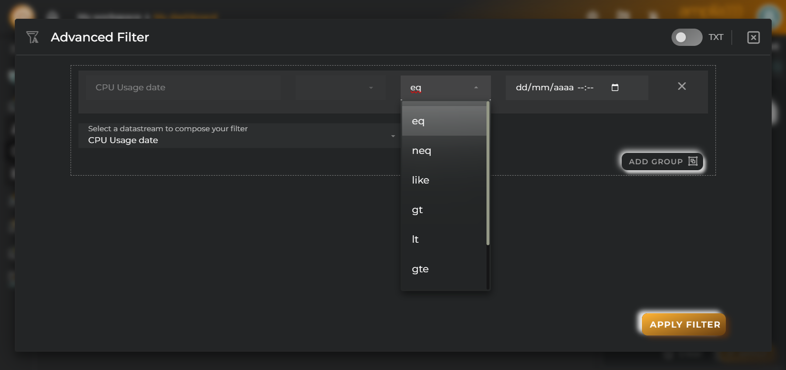
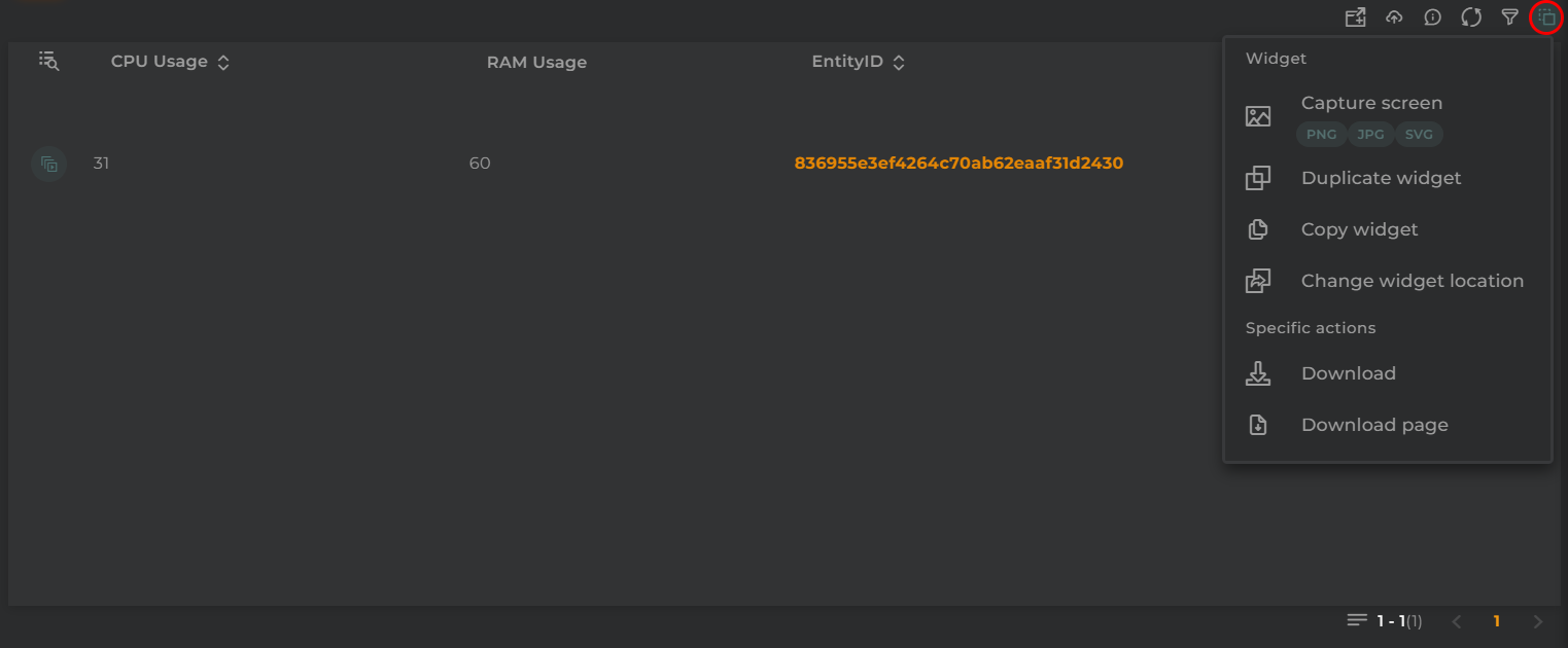
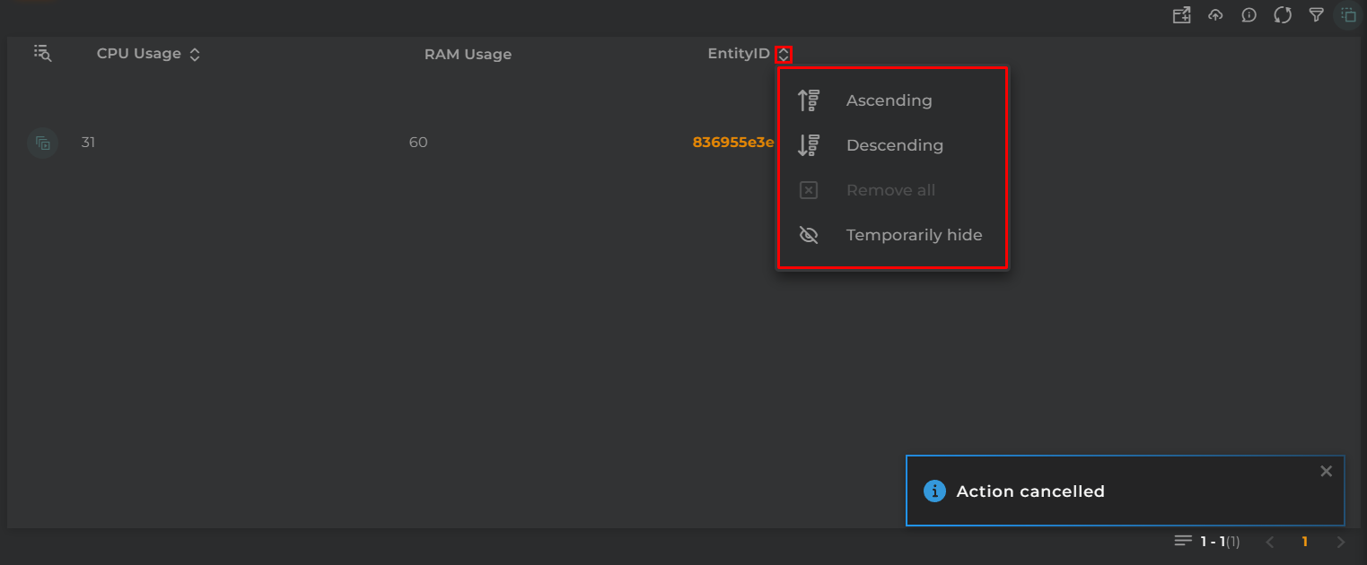
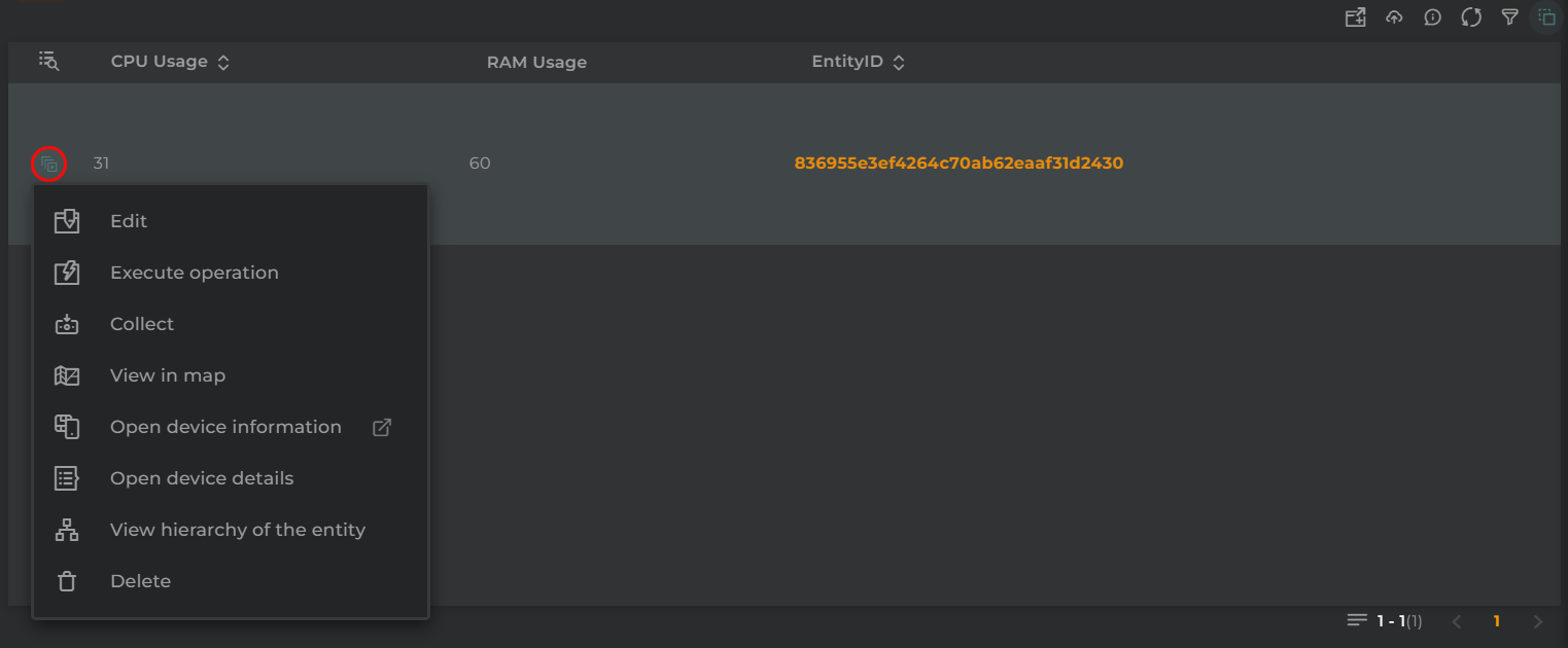
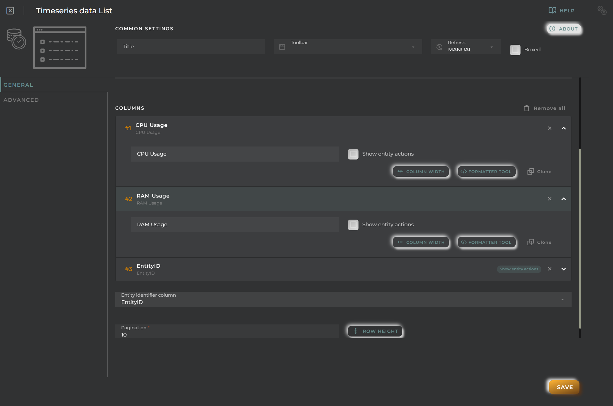


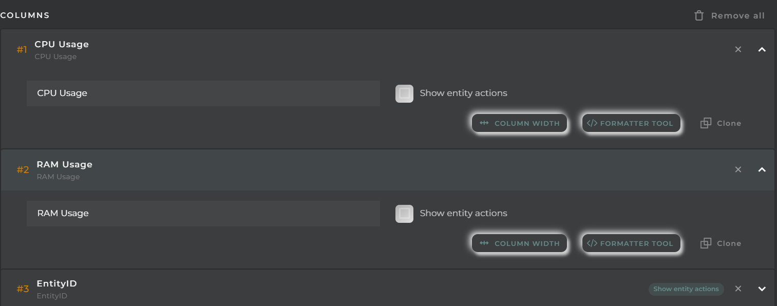


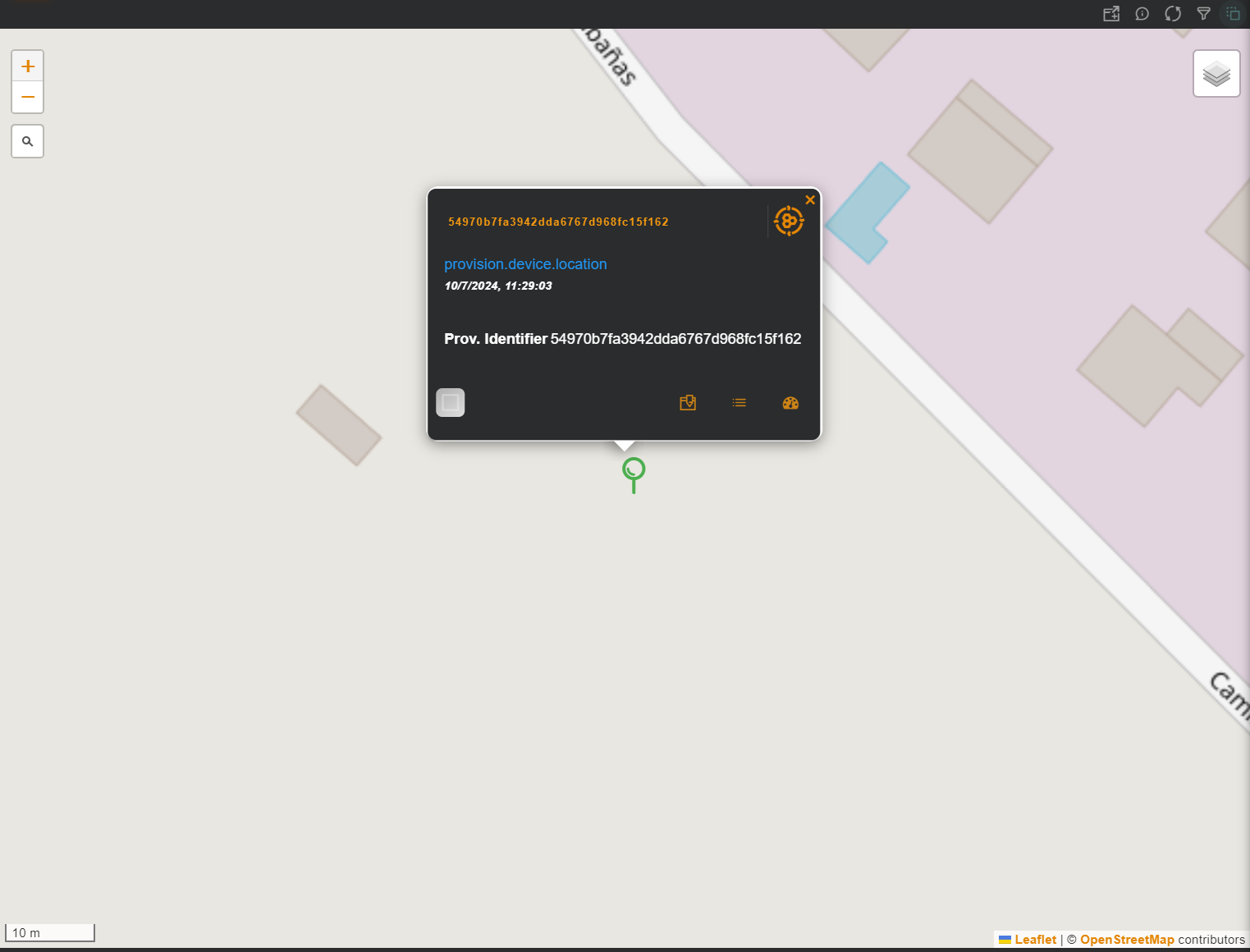
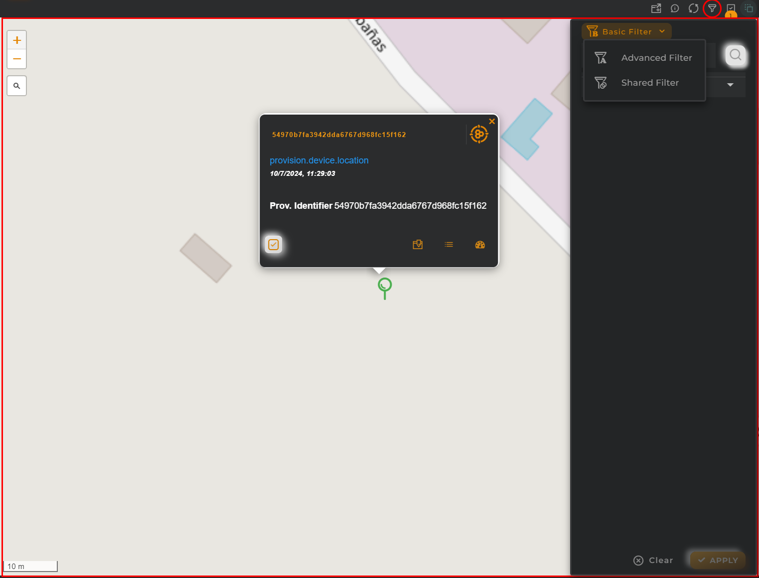
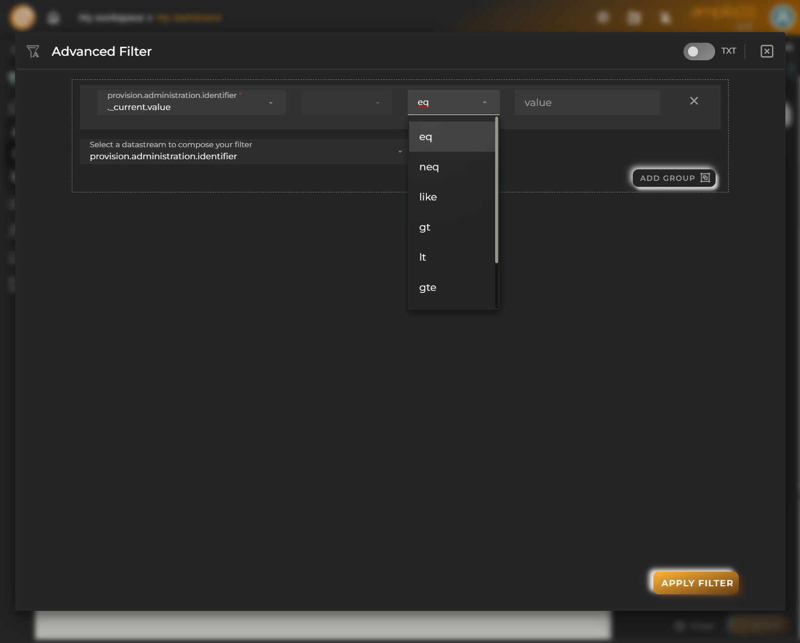
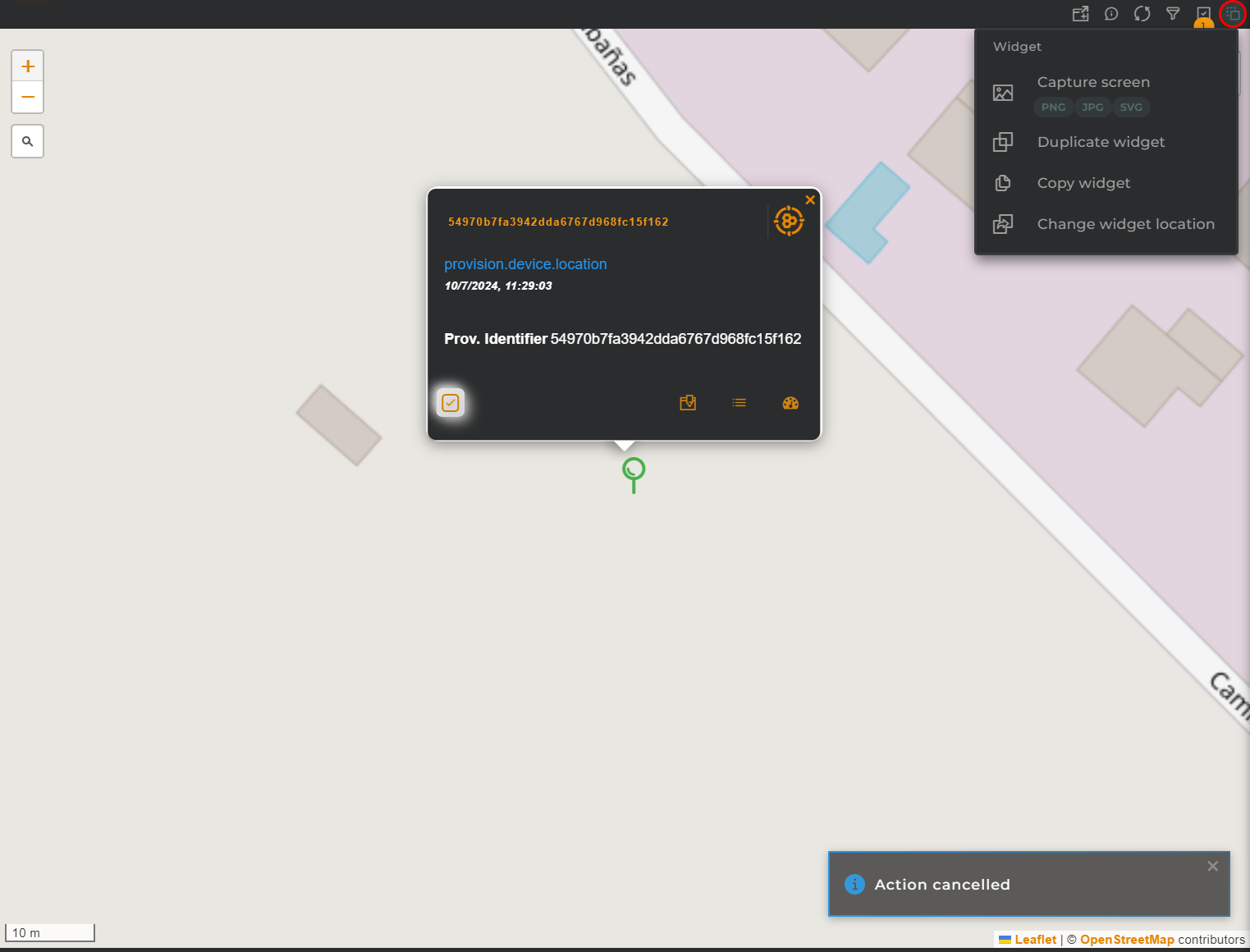
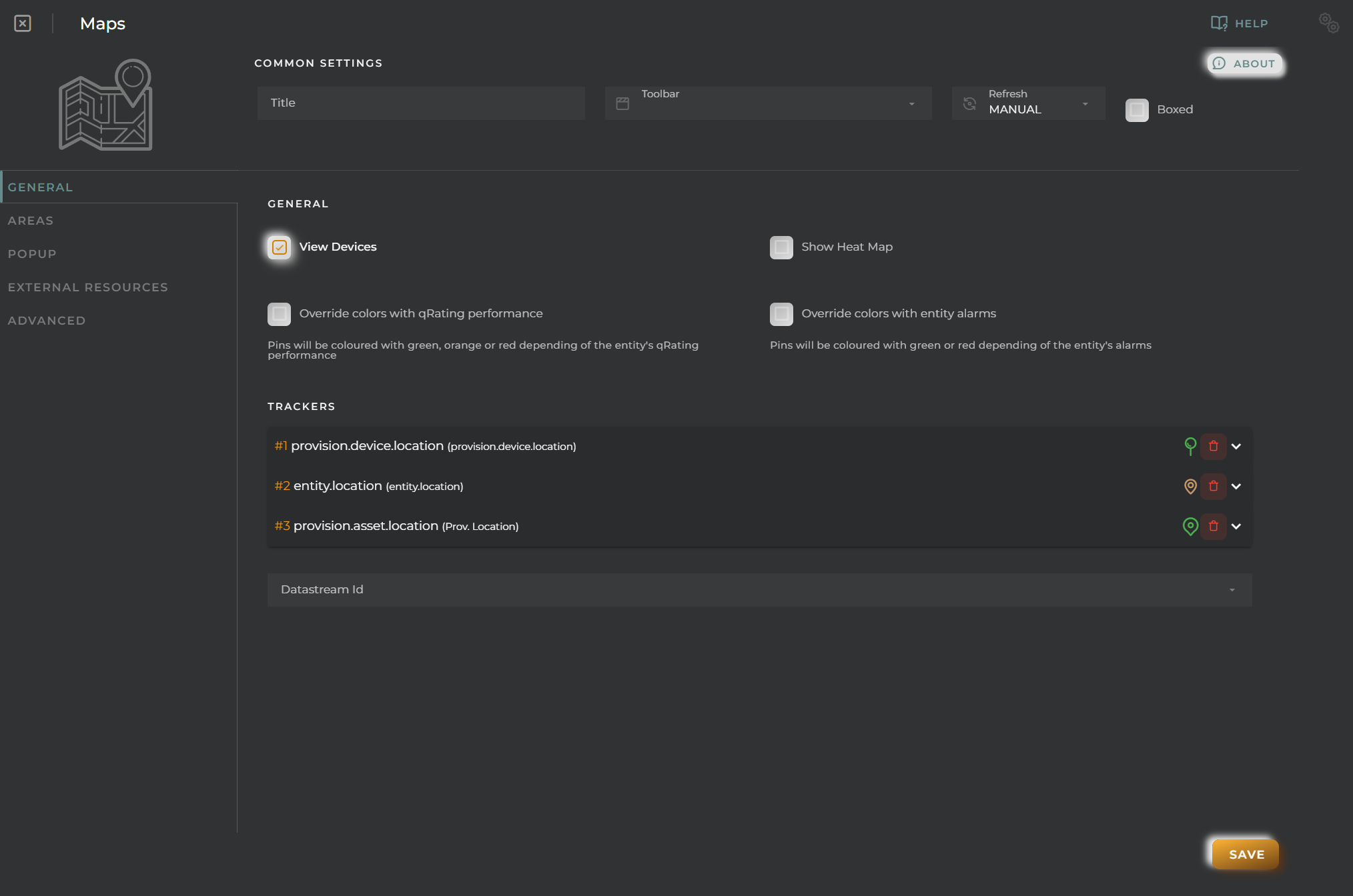
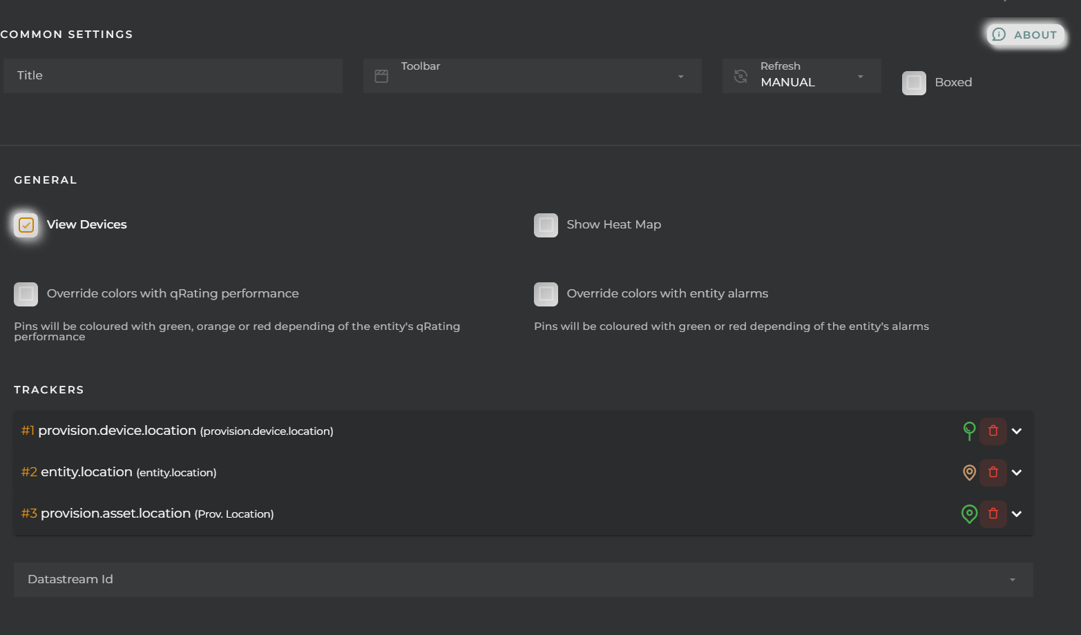
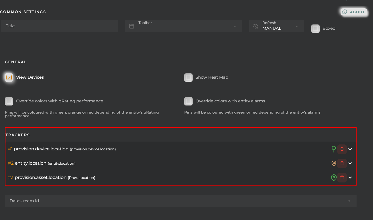 - alias: modification of the popup title for the pin - icon: pin icon - color: pin color - formatter: pin formatter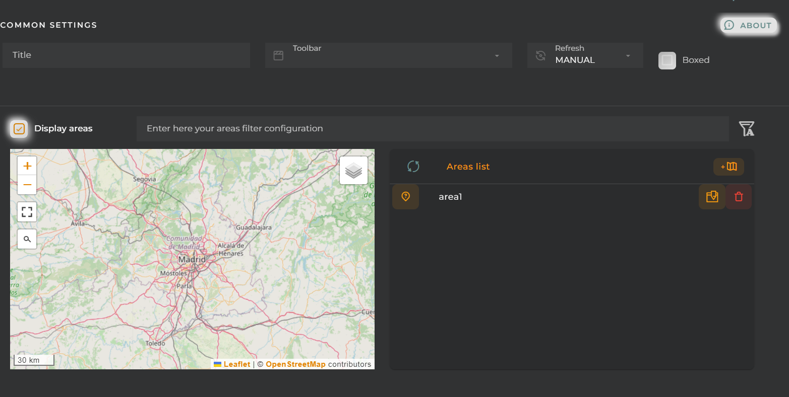
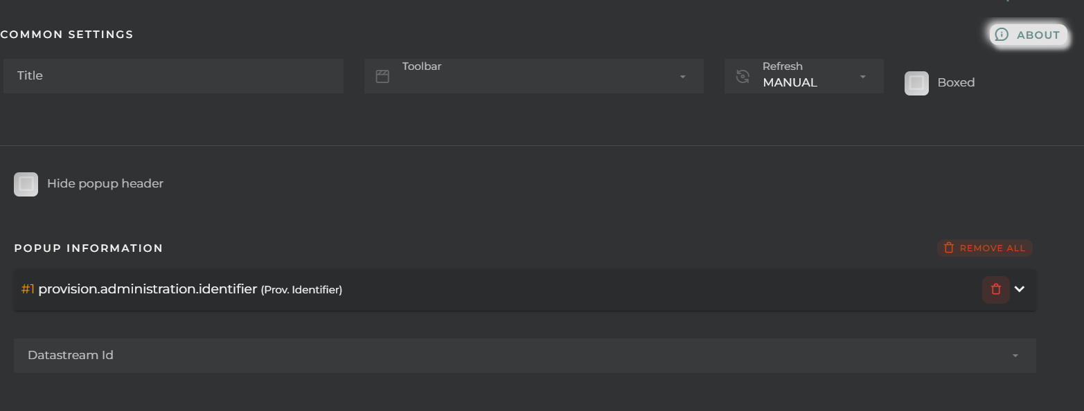
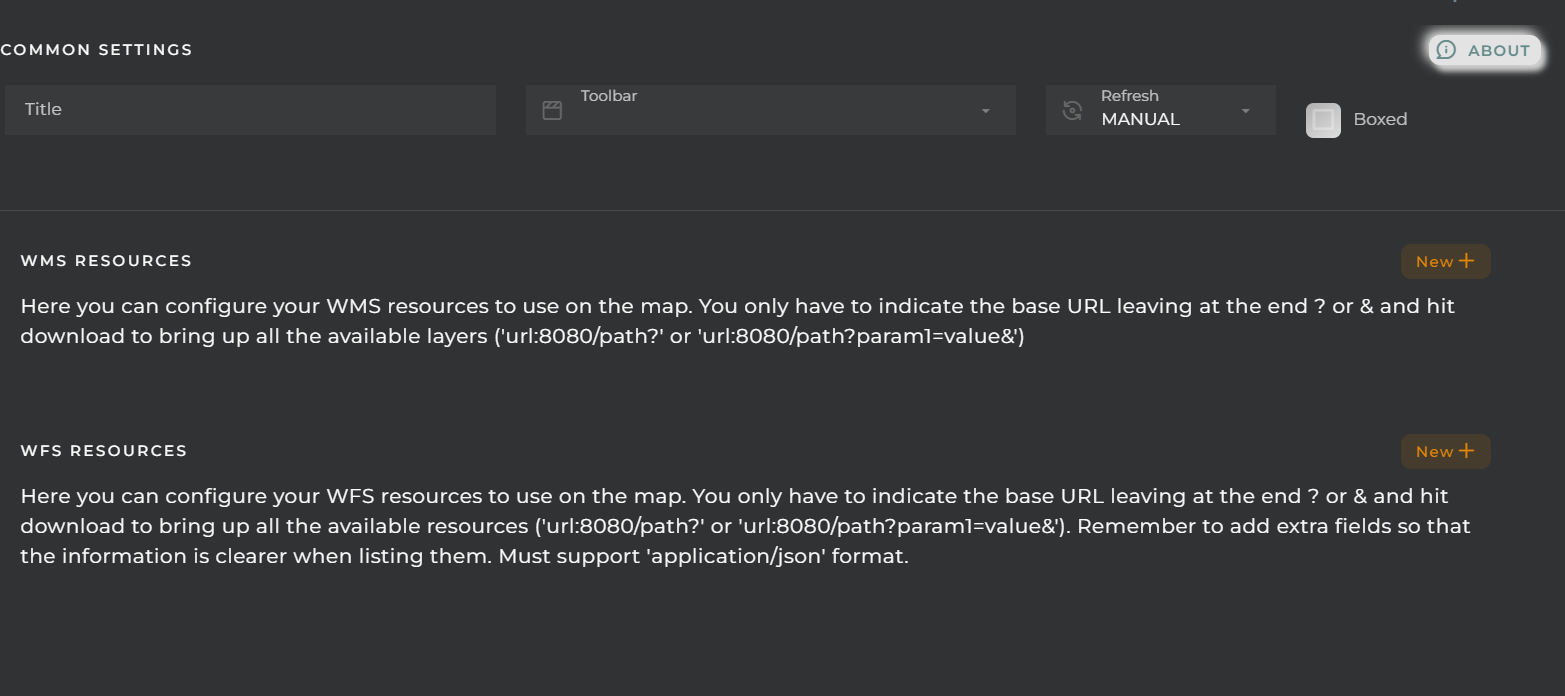
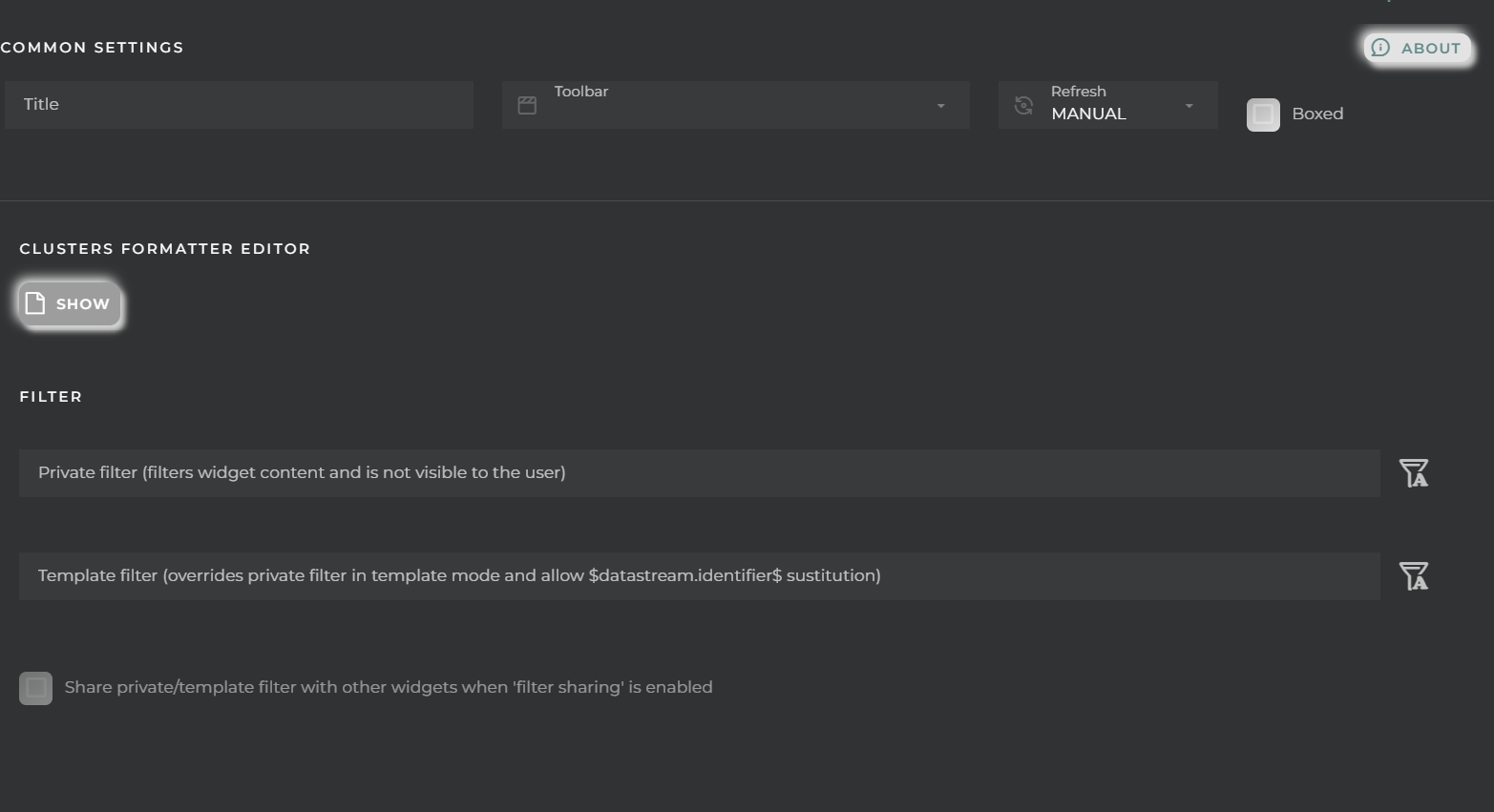


 - alias: modification of the title of the pin’s popup - color: color of the tracker - route simulation: route simulation


